Although not a post on art per se it is an account of a family and their links with art.
Lord Sempill
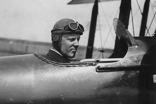
William Francis Forbes-Sempill, 19th Lord Sempill, was a Scottish peer and record-breaking air pioneer who was later shown to have passed secret information to the Imperial Japanese military before the Second World War.
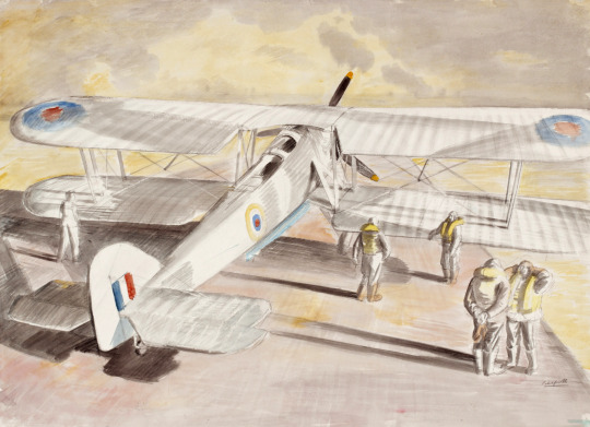
Educated at Eton, he began his career as a pilot in the Royal Flying Corps and then served in the Royal Naval Air Service and Royal Air Force during the First World War. In 1921, Sempill led an official military mission to Japan that showcased the latest British aircraft. In subsequent years he continued to aid the Imperial Japanese Navy in developing its Navy Air Service.
In the 1920s, Sempill began giving military secrets to the Japanese. Although his activities were uncovered by British Intelligence, Sempill was not prosecuted for spying and allowed to continue in public life. He was eventually forced to retire from the Royal Navy in 1941 after being discovered passing on secret material to Tokyo shortly before Japan declared war in the Pacific.
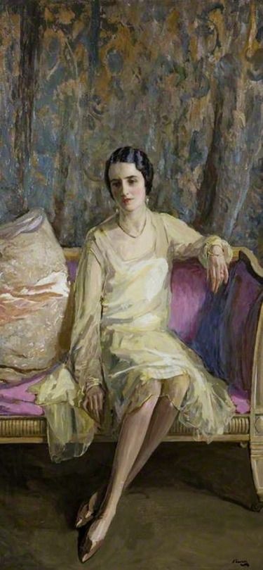
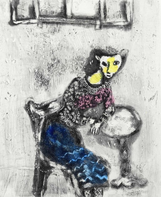
John Lavery – Eileen in Primrose Yellow, 1926
Eileen Lavery
In 1919 Sempill married Eileen Marion Lavery, daughter of the Irish painter Sir John Lavery the WW1 War Artist. Eileen was Lavery’s only child. Shortly after giving birth and suffering from tuberculosis, Kathleen MacDermott, her mother, died in November 1891.
When her father took up permanent residence in London 1898. Eileen attended Holy Cross Convent School at Rochampton, and accompanied her father on his annual trips to Tangier before her marriage to James Dickinson in 1912. This marriage failed after the birth of their first child and Eileen and James divorced.
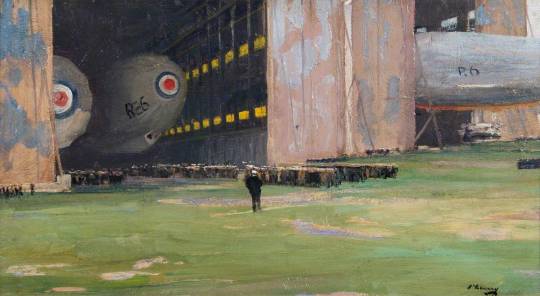
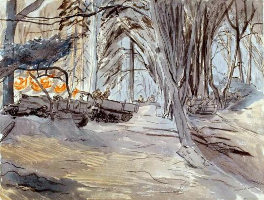
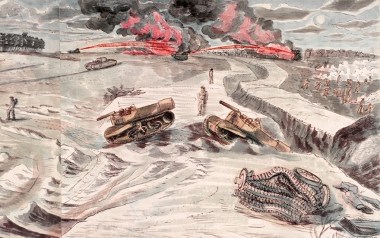
John Lavery – R23 Type British Airships at Pulham St Mary, Norfolk, 1918
In 1920 Eileen married William Francis Forbes-Sempill, later Lord Sempill of Craigevar with whom she had two further children.
Their first daughter, Ann Moira, was born in 1920. Their second daughter, June Mary, was born in 1923, and was killed aged 18 as a result of enemy action on 11 May 1941 – the last day of the Blitz – at 15 Basil Street, London, just behind Harrods. She had been serving with the WVS Mobile Canteen Service. Eileen died in 1935.

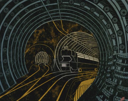
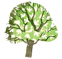
Eric Ravilious – Wood Engraved Trade Card for Dunbar Hay Ltd, 1938
Cecilia Dunbar Kilburn
Lord Sempill would remarry, Cecilia Alice Dunbar-Kilburn, the daughter of Bertram Edward Dunbar-Kilburn, a
patent agent.
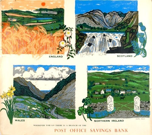
Cecilia would open the shop ‘Dunbar Hay Ltd’ of 15 Albemarle Street, London W1. It was founded in 1936 with and Athole Hay and gave opportunities for graphic artists and students from the Royal College of Art. These included Eric Ravilious, Eric Bawden and Enid Marx, to show their designs, including furniture, furnishings, ceramics, fabrics, patterns. Ravilious designed the wood-engraved trade card for the shop, which closed in 1940 because of WW2
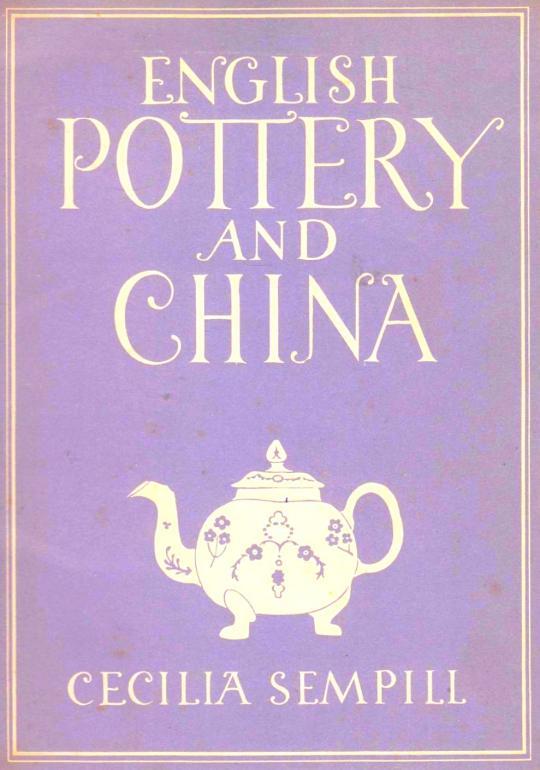
In 1947 Cecilia would publish a monograph on English pottery and china as part of the Britian in pictures series of books.
Sir Ewan Forbes, 11th Baronet
Sir Ewan Forbes of Craigievar, 11th Baronet (6 September 1912 – 12 September 1991) was a Scottish nobleman, general practitioner and farmer. Due to the presence of an intersex condition at birth, he was christened Elizabeth Forbes-Sempill, and officially registered as the youngest daughter of John, Lord Sempill. After an uncomfortable upbringing, he began living as a man at the start of his medical career in 1945. He formally re-registered his birth as male in 1952, adopting the name of “Ewan Forbes-Sempill”, and was married a month later.
In 1965, he stood to inherit his elder brother’s baronetcy, together with a large estate. This inheritance was challenged by his cousin, who argued that the re-registration was invalid; under this interpretation, Forbes would legally be considered a woman, and thus unable to inherit. The legal position was unclear, and it took three years before a ruling by the Court of Session was finally upheld by the Home Secretary, granting him the title.