Part of the particular charm of Eric Ravilious’s work is that it is everywhere, I don’t mean on t-towels or mugs, (though regrettably we are at that stage now) it is that his pictures cover scenes that can be found all over Britain. There are many examples where his watercolours could fool you to be a country road you know and pass, until you find it was painted in deepest darkest Sussex and not Northern Essex.
It would surprise no-one then that most of the works he illustrated for London Transport didn’t feature London. The woodcuts made for press adverts and later used on booklets were mostly views from Essex and the village he lived in, Castle Hedingham.
Ravilious and his new wife, the artist and diarist, Tirzah (née Garwood) moved to Bank House in the village in September 1934. It was around the same time that he started an affair with Helen Binyon from 1934-37 – there are a mass of letters between the two to help the writing of this post.
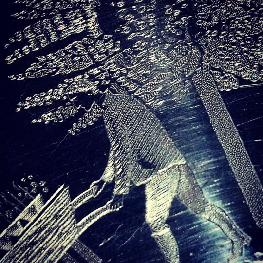
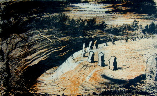
Eric Ravilious – Back Gardens, Castle Hedingham
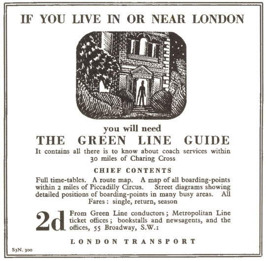
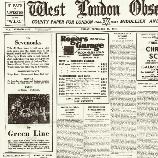
Green Line Coaches Limited was formed on 9th July 1930 by the London General Omnibus Company, to offer coach services from London to towns up to 30 miles away, comprising 60 vehicles on eight routes. London Transport took the company over in 1933 but kept the name the Green Line.
It was via the Curwen Press that Ravilious was asked to make illustrations for London Transport and the Green Line. They wanted a simple, long, thin wood-engraving. This started a series of wood-engravings that Ravilious would produce for other areas of London Transport.
The order was commissioned on the 20th March 1935. In a letter to Helen Binyon ten days later, Ravilious wrote:
30th March 1935
Green Line Buses would like an advertisement for the Essex scenery – some long narrow engravings, so this job will help to pass the time pleasantly next week. I wish commercial work was all so straightforward so much becomes a compromise between the client’s ideas and what the printer thinks about it and always a hurry for results. These engravings will be fun to do I think. †
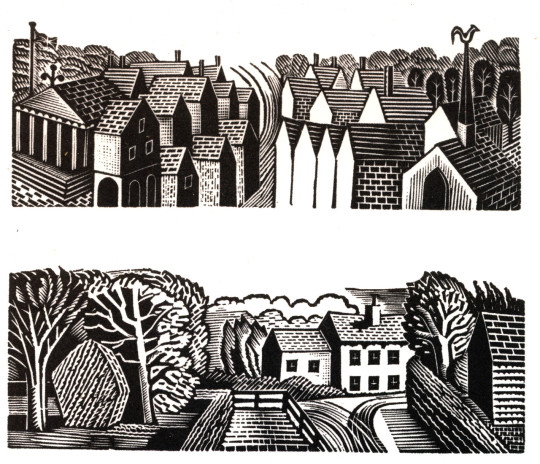
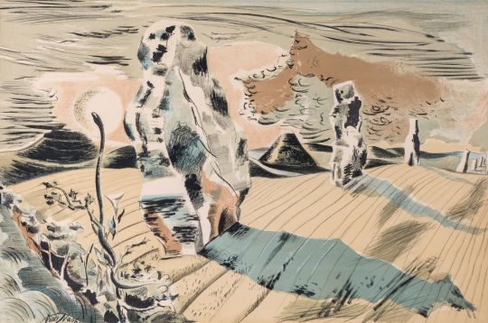
Eric Ravilious – Green Line Coach Adverts, 1935
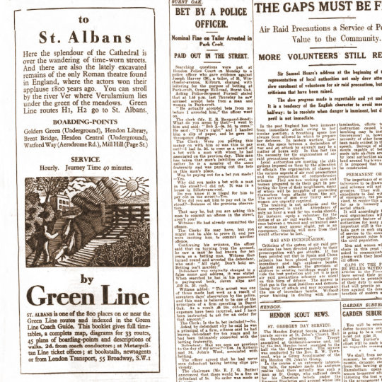
Below is the advert from the original newspaper-sheet, with the news of the day surrounding it. Rather like many adverts of the time there is a quote and a hint at tourism; ‘What hast though to say of Paradise Found?’ and then some information on John
Milton’s home where he completed Paradise Lost.
These remind me of the adverts for Shell Edward Bawden was illustrating at the same time, only these Green Line adverts have a lack of humour in favour of fact. The typography is spot on with dishing out the information, very simple and no fuss. Starting point, times and fares and return journeys, I wish more timetables were like this now.
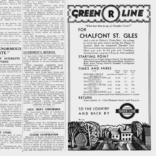
Eric Ravilious – Advert and wood-engraving in a newspaper, 1935.
Ravilious was very busy at this point in his life, so it will surprise no-one that he was a great re-cycler of his own work, woodcuts for paid trade work became watercolours for his own exhibitions.
Time would also effect the travelling he could do, so other examples of Ravilious using his local area can be seen by the multi-named Hull’s Mill – Hovis Mill – Maplestead Mill, found in the next village to Castle Hedingham, Sible Hedingham. He would use the building from every angle for a variety of adverts for London Transport from 1935-36.
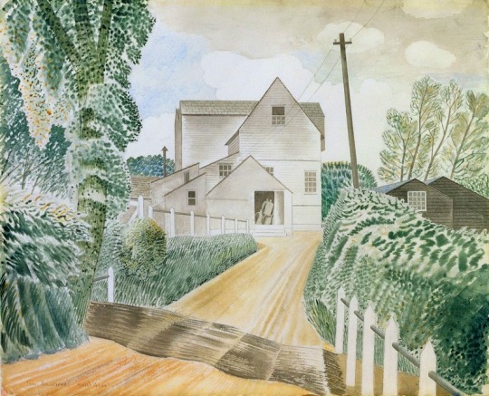
Eric Ravilious – Hull’s Mill, 1935
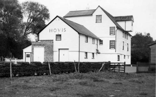
In Ravilious’s time the building was known locally as Hull’s Mill but in 1917 it was bought by Hovis who ran it til 1957 and sold it in 1959. Recently, although always considered a part of Sible Hedingham the mill is over the parish line on the Great Maplestead side of the river and is known as Maplestead Mill, located next to Hull’s Farm.
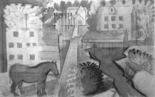
Mechanically it was driven by a water wheel, then after the First World War it was converted to be powered by a turbine and a gas engine and the water mill removed. With the water wheel removed in the painting above you can see the exhaust stack for the turbine and gas apparatus.
Emilie Montgomery Gardner – Hull’s Mill, 1952
Below is the design for the print that Ravilious made of Hull’s Mill, annoying (especially if you are trying to research this) this block is named Hovis Mill, maybe to differentiate it from the watercolour above. It is a larger woodblock for Ravilious and this maybe why he engraved the mill in triptych style. In a letter to Helen Binyon Eric notes:
8 November 1935
…The block is much too big. It is one I happened to have so feel I should use it all. †
Eric Ravilious – Design in Pencil for Hovis Mill, 1935
In another letter to Helen Binyon Ravilious writes:
The Mill drawings are going fairly well and may finish themselves one day. It is an extraordinarily attractive place – a bit like this. †
Ravilious illustrated this letter to Binyon and a drawing of the mill and last part of the letter are pictured below.
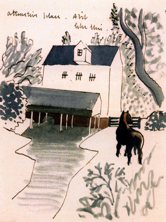
Eric Ravilious – Design on part of a letter to Helen Binyon, 1935
When living at Brick House with Edward and Charlotte Bawden, Tirzah’s uncle made Eric and her a canoe, it maybe why Eric put one in the Hovis woodcut below. The Paddle can be see in the painting The Attic Bedroom, Brick House. The river behind Hull’s Mill is also one of the widest parts of river in the area, being cut wider from when the Mill had a water wheel, and still is free from weeds.
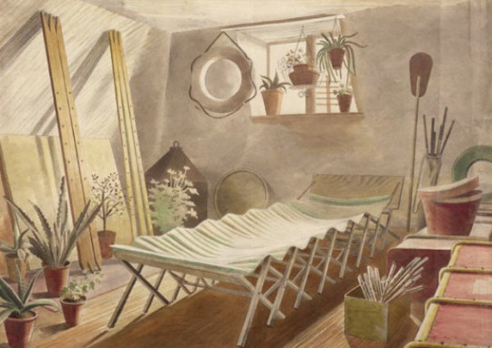
Eric Ravilious – The Attic Bedroom, Brick House, 1934
Eric Ravilious – Hovis Mill, 1935
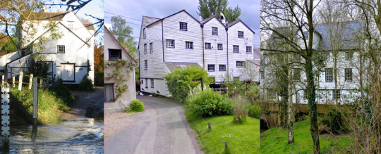
A set of views of the Mill today, 2018
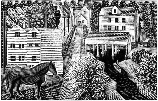
Ravilious would go on to cut the mill in another block using the same design again, this time without the canoe as in the Hovis wood-engraving, but with the horse grazing in the field like the above letter to Binyon. In this wood-engraving this time called Pony by a Mill. Below is the study for his wood-block design, squared off and ready for engraving.
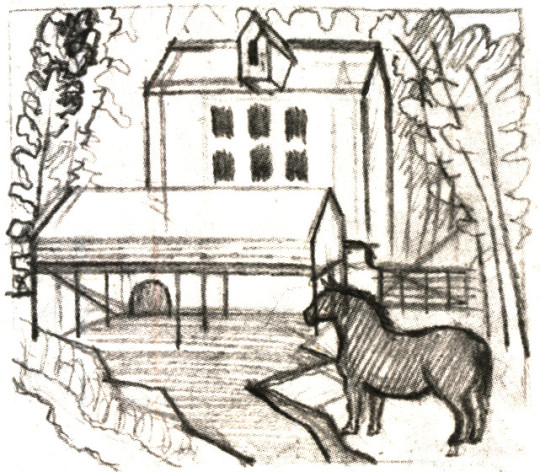
Eric Ravilious – Drawing for Pony by a Mill wood-block, 1936

Eric Ravilious – Two Cows / Pony by a Mill, 1936
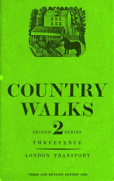
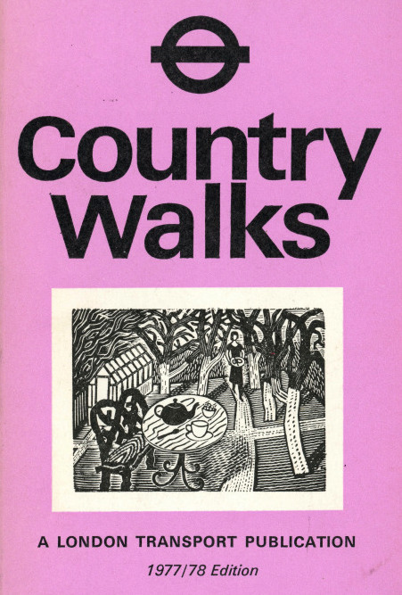
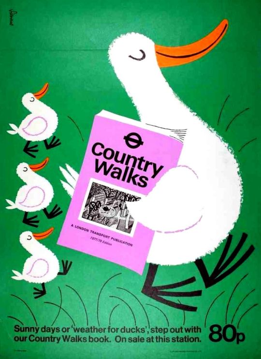
Cover for Country Walks, 2nd Series with a Ravilious Design of Pony by a Mill.
Above is the print Pony by a Mill with the edges chamfered off in use on one of the London Transport booklets, originally printed in 1936. The 3rd series would also feature the Two Cows wood engraving below.
The Country Walk books were by Charles White and printed for London Transport to show people the possibilities of using the train and bus network. Inside they had maps and planned walks showing how to get to the locations and the sights one might see.
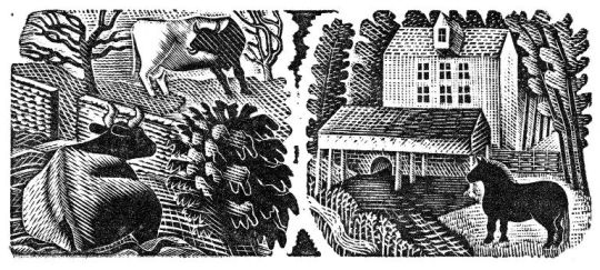
Eric Ravilious – Two Cows / Pony by a Mill, 1936
The two images were engraved on the same block of wood and printed together as one proof. On the left a cow and a bull in a field, separated by a stone wall.
Below is the original drawing on tracing paper for Two Cows, reversed in design as a woodblock always prints backwards.
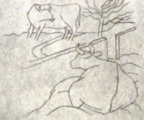
Eric Ravilious – Two Cows, preliminary study for a woodcut, 1936
The pencil design and wood-engraving again would be re-cycled into another watercolour, Two Cows. Here keeping the study of a cow in the same pose, now doubled in pose, but this time with the perspective of a barn door to fix the eyes attention.
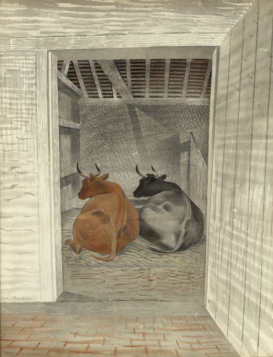
Eric Ravilious – Two Cows, 1936, The Fry Gallery
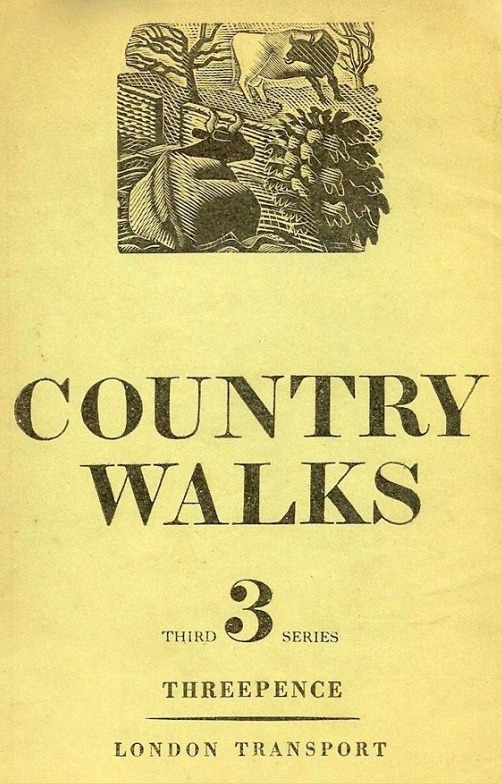
1936 cover to Country Walks, 3rd Series with a Ravilious Design of Two Cows.
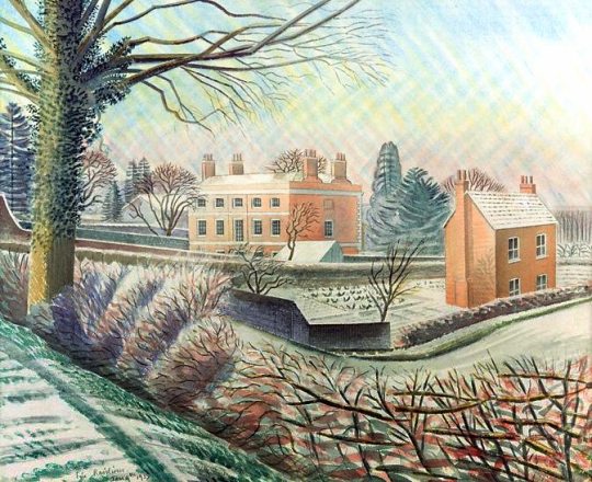
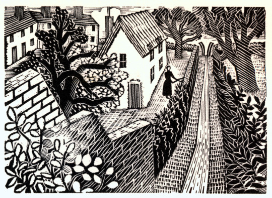
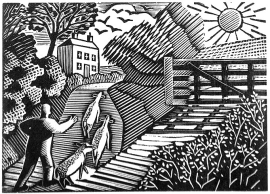
Eric Ravilious – Vicarage in Winter, 1935
Another work with the creativity sparked in Castle Hedingham is the Vicarage in Winter started in the Winter of 1935. Tirzah writes in her diary that Eric’s paint had frozen on the brush and some days later Eric wrote to Helen Binyon:
The snow picture is finished and not bad – rather pretty but so was the thing, like a Christmas card. ‡
This water colour takes us back to the Green Line illustrations and in 1936 Ravilious used the cottage to the right in Vicarage in Winter for one of his wood-engravings for London Transport. According to Barry Kitts:
Ravilious has transformed the slates on the Essex cottage – into thatch. †
The woman cutting the hedge with the path leading up to a V shaped Sussex style stile are pictured – but it is the wall and hedge in Vicarage in Winter that bind them together as the same location.
Eric Ravilious – Cutting The Hedge, 1936
The V Stile also appeared in the Kynoch Press Notebook for 1933. The the stile is on the page for the 8th May but its technical name is Block 121. The Notebook has 42 engraved vignettes of rural life.
Eric Ravilious – Kynoch Press Block 121, 1932
Below is the press advert, the text in the advert talks of the clean breeze of the downs and how you can see Lions at Whipsnade Zoo.
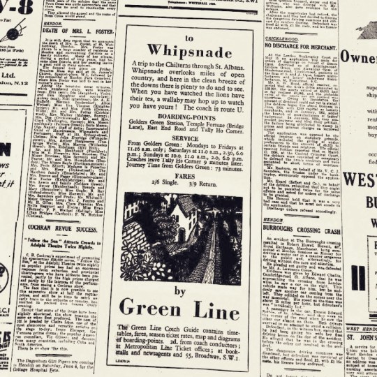
Eric Ravilious – Cutting The Hedge as part of a Green Line Advert, 1936
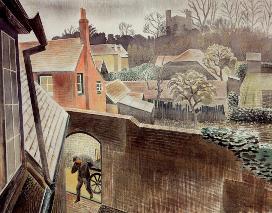
Another design is the Suburban Home with the man in top hat and umbrella standing in the doorway, much like the men are in the watercolour of Hull’s Mill.
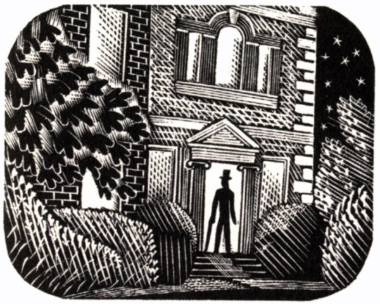
Eric Ravilious – Suburban Home, 1936
The house turns out to be the Old Vicarage in Castle Hedingham, the same in Vicarage in Winter, 1935. The steps, the ionic colonnaded door and the window above all say so – it isn’t a fact I have seen in print before. Below is the engraving in the advert as it would appear in the press.
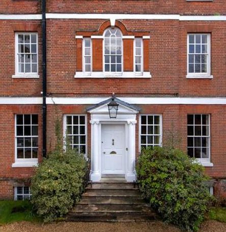
The Old Vicarage in Castle Hedingham as it is now.
Eric Ravilious – Suburban Home as part of a Newspaper advert, 1936
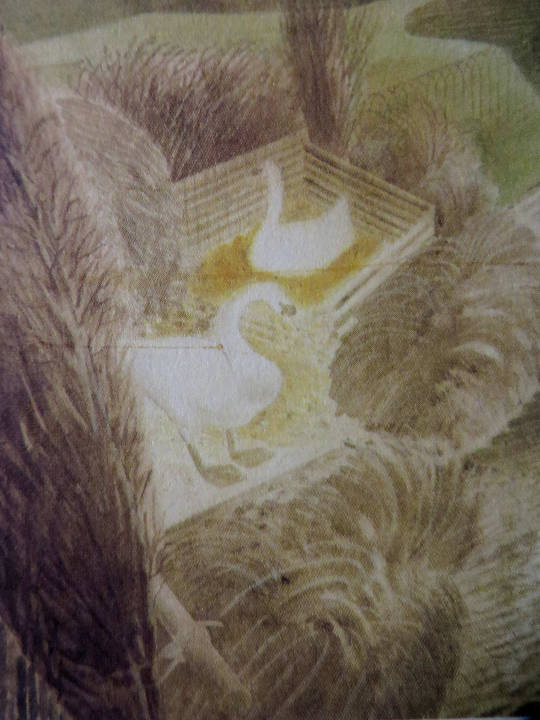
With the Two Swans as others, a watercolour followed like the Two Cows watercolour, though the figures are similar, they have no relation to the backgrounds of each other.
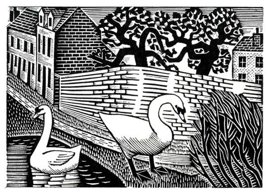
Eric Ravilious – Two Swans, 1936
Eric Ravilious – Two Swans, 1936
The Shepard is one of the most lively engravings that Ravilious made for London Transport. The Sheep and their ears with the hillside up to the house are pleasing. The technicality of the halftone shading are some of his best.
Eric Ravilious – The Shepherd, 1936
Eric Ravilious – The Shepard as part of a Green Line Advert, 1936
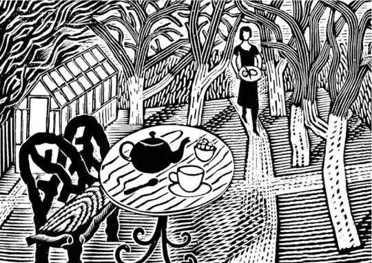
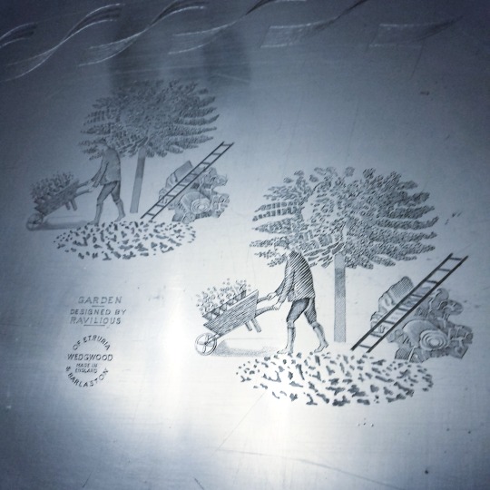
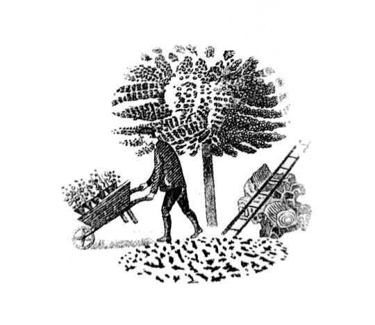
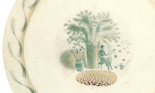
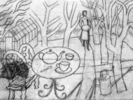
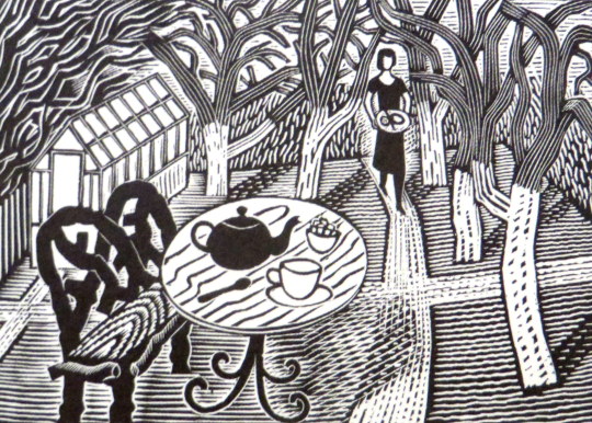
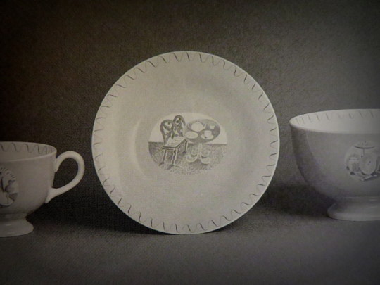
Eric Ravilious – Tea in the Garden, 1936
The last stop on these London Underground travels is of Tea in the Garden. It is a rather abstract design but it was the start of the commuter lifestyle as London was building a new wave of suburbia and you can imagine the print being used with slogans like “home in time for tea” or “enjoy the garden, 20 mins from the city by bus”.
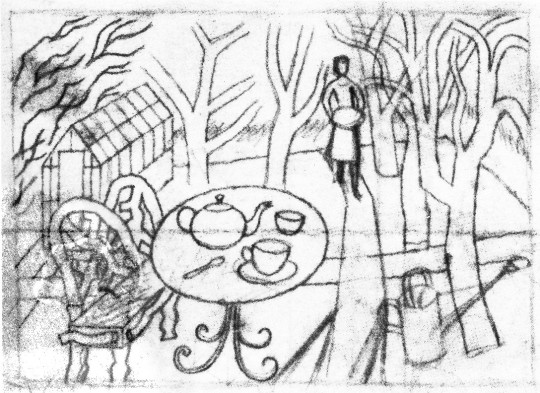
Eric Ravilious – Sketch for Tea in the Garden, 1936
Eric Ravilious – Tea in the Garden as part of a Green Line Advert, 1936
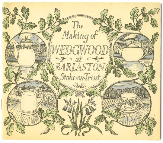
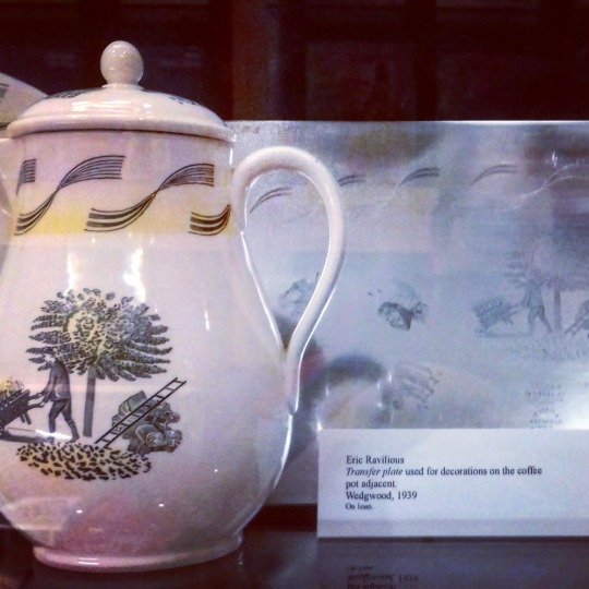
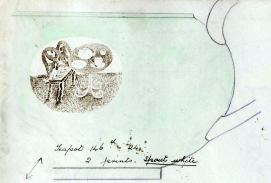
Soon after Ravilious reused the design for a commission with Wedgwood, he was so busy during this point that many designs were recycled from wood engravings to watercolours or china. Below you can see a sketch drawing for a teapot design using the woodblock above. Carving out the legs of the bench and inverting the colours of the table so when printed the transfer will be black and an enamel colour wash painted over.
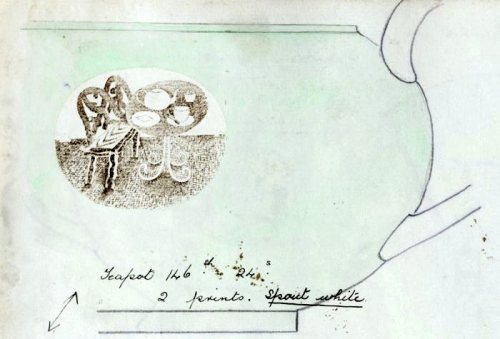
Eric Ravilious – Sketched idea for Teapot design, 1938
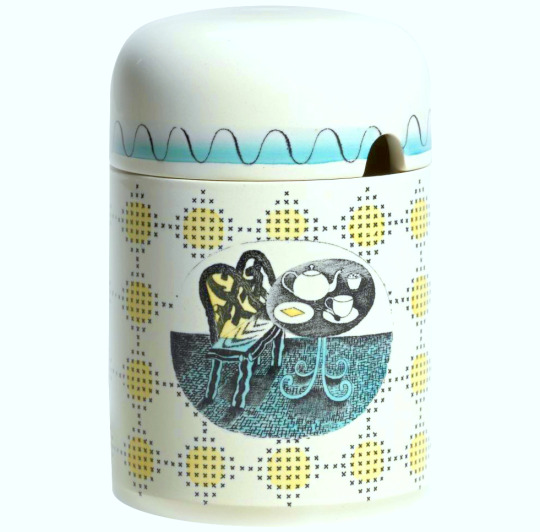
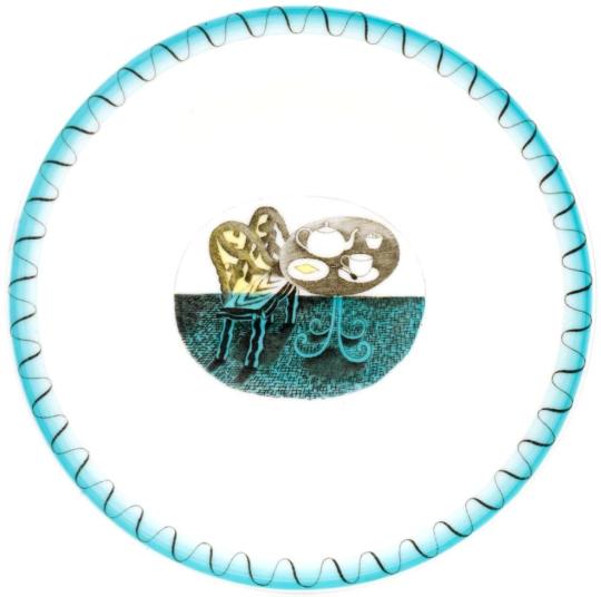
The finished design below, with the colouring in yellow, blue and green. The design has been made simpler and the shading is able to be more subtle as it will be printed on a metal plate, so there is more detail in the halftone lines. It was first used on a preserve jar for Wedgwood.
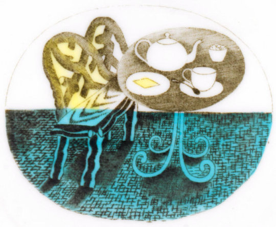
Eric Ravilious – Printed and Enamelled design from Wedgwood, 1938
The preserve jar was introduced six months in advance of the rest of the pattern. The design was advertised in 1939 as being available also in breakfast and coffee sets; the war prevented production of these. At first unnamed, later called ‘Teaset’, the design was finally named ‘Afternoon Tea’.

Eric Ravilious – The Final Jampot by Wedgwood using Ravilious’s Design, 1938
† Ravilious – Engravings by Jeremy Greenwood, Wood Lea Press, 2008.
Ravilious & Wedgwood by Robert Harling, 1995.
Away We Go by Oliver Green and Alan Powers, 2006
Eric Ravilious: Memoir of an Artist by Helen Binyon, 1983
‡ Ravilious: The Watercolours by James Russell, 2015