Notes on the Building of Broadcasting House by Val Myer

image

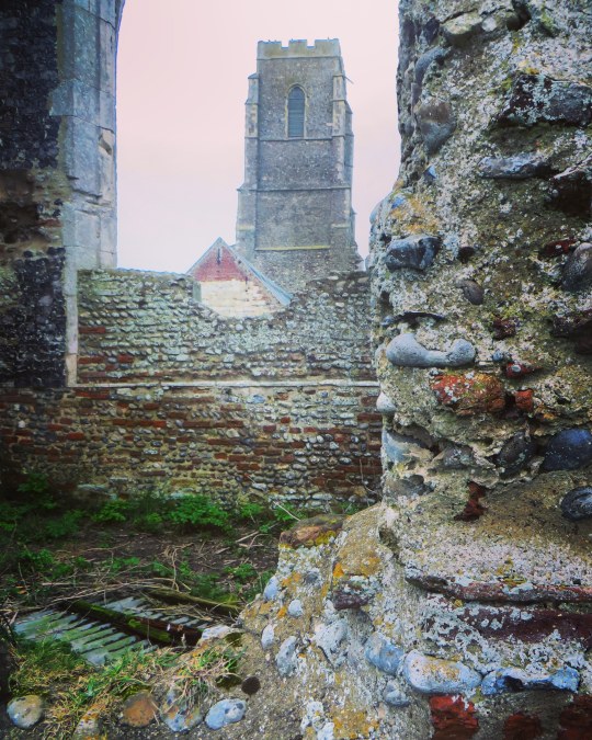
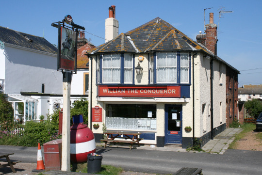
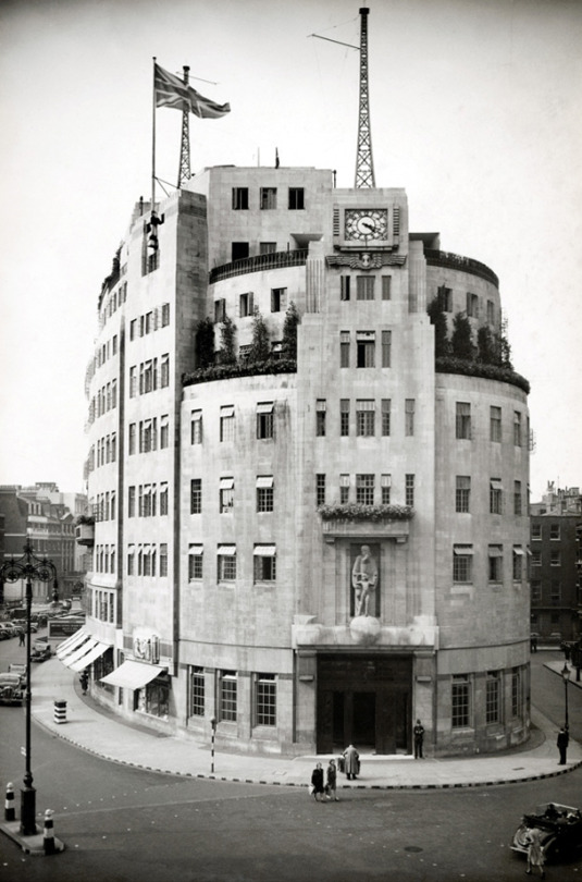
 A newly finished Broadcasting House, London, 1933

It is imagined, in many quarters, that “modern” architecture has revolutionised the whole of present-day practice, whereas the truth is that good architecture has always been a matter of common-sense, plus a leavening of aesthetic instinct. In reality, its vital principles are no different today from those which guided the old Egyptians, Greeks, and Romans.

In planning a building, the first essential, of course, is to make it suitable for the purpose for which it is intended. That it should be pleasing to the eye is, obviously, a further necessity, but, if it looks suitable, its designer is already halfway towards achieving his object.

image

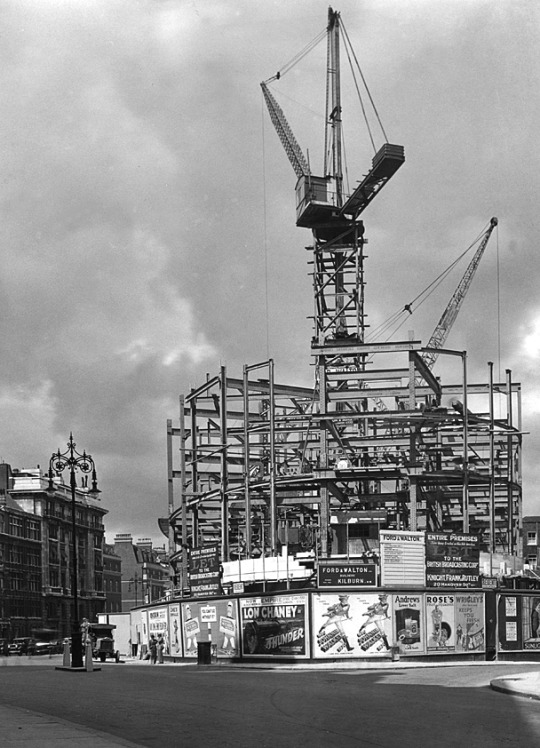
 Broadcasting House – Under Construction and surrounded by Poster Billboards

In the case of Broadcasting House, we had first to consider its functions. These are twofold; the actual broadcasting, and the administration of broadcasting. Obviously, the studios, Control Room, and the accommodation of technical equipment come first, with the actual studios as the most important factor of all.

Accordingly, it was the planning of the studios which had to be the key to the whole scheme. At the outset, it was thought that the ideal arrangement would be to place all the studios on one floor and, as protection against inter – studio interference, to surround each by a complete circuit of brick -built corridor. As protection against extraneous noises, the studios would be placed at the top of the building.

The site of Broadcasting House, however, though picturesque in form, is irregular, which fact would have caused studios so grouped to be of awkward shape. Besides this, although the B.B.C., at that early stage, contemplated fewer studios than have now been built, the system of individual insulation by corridors and walls would have been so extravagant that the areas left for studios would have been quite inadequate. Moreover, owing to the high value of a site in the heart of London, the space available for the studios is necessarily limited. Hence the open -area system of insulation, adopted elsewhere, was out of the question.

After exploring scores of different systems of planning, the problem of accommodating a large number of studios and their suites within the space available was quite suddenly solved. Instead of the studios being all on one floor, or on two floors, they would be all in one tower, so that, given a good service of lifts, circulation would be actually easier than if they had been all on the same level, and, of course, larger and more shapely studios could be provided. Once this key idea had been found, the plan was rapidly developed and, one after the other, its benefits appeared. The evolution of the plan proceeded on simple lines which can best be expressed as follows :

  • Studios must be insulated from sound Put a thick brick wall round them, omitting the usual steel framework.
  • Studios must be artificially ventilated, so need have no windows
  • Put them in the centre of the building, where there is least daylight to waste.
  • Offices must have daylight
  • Put them all round the outside of the building, where plenty of daylight is available.
  • Studios need to be sound insulated from one another
  • Put between them horizontal layers of rooms such as Music Libraries, Book Stores, etc, which neither create noise nor are disturbed by it.

In this way, item by item, the plans were wrestled with and were slowly developed to their present form. Sometimes, as a result of much thought, whole features had to be discarded. Such was the fate of a huge parking garage, at one time accommodated in the basement. I could fill many pages with the history of planning this building, with all its exacting requirements, but, interesting as this would be to myself, this is, perhaps, hardly the place for such a story.
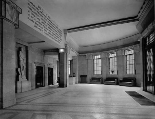
image

 The Entrance Hall 

Before speaking of the exterior, I will just say a word about the internal decoration of the principal apartments. The Entrance Hall, semi -circular in plan, is simplicity itself, devoid of ornament, and depends for its effect upon the grace of the natural curves which arise from its circular form and the rhythm of its vertical lines. The beauty of the English marble (Hopton -Wood stone), which lines the walls, is an added charm.

The central feature of the Hall is to be a lovely figure of “The Sower,” for which Eric Gill has already made his model.

image

 The Entrance Hall with The Sower by Eric Gill.
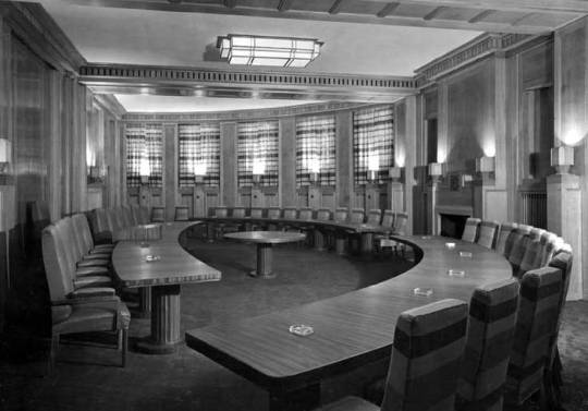
image

 The Council Chamber

The Council Chamber, sixty feet across, is of semi- circular shape, like the Entrance Hall. This room, whose acoustic qualities are strangely happy to the naked ear, is lined with Tasmanian oak and, at night, is entirely illuminated by reflected light from lamps concealed in wrought – oak urns. The pedestals of these urns serve as relieving accents of interest to the simple panelled walls.
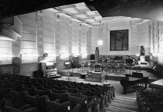
image

 The Concert Hall 

The Concert Hall , in the heart of the building, is wedge – shaped in plan. The splay is not sufficient for one to realise, at first sight, its existence, but it has the strange perspective effect of making the Hall appear very much longer from the back than from the stage. The treatment of the ceiling is entirely novel; it is hoped that, with the semi – indirect lighting indicated, the ceiling will provide a very distinctive feature.

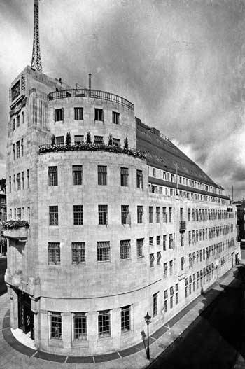
Now, a word as to the exterior. First, let me explain the reason for the eastern side being cut away as with a draw knife. This part of Langham Street is narrow and, not only have the opposite owners rights of light which had to be respected, but there are three -sided mutual covenants with other neighbours which could not be broken. Hence, the whole of the building above the fourth floor had to be  sloped back and restrained within a limiting angle. In Portland Place, the only limit of height was that imposed by the London Building Act..

image

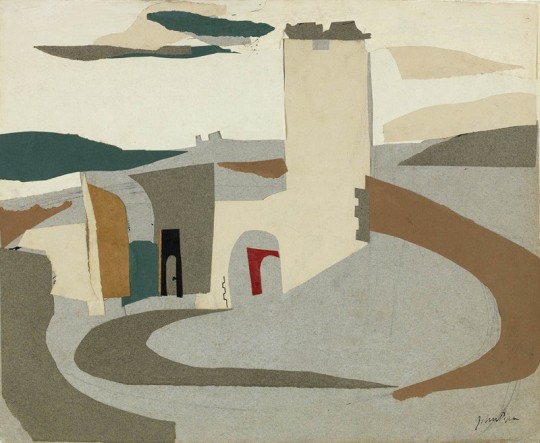
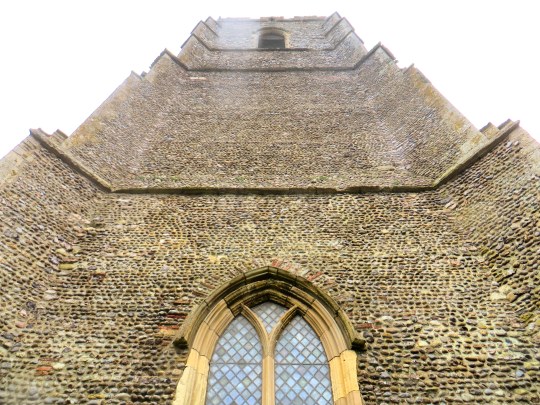
 The East Side of Broadcasting House

The south end of the building, facing down Regent Street, suffered under the same difficulties as the Langham Street front, but at this vital point, realising my troubles, the parties concerned made certain concessions of real value. In the circumstances, the obvious course seemed to be to design a symmetrical façade to Portland Place which would dominate the whole building, to emphasise the main doorway facing south by placing a Clock Tower above it, and to be satisfied with a modest elevation to Langham Street which, without being striking, would be suitable.

The marrying together of these three components was a particularly interesting problem, which was helped by the I provision of a third aerial mast over the Clock Tower.

image

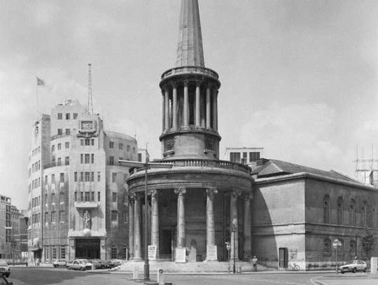
 All Souls Church and Broadcasting House

At an early date I realised that the site possessed a rare virtue in the long curve of the western side, and so, in organising the proportion of my masses and the play of light and shade, I tried to make full use of the gracious horizontal lines which this curve suggested. Broadcasting House is said to look bigger than its actual dimensions. This is due to the scale and number of the windows, necessitated by the provision of an immense number of small offices. Endless flexibility of subdivision of offices was required by the Corporation, which fact, naturally, weighed with me in preparing my design for the façade. Although economy was essential to the whole scheme, and the sculpture at my disposal limited, I insisted that it be as good as possible, and then placed it, with other architectural features, at the most effective points, hoping to set it off to advantage by the contrast of plain walling and the considered rhythm of the windows referred to above.

image

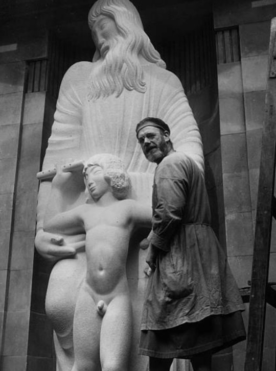
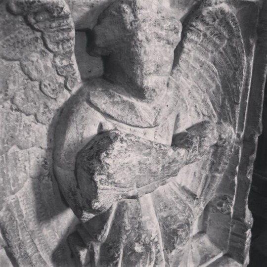
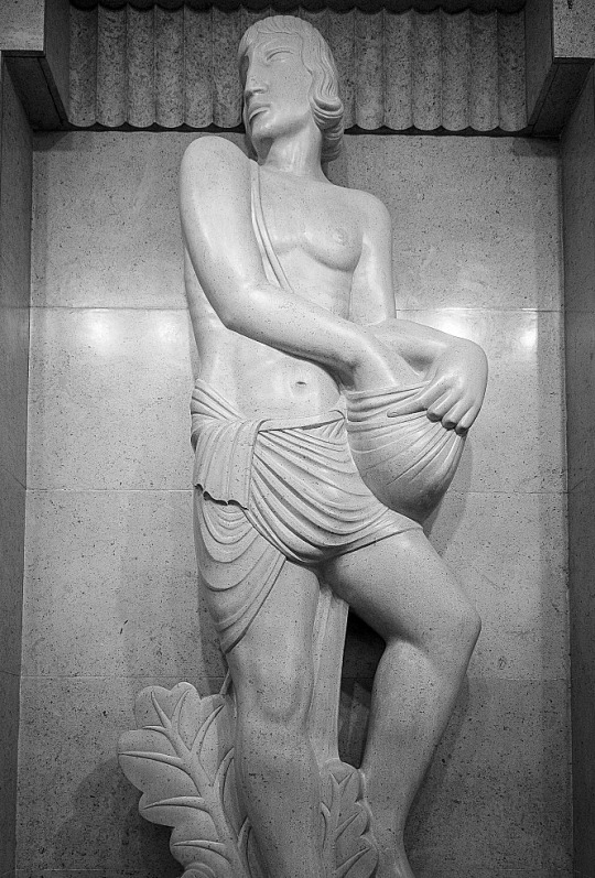
 Eric Gill – Prospero and Ariel, 1933

As a footnote it is worth looking at the Eric Gill’s views on the building and his work for it.

His (Gill’s) frustration with the BBC work must have been compounded by the trouble over the size of Ariel’s penis already recounted, and with ‘Bad weather, bad stone and bad health’ – though it was on his own choice to work on inadequate and exposed scaffolding. From this perch he was heard to shout to a passing friend, ‘You know, this is all balls’. ‘The Sower’ was also done with some cynicism as he wrote to his brother Cecil; ‘I am about to begin the statue, representing a man ‘Broadcasting’, to stand in the entrance hall. Comic thought, whe you consider the quality of BBC semination, to compre it with the effords of a simply countryman sowing corn! However, it’s their idea, not mine. Mine not to reason why… mine simple, to carve a good image of a broadcaster”. 

Malcolm Yorke – Eric Gill: Man of Flesh and Spirit

Discover Ralph Maynard Smith

 Ralph Maynard Smith – Surfaces Floating above a Beach at Sunset, 1950

Ralph Maynard Smith was born in 1904. He was the son of an English architect who had emigrated to South Africa in the late 1800s and had set up a productive architectural practice in Cape Town. He was educated in South Africa and England and even as a boy was devoted to drawing and painting.

image

 Ralph Maynard Smith – Vertical Surfaces on a Beach, 1951

In 1923, while a student at the Architectural Association in London, he travelled to Scotland, and crossed the island of Mull on foot. He spent six weeks there, finally reaching the white shell beaches of Iona. He carried with him a rucksack containing full painting gear and the five volumes of Ruskin’s Modern Painters. He drew and painted all the way, with much of the study being around Loch Scridain. He alluded ever afterwards to the importance of those weeks, but spoke only once of the day when in the silence of the mountains a running stream talked to him. From then on his devotion to the practice of art dominated his life, but was played out in secret. But if for some reason it had to be secret, how could the artist organise his life in practice to follow this ideal and achieve concrete results?

We can only deduce what his plan may have been from the evidence of his life, which outwardly showed an unwavering consistency of purpose. He seems to have determined on a scheme that was never defined or spoken of, except tangentially in his journals. He called these journals “The Ravine”, after Van Gogh’s painting of that name, and drafted his first entries while still on Mull.

image

 Ralph Maynard Smith – Shepherd Landscape

In 1923, as well as painting, Ralph Maynard Smith was studying architecture in London.  He was one of the youngest in his year to qualify at the Architectural Association in 1925. That was followed by a year’s practical work with a London architect, which led to his associate status at the RIBA.

Soon afterwards he got a permanent job with the then well-known architects Elcock & Sutcliffe, who had just had a notable success with their Art Deco Daily Telegraph building. Later on Ralph Maynard Smith became a partner in the firm. Having landed that job in 1928, he married Geraldine Lyles and set up home in Woldingham. Their son was born in 1929 and they lived for the rest of their lives on the Surrey Downs (after a few years just moving from Woldingham to Tadworth). We see Ralph Maynard Smith’s life plan unfolding. Practicing professionally as an architect, he gave himself a measure of security, while  devoting every leisure moment to realising his vision for painting.

image

 Ralph Maynard Smith – Shadows,Shadows, 1949.

image

 Ralph Maynard Smith – Circles and Moon, 1950

image

 Ralph Maynard Smith – Eclipse of the Winged Embryo, 1949

Text via Ralph Maynard Smith Trust

How to read a John Piper painting

image

 John Piper – Abstract I, 1935

It is always interesting looking back at an artists work in retrospective books, the early works and the friends around them to how they sailed on into life and the work progressed. This post is about the work of John Piper and how I look at his pictures.

Piper’s art education would have been set in a landscape were the tectonic plates of traditional art education of the last 200 years met with post-impressionism and modernism from the exhibitions in 1910 and 1912 by Roger Fry and other movements like Futurism (1912), Vorticism (1914), Cubism (1910-late 20s) and Surrealism (1921-50s).

But these shocks would have been picked up and absorbed by the young artists to come and change British art in the twentieth century, people that John Piper surrounded himself  whom were both artists and collectors; Henry Moore, Cedric Morris, Ben Nicholson and Barbara Hepworth where in the Seven and Five Society with Piper (he was the secretary), but also collectors and writers like Jim Ede, John Betjeman, Osbert Lancaster and Benjamin Britten and John Rothenstein.

image

 John Piper – Beach at Donegal, 1937

In the 1930s Piper was mostly active in two areas of art, collage and abstraction. The Seven and Five Society would give him a platform to showcase these works alongside other artists investigating both modernism in abstraction but form and function:

The Seven and Five Society was an art group of seven painters and five sculptors created in 1919 and based in London. The group was originally intended to encompass traditional, conservative artistic sensibilities. 

However, in 1924 Ben Nicholson, one of the pioneers of abstract art in Britain, joined the Seven and Five. He was followed by other modernists including Barbara Hepworth, Henry Moore and later, John Piper. They effectively hijacked the group, expelling the non-modernists. In 1935 they renamed it the Seven and Five Abstract
Group and held the first all abstract exhibition in Britain at the Zwemmer Gallery in London.

image

John Piper – Knowlton, Dorset, 1936

In these blocks of colour, objects could be simplified to their basic
form. A really good example of this would be Piper’s collage of
Knowlton, Dorset. With almost no ink lines it is just colour and
form. From these types of collage you get more ink washes and
drawings over the top.

image

 John Piper – Newhaven Harbour and Cliff, Sussex, 1936

Then when it came to returning to painting I always think that this is how Piper approached subjects, first with the base of colours and form, then the black line drawing, as if it were a trade illustration, much in the same way Raoul Dufy paints.

image

 John Piper – Interior of Coventry Cathedral, 15 November 1940

It’s a technique that Piper mastered when painting in the ruins of Coventry Cathedral. – the colour in blocks with black paint for texture. It would also be the way he approached printmaking and lithography.

He also used wax resists in his paintings to keep some of the bold colours and put chalk and pastels over the paintwork too. In time he would work out the form of a painting and the resist rubber gum would leave white lines over his many washes of colour.

image

 John Piper – Buckden in a Storm, 1977

image

 John Piper – Eastnor Castle, 1983

Tove and Tolkien

image

Tove Jansson was born in Helsinki, and was an illustrator, most famous for her series of comics and books on the Moomins. She also wrote books for adults, notably The Summer Book and The True Deceiver. But this post is about the surprising choice of her by Swedish publishers as the illustrator for The Hobbit by J. R. R. Tolkien, in Swedish called, Bilbo, a Hobbit’s adventure.  

image

 J. R. R. Tolkien – Bilbo: En Hobbits Äventyr – The Hobbit, in Swedish, 1962

As an author Tove was at one of the heights of her career when she illustrated The Hobbit in 1962, but the commission gave her space away from the Moomins and a much needed chance to experiment.

It was Astrid Lindgren’s idea to commission Tove Jansson to illustrate a new translation of J.R.R Tolkien’s The Hobbit in 1959-1960. The two great Scandinavian children’s book authors had met only once or twice, but Astrid used all her rhetorical powers to win Jansson over. 

Tove Jansson needed only a few days to think it over before she got dwn to work, and in 1962 Bilbo: A Hobbit’s Adventure, in Britt G Hall-qvist’s translation was ready.

Literary cristics and Tolkien fans were less enthusiastic, however. ‘The children’s book of the century’ ran to only one printing, and must be considered one of Astrid Lindgren’s greatest flops as an editor. 

image

Some of the illustrations were done on loose bits of paper collaged together. Other pictures were as one full ink image.

Her Moominland has its own place in the universe of fantasy, on a level with Tolkien’s Middle Earth or C. S. Lewis’s Narnia. Moomin valley, however, is not a mythical world. It is close to current reality; furthermore, it clearly depicts the character of Finland’s skerries.

Tove Jansson and Irmelin Sandman Lilius have both written “books for adults,” but the unquestionable emphasis is on the fantasy tales; both adults and children read their stories. 

image

 Here is a page from Jansson’s sketchbook on the Hobbit. 

Below pictured is Gollum is pictured with a crown of laurel leaves, his wide eyes and looking far more innocent that he is.

image
image
image

Below are two versions of dust jackets for the Hobbit in Finnish, one in 1973 that likely was issued for Tolkien’s death and one far more recent for the 80th anniversary of the Hobbit.

image

 J. R. R. Tolkien – Lohikäärmevuori, Finnish Edition of the Hobbit, 1973

image

 J. R. R. Tolkien – Hobitti eli sinne ja takaisin – The Hobbit or There and Back Again. 80th Anniversary Edition. 2017.

Astrid Lindgren: The Woman Behind Pippi Longstocking
George C. Schoolfield – A History of Finland’s Literature – p743

A Trip to Covehithe

A trip to the Suffolk coast it is always nice, but if you don’t know it, try stopping at Covehithe church. It is placed on that part of the Suffolk coast that is crumbling slowly into the sea. Now only a field saves the church from the fate that Dunwich church suffered.

image

The original church is now a ruin. The oldest fabric in the original large medieval church dates from the 14th century, although most of it is from the 15th century. During the Civil War much of the stained glass was destroyed by the local iconoclast William Dowsing. By the later part of that century the large church was too expensive for the parishioners to maintain, and they were given permission in 1672 to remove the roof and to build a much smaller church within it.

This small church is still in use, while the tower and the ruins of the old church are maintained by the Churches Conservation Trust.

image
image
image
image
image
image
image
image
image
image
image
image
image
image
image
image
image

The church was painted by John Piper and Piper is shown painting it in a documentary on our Youtube channel.

John Piper – Covehithe Church, 1983

Discover John Norris Wood

The Fry Gallery in Saffron Walden have many artists under their remit of ‘North Essex’ and one of the more unexpected ones is John Norris Wood. A naturalist and teacher at the Royal College of Art, he was an influential figure in keeping nature and drawing part of the art syllabus at the college.

image

Born in London on 29 November 1930, son of Lucy and Wilfrid Burton Wood, John grew up in Shalford Green, near Braintree, Essex. Educated at Bryanston School, being influenced by the art master, Charles Handley-Read.

image

 John Norris Wood – Night Flight

At the age of 16, when he was introduced to Edward Bawden: ‘Edward phoned me up saying his wife Charlotte Bawden had been to see some pictures I’d been exhibiting in Braintree and that he would like me to come and visit him if I would care to. So I did, and it was all very amazing. There were so many things in his house designed by him, from fabrics to furniture to masses of pictures, of course, and I was enchanted. So I first came to know about the College when I was far, far too young to go there [through] Edward saying he taught at the Royal College and telling me about it.’

Bawden was impressed by John’s proficiency as a draughtsman, gave him some lessons, and allowed him to use his studio whenever he wanted – the anecdote goes – as long as he didn’t speak.

image

 John Norris Wood – Country Garden Butterflies 

He studied at Goldsmiths’ College School of Art, under Clive Gardiner and teachers who included Sam Rabin, Adrian Ryan and Betty Swanwick and then went on to the Royal College of Art, where his teachers included Edward Ardizzone, John Minton and, most significantly, Edward Bawden; while there he won a silver medal for zoological drawing.

image

 John Norris Wood – The Desire of the Moth for the Lamp 

In 1962 John married Julie, the daughter of Richard Guyatt, in 1962 and they led a blissfully happy, if unconventional, family life at his small nature reserve in East Sussex.

In 1971 Robin Darwin, rector of the Royal College of Art, asked John Norris Wood to found the Natural History and Illustration and Ecological Studies course there.

During the late 1950s he spent periods at the East Anglian School of Painting and Design at Benton End, Hadleigh, Suffolk. Wood taught at Goldsmiths’ 1956-1968, Cambridge School of Art 1959-1970 and Hornsey College of Art and in 1971 he returned to the Royal College of Art becoming a Fellow in 1980. In 1962 Wood married the designer, Julie Corsellis Grant, daughter of designer, Richard Guyatt and they lived at Garretts, Shalford, Essex and had two children.

image

 John Norris Wood – Stamps

Wood became a freelance artist and illustrator, working for a variety of book and magazine publishers in Britain and America. His series for children, ‘Nature Hide and Seek’, which he wrote and co-illustrated with Kevin Dean, was designated best children’s books of the year by the US Association for the Advancement of Science also writing and broadcasting for television on a number of natural history subjects. Wood has exhibited widely in London and the provinces, and also internationally. His solo shows include those at the Fry Art Gallery, Saffron Walden 2001, the Chappel Galleries, Colchester 2002 and the Museum of Zoology, University of Cambridge 2004. A member of the Society of Wildlife Artists in 1997 and also a member of the Society of Authors and the Thomas Hardy Society. He latterly lived Wadhurst, East Sussex and he died 17 October 2015.

image

 John Norris Wood – An Alphabet in Praise of Frogs & Toads

Ewen Bridge Farm

In 1941 Eric Ravilious moved to Ironbridge Farm, Shalford, Essex. It was to be the last home he would know. The Second World War had come and he was touring the country painting works on behalf of the War Artists’ Advisory Committee.

The farmhouse, which dates from the 16th century is called Ewen Bridge Farm, though it is also confused as Iron Bridge Farm as there is a bridge with ironwork nearby on a footpath, however this is a coincidence and has no historical reference to the farmhouse.

image

 Eric Ravilious – Iron Bridge at Ewenbridge, 1941

In the year before the move from Castle Hedingham to the Farm, Ravilious’s wife Tirzah, was diagnosed with breast cancer and just before moving in 1941, Eric’s mother Emma died, she was 77 years old. Tizah gave birth to Anne Ravilious (Ullmann) and they moved into the farm.

At the end of April, at very short notice, they all moved from Castle Hedingham to a new house, but still in Essex. It was called Ironbridge Farm, at Shalford, near Braintree, and was in the valley of the Pant. The country and the river were looking lovely in the spring. The house, an old one, with very few conveniences.

Eric’s friend Peggy Angus rented Furlongs, a cottage on an a vast country estate and never bought the property, continuing to rent it all her life. Furlongs also had no electricity but did have running water. Peggy’s life may have been the inspiration for the move, and the desire for more space would have been obvious with three children now in the family. The farm was also five miles closer to Great Bardfield than Castle Hedingham.

They rented Ironbridge Farm at Shalton, near Braintree, paying half the rent to their landlord (the Labour politician John Strachey) in Eric’s pictures. 

image

 Eric Ravilious – Farm House and Field, 1941

The house then looks to have been clad and whitewashed, however today the building has it’s beams exposed and is painted a light yellow, otherwise externally it is much the same.

image

 Ironbridge Farm today.

image

 Eric Ravilious – Tree Trunk & Barrow Ironbridge, 1941

The inside of the house looks a lonely whitewashed place. No time for decorating looks to have been spared and with the war and the fact it was a rented property it may not have happened at all, in the following paintings the rooms have few items of furniture in them, making every room look colder. On the wall is another of his paintings from the house. In the interior paintings Ravilious shows us his other works or tubes of paints, it is like he is looking at a mirror with out himself in it.

image

 Eric Ravilious – Ironbridge Interior, 1941 

In the painting below (Flowers on Cottage Table), the vase on a coaster is an undecorated specimen from Wedgwood for Ravilious’s Boat Race Vase in 1938. It shows that he must have designed for the china with demonstration shapes in front of him.

image

 Eric Ravilious – Boat Race Day Footed Bowl, 1938

image

 Eric Ravilious – Flowers on Cottage Table, 1941 

Below is a draft copy of the same painting but in an unfinished state.

image

 Eric Ravilious – Garden Flowers on Cottage Table, 1941

Ian Carter – Railways and Culture in Britain: The Epitome of Modernity, 2001
Helen Binyon – Eric Ravilious: Memoir of an Artist, 1983
  Robert Harling – Ravilious & Wedgwood, 1986

Ravilious in Rye

This post started off with me wondering where the picture below was painted and the view from the window. It turns out to be Rye and the view is of the Harbour there. The pub it was painted in still exists. 

image

 Eric Ravilious – Room at the William the Conqueror, 1938

In real life the Room at the William the Conqueror painting is an odd one. It has a section of it pasted over with paper that has been repainted in the middle of the painting, almost like a sketch that was compleated. The ‘edit’ must have been a different paper as it has yellowed in a way the rest of the painting hasn’t. I wonder what is under the patch? My guess is a chair – if it was Bawden it would have been a cat.

The image below is the pub, still standing today with the bay windows upstairs and the view of the harbour that they face. It is always nice to look at a painting and be able to find the location and wonder that almost 80 years ago Ravilious was up there painting away.

image

 The William the Conqueror Pub more recently. 

The view out of the window then would have been like the postcard below, the lighthouse to the right with the shed just beside it, the harbour in use with all sizes of sea-craft. The design of the lighthouse is also not what you would think of, it looks like it was constructed of wood.

image

The view Ravilious would pick turns out to be a favourite of artists, looking at other paintings of Rye Harbour many painted the lighthouse from across the water. 

The harbour itself was tidal and some way inland, so it was not always safe for boats to travel inland if the tide was out. This led to the building of the lighthouse, to warn of the low tide. A complex  but fascinating sequence of lights shining from the lighthouse out to sea, signalled if it was safe to travel into the harbour or not.

At night the lighthouse was used with a red light exhibited from a window at 25 feet above height water level, visible for 3 miles, to indicate 8 feet clearance above the bar. When the level rose to 9 feet an additional bright white light was exhibited from a second window at 12 feet above high water level and finally when the clearance was over 10 feet the red light was extinguished leaving only the white light showing.

The painting below is only a few paces down the embankment from the pub but it shows off the litter of the port-side and Ravilious’s love for antiquated and forgotten items.

image

 Eric Ravilious – Anchor and Boats, Rye, 1938

image

 Eric Ravilious – Rye Harbour, 1938

This painting has a different angle and one of Ravilious’s most famous works, the mouth of the harbour on the way out to sea at low tide.

He (Ravilious) went on to Rye Harbour to paint, staying at the William the Conqueror Inn. The artist Edward Le Bas, who was staying at his cottage nearby, saw the landscape Eric was painting and liked it.

Edward La Bas also painted the same scene of the lighthouse over the harbour the next year. 

image

 Edward Le Bas – The Lighthouse, Rye Harbour, East Sussex, 1939
 Once in the collection of Edward Marsh.

The Cement Works

image

 Eric Ravilious – Tea at Furlongs, 1939

From 1933 until the early 1990s, Peggy Angus lived at Furlongs, a cottage on the remote south downs near Beddingham – a stone’s throw from Glyndebourne and Charleston. Before the Second World War she entertained many notable artists of the day at Furlongs, including Eric Ravilious and John Piper. The life of Peggy Angus reads from the page like the royalty of the 1930s art world.

Born in Chile on 9 November 1904, in a railway station, the eleventh of thirteen children of a Scottish railway engineer. She spent her first five years in Chile before her family returned to Britain. She grew up in Muswell Hill and became a pupil at the North London Collegiate School. At 17, she entered the Royal College of Art and, later, won a painting and teaching scholarship to Paris.

At the RCA, her contemporaries included the sculptors Henry Moore and Barbara Hepworth, the painters Eric Ravilious and Edward Bawden, and illustrators Barnett Freedman and Enid Marx. Angus wanted to be a painter but soon transferred to the Design School at the RCA, where she was taught by Paul Nash. In order to earn a living, Angus took a teacher training course and began her first teaching post in 1925. Angus travelled to Russia in 1932 for an art teachers’ study visit and later urged her students to travel to the Soviet Union. This earned her the nickname “Red Angus.”

After her visit to Russia in 1932, she became one of the founding members of Artists’ International Association, an organisation born out of social and political conflicts of the 1930s. Between 1938 and 1947, Angus was married to James Maude Richards (author of Castles on the ground, High Street), a young architect and writer, with whom she had a daughter, Victoria, and a son Angus. Later, Richards and Angus divorced. Richards became editor of the Architectural Review and introduced her to many modernist architects. ♥

Eric Ravilious first came to visit Furlongs in 1934. Peggy Angus and her husband J M Richards had a lodger who lived with them in London, it was Helen Binyon, daughter of Laurence Binyon. Helen was a talented wood-engraver. On a trip to Furlongs, Ravilious and Binyon found themselves antiquated themselves with each other.

image

 Peggy Angus – Eric Ravilious and Helen Binyon, 1934

Ravilious and Helen Binyon had been students together at the RCA, but lost touch. Peggy Angus brought them back together. Tirzah certainly visited Furlongs in 1934, but Eric’s many later visits were made to meet Binyon, with whom he conducted a flaming affair for five years. In 1938 Binyon’s concern for Tirzah forced an end to this relationship.

On a local trip Peggy Angus took Ravilious to a cement works that was on the other side of Lewes.

In the cement works close to Furlongs, Ravilious found a miniature landscape complete with dramatic cliffs and deep gorges: a kind of modern, industrial – and in a strange way domesticated – version of the Romantic landscapes painted by Cozens and Towne. ♣

Peggy Angus took Ravilious to see a recently opened cement works, where miniature ‘Dolly’ engines ran on curving tracks, a few miles away across the hills. As Binyon recalls, the manager ‘was surprised but pleased to meet two artists who could see beauty in his works and said they were welcome to come and draw there; he had been pained to find, when the works were started, that he was considered a desecrator of the countryside and an object of abuse from the locals.

In a letter Tirzah Ravilious wrote:

There were two cement works nearby, one called Greta and the other called Garbo, and Eric was delighted with them and the funny little engines which drove the trucks. He was very happy there and did a series of cement works pictures. 

Angus and Ravilious would paint together, Angus using oil paints and Ravilious watercolours. Both produced lively works, but with Eric’s works being more simple and abstracted to the eye and Angus’s being nearer to how a photograph would see it.

image

 Peggy Angus – Asham Cement Works, 1934

image

 Peggy Angus – Asham Cement Works, 1934 

image

 Eric Ravilious – Alpha Cement Works, 1934

image

 Eric Ravilious – The Cement Pit I, 1934

image

 Eric Ravilious – Cement Works II, 1934

image

 Eric Ravilious, Dolly Engine, 1934

Below is a letter from Angus to Ravilious, noting how he sent them an Optimus lamp and noting that she has finished one of her oil paintings of the cement works. The drawing below has Peggy’s address has a haystack, like Eric would paint the next year (pictured under the letter).

image

 Letter from Peggy Angus to Eric Ravilious 

image

 Eric Ravilious – Furlongs, 1935

In order to do more work at Furlongs and likely to have time away from Tirzah, and more time with Helen, Eric bought two old Caravans that had been used as mobile pest houses.

image

 Eric Ravilious – Caravans, 1936

When Peggy and Eric were walking home from the cement works, and had just crossed the Newhaven road, they noticed what seemed to be an old track below the side of the lane they were on, and underneath its overgrown vegetation they saw bits of what seemed to be two odd-looking vehicles. They crawled round them but could not make out what they were. When they asked Mr Wilson at the cement works about them, he said they were fever wagons from the Boer War; after the war they had been shipped back to Newhaven. He thought they might have been used by the first prospectors for the cement works and then been dumped where they were now. He had no use for them and offered to sell them for 15 shillings each. 

Ravilious rooted out two abandoned horse-drawn Crimean War fever wagons from local ditches, then arranged for them to be secreted in undergrowth near Furlongs. One was fitted up as a bedroom, the other as a studio. ♠

We know when Ravilious’s wife Tirzah came on a visit to Furlongs that she decorated the bedroom caravan. She also accepted his trips to Sussex painting, leaving her at home in Essex as he was producing enough paintings to furnish one of his art shows at Zwemmer Galleries. He had connected with the landscape and was turning out many colourful works.

Ravilious would also use Furlongs as a base to explore away from the house. He would paint Newhaven starting out from Furlongs to meet Edward Bawden and both staying in at the Hope Inn.

The second time the Raviliouses came they brought with them more painting materials and Tirzah’s marbling apparatus and sheets of Michallet paper. She set all this up and was soon making charming patterned papers; some of the plum-coloured ones she used to paper the wall in the Furlongs kitchen.

While Tirzah awaited the birth of their second child, James, in Eastbourne. Peggy Angus was there, also expecting a baby, and there were other visits and visitors.One evening was spent at Bentley Wood with architect Serge Chermayeff, and another drinking claret with Diana Low in the garden at Furlongs. In the resulting paintings, particularly Tea at Furlongs and Interior at Furlongs. 

Ravilious returned to Furlongs for the last time in August 1939.

† James Russell – Ravilious: The Watercolours, 2015
Helen Binyon  – Eric Ravilious: Memoir of an Artist, 1983
Ian Carter – Railways and Culture in Britain: The Epitome of Modernity, 2001
♣ Eric Ravilious – Dulwich Picture Gallery Guide, 2015
Wikipedia – Peggy Angus
Eric Ravilious: Imagined Realities, 2004

Matchboxes

image

Once having studied graphic design I find the history of printing and advertising fascinating. There are all sorts of ephemera that I collect, old business cards, shop receipts, tins, and matchboxes. The woodcuts and early lithographic designs are artworks to their own.

Matchbox designs, being on small cheap items, vulnerable to the customer’s whim, often reflected almost uncannily the attitudes of their age, long before these attitudes could be recognised or analysed. 

Matchbox labels first appeared in 1829 and every conceivable idea was used to illustrate them. By the middle of the nineteenth century the collection of these often colourful and decorative little pieces of design had become a European craze. The early labels were printed by letterpress with woodcut designs, but soon chromolithography was also being used. 

These box labels are mostly from the English and Indian collections, but there are hundreds of other examples.

image
image
image
image
image
image
image
image
image
image
image
image
image
image
image
image
image
image
image
image
image
image
image
image
image
image
image
image
image
image
image
image
image
image
image
image
image
image
image
image
image
image
image
image
image
image
image
image
image
image
image
image
image
image
image
image
image
image
image
image
image
image
image
image
image
image
image
image
image
image
image
image
image
image
image
image
image
image
image
image
image
image
image
image
image
image

David Gentleman – Designs In Miniature, 1972