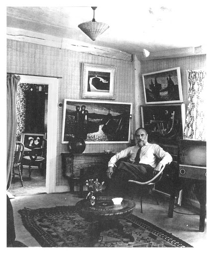
Stanley Clifford Smith at home in Great Bardfield in the 50s
It is a sad fact that histories are penned by the winners, or the people left to write it. In the case of the Great Bardfield artists that history was left to Olive Cook. When the Fry Art Gallery was set up in 1986 she wrote the history of the local artists and for about 10 years that version of the truth was printed and reprinted. It has now thankfully been corrected now but with more time on my hands I went back to the original copies of their visitors guides and found she had erased Stanley Clifford-Smith totally. It might have been due to the Fry Art Gallery not owning any of his work at the time they opened. But history can be uncovered and re-penned (and as I mentioned, has been). This happened to some lengths when Stanley’s son, Silas Clifford-Smith wrote ‘Under moon-light’ a biography his of father and his mother Joan Glass.
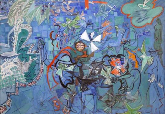
Joan Glass – The Reflected Gardener
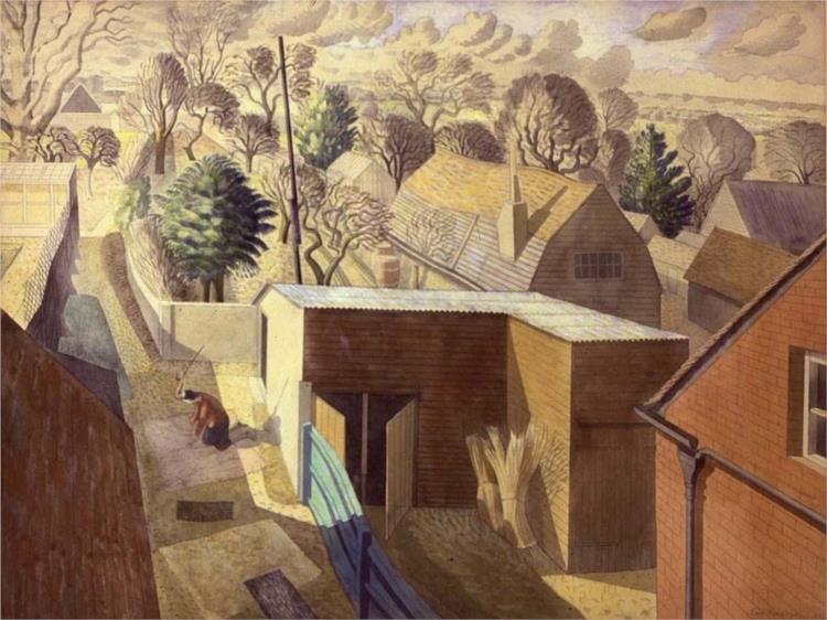
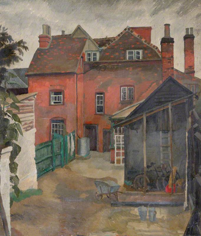
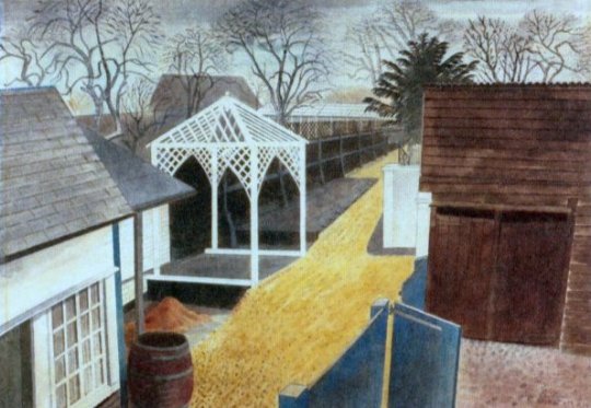
Stanley Clifford-Smith, known mostly as Clifford, was three years younger than Bawden and had four children by the time he moved to Great Bardfield. When young, Clifford was partly raised and schooled in Paris as his father was working there. As a child he had seen Debussy perform Clair de Lune and the composer came to their home for dinner. He had served in the Navy during the war as a navigation officer and lived in various properties in East Anglia, focusing on painting and designing textiles with his wife. Joan Clifford-Smith (née Glass) worked under her maiden name. She had studied at Chelsea Polytechnic under Graham Sutherland and one of the life models was Quentin Crisp. At Chelsea she started designing textiles and selling designs to carpet manufacturers. During the war she joined the Wrens and worked in the BBC Canteen.
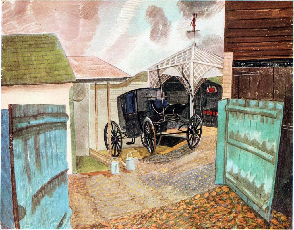
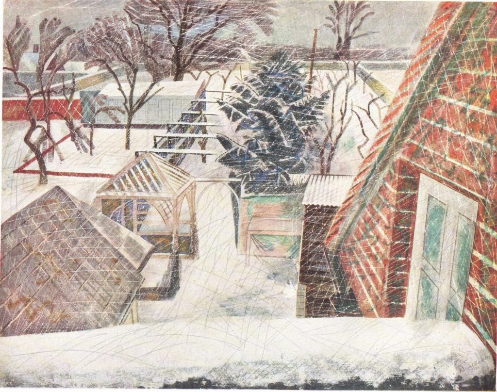
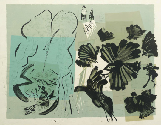
Joan and Stanley married in Newmarket in 1946, and in 1952 they moved to Buck House, Great Bardfield and later the Old Bakery opposite Edward Bawden’s Brick House. Unlike the artists in St Ives that tended to influence each other, these Essex artists all had different styles and influences. John Aldridge being a traditional painter, Bawden more comic and print based, Rothenstein taking abstraction to it’s limits and becoming more like Britains Picasso, and then George Chapman who’s modernist welsh pictures looked rather alien in the East of England and also favoured etchings. Clifford was the most experimental painter of the village (Rothenstein being the most experimental printmaker) and his style was inspired by French painters and Expressionism, but like all the artists, translated it into his style.
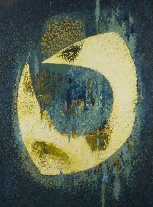
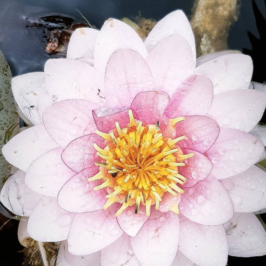
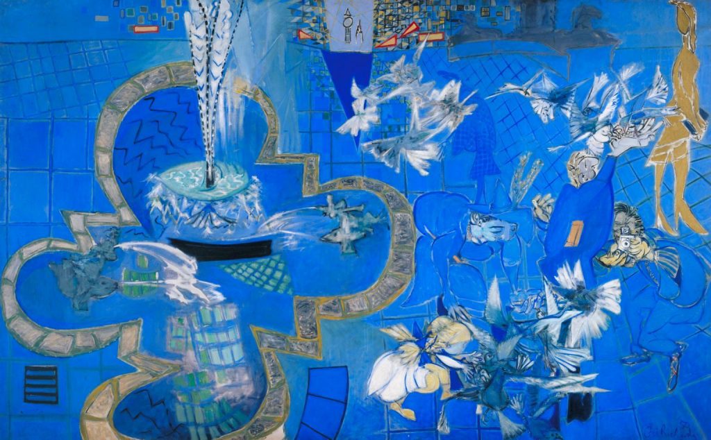
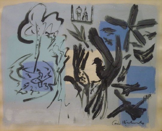
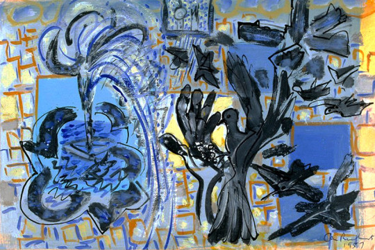
Stanley Clifford-Smith – Clair de la lune, 1965
This small Essex village in the 1950s and 60s became a refuge for artists who had moved out of London when looking to start a family, but where still working in the city, mostly as art teachers and found it easy to commute back and forth. Having so many artists in a small location, the village applied for a money to have an art exhibition as part of the 1951 Festival of Britain arts grant. They got the money, had the exhibition and found it to be so successful that they wanted to do one again in 1954, and these became known as the Great Bardfield Open House exhibitions. Other Open house exhibitions were in 1954, 1955 and a touring exhibition was in 1957 and 1958.
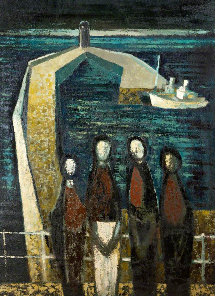
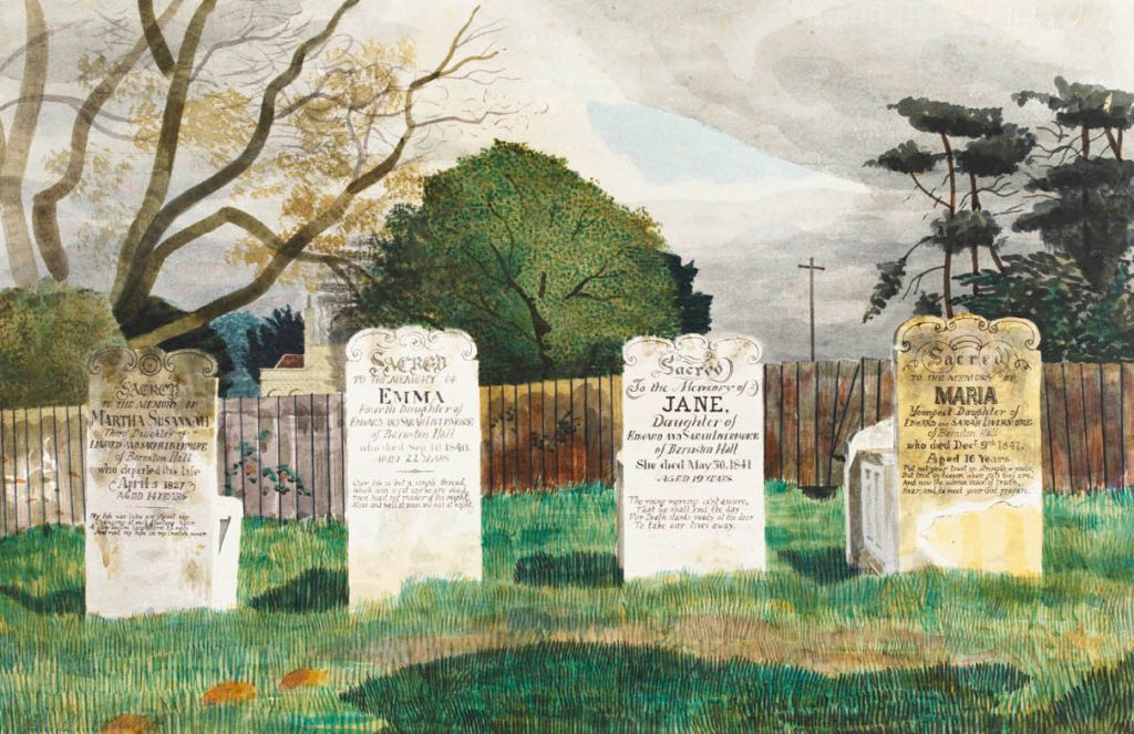
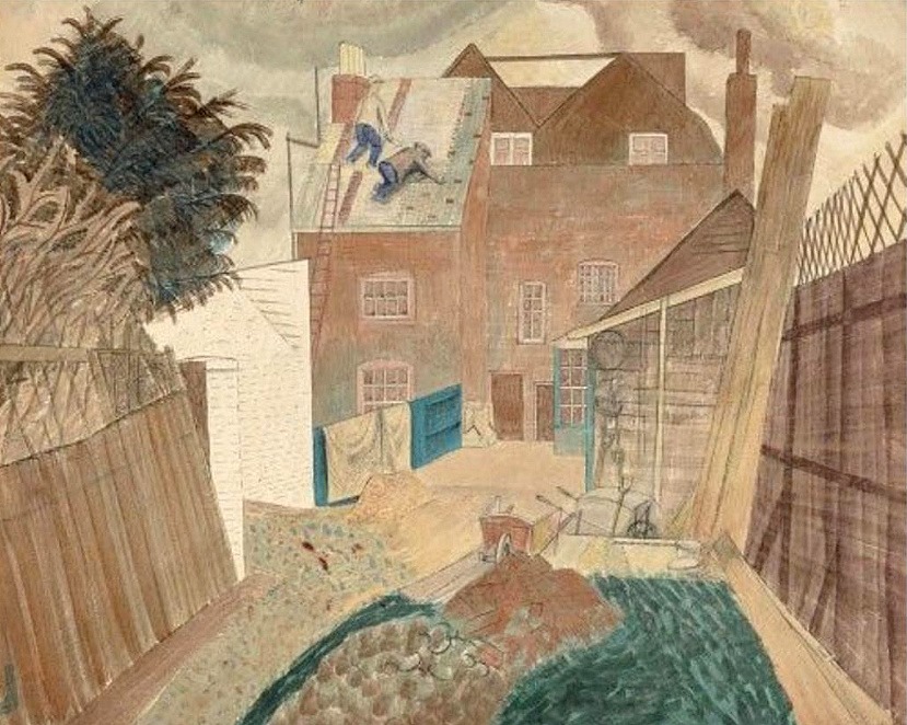
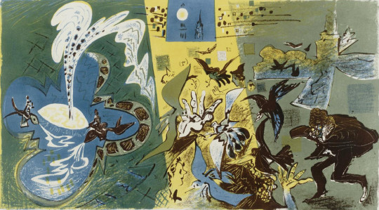
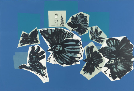
Stanley Clifford-Smith – Harbour and Figures, 1956
It was Stanley Clifford-Smith who helped set up these open-house days in Great Bardfield and exhibited with the other artists of the village. They would turn their houses into art galleries and thousands of people came into their homes to view the work.
In the 1960s the artists with larger families all started to move away from Great Bardfield and Clifford Smith moved to London. By the 70s very few artists were left and John Aldridge was the only artist to stay until his death in 1983.
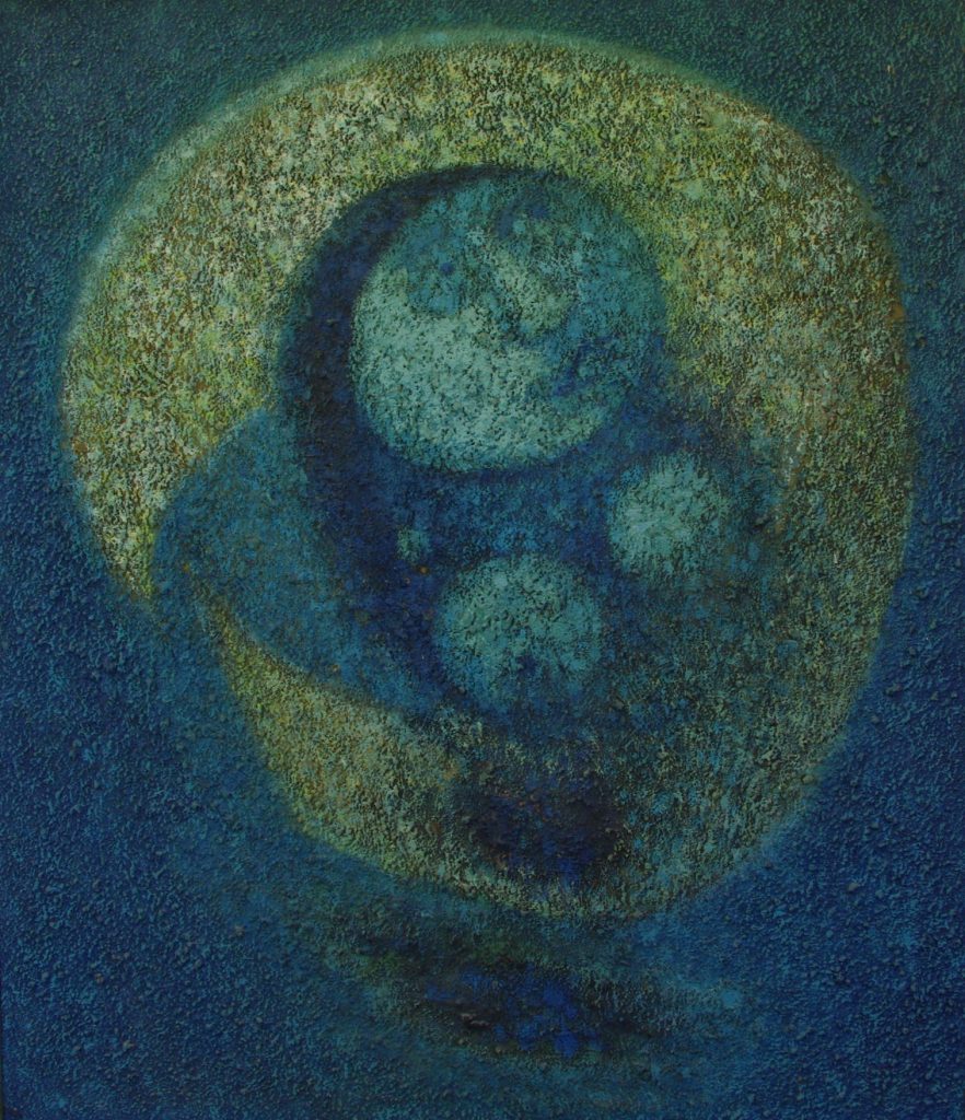
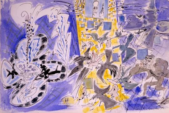
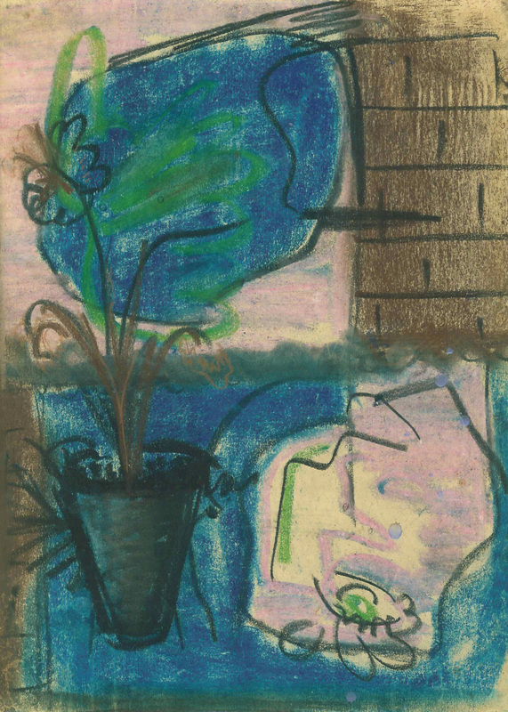
Stanley Clifford-Smith – Woman Bewitched by the Moon