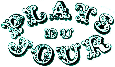
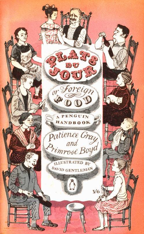
Plats du Jour by Patience Gray and Primrose Boyd is a book illustrated by a 27-year-old David Gentleman in 1957 used to be everywhere, I would see it in most charity shops and on book stalls, however now if you look online and try to find a copy it is about £30 and up. The Persephone Press reissued it it in 2006 with the original illustrations. However the art of the small illustrated cook book has been lost on a tide of celebrity endorsed cookery books, for a nice cookery book we can only look back or to a private press and hope to get books like Lovely Food – A Cookery Notebook by Ruth Lowinsky, Mediterranean Food by Elizabeth David or such like.
However I thought Plats Du Jour was worth looking at in close up for the beautiful covers, letter work and illustration inside. They are so beautiful it is almost aspirational. It sold 50,000 copies in its first year, far outstripping Elizabeth David who was the cookery writer of that age.
Although Gentleman has designed almost everything it could be imagined from Coins and Stamps to Underground Station Artwork and Anti War propaganda he is known most of either his wood-engravings or his lithographs but his drawings and watercolours need a modern retrospective.
Here to go on with the Great Bardfield Cookery Collection are some of Chloe Cheese’s illustrations for Big Flavours and Rough Edges by David Eyre and the Eagle Cook, published in 2001.
Chloe Cheese is an English illustrator, painter and print-maker. She was born in London, the daughter of artist and printmaker Bernard Cheese and artist and illustrator Sheila Robinson. Her childhood was spent in Great Bardfield, Essex. She studied at Cambridge School of Art and the Royal College of Art.
As part of this series of posts looking at the illustrations of Great Bardfield artists in cookery books, here is Walter Hoyle’s contribution. In a previous post I have noted Hoyle’s biography.
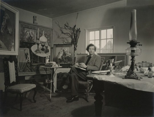
Geoffrey Ireland – Walter Hoyle, 1956
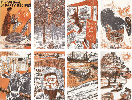
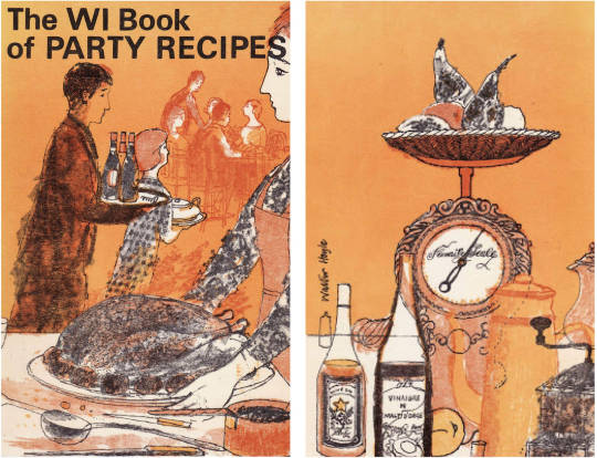
In 1969 Walter Hoyle illustrated the ‘Women’s Institute book of Party Recipes’. This series of little illustrations are some of his best in my opinion.
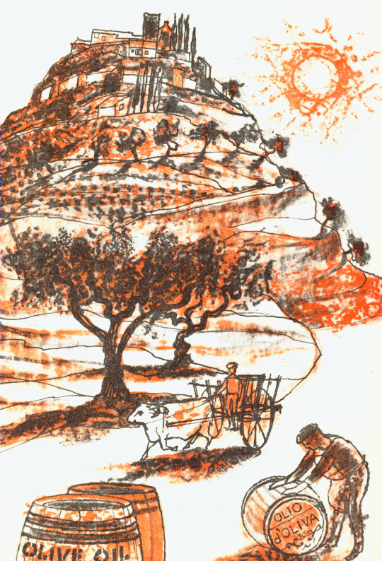
They form a curious set of mixed media works that I believe to have been printed by Hoyle in lithograph then sent off to the book printers to be mass-printed, with the look of being a lithograph, but without it being so. Clearly the book was designed to be cheaply printed, for one it is spiral bound – but this is rather helpful in a cookery book. The other indicator of cheapness is that it has a very limited colour palate of orange, red and black. It was printed by Novello & Co Ltd, who mostly make sheet-music scores.
Walter Hoyle – Sauces, 1969
The illustrations are pencil and ink drawings with colour overlays in orange and red. I love the way that either the printer or Hoyle flood-fill the backgrounds of some of the drawings with pure colour. The method of printing used at this time was called ‘Simulated Lithography’, where any drawing could be put onto a printing plate and printed in one colour tone by using plastic films and scans of the original drawings. This process was easier than using lithographic stones and artists can line up the plastic films and work at a print to get the coloured edges correct.
Instead of drawing on lithographic stones or plates the artist drew on a transparent sheet of plastic grained like a lithographic plate. The advantages were that any opaque material, chalk, pencil, ink etc. may be used, because the sheets of plastic are not transferred but are used in the same way as a photographic positive would be. That is, placed in a printing frame against a lithographic machine plate and then exposed to light. By this means an offset printing plate capable of a hundred thousand run can be produced. Also machine plates can be duplicated from the plastic original without any deterioration in quality, for the artist can superimpose one sheet on another. It is possible that the use of plastic sheets came to be common with the scarcity of metal, being used for ammunition in wartime. †
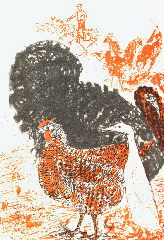
Walter Hoyle – Poultry, 1969
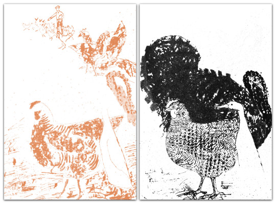
Below I have separated two layers into Colour and Black (K), the chicken, duck and turkey picture above. What I like about this print is the colour layer is a mixture of line drawing and flicked ink splats to give texture. The black layer has a fine line children and the outline of a white duck using the almost scrubbed brush black turkey design.
Left: The Colour. Right: The Black overlay.
Walter Hoyle – Front and Rear Covers, 1969.
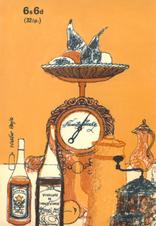
Below are a set of illustrations that in 1969 would have been more familiar than today’s shopping life. The picture of the antiquated scales is beautiful.
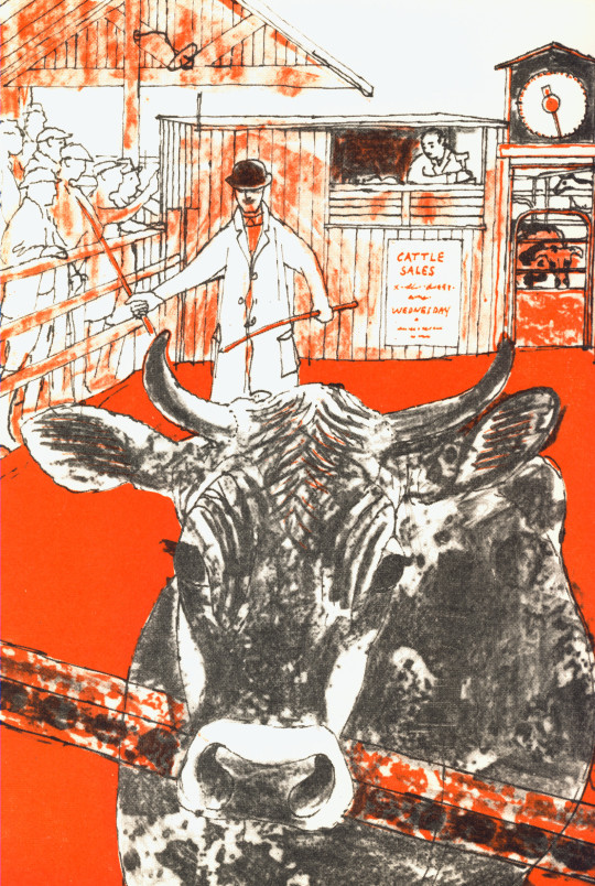
Walter Hoyle – Meat, 1969
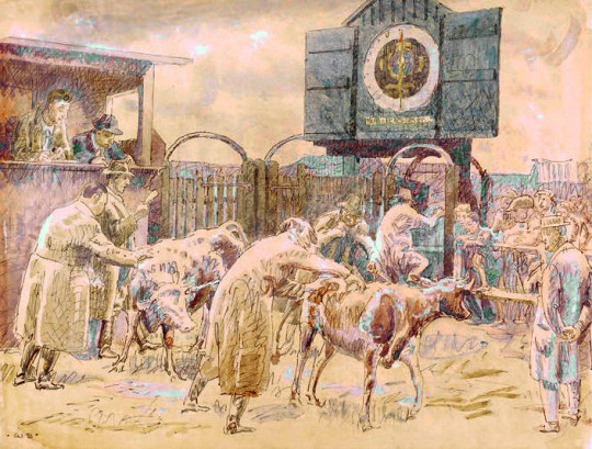
Above is a drawing of the Cattle Market and although it could have been Braintree (closest to Great Bardfield) it is impossible to know. Below is Braintree Cattle Market by Walter Bayes in 1940 from the Recording Britain project, but this type of market was common all over Britain as many towns had their own cattle markets. I thought it would be nice to point out the scales and auctioneer’s hut next to the ring.
Walter Bayes – Braintree Cattle Market, 1940
Walter Hoyle – Sweets, 1969
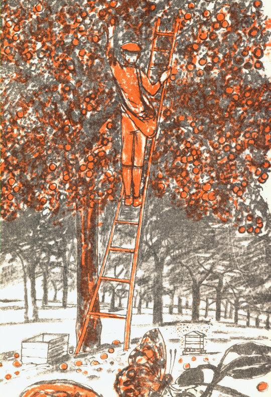
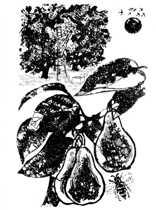
Above is an illustration from the cookery book of a man picking apples in an orchard and, below is almost the same drawing made four years later for the BBC book of the Countryside by Walter Hoyle in 1963. As the WI book illustration have been drawn on to printing plate the image would have been reversed – so the ladder, man and fruit crate are a mirror image to the figures below. I know the picture from the Countryside book isn’t mirrored as it came from an ink drawing and I own those drawings.
Walter Hoyle – September, 1963
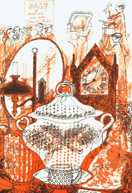
The rest of the illustrations I present below I can find nothing too remarkable to say other than Hoyle is cunning about the use of a soup tureen in an antique auction reminded me of the Cow for ‘Meat’ in an auction, rather than illustrating the food stuffs. There is a bit more imagination going on here.
Some of the scenes like Eggs and Sauces have a French and Italian flare, but it is likely because Hoyle and his French wife Denise spent many holidays there. The Sauces location looks like Civita di Bagnoregio but it’s very hard to know.
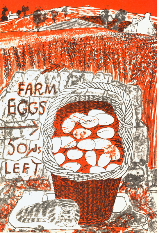
Walter Hoyle – Eggs, 1969
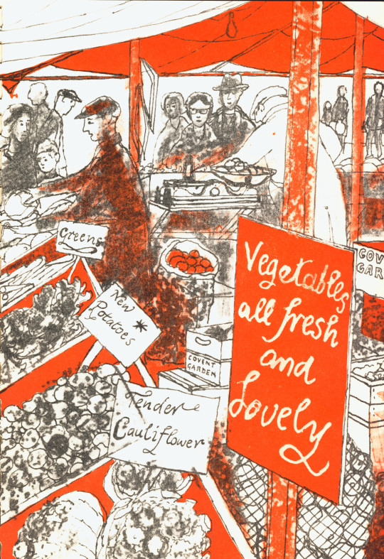
Walter Hoyle – Vegetable, 1969
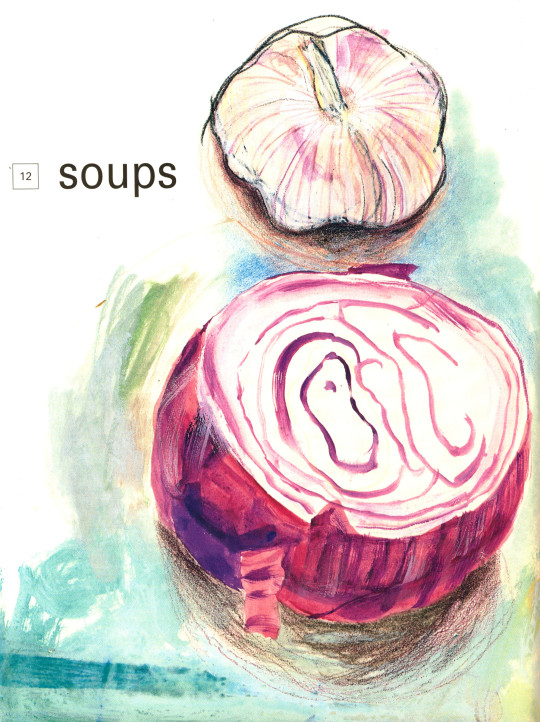
Walter Hoyle – Soup, 1969
Walter Hoyle – Rear Cover, 1969
† Ruth Artmonsky – The School Prints – A Romantic Project – 2006, p98
Cookery books are always important social documents, not just for tastes in eating but also for who will be doing the cooking. In the 1930s when more ladies of the house were doing the cooking and not the staff, cookbooks became more about budget, health and economy than the Victorian grandiose books for how to have your staff prepare a banquet. The bookends for the 1930s where the Great Depression and WW2, both had an effect in Britain and publishing. The Government would produce various cook books to promote health in a population with limited budget or ingredients to get the vitamins they needed. Publishing too had become cheaper and books more affordable. In these conditions the start of a suburban cookbook caught the publishers attention.
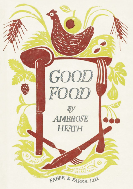
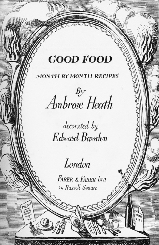
In this post are the books by Ambrose Heath showing various simple designs by Edward Bawden. The dust jacket and book-boards have a two-colour design in linocut and the internal pages are illustrated with black and white pen and ink studies.
I think part of the charm the books had Bawden illustrated was the playful and primitive look. Linocut is a medium that has had a bumpy road in the acceptance of art. Invented as a type of flooring in the 1860s, various artists used it for its printing quality and ease of carving, however detail couldn’t be applied to a linocut without many over-impressions, and the artists who did champion it in the 1920s made abstract works, like Sybil Andrews and many at the Grosvenor School of Modern Art. Books on how to make linocuts were popular such as Claude Flight’s own monograph, but many imitations came after and those books were aimed at the amateur artists or children.
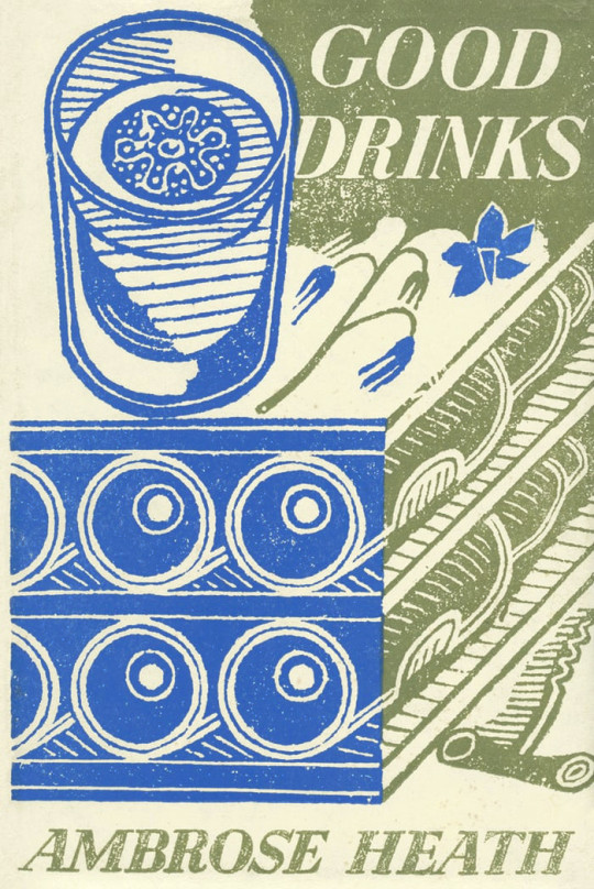
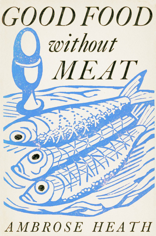
Edward Bawden’s works for linocut are the start of a lifelong pursuit of the medium. Unlike most people who try to start with linocut he saw the trick was to make the items oversized. Detail is for wood-engraving but with linocut it is better to be obvious. The soup-terrine or salt pot are large and simple but also beautiful compared to what cookery books looked like before. The standard type for a cookery book cover would have been a black and white photo of the author or a depressingly garish line drawing, embossed into wine-red cloth in gold, I am thinking of Mrs Beeton.
Edward Bawden – Front Cover for Good Food, 1932
Edward Bawden – Title Page for Good Food, 1932
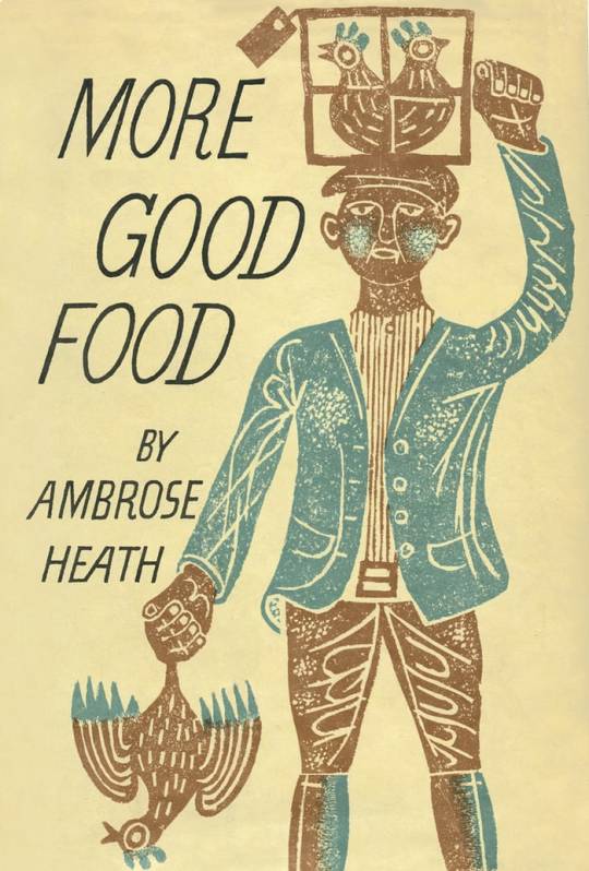
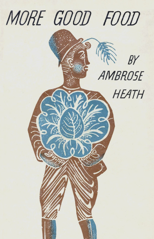
Edward Bawden – Front Cover for More Good Food, 1933
Edward Bawden – Rear Cover for More Good Food, 1933
What also is telling of an attention to quality in these books is that when Good Food and More Good Food were published, they are described as being ‘Decorated by Edward Bawden’ rather than illustrated, a subtle difference but I think it was the start of a change to how people illustrated cookery books.
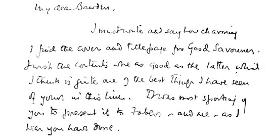
I rather thought that as with most cases the author would have little to do with the designs of the cover or even be able to approve them, but in this case there is a letter from Ambrose Heath to Bawden:
My dear Bawden,
I must write and say how charming I find the cover and title page for Good Savouries. I wish the contents were as good as the latter which I think is quite one of the best things I have seen of yours in this line. I was most sporting of you to present it to Faber, and me, as I hear you have done. †
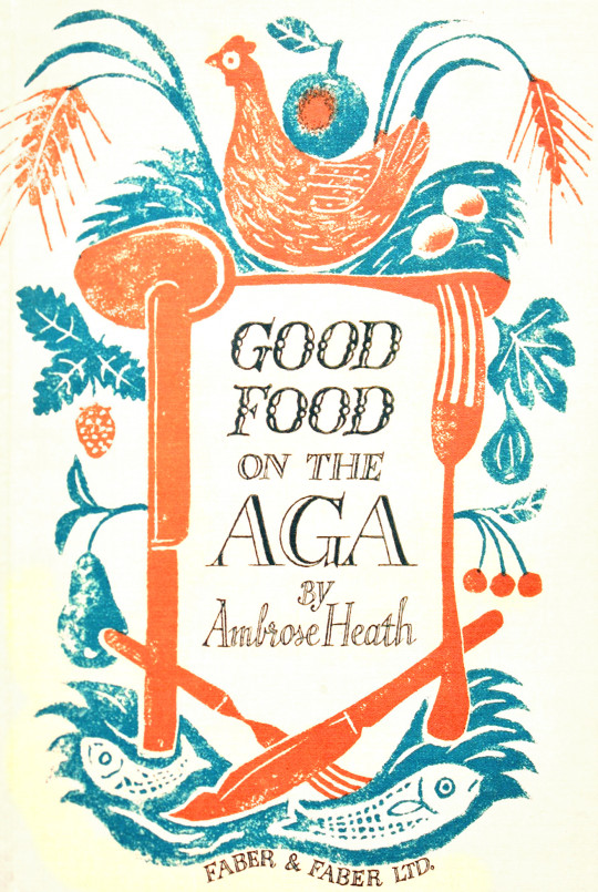
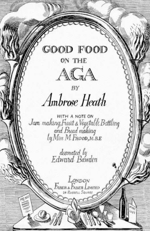
Edward Bawden – Front Cover for Good Food On The Aga, 1933
Ambrose Heath didn’t just write on the subject of AGA cookery; he was a passionate AGA cook himself. A 1933 AGA brochure stated: “For many
months now Mr Ambrose Heath has done his own cooking and tested his professional recipes on an AGA Cooker, and his enthusiasm is unbounded for the AGA cooker’s cooking efficiency. “He explains the various improvements made possible by AGA cooking and the difference in method due to the principle of AGA Heat Storage. He emphasises especially the enormously increased leisure which the AGA affords the Cook.” ‡
Edward Bawden – Title Page for Good Food On The Aga, 1933
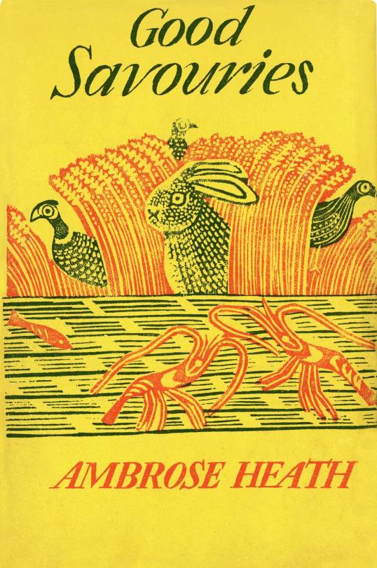
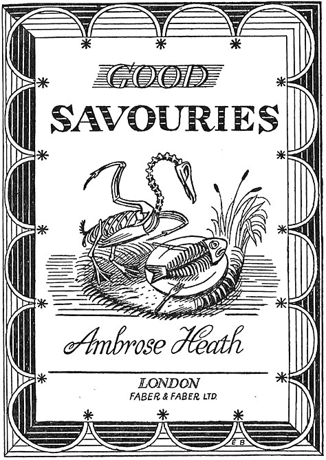
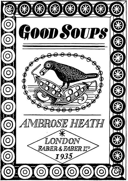
A steady job for Bawden during the thirties was decorating the Good Food guides by Ambrose Heath, published by Faber and Faber. There were ten of these with a dozen line-drawn illustrations inside, and a witty linocut cover, each with superbly inventive margins, different lettering styles and a central illustration – for example, Good Soups has a bird picking the peas from a pod and Good Savouries has a skeleton fowl contemplating a skeleton fish on a plate, elsewhere you might see flies on the crumbs or find mice in the cheese. ♠
Edward Bawden – Front Cover for Good Savouries, 1934
Edward Bawden – Title Page for Good Savouries, 1934
Edward Bawden – Rear Cover for Good Savouries, 1934
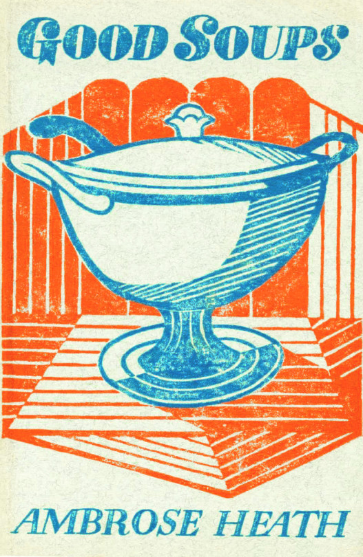
Edward Bawden – Front Cover for Good Soups, 1935
Good Soups is my favourite of all the books for the illustration of geometric patterns and inside the pen and ink drawings are often mistaken for linocut illustrations too.
Edward Bawden – Title Page for Good Soups, 1935
Edward Bawden – Rear Cover for Good Soups, 1935
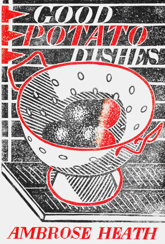
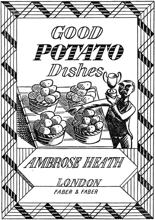
Edward Bawden – Front Cover for Good Potato Dishes, 1935
Edward Bawden – Title Page for Good Potato Dishes, 1935
Edward Bawden – Rear Cover for Good Potato Dishes, 1935
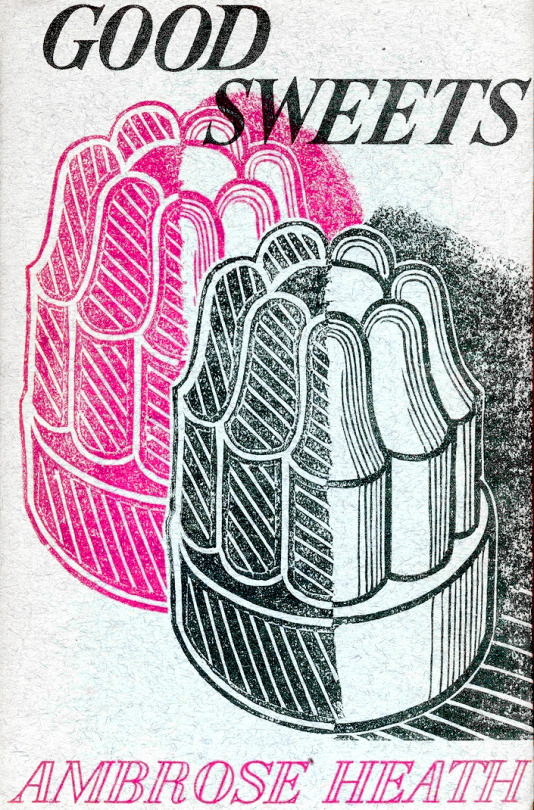
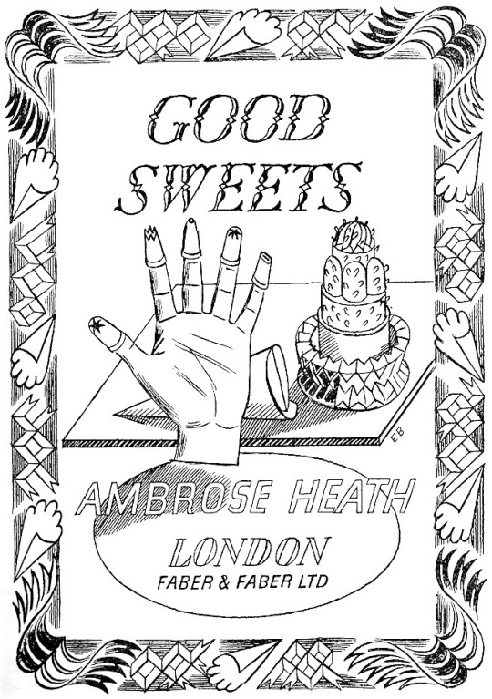
Edward Bawden – Front Cover for Good Sweets, 1937
Edward Bawden – Title Page for Good Sweets, 1937
Edward Bawden – Rear Cover for Good Sweets, 1937
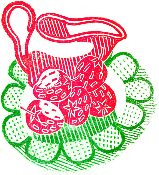
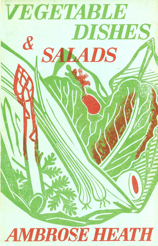
Edward Bawden – Front Cover for Vegetable Dishes & Salads, 1938
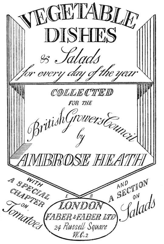
Edward Bawden – Title Page for Vegetable Dishes & Salads, 1938
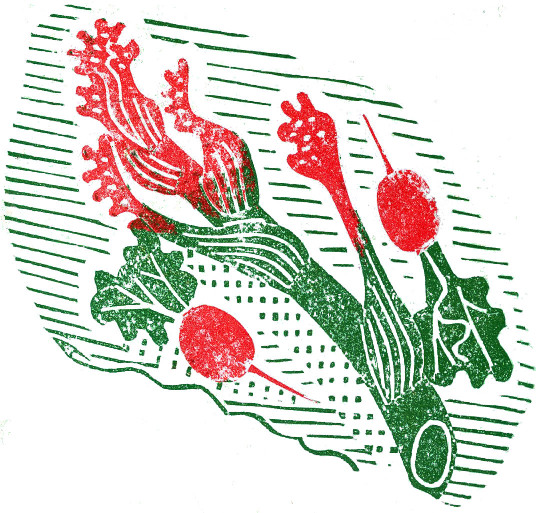
Edward Bawden – Rear Cover for Vegetable Dishes & Salads, 1938
Edward Bawden – Front Cover for Good Drinks, 1939
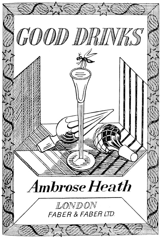
Edward Bawden – Title Cover for Good Drinks, 1939
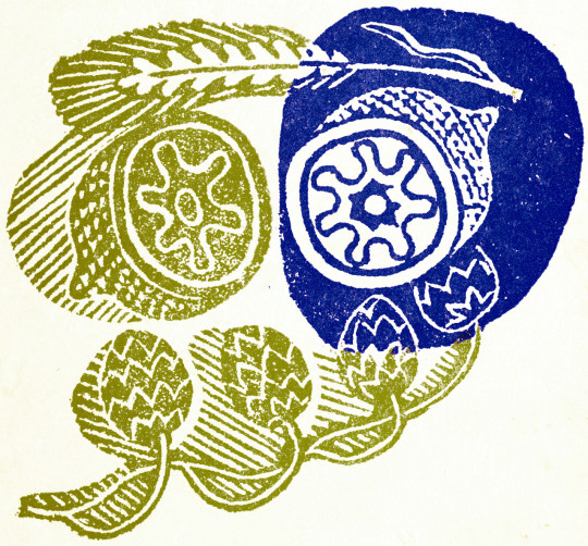
Edward Bawden – Rear Cover for Good Drinks, 1939
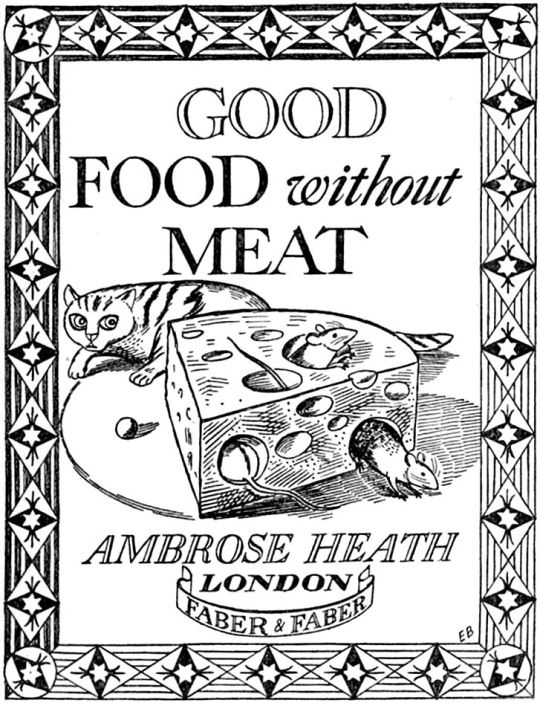
Edward Bawden – Front Cover for Good Food Without Meat, 1940
Edward Bawden – Title Page for Good Food Without Meat, 1940
Edward Bawden – Rear Cover for Good Food Without Meat, 1940
† Letter to Edward Bawden from Ambrose Heath, 31st May 1934. ‡ How The Aga Cooker Became An Icon, 2013, p32 ♠ Malcolm Yorke – Edward Bawden and His Circle, 2007, p74
This is the first part in a series of posts I have been working on about the cookery books made by artists of Great Bardfield. This first volume is on Eric Ravilious.
Eric William Ravilious (22 July 1903 – 2 September 1942) was an English painter, designer, book illustrator and wood-engraver. He grew up in East Sussex, and is particularly known for his watercolours of the South Downs and other English landscapes, which examine English landscape and vernacular art with an off-kilter, modernist sensibility and clarity. He served as a war artist, and died when the aircraft he was in was lost off Iceland. ◊
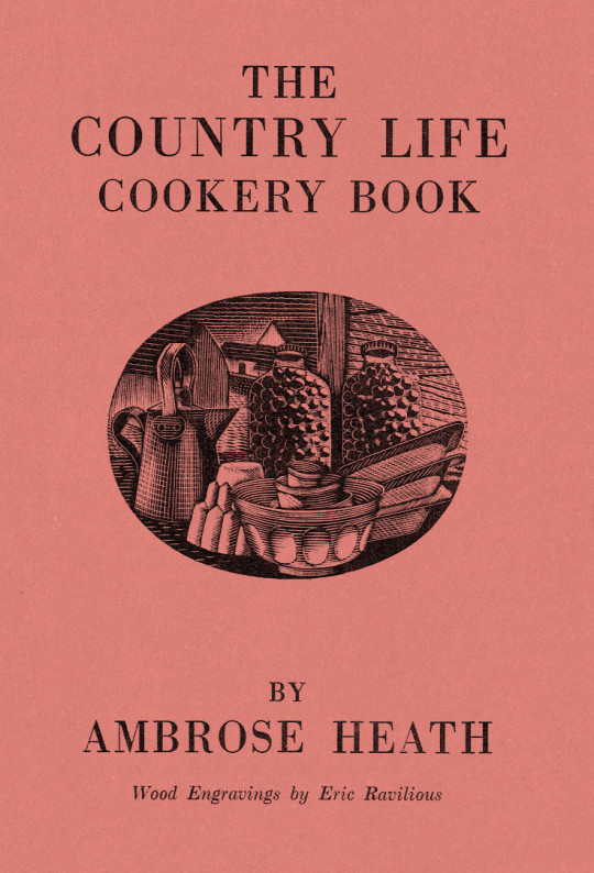
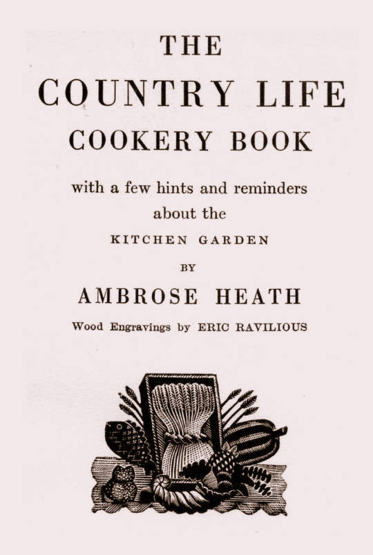
Dust Jacket for The Country Life Cookery Book by Ambrose Heath, 1937
The Country Life Cookery Book was published in 1937 and illustrated by Eric Ravilious. Country Life to some may just be the magazine, but at this point in history they were a major publisher about architecture, craft and a style of country life that would appeal to the new middle and upper classes of Britain. The publications normally contained lots of high quality photography.
In the same year as the Cookery Book was published were many other books, here are a few others for adults: Where To Catch Salmon And Trout, Elements Of Stabling, Morning Flight A Book Of Wildfowl, Gun For Company, Victorian Street Ballads. For children there were: Skilled Horsemanship, The Golden Knight and Other Stories, Peter & Co, Knight in Africa and Rajah the Elephant… as part of the ‘Junior Country Life Library’.
The books are countryside propaganda in the age of travel by train, omnibus, charabanc and car. They were promoting Britain in the way they wanted to see it. It is fair to say when people talk about the ‘Golden Nineteen-Thirties’ that Country Life had a great deal in the legend.
The Title-Page
Eric Ravilious – Title-page of the Country Life Cookery Book, 1937
We know Ravilious got the commission for the cookery book in July 1936 as he wrote in this letter to Helen Binyon:
This book is now begun and begins to be promising. †
The wood-engravings follow a seasonal theme, month by month rather than chapters on food or following the text – this calendar style is like the other Ambrose Heath books for Faber & Faber that Edward Bawden had illustrated for the previous five years. Only 12 blocks were cut by Ravilious for the in the book, so with the title page decoration, two of the months (January & December) used the same image. One can only assume this was how many images they thought they needed and so how many images they paid for.
Having the chapters as seasonal months would also hurry the project along from the illustration front – as in April of 1937, nine months later, Ravilious wrote to Binyon:
I don’t believe Heath has written his text yet. ‡
But not having the text as a guide would mean Ravilious could invent the illustrations from his mind and use past works. He worked on the illustrations from July 1936 – February 1937 while taking on other commissioned work and finishing a series of watercolours.
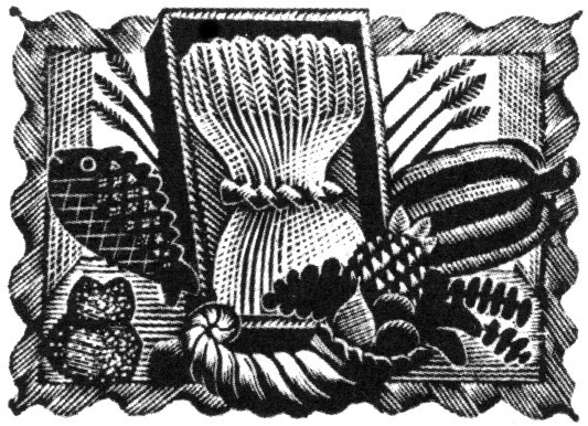
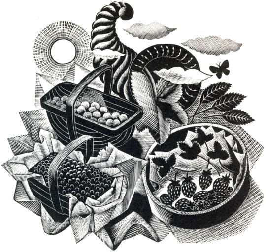
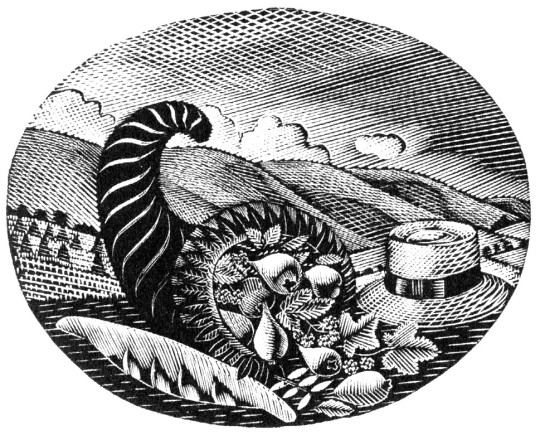
Below is the title page wood-engraving of a framed cornucopia, a wheat-sheaf and food produce. This illustration is a reject from another job.
Eric Ravilious – Title-page (Harvest Festival), Wood-engraving for the Cornhill Magazine, 1936
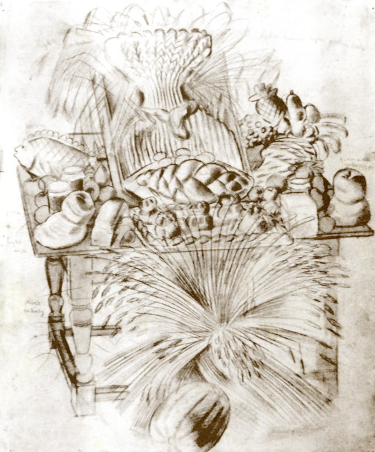
Ravilious was completing a commission for The Cornhill Magazine in the later part of 1936 and the project overlapped with the Cookery Book. So when one of the wood engravings was rejected by John Murray (editor of The Cornhill) he used it on the cookery book. I thought this engraving was a bit surreal and over the top until I discovered a drawing of it below.
Eric Ravilious – Harvest Festival and Loaves, 1936
I’ve been drawing the bread table in the church – dead and fancy loaves, barley and corn, apples and eggs – and I thought it too beautiful not to place on record. ♠
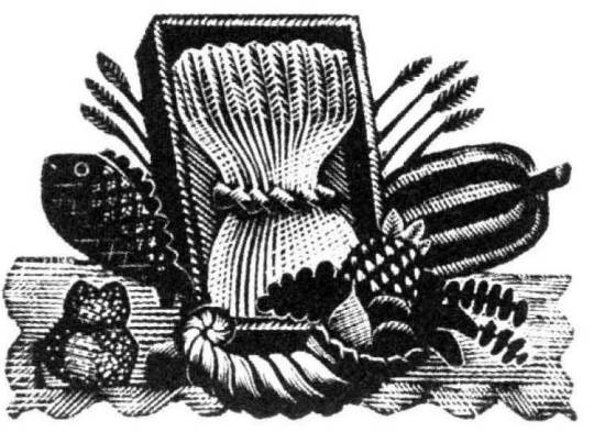
Having been rejected for one job Ravilious cut away the framed backdrop of the table and submitted the wood-engraving below for the Cookery Book project instead.
Eric Ravilious – Title-page (Harvest Festival), Wood-engraving for the Country Life Cookery Book, 1937
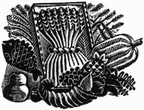
Below is another woodblock based on the same image made for The Writings of Gilbert White of Selborne in 1938. It’s a new version and not an edited restrike. Likely cut in 1937 as the job was commissioned in May of that year and the book published in 1938.
Eric Ravilious – (Harvest Festival), Wood-engraving for The Writings of Gilbert White of Selborne in 1938
January and December
Eric Ravilious – January & December, Wood-engraving for the Country Life Cookery Book, 1937
January & December is the block that is used twice in the cookery book.
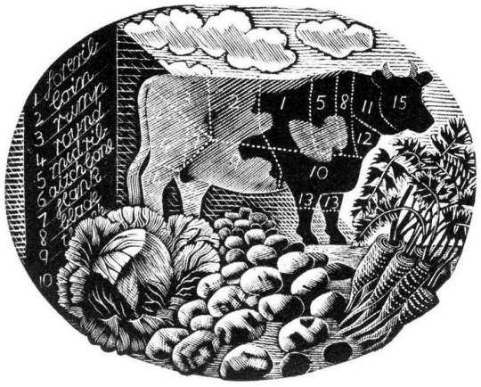
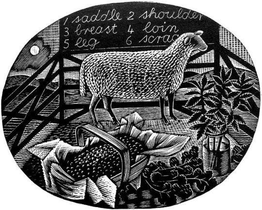
Ravilious would also find inspiration in the past. He owned a copy of The Frugal Housewife published by J Fairburn, 1838 and below is the meat guide on animals. I think this Ravilious woodcut is one of the defining moments in cookery illustration and helped re-popularise this old fashion key to animal flesh. The meat guide is now a typical image to see in cookery books to educate what meats can be gained from an animal. It is used three times in this book. He mentions the idea to use old cookery books below:
I’ve had what you would call a cleaver idea, and Mrs Beeton has been a help. †
Frontispiece – The Frugal Housewife, J. Fairburn, 1838
February
Eric Ravilious – February, Wood-engraving for the Country Life Cookery Book, 1937
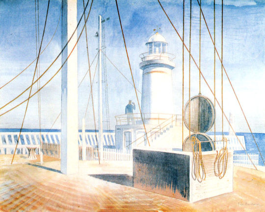
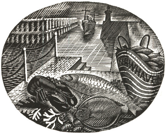
In the August of 1935 Edward Bawden and Ravilious went on a painting trip to Newhaven and in the wood-engraving above, the basket of fish emblazoned with the name of the town.
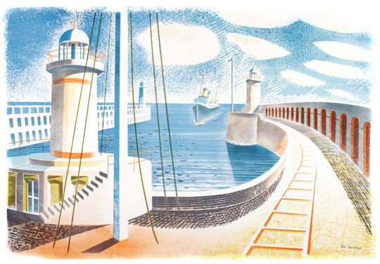
The idea for the wood engraving would also pop up again in another format, this time a print for Contemporary Lithographs, a company working with artists to make large runs of lithographic prints that would be cheap for the public to buy from the Zwemmer Gallery. Below is one of the watercolours from 1935 that could have been the inspiration for the commission. (The watercolour was also sold via Zwemmer Gallery).
Eric Ravilious – Newhaven Harbour, 1935
The print that Ravilious completed is very similar to the Cookery Book print as the jobs overlapped. The official title of the print is Newhaven Harbour but Eric referred to the print as ‘Homage to Seurat’. Helen Binyon wrote that the print has a:
scene of sensitive clarity and beautiful luminosity ♦
Eric Ravilious – Newhaven Harbour, Contemporary Lithographs Ltd, 1937
Eric Ravilious – February, Wood-engraving for the Country Life Cookery Book, 1937
March
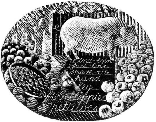
Eric Ravilious – March, Wood-engraving for the Country Life Cookery Book, 1937
A pig surrounded by the fruit of choice, apples, and to the left of the wood-engraving a garden sieve with berries upon it. The watercolour below comes from the same year as the Cookery Book’s commission, but is now one of the lost paintings of Ravilious, it was also damaged when last seen having had the top left corner ripped and creased.
Trugs with Fruit is a lost watercolour by Eric Ravilious, damaged. In the corner it may have been framed and sold or just disregarded and thrown away, but it appears in the wood engraving in this commission for John G Murray, editor of the Cornhill Magazine. It was made for publicity for the Magazine but so far has only ever been seen on the compliment slips they had for a short time.
Eric Ravilious – Trugs with Fruit, 1936
April
Eric Ravilious – April, Wood-engraving for the Country Life Cookery Book, 1937
Rather like the Title Page, the wood engraving for April came at the same time as the Cornhill Magazine commission. Below is a watercolour, now presumed lost of trugs of fruit and the same trug appears in the wood engraving next to a glass of mint – these are red currents and mint, said to be the good sauces for Lamb.
Eric Ravilious – Trugs with Fruit, 1936
The wood-engraving below would have been copied from the painting and in the printing process it appears reversed, it comes with the same cornucopia from the title-page engraving.
Eric Ravilious – Autumn Fruits, 1936
And here you can see the wood-engraving in use on the Cornhill Magazine compliment slip.
Eric Ravilious – Cornhill Magazine Complement Slip with Autumn Fruits, 1936
May
The wood-engraving for May looks to be the most original of all of the illustrations, I can’t think of having seen any element in past work.
Eric Ravilious – May, Wood-engraving for the Country Life Cookery Book, 1937
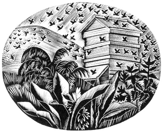
June
Eric Ravilious – June, Wood-engraving for the Country Life Cookery Book, 1937
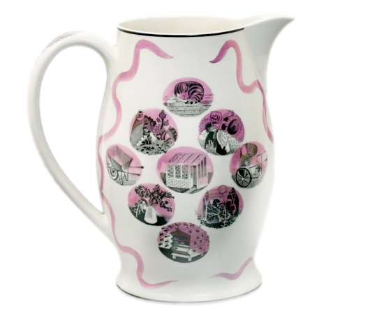
The June illustration features a bee-hive. A variation of the image would be used two years later on The Garden Implements Jug that was also designed by Ravilious for Wedgwood. The bottom most vignette.
Wedgwood Garden Implements Jug, 1939
July
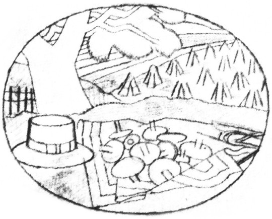
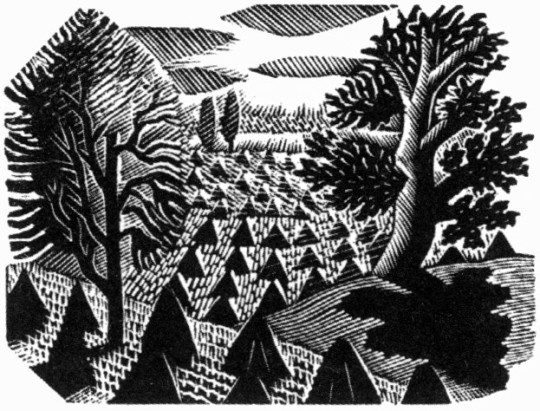
Eric Ravilious – July, Wood-engraving for the Country Life Cookery Book, 1937
The wood-engraving for July has roots in many places. The finished wood block has a hat, cornucopia of pears, a hat on the backdrop of hills and cornstooks. In an early drawing for the wood-block the hat is in the same place (reversed when printed) but many of the other elements have changed.
Eric Ravilious – Proposed July Block, Drawing made on tracing paper for woodblock, (reversed for printing), 1936
It is likely that the print Ravilious drew out was inspired by the Harvest theme of the month he was illustrating and he looked back on older work. Below the wood engraving from 1934 is one of many Curwen Press Stock Blocks. They are woodblocks and prints the press has paid artists to make so they can be used without the need to hire an illustrator for a job, so production times can be quicker and still have illustrated items.
The tree and setting of cornstooks reminded me of the drawing he made above and even the way the stooks flow uphill.
Eric Ravilious – July, Wood-engraving for the Country Life Cookery Book, 1937
Eric Ravilious – Curwen Press Stock Block 985, 1936
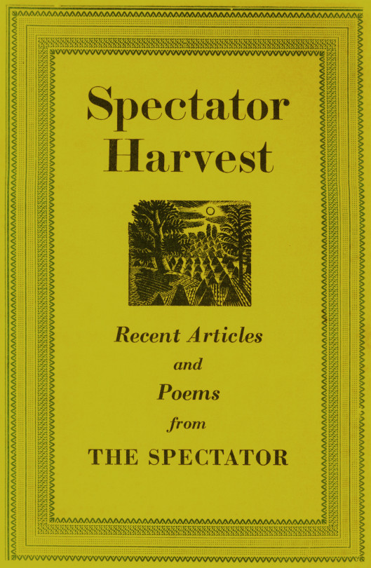
The booklet the block was used upon happened to be called Spectator Harvest, for the Spectator Magazine.
Spectator Harvest, 1952
It was also re-cut in mirror image for The Writings of Gilbert White of Selborne in 1938.
Eric Ravilious – Selborne Tailpiece Volume 2, 1938
But back to the cookery book – the cornucopia below (that appeared next to a hat and a baguette) has been seen before in this post – in the wood-engraving in use on the Cornhill Magazine compliment slip.
Eric Ravilious – July, Wood-engraving for the Country Life Cookery Book, 1937
One above the other, it isn’t hard to see a link.
Eric Ravilious – Autumn Fruits, 1936
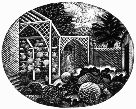
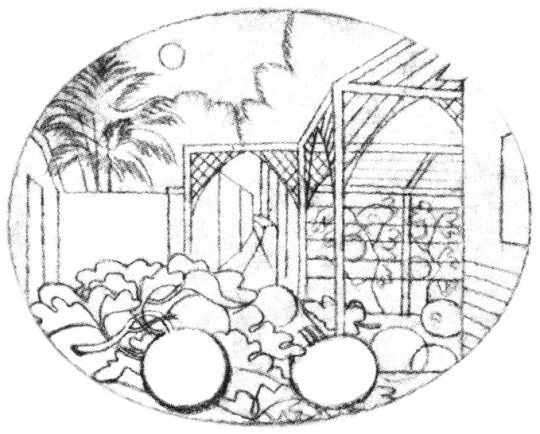
August
Eric Ravilious – August, Wood-engraving for the Country Life Cookery Book, 1937
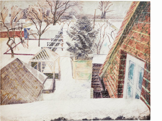
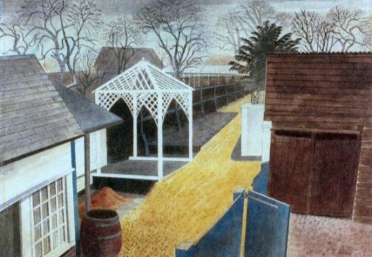
For the August vignette Ravilious chose to illustrate the garden of Brick House in Great Bardfield. Ravilious and his wife Tirzah had shared the house with Edward Bawden and his wife Charlotte from 1932 until 1935 when the Raviliouses moved to near-by Castle Hedingham.
In 1936 Bawden painted the garden in the winter of the Cookery Book commission showing the wood gazebo that was up in 1932 as it was a wedding gift from Eric and Tirzah to Edward and Charlotte. The arches must have been added between then, around 1936.
Edward Bawden, February 2pm, 1936
Eric Ravilious – The Garden Path, 1933
Eric Ravilious – August – Drawing made on tracing paper for woodblock, 1936 (reversed for printing)
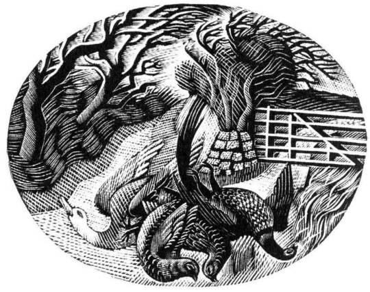
September
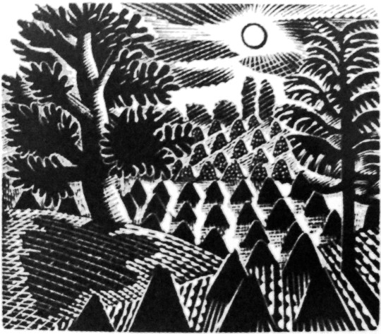
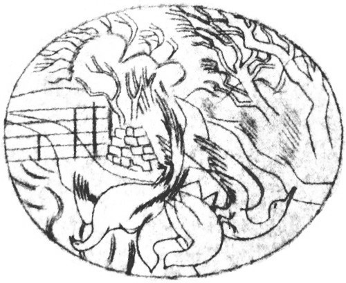
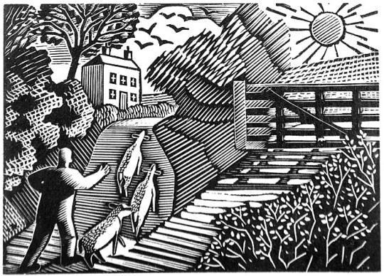
Eric Ravilious – September, Wood-engraving for the Country Life Cookery Book, 1937
The illustration for September shows the game shooting season and a brace of birds, maybe a goose to the left and pheasants to the right in front of a country lane. Below is the original trace drawing for the block, reversed for printing.
Eric Ravilious – September, Drawing made on tracing paper for woodblock, (reversed for printing), 1936
Followers of my blog would not be surprised to see that the illustration bears a similarity to another one, the wood-engraving for London Transport, this is confirmed in a letter to Helen Binyon again:
The jobs, cookery and Green Line advertisements – are all done and sent off and very glad am I that hard work is finished. ♣
Counter to the letter I can’t find another reference to them in print.
Eric Ravilious – The Shepard, 1936
The Shepard is one of the most lively engravings that Ravilious made for London Transport. The Sheep and their ears with the hillside up to the house are pleasing. The technicality of the halftone shading are some of his best. ♥
The Cookery Books version of the engraving is more detailed, I think because the printing was likely to be finer than the press adverts the London Transport one would be reproduced in.
Eric Ravilious – September, Wood-engraving for the Country Life Cookery Book, 1937
October
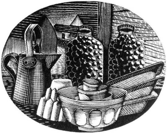
Eric Ravilious – October, Wood-engraving for the Country Life Cookery Book, 1937
October sees kitchen items, a jug, copper jelly mould stacked mixing bowls and baking trays with two jars of preserved items.
November
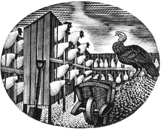
Eric Ravilious – November, Wood-engraving for the Country Life Cookery Book, 1937
The last work of a chicken farm and a turkey with wheelbarrow gives the Christmas feeling and may have been marked to have been the December illustration but January’s wood-engraving was also used as December.
† Eric Ravilious to Helen Binyon – 19th July, 1936 ‡ Eric Ravilious to Helen Binyon – 14th April, 1937 ♠ Eric Ravilious to Helen Binton – 6th October, 1936 ♣ Eric Ravilious to Helen Binyon – 17th August (1936) ♦ Helen Binyon – Eric Ravilious: Memoir of an Artist, 2016 ♥ Robjn Cantus – A Journey of London Transport with Eric Ravilious, 2018 ◊ Wikipedia – Eric Ravilious
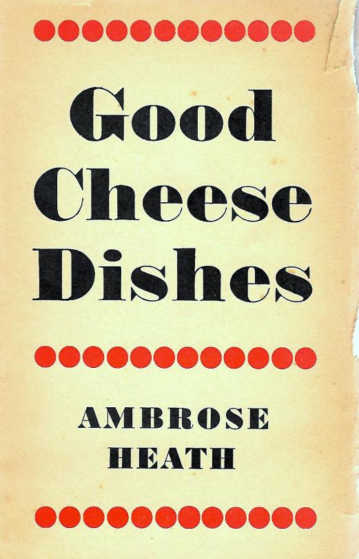
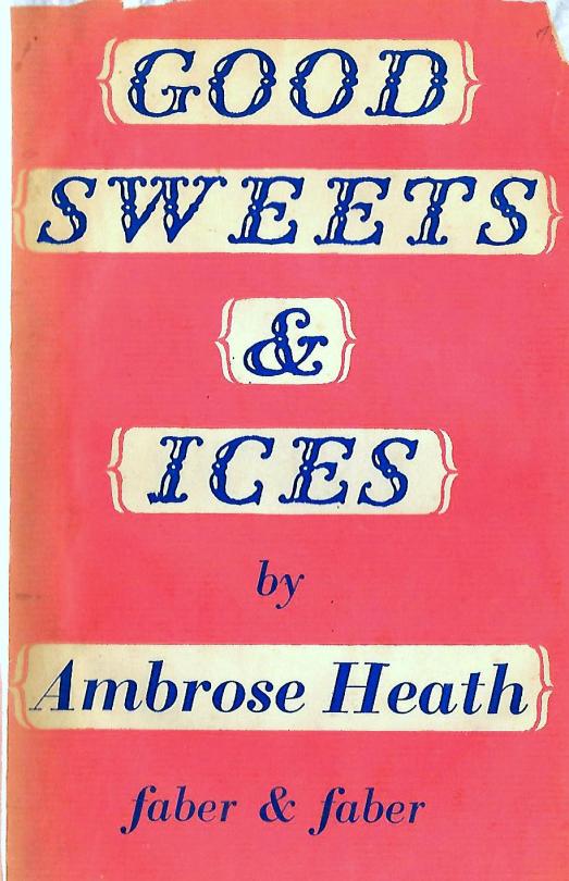
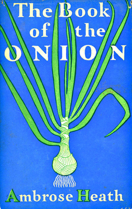
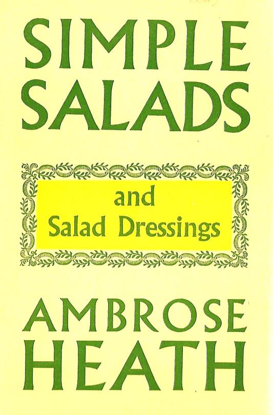
The books of Ambrose Heath illustrated by Eric Ravilious or Edward Bawden are worth a lot of money in mint condition. I was thinking that it was sad that people are only collecting those books, for the illustrations, not the recipes. But also there are so many other wonderful designs of books by Heath worth buying.
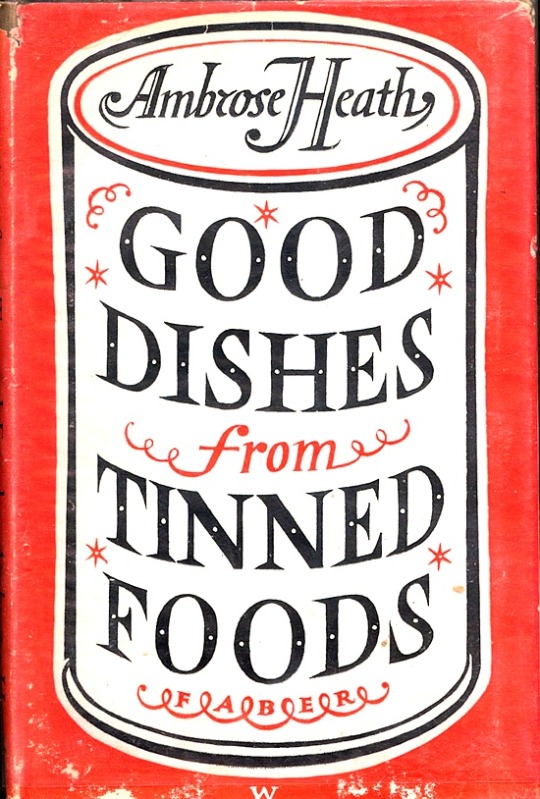
Ambrose Heath – Good Dishes from Tinned Foods – Faber & Faber, 1939.
I doubt that Heath had much say or interest in who illustrated his books or how, most of it seams to be same in the hands of Faber and Faber.
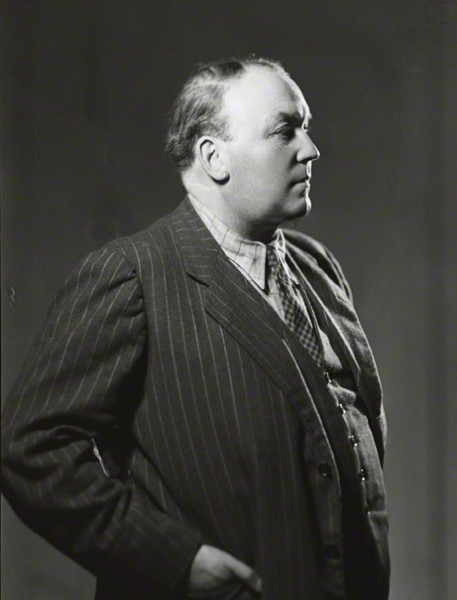
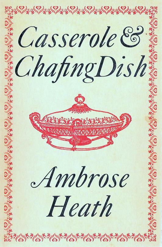
Ambrose Heath
Ambrose Heath was born Francis Geoffrey Miller on the 7th February 1891 in London. He was a journalist and food writer who wrote for newspapers including The Times and The Manchester Guardian, before becoming the food writer for The Morning Post.
In 1933 he published his first book ‘Good Food: Month By Month Recipes’ (illustrated by E. Bawden). It was a success and the year later another three books and reprints came. In the 30′s he wrote over 20 books and many more for publications and companies like Aga stoves. The most expensive of the cook books is undoubtedly ‘The Country Life Cookery Book’ (illustrated by Ravilious in 1937).
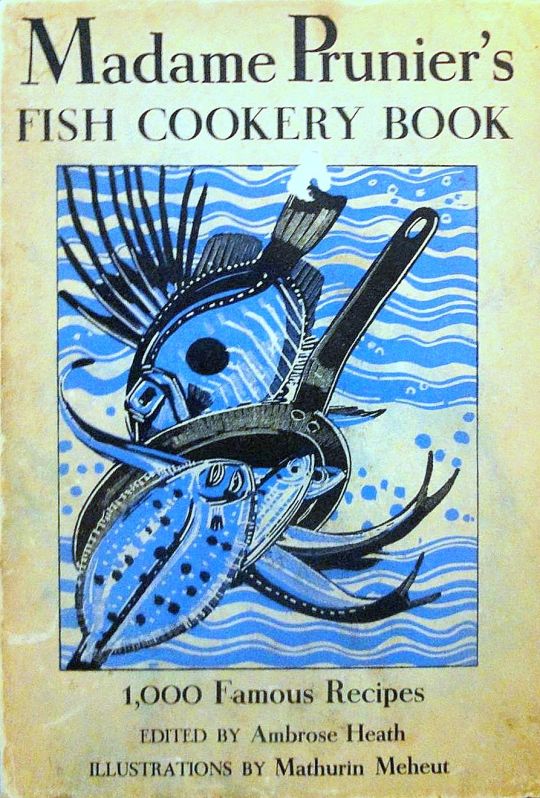
Heath wrote and translated more than one hundred works on food. In his lifetime he was best known for a translation of ‘Madame Prunier’s Fish Cookery Book’ that enjoyed many reprintings. He died on the 31st May 1969 in Surrey.
Ambrose Heath – Madame Prunier’s Fish Cookery Book – Nicholson & Watson, 1938.
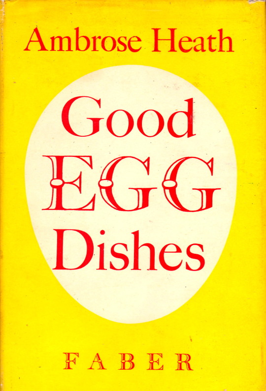
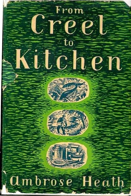
Below are a the beautiful covers of his other books without ER or EB. I think all the samples I have selected where published and thus designed by Faber & Faber.