I am unsure what the public perception was of Duncan Grant in the 1950s, if people knew he was homosexual or if Vanessa Bell’s infatuation with him masked that.
Either way it is surprising to see murals by Grant in a Cathedral given attitudes to such bohemian artists in the church. But in Lincoln Cathedral there is a cell with his homoerotic murals designed on the theme of Lincoln’s history in the wool trade.
As with anything Bloomsbury, nothing is simple, so here is a bit of background on Bell and Grant:
Vanessa Bell, married Clive Bell in 1907, and had two sons in quick succession. The couple had an open marriage, both taking lovers throughout their lives. Vanessa had affairs with art critic Roger Fry and with the painter Duncan Grant. Vanessa succeeded in seducing Duncan one evening and she became pregnant in the spring of 1918, having a daughter, Angelica in 1918, whom Vanessa and Clive Bell raised as his own child.
In 1942, aged 24, Angelica married David Garnett. The relationship had begun in the spring of 1938, when Garnett was married to his first wife, Rachel “Ray” Marshall, who was dying of cancer. Angelica had four daughters with Garnett.
Garnett was a member of her parents’ circle, a former lover of Duncan Grant who had also attempted to seduce Vanessa Bell. When Angelica was born, Garnett had written to Lytton Strachey saying of the baby: “Its beauty is the remarkable thing … I think of marrying it; when she is 20 I shall be 46 – will it be scandalous?”
In fact Garnett was nearly 50 at the time of their marriage. Despite their consternation, Angelica’s parents did not inform their daughter of these details of Garnett’s past, although various associates of the family did attempt to warn her against the marriage: John Maynard Keynes had her to tea. Angelica lost her virginity to Garnett in H.G. Wells’s spare bedroom. ‡
They were a bohemian lot.
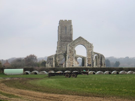
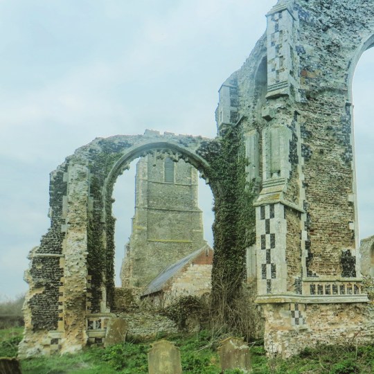
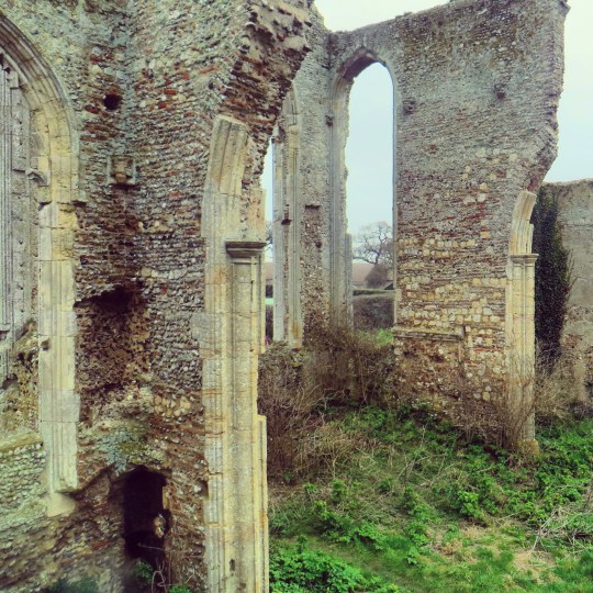
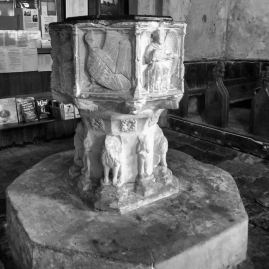
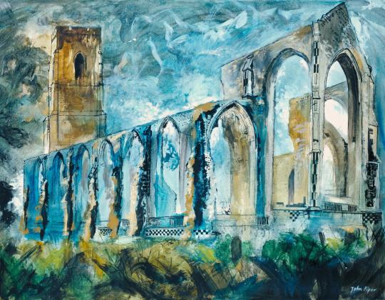
The Russell Chantry, Lincoln Cathedral, before the Duncan Grant murals.
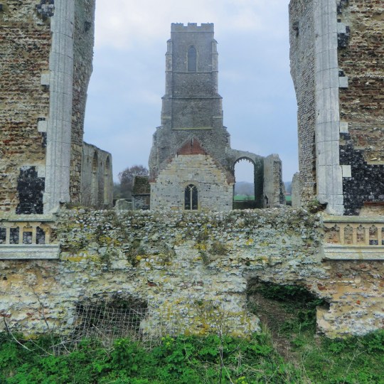
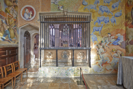
The Edwin Austin Abbey Memorial Fund, set up in 1952 by the widow of the illustrator and historical painter to promote murals in public places, had placed a notice in The Times on 2 May 1952 inviting proposals. One of these had come Duncan’s way, helped no doubt by Vanessa’s presence on the Fund’s committee, and he was to decorate the chapel dedicated to St Blaize, patron saint of the wool industry, in the Russell Chantry at Lincoln Cathedral. †
St Blaize was a doctor from a rich family who renounced his possessions and lived in caves and hillsides, caring for the animals.
After seven years the murals where finished in 1959, they where effectively hidden from public view. The subjects Grant painted were just too homoerotic for the church at that time. The space was used a broom-cupboard for a while in the 1970s.
With the mass publications of various Bloomsbury books and the rise of interest in Duncan Grant, the chapel was re-opened for public view after restoration in 1990. However when I went in the summer of 2018 the room was locked and wasn’t mentioned on the handout map given when you enter the building.
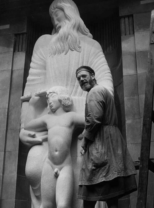
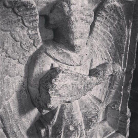
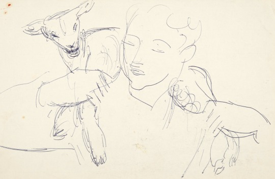
Below is a study for the Christ figure that Grant painted, the study is likely of Paul Roche, Grants lover and painting model.
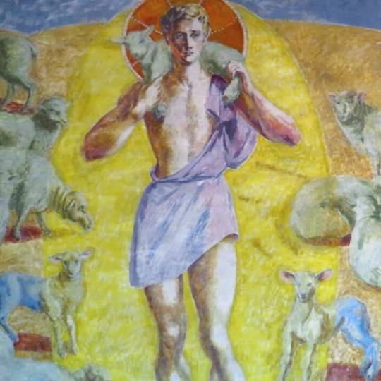
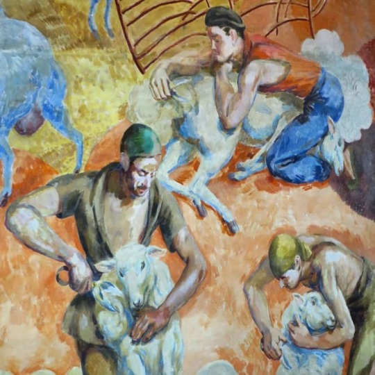
In London, Duncan had begun to draw Paul in some of the poses that he needed: for the men shearing sheep and for the full-length figure that dominates the altar wall, the Good Shepherd, carrying a sheep on his shoulders.
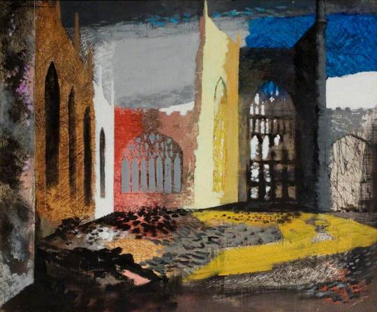
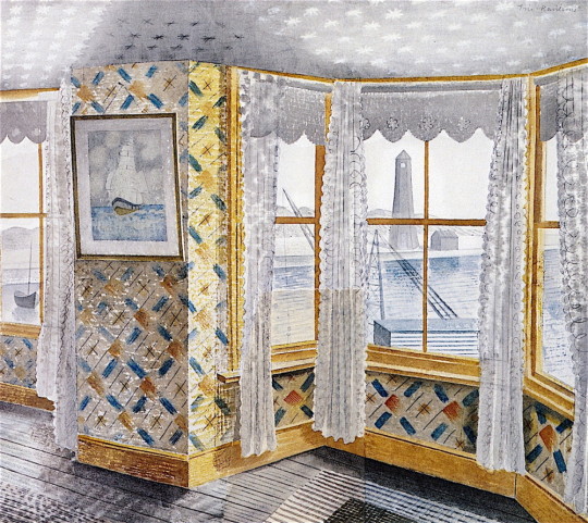
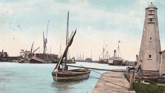
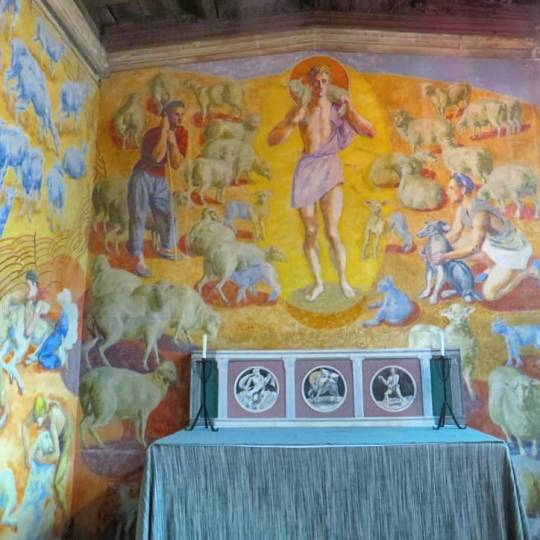
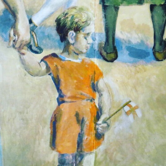
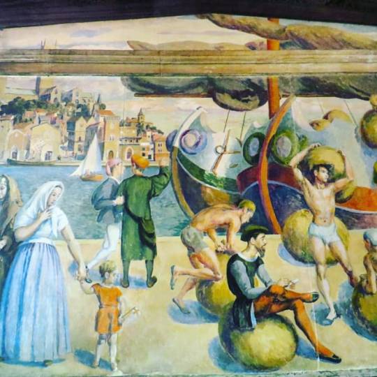
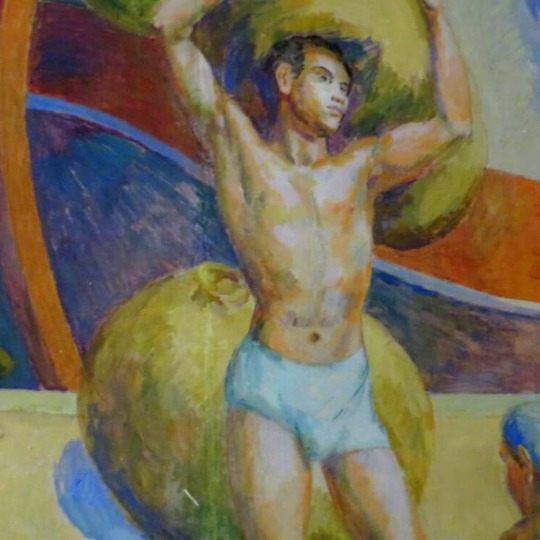
On the wall opposite he was to paint a view of medieval Lincoln, with a busy harbour scene in the foreground. On the right-hand side men heave bales of wool, their balletic poses echoing the curves found in the ships’ prows, while on the left three statuesque figures (Angelica, Vanessa and Olivier) are linked with the men by the small boy pulling at Olivier’s hand. †
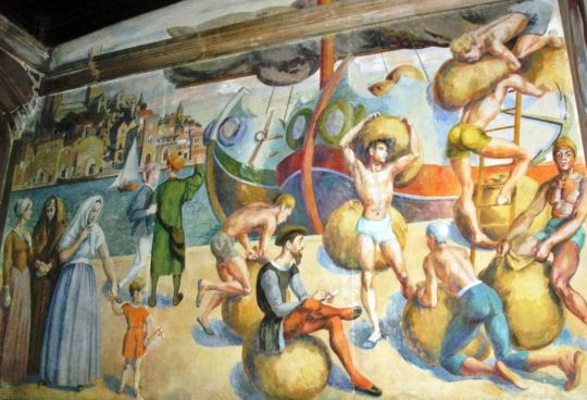
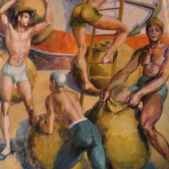
The large ships with the homoerotic and suggestive men are likely what caused the greatest offence to Anglican eyes in the 1960s. The men bending over normally in front of other men’s groins and perfectly painted bums.
As mentioned above the three women below are from Grant’s household. Angelica Bell his biological daughter, Vanessa Bell and Olivier Bell, the wife of Vanessa and Clive’s son Quentin Bell.
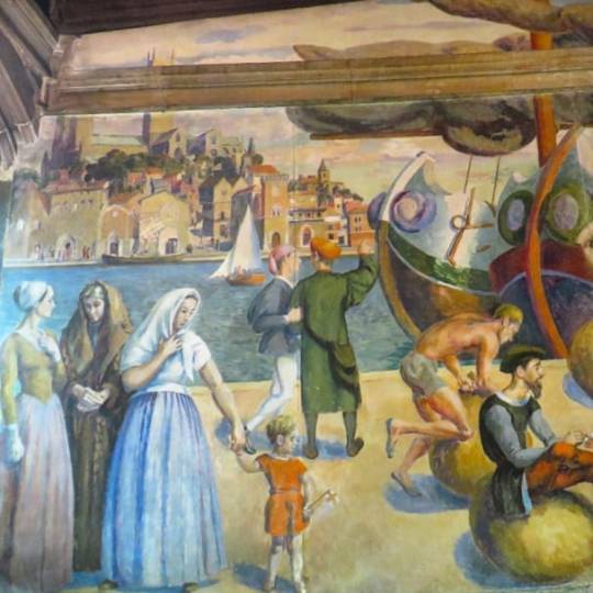
Even the little boy looks a little phallic with his flag stuck out at a saucy angle.
In October 1955 Duncan, while painting his Lincoln murals, jumped off a high stand on to a stool that overturned, and cut his head on an electric fire. The accident was minor, but the murals he was painting played a large part in helping him through a low period, for the public at this time showed little interest in his work. †
In the image below you can see a round window above the door painted in with St Blaise looking toward the alter. By the time Grant had finished the works he was in his mid-seventies.
In 1958 Duncan completed the Lincoln murals, which had for so long dominated the studio at Charleston. In order to see them installed, he and Vanessa travelled north and booked in at the White Hart. †
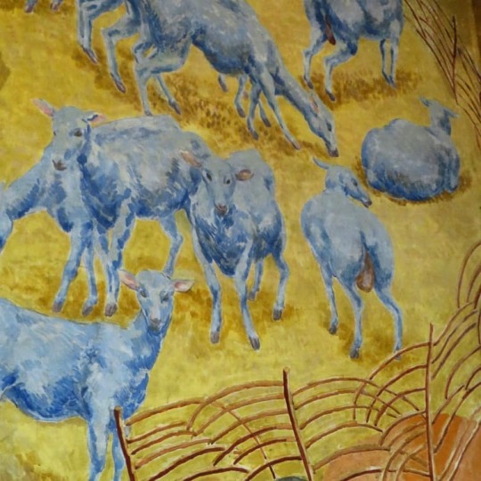
He had put a great deal of thought and labour into this decorative scheme, and at one point had used paper cut-outs to help him decide on the exact positioning of the sheep on either side of the Good Shepherd. Paul had modelled for the young beardless Christ. Consciously or unconsciously, Duncan had drawn on an early Christian tradition which, to ease the transition from paganism to Christianity, depicted Christ in a manner reminiscent of Mercury. Duncan’s Good Shepherd, surrounded by a mandorla of light, fills the centre of the altar wall and faces the view of medieval Lincoln on the wall opposite. †
The picture below is a study in the art gallery in Lincoln of the mural back wall with the original headdresses on the three women and the rest of the scene remarkably similar to the final result, other than Lincoln looks more Italian in the final mural.
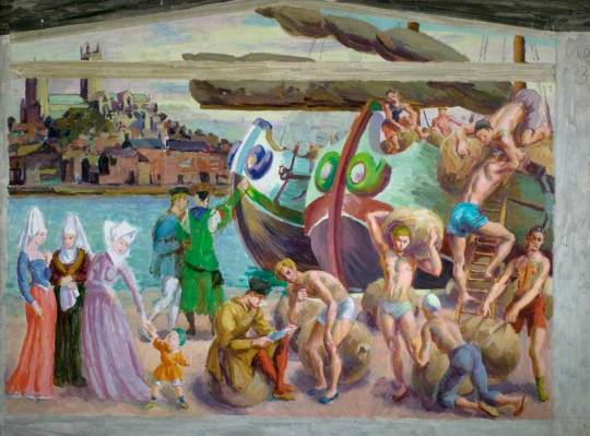
Study for The Wool Staple in Medieval Lincoln
The final work was painted in oil on fibrous plaster-boards, which gives to the oils an impression of the chalky surface of fresco. Once the panels arrived in Lincoln in the summer of 1956 they were attached to the walls on battens over the following two years. Duncan Grant and Vanessa Bell attended the unveiling in July 1959, when they stayed as usual in the White Hart Hotel. Vanessa died two years later, while Grant was to live to ripe old age, still travelling and painting and enjoying exhibitions, often with his friend Paul Roche, the model for The Good Shepherd. †
† Frances Spalding – Duncan Grant, 1997
‡ Angelica Garnett – Wikipedia