Bawden’s Bible

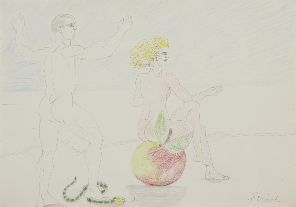
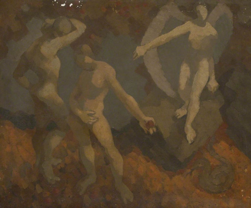
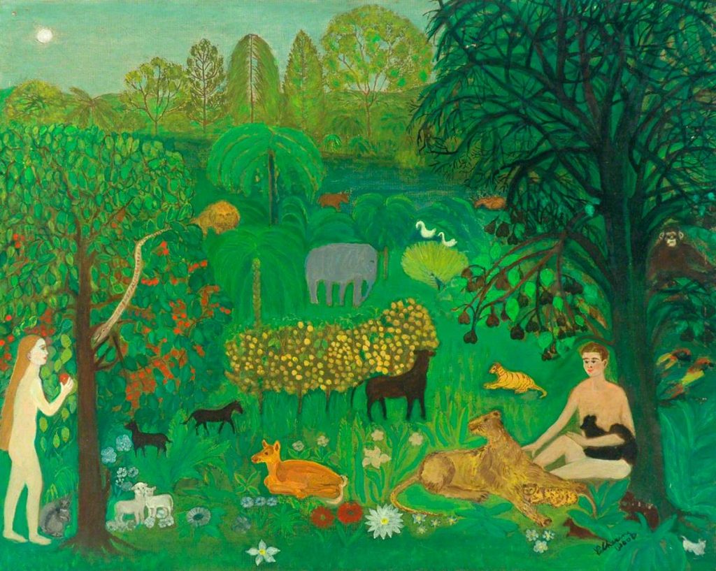
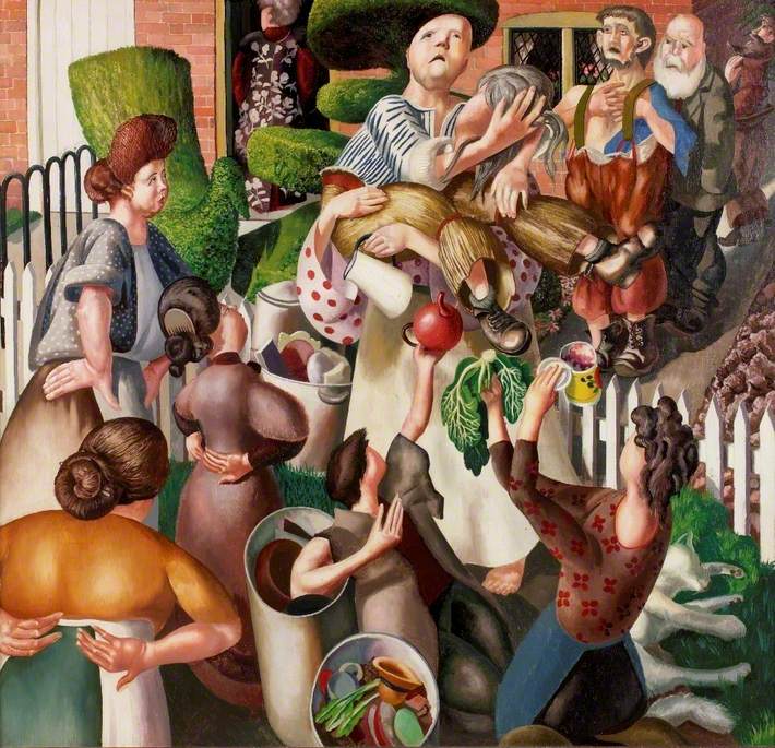
In the 1960’s the Oxford University Press embarked on an expensive project of an illustrated Bible by all the hip artists of the era. It was called The Oxford Illustrated Old Testament: With Drawings by Contemporary Artists. The text used the 1611 King James Version and it came out in five volumes, with a staggered release over two years.

Each volume was a hardback binding and the series had around 700 illustrations. Illustrators include: Edward Bawden, Ceri Richards, Edward Ardizzone, David Hockney; Brian Wildsmith, Peter Blake, Carel Weight, John Bratby, Brian Robb, Francis Hoyland, Cecil Collins and many more.

The problem the series had was the expense and the colour illustrations were switched to black-and-white, meaning artists work like Peter Blake and Leonard Rosoman, whose work was vividly colourful turned out to be similar tones of grey.

Bawden’s statement on the project:

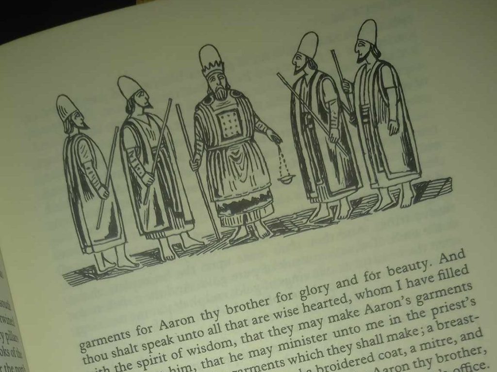
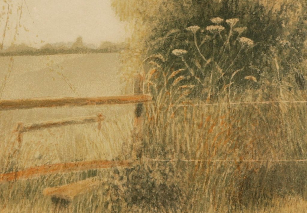
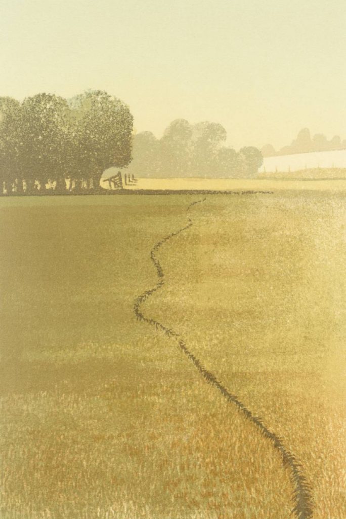
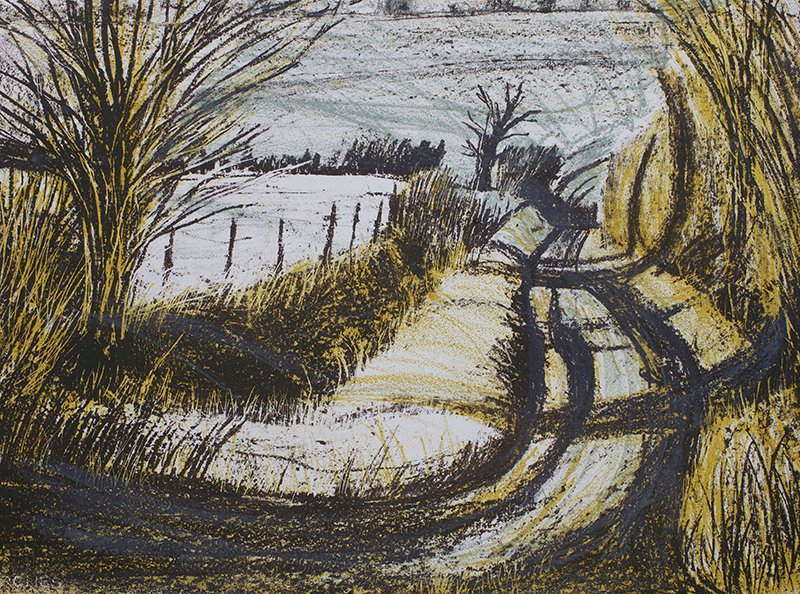
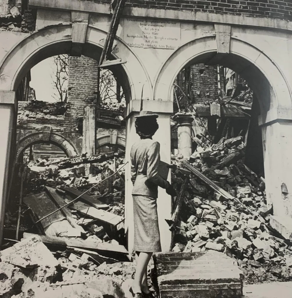
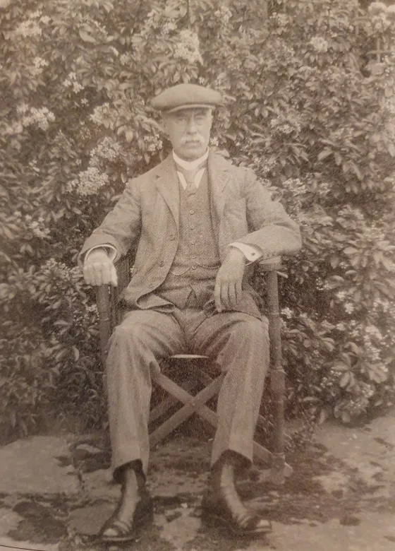
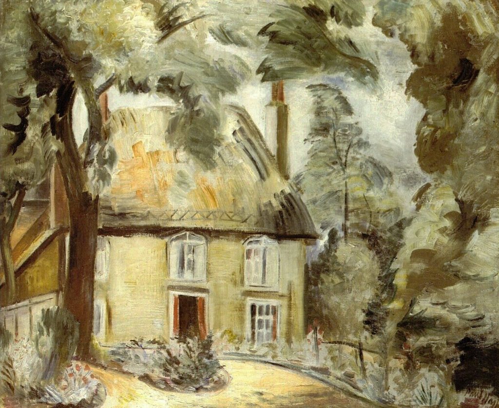
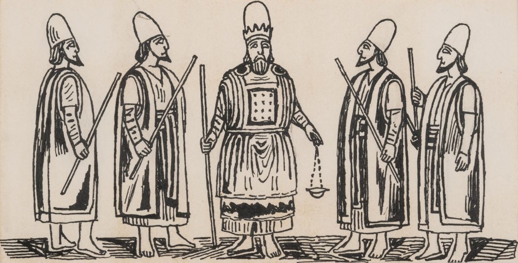
The interest I have felt in making drawings to illustrate passages in the Old Testament, especially for Genesis, might not have been quite the same without having had the experience of serving in the Near East in the Second World War. During a year which I spent in Iraq I was able to draw the Marsh Arabs, later on I made drawings also of the Kurds who live in the mountainous country to the north.

In Kurdistan there was the annual migration of tribesmen and their families from the summer pasture to the winter quarters; flocks grazing and moving slowly forward with the men, followed by the womenfolk on foot or riding on donkeys. It was a scene that might have been much the same when Abraham journeyed from Haran to Canaan.

Nomadic Arabs who live in tents have also an immemorial way of life, and whatever changes may have occurred since Old Testament times, there is today the same impression of life as it was lived in the past.

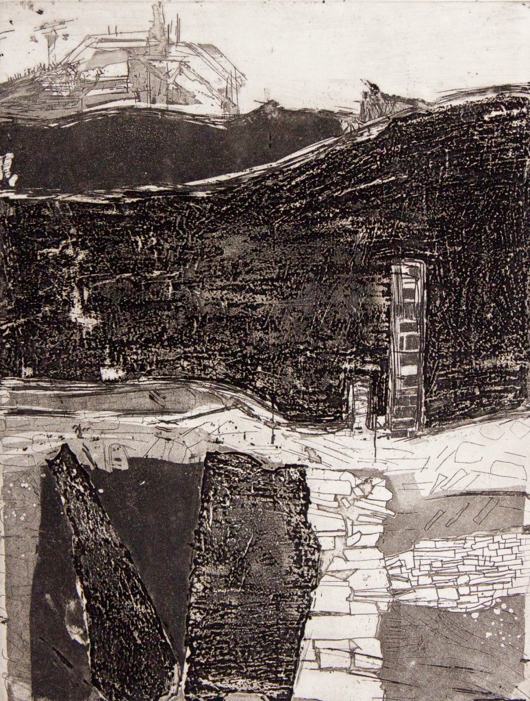
The account of the lives of the Patriarchs and the description of happenings that took place in those days are extraordinarily convincing as a visual record. There is, however, a feeling of remoteness about this historical past. I have tried to recreate my own impressions of the Near East and its unfamiliar character, the strange desert landscape, arid and hostile, and the tent- dwellers who live in these surroundings, because as an illustrator I would like to identify myself more intimately with the spirit of the Old Testament stories.

The Oxford Old Testament Drawings, RA, 1968.

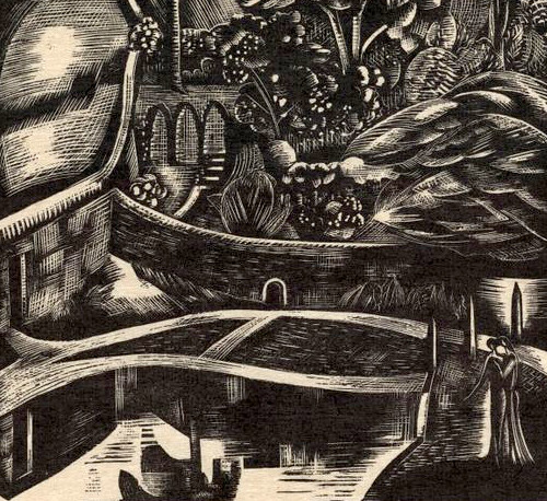
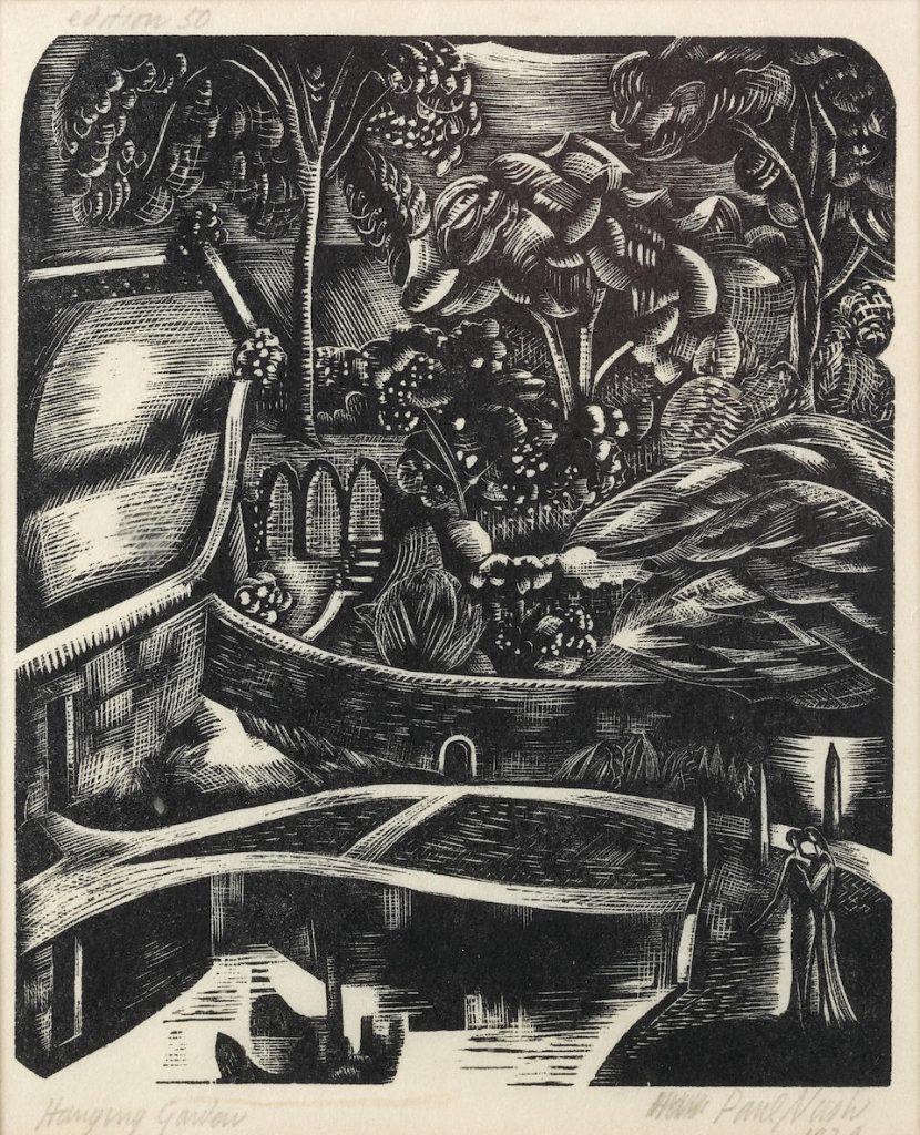
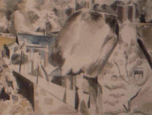
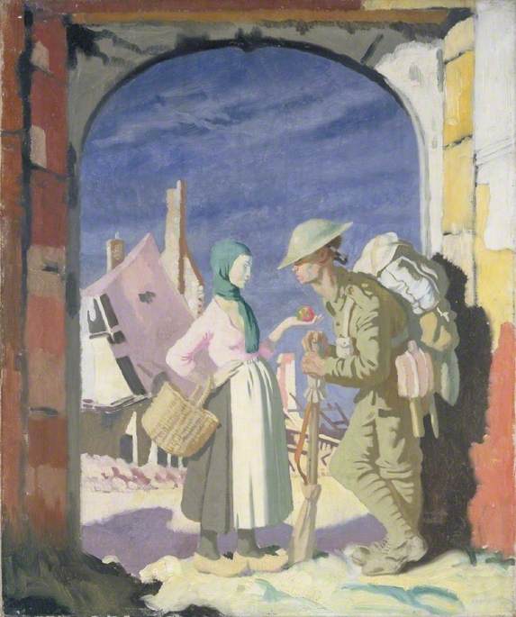
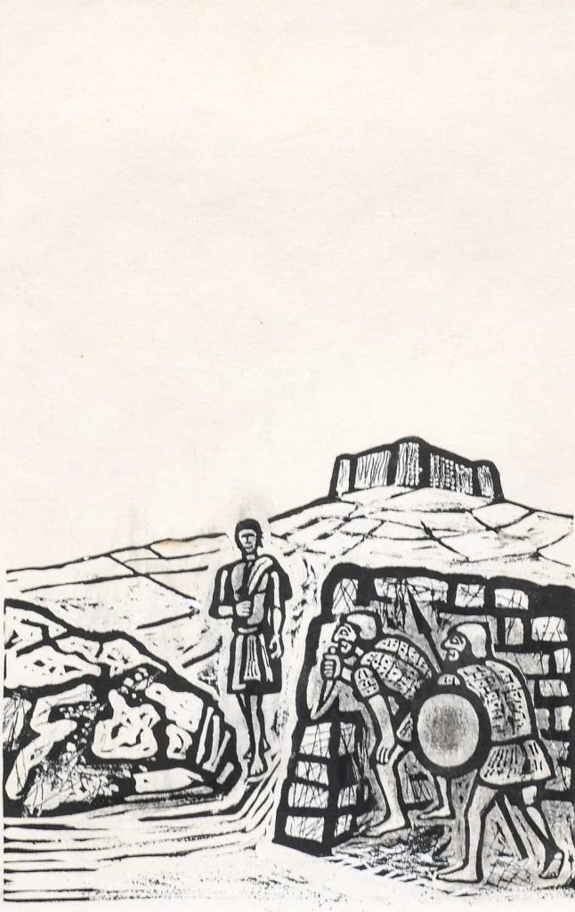
In the first volume Bawden provided line illustrations and then in the later ones they were his drawings with ink painted on as if they were linocuts, a trick he used for many of his dust jacket designs, as seen in the illustration below.

Vol.1: The Pentateuch: Genesis to Deuteronomy (435 pages).
Vol.2: The Historical Books: Joshua to Esther (531 pages).
Vol.3: The Poetical Books: Job to The Song of Solomon (356 pages).
Vol.4: The Prophets: Isaiah to Malachi (532 pages).
Vol.5: The Apocrypha: Esdras to Maccabees (438 pages).

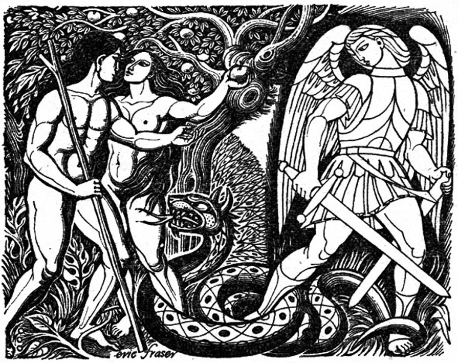
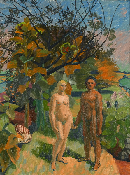
The Oxford Illustrated Old Testament will break away from the old-established tradition of illustrated Bibles by using the work of twenty-two distinguished contemporary British artists. The five volumes will attract the artist and the connoisseur of book illustration, as well as those readers of the Bible who will welcome a strikingly illustrated edition of the Old Testament. All the seven hundred drawings commissioned are on show in this Diploma Gallery exhibition. The majority are for sale. To illustrate Biblical themes is a testing enterprise, making special demands and frequently stirring unsuspected depths of power. To illustrate the whole of the Old Testament in its variety and majesty calls for a group of artists, each with complete freedom to contribute his own vision, his own intuitive or intellectual response. Each artist was invited to undertake a particular book (or portion of a longer book), and each was given complete freedom of interpretation, in any black-and-white medium. The dramatic way in which contrasting imaginative concepts come together in these volumes will, it is hoped, justify the undertaking. The work will be published in five volumes, the first three in the autumn of this year, the remaining two in the spring of 1969. The volumes are divided as follows: 1. The Pentateuch (Genesis to Deuteronomy); 2. The Historical Books (Joshua to Esther); 3. The Poetical Books (Job to The Song of Solomon); 4. The Prophets (Isaiah to Malachi); 5. The Apocrypha. The text used is that of the Authorized Version, chosen as the classic and most widely known English version, a common heritage to which each artist and reader might respond in his own way. Inevitably some of the artists first approached were too heavily committed to accept the invitation, though all were attracted; but an impressive group was finally assembled. Their own comments on their approach to the work will be printed at the end of each volume, and are reproduced in full in the pages of this catalogue.

The printing process is offset lithography and the illustrations include work in pen, wash, gouache, chalk and pencil, as well as some etchings. Being drawn for reproduction, some of the originals carry apparent blemishes-erasures and whiting-out marks, for example-that will not appear on the printed page. The illustrating of books is an exacting and, at present, an under-regarded art. This exhibition, and the volumes that are to follow, may help to restore the balance.

The Oxford Old Testament Drawings, RA, 1968.

In Praise of Michael Carlo

Michael Carlo – The Chair, 1984

The Suffolk printmaker Michael Carlo is maybe melined for his orange style prints, but I think they have a beauty that has been overlooked for so long. Working for the Curwen Press and Christie’s Contemporary Art made his work very popular in large editions. You don’t see them so much anymore and I think it’s a shame. I have quite a collection of them. I think the woodland and pathway prints also have a wonderful technical ability to them that is overlooked.

Michael Carlo – Mid-day, 1978

The image of the dappled light in woodland is a universal picture. I see it all over Britain and in the lanes on my cycle rides into Cambridge. I think what is important about the method of his printing at that time was how painterly it is. Printed in layers of colours, it is the areas Carlo leaves blank for the yellow and white to appear though the greens as weeds and cow parsley that grow on the edges of paths like this.

Michael Carlo – Wooded Lane, 1976

I can’t help feeling if these screen prints and lithographs were blown up in size to fill whole walls people would be impressed with Carlo’s technical ability. After having a lucrative series of prints of Christie’s Contemporary Art in the 70s and 80s, he became more abstract and worked in a series of colourways. Like the print below, a woodcut of a field and woodland in an explosion of colour.


Here is some text from Carlo’s website that is rather entertaining and I have illustrated with his works:

From the very start I loved it at Colchester Art School: I found my tribe. With staff including Edward Bawden, John Nash, Peter Coker, Edward Middleditch and Nigel Henderson, It was so exciting. After two years I specialised in painting and printmaking and was encouraged to go to North Wales and visit the slate quarries, to get away from East Anglia and the fields and the big sky.

Michael Carlo – Slate Quarry North Wales, Etching, 1966

I hitchhiked there with a tent and a large drawing board in the summer of 1964. I did a huge quantity of drawings and photographs and in Feb 1965 it got me into the royal college of art and into a flat in Shepherds Bush. At the RCA I learned to do photo screen printing; I also won the lithography prize, despite the big move to ‘pop’ art, I stuck to slate quarries.

Michael Carlo – London Transport Poster.

In 1972, unable to buy a house in London, I moved out to Essex, near Braintree, to a derelict cottage surrounded by fields and after a short time became obsessed by the land, weather and time of year. I had an etching press by then and was also doing simple hands on silk screen printing.

By 1976 I was working a lot of the time for Christie’s Contemporary Art, producing commissioned silk screen prints in large editions, doing all the printing in a small outside wash house, my studio. In 1979, with the help of a contract with CCA I was able to move. On a visit to my parents in Suffolk, near Glemsford, I saw a large barn with other outbuildings and a small barn part-converted into a house. My first job was to convert a row of stables and pigstys into a long studio. I also bought a stone lithography press and gave up part-time teaching in London and Southend-On-Sea.

Around 1995 I stopped doing prints for Christie’s Contemporary Art which gave me complete freedom to do as I wished. My work became less romantic, a little harder. I did more etching and stone lithography plus I started doing reduction woodcuts using MDF in very small editions of 12 or 15. Not of 250.

Michael Carlo – Winter Sun In The Lane, 1990

Fashion Is Indestructible

If you think Anna Winters was the original pioneer of Vogue, you’d be quite wrong. Audrey Withers was editor of Vogue from 1940-60, and she worked with many photographers to make the magazine stand out. One of the most remarkable photoshoots was this series by Cecil Beaton set in blitz bombed London.

Today I think, if you took these photos there would be an outcry of insensitivity, however, the contemporary opinion of these photographs were that London, like fashion, is indestructible.

Paper Bag

The first woman to be issued a patent in an American court, was Margaret Eloise Knight (1838-1914) for a machine for folding and gluing flat-bottomed paper bags.

As a little girl, ‘Mattie’ (as her parents and friends nicknamed her), preferred to play with woodworking tools instead of dolls, stating that “the only things she wanted were a jack knife, a gimlet drill, and pieces of wood. She then made kites and sleds out of wood.

After the early death of her father, Knight was forced to leave school aged 12 and work in the cotton loom mills in her town. After an accident at one of the mills where a shuttle flew off the loom stabbing a worker, she suggested a safety measure that was adopted with no credit to her.

Ill health ended her work in the mills but in order to survive she worked any job she could set her mind to. In 1867, she moved to Springfield, Massachusetts and was hired by the Columbia Paper Bag Company. She noticed that the envelope-shaped machine-made paper bags they produced were weak and narrow – unsuitable for groceries and hardware goods.

The British had been using paper bags since the 1840s and also had machines that made wider bags, however what Margaret Knight was to do was to make a machine that cut, folded, and glued paper to form the flat-bottomed brown paper bags familiar to shoppers today.

The trials to make the machine took three years and in order to obtain a patent a model of the machine was made in iron. During the manufacture, the design was stolen by Charles Annan, who had seen the prototype in the workshop of the company producing it and applied for a patent first. When Knight attempted to patent her work, she discovered Annan’s patent and filed a patent interference lawsuit in the autumn of 1870. She won the claim based on her journals, drawings and witnesses and was granted the patent for her machine. She was not the first woman to be awarded a patent but she was the first to win one in court.

With the patent she teamed up with a businessman and formed the Eastern Paper Bag Company. She received royalties from her invention that were capped at $25,000, around one million dollars today. Knight went on to be awarded another 26 patents and on her death an obituary was headlined as a “woman Edison”.

The eloquence of an Essex printmaker

This is an interview with Michael Rothenstein. I think things like this are important to put online because there is too much artistic speculation today in replacement for research and facts.

Michael Rothenstein’s prints of cockerels make an immediate impression on you the moment you enter the 1981 Royal Academy Summer Exhibition – beckoning the eye, their vivid contours eloquent of the printmaker’s art.

A graphic artist and printmaker, Rothenstein worked for many years in Great Bardfield, where in 1954, he founded the famous graphic workshop. Later he moved to his present studio a large barn at Stisted, near Braintree. Here, away from that hub of activity (the workshop at Great Bardfield attracted thousands of visitors every year) he feels he can work more privately. “Each technique has its own magic, and different artists come upon a technique which for them is magic at different times in their lives”, says Rothenstein, who did not himself discover printmaking until he was over forty. Once he had embarked on the process it took him over completely. “It was like a rebirth”, he says. Because printmaking had relatively passed him by when he was at art college, Rothenstein was able to convey the excitement of his own discovery in the books he began to write on printmaking. in the 1960s.

His graphics were immediately widely reproduced. Today from Stisted, working with Shelley Rose (a talented young printer who is his part-time assistant) his work is shown all over the world, rare for a graphic artist. Already this year there’s been a large retrospective exhibition in Scandinavia as well as exhibitions in West Germany, at the Tate and the
V&A and his works on paper will be shown all summer in the prestigious Ljubljana Biennale.

Over the years Rothenstein has developed a finesse and precision hitherto unattained for such a revolutionary process. For many of his relief prints he uses huge tree-trunks which he obtains from Sible Hedingham. He also uses quite cheap crate wood waste from a factory in Braintree, as well as corroded iron and lino.

A lithe-bodied, charming man, his sustained vigour, evident during twelve gruelling weeks on the Royal Academy Senior Hanging Committee, left younger colleagues marvelling. “I put it down to a reformed diet”, he says. For the recipe-book by Royal Academicians, which the Royal Academy is to publish later this year, Rothenstein own contribution is an invigorating breakfast which includes muesli, homemade yogurt, lecithin, wheat-germ and blackcurrant juice, ideas inspired by the American “nutrition against disease” movement. His cover-illustration of this book, the cockerel, points again to how this virile theme runs constantly through his work.
Rothenstein exhibition “Works on Paper” at the Minories, Colchester, took place in May. That same month his barn was the centre for an art exhibition by children from seven Essex schools, part of the Braintree Arts Festival – for Rothenstein is also: president of the Braintree Arts Association.

Next year he plans to exhibit in the gallery of Gainsborough’s House in Sudbury. Here a print workshop has been set up in the garden for artists who work in print, but have no presses of their own. There is a permanent portfolio of their work on show in the gallery itself.

Rothenstein feels strongly that there should be a centre in North Essex where the many distinguished graphic artists who work there could have their work permanently available to the public. “There is nothing like this at present in the area and they deserve it!” he says.


Mauve

Mauve is a synthetic dye named in 1859. Chemist William Henry Perkin, then eighteen, was attempting in 1856 to synthesize quinine, which was used to treat malaria. Though his experiment failed, Perkins found that the solution in the bottle was a purple colour, stained fabrics and would not wash out. He had discovered the first aniline dye. Perkin originally named the dye ‘Tyrian purple’ after the historical dye – but he filed for a patent in August 1856 (patent No. 1984). The product was renamed mauve after it was marketed in 1859 to Perkin’s mauve, mauveine, or aniline purple.

Choice of mauve shades of paint

He established a factory in Greenford Green called Perkin and Son and in 1860, Queen Victoria wore a silk dress dyed in the colour. The public went wild from this royal patronage and the introduction of this new colour caused a craze that took over the public’s imagination. Everything that could be dyed mauve, was. The previous fashions in colour were brown or beige and dyes were made from insects or botanical substances, that needed large quantities and made them expensive.

The passion for this colour also fuelled a race in chemistry to find the next wonder dye to be a colour of the moment.

Crystal Clear

Jacob Epstein – Orchids, 1954

The American crystal glass company Steuben was set up in 1933 as a branch off of another company founded in 1903 by British glassmaker Frederick Carder. The Corning Glass company took over the company in 1918 and then Steuben was founded to be the high end department. The ethos of Steuben was hand blown and crafted design. Their companies design department was set up under the American sculpture Sidney Waugh who designed many of the shapes of vases but also engraved them too. Their headquarters and centre was the rather airport and modern looking Corning Glass Center, Corning, New York, pictured below.

Steuben wanted to push their wears on the British Market, so they went on a charm offensive, commissioning British artists to make designs for various pieces in their collection. These were then engraved and made up part of an exhibition at Park Lane House, 45 Park Lane, London, an exhibition centre throughout the 1950s. (Not the location of the Dorchester, as that is build on top of 25 Park Lane and the numbers were all changed in the 1960s)

The event ran from October 14-November 9, 1955, and had its own booklet printed by the Curwen Press of the history of the company and images of some of the designs. The whole event was designed to inspire the public, but most of all, shop chains to stock the companies domestic ranges of glasses and decanters (many of these would be custom orders as wedding list gifts, rather than items on the shop shelving, prêt à partir). Most of these companies will be ones only your mothers will recall, like, Debenhams, Binns, Peter Robinson, Dickins & Jones and other stores consigned to history.

Below are some of the designs by the British artists they engraved.

The engraved designs were likely one off and individual. This might be reflected in the prices that were rather steep for the time in 1954. Listed in American dollars the prices are: Muirhead Bone’s Spanish Fountain $1200. Jacob Epstein’s Orchids $2000. Duncan Grant’s Summer $750. Graham Sutherland’s Mantis $900.

Many other artists listed in the exhibition booklet, but not depicted included: John Nash, John Piper, Matthew Smith, Reynolds Stone, Eric Gill, Leslie Durbin, Robin Darwin and Cecil Beaton.

As a bonus image, below is a vase by Matisse that was also included in the exhibition. This was part of a French collection of designs Steuben made in 1939. It was bought by the Louvre. Many of the unsold British designs were donated to the New York Museum of Modern Art.

Matisse – Pan, 1939

The Visitors Book

Percy Withers (1867-1945)

Dr. Percy Withers (1867-1945) is said to have had a wonderful skill with keeping friendships, but this is likely due to his welcoming hospitality of visitors at his Lake District and Oxford homes, and for keeping up with correspondence. His popularity is visible in the pages of his visitors book, aptly called ‘A Paradise of Dainty Devices‘, titled after the Richard Edwardes poem. It was kept for the visitors of his home near Oxford, Souldern Court and later, Epwell Mill in Warwickshire.

Percy Withers bookplate, designed by William Nicholson.

The leather bound book contains handwritten contributions from poets such as A.E. Housman, W.B. Yeats, and Robert Bridges, alongside cartoon sketches by Max Beerbohm and William Rothenstein; watercolours by artists including Edward Vulliamy and most surprisingly Paul Nash and John Nash. Although most of the poems have been published elsewhere, the sketches and paintings are unique. The visitors book was donated to Somerville College, Oxon, by Audrey Withers, an alumni in 1976.

Withers was a physician and writer. He also gave lectures to many societies of his trips and travels, he also wrote books on a vast range of topics, from: Egyptology, Cumberland, and childrens verse, to his most known work, the biography of his friend A. E. Housman.

A.E. Housman in the garden of Souldern Court, 1922.

Withers was transferred to the National Service Board (Conscription) in Cambridge in the early summer of 1917 and Housman was the Kennedy Professor of Latin at Trinity College, it was at this time the men met and became friends. In the years after the war, Housman was a guest at Souldern Court. After Housman’s death in 1935, Withers wrote a biography of his friend, A Buried Life: Personal Recollections of A. E. Housman (1940) reviewed by Archie Burnett as “a sympathetic but somewhat baffled memoir”.

The pages below are all from the visitors book of Souldern Court, and it is the guests of Withers there, that make up this blog.

F. L. Griggs – A view in Souldern.
A. E. Housman – Illic Jacet, 1917.
Edward Vulliamy, Landscape, 1923
W. B. Yeats – When You Are Old, 1922.
John Nash – Landscape, 1924
Paul Nash – Souldern Court, Oxfordshire, May, 1922.

The view Nash painted is likely of the garden at Souldern Court. It is likely that the tennis court at the property now, existed in Nash’s time.

Souldern Court, Souldern near Banbury

Percy Withers asked Paul Nash for four watercolours of the house and village, they were Nash’s first commision. Nash looks to have painted the works in oil but he only returned three works out of the four.

The painting below, is the view over the road from Souldern Court. The elevated angle of the work show Nash must have painted it from his bedroom window as it is before he started to use photography as an aide memoire.

Paul Nash – Pond at Souldern, 1923

SOULDERN or “SULTHORN” as it was originally called was founded before Roman times — it lies between the flood plain of the River Cherwell and the upland of the Great Oolite, from which limestone water percolates down to emerge as excellent springs. One of these may be seen as Souldern pond, old name — Town Well. A photograph taken in 1905 is shown (below).

http://www.souldern.org/history/

The oil painting of the pond at Souldern, and below is the photograph. I am delighted to say the village scene looks the same today.

In 1923 Paul Nash also made a wood engraving of the view and called it Hanging Garden, it was editioned in 1924.

Paul Nash – Hanging Garden, 1924

Below is one of the other paintings from the village, though even with those iconic windows, I can’t trace the buildings location.

Paul Nash – Thatched Cottage, Souldern, 1923

Below is a watercolour painting by Paul Nash of Cottages in the area. However the photograph comes from the 1995 auction guide and is as clear as I can make it. Another painting called The Walnut Tree (1923), a watercolour was sold in 1989 but last exhibited in 1975 at the Tate Gallery Retrospective of Paul Nash.

Paul Nash – Thatched cottages, Souldern , 1923

Adam and Eve

Sometimes when writing the blog it is helpful to pick a topic that artists paint and react to, in this case it is Adam and Eve. Go into any gallery and normally there are at least ten paintings of this bible tale, but those paintings, usually pre 1900, were made to sell under a system of patronage of artists and their collectors. Today the topic is less fashionable, but I think these are curious works by modern artists.

Eric Fraser – Adam and Eve.

Charles Mahoney – Adam and Eve in the Garden of Eden, 1936.

Adam and Eve in the Garden of Eden, 1936

Elisabeth Frink – Adam and Eve, 1968

Thomas Watt – Adam, Eve, Serpent and Angel, 1947

Catherine Wood – The Garden of Eden, 1971

In the picture below we have a curious bending of the tale, with Péronne used as the location, a shelled and bombed town in the Somme during World War One. A paradise lost and in ruins.

William Orpen – Adam and Eve at Péronne, 1918

Stanley Spencer – Adam and Eve in the Garden of Eden, 1936

What I also have thought of is the colour red and it’s link to danger, from signage, to the ruby slippers of Dorothy Gale. The serpent is green but the fruit is red.

The artists at Cresta

Wells Wintemute Coates design for the Cresta shop front.

Tom Heron (the father of Patrick Heron) was born in Bradford in 1890. He had rather artistic connections and unusually for a manufacturer at that time, he was left wing and was in the Guild Socialist League, taking on sweatshop conditions in factories and mixing with left wing artists and politicians. Heron was a silk manufacturer with Cryséde silks (1926-1929) and moved from St Ives, Cornwall to Welwyn Garden City in 1929 to set up Cresta Silks Ltd. For this high class, high fashion brand, he used professional gallery artists as designers, most notably Paul Nash, as well as architects like Wells Wintemute Coates to design their shop fronts and logos and packaging designed by Edward McKnight Kauffer.

Cresta Silks Ltd was a dressmaking firm that specialised in producing high quality silk clothing during the 1930s and 40s, thereafter covering a more general … The early designs were mainly by artists who later became well known-Paul Nash.

Museum Bulletin – Volumes 23–24, 1983

Paul Nash – Phalanx Pattern, for Cresta Silks Ltd, 1930

When WWII broke out silk was requisitioned for parachutes so Heron switched to wool fabric enabling Cresta to continue. The company had to leave its Howardsgate factory which was used by Murphy Radio for essential war work. Cresta Silks went into Welwyn Stores temporarily and Heron went to the Board of Trade as ‘Advisor on Women’s and Children’s Clothing’ where he initiated the famous Utility Clothing scheme for the wartime population. In 1946 the company was able to return to its Howardsgate factory though it would eventually move back to Welwyn Department Stores in 1954.

Welwyn Garden City – Heritage Trust

Patrick Heron – Amaryllis, 1936

Paul Nash – Cherry Orchard, 1932

Paul Nash – Design, for Cresta Silks Ltd, 1930

Aztec – Patrick Heron, for Cresta Silks Ltd, 1947

Graham Sutherland – Web, for Cresta Silks Ltd, 1947

Below is a silk scarf by Patrick Heron, designed in 1948, but produced in 1985. ‘St Ives’ was one of the silk scarfs Patrick made for his father’s company, but Cresta Silks rejected it and didn’t produce it, so it was made as high class merchandise for the Barbican Art Gallery’s 1985 retrospective of Heron.

Patrick Heron – St Ives Design, designed in 1948, produced in 1985