Masquerading School Print

Following my Post on the John Nash ‘Harvesting’ Schools Print I thought I would present another unravelling of prints from my collection of books.

image

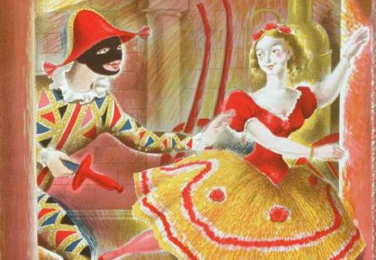
 A detail of Harlequinade by Clarke Hutton, 1946.

Stanley Clarke Hutton was born in Stoke Newington, London, on 14 November 1898, son of Harold Clarke Hutton, a solicitor, and his wife Ethel, née Clark. In 1916 he became assistant stage designer at the Empire Theatre. About a decade later he took a trip to Italy, which inspired him to become a fine artist.

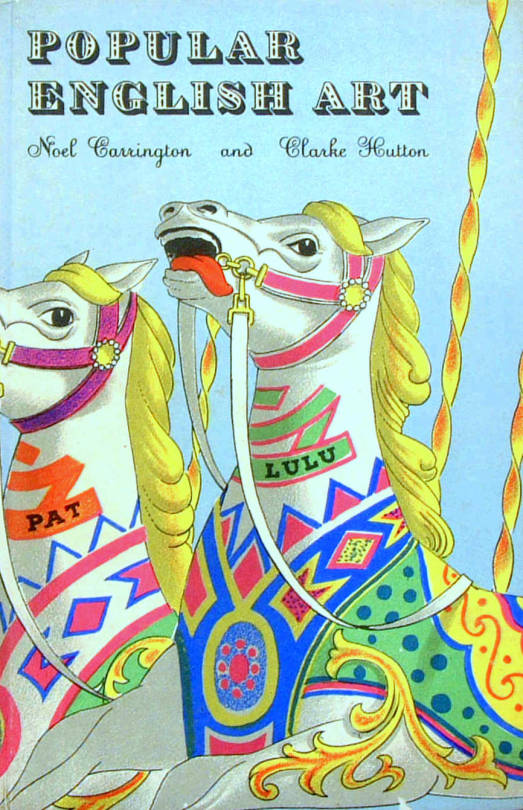
In 1927 he joined A.S. Hartrick’s lithography class at the Central School of Arts and Crafts in London, after Hartrick retired he taught the class himself until 1968. He experimented with the technique of auto-lithography with the aim of developing a way of printing affordable full-colour children’s books, and worked with Noel Carrington at Penguin Books to develop the Picture Puffin imprint. With Penguin he also illustrated Popular English Art by Noel Carrington, for King Penguin Books, in 1945.

He used the auto-lithography techniques he developed for the Oxford University Press’ Picture History series. Other notable publications where for The Folio Society. He illustrated about 50 books in all, for publishers in the UK and USA.

His paintings, figures and landscapes, were widely exhibited. His later work took on a surrealist influence. He died in Westminster in the second quarter of 1984.

image

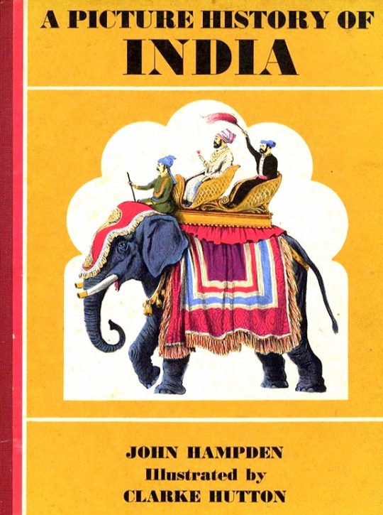
 A Picture History of India by John Hampden – Oxford University Press, 1965
Illustrated by Clarke Hutton

It was his illustrations for Noel Streatfeild’s ‘Harlequinade’ that the link to the Schools Print lays. It’s remarkably similar. Most of the figures are all represented, the harlequin, the ballet dancer and the policeman in the corner. Again under the same street light the clown, dog and jester appear.

The book was published in 1943 and the Schools Print was produced in 1946. So rather like the case of the John Nash ‘Harvesting’ the Schools print is made from recycled earlier sketches and ideas, in my opinion, to great effect – these days it would be considered good marketing for the book.

image

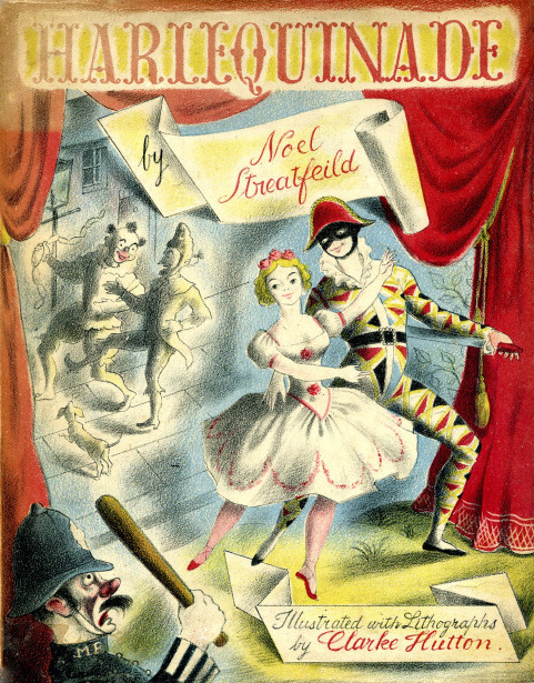
 Noel Streatfield – Harlequinade. Chatto and Windus, 1943.
Illustrated by Clarke Hutton

image

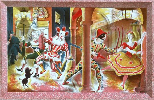
 Clarke Hutton – Harlequinade – A Schools Print, 1946.

About The Schools Prints:
Set up in 1945 by Brenda Rawnsley, the School Prints scheme commissioned well-known artists to create lithographs, which would then be printed in large numbers and sold cheaply to schools for display in classrooms. The aim was to give ‘school children an understanding of contemporary art’. Each lithograph had a drawn frame so that the print could be pinned to the wall. 

In the spirit of post-war optimism, artists responded enthusiastically. The scheme was a unique attempt at giving children access to original works of art in a period of austerity but ended in 1949 because of financial problems. 

King Penguin Books

The King Penguin book series were beautifully printed books. To me, they were like the Ladybird Books for adults, covering a wide range of unconnected topics and monographs.

image

 A Prospect of Wales, illustrated by Kenneth Rowntree, 1948.

The motive for Penguin Books was to broaden its appeal to the public. While still a young company, Penguin shocked the Publishing world with paperback books for sale by known and respected authors. Before that the idea of paperback fiction was to expect an unknown author and a throw-away after use book.

The original run of penguin books were black and white inside and mostly text, with the iconic two stripe colour banding. The colour schemes included: orange and white for general fiction, green and white for crime fiction, cerise and white for travel and adventure, dark blue and white for biographies, yellow and white for miscellaneous, red and white for drama; and the rarer purple and white for essays and belles lettres and grey and white for world affairs.

image

 D.H.Lawrence – Sons and Lovers, 1948. Original Penguin Book cover.

They were an British knock off of the Insel-Bücherei (Island Library) series published in Germany by Insel Verlag from 1912 onwards. The size of the German books with their repeated pattern book coverings was an inspiration. The head of Penguin books is quoted:

Why, we felt, should there not be a similar series of books in this country? The experiment, started a few weeks after war broke out, turned out to be successful. One of the most distinctive features of this series is their decorative covers.” †

image

  Friedrich Nietzsche – Poems. Insel Bucherei 

The aim of the King Penguin is different. These have not been planned to coincide with the public’s growing appreciation of art, but rather to appeal to the general liking for illustrated keepsakes of special projects.” 

The King Penguin series were also hardback books with colour lithographic illustrations, a move away from paperback and monochrome books.

image

 British Butterflies, cover by Paxton Chadwick, 1951.

The books originally combined a classic series of colour plates with an authoritative text. The first two volumes featured sixteen plates from John Gould’s ‘The Birds of Great Britain’ (1873) with historical introduction and commentary on each plate by Phyllis Barclay-Smith, and sixteen plates from Redouté’s Roses (1817–24) with historical introduction and commentary by John Ramsbottom. The third volume began the alternative practice of colour plates from a variety of sources. There were 76 volumes of King Penguin books in total.

Where as the educated scholars writing the books were the famous people at the time, today most people hunt for the illustrators, like John Piper, Edward Bawden, Hutton Clarke, Barbara Jones and Enid Marx.

image

 Birds of the Sea, cover designed by Enid Marx, 1945.

image

 Popular English Art, illustrated by Clarke Hutton, 1945.

image

 Life in an English Village, illustrated by Edward Bawden, 1949.

image

 Flowers of the Meadow, Illustrated by Robin Tanner, 1950.

† The Private Library p143, 1977