Eleanor Esmonde-White

There is so much not explored about the Festival of Britain. There are many books but with so many artists a lot of names get forgotten. One of them is Eleanor Esmonde-White (1914-2007). Her work for the festival is at the bottom of this post.

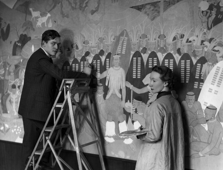
She was a South African artist born in Dundee in Kwa-Zulu Natal. She Studied fine art at the University of Natal in 1932 and was a scholarship to spend a year studying in London at the Royal College of Art alongside Le Roux Smith Le Roux (1914–1963). In order to be awarded the scholarship she had to agree not to marry before the age of 26, the government not wanting to waste money on a women who might drop out of the education or risk getting pregnant.

A few weeks into the first semester the renowned British architect, Sir Herbert Baker, announced that he was offering a scholarship to the two top South African art students to study at the Royal College of Art (RCA) in London. Baker had been commissioned to design South Africa House on Trafalgar Square in London as the headquarters of the South African High Commissioner.

According to Eleanor, Sir Herbert propagated the practice of decorating public buildings with murals and tapestries and aspired to establish a school in South Africa where artists would learn the skill of mural painting.

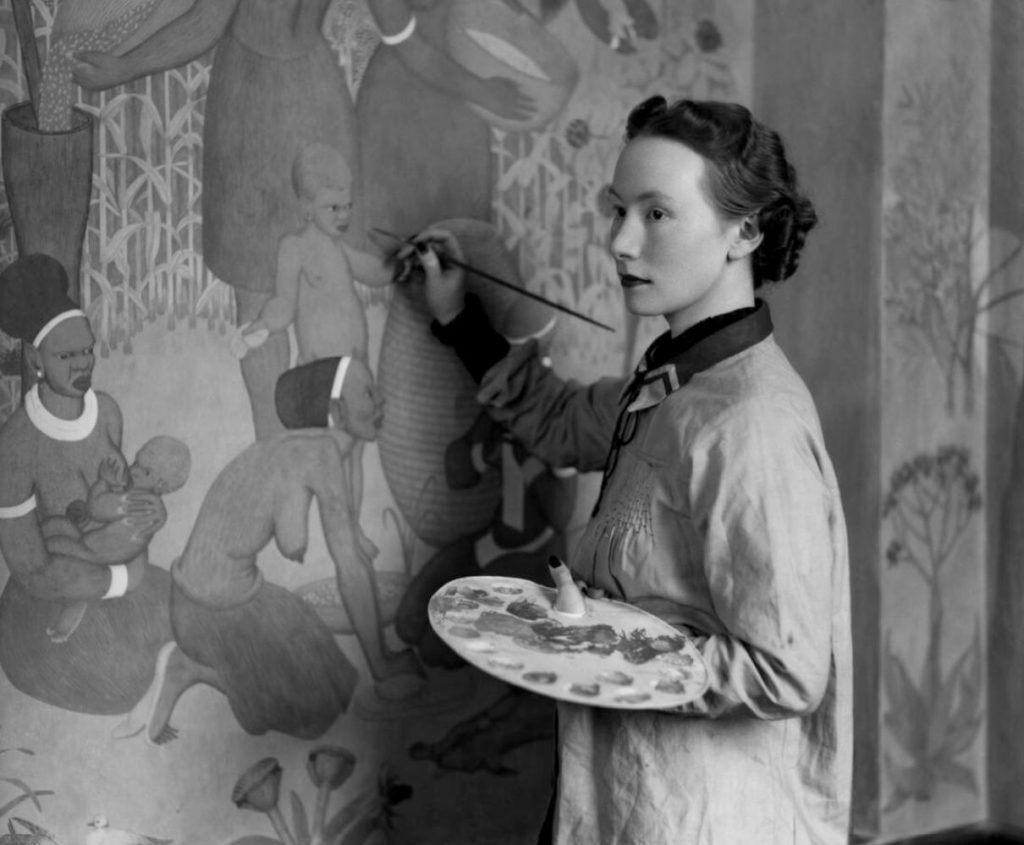
The murals took four years for them to complete. The caucasian world of the diplomatic service at that time were amazed when Esmonde-White told them of her plans to depict the tribes of South Africa, from the farmers to the Amazulus. The Amazulu mural was of a traditional ceremony that predated the white settlement of the country.

After apartheid in 1994, many of these were due to be painted over by a new wave of diplomats, with some of the scenes considered racist at the time. However their artistic merit was recognised and they were simply boarded over until 2012, when they were restored, ‘after it was decided they were not as offensive as first appeared‘ with the project headed by Lorna de Smidt, a South African political scientist and art historian who said ‘We had to acknowledge the past, and accept that it is there. You can’t just airbrush things out of history and pretend they didn’t exist‘.

Eleanor Esmonde-White & Le Roux Smith painting murals in South Africa House, 1936

The murals in 1936 were considered a great success and they both won scholarships to study mural design at the Royal College of Art for a year.

After the murals were completed Esmonde-White had a studio in South Africa House so she could work on murals for buildings in her homeland. She worked on a series of murals in London during the Second World War, with them being shipped off to South Africa, but the fashions of London for scantily clad figures were not received well and the murals was placed in the basement of a government office.

In 1945, the death of her father, a heavy workload and the war took their toll on her and she had a breakdown. Her mother who was in London took her to a farm in Wales to recuperate. After this she made a large war mural for the Canadian forces for the Brookwood Military Cemetery. She worked for architects in London making murals and in 1949 returned back to South Africa.

In 1949 Esmonde-White established the department of Design at the Michaelis School of Art at the University of Cape Town.

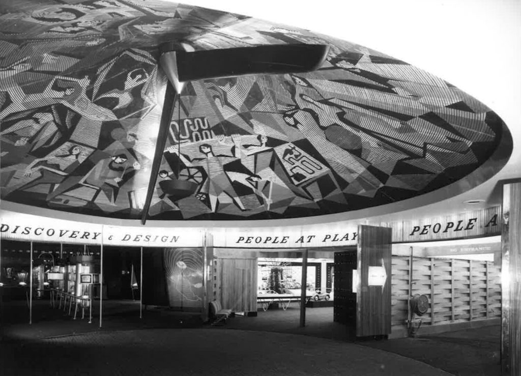
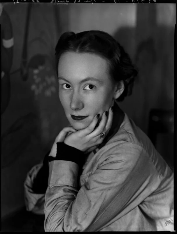
While teaching at the school she got an offer by Hugh Casson to design a large mural for the Festival of Britain. It was completed in 1951 and was a massive mosaic mural for the Dome of Discovery. There are very few records of her work on this and I can only find this one image.

Staying in South Africa, she continued to work and build up a legacy as a teacher and an artist in her own right. Her paintings are held in major collections in her homeland.

Peter Collingwood Interview

This is an interview from a 1987 edition of Handwoven magazine with Peter Collingwood. As it is unlikely to be online I thought it important to post.


Introduction: It is a rare weaver who has not heard of Peter Collingwood. He is renowned as a rug weaver; his book The Techniques of Rug Weaving, published in 1968 and now in its ninth printing, is considered the definitive reference on the subject. Shaft-switching, a Collingwood invention which has become universally accepted is his trademark. Exhibitions of his work often include is “macrogauzes”, hangings which feature twisted and crossed threads in artistically intricate patterns, created with yet another loom adaptation he developed. He may be the foremost authority on sprang and card weaving, subject of two additional books he has written. You might expect Peter Collingwood to have a physical stature and (justifiably) an ego to match is legendary world-wide reputation. It comes as a bit of a surprise, therefore, to meet this quiet, unassuming man for the first time. He is not a showman. He does not need to be; his work speaks for itself. He is a modest, soft-spoken man with a clever, subtle sense of humor. Interweave Press was fortunate to have the opportunity to talk with Peter during his 1987 teaching tour of the U.S., and we are pleased to present that interview here.

IP: Everyone knows who Peter Collingwood is. You’ve put in 35 years and during this time you’ve been a tremendous influence on the weaving world. You’re not only weaving, you’re teaching, writing and collecting textiles. I’d like for you to talk about how you’ve come to do all these things.

Peter Collingwood: It began by giving up being a doctor, which I didn’t like. As a child I was always confident in the way that I could do things with my hands. My favorite game was to balance a stick on my fingers and toss it up in the air and catch it balancing it again. I was interested in skills and I always felt confident that I could construct toys or make things. I certainly wasn’t confident in curing people of the diseases they presented. So, when I came across a loom in an occupational therapy department of a hospital, it interested me as a purely technical device. At the time, I knew absolutely nothing about weaving; all I saw was a machine. I made myself a very simple sort of inkle loom and added a pedal for making the sheds. I then put two inkle looms face to face so that I could weave wider fabrics. Then I added four shafts. For me, learning to weave was just finding things out for myself because at that stage I didn’t have any books on weaving. I can remember puzzling over a houndstooth jacket fabric and thinking that this must take three harnesses to weave, which was completely wrong. Finding out for myself that this weave required four harnesses was much more important for me than if I had read it in a book.

IP: Were you a doctor at that time?

Peter Collingwood: Yes. I was doing my internship at the time, and then after that I had to do two years in the army which gave me a lot of weaving time. I built a portable loom and I would whiz around in an army ambulance with this loom in the back on which I wove scarves furiously. When I left the army I saw an advertisement to work in the Red Cross in Jordan with Arab refugees. I thought that this sounded worthwhile, so I went there for nine months. This is when I came across ethnic weaving for the first time. When I returned to England, I bought a loom from George Maxwell and when I went to visit him he suggested that I visit Ethel Mairet who was the most important weaver at the time and lived close to him. I asked her if I could work with her, and I think she was a bit intrigued because she’d never had a man work in her workshop before. She said that I could come for a month, and I sort of bumbled my way through. I’d never thrown a shuttle; up until this time, I’d just poked little sticks through the shed. But Ethel Mairet had proper looms with shuttles and pedals. For me, it was a very strange experience, but it was an eye-opener because it was the first time I had met somebody who you’d now say was weaving art fabrics. She had an aesthetic approach to weaving and she wasn’t just mechanically throwing shuttles and beating up the weft. Ethel Mairet had a very good eye for color, texture and quality. Just to spend time in her house was an education, as there were textiles every where, some collected on her trips on the continent some from the great French designer, Paul Rodier. By the time I left Ethel Mairet’s workshop I had met other people, and I started weaving rugs with Barbara Sawyer, one of the people I’d met there. She did the designing and I did most of the weaving. I think we quarreled about something, and then she passed me on to Alastair Morton who was perhaps the most important person I worked with because he had a very technical approach that was more allied to the way I tend to look at things. Alastair would plan a long sample warp and ask me to see what I could get out of it. Then he would just leave me to work, which was wonderful. At the time I didn’t realize how much he was allowing me to do. After the sample was finished, he would pore over it inch by inch, and then ask me to weave ten yards or so of some little bit of it. He was very good at designing what I call a “pregnant” warp, one full of possibilities. This is when I started weaving multi-shaft rugs. Alastair had done single corduroy, and then I thought of the double corduroy idea. By this time I’d made a funny little eight harness loom which had keys like a piano, one for each harness. It was something like a dobby but you selected your harnesses for each shed rather than having them pre-selected. It was quite good for designing and I worked out a lot of multi-shaft pieces on it, including a block weave which Alastair let me weave in his workshop. I then moved to London and set up a workshop to weave rugs in a little room behind a furniture-moving firm. That was in 1953.

IP: Was it your intention at the time to make weaving your career?

Peter Collingwood: Yes, I was certainly determined to try it, especially as I was repeatedly told it was impossible. I knew I had to make a rug in two days so that I could sell it to a shop for about four pounds (which was something like $7.50). I could make a rug in two days if I limited myself to shuttle-thrown designs, and loom-controlled patterns. I abandoned traditional ways of making rugs because I needed the speed to survive. The most important thing to me was not to be a failure at weaving. What I mean by traditional techniques are tapestry, soumak, knotting—the ways in which rugs have been made in the past that are very slow but which give limitless design possibilities. When designing, I never start with a blank sheet of paper and some wonderfully inspired design and then ask how can I weave it? Rather, I always start with a technique, do the long sample and see what the technique will produce. I try to exploit what a technique will give me rather than impose a design on a technique. If a technique automatically gives little square blocks, then I try to see what can be done with little square blocks. If a weave automatically gives diagonal lines, then I see what I can do with diagonal lines. It’s one of many approaches, but it’s the only way I know how to do things. It’s important to be as critical of your work as you are of, say, modern furniture or painting. Try to apply the same standards you apply to other things to your work. I find design the most difficult part in weaving; especially trying to think of ideas that are new. I feel the only thing that can help you in designing is your own eyes—and your eyes need to be educated in some way. Mine, I hope, have been educated by the things I have around the house, objects I’ve collected: textiles, baskets, wooden pieces, pottery. Their shapes, colors and textures are constantly teaching my eyes lessons in design. My first rugs were very simple, mostly woven in summer and winter which I thought I’d invented until I found it in a book. However, it wasn’t until I got into shaft-switching that I had to seriously think about designing because before that, everything was pretty simple. With shaft-switching I realized that I could make any shape. Now I wasn’t just limited to squares and rectangles. Shaft-switching meant that I could get away from straight-sided motifs. Designing is difficult. We’re not living in a tradition, are we? Today anything is possible, whereas in the past, the tradition you lived in determined, in part, your designs. For example, if you made knotted rugs and lived in Afghanistan in 1850, you couldn’t make just any sort of knotted rug; you could only make a knotted rug that was like the one your father made, in the colors that were local to your tribe. Since we don’t have this kind of tradition now, I’ve relied on technique to limit my designs. For example, even with all its possibilities, shaft-switching has its limitations: you can only use two colors at one time, and you can’t make swirling, curvy designs. Designing macrogauzes, of course, is something totally different because it’s a much freer technique. With pieces such as these that hang on the wall, you don’t have the practical limitations found in rug weaving. Structurally, macrogauzes only need to hold together enough so as not to actually fall to pieces when you hang them on the wall. Because it’s possible to do so many different things with the macrogauzes, I find I need to limit myself. I decided before I start a piece, for example, that I’m going to just cross threads over on this piece or only twist threads. Otherwise things just get out of hand.

IP: Part of what you do is creative work, but the bulk of your time is spent in production. How do you do it?

Peter Collingwood: I’d say that I’m inventive, rather than creative. And I am inventive so that I can continue to be a production weaver. I think these things are important. There’s no point in trying to be a handweaver and just doing what a machine can do. To justify myself as a handweaver, I feel that I have to be able to do something a machine can’t. This certainly applies to macrogauzes because there’s not a machine that can make them; maybe it doesn’t apply to shaft-switching because I suppose that if there were enough people who wanted shaft-switched rugs, someone would invent a machine to make them.

IP: How does writing fit into what you do?

Peter Collingwood: I spend most of my time weaving. But when I wrote The Techniques of Rug Weaving, I worked on it in the morning and then I’d weave in the afternoon. It was a rather hard time for us financially. My wife had to teach a lot and help us keep going.

IP: Why did you decide to write that book?

Peter Collingwood: I had been teaching in London art schools and I began seeing things appear in magazines that I know I had taught people. I began to get a bit uppish, thinking that I should get credit for these things because I had thought of them first. Also, there was no big book on rug weaving, and the more I researched the subject, the more I realized what was involved in multi-shaft rug weaving and that not much of it had been written down. Once I started writing the rug book I also realized that there were many gaps in my knowledge. Up until then I had just woven 2/2 twills, so that when I did the chapter on twills, I had to make many samples just to find out how other twills worked. And when I did the chapter on corduroy I found that there were many different things you could do with the technique. I do think that many people don’t realize how much original stuff is in this book. Today people think that shaft-switching has always existed. I suppose, though, that in 100 year’s time, it really doesn’t matter who thought of these things, but I do like to think up things. I like sitting at the loom with a warp and seeing what I can do with it.

IP: It seems like it would be easy for you not to want to share what you’ve worked so hard to learn.

Peter Collingwood: Well, I always want people to like me, and people like you if you tell them things! The book has paid off, though, hasn’t it?

IP: Would you say that The Techniques of Rug Weaving is what made you known?

Peter Collingwood: Yes, I think so, much more so than my weaving. It was that book that got people wanting me to teach in America. Another reason I wrote the book—and I’m just remembering this now—was so that I wouldn’t have to teach anymore. I thought that if I got the whole bloody thing down between two covers, there’d be no need to teach anymore. Then, of course, some people just can’t learn from books, or often people think that you’ve kept a few things up your sleeve, and that if you actually teach them personally, they’ll learn a bit more. So as a means of stopping my teaching, the book was a complete failure. For me, classification is important. All the books I’ve written have begun with a compilation of great bundle of knowledge which I try to clarify. It pleases me to put order into things, and it’s something that I think I can do. I suppose that this comes from my medical training which encouraged me to think in an orderly way.

IP: Tell me about you latest book, The Maker’s Hand.

Peter Collingwood: This is a book whose idea didn’t come from me. It was either Ib Bellew’s or Ann Sutton’s idea. Ib told me that I’d done all these books which had been such a hard grind work, and that now I should do a nice easy book. “You’ve got all these textiles,” he said, “all you have to do is write a few sentences and scribble a few diagrams, and there you are.” I suppose it was easier than my earlier books, but it wasn’t easy. I wanted to say something interesting about each textile. I wanted to arrange the pieces according to a textile classification and then pages needed to alternate between black and white and color, and it was very difficult to marry these two concepts. I wanted to diagram each piece, and many of the structures I had not tried to diagram before. I found this part of the process quite difficult and time-consuming.

IP: What’s coming next?

Peter Collingwood: At the moment, I am very interested in the technique of ply-splitting, and I have collected over 50 camel girths from Rajasthan, India, almost the only place in the world where this method is used. This could be the subject of another book—perhaps another one like the sprang book, which people buy then never seem to use!

IP: Any advice?

Peter Collingwood: When I left Ethel Mairet, she sent me a letter saying, “Be as self-critical as I am in my workshop, then you may get somewhere.” I have tried to follow that piece of advice, though it is hard to really be critical about a new piece you have put a lot of thought and time into. Over my macrogauze loom there is an Eastern saying, “The simple only reappears after the complex is exhausted.” I have found this very true, both in weaving and when writing about complicated structures.
Piper In Cambridge

There are a few good examples of John Piper’s work in Cambridgeshire. They are mostly his stained glass. This time is his work in the Chapel of Robinson College.

The college was founded by David Robinson, a philanthropist who had grown up in the city, working in his father’s cycle shop and making his money from his TV and Radio rental company. In the 1962 he was making £1,500,000 a year and in 1968 he sold it to Granada for eight million.

He found the Robinson Charitable Trust, giving money to Addenbrookes who built the Rosie Maternity Unit, named after his mother, that replaced the Victorian hospital on Mill Road. And two wings, to the old Papworth Hospital and another to Evelyn Hospital.

In the late 1960s he left Cambridge University 18 Million to found a new college, and in 1973 they set to work planning the college. The Architects Gillespie, Kidd and Coia who designed a brutalist style castle. With large red brick building with modernist portcullis designs and towers. The Chapel is a bizarre shape, with a set of medieval style balconies for the congregation as well as a flat platform for rows of chairs.

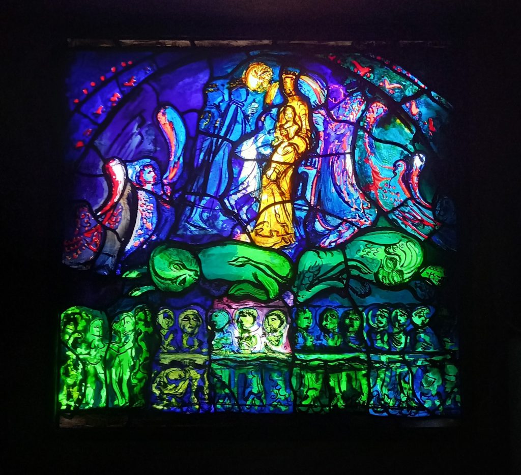
John Piper & Patrick Reyntiens ‘The Adoration of the Kings’ window in the side chapel.

Like with many of his windows, Piper worked with the glass maker Patrick Reyntiens, who translated his designs into glass and taught piper the practicalities of making windows. They would work together planning, painting and arranging the windows in the design and production.

There is a small window in a side chapel and another large window in the main chapel. When questioned about the smaller window Piper explained the design:

There is a small devotional chapel with a window of stained glass of modest size, which shows the Virgin and Child and the Magi bringing gifts. This scene is set above The Sleeping Beasts of Paganism, and in the lowest section are the first and last acts of the Christian story – Adam and Eve with the Serpent to the left, the Last Supper to the right. My designs, with fullsize cartoons, were all interpreted in glass by the Reyntiens studio at Beaconsfield with their usual sensibility and brio. The inspiration for this design was a carved stone tympanum in the Romanesque village church at Neuilly-en-Donjon (Allier) in central France.

John Piper

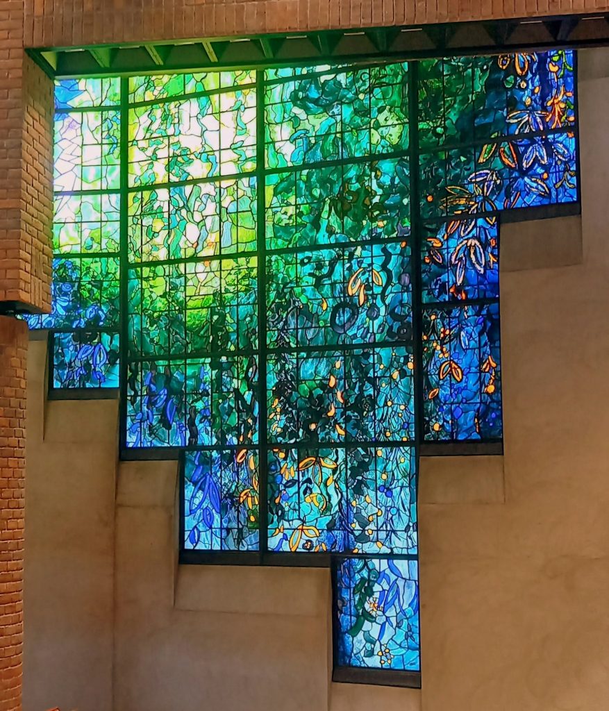
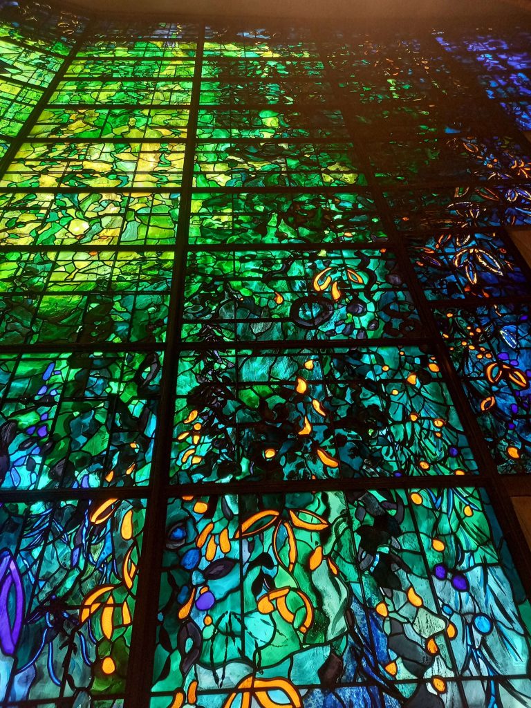
The larger window has the feel of a Monet painting and typical of Piper’s work, has a slow gradient of colour from yellow to green and then blue on the edges.
The subject of the stained glass, which I designed, is a modern ‘Light of the World’, with a great circular light penetrating and dominating all Nature’

John Piper

Piper had become interested in stained glass after being mesmerized by it as a child on a visit to Notre Dame. He wrote about the medieval designs of stained glass and was able to translate his works into windows when he was first asked to design one for Oundle School Chapel in 1953.

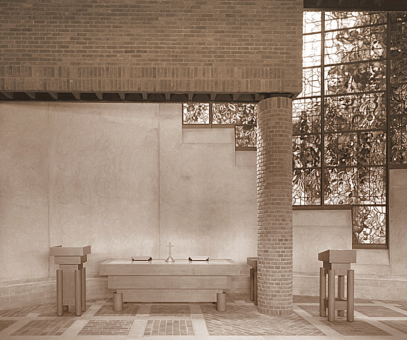
In the photograph below, you can see the chapels original set up when completed. Surprisingly, the lecterns and altar were also designed by John Piper in collaboration with Isi Metzstein. Isi was a German Jewish architect who aged 10 was placed on a Kindertransport and raised in Britain. He trained as an architect for the company that built the college and then worked at the Glasgow School of Art.

Piper formed an excellent working relationship with Isi Metzstein , and became concerned not only with the stained glass, but with all manner of furnishings as well : the wooden cross and candlesticks , the tapestries and altar cloth.

June Osborne – John Piper and Stained Glass

The Eraser

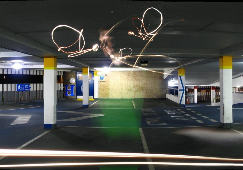
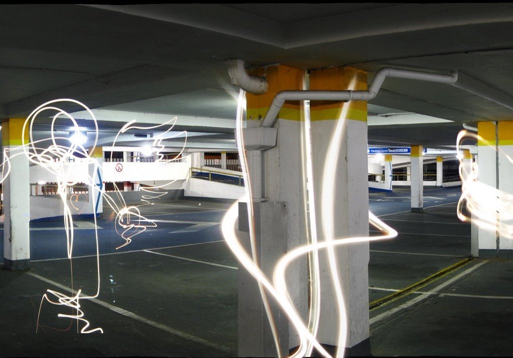
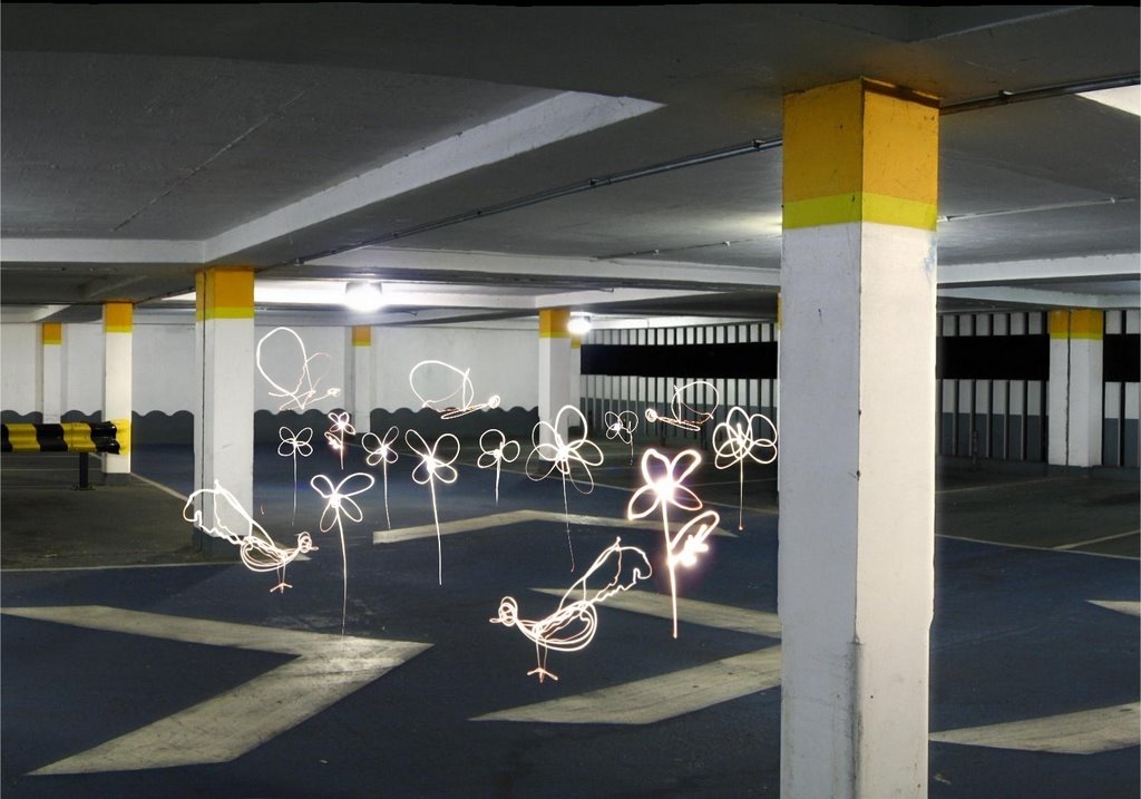
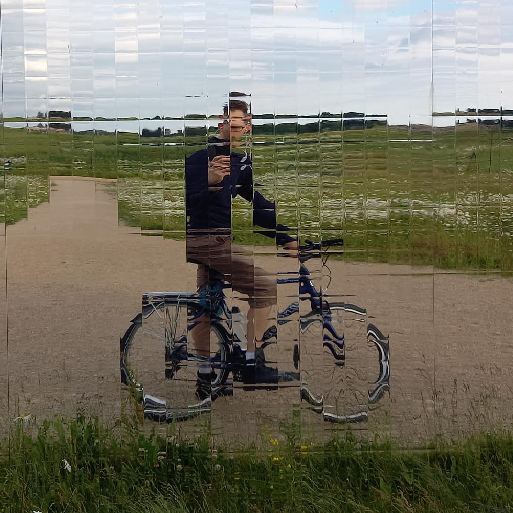
Here is a video that never really got finished for XL Records. Money, funding and time got in the way. But here are some photographs of me, painting with bike lights and LED tubes in, what was, Park Street Car Park in Cambridge.
Fisherman’s Friend

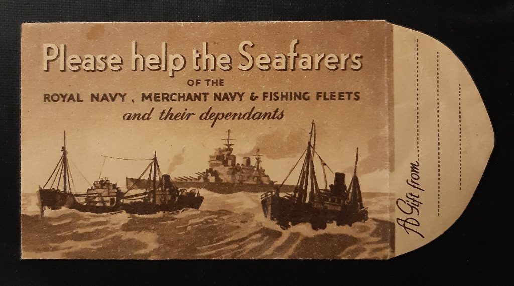
In 2016 I started this blog. I was inspired by a blog called Shelf Appeal and I thought I had something original to say. This blog has given me many friends and from them and my writing I have had two books. There are more to come I am happy to say. I have posted every Thursday over that time. This post is actually something I always earmarked to write about. It was a small piece of ephemera I found in a book.

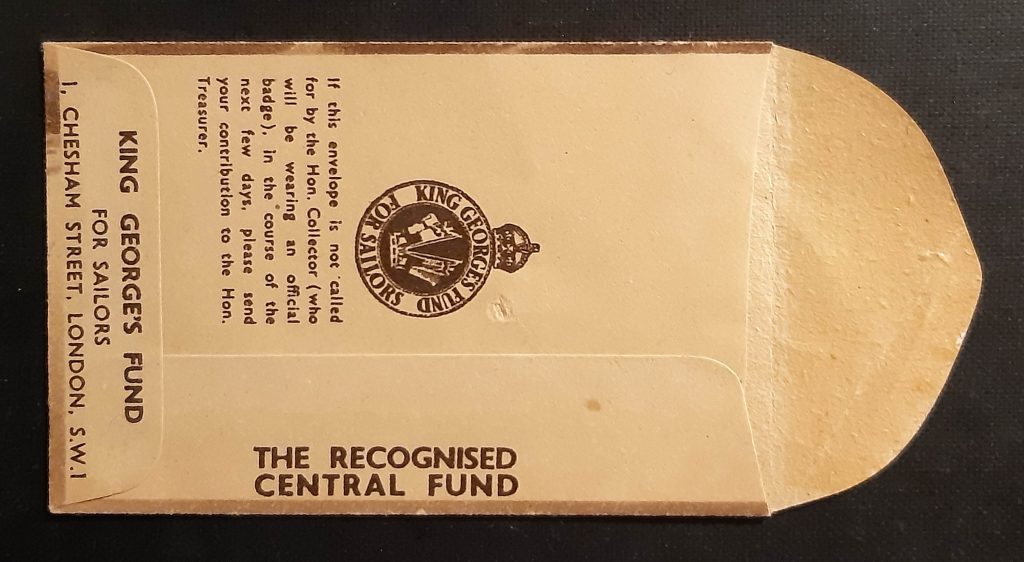
It is a donation slip, and from the wording on the back, it sounds like it was hand posted through a door, to be collected by one of the charities representatives.

The charity is the King George’s Fund for Sailors. During the turbulent days of the First World War, thousands of lives were lost at sea – many of them young sailors – and the public wanted to support those who were fighting, as well as their dependants. To help direct their hard-earned funds, a central organisation was established: King George’s Fund for Sailors, now called the Seafarers’ Charity.

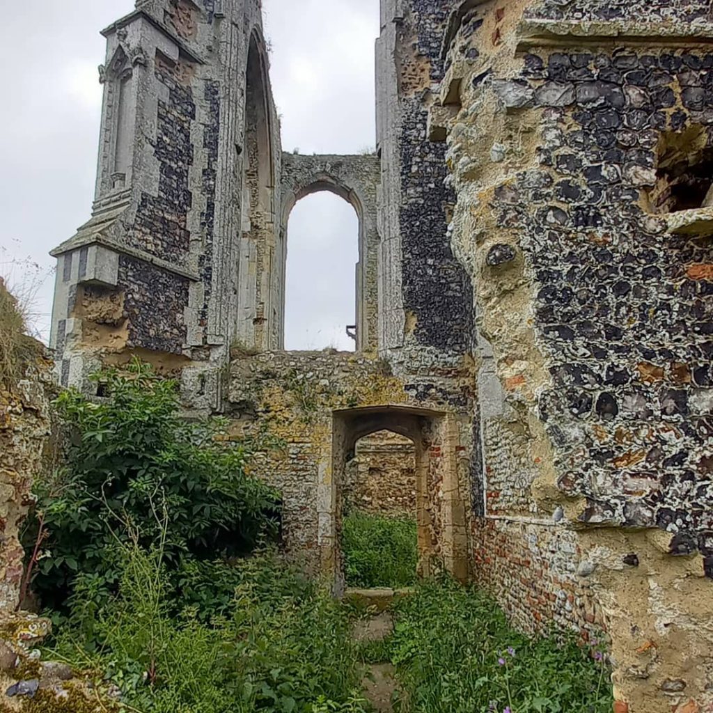
A few photos

When I Was A Child

Below is a memory of Mrs M Scholes of Stansted from a publication of memories of Essex People, When I was a Child (1985). It is a children’s memory of the First World War and I found it really interesting the view point a child would have on the conflict.


We were a family of five children living in Surrey on the edge of an open common. Life seemed to go on quite normally for us until 1916, when my Father was called up. Before that year I can only remember taking part in a school concert which we gave for wounded soldiers. I was rather intrigued by all those men being dressed alike in bright blue suits with white shirts and red ties, but I am sure I had no conception of why they were there, or how they came to be wounded. I knew the war was in France, and that they crossed the English Channel to get there, and that they lived in muddy trenches, but that was another world. From time to time we heard booming noises and we were told that they were the guns in France.

The day came when my Father had to go. My Mother was terribly distraught and the bottom seemed to fall out of life in the home. But it was August and summer holidays from school.

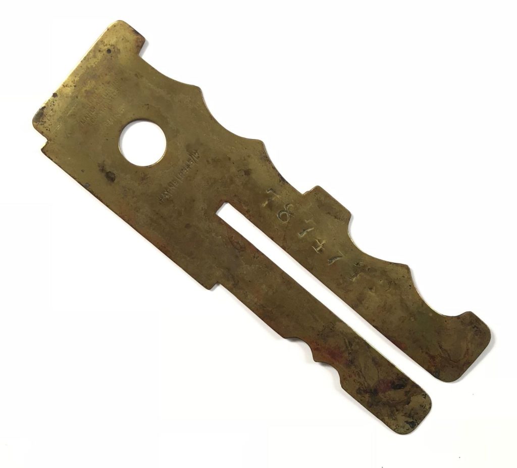
We went out looking for dragon flies and stag beetles, newts and frogs and toads as usual. It was only at night that we realised that things had changed. My Father came home at first in mufti and said that he had been marching somewhere in London all day, but after a few days he came home in khaki with horrid putties wound round his legs, a greatcoat which was too long for him and a nasty peaked cap over his eyes. He had lots of brass buttons which had to be polished without getting white stuff on his coat. The Army gave him a button stick to do this, which we children thought was very cute.

He did not come home for long. He was sent to Aldershot and only came home on leave after that. We settled down to wait for the postman every morning.


Both my parents were great gardeners. We grew all our own fruit and vegetables and I my mother taught us older children to weed and hoe and harvest the crops, so that all would be in order when Father came back.

My father was sent to France in March 1917, and we began making up parcels of things he liked. I had to take them to the Post Office about one mile from our house. I had just learnt to make a Yorkshire parkin so this had to be included. I can remember my mother making a sort of chocolate from cocoa butter for the parcel. It was poured into tin lids to set. We never knew what happened to these parcels as, in May 1917, my father was reported missing and that was the last we heard of him.

During those three months, we children used to go to the bedroom window when we knew that the postman was coming down the road, so as to be the first to report that there was a letter from Dad. Unfortunately it never came. My mother advertised for information in the Territorial Gazette. I can remember a soldier coming to see us and saying that he was with my father when he was shot in the face. My mother always seemed very sceptical about this and so we never felt we really knew what had happened. We cannot be surprised when we read the terrible history of those battles today.

I can remember a night when we looked across the sky, and saw the Zeppelin coming down in flames over Potter’s Bar. I asked my mother if there were men in it. When she said that there were, a chill horror came over me, a horror that remains with me to this day, man’s inhumanity to man.

Perhaps my last memory of the First World War is of November 11th 1918. There was little going on in our district, but we heard of the rejoicing and celebrations in London. My mother felt she had lost so much. She was now faced with the prospect of bringing up five children alone so there was little cause for rejoicing in our house. It was a sad day for us. I have found it a sad day ever since. Man seems to have learned so little from it. The Cenotaph was erected in London in memory of the men who fell. If those men could rise up on Armistice Day, would they feel they had made the great sacrifice in vain? I wonder.

Wool X Bickerstaff

It’s not often that I see something so graphic it captivates me totally. As most people know, my obsessions tent to be for the Great Bardfield group of artists and the endless differences in their work. But what attracts me to a work really is the technicality of it.

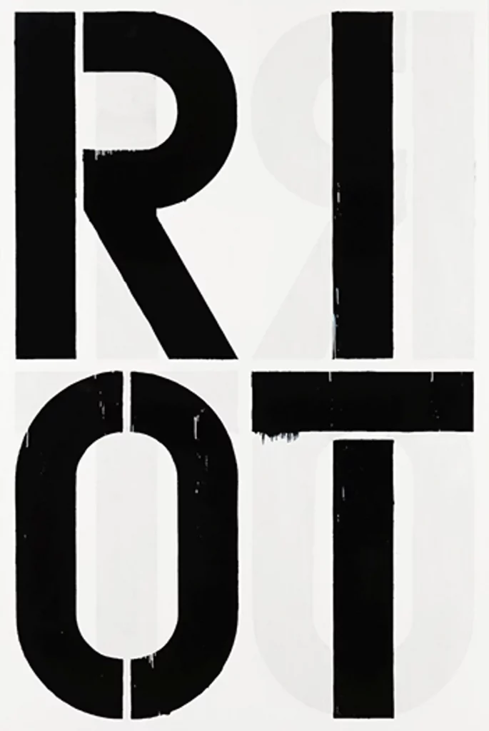
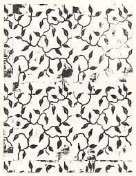
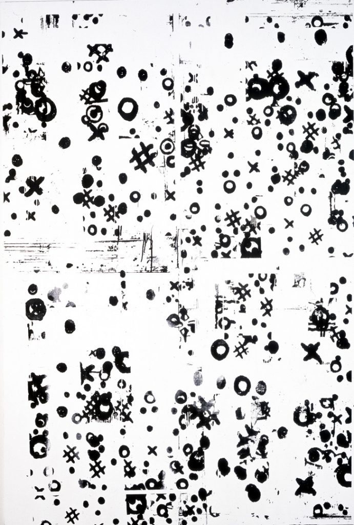
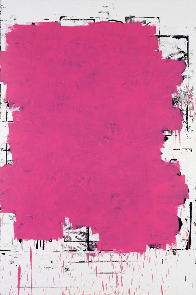
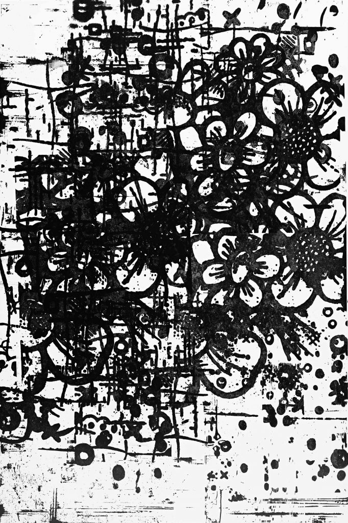
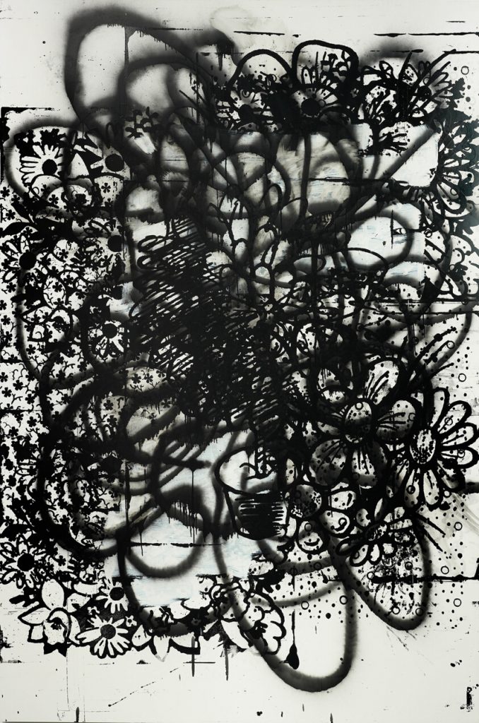
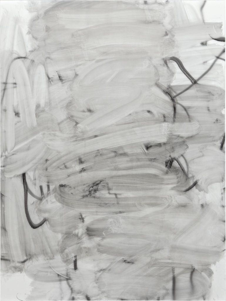
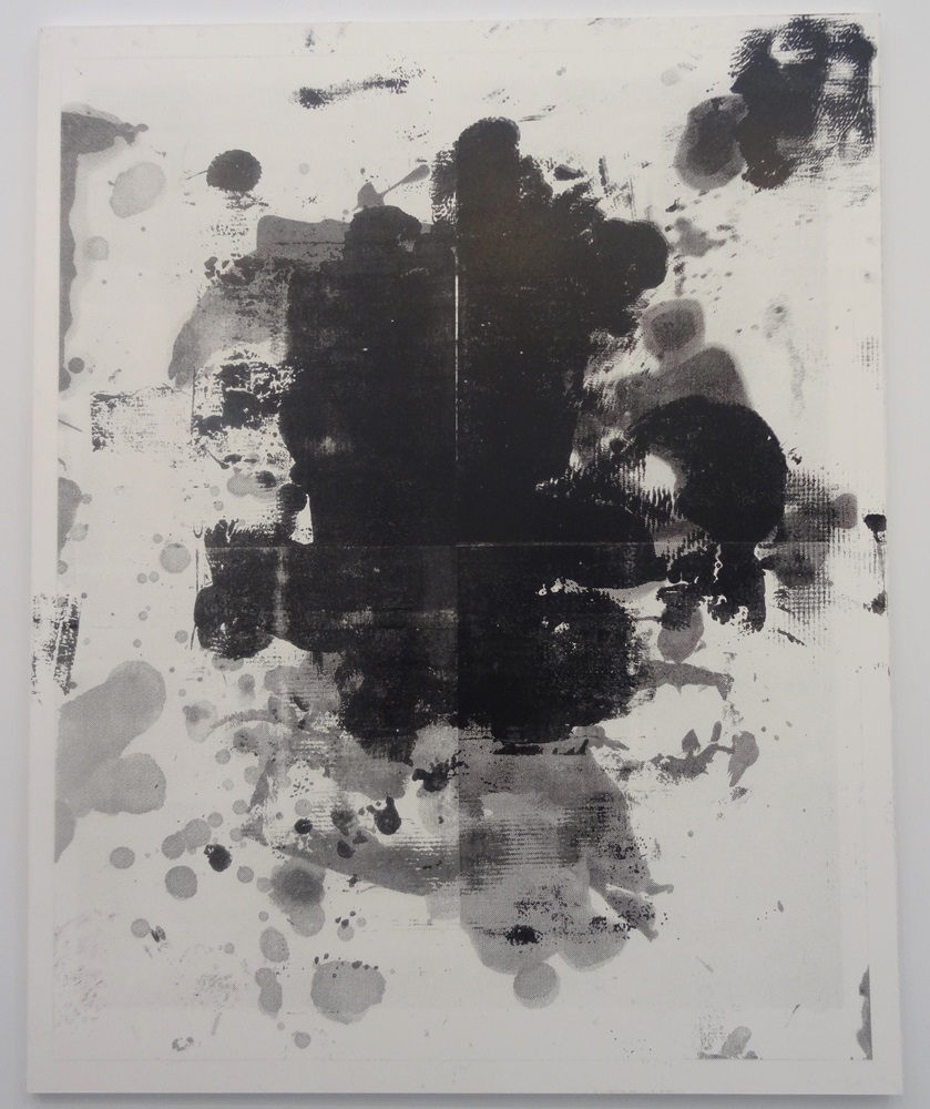
Long before I discovered the work of Great Bardfield, I was rather obsessed with the American artist Christopher Wool, having found a set of his books in the (now closed) Galloway and Porter shop in Cambridge. His work is rude, bold, graphic and he repeats images. It is likely as inspired by the screen prints of Andy Warhol as it is of graffiti. I had a large work by him that I managed to find in a London auction in 2005 that I sold to buy more ‘Bardfield paintings. It was a screen print on metal and over a metre in height.

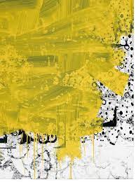
Wood’s work tends to be simple typographic phrases or patterned designs. He has silk screens of different patterns that he uses over and over, mixing them with other designs and sometimes working hard to erase them with areas of colour or pure ink. With colour, smudged, warped by moving the plate while printing… the works are in a constant decay and evolution.

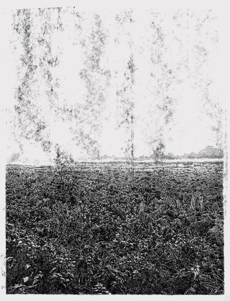
The echos of this obsession were brought back to me when I discovered the work of William ‘Bill’ Bickerstaff, An artist who draws in fine pens and has created a set of drawings of the Cambridgeshire landscape.

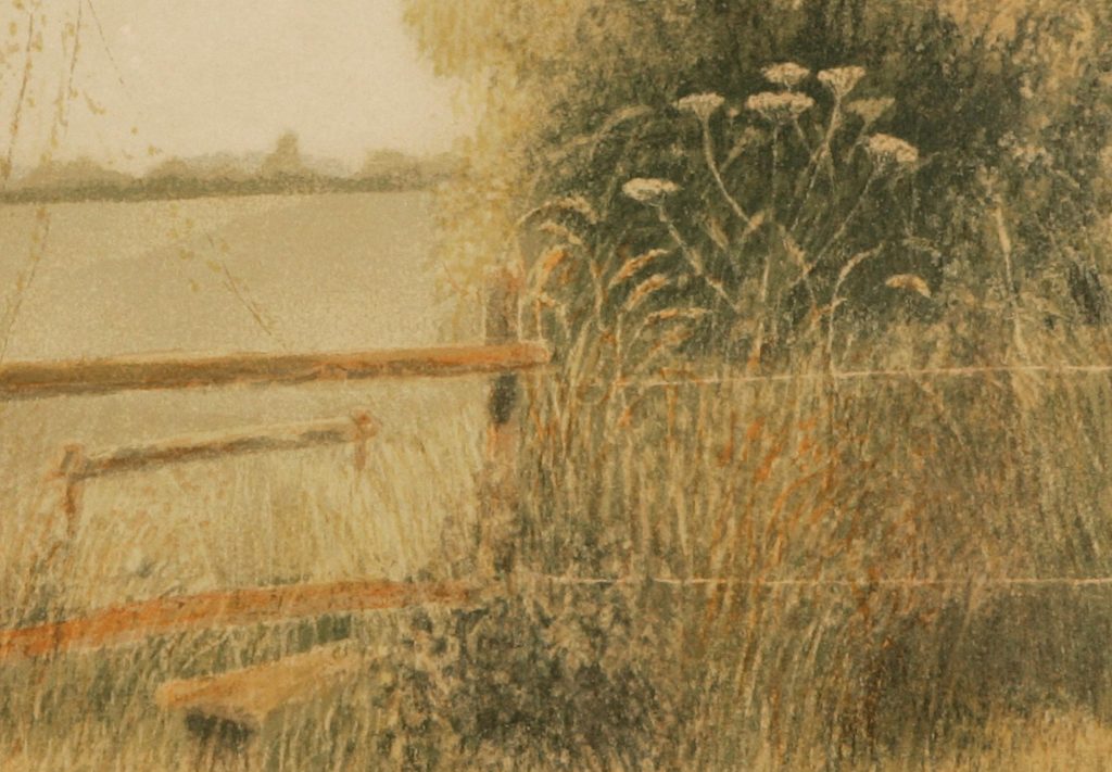
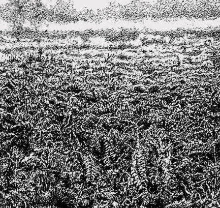
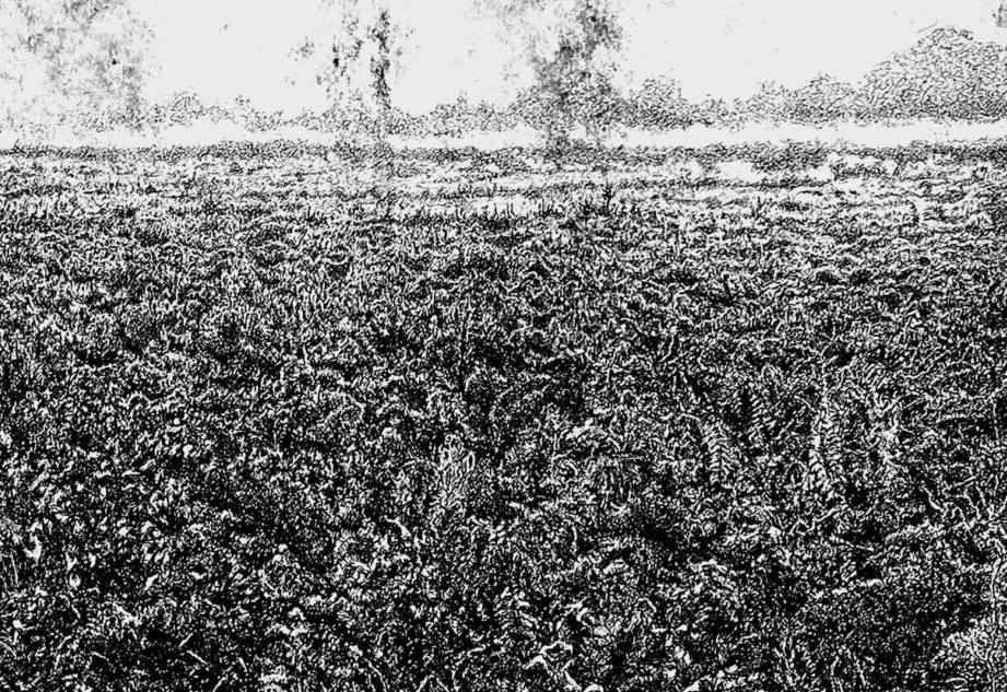
William Bickerstaff – Field, 2022

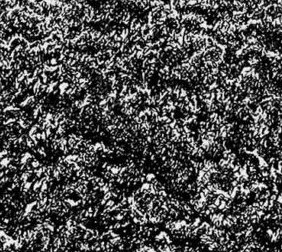
What at first looks like a photograph with ink rollering over it turns out to be a set of intricate works and markings on paper with pen and roller ink, as seen in the details below.

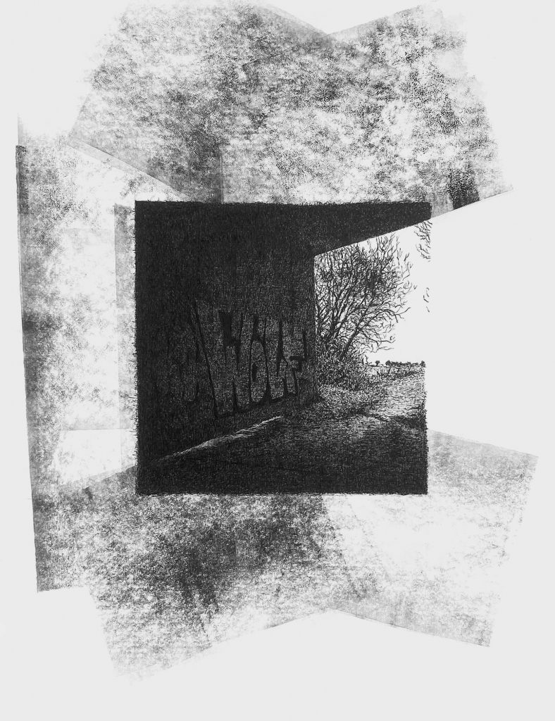
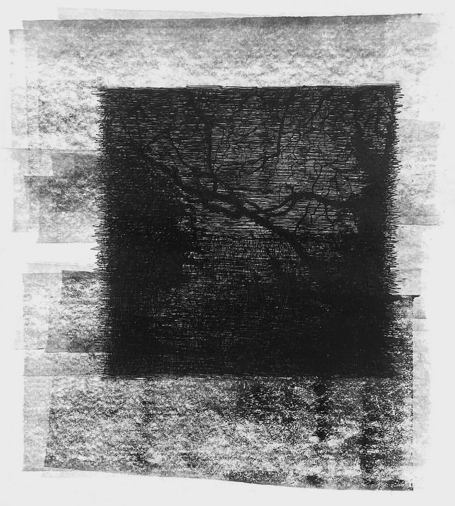
Some of the work would have been sublimely pretty and has echoes of Elisabeth Vellacotts detailed drawings of tree studies, but Bickerstaff takes these drawings and gives a danger to them. In many ways they remind me of Paul Nash works and what he would be doing today, if he were alive. They have the feel of a double exposure on a camera film, something that needs more attention from the viewer to decipher.

William Bickerstaff – Borley Wood, 2020
William Bickerstaff – From Rivey Hill, 2022

The ability to draw out the overlooked elements of life is something I admire and then to subvert it into something far more interesting is a rare thing to find. So many artists are armed with the skill to depict the world around them but few can push it further and make their own work far more textured than the reality.

William Bickerstaff – Bad Wolf, 2020

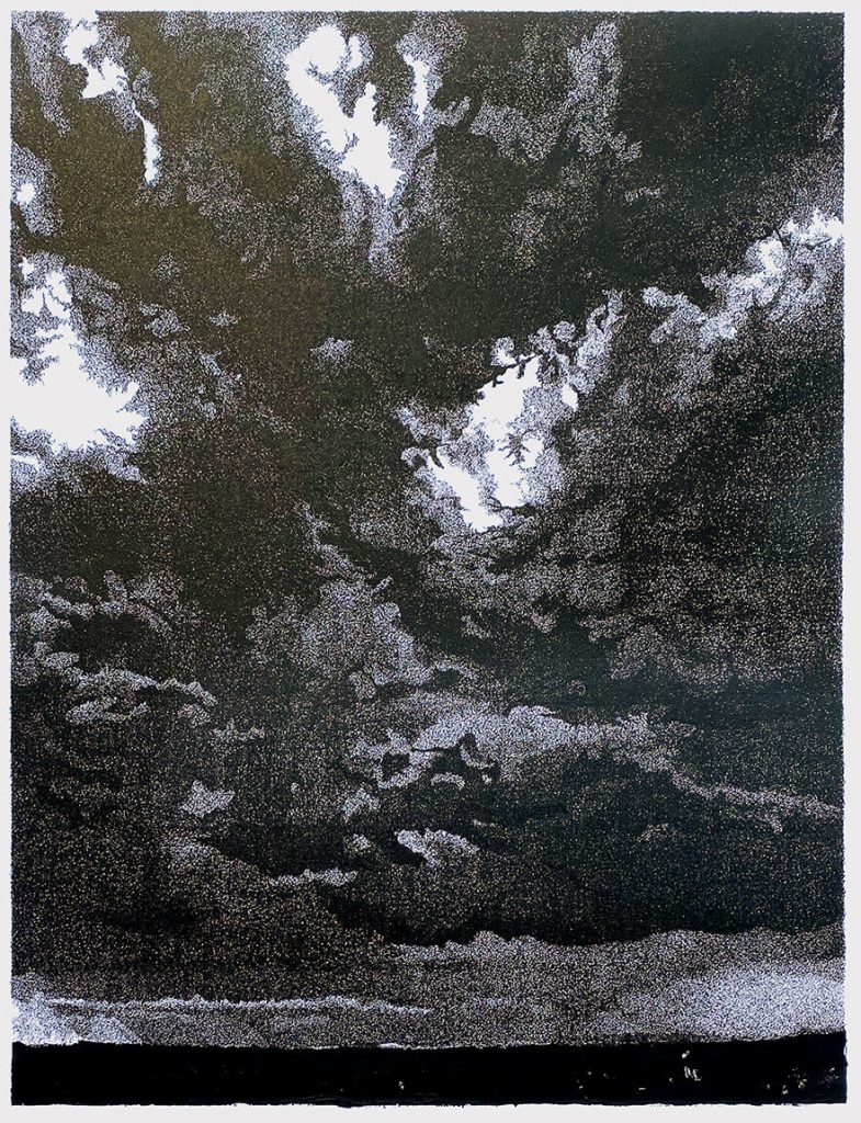
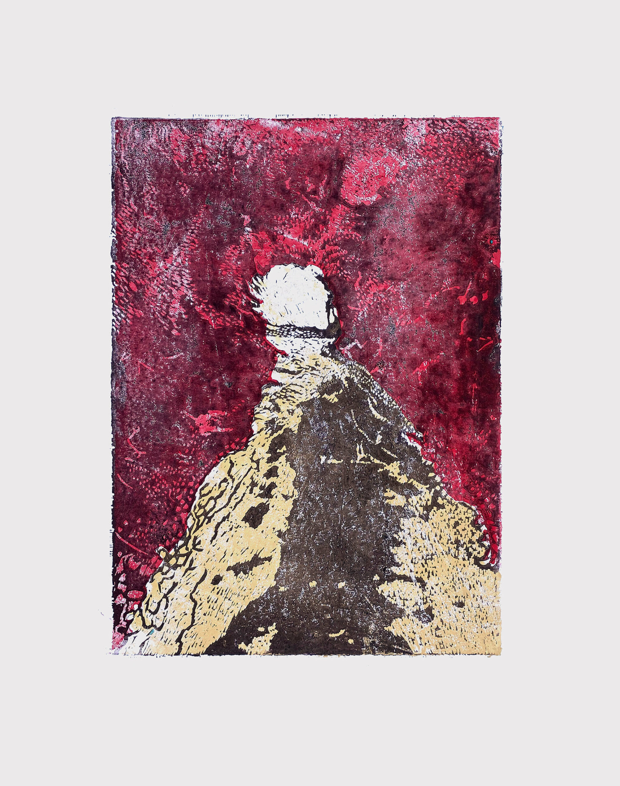
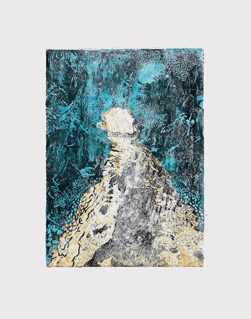
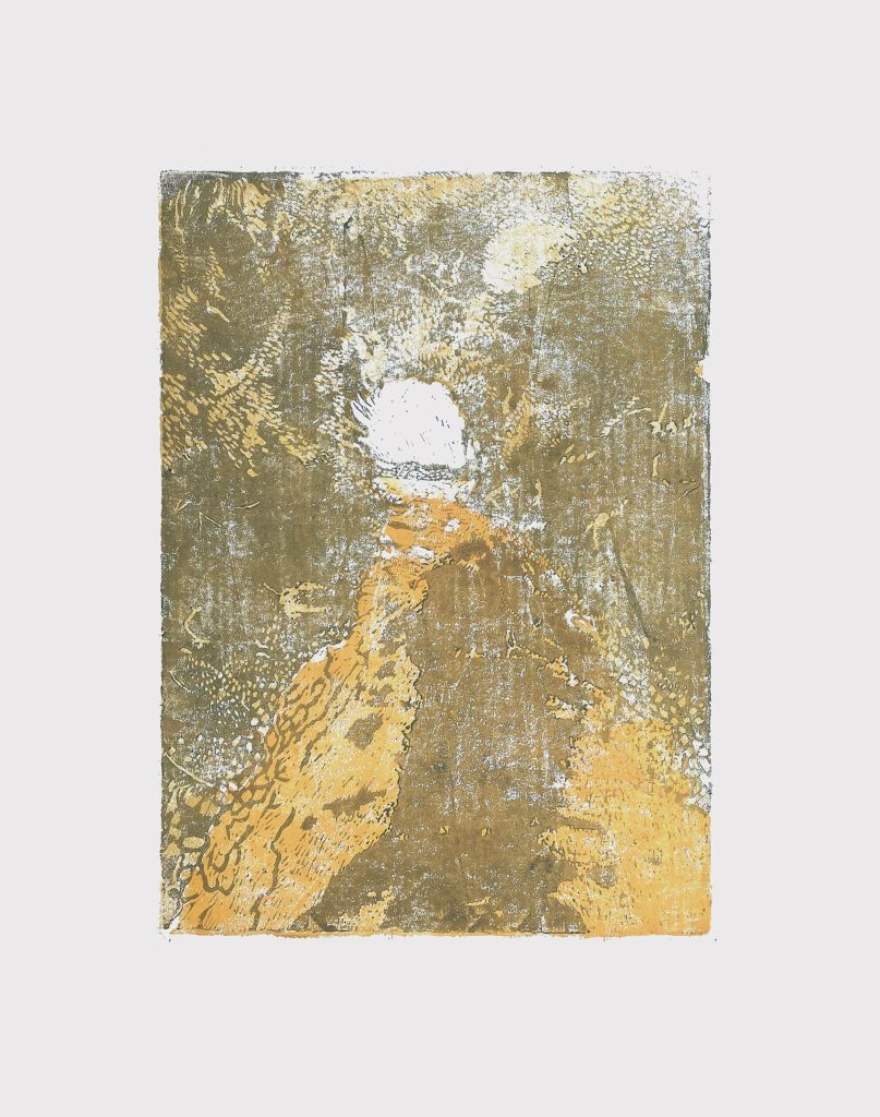
The series below of linocuts layered in colour with erosion of the ink show far more awareness of textures to create a landscape than the typical use of linocuts with thick black inks and bold colours like a stained glass window, in Bickerstaff ‘s work way the ink is applied gives a texture that is much more photographic than you’d expect it to be, it has the feeling of a memory that is always being eroded by the mind’s own perception.

Bawden’s Bible

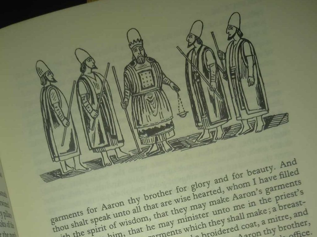
In the 1960’s the Oxford University Press embarked on an expensive project of an illustrated Bible by all the hip artists of the era. It was called The Oxford Illustrated Old Testament: With Drawings by Contemporary Artists. The text used the 1611 King James Version and it came out in five volumes, with a staggered release over two years.

Each volume was a hardback binding and the series had around 700 illustrations. Illustrators include: Edward Bawden, Ceri Richards, Edward Ardizzone, David Hockney; Brian Wildsmith, Peter Blake, Carel Weight, John Bratby, Brian Robb, Francis Hoyland, Cecil Collins and many more.

The problem the series had was the expense and the colour illustrations were switched to black-and-white, meaning artists work like Peter Blake and Leonard Rosoman, whose work was vividly colourful turned out to be similar tones of grey.

Bawden’s statement on the project:

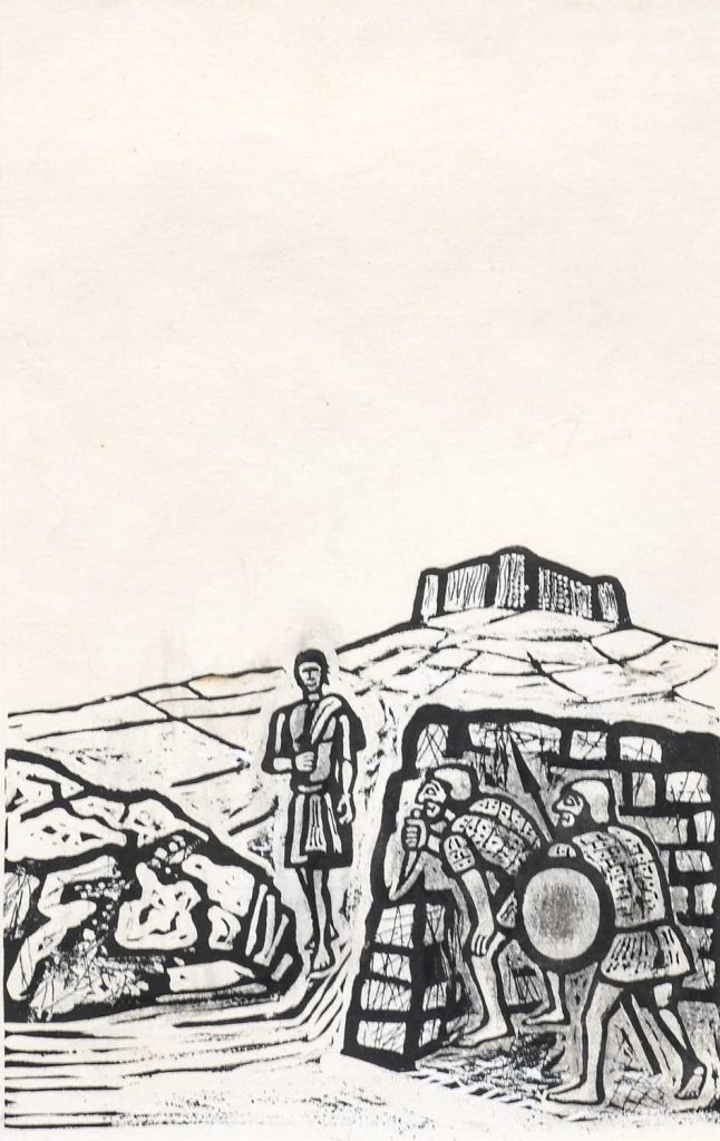
The interest I have felt in making drawings to illustrate passages in the Old Testament, especially for Genesis, might not have been quite the same without having had the experience of serving in the Near East in the Second World War. During a year which I spent in Iraq I was able to draw the Marsh Arabs, later on I made drawings also of the Kurds who live in the mountainous country to the north.

In Kurdistan there was the annual migration of tribesmen and their families from the summer pasture to the winter quarters; flocks grazing and moving slowly forward with the men, followed by the womenfolk on foot or riding on donkeys. It was a scene that might have been much the same when Abraham journeyed from Haran to Canaan.

Nomadic Arabs who live in tents have also an immemorial way of life, and whatever changes may have occurred since Old Testament times, there is today the same impression of life as it was lived in the past.

The account of the lives of the Patriarchs and the description of happenings that took place in those days are extraordinarily convincing as a visual record. There is, however, a feeling of remoteness about this historical past. I have tried to recreate my own impressions of the Near East and its unfamiliar character, the strange desert landscape, arid and hostile, and the tent- dwellers who live in these surroundings, because as an illustrator I would like to identify myself more intimately with the spirit of the Old Testament stories.

The Oxford Old Testament Drawings, RA, 1968.

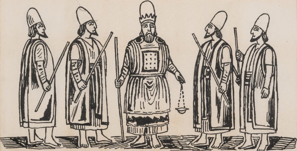
In the first volume Bawden provided line illustrations and then in the later ones they were his drawings with ink painted on as if they were linocuts, a trick he used for many of his dust jacket designs, as seen in the illustration below.

Vol.1: The Pentateuch: Genesis to Deuteronomy (435 pages).
Vol.2: The Historical Books: Joshua to Esther (531 pages).
Vol.3: The Poetical Books: Job to The Song of Solomon (356 pages).
Vol.4: The Prophets: Isaiah to Malachi (532 pages).
Vol.5: The Apocrypha: Esdras to Maccabees (438 pages).

The Oxford Illustrated Old Testament will break away from the old-established tradition of illustrated Bibles by using the work of twenty-two distinguished contemporary British artists. The five volumes will attract the artist and the connoisseur of book illustration, as well as those readers of the Bible who will welcome a strikingly illustrated edition of the Old Testament. All the seven hundred drawings commissioned are on show in this Diploma Gallery exhibition. The majority are for sale. To illustrate Biblical themes is a testing enterprise, making special demands and frequently stirring unsuspected depths of power. To illustrate the whole of the Old Testament in its variety and majesty calls for a group of artists, each with complete freedom to contribute his own vision, his own intuitive or intellectual response. Each artist was invited to undertake a particular book (or portion of a longer book), and each was given complete freedom of interpretation, in any black-and-white medium. The dramatic way in which contrasting imaginative concepts come together in these volumes will, it is hoped, justify the undertaking. The work will be published in five volumes, the first three in the autumn of this year, the remaining two in the spring of 1969. The volumes are divided as follows: 1. The Pentateuch (Genesis to Deuteronomy); 2. The Historical Books (Joshua to Esther); 3. The Poetical Books (Job to The Song of Solomon); 4. The Prophets (Isaiah to Malachi); 5. The Apocrypha. The text used is that of the Authorized Version, chosen as the classic and most widely known English version, a common heritage to which each artist and reader might respond in his own way. Inevitably some of the artists first approached were too heavily committed to accept the invitation, though all were attracted; but an impressive group was finally assembled. Their own comments on their approach to the work will be printed at the end of each volume, and are reproduced in full in the pages of this catalogue.

The printing process is offset lithography and the illustrations include work in pen, wash, gouache, chalk and pencil, as well as some etchings. Being drawn for reproduction, some of the originals carry apparent blemishes-erasures and whiting-out marks, for example-that will not appear on the printed page. The illustrating of books is an exacting and, at present, an under-regarded art. This exhibition, and the volumes that are to follow, may help to restore the balance.

The Oxford Old Testament Drawings, RA, 1968.

In Praise of Michael Carlo

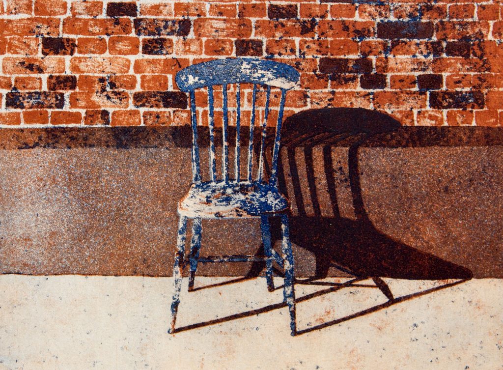
Michael Carlo – The Chair, 1984

The Suffolk printmaker Michael Carlo is maybe melined for his orange style prints, but I think they have a beauty that has been overlooked for so long. Working for the Curwen Press and Christie’s Contemporary Art made his work very popular in large editions. You don’t see them so much anymore and I think it’s a shame. I have quite a collection of them. I think the woodland and pathway prints also have a wonderful technical ability to them that is overlooked.

Michael Carlo – Mid-day, 1978

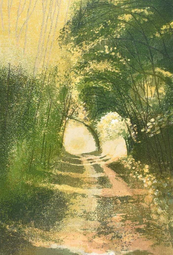
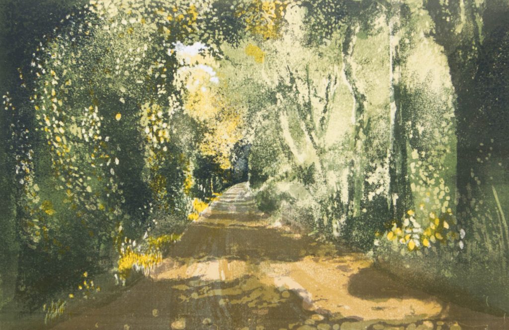
The image of the dappled light in woodland is a universal picture. I see it all over Britain and in the lanes on my cycle rides into Cambridge. I think what is important about the method of his printing at that time was how painterly it is. Printed in layers of colours, it is the areas Carlo leaves blank for the yellow and white to appear though the greens as weeds and cow parsley that grow on the edges of paths like this.

Michael Carlo – Wooded Lane, 1976

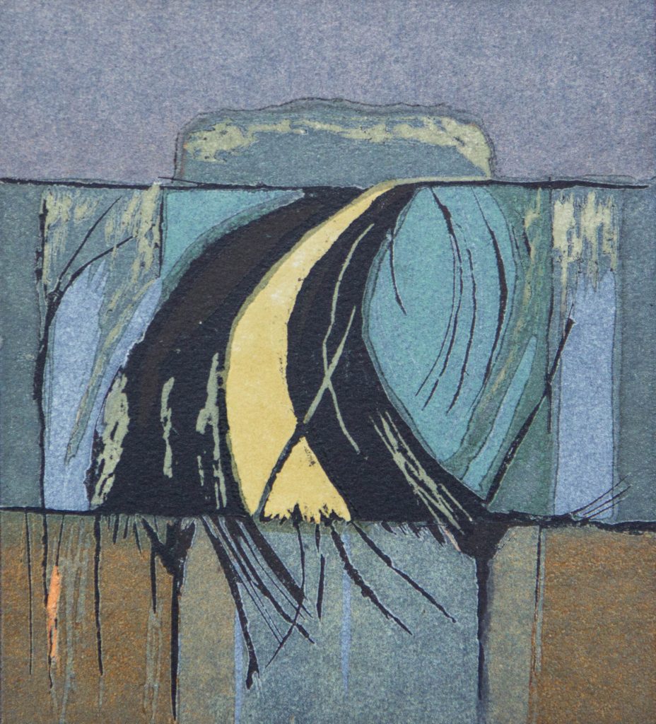
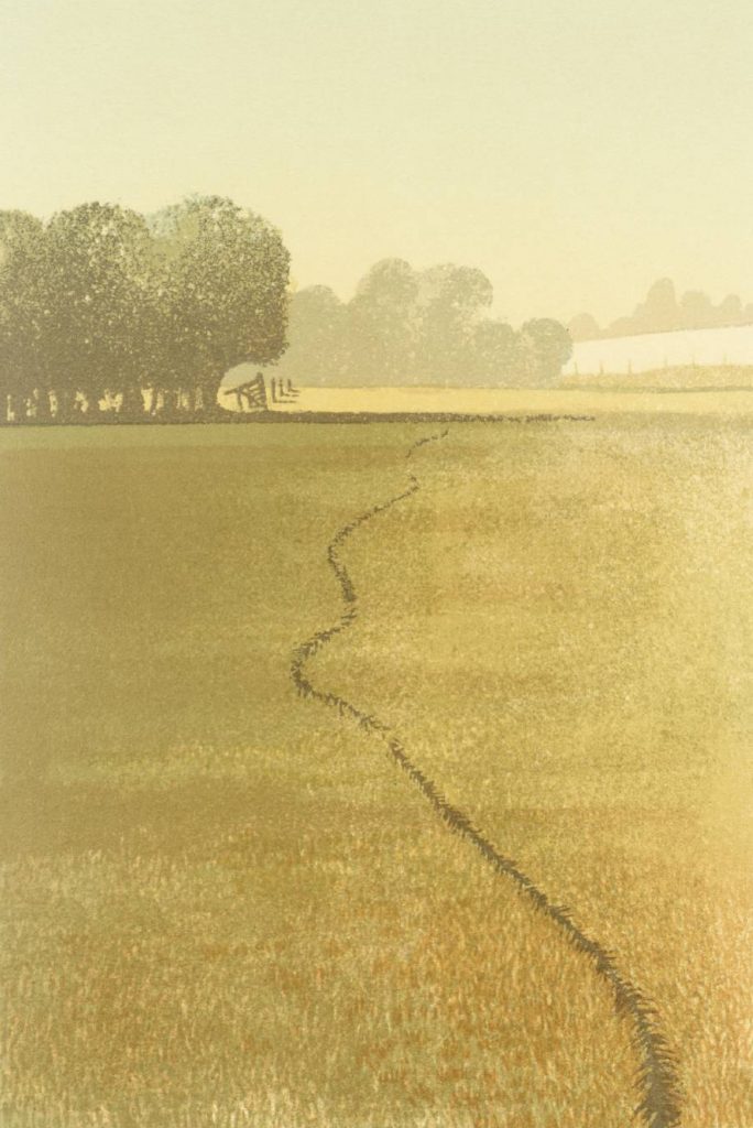
I can’t help feeling if these screen prints and lithographs were blown up in size to fill whole walls people would be impressed with Carlo’s technical ability. After having a lucrative series of prints of Christie’s Contemporary Art in the 70s and 80s, he became more abstract and worked in a series of colourways. Like the print below, a woodcut of a field and woodland in an explosion of colour.


Here is some text from Carlo’s website that is rather entertaining and I have illustrated with his works:

From the very start I loved it at Colchester Art School: I found my tribe. With staff including Edward Bawden, John Nash, Peter Coker, Edward Middleditch and Nigel Henderson, It was so exciting. After two years I specialised in painting and printmaking and was encouraged to go to North Wales and visit the slate quarries, to get away from East Anglia and the fields and the big sky.

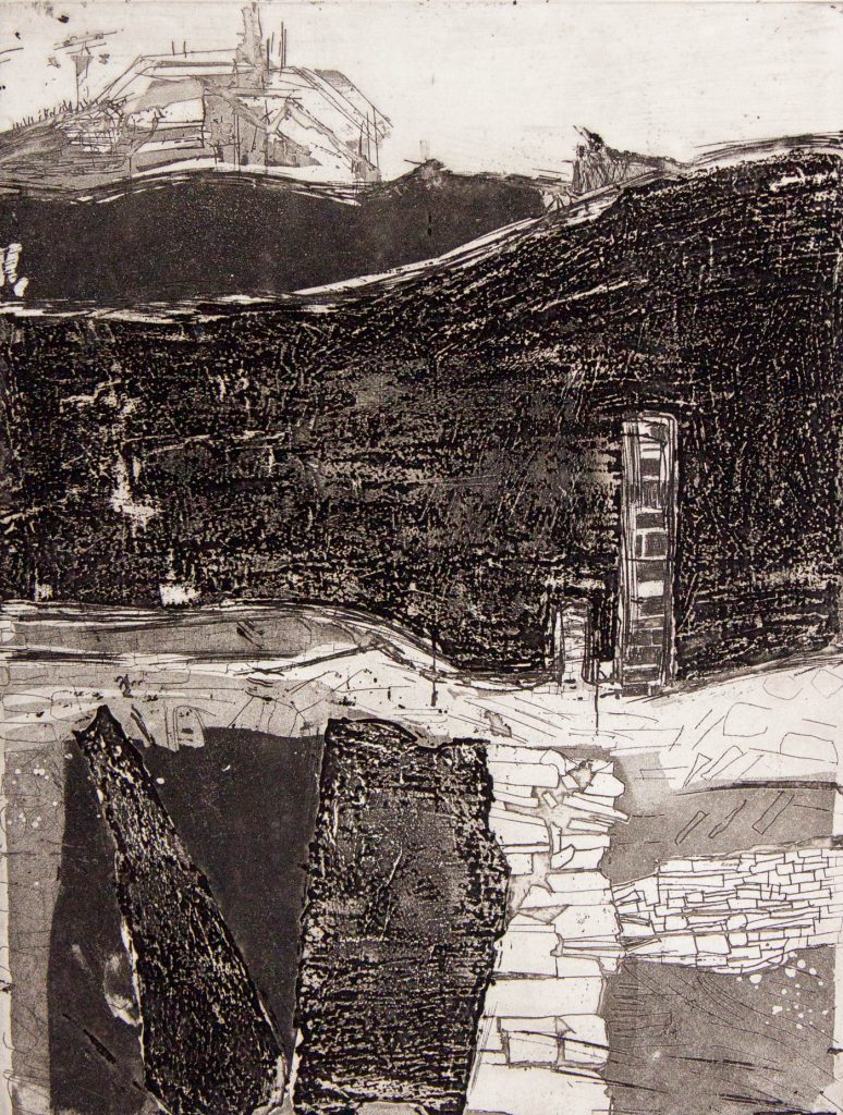
Michael Carlo – Slate Quarry North Wales, Etching, 1966

I hitchhiked there with a tent and a large drawing board in the summer of 1964. I did a huge quantity of drawings and photographs and in Feb 1965 it got me into the royal college of art and into a flat in Shepherds Bush. At the RCA I learned to do photo screen printing; I also won the lithography prize, despite the big move to ‘pop’ art, I stuck to slate quarries.

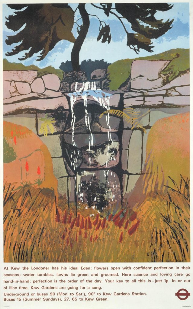
Michael Carlo – London Transport Poster.

In 1972, unable to buy a house in London, I moved out to Essex, near Braintree, to a derelict cottage surrounded by fields and after a short time became obsessed by the land, weather and time of year. I had an etching press by then and was also doing simple hands on silk screen printing.

By 1976 I was working a lot of the time for Christie’s Contemporary Art, producing commissioned silk screen prints in large editions, doing all the printing in a small outside wash house, my studio. In 1979, with the help of a contract with CCA I was able to move. On a visit to my parents in Suffolk, near Glemsford, I saw a large barn with other outbuildings and a small barn part-converted into a house. My first job was to convert a row of stables and pigstys into a long studio. I also bought a stone lithography press and gave up part-time teaching in London and Southend-On-Sea.

Around 1995 I stopped doing prints for Christie’s Contemporary Art which gave me complete freedom to do as I wished. My work became less romantic, a little harder. I did more etching and stone lithography plus I started doing reduction woodcuts using MDF in very small editions of 12 or 15. Not of 250.

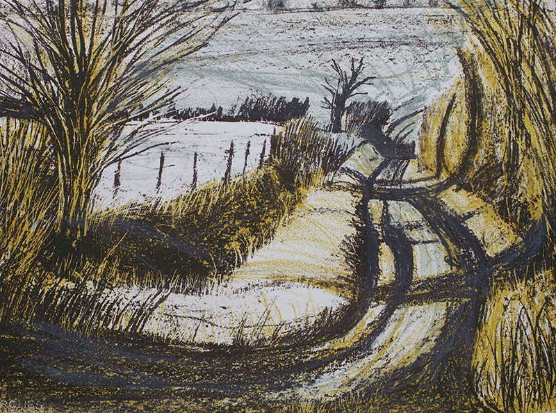
Michael Carlo – Winter Sun In The Lane, 1990