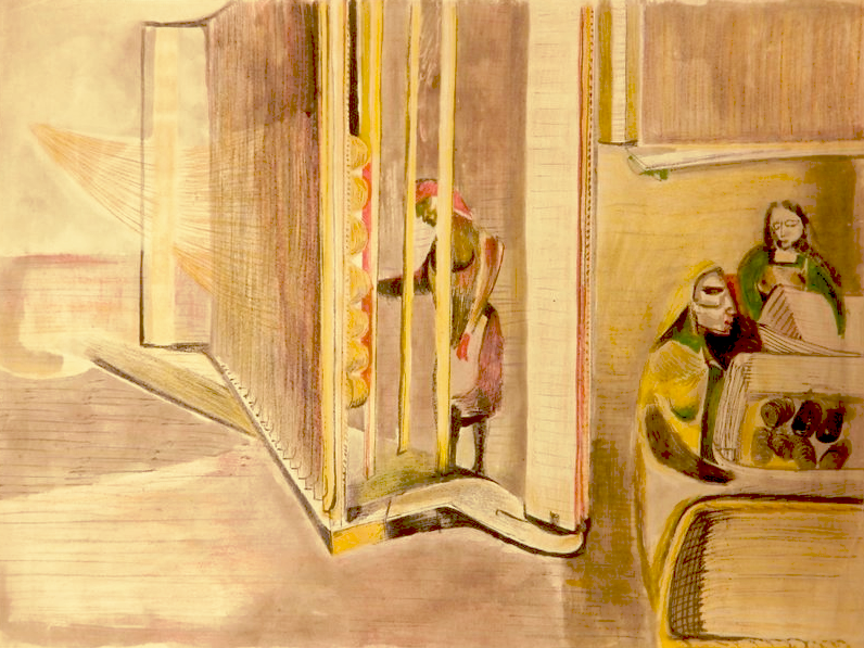
Many years ago as a student, I worked making screen prints of an edition of World of Interiors. I can’t remember why, but I found the images of the finished versions the other day.
Category: Uncategorised
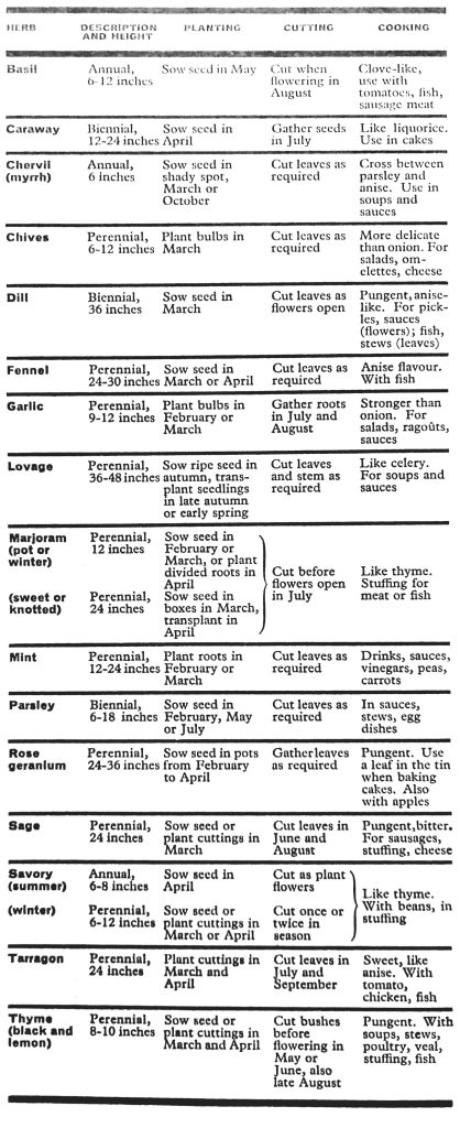
It is sometimes thought, I believe, that the use of herbs in cookery is an import brought to this country from France, Italy, Spain and other foreign countries. There, it is thought, they are used in great quantities to disguise the meat, fish and vegetables which, it is mistakenly believed, have not the superior flavour of our own. In fact, as a nation we have always relied a good deal on herbs in cookery and we still do. It is only that the varieties have become very restricted.
At one time the term ‘herbs’ included, as well as all the aromatic herbs, green leaf and salad vegetables such as spinach, sorrel, lettuce and celery, with shallots, leeks and often flowers as well; cowslips, tansy, nasturtiums, elder flowers and marigolds.
Eighteenth-century cookery books included, as well as numerous herb teas, wines and medicinal concoctions, recipes for herb puddings, soups and pies to be eaten in the spring to refresh the blood after a winter diet of salt meat and dried vegetables. The custom survives to this day in the rhubarb dishes of spring. The choice of herbs to flavour fish, meat and fowl was originally based on the principle that what the animals ate, or the plants growing where they grazed, were used to bring out the flavour of their flesh when they were cooked. A few tips for the preparation of herbs for kitchen use may be useful. Small quantities of fresh herbs such as chives and parsley to sprinkle on salads or in soups are best cut with kitchen scissors.
For larger amounts, there is a most useful solid little wooden bowl and chopper made in France especially for this pur- pose, and which eliminates the washing of the chopping board every time parsley and onion have to be chopped. This can be bought in London. Another method is to place the herbs to be chopped in a heavy tumbler (a glass mustard jar is ideal) and, turning the jar round and round in one hand, with the other chop the herbs with scissors.
To dry herbs for winter use, put them on a tray in a fairly fast oven, and when dry store them as they are, on the stalks (the flavour keeps better unpowdered) in glass-stoppered jars. With this method you can always see what you’ve got. Fines herbes for omelettes, fish, liver, steaks and so on should, unless otherwise specified, be a mixture of parsley, chervil, chives and tarragon. A mixture of chopped mushrooms and shallots was also at one time known as fines herbes but is properly a duxelles. A bouquet garni, or faggot of herbs, consists of a bayleaf, one or two parsley stalks and a sprig of thyme tied with a thread so that it can be removed from the stew before serving.
Occasionally in French cookery books the term fournitures is used in directions for salad or soup-making. This means salad herbs, which in French markets are usually sold on stalls separate from the vegetable stalls, by the women who have brought their little bunches in from the country. Sorrel is usually included among the fournitures.
Rosemary and sage, two of the most beautiful aromatic herbs of the garden, can also be two of the most disastrous in the kitchen unless used in infinitesimal quantities. The oils which they contain easily overwhelm other flavours, and im- part an acrid taste to stuffings, sauces and stocks. I have always thought it odd that in England, where ‘messed up’ food is so violently condemned, a particularly coarse mixture like sage and onions should be so popular. However, these things are a question of taste, and I only advise, when rosemary has been put into a stew, that it should be removed before serving so that the diners do not choke on the spiky little leaves.
Sauce verte
This is, I think, one of the great achieve- ments of the simpler French cooking. It straightaway lifts any fish with which it is served into the sphere of elegance. But it need not be confined to fish. First prepare a very thick mayonnaise with 2 or even 3 egg yolks, one-third to half a pint of best olive oil, and a few drops of wine or cider vinegar. The other ingredients are 10 fine spinach leaves, 10 sprigs of watercress, 4 of tarragon, 4 of parsley. Pick the leaves of the watercress, tarragon and parsley from the stalks. Put all these leaves with the spinach into boiling water for 2 minutes. Strain, and squeeze them quite dry, pound them, and put the resulting paste through a fine sieve. It should emerge a compact purée. Stir gradually into the mayonnaise.
La soupe au pistou
A famous soup of which there are many versions. Pesto, the basil, cheese and pine nut sauce of the Genoese, was adapted by their neighbours in Nice, who modified it to suit their own tastes, and called it, in the local dialect, pistou. It is the addition of this sauce to the soup which gives it its name and its individuality. Without it, it is simply a variation of minestrone. Basil is not easy to come by in England, although a century ago it was common, being essential for the flavouring of turtle soup. It is also said to have given the peculiar flavour to the famous Fetter Lane sausages.
Now to the soup, a version taken from
a book of Provençal recipes, Mets de Provence, by Eugène Blancard (1926). In a little olive oil, let a sliced onion take colour; add two chopped and peeled tomatoes. When they have melted pour in 21 pints of water. Season. When the water boils throw in lb of green French beans cut into inch-lengths, 4 oz of white haricot beans (these should be fresh, but in England dried ones must do, previous- ly soaked, and cooked apart, but left slightly underdone; or they may be omitted altogether, the quantity of pota- toes and vermicelli being increased to make up for them), a medium-size cour- gette unpeeled and diced, 2 or 3 potatoes, peeled and diced. When available, add also a few chopped celery leaves, and a chopped leek or two. After 10 minutes add 2 oz of large vermicelli in short lengths.
In the meantime prepare the following mixture: in a mortar pound 3 cloves of garlic with the leaves of about 10 sprigs of very fresh basil. When they are in a paste, start adding drop by drop two or three tablespoons of olive oil. Add this to the soup at the last, off the fire. Serve with grated Parmesan or Gruyère.
Poulet rôti à l’estragon
Tarragon imparts an exquisite flavour to chicken; to me Poulet à l’estragon is one of the great treats of summer.
For a fat roasting chicken weighing about 2 lb when plucked and drawn, knead a good oz of butter with a table- spoon of tarragon leaves, half a clove of garlic, salt, pepper and a tablespoon of breadcrumbs. Put this inside the bird, which should be well coated with olive oil. Roast the bird lying on its side on a grid in a baking dish. Turn it over at half time; about 20 minutes on each side in a hot oven should be sufficient (those who have a roomy grill might try grilling it, which takes about 25 minutes, and gives much more the impression of a spit- roasted bird, but it must be constantly watched and turned over so that the legs are as well done as the breast).
When the bird is cooked, heat a small glass of brandy in a soup ladle, set light to it, pour it flaming over the chicken, and rotate the dish so that the flames spread and continue to burn as long as possible. Return the bird to a low oven for 5 minutes, during which the brandy sauce will mature and lose its rawness. Serve with the Poulet à l’estragon a salad of whole, small, peeled tomatoes, dressed with thick cream seasoned with salt, pepper, a few drops of vinegar and some whole tarragon leaves.
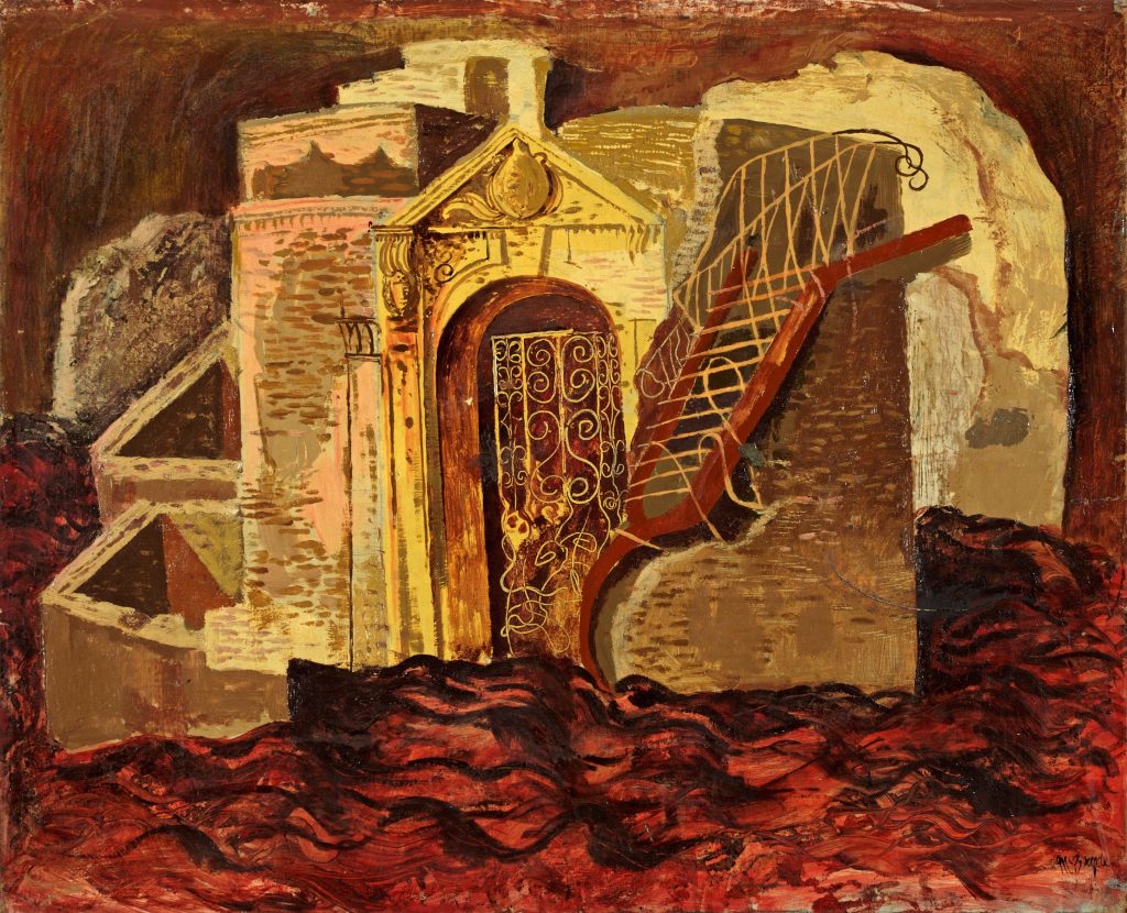
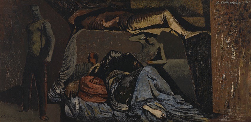
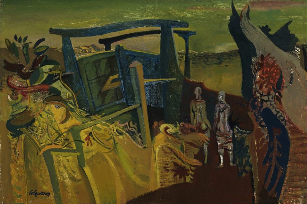
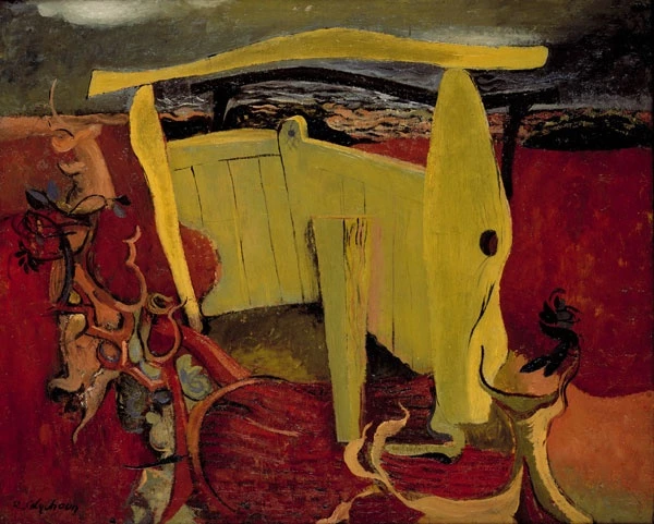
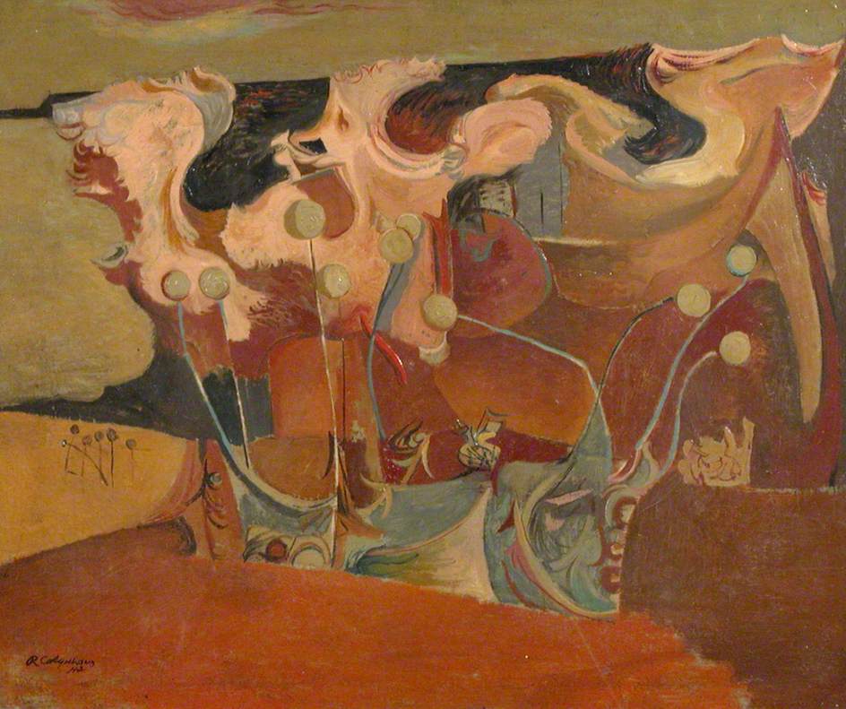
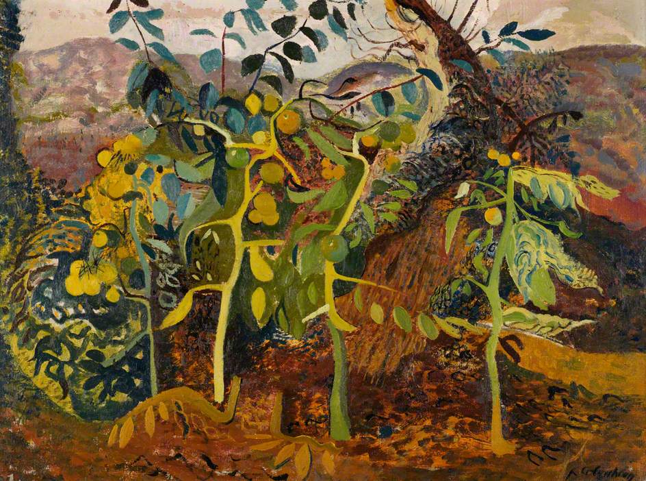
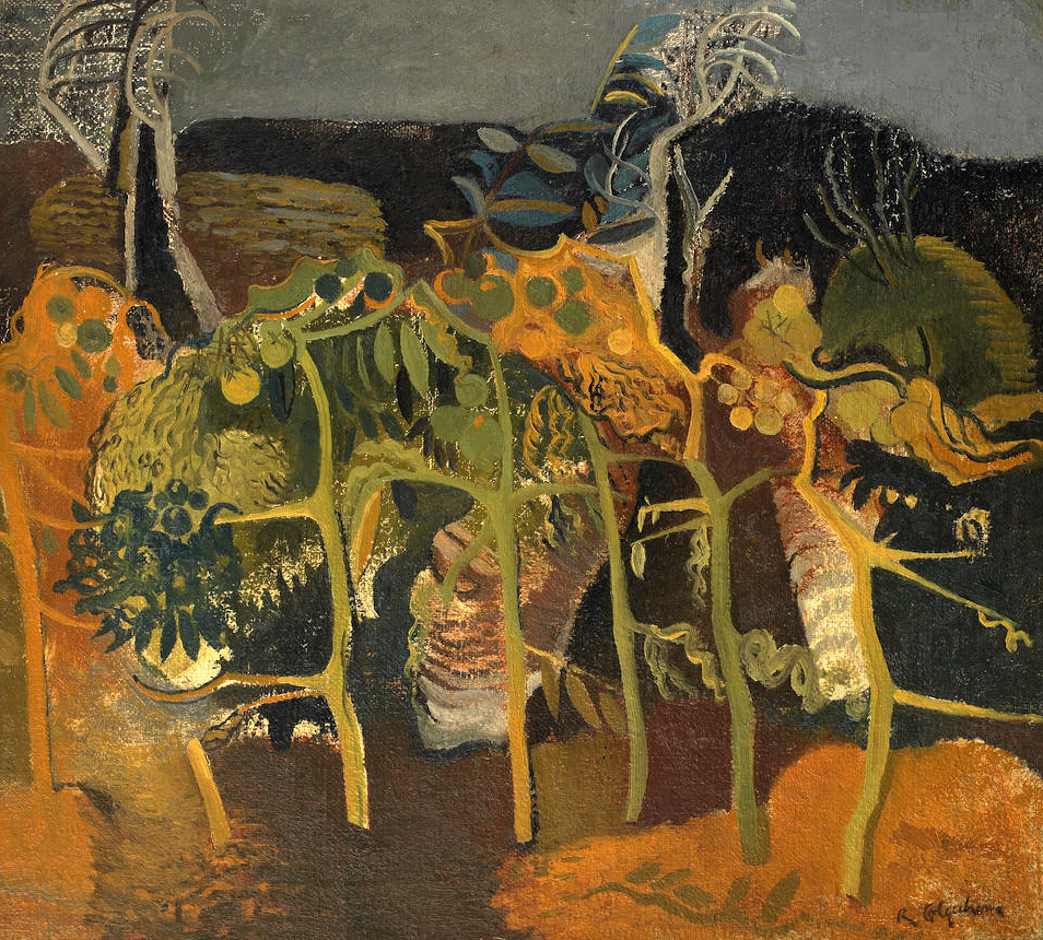
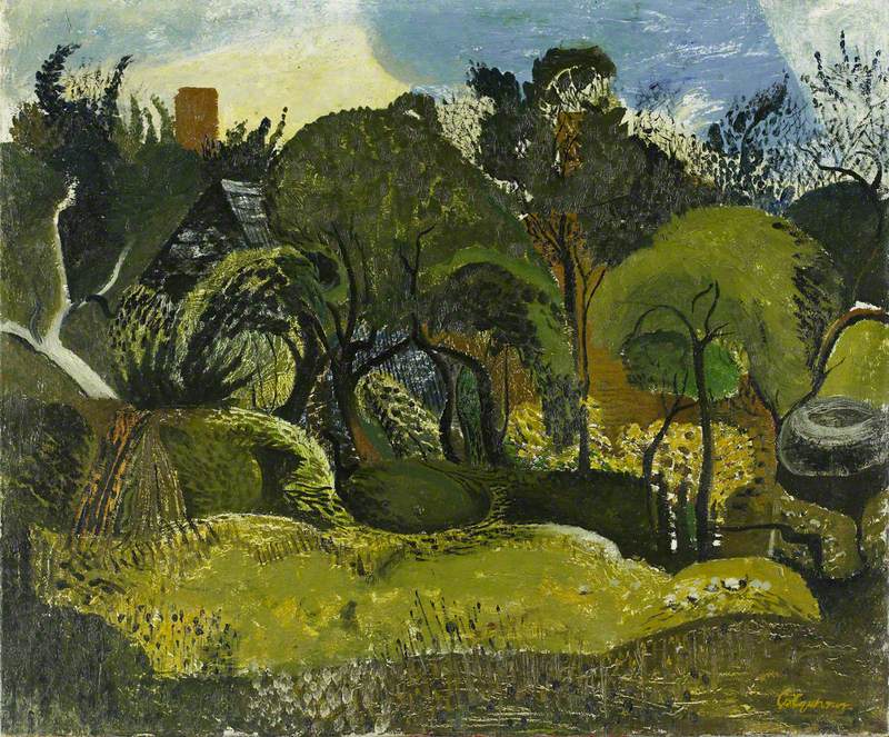
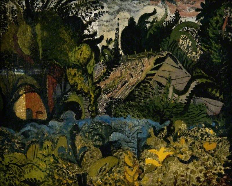
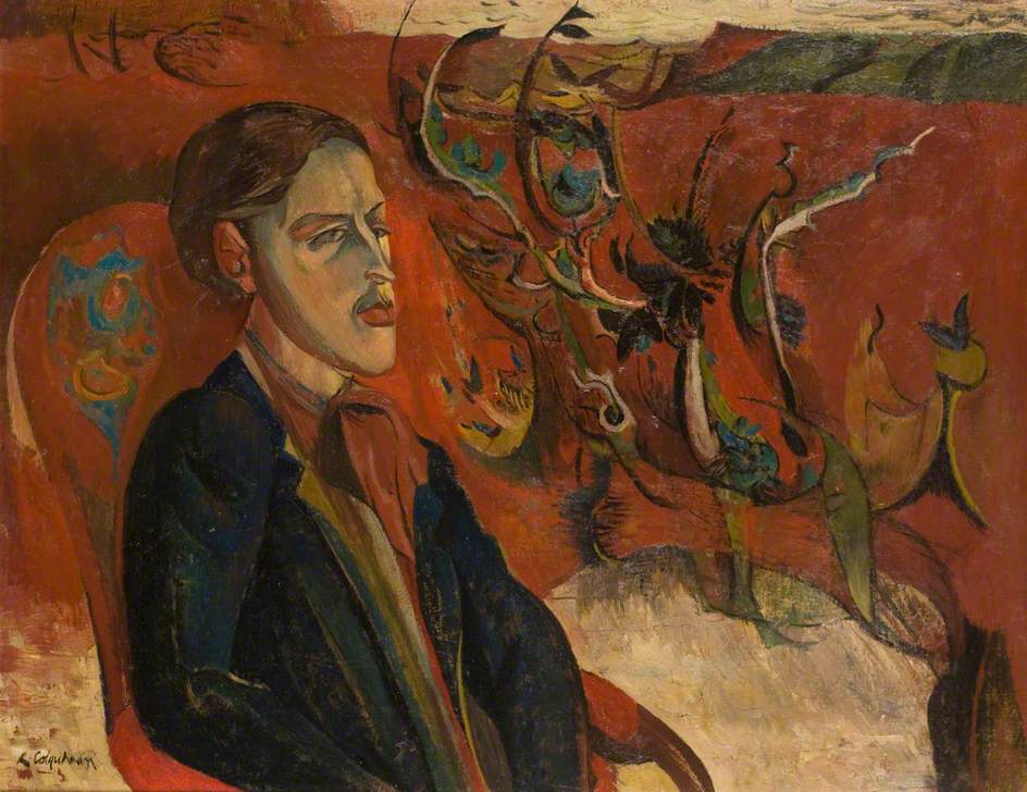
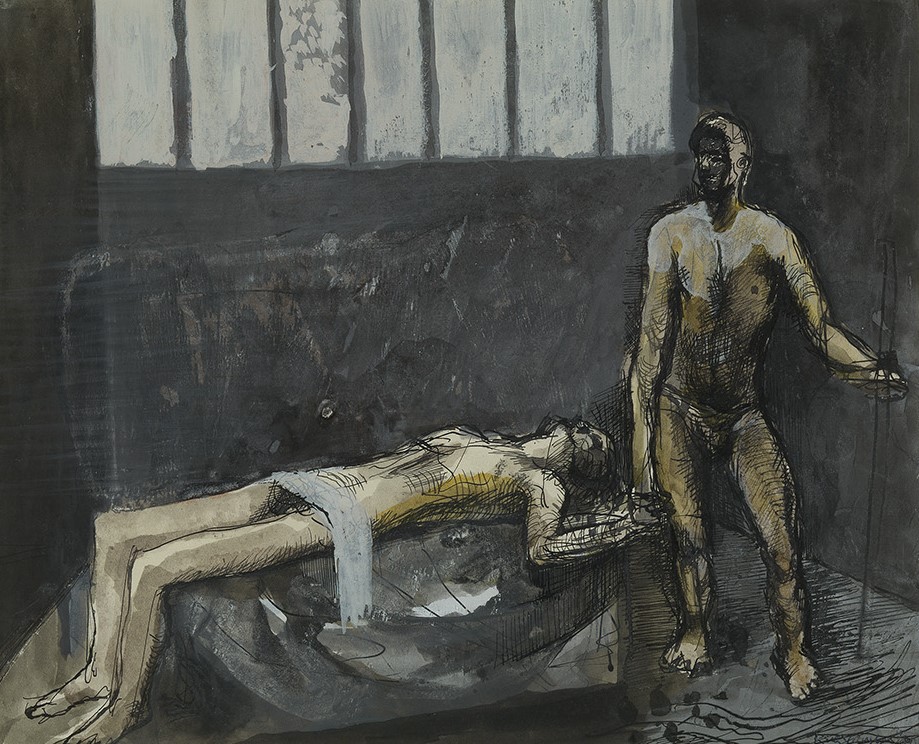
Robert Colquhoun was serving as an ambulance driver in the Royal Army Medical Corps during the Second World War. After being injured, he returned to London in 1941 where he continued to share a studio space with Robert MacBryde. The pair shared a house with John Minton and Jankel Adler lived near.
This is a blog featuring some of the work the Robert’s made during the Second World War. They have the feel of Frances Hodgkins about them and some show the influence of artists such as Michael Ayrton too.
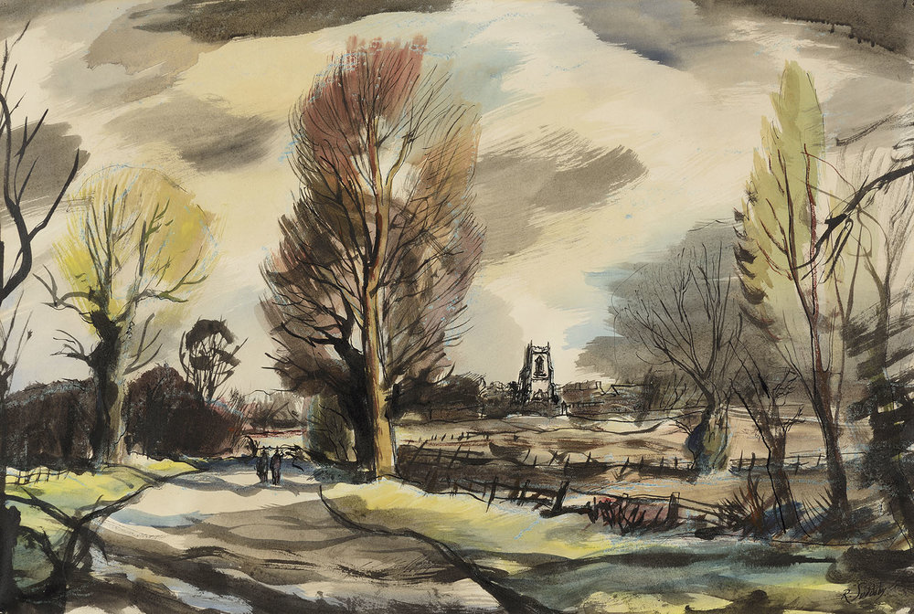
Suddaby was born in Yorkshire and studied at the Sheffield College of Art from 1926 on a scholarship. He moved to London and for four years painting still lifes, local views and ones of Cornwall, but he didn’t have a solo exhibition until he was offered an exhibition at Lucy Carrington Wertheim’s Gallery in 1935. The next year he had a solo show at the Redfern Gallery.
In 1937 he moved to Sudbury, Suffolk and his work became almost totally East Anglian, of flooded fields and tree lined lanes. He took part in the Recording Britain scheme. He became a founding member of the Colchester Art Society, designed a poster for Shell and later became the curator of Gainsborough’s House museum.
This is a short little elegy to Rowland Suddaby by his friend Michael Webber, from the East Anglian Magazine, January 1973
Visits to East Anglia will never be quite the same. Whenever we could, my family and | always tried ’ to travel via Sudbury so that -we could visit Gainsborough’s House and meet the curator, Rowland Suddaby. Now he has gone and though the house and the works of the master remain we shall never again enjoy the company of a man who was not only a fine artist but also a person of immense charm, kindness and honesty.
He was marvellous with children – my own daughters were as saddened to hear of his passing as I was myself – and this could be seen In the delight with which he showed us round the house when the local schools were exhibiting their work.
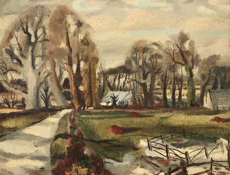
His own work was seen far too infrequently. His watercolours were among the most powerful and brilliant landscapes painted in this country in our time, dashing, incisive works which owed much to the best French traditions of Maurice de Vlaminck and André Dunoyer de Segonzac but which never lost that solid observation of nature which seemed so natural to a Yorkshireman who came to live in Constable’s country. His oil paintings, too, showed a delight in colour and pigment which made for exciting and satisfying viewing. There is no doubt that through his art he will live on.
Equally his name will be long remembered through the tremendous work he did for Gainsborough’s House. He brought new life to an already successful institution and developed it into a centre of East Anglian art worthy of the man whose name it bears. He will be a hard man to replace for as Roy Turner Durrant said, in an eloquent letter to the East Anglian Daily Times, “he was a kind man and artists are not always kind”. East Anglia is indeed fortunate in that artists like Suddaby and Cavendish Morton give so freely of their time in order that we can benefit.
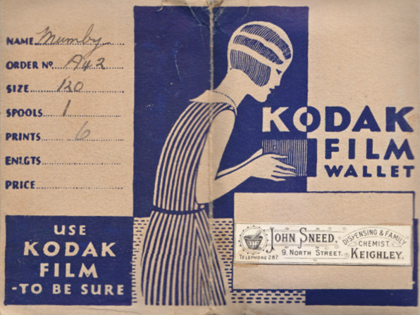
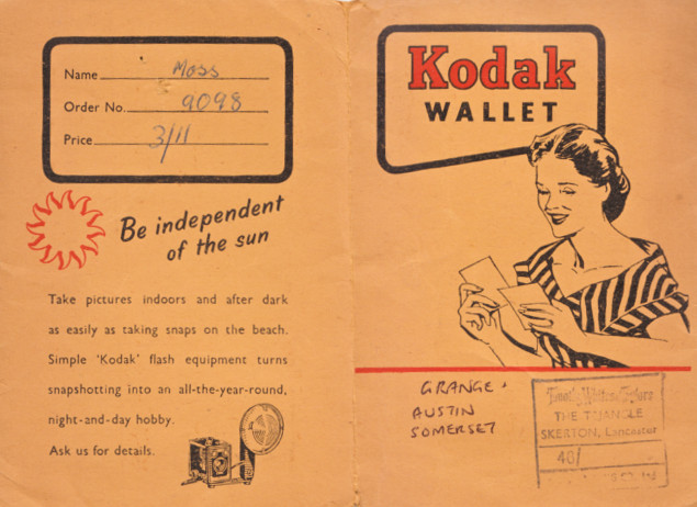
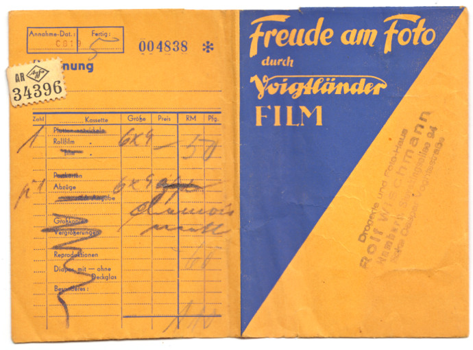
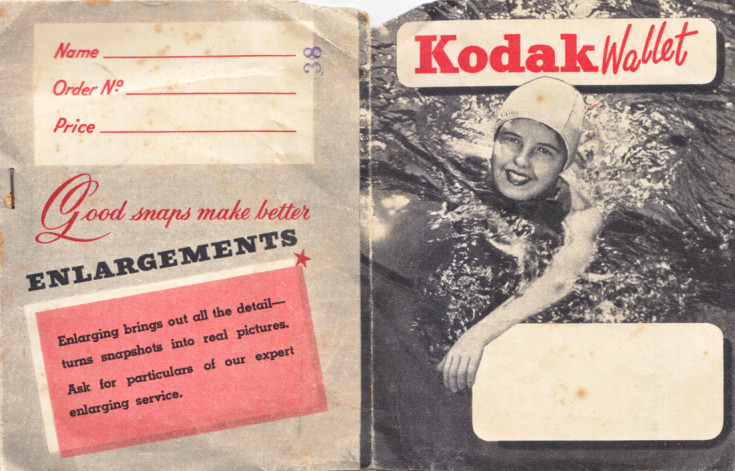
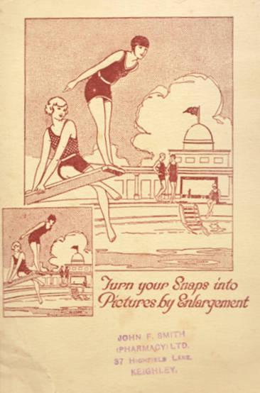
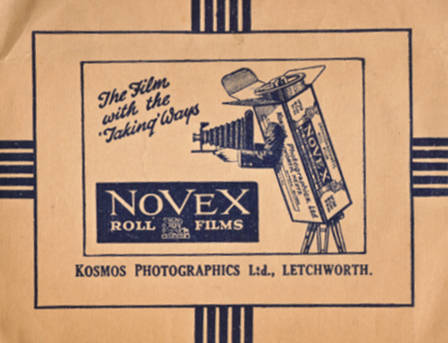
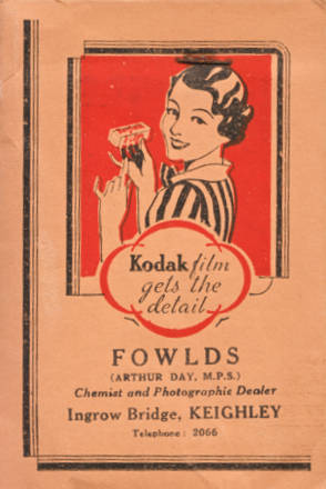
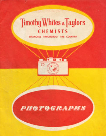
The other day I uncovered a lot of old wallets for photo and negatives and I thought they would be interesting to post. Really it is the graphic design of it all. The different audiences and eras of photography. Many of these date from 1930-1940. A lot of them are old photographs of Germany.
In AD 945 the Abbot of Croyland had a great bell cast, which he called Guthlac, after the abbey’s founder. Egelric, his successor, added six more bells, called Bartholomew, Betelin, Turketil, Tatwin, Pega and Bega. Perhaps these were saints’ names, though some of them have a suspiciously pagan ring; one suspects though, that pious dedications cloaked a natural human instinct to give personalities to objects whose individual voices had so distinct an identity. It was not until the sixteenth century that the name of the bell founder himself began to appear on the bell, and it was a sixteenth century founder, Robert Mot, who opened the foundry in the Whitechapel Road. Two of the bells of Westminster Abbey bear his name and the rest have also been made or recast at Whitechapel. Indeed, many of his bells are still in use and frequently return to the Whitechapel Foundry for repair or rehanging. And the methods used for the casting of bells have changed little since Mot himself made them.
In 1738 the foundry moved across the road and took over the site of a coaching inn called the Artichoke. A remaining area of the old courtyard is still the centre of today’s complex of buildings (fragments of saltglaze bellarmine bottles still turn up). Here Big Ben was cast in 1858, only one of many famous bells that have issued from the foundry. The bell moulder at the time, Thomas Kimber, also kept records of the details and inscriptions of every bell that came into the foundry and it was from his drawings that the foundry was able to remake many bells which were destroyed during the Second World War.
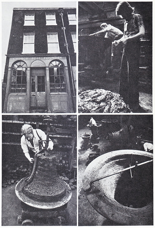
Bells are commonly associated with change ringing, in which intricate patterns of sound are made by varying the order in which the bells are rung. The practice was introduced in England at the beginning of the seventeenth century and presupposes a set of bells of varying sizes, to give the different notes, The bells are swung by ropes on the frame on which they hang, so that the whole bell is turned through a full circle, and struck one blow by the clapper. This method of ringing gives a full deep tone, and naturally superseded the previous one in which the clapper was itself attached to the rope and so pulled against the bell.
The characteristic bell shape evolved during the Middle Ages. The bell grew longer, and the flared lip developed, with a soundbow, or extra thickness, at the point where the clapper strikes. Both these developments went to make better sounds, but an important advance came in the seventeenth century when (two Dutchmen, the _ brothers Hemony, learnt to adjust the harmonics of the bell, and to grade correctly not only the note heard when the bell first sounds, the “strike”, but the other notes which follow as the sound vibrates, the “hum”, which should be one octave below the strike, the partial tones in between, the minor third and the fifth, and the octave above the strike. The results of their experiments were lost however, and harmonics remained largely a matter of luck until they were rediscovered at the end of the nineteenth century.
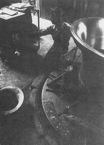
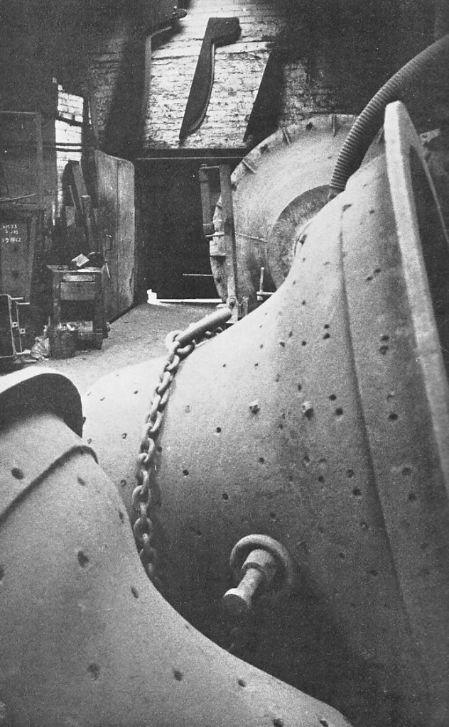
To begin the actual making of a bell is a messy business. To build up the “‘core’”’, the mould on which the inner shape of the bell is formed, a mudbath of London clay, horsedung and horsehair is stirred in the middle of the floor and when the mixture is of the right consistency it is plastered by hand onto a layer of bricks. The shape is checked against a moulding board, which represents the exact dimensions of the inner curve of the bell. When finished, the mould is dried in an oven and coated with graphite and polished for a very smooth finish. A similar process is used to make the “cope”, the outside shape of the bell, which is built up inside an iron case. It is finished m the same way, but before dry ng any inscription is pressed to the damp loam so that it stands out in relief when the bell is cast.
Next comes the process of “closing down”. The cope is lowered over the core and the two moulds are firmly clamped together. A huge ladle is filled with molten metal from the furnace — approximately 77 per cent copper and 23 per cent tin – and this is poured into the space between the cope and the core. The metal must be at exactly the right temperature; small bells needing a higher temperature than large ones. Slowly the bell cools, taking between one and eight days, according to size. Finally the moulds are chipped off and the bell is ready for tuning.
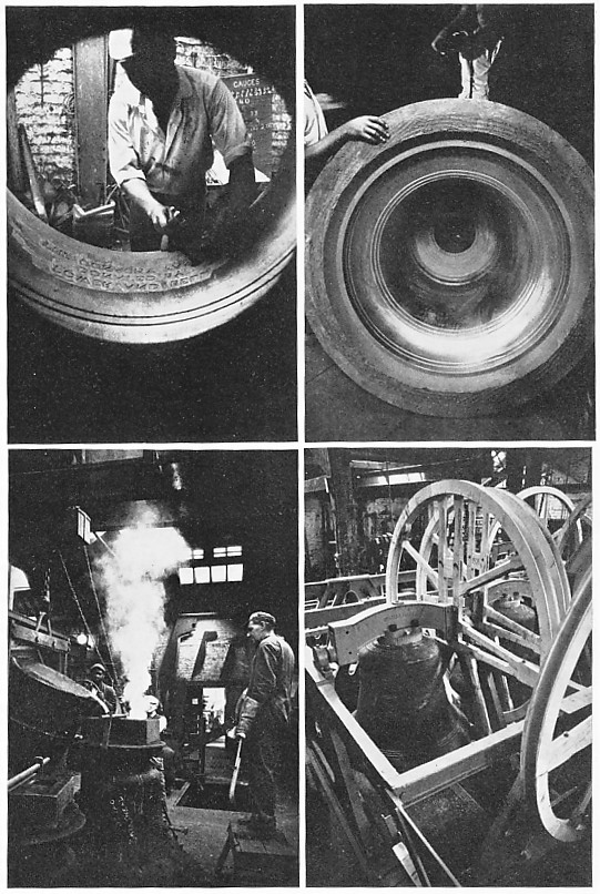
In the tuning process fine parings of metal are taken off with a lathe until the bell reaches the correct pitch. Instruments for checking tuning have now become so accurate that they are in fact inaccurate, as they can record a range of sounds beyond the human ear and they adjust to a scale which sounds perfect no doubt to ethereal ears but quite wrong to flesh and blood ones. In the final stages therefore, only human sounding boards are used.
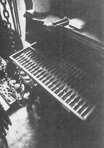
The Whitechapel Bell Foundry also makes handbells, for which moulds of sand like little bell-shaped sandcastles are used for the core. In tuning bells of this size even the final polishing they are given can have an effect on the sound.
Every bell is made individually over a period of two or three months, If anything goes wrong, the whole process must begin again, with corresponding waste of time, money and labour. There are no short cuts. In such circumstances, skill is the very essence of the business.
One last request: please do not try to visit the foundry. They already have more visitors than they know what to do with and there is really not room for them in the high sheds, filled with Piranesi shadows and machinery, the floors covered with bells awaiting repair. Since the managers are too courteous to find it easy to drive people away, you might reflect that they have a two-year backlog of work and there are only two belles left in England. If to keep the belfries of the world reeling with changes, keep away and let them get on with it.
Here is a poem by Alan Ross on the death of Keith Vaughan in 1977. They had met when Ross was working with Minton on Time Was Away. At this point in time, they were living in the same house in different flats. For a time Ross was sleeping in the boiler room while trying to make a living as a journalist. In 1966 Ross also edited Vaughan’s journals, Keith Vaughan Journals & Drawings.
Iowa and Keith Vaughan
Learning of your suicide,
The customary calm of your ending
In that methodical way,
The remorseless advance of the enemy
You could not stop gaining on you,
I look up
At your paintings of Iowa,
Cedar Rapids, Des Moines, Omaha,
Remembering my own journeys
Through that unpopulated landscape
West of Chicago – unpopulated
Because she wasn’t with me – my notes
So similar to those scratched
In the margins of your drawings,
As if it were them I travelled through,
Not the real thing, that emptiness
Spilling its way to the Pacific.
You observed:
“Red oxide barns with silver pinnacles”
“Pink pigs bursting from black earth like truffles”
“Ochre sticks of corn stubble”
“Space and sun”
And approaching Omaha
“For sale – Night Crawlers”
“The air of expectation; of probing contacts”
“Extraordinary prevalence of mortuaries,
Neon-lit and glittering like cinemas”.
What you drew
Were the black barns and white-timbered houses
Reminding you of Essex,
Snow patches and corn stooks,
Silos erect on the countryside like penises,
The starched white
Fences protective of loneliness.
I am in Iowa again,
Landlocked and frozen
In a numbing death of the spirit –
You knew before your own
How many forms death takes.
This is the suicide note of Keith Vaughan from his journals. After suffering from Cancer for two years, he arranged to be at home alone, sending his lover to his country home and for his friend to take him to hospital the next day (in the hope of his body being discovered).
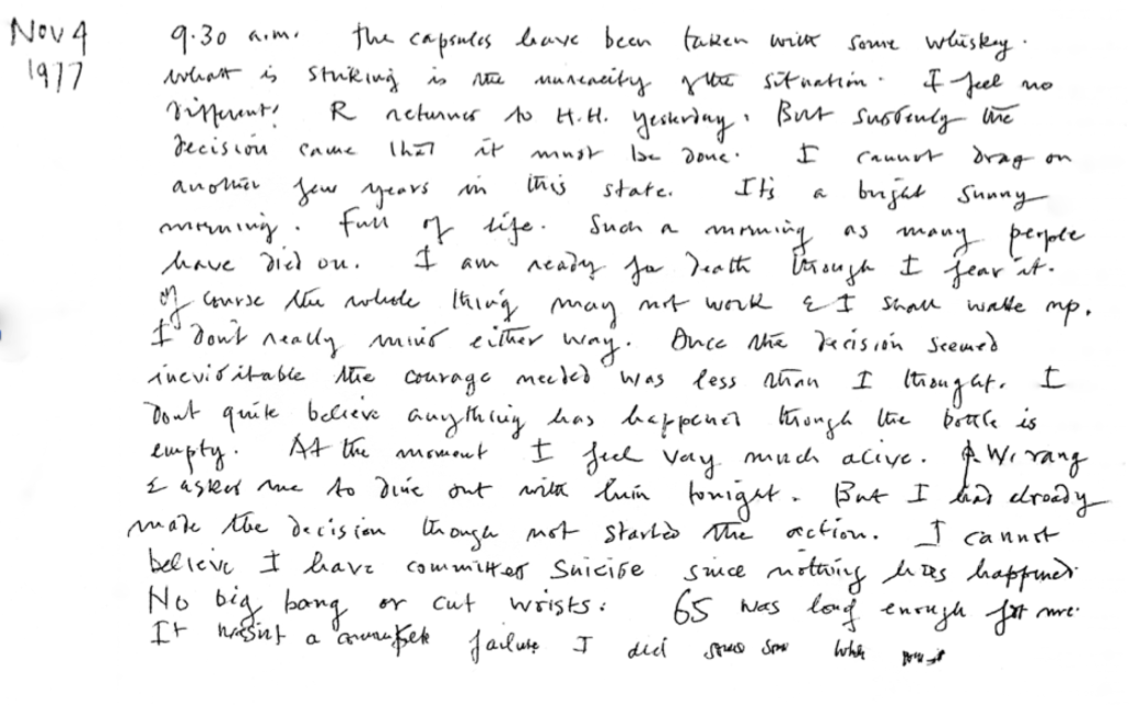
Nov 4 1977
9.30 a.m. the capsules have been taken with some whisky. What is striking is the unreality of the situation. I feel no different. Ramsay returned to Harrow Hill yesterday. But suddenly the decision came that it must be done. I cannot drag on another few years in this state. It’s a bright sunny morning. Full of life. Such a morning as many people have died on. I am ready for death though I fear it. Of course the whole thing may not work and I shall wake up. I don’t really mind either way. Once the decision seemed inevitable the courage needed was less than I thought. I don’t quite believe anything has happened though the bottle is empty. At the moment I feel very much alive. Patrick Woodcock rang and asked me to dine out with him tonight. But I had already made the decision though not started the action. I cannot believe I have committed suicide since nothing has happened. No big bang or cut wrists. 65 was long enough for me. It wasn’t a complete failure I did some good…
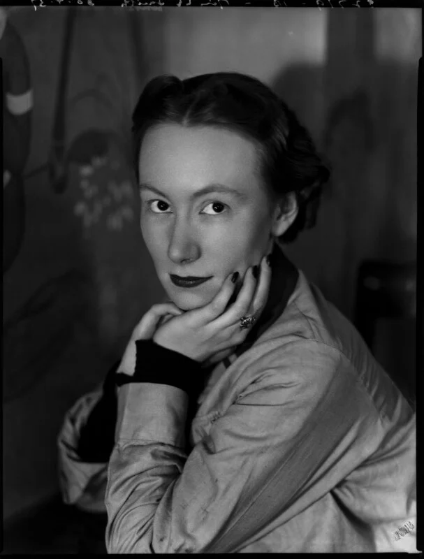
There is so much not explored about the Festival of Britain. There are many books but with so many artists a lot of names get forgotten. One of them is Eleanor Esmonde-White (1914-2007). Her work for the festival is at the bottom of this post.
She was a South African artist born in Dundee in Kwa-Zulu Natal. She Studied fine art at the University of Natal in 1932 and was a scholarship to spend a year studying in London at the Royal College of Art alongside Le Roux Smith Le Roux (1914–1963). In order to be awarded the scholarship she had to agree not to marry before the age of 26, the government not wanting to waste money on a women who might drop out of the education or risk getting pregnant.
A few weeks into the first semester the renowned British architect, Sir Herbert Baker, announced that he was offering a scholarship to the two top South African art students to study at the Royal College of Art (RCA) in London. Baker had been commissioned to design South Africa House on Trafalgar Square in London as the headquarters of the South African High Commissioner.
According to Eleanor, Sir Herbert propagated the practice of decorating public buildings with murals and tapestries and aspired to establish a school in South Africa where artists would learn the skill of mural painting.
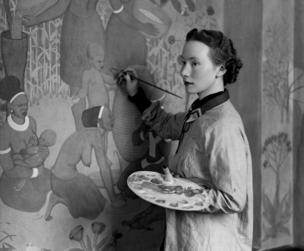
The murals took four years for them to complete. The caucasian world of the diplomatic service at that time were amazed when Esmonde-White told them of her plans to depict the tribes of South Africa, from the farmers to the Amazulus. The Amazulu mural was of a traditional ceremony that predated the white settlement of the country.
After apartheid in 1994, many of these were due to be painted over by a new wave of diplomats, with some of the scenes considered racist at the time. However their artistic merit was recognised and they were simply boarded over until 2012, when they were restored, ‘after it was decided they were not as offensive as first appeared‘ with the project headed by Lorna de Smidt, a South African political scientist and art historian who said ‘We had to acknowledge the past, and accept that it is there. You can’t just airbrush things out of history and pretend they didn’t exist‘.
The murals in 1936 were considered a great success and they both won scholarships to study mural design at the Royal College of Art for a year.
After the murals were completed Esmonde-White had a studio in South Africa House so she could work on murals for buildings in her homeland. She worked on a series of murals in London during the Second World War, with them being shipped off to South Africa, but the fashions of London for scantily clad figures were not received well and the murals was placed in the basement of a government office.
In 1945, the death of her father, a heavy workload and the war took their toll on her and she had a breakdown. Her mother who was in London took her to a farm in Wales to recuperate. After this she made a large war mural for the Canadian forces for the Brookwood Military Cemetery. She worked for architects in London making murals and in 1949 returned back to South Africa.
In 1949 Esmonde-White established the department of Design at the Michaelis School of Art at the University of Cape Town.
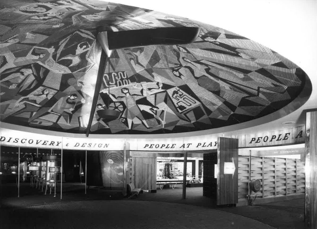
While teaching at the school she got an offer by Hugh Casson to design a large mural for the Festival of Britain. It was completed in 1951 and was a massive mosaic mural for the Dome of Discovery. There are very few records of her work on this and I can only find this one image.
Staying in South Africa, she continued to work and build up a legacy as a teacher and an artist in her own right. Her paintings are held in major collections in her homeland.
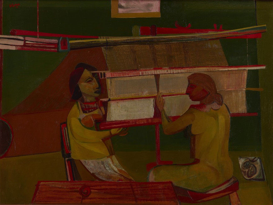
This is an interview from a 1987 edition of Handwoven magazine with Peter Collingwood. As it is unlikely to be online I thought it important to post.
Introduction: It is a rare weaver who has not heard of Peter Collingwood. He is renowned as a rug weaver; his book The Techniques of Rug Weaving, published in 1968 and now in its ninth printing, is considered the definitive reference on the subject. Shaft-switching, a Collingwood invention which has become universally accepted is his trademark. Exhibitions of his work often include is “macrogauzes”, hangings which feature twisted and crossed threads in artistically intricate patterns, created with yet another loom adaptation he developed. He may be the foremost authority on sprang and card weaving, subject of two additional books he has written. You might expect Peter Collingwood to have a physical stature and (justifiably) an ego to match is legendary world-wide reputation. It comes as a bit of a surprise, therefore, to meet this quiet, unassuming man for the first time. He is not a showman. He does not need to be; his work speaks for itself. He is a modest, soft-spoken man with a clever, subtle sense of humor. Interweave Press was fortunate to have the opportunity to talk with Peter during his 1987 teaching tour of the U.S., and we are pleased to present that interview here.
IP: Everyone knows who Peter Collingwood is. You’ve put in 35 years and during this time you’ve been a tremendous influence on the weaving world. You’re not only weaving, you’re teaching, writing and collecting textiles. I’d like for you to talk about how you’ve come to do all these things.
Peter Collingwood: It began by giving up being a doctor, which I didn’t like. As a child I was always confident in the way that I could do things with my hands. My favorite game was to balance a stick on my fingers and toss it up in the air and catch it balancing it again. I was interested in skills and I always felt confident that I could construct toys or make things. I certainly wasn’t confident in curing people of the diseases they presented. So, when I came across a loom in an occupational therapy department of a hospital, it interested me as a purely technical device. At the time, I knew absolutely nothing about weaving; all I saw was a machine. I made myself a very simple sort of inkle loom and added a pedal for making the sheds. I then put two inkle looms face to face so that I could weave wider fabrics. Then I added four shafts. For me, learning to weave was just finding things out for myself because at that stage I didn’t have any books on weaving. I can remember puzzling over a houndstooth jacket fabric and thinking that this must take three harnesses to weave, which was completely wrong. Finding out for myself that this weave required four harnesses was much more important for me than if I had read it in a book.
IP: Were you a doctor at that time?
Peter Collingwood: Yes. I was doing my internship at the time, and then after that I had to do two years in the army which gave me a lot of weaving time. I built a portable loom and I would whiz around in an army ambulance with this loom in the back on which I wove scarves furiously. When I left the army I saw an advertisement to work in the Red Cross in Jordan with Arab refugees. I thought that this sounded worthwhile, so I went there for nine months. This is when I came across ethnic weaving for the first time. When I returned to England, I bought a loom from George Maxwell and when I went to visit him he suggested that I visit Ethel Mairet who was the most important weaver at the time and lived close to him. I asked her if I could work with her, and I think she was a bit intrigued because she’d never had a man work in her workshop before. She said that I could come for a month, and I sort of bumbled my way through. I’d never thrown a shuttle; up until this time, I’d just poked little sticks through the shed. But Ethel Mairet had proper looms with shuttles and pedals. For me, it was a very strange experience, but it was an eye-opener because it was the first time I had met somebody who you’d now say was weaving art fabrics. She had an aesthetic approach to weaving and she wasn’t just mechanically throwing shuttles and beating up the weft. Ethel Mairet had a very good eye for color, texture and quality. Just to spend time in her house was an education, as there were textiles every where, some collected on her trips on the continent some from the great French designer, Paul Rodier. By the time I left Ethel Mairet’s workshop I had met other people, and I started weaving rugs with Barbara Sawyer, one of the people I’d met there. She did the designing and I did most of the weaving. I think we quarreled about something, and then she passed me on to Alastair Morton who was perhaps the most important person I worked with because he had a very technical approach that was more allied to the way I tend to look at things. Alastair would plan a long sample warp and ask me to see what I could get out of it. Then he would just leave me to work, which was wonderful. At the time I didn’t realize how much he was allowing me to do. After the sample was finished, he would pore over it inch by inch, and then ask me to weave ten yards or so of some little bit of it. He was very good at designing what I call a “pregnant” warp, one full of possibilities. This is when I started weaving multi-shaft rugs. Alastair had done single corduroy, and then I thought of the double corduroy idea. By this time I’d made a funny little eight harness loom which had keys like a piano, one for each harness. It was something like a dobby but you selected your harnesses for each shed rather than having them pre-selected. It was quite good for designing and I worked out a lot of multi-shaft pieces on it, including a block weave which Alastair let me weave in his workshop. I then moved to London and set up a workshop to weave rugs in a little room behind a furniture-moving firm. That was in 1953.
IP: Was it your intention at the time to make weaving your career?
Peter Collingwood: Yes, I was certainly determined to try it, especially as I was repeatedly told it was impossible. I knew I had to make a rug in two days so that I could sell it to a shop for about four pounds (which was something like $7.50). I could make a rug in two days if I limited myself to shuttle-thrown designs, and loom-controlled patterns. I abandoned traditional ways of making rugs because I needed the speed to survive. The most important thing to me was not to be a failure at weaving. What I mean by traditional techniques are tapestry, soumak, knotting—the ways in which rugs have been made in the past that are very slow but which give limitless design possibilities. When designing, I never start with a blank sheet of paper and some wonderfully inspired design and then ask how can I weave it? Rather, I always start with a technique, do the long sample and see what the technique will produce. I try to exploit what a technique will give me rather than impose a design on a technique. If a technique automatically gives little square blocks, then I try to see what can be done with little square blocks. If a weave automatically gives diagonal lines, then I see what I can do with diagonal lines. It’s one of many approaches, but it’s the only way I know how to do things. It’s important to be as critical of your work as you are of, say, modern furniture or painting. Try to apply the same standards you apply to other things to your work. I find design the most difficult part in weaving; especially trying to think of ideas that are new. I feel the only thing that can help you in designing is your own eyes—and your eyes need to be educated in some way. Mine, I hope, have been educated by the things I have around the house, objects I’ve collected: textiles, baskets, wooden pieces, pottery. Their shapes, colors and textures are constantly teaching my eyes lessons in design. My first rugs were very simple, mostly woven in summer and winter which I thought I’d invented until I found it in a book. However, it wasn’t until I got into shaft-switching that I had to seriously think about designing because before that, everything was pretty simple. With shaft-switching I realized that I could make any shape. Now I wasn’t just limited to squares and rectangles. Shaft-switching meant that I could get away from straight-sided motifs. Designing is difficult. We’re not living in a tradition, are we? Today anything is possible, whereas in the past, the tradition you lived in determined, in part, your designs. For example, if you made knotted rugs and lived in Afghanistan in 1850, you couldn’t make just any sort of knotted rug; you could only make a knotted rug that was like the one your father made, in the colors that were local to your tribe. Since we don’t have this kind of tradition now, I’ve relied on technique to limit my designs. For example, even with all its possibilities, shaft-switching has its limitations: you can only use two colors at one time, and you can’t make swirling, curvy designs. Designing macrogauzes, of course, is something totally different because it’s a much freer technique. With pieces such as these that hang on the wall, you don’t have the practical limitations found in rug weaving. Structurally, macrogauzes only need to hold together enough so as not to actually fall to pieces when you hang them on the wall. Because it’s possible to do so many different things with the macrogauzes, I find I need to limit myself. I decided before I start a piece, for example, that I’m going to just cross threads over on this piece or only twist threads. Otherwise things just get out of hand.
IP: Part of what you do is creative work, but the bulk of your time is spent in production. How do you do it?
Peter Collingwood: I’d say that I’m inventive, rather than creative. And I am inventive so that I can continue to be a production weaver. I think these things are important. There’s no point in trying to be a handweaver and just doing what a machine can do. To justify myself as a handweaver, I feel that I have to be able to do something a machine can’t. This certainly applies to macrogauzes because there’s not a machine that can make them; maybe it doesn’t apply to shaft-switching because I suppose that if there were enough people who wanted shaft-switched rugs, someone would invent a machine to make them.
IP: How does writing fit into what you do?
Peter Collingwood: I spend most of my time weaving. But when I wrote The Techniques of Rug Weaving, I worked on it in the morning and then I’d weave in the afternoon. It was a rather hard time for us financially. My wife had to teach a lot and help us keep going.
IP: Why did you decide to write that book?
Peter Collingwood: I had been teaching in London art schools and I began seeing things appear in magazines that I know I had taught people. I began to get a bit uppish, thinking that I should get credit for these things because I had thought of them first. Also, there was no big book on rug weaving, and the more I researched the subject, the more I realized what was involved in multi-shaft rug weaving and that not much of it had been written down. Once I started writing the rug book I also realized that there were many gaps in my knowledge. Up until then I had just woven 2/2 twills, so that when I did the chapter on twills, I had to make many samples just to find out how other twills worked. And when I did the chapter on corduroy I found that there were many different things you could do with the technique. I do think that many people don’t realize how much original stuff is in this book. Today people think that shaft-switching has always existed. I suppose, though, that in 100 year’s time, it really doesn’t matter who thought of these things, but I do like to think up things. I like sitting at the loom with a warp and seeing what I can do with it.
IP: It seems like it would be easy for you not to want to share what you’ve worked so hard to learn.
Peter Collingwood: Well, I always want people to like me, and people like you if you tell them things! The book has paid off, though, hasn’t it?
IP: Would you say that The Techniques of Rug Weaving is what made you known?
Peter Collingwood: Yes, I think so, much more so than my weaving. It was that book that got people wanting me to teach in America. Another reason I wrote the book—and I’m just remembering this now—was so that I wouldn’t have to teach anymore. I thought that if I got the whole bloody thing down between two covers, there’d be no need to teach anymore. Then, of course, some people just can’t learn from books, or often people think that you’ve kept a few things up your sleeve, and that if you actually teach them personally, they’ll learn a bit more. So as a means of stopping my teaching, the book was a complete failure. For me, classification is important. All the books I’ve written have begun with a compilation of great bundle of knowledge which I try to clarify. It pleases me to put order into things, and it’s something that I think I can do. I suppose that this comes from my medical training which encouraged me to think in an orderly way.
IP: Tell me about you latest book, The Maker’s Hand.
Peter Collingwood: This is a book whose idea didn’t come from me. It was either Ib Bellew’s or Ann Sutton’s idea. Ib told me that I’d done all these books which had been such a hard grind work, and that now I should do a nice easy book. “You’ve got all these textiles,” he said, “all you have to do is write a few sentences and scribble a few diagrams, and there you are.” I suppose it was easier than my earlier books, but it wasn’t easy. I wanted to say something interesting about each textile. I wanted to arrange the pieces according to a textile classification and then pages needed to alternate between black and white and color, and it was very difficult to marry these two concepts. I wanted to diagram each piece, and many of the structures I had not tried to diagram before. I found this part of the process quite difficult and time-consuming.
IP: What’s coming next?
Peter Collingwood: At the moment, I am very interested in the technique of ply-splitting, and I have collected over 50 camel girths from Rajasthan, India, almost the only place in the world where this method is used. This could be the subject of another book—perhaps another one like the sprang book, which people buy then never seem to use!
IP: Any advice?
Peter Collingwood: When I left Ethel Mairet, she sent me a letter saying, “Be as self-critical as I am in my workshop, then you may get somewhere.” I have tried to follow that piece of advice, though it is hard to really be critical about a new piece you have put a lot of thought and time into. Over my macrogauze loom there is an Eastern saying, “The simple only reappears after the complex is exhausted.” I have found this very true, both in weaving and when writing about complicated structures.