When I Was A Child

Below is a memory of Mrs M Scholes of Stansted from a publication of memories of Essex People, When I was a Child (1985). It is a children’s memory of the First World War and I found it really interesting the view point a child would have on the conflict.


We were a family of five children living in Surrey on the edge of an open common. Life seemed to go on quite normally for us until 1916, when my Father was called up. Before that year I can only remember taking part in a school concert which we gave for wounded soldiers. I was rather intrigued by all those men being dressed alike in bright blue suits with white shirts and red ties, but I am sure I had no conception of why they were there, or how they came to be wounded. I knew the war was in France, and that they crossed the English Channel to get there, and that they lived in muddy trenches, but that was another world. From time to time we heard booming noises and we were told that they were the guns in France.

The day came when my Father had to go. My Mother was terribly distraught and the bottom seemed to fall out of life in the home. But it was August and summer holidays from school.

We went out looking for dragon flies and stag beetles, newts and frogs and toads as usual. It was only at night that we realised that things had changed. My Father came home at first in mufti and said that he had been marching somewhere in London all day, but after a few days he came home in khaki with horrid putties wound round his legs, a greatcoat which was too long for him and a nasty peaked cap over his eyes. He had lots of brass buttons which had to be polished without getting white stuff on his coat. The Army gave him a button stick to do this, which we children thought was very cute.

He did not come home for long. He was sent to Aldershot and only came home on leave after that. We settled down to wait for the postman every morning.


Both my parents were great gardeners. We grew all our own fruit and vegetables and I my mother taught us older children to weed and hoe and harvest the crops, so that all would be in order when Father came back.

My father was sent to France in March 1917, and we began making up parcels of things he liked. I had to take them to the Post Office about one mile from our house. I had just learnt to make a Yorkshire parkin so this had to be included. I can remember my mother making a sort of chocolate from cocoa butter for the parcel. It was poured into tin lids to set. We never knew what happened to these parcels as, in May 1917, my father was reported missing and that was the last we heard of him.

During those three months, we children used to go to the bedroom window when we knew that the postman was coming down the road, so as to be the first to report that there was a letter from Dad. Unfortunately it never came. My mother advertised for information in the Territorial Gazette. I can remember a soldier coming to see us and saying that he was with my father when he was shot in the face. My mother always seemed very sceptical about this and so we never felt we really knew what had happened. We cannot be surprised when we read the terrible history of those battles today.

I can remember a night when we looked across the sky, and saw the Zeppelin coming down in flames over Potter’s Bar. I asked my mother if there were men in it. When she said that there were, a chill horror came over me, a horror that remains with me to this day, man’s inhumanity to man.

Perhaps my last memory of the First World War is of November 11th 1918. There was little going on in our district, but we heard of the rejoicing and celebrations in London. My mother felt she had lost so much. She was now faced with the prospect of bringing up five children alone so there was little cause for rejoicing in our house. It was a sad day for us. I have found it a sad day ever since. Man seems to have learned so little from it. The Cenotaph was erected in London in memory of the men who fell. If those men could rise up on Armistice Day, would they feel they had made the great sacrifice in vain? I wonder.

Wool X Bickerstaff

It’s not often that I see something so graphic it captivates me totally. As most people know, my obsessions tent to be for the Great Bardfield group of artists and the endless differences in their work. But what attracts me to a work really is the technicality of it.

Long before I discovered the work of Great Bardfield, I was rather obsessed with the American artist Christopher Wool, having found a set of his books in the (now closed) Galloway and Porter shop in Cambridge. His work is rude, bold, graphic and he repeats images. It is likely as inspired by the screen prints of Andy Warhol as it is of graffiti. I had a large work by him that I managed to find in a London auction in 2005 that I sold to buy more ‘Bardfield paintings. It was a screen print on metal and over a metre in height.

Wood’s work tends to be simple typographic phrases or patterned designs. He has silk screens of different patterns that he uses over and over, mixing them with other designs and sometimes working hard to erase them with areas of colour or pure ink. With colour, smudged, warped by moving the plate while printing… the works are in a constant decay and evolution.
The echos of this obsession were brought back to me when I discovered the work of William ‘Bill’ Bickerstaff, An artist who draws in fine pens and has created a set of drawings of the Cambridgeshire landscape.

William Bickerstaff – Field, 2022

What at first looks like a photograph with ink rollering over it turns out to be a set of intricate works and markings on paper with pen and roller ink, as seen in the details below.

Some of the work would have been sublimely pretty and has echoes of Elisabeth Vellacotts detailed drawings of tree studies, but Bickerstaff takes these drawings and gives a danger to them. In many ways they remind me of Paul Nash works and what he would be doing today, if he were alive. They have the feel of a double exposure on a camera film, something that needs more attention from the viewer to decipher.

William Bickerstaff – Borley Wood, 2020
William Bickerstaff – From Rivey Hill, 2022

The ability to draw out the overlooked elements of life is something I admire and then to subvert it into something far more interesting is a rare thing to find. So many artists are armed with the skill to depict the world around them but few can push it further and make their own work far more textured than the reality.

William Bickerstaff – Bad Wolf, 2020

The series below of linocuts layered in colour with erosion of the ink show far more awareness of textures to create a landscape than the typical use of linocuts with thick black inks and bold colours like a stained glass window, in Bickerstaff ‘s work way the ink is applied gives a texture that is much more photographic than you’d expect it to be, it has the feeling of a memory that is always being eroded by the mind’s own perception.
Bawden’s Bible

In the 1960’s the Oxford University Press embarked on an expensive project of an illustrated Bible by all the hip artists of the era. It was called The Oxford Illustrated Old Testament: With Drawings by Contemporary Artists. The text used the 1611 King James Version and it came out in five volumes, with a staggered release over two years.

Each volume was a hardback binding and the series had around 700 illustrations. Illustrators include: Edward Bawden, Ceri Richards, Edward Ardizzone, David Hockney; Brian Wildsmith, Peter Blake, Carel Weight, John Bratby, Brian Robb, Francis Hoyland, Cecil Collins and many more.

The problem the series had was the expense and the colour illustrations were switched to black-and-white, meaning artists work like Peter Blake and Leonard Rosoman, whose work was vividly colourful turned out to be similar tones of grey.

Bawden’s statement on the project:

The interest I have felt in making drawings to illustrate passages in the Old Testament, especially for Genesis, might not have been quite the same without having had the experience of serving in the Near East in the Second World War. During a year which I spent in Iraq I was able to draw the Marsh Arabs, later on I made drawings also of the Kurds who live in the mountainous country to the north.

In Kurdistan there was the annual migration of tribesmen and their families from the summer pasture to the winter quarters; flocks grazing and moving slowly forward with the men, followed by the womenfolk on foot or riding on donkeys. It was a scene that might have been much the same when Abraham journeyed from Haran to Canaan.

Nomadic Arabs who live in tents have also an immemorial way of life, and whatever changes may have occurred since Old Testament times, there is today the same impression of life as it was lived in the past.

The account of the lives of the Patriarchs and the description of happenings that took place in those days are extraordinarily convincing as a visual record. There is, however, a feeling of remoteness about this historical past. I have tried to recreate my own impressions of the Near East and its unfamiliar character, the strange desert landscape, arid and hostile, and the tent- dwellers who live in these surroundings, because as an illustrator I would like to identify myself more intimately with the spirit of the Old Testament stories.

The Oxford Old Testament Drawings, RA, 1968.

In the first volume Bawden provided line illustrations and then in the later ones they were his drawings with ink painted on as if they were linocuts, a trick he used for many of his dust jacket designs, as seen in the illustration below.

Vol.1: The Pentateuch: Genesis to Deuteronomy (435 pages).
Vol.2: The Historical Books: Joshua to Esther (531 pages).
Vol.3: The Poetical Books: Job to The Song of Solomon (356 pages).
Vol.4: The Prophets: Isaiah to Malachi (532 pages).
Vol.5: The Apocrypha: Esdras to Maccabees (438 pages).

The Oxford Illustrated Old Testament will break away from the old-established tradition of illustrated Bibles by using the work of twenty-two distinguished contemporary British artists. The five volumes will attract the artist and the connoisseur of book illustration, as well as those readers of the Bible who will welcome a strikingly illustrated edition of the Old Testament. All the seven hundred drawings commissioned are on show in this Diploma Gallery exhibition. The majority are for sale. To illustrate Biblical themes is a testing enterprise, making special demands and frequently stirring unsuspected depths of power. To illustrate the whole of the Old Testament in its variety and majesty calls for a group of artists, each with complete freedom to contribute his own vision, his own intuitive or intellectual response. Each artist was invited to undertake a particular book (or portion of a longer book), and each was given complete freedom of interpretation, in any black-and-white medium. The dramatic way in which contrasting imaginative concepts come together in these volumes will, it is hoped, justify the undertaking. The work will be published in five volumes, the first three in the autumn of this year, the remaining two in the spring of 1969. The volumes are divided as follows: 1. The Pentateuch (Genesis to Deuteronomy); 2. The Historical Books (Joshua to Esther); 3. The Poetical Books (Job to The Song of Solomon); 4. The Prophets (Isaiah to Malachi); 5. The Apocrypha. The text used is that of the Authorized Version, chosen as the classic and most widely known English version, a common heritage to which each artist and reader might respond in his own way. Inevitably some of the artists first approached were too heavily committed to accept the invitation, though all were attracted; but an impressive group was finally assembled. Their own comments on their approach to the work will be printed at the end of each volume, and are reproduced in full in the pages of this catalogue.
The printing process is offset lithography and the illustrations include work in pen, wash, gouache, chalk and pencil, as well as some etchings. Being drawn for reproduction, some of the originals carry apparent blemishes-erasures and whiting-out marks, for example-that will not appear on the printed page. The illustrating of books is an exacting and, at present, an under-regarded art. This exhibition, and the volumes that are to follow, may help to restore the balance.

The Oxford Old Testament Drawings, RA, 1968.

In Praise of Michael Carlo

Michael Carlo – The Chair, 1984

The Suffolk printmaker Michael Carlo is maybe melined for his orange style prints, but I think they have a beauty that has been overlooked for so long. Working for the Curwen Press and Christie’s Contemporary Art made his work very popular in large editions. You don’t see them so much anymore and I think it’s a shame. I have quite a collection of them. I think the woodland and pathway prints also have a wonderful technical ability to them that is overlooked.

Michael Carlo – Mid-day, 1978

The image of the dappled light in woodland is a universal picture. I see it all over Britain and in the lanes on my cycle rides into Cambridge. I think what is important about the method of his printing at that time was how painterly it is. Printed in layers of colours, it is the areas Carlo leaves blank for the yellow and white to appear though the greens as weeds and cow parsley that grow on the edges of paths like this.

Michael Carlo – Wooded Lane, 1976

I can’t help feeling if these screen prints and lithographs were blown up in size to fill whole walls people would be impressed with Carlo’s technical ability. After having a lucrative series of prints of Christie’s Contemporary Art in the 70s and 80s, he became more abstract and worked in a series of colourways. Like the print below, a woodcut of a field and woodland in an explosion of colour.


Here is some text from Carlo’s website that is rather entertaining and I have illustrated with his works:

From the very start I loved it at Colchester Art School: I found my tribe. With staff including Edward Bawden, John Nash, Peter Coker, Edward Middleditch and Nigel Henderson, It was so exciting. After two years I specialised in painting and printmaking and was encouraged to go to North Wales and visit the slate quarries, to get away from East Anglia and the fields and the big sky.

Michael Carlo – Slate Quarry North Wales, Etching, 1966

I hitchhiked there with a tent and a large drawing board in the summer of 1964. I did a huge quantity of drawings and photographs and in Feb 1965 it got me into the royal college of art and into a flat in Shepherds Bush. At the RCA I learned to do photo screen printing; I also won the lithography prize, despite the big move to ‘pop’ art, I stuck to slate quarries.

Michael Carlo – London Transport Poster.

In 1972, unable to buy a house in London, I moved out to Essex, near Braintree, to a derelict cottage surrounded by fields and after a short time became obsessed by the land, weather and time of year. I had an etching press by then and was also doing simple hands on silk screen printing.

By 1976 I was working a lot of the time for Christie’s Contemporary Art, producing commissioned silk screen prints in large editions, doing all the printing in a small outside wash house, my studio. In 1979, with the help of a contract with CCA I was able to move. On a visit to my parents in Suffolk, near Glemsford, I saw a large barn with other outbuildings and a small barn part-converted into a house. My first job was to convert a row of stables and pigstys into a long studio. I also bought a stone lithography press and gave up part-time teaching in London and Southend-On-Sea.

Around 1995 I stopped doing prints for Christie’s Contemporary Art which gave me complete freedom to do as I wished. My work became less romantic, a little harder. I did more etching and stone lithography plus I started doing reduction woodcuts using MDF in very small editions of 12 or 15. Not of 250.

Michael Carlo – Winter Sun In The Lane, 1990

The Long Flight Home

Leslie Wood was an English artist and illustrator who worked on covers for Punch and during his time was rather famous but seems is only remembered by bibliophiles.

Born in Stockport, England he studied at the Manchester College of Art and Design. In 1943, Wood showed some of his work to Faber and Faber, and was soon commissioned to take over illustration of Diana Ross’ Little Red Engine books, and went on to illustrate many other children’s books.
Below are some examples of his work next to the final published ones. I have been buying up his works for some time and many of them are in the form of these storyboards that the publishers printed and returned to him after. This is a book by Erik Hutchinson, who wrote a few children’s books including this one of a swallow on it’s migration home.

Mudies

One of the problems with collecting things is the volume of stuff you end up with that are interesting. This book is one of those. I don’t think it’s an interesting volume but what I liked was the Mudies Library sticker pasted inside the book and designed to hang over the outside.

With some very crude photoshop I have re-designed how the original label would have worked and it’s really the simplicity of only using one label to brand the book for the library.

Charles Edward Mudie was a publisher and in 1842 founded a lending library, which he called Mudie’s Select Library. Subscribers paid one guinea per year for an unlimited number of books, but could only borrow one volume at a time. With branches all over London as you can free from six options in the label above.

Heffers Gallery

In 1876 Heffers books were founded by William Heffer in Cambridge and soon they became a publisher too. With many shops in Cambridge, today we eulogise their gallery at 18 Sidney Street, Cambridge.

A major brand in Cambridge in the late 1990s they had six shops in the city, each catering to different areas of the business. The Trinity Street shop was the largest for both general books and text books. Rose Crescent – Classical Music, King Street – Art Supplies, Grafton Centre & St Andrews Street – General books.

The Sidney Street shop at that time was for new best sellers on the ground floor and stationary with an art gallery on the top floor. As seen in the photograph above, it was a traditional setting on two levels, with roof lights.

In 1949 Bryan Robertson became curator at the Heffer Gallery in Cambridge and for a year he hired the Newnham student and cookery writer Jane Grigson to help run the gallery. Although he was only there for three years, he helped bring in fashionable artists and ceramics and helped change the gallery from selling reproduction prints of the university colleges and Victorian watercolours.

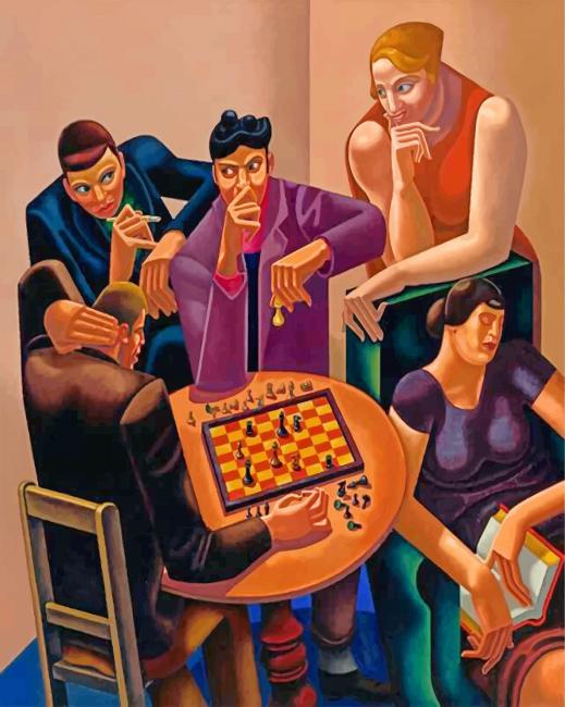
One of his first exhibitions was of New Paintings by Francis Rose, Cecil Collins and Merlyn Evans held at Heffer’s Gallery in Cambridge in 1950. The next year Josef Herman exhibited in a solo show.

Merlyn Evans – Tragic Group, 1949

As curators changed over the years the gallery would have a routine of exhibitions of historical works, maps and archaeological prints, and then modern art. From the advert below from 1955 Heffer’s are promoting the latest new ceramics by Lucie Rie and Bernard Leach. By this time they had their own picture framing department, so it’s not uncommon in East Anglia to find the Heffer’s label on the back of pictures that were framed there.

The fate of the gallery came when Heffer’s sold the business to Blackwells in Oxford who closed many of the shops in the city in order to focus on the Trinity Street shop.

On the steps of Heffers Gallery: Cecil and Elizabeth Collins, Bryan Robertson, Lucy M Boston?, Elisabeth Vellacott and Merlyn Evans.

Kelmscott Manor, 1896

It was at the invitation of William Morris that Frederick H. Evans came to photograph Kelmscott Manor in 1896. The photographer was 43 and was also running a bookshop in London. Two years after these photos were taken he sold his bookshop to become a full time artist. Today he is remembered for his large photographic prints of the Cathedrals of Britain.

There are only two sets of these photographs, both in American museums. Even’s photographic style was of platinotype images, images of a subtle dusty tone and almost like a photogravure, printed on platinum with sepia tones.

Kelmscott Manor was the country home of the writer, designer and socialist William Morris from 1871 until his death in 1896. The house was originally constructed in 1570 with some additions in the 17th century. It is open to the public to visit and owned by the Society of Antiquaries of London.

For the first three years, the Morris’s shared lease of the house with Dante Gabriel Rossetti until 1874. Rossetti and Jane Morris used the house to continue their long affair while William was travelling in Iceland, their romance starting originally a few years before. The manor can be seen in the corner of this painting of Jane Morris by Rossetti below made during that summer.

Dante Gabriel Rossetti – Water Willow, 1871.

The following year Rossetti’s poems were published to poor reviews and he spent his time at Kelmscott drunk on whiskey or high on chloral. In 1873 he had returned to painting and his work had recovered but the following year Morris couldn’t keep the scandal quiet his wife and his business partner were having an affair, so he cut him out of the Morris company and was asked to leave the house in July, 1874.

The Morris’s stayed on renting the house until 1914, when Jane bought the house to give her daughters Jane and May some security.

May Morris died in 1938 and bequeathed the house to Oxford University, on the basis the contents were preserved and the public were granted access. The University were unwilling to preserve the house as ‘a museum piece’ and passed the house and land to the Society of Antiquaries in 1962.

A protest

Painted by John Sell Cotman and his son, Miles Edmund Cotman, this is a hypothetical scene of protest and anger.

John Sell and Miles Edmund Cotman – The Wreck of the Houghton Hall Pictures c1779

Robert Walpole had been made a prime minister under George I. He was from a wealthy family and had invested in the South Sea Company when stocks were cheap and sold them at a profit before the company’s collapse of an inflated share price. They traded in slaves, mahogany and rum. He used the money to build Houghton Hall. Over the years he collected good furniture and paintings, filling his home with the spoils of wealth. He died leaving massive debts and his estate to his son, who sold some of the works to keep afloat, however he only survived his father by six years and the estate and debts passed to his son George.

Described as “the most ruined young man in England” George Walpole was frivolous with what money was left to him, gamling most of it away. In a scheme to make money he decided to sell his grandfather’s collection of furniture and art. In a deal negotiated by James Christie, founder of the auction house, the collection was sold to Empress Catherine the Great.

Their sale was seen as a public scandal as they collection included works such as: Rembrandt, Van Dyck, Teniers, Rubens, Poussin, Claude Lorrain, and Murillo.

This image has an empty alt attribute; its file name is 945.jpg
John Sell and Miles Edmund Cotman – The Wreck of the Houghton Hall Pictures c1779

Following the outrage of the works sale, the painting was made by John Sell Cotman and his son, showing the bodies of dead sailors and works including the large Rubens washed up on the shore in ruins with other plunder from the estate. Though no misfortune ever happened in real life and the boats made it to Russia complete, there was an anger felt by the upper classes in Britain of the loss of such a collection that showed a different style of “lost treasure”. The boat had set sail from Kings Lynn harbour for Russia and as the Cotman’s were Norfolk artists this might be why they felt a betrayal of their fellow countryman, George Walpole.

Shredded Wheat

When Welwyn Garden City was first imagined, it was to provide not only housing, but a social system that would sustain a utopian country town. Writing in his manifesto Garden Cities Of To-Morrow (1898), Ebenezer Howard has planned out how this was to be achieved in Victorian Britain. With his ‘Three Magnets’ diagram, he breaks down society into town and country, listing the pros and cons for both and combining them in the bottom part of the illustration as an early Venn diagram. “The town is the symbol of society — of mutual help and friendly cooperation, of fatherhood, motherhood, brotherhood, sisterhood, of wide relations between man and man — of broad, expanding sympathies — of science, art, culture, religion. And the country! The country is the symbol of God’s love and care for man.”

His hope was to avoid the errors of the past in the mill towns of Britain, where factories popped up quicker than the homes for the workers could be considered, with slum housing erected to cope with demand. If towns were to be built afresh, they should avoid cheap ribbon building. Homes should have gardens, roads should be lined with trees; the town should have a large park, areas for offices, shops and factories for people to work in. Reflecting on Victorian British cities Howard wrote: “The well-lit streets are a great attraction, especially in winter, but the sunlight is being more and more shut out, while the air is so vitiated that the fine public buildings, like the sparrows, rapidly become covered with soot, and the very statues are in despair. Palatial edifices and fearful slums are the strange, complementary features of modern cities“.

After seeing his plan for a city implemented, Ebenezer Howard died and then the second wave of building was designed by two men: Louis Emanuel Jean Guy de Savoie-Carignan de Soissons (1890-1962) who had studied at the Royal Institute of British Architects before setting up his architectural practice De Soissons & Kenyon, alongside Arthur William Kenyon (1885-1969). Part of their plan was a large factory near the railway, and it was for Shredded Wheat.

Now in ruins, the can be seen from the trains that run through Welwyn Garden City. The silos have been preserved and shall be used in the redevelopment of the site.

The Shredded Wheat factory known locally as ‘The Wheat’, opened in 1926 and ceased production in January 2008. Originally designed by De Soissons and Kenyon. The site is to be redevelopment with flats and shops with the original factory made the centre of focus as a Grade II listed landmark building.