Both beautiful and inspiring, the artwork that Shell used on their posters was a shift in advertising for two reasons: They were selling the ambitions of the motorist beyond commuting; a generation of day-trippers without trains. Also they were presenting modern art to the public in an era when museums charged admission. The posters were pasted on the sides of petrol stations, lorries and billboards with that simple line “You Can Be Sure of Shell”.
Shell Mex Limited appointed a new Publicity Director in 1932, Jack Beddington. His insight turned the British Shell advertisements of the 1930s into one of the classic campaigns of the twentieth century. The genius of the campaign was to let artists depict Britain in their own styles, they would paint an image and whatever their style, it was surrounded by text. There would be no need for product placement, for models holding petrol cans, it was a campaign exposing the beauty and wonder of Britain and modern art.
Some of these posters were exhibited at the New Burlington Galleries in 1934. Below are two quotes from different reviews on the exhibition that show the surprise of critics to Beddington’s use of modern artists in poster design.
It is now a good many years since, under the able directorship of Mr Frank Pick, some of our best designers were encouraged to show their works in public – using the expression in its broadest sense. People who never though of going to picture galleries could, for the first time find delight in good pictorial art even in an Underground station and in the street. –
Apollo, January to June, 1934, p322 †
If it can be hoped that big firms like Shell-Mex are really going to patronize art as intelligently as this, we shall expect to be seeing in a few years’ time at Christie’s, not the sale of the collection of the Duke of Frumpshire, but of the Gas Light and Coke Company. If the princes of commerce are going to behave like princes we shall have some fun. ‡
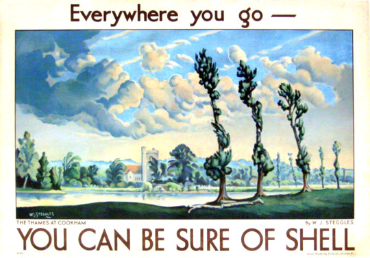
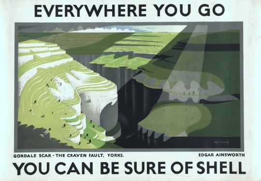
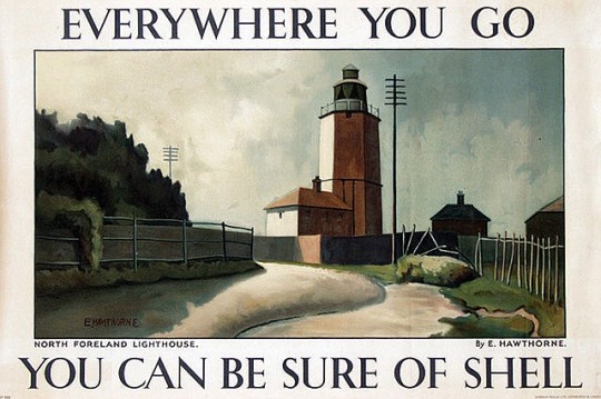
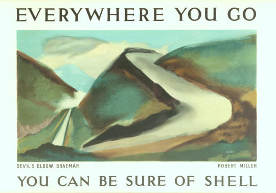
The Everywhere You Go series is one of the more curious for it is before the typographic design for the posters had settled down, a range of typefaces, colours and sizes are used. The first offering by W J Steggles has the tag line in lowercase. Steggles was part of the now fashionable, East London Group of artists, he painted various scenes for Shell posters, as did his brother Harold and
Elwin Hawrhorne.
Walter James Steggles – The Thames at Cookham
Edgar Ainsworth – Gordale Scar
Elwin Hawrhorne – North Foreland Lighthouse
Robert Miller – Devil’s Elbow, Braemar
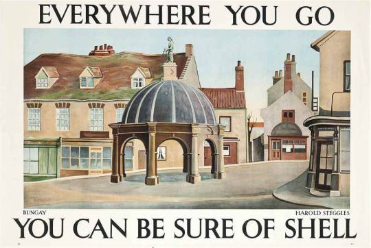
Harold Steggles – Bungay
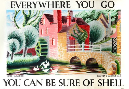
Rosemary and Clifford Ellis – Lower Slaughter
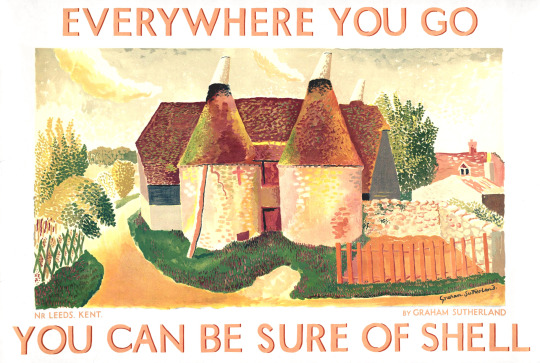
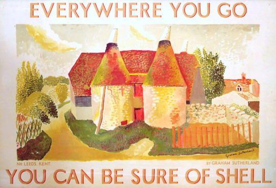
Graham Sutherland – Oust Houses nr Leeds, Kent
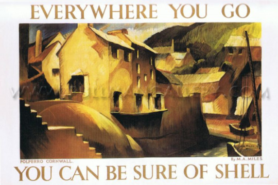
M. A. Miles – Polperro Cornwall
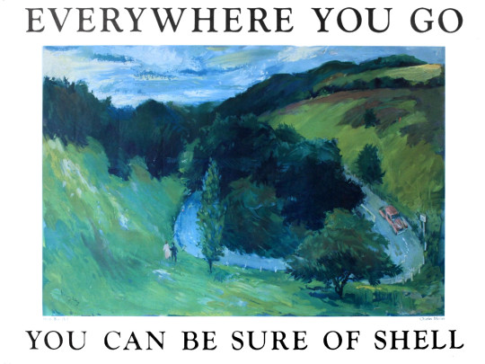
Charles Mozley – Boxhill
John Armstrong – Newlands Corner
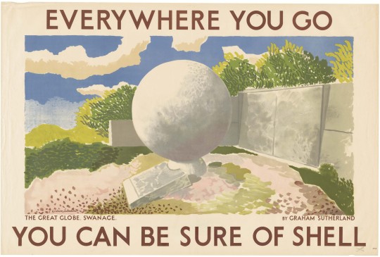
Graham Sutherland – The Great Globe, Swanage
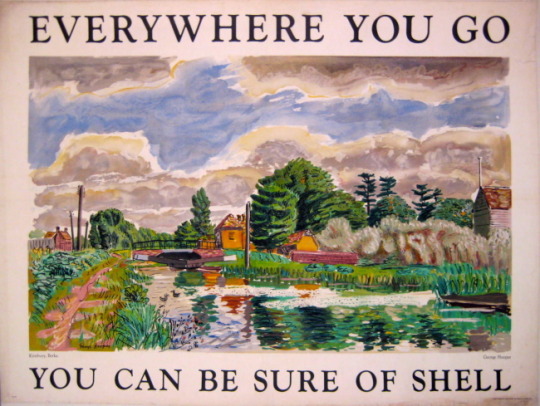
George Hooper – Kintbury Berks
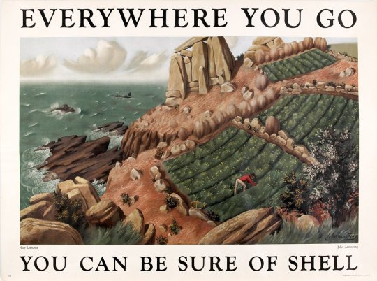
John Armstrong – Near Lamorna
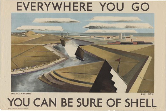
Paul Nash – Rye Marshes
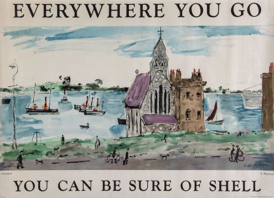
Edward Wakeford – Gravesend
† Apollo, January to June, 1934, p322
‡ W.W.Winkworth – The Spectator – 29 JUNE 1934, p15
Catherine McDermott – Design Museum Book of Twentieth Century Design, 1998, p319
Rather like my post on Graham Clarke, where I complained of his etchings and promoted his linocuts, in this post I would sooner promote and have a Sutherland etching than any of his other works.
I don’t know why I dislike so many of his paintings and to my opinion he only got worse with time. His work before WW2 seemed to have the sinister lust for mocking everything into destruction. It is almost as if he was calling for the war and then to use it as source material afterwards.
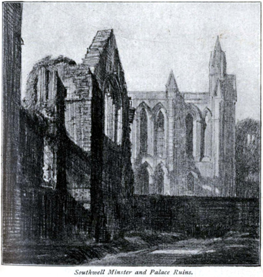
Frederick Landseer Griggs – Southwell Minster, 1916
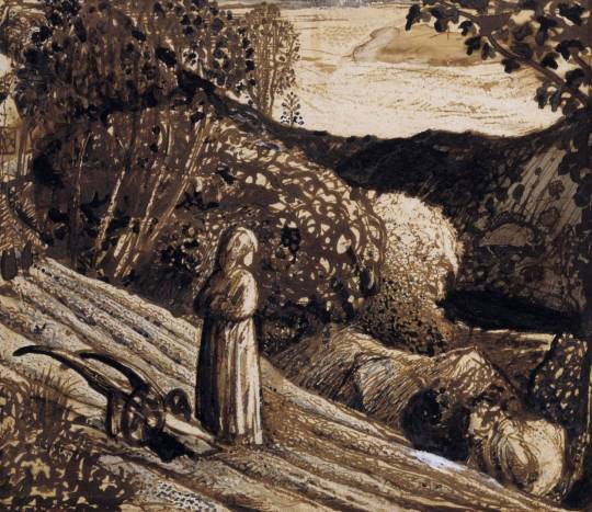
Sutherland was apprenticed as an engineer before studying engraving at Goldsmiths College in London. His tutor was F. L. Griggs, who had been working as an illustrator for the Highways and Byways series of books. These publications bought to light the modern ability to travel by bus, car or train around the country. Griggs pen drawings for these books, I would say, were the point when romantic nostalgia came back into fashion and his students would have been exposed to this.
‘He had a palm as delicate as gossamer,’ Sutherland remembered, it was his drawn illustrations to the thirteen volumes of the Highways and Byways guidebooks which had inspired both Piper and Sutherland as boys. When the older man offered both friendship and technical advice Sutherland was flattered to receive it. He and Paul Drury spent the Christmas of 1926 with Griggs learning about inking plates and printing them. Above all he helped to augment their growing enthusiasm for Palmer. †
Samuel Palmer – Landscape, Girl Standing, 1826
In autumn 1924 William Larkins showed his friends a Palmer print The Herdsman’s Cottage, which he had bought in Charing Cross Road. This tiny work came as a revelation to them all. Sutherland recalled: I remember I was amazed by its completeness, both emotional and technical. It was unheard of at the school to cover the plate almost completely with work and quite new to us that the complex variety and multiplicity of lines could form a tone of such luminosity. †
The landscapes were daring and drawn from unexpected viewpoints: The Girl in the Ploughed Field astonished me with its total disregard for conventional composition. The drawing is almost what we today call naïf. †
So, as noted, the biggest change in style for Sutherland at this time from the teaching of Griggs into the engraving style of Palmer works would be to etching the sky. The image Number Fourty-Nine above from 1924 has a clean sky where as the images below have engraving all over the etching-plate.
In the 1920s, when photographs were being used as illustrations, the question of art was in doubt; why should an artist depict a scene when the camera can do the job for them? So the result was that an artist can bend reality. From this came an ideal eden like view of the past and a retelling of rural life before the invention of machines. Later on the art world would rebel against the camera and surrealist, cubist and impressionist styles would be invented.
The 1920s was the start of a revival for Palmer, unpublished plates were being printed, the Medici Society published his other works for the public and books were being scribed.
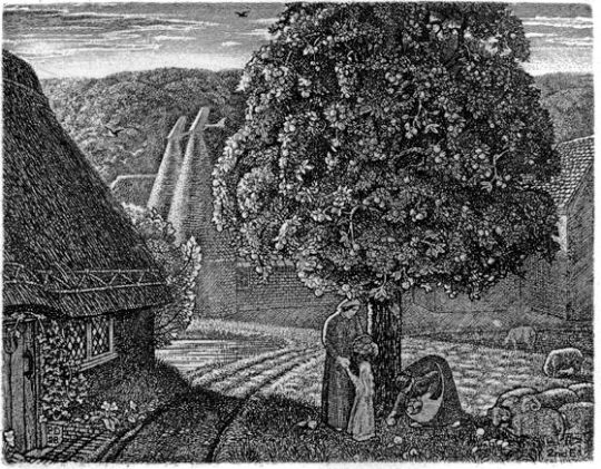
Other artists worth noting are Robin Tanner or Paul Drury, both new converts to the church of Samuel Palmer’s work. These men walked the first steps in the world of the New Romantics, coming out of Goldsmiths College at that time.
Paul Drury – September, 1928
Robin Tanner – The Road Mender, 1928
All men at the same time made an impact on the artworld and they all shared themes, knowingly or not. Below are the etchings of Sutherland.
Graham Sutherland – Wood Interior, 1929
Graham Sutherland – Cray Fields, 1925
Graham Sutherland – Pecken Wood, 1925
I thought it worth including this study by Sutherland of a print. Looking more like a mono-print it has all the qualities of Palmer’s work as it is done in ink and oil paint. The final etching is below.
Graham Sutherland – Sketch for Pastoral, 1930
Graham Sutherland – Pastoral, 1930
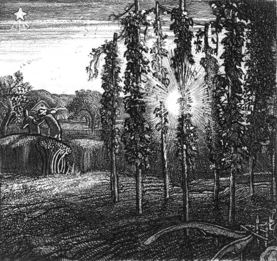
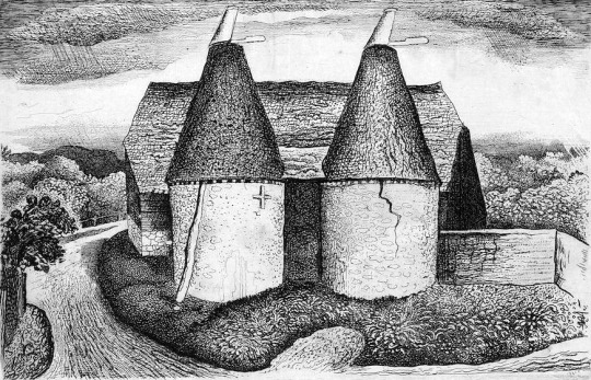
Graham Sutherland – Oast House, 1932
These words would get translated in various styles into Sutherland’s work but one of the most restrained and pleasing was this Shell Poster.
Graham Sutherland – Shell Poster – Oust Houses, Near Leeds, Kent, 1932
† The Spirit of Place: Nine Neo-Romantic Artists and Their Times, 2001, p108
Stuart Sillars – British Romantic Art and the Second World War, 1991, p42
Both beautiful and inspiring, the artwork that Shell used on their posters was a shift in advertising for two reasons: They were selling the ambitions of the motorist beyond commuting; a generation of day-trippers without trains. Also they were presenting modern art to the public in an era when museums charged admission. The posters were pasted on the sides of petrol stations, lorries and billboards with that simple line “You Can Be Sure of Shell”.
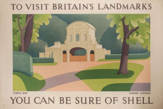
Edward Scroggie – Temple Bar
The respectability of motor touring was reinforced by the list of artists commissioned by Shell. It reads like a Who’s Who of the British art establishment of the period – Paul Nash, Graham Sutherland, Vanessa Bell, Ben Nicholson, Rex Whistler and Edward McKnight Kauffer – who between them produced some of the finest examples of commercial art while promoting a nostalgic view of England at the same time. At this stage of the century the motor car itself was not perceived as a threat to the countryside. Buying a car meant buying into a new world. ‡
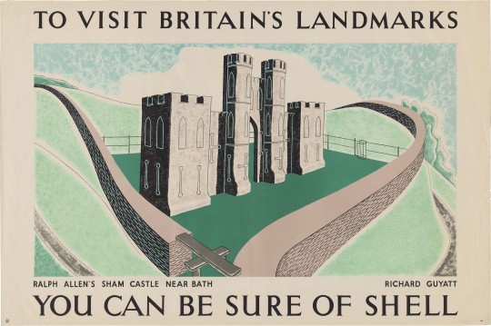
Richard Guyatt – Ralph Allen’s Sham Castle
Ralph Allen’s Sham Castle: Ralph Allen was an entrepreneur, philanthropist and was notable for his reforms to the British postal system. He his home, Prior Park, a Palladian house, built to demonstrate the properties of Bath stone as a building material, Allen happened to own a few stone mines in Bath. On the crest of Bathwick Hill facing the city of Bath is the colloquially dubbed “Ralph Allen’s Sham Castle”, built in 1755. Guyatts poster is the most modernist in this post, making use of positive and negative line drawing in the shade and light.
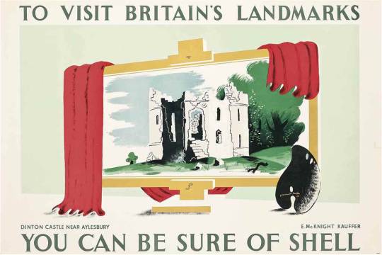
Edward McKnight Kauffer – Dinton Castle, Near Aylesbury
Dinton Castle:
A most charming, innocent folly, standing on a little mound by the Aylesbury-Thame road and circled by pine trees. It was built in 1769 by Sir John Vanhatten to house his collection of fossils, some of which are let into the random rubble walls. The plan is a hexagon with towers at two opposite corners, one for fireplaces and the other for a spiral staircase. ♠
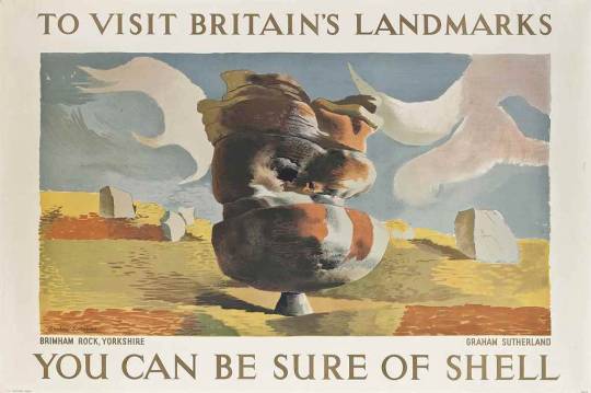
Graham Sutherland – Bringham Rock, Yorkshire
Bringham Rock, Yorkshire.
Sutherland visited this site in the autumn of 1935 at the suggestion of Jack Beddington, who wanted it to figure as one of a series of Shell posters. The result is a dreamlike lithograph, more in the style of Paul Nash. There are other rock structures on the site, all unique. ♣
There are many variations of rock formations, caused by Millstone Grit being eroded by water, glaciation and wind, some of which have formed amazing shapes. ♣
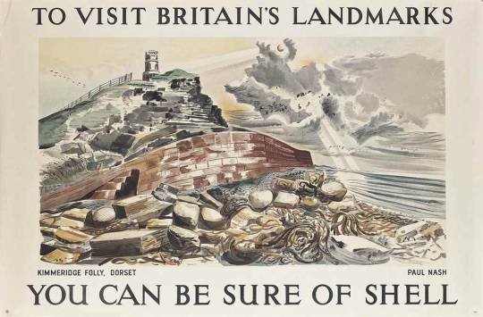
Paul Nash – Kimmeridge Folly, Dorset
Kimmeridge Folly, Dorset When Paul Nash was working for Shell in 1937 it was to produce the Shell Guide of Dorset. He relocated for the project. His boss for the guide was not just Jack Beddington but also John Betjeman. It was Betjeman who suggested he paint Kemmeridge Folly for the ‘Landmark’s’ campaign. Paul Nash was paid 50 guineas when the picture was accepted as a poster in 1938.
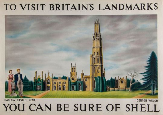
Denton Welch – Hadlow Castle, Kent
Hadlow Castle, Kent
The first few months of 1937 saw Denton working on a large-scale panel of Hadlow Castle, a building some three miles east of Tonbridge. Although the main part of the house dated from the end of the eighteenth century and had been inspired by Strawberry Hill, the 170-foot tower, built between 1938-40, was modelled on William Beckford’s Fonthill. The whole ambience of the place appealed greatly to Denton’s love of the Gothic. His naive painting, which shows the puny tower rising above the other parts like a coffee-iced wedding cake, was designed specifically to be reproduced as a poster. †
Hadlow Castle was built on the site of Hadlow Court Lodge, a country house. The Castle was built over a number of years from the late 1780s, commissioned by Walter May in an ornate Gothic style, it became known as May’s Folly. The architect was J. Dugdale.
His son, Walter Barton May inherited the estate in 1823. It was he, who added a 170 feet (52 m) octagonal tower in 1838, the architect was George Ledwell Taylor. The tower was based in part on James Wyatt’s at Fonthill Abbey. A 40 feet (12 m) octagonal lantern was added two years later in 1840 and another smaller tower was added in 1852. This was dismantled in 1905. Walter Barton May died in 1858 and the estate was sold.
The property passed from many owners in the early twentieth century. During the Second World War it was used as a watchtower by the Home Guard and Royal Observer Corps. The unoccupied castle changed hands several times after the war too, until it was demolished in 1951, except for the servants’ quarters, several stables and the Coach House, which was saved due to campaigning from the society portrait painter and local resident, Bernard Hailstone. The Tower was Listed as a historic structure on 17 April 1951.
† Denton Welch: Writer and Artist by James Methuen-Campbell, 2003
‡ The English Landscape in the Twentieth Century by Trevor Rowley 2006
♠ Follies & Grottoes by Barbara Jones, 1953
♣ Wikipedia: Brimham Rocks
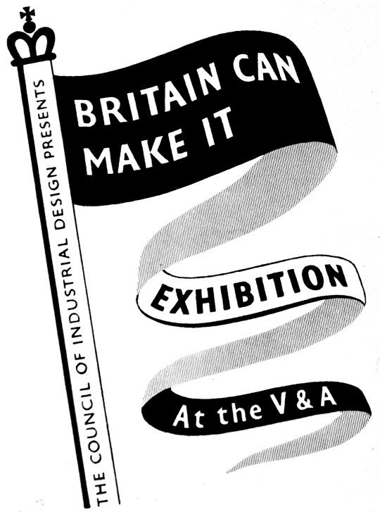
Even before the end of World War II, it was recognised that post-war economic reconstruction, manufacturing and international trade would require the acceptance of Britain as an industrial design and manufacturing source around the world. The pre-war Empire days of British dominance where nearing their end. In 1946, the British Council of Industrial Design held an exhibition called ‘Britain Can Make It.’
The exhibition was held from September to November at the Victoria and Albert Museum, London. Part of the reason for choosing this venue was that many of the museum’s main exhibits were still in their wartime evacuation storage, outside London. The venue was undamaged by bombing, empty and available, and itself in need of an attraction to restore its pre-war visitors.
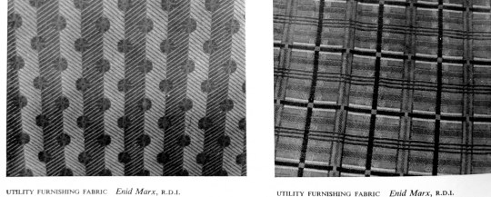
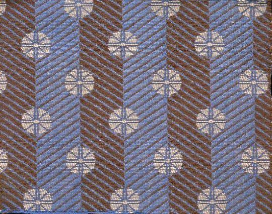
Despite severe cutbacks in production during World War II, the concept of ‘good’ design continued to be of importance and was supported by the Utility Scheme introduced in 1941. Enid Marx was a fabric designer for the scheme, as well as for companies like London Transport.
In the catalogue for the exhibition are essays on design by people like Robin Darwin, Gordon Russell and even George Bernard Shaw. I have copied the piece below from the exhibition catalogue as it is an incredibly rare item and the works and opinions of Enid Marx are also hard to find.
Furnishing Fabrics by Enid Marx
Well over a century has passed since the introduction of machinery revolutionised English textile manufacture and made mass production possible. Since then, technical processes have steadily improved; but it is only quite recently that we have begun to absorb machine-made goods into our aesthetic traditions. Up to now, manufacturers and salesmen have been so concerned with mechanical invention and the chemical problems of synthetic dyes, that all their energies and resources were devoted to these ends. Pattern and design were subordinated to pre-conceived notions of how best to display the elaborate possibilities of the latest mechanical device. Consequently, aesthetic development in English furnishing fabrics stood still for close on a hundred years.
At first sight, this statement may seem a gross exaggeration; but we have only to look at pattern books of early chintzes to realise how little has been done in textile printing in England since, say, 1860, which can compare aesthetically with these designs of the 18th and early 19th centuries. In weaving, too, the brocades and tapestries of this early period have never been surpassed for beauty of design, texture and colour. Imitations and adaptations of these early designs are still best sellers to-day-or, rather, were so before rationing made them unobtainable.
No one would deny that it is easier to achieve high aesthetic standards in hand-woven or printed textiles. All the slight irregularities inevitable in hand-made things enhance their interest and give them vitality. There are not nearly so many steps between the designer and the craftsman and each step is likely to add to, rather than detract from, the beauty of the final result. The converse is true of the mass-produced machine made woven or printed textile. Here each step needs to be carefully thought out at all stages of production if the designers true intentions are to be brought out.
Enid Marx – Spot and Stripe – Morton Sundour Fabrics Limited, for Utility Furnishings.
In England before, and in the early days of the industrial revolution, we had a fine tradition of textile design; the drawing was sensitive, the colours subtle and well used, the textures of the fabrics interesting and of excellent quality. About the time of the Great Exhibition of 1851 we notice a rapid decline in aesthetic standards, and not until the present day has this downward trend begun to reverse itself. Space forbids any attempt to analyse the reasons for this long spell of ugliness, which was by no means confined to England; there are many contributory factors. But one point needs stressing. The decline was not, as is so often stated, due to the use of machinery in itself, but rather to the way in which the machine was used.
William Morris, horrified at the prevailing ugliness, revolted against the machine. How much better if, instead, he had revolted against its misuse and directed his delight in good craftsmanship towards improving machine-made mass production. In looking at his designs for hand block printed textiles we are struck by the way he himself succumbed to the very environment against which he was revolting; they have just that mechanical and wooden quality for which he blamed the machine. It is indeed strange that Morris, with his abounding vitality, should have produced textile designs so lacking in it, in spite of his fine sense of spacing, tone values and the beautiful colours he got through reverting to the old vegetable dyes. Nevertheless that Morris should have had so great an influence on design abroad as well as at home shows how great was the popular demand for an aesthetic revival of the influence of the artist-craftsman.
The vegetable dyes, reintroduced by Morris, have a quality and depth of tone which gives them a richness rarely obtainable with synthetic dyes; though vegetable dyes are incomparably less fast to light. Even today, synthetic dyes tend to be harsh and brittle in colour. Though they can give great brilliance, especially on rayon, this does not make up for their lack of depth. Probably this is because their development has mostly lain in the hands of the chemists who have been fully occupied with the problems of providing colour fastness for the different dying and printing groups, as also for the new yarns and combinations of yarns that are constantly being introduced. We may notice that in France, where standards of fastness are perhaps less high than here, the range of colours used is much more subtle. Our problem is to make our colours as beautiful as they are durable.
After the first world war, new materials of all kinds came on to the market, as they are about to do again. This had a stimulating effect on textile design. To take one example, the development of laminated woods, with their grained surfaces, for furniture helped to revive interest in the textures of furnishing fabrics. Spinning is the clue to woven stuffs; indeed the spinning jenny was one of the first steps on the road to mass production in the late 18th century. With the new interest in textures in the early nineteen twenties, the more enterprising manufacturers began to study the effects obtained by the hand loom weavers using hand-spun yarns. The new interest in, and experiments with, textures started on the Continent, in Germany, Austria and Sweden especially. Our English manufacturers were slower off the mark, a contributory reason being, no doubt, that we had to make a more radical change in outlook; the English textile industry had been built up during the previous century on the basis of supplying world-wide markets, but now, faced with the growth of native textile industries supported by tariffs in foreign countries, and the competition of cheap labour, we had to think increasingly in terms of quality. The so-called ”folk weaves”, though at first a poor imitation of the hand-woven prototype, and, in the early stages, of poor quality, at least introduced the idea of textural variety for furnishing fabrics. Later there followed cotton and linen tweeds, and other rough surface effects, of a more successful nature.
England has, of course, a very long tradition of craftsmanship in weaving. The design of printed textiles responded more slowly to new ideas, than woven ones. The world slump accentuated the problem of printed textiles, namely that the cost of setting up and running an elaborate roller printing machine, with say sixteen colours, requires a very large output for one design, which in turn makes experiments in design costly. But already in the early twenties a number of artists in England had become interested in designing and printing textiles, at first by the hand block method. They achieved considerable success with the decorators and the public. The very simplicity of the means by which they obtained their effects, and the freshness and vitality of their well-drawn designs appealed to the public. Some artists also combined together to design and market screen-printed textiles. Screen printing, being quicker than hand-block printing, was a step towards mass production. It was also adopted by our more enterprising manufacturers as a means of mass production without the heavy initial outlay of roller printing, which therefore made it possible for them to be more venturesome with new designs.
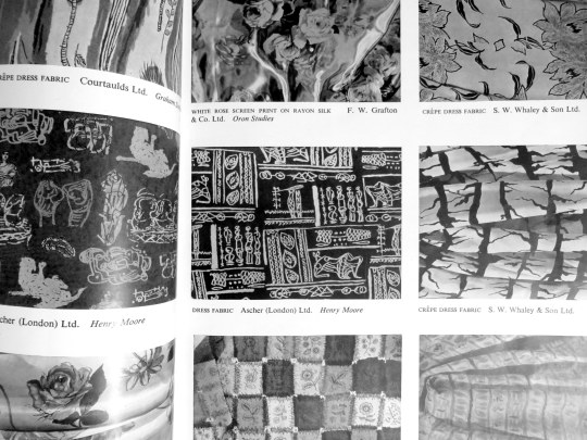
Page from the ‘Britain Can Make It’ exhibition catalogue with designs by Henry Moore and Graham Sutherland.
Hitherto artists had been shy of designing for manufacturers, as they found their designs tended to be changed beyond recognition in the process of manufacture, losing all their individuality. But manufacturers began increasingly to realise the value of artists in bringing in fresh ideas. At last they were prepared to co-operate with the artist in endeavouring to make the final product approximate as closely as possible to the artists original conception, rather than, as hitherto, disregarding the finer points of the design for convenience in production. Such co-operation involves encouraging the artist to work closely with the technical staff. This co-operation has given a much wider range and variety to mass production and appears to be the great hope for the future. Indeed there are many signs that we are standing on the threshold of a great renaissance in English textile design, once the present shortages have been relieved.