Magazines in second hand book and charity shops are treated with various levels of scorn, I am guessing it’s because they don’t stack on a shelf easily and can look untidy. It’s a shame as some are full of adverts and illustrations that are not found anywhere else.
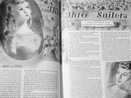
Here is one piece illustrated by Barnett Freedman from the Housewise Magazine in the 1950s. Although there maybe more, I have never seen Freedman illustrate a magazine artical. It’s a simple monochrome print with the focus was on the draftsmanship.
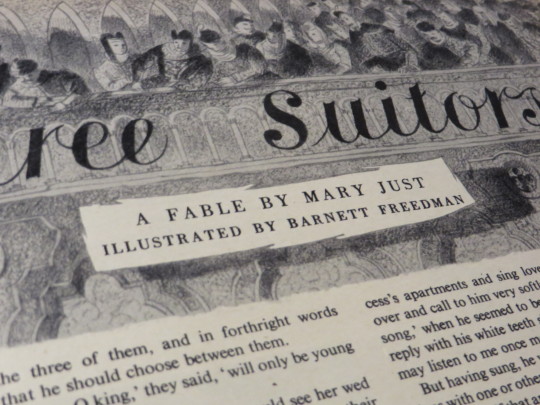
Many of Freedman’s book dust jacket designs are like this too, but with a simple colour wash behind them, he was very economic with colour – in printing terms. With his marvellous free-drawn typefaces and grainy illustration, with closer views you can see the picture is of a theatre and the balcony with the audience looking down on the artical. The heroin is in a locket cameo to the left and the hero to the bottom right. Short simple and I hope an unusual sight for those who know Freedman’s work.
