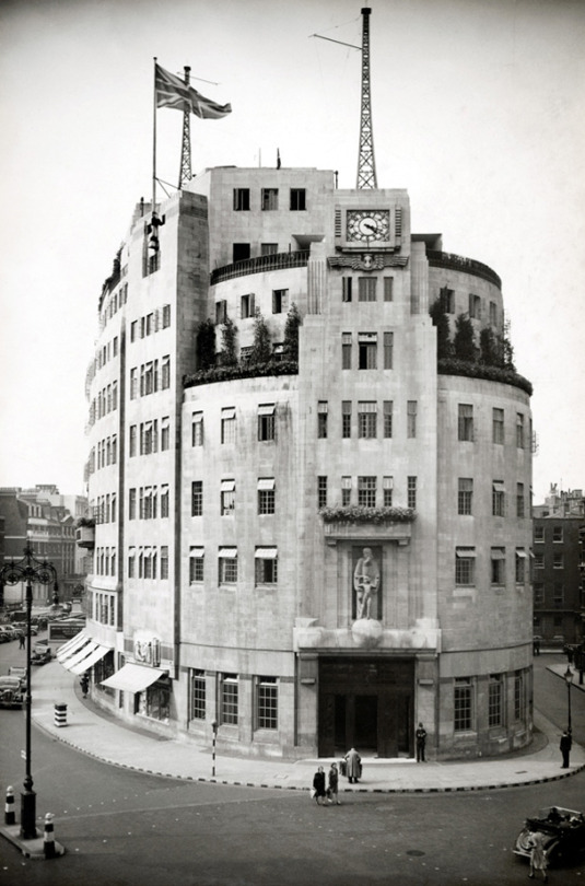
A newly finished Broadcasting House, London, 1933
It is imagined, in many quarters, that “modern” architecture has revolutionised the whole of present-day practice, whereas the truth is that good architecture has always been a matter of common-sense, plus a leavening of aesthetic instinct. In reality, its vital principles are no different today from those which guided the old Egyptians, Greeks, and Romans.
In planning a building, the first essential, of course, is to make it suitable for the purpose for which it is intended. That it should be pleasing to the eye is, obviously, a further necessity, but, if it looks suitable, its designer is already halfway towards achieving his object.
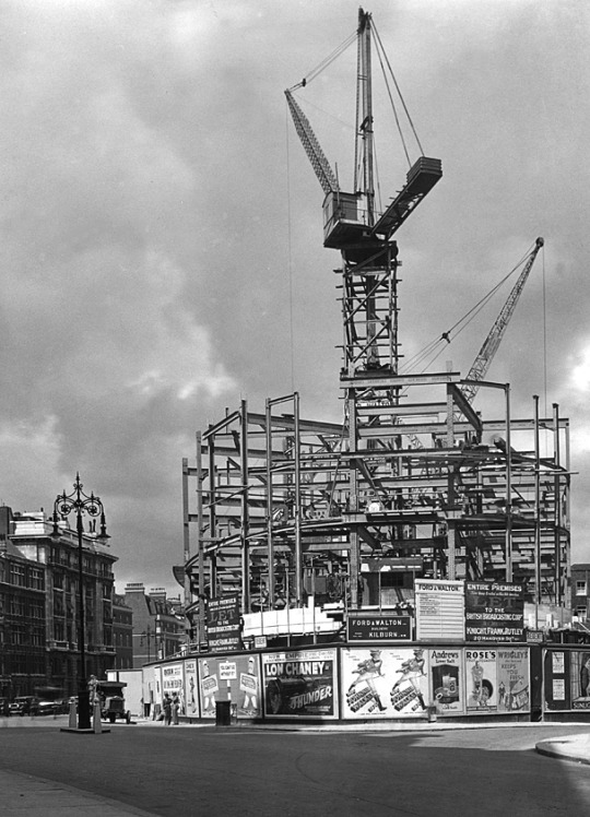
Broadcasting House – Under Construction and surrounded by Poster Billboards
In the case of Broadcasting House, we had first to consider its functions. These are twofold; the actual broadcasting, and the administration of broadcasting. Obviously, the studios, Control Room, and the accommodation of technical equipment come first, with the actual studios as the most important factor of all.
Accordingly, it was the planning of the studios which had to be the key to the whole scheme. At the outset, it was thought that the ideal arrangement would be to place all the studios on one floor and, as protection against inter – studio interference, to surround each by a complete circuit of brick -built corridor. As protection against extraneous noises, the studios would be placed at the top of the building.
The site of Broadcasting House, however, though picturesque in form, is irregular, which fact would have caused studios so grouped to be of awkward shape. Besides this, although the B.B.C., at that early stage, contemplated fewer studios than have now been built, the system of individual insulation by corridors and walls would have been so extravagant that the areas left for studios would have been quite inadequate. Moreover, owing to the high value of a site in the heart of London, the space available for the studios is necessarily limited. Hence the open -area system of insulation, adopted elsewhere, was out of the question.
After exploring scores of different systems of planning, the problem of accommodating a large number of studios and their suites within the space available was quite suddenly solved. Instead of the studios being all on one floor, or on two floors, they would be all in one tower, so that, given a good service of lifts, circulation would be actually easier than if they had been all on the same level, and, of course, larger and more shapely studios could be provided. Once this key idea had been found, the plan was rapidly developed and, one after the other, its benefits appeared. The evolution of the plan proceeded on simple lines which can best be expressed as follows :
- Studios must be insulated from sound Put a thick brick wall round them, omitting the usual steel framework.
- Studios must be artificially ventilated, so need have no windows
- Put them in the centre of the building, where there is least daylight to waste.
- Offices must have daylight
- Put them all round the outside of the building, where plenty of daylight is available.
- Studios need to be sound insulated from one another
- Put between them horizontal layers of rooms such as Music Libraries, Book Stores, etc, which neither create noise nor are disturbed by it.
In this way, item by item, the plans were wrestled with and were slowly developed to their present form. Sometimes, as a result of much thought, whole features had to be discarded. Such was the fate of a huge parking garage, at one time accommodated in the basement. I could fill many pages with the history of planning this building, with all its exacting requirements, but, interesting as this would be to myself, this is, perhaps, hardly the place for such a story.
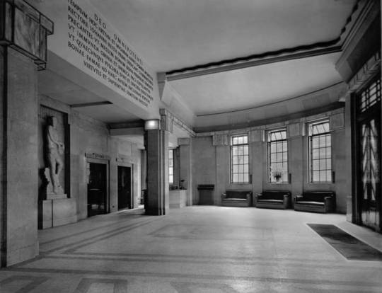
The Entrance Hall
Before speaking of the exterior, I will just say a word about the internal decoration of the principal apartments. The Entrance Hall, semi -circular in plan, is simplicity itself, devoid of ornament, and depends for its effect upon the grace of the natural curves which arise from its circular form and the rhythm of its vertical lines. The beauty of the English marble (Hopton -Wood stone), which lines the walls, is an added charm.
The central feature of the Hall is to be a lovely figure of “The Sower,” for which Eric Gill has already made his model.
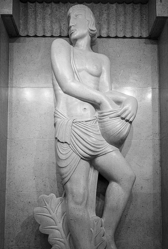
The Entrance Hall with The Sower by Eric Gill.
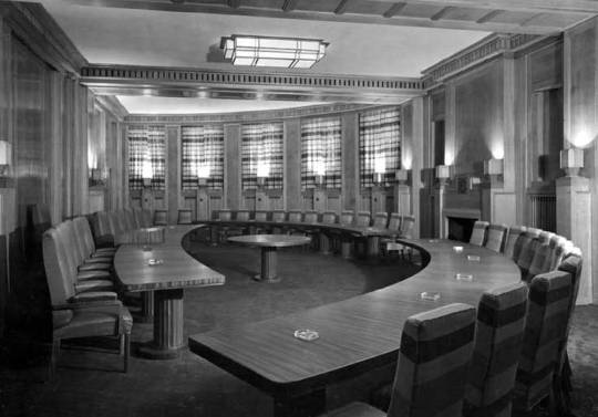
The Council Chamber
The Council Chamber, sixty feet across, is of semi- circular shape, like the Entrance Hall. This room, whose acoustic qualities are strangely happy to the naked ear, is lined with Tasmanian oak and, at night, is entirely illuminated by reflected light from lamps concealed in wrought – oak urns. The pedestals of these urns serve as relieving accents of interest to the simple panelled walls.
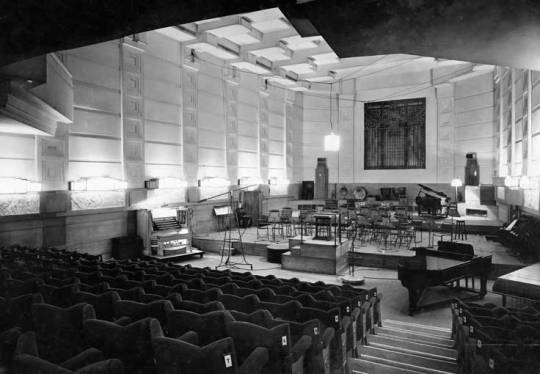
The Concert Hall
The Concert Hall , in the heart of the building, is wedge – shaped in plan. The splay is not sufficient for one to realise, at first sight, its existence, but it has the strange perspective effect of making the Hall appear very much longer from the back than from the stage. The treatment of the ceiling is entirely novel; it is hoped that, with the semi – indirect lighting indicated, the ceiling will provide a very distinctive feature.
Now, a word as to the exterior. First, let me explain the reason for the eastern side being cut away as with a draw knife. This part of Langham Street is narrow and, not only have the opposite owners rights of light which had to be respected, but there are three -sided mutual covenants with other neighbours which could not be broken. Hence, the whole of the building above the fourth floor had to be sloped back and restrained within a limiting angle. In Portland Place, the only limit of height was that imposed by the London Building Act..
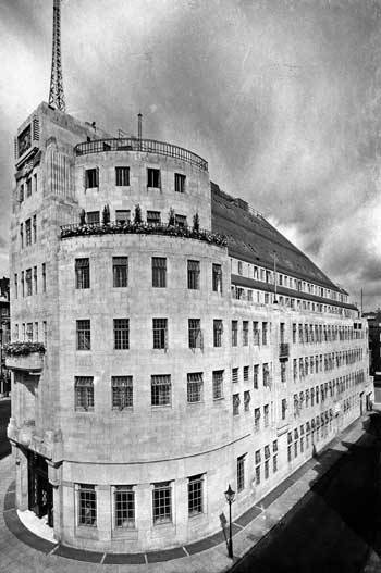
The East Side of Broadcasting House
The south end of the building, facing down Regent Street, suffered under the same difficulties as the Langham Street front, but at this vital point, realising my troubles, the parties concerned made certain concessions of real value. In the circumstances, the obvious course seemed to be to design a symmetrical façade to Portland Place which would dominate the whole building, to emphasise the main doorway facing south by placing a Clock Tower above it, and to be satisfied with a modest elevation to Langham Street which, without being striking, would be suitable.
The marrying together of these three components was a particularly interesting problem, which was helped by the I provision of a third aerial mast over the Clock Tower.
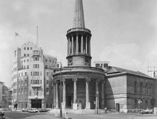
All Souls Church and Broadcasting House
At an early date I realised that the site possessed a rare virtue in the long curve of the western side, and so, in organising the proportion of my masses and the play of light and shade, I tried to make full use of the gracious horizontal lines which this curve suggested. Broadcasting House is said to look bigger than its actual dimensions. This is due to the scale and number of the windows, necessitated by the provision of an immense number of small offices. Endless flexibility of subdivision of offices was required by the Corporation, which fact, naturally, weighed with me in preparing my design for the façade. Although economy was essential to the whole scheme, and the sculpture at my disposal limited, I insisted that it be as good as possible, and then placed it, with other architectural features, at the most effective points, hoping to set it off to advantage by the contrast of plain walling and the considered rhythm of the windows referred to above.
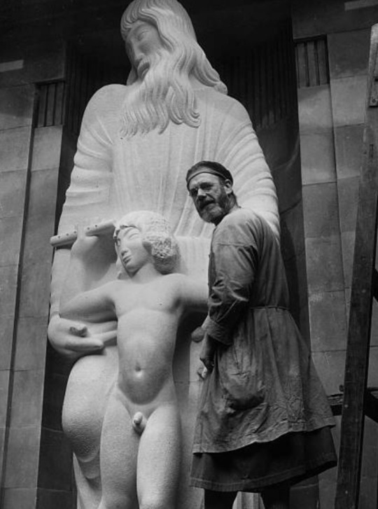
Eric Gill – Prospero and Ariel, 1933
As a footnote it is worth looking at the Eric Gill’s views on the building and his work for it.
His (Gill’s) frustration with the BBC work must have been compounded by the trouble over the size of Ariel’s penis already recounted, and with ‘Bad weather, bad stone and bad health’ – though it was on his own choice to work on inadequate and exposed scaffolding. From this perch he was heard to shout to a passing friend, ‘You know, this is all balls’. ‘The Sower’ was also done with some cynicism as he wrote to his brother Cecil; ‘I am about to begin the statue, representing a man ‘Broadcasting’, to stand in the entrance hall. Comic thought, whe you consider the quality of BBC semination, to compre it with the effords of a simply countryman sowing corn! However, it’s their idea, not mine. Mine not to reason why… mine simple, to carve a good image of a broadcaster”. †
† Malcolm Yorke – Eric Gill: Man of Flesh and Spirit
