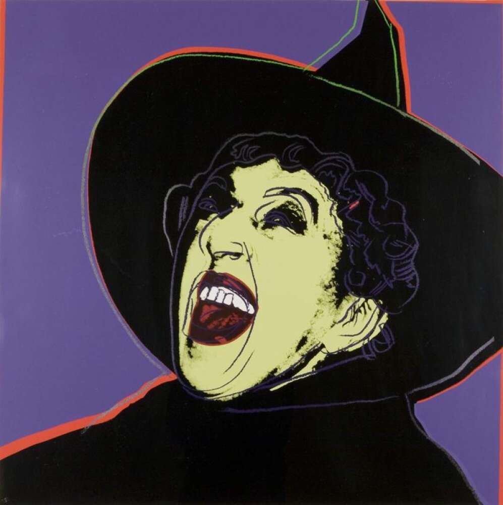
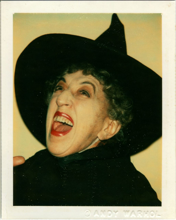
In 1981 Andy Warhol was embarking on a new series of large screen prints, Myths. Warhol’s obsession with famous image for this series took a turn to things that were culturally iconic like Father Christmas, Dracula and Superman. After meeting Hamilton one evening at the NYC Met Opera, he invited the star of Wizard of Oz, Margaret Hamilton to the factory, his New York studio to re-enact her famous role as the Wicked Witch of the West for the print The Witch.
I saw Margaret Hamilton , the witch from the Wizard of Oz, it was exciting, and I went over and said she was wonderful. Now she’s doing commercials for Maxwell House. She is really petite.
Andy Warhol Diaries, 1980.
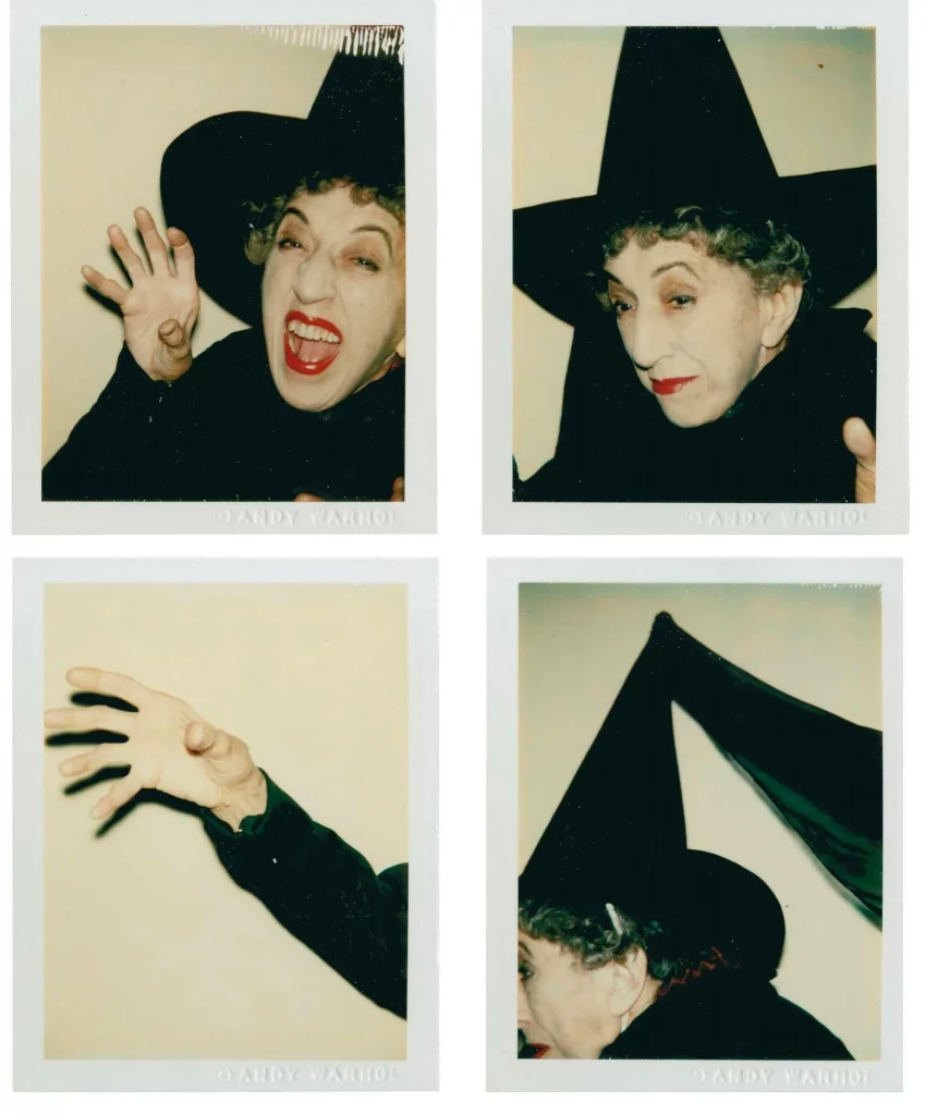
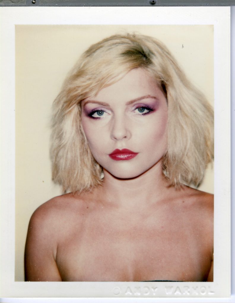
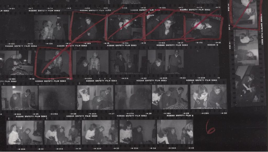
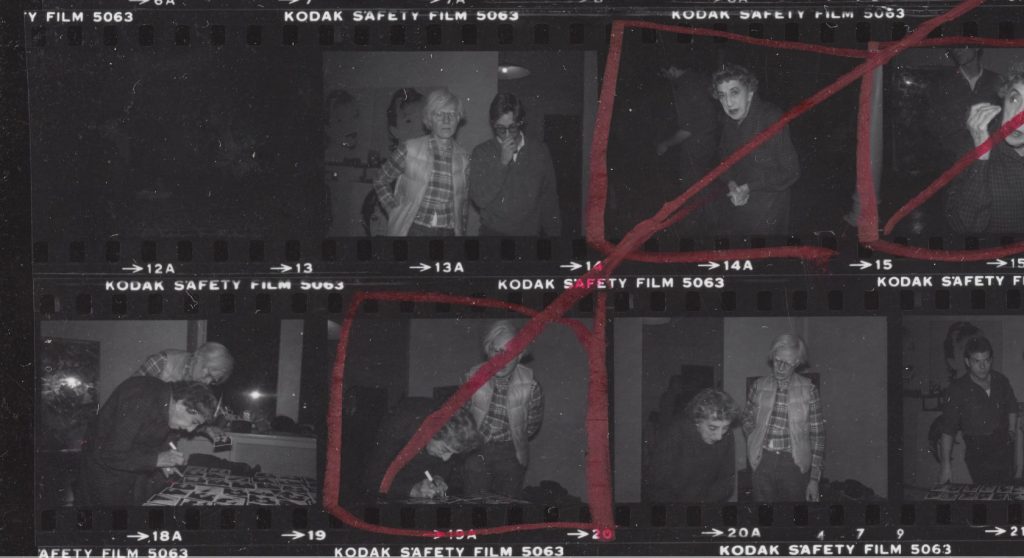
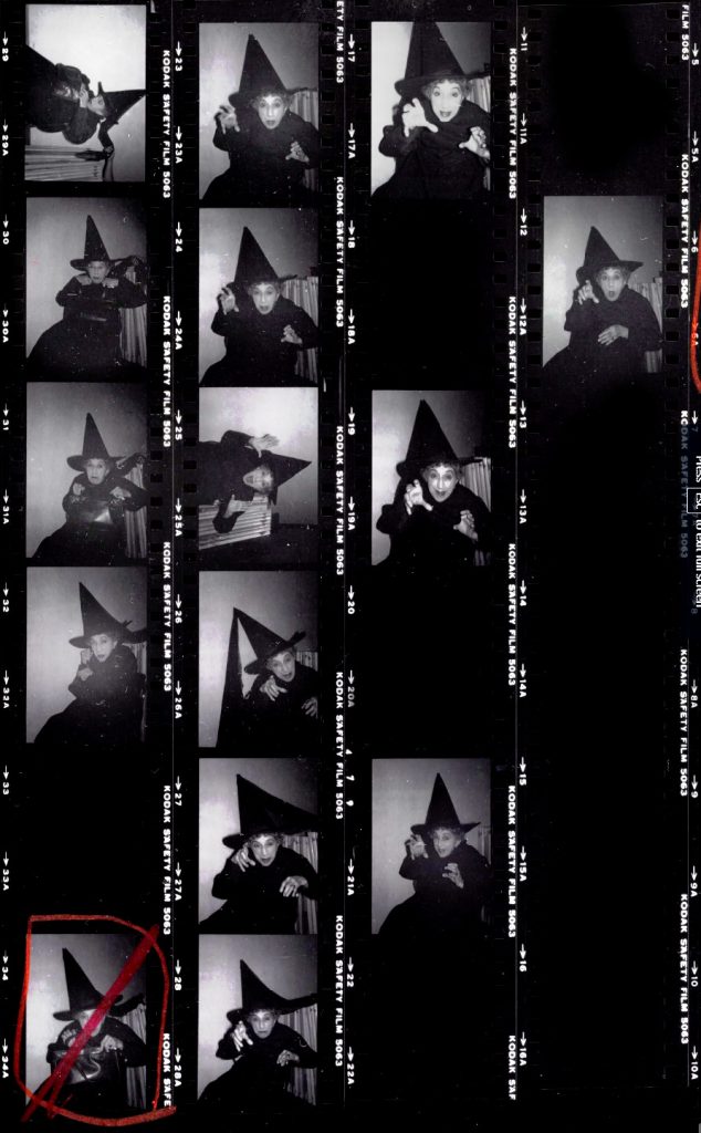
Hamilton arrived at the Factory and a make up artist applied some make up, while Warhol took many photographs to see how he wanted the images to look. These polaroids were laid on a table and they both picked their favourites from the selection.
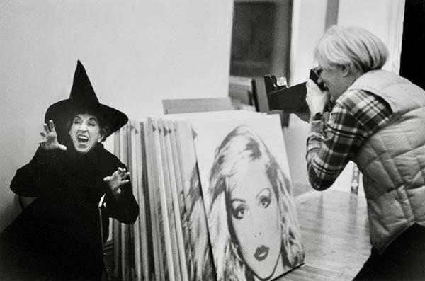
In the photograph above, a pile of screen prints of Debby Harry can be seen stacked up against the wall. The original polaroid is below.
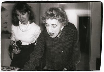
Here in this contact sheet we can see Hamilton and Warhol reviewing the Polaroids on a table.
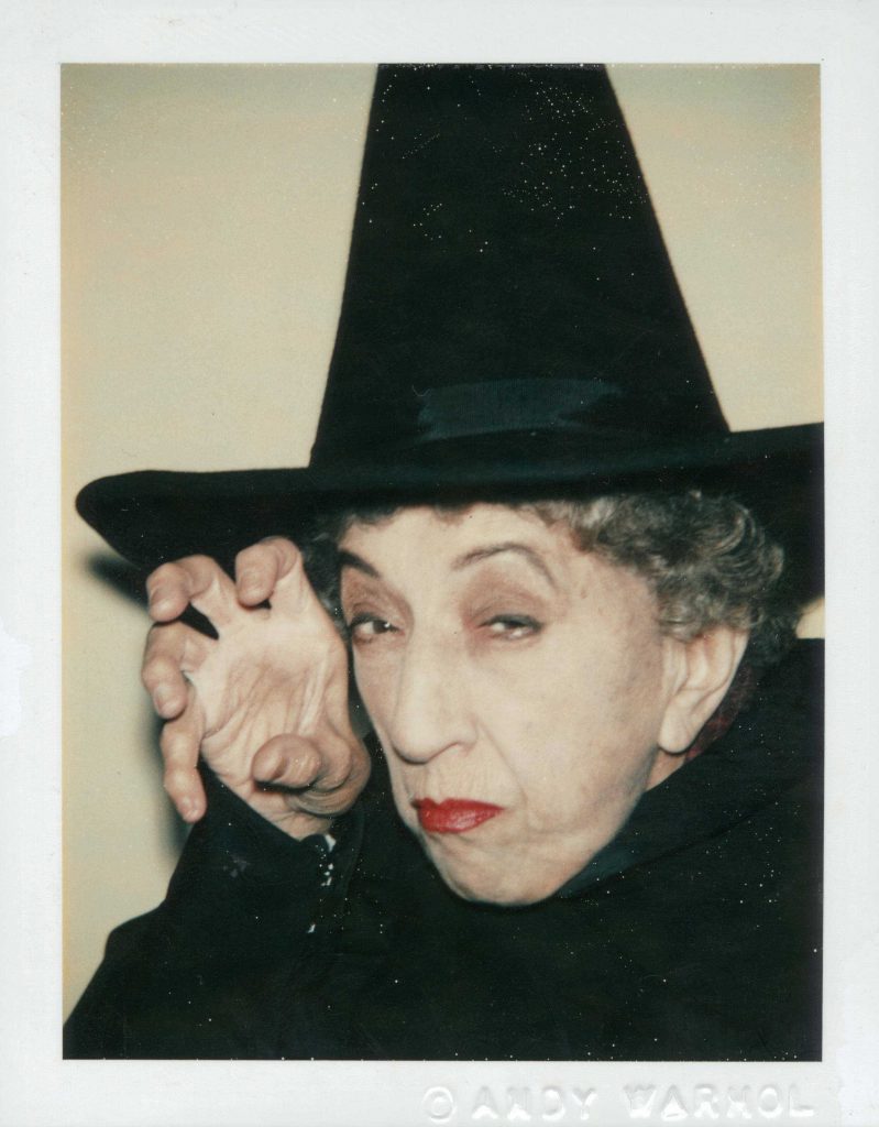
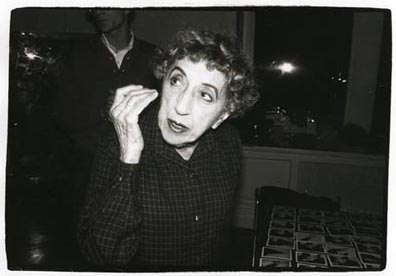
Then more images were taken with a film real camera of Hamilton, maybe by an assistant of Warhols. But in the end he used the still from the polaroid below.
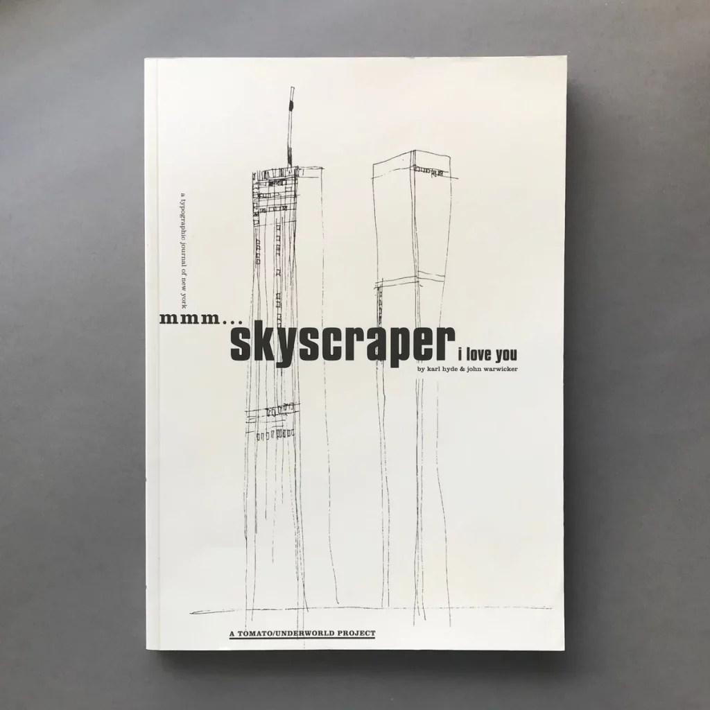
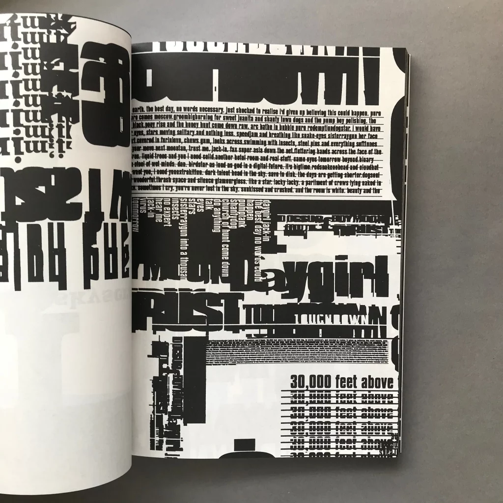
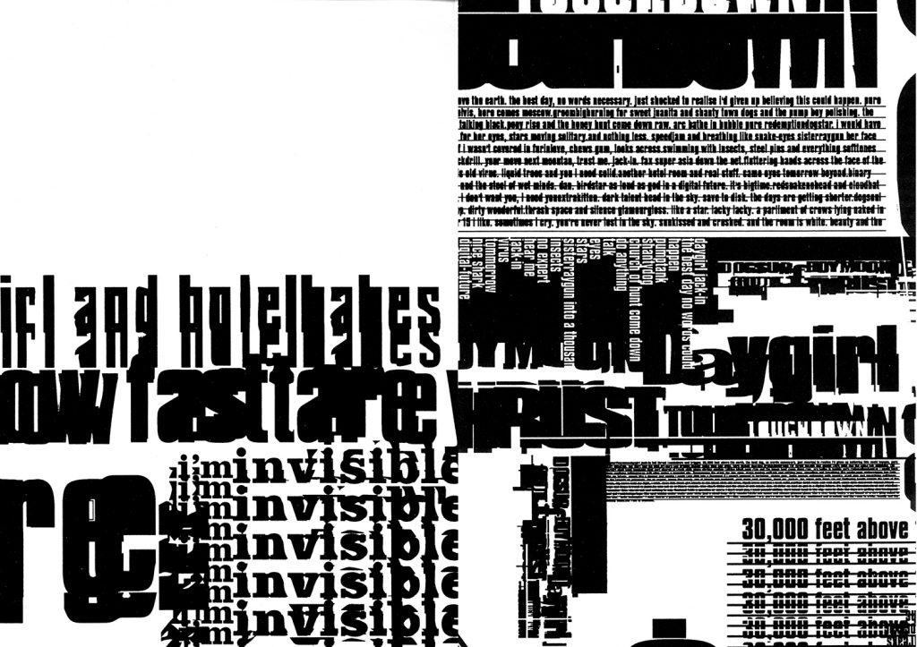
This is a book and a song. Mmm… Skyscraper I Love You is a song by the band Underworld, and the lyrics by Karl Hyde were about New York city. Anyone that is aware of Hyde’s work would know it is heavily reliant on words; from lyrics he writes that are a a mixture of songwriting, overheard conversations and observations on the street, recorded in his ears much like a street photographer uses a lens. The song was recorded and released in 1993. The Jam Scraper mix was originally due to be on the album but replaced later in the process.
“I write lots of stuff when I’m travelling. I write all my ideas in notebooks… I remember flying over New York and looking down and thinking, ‘It’s a beautiful thing’. So that’s exactly what I scribbled down. And when the captain said, ‘We’re 30,000 feet above the earth’, I wrote that down as well. Those words then became the opening two lines of ‘Skyscraper’. Most of the rest of ‘Skyscraper’ came from stuff which I’d collected wandering round the New York streets over the course of a week. I got some of it out of The Village Voice and Screw magazine, and other parts I wrote in an alleyway in Greenwich Village at four in the morning. When I got back, I cut the various lines up and then made a montage. It’s kind of a Cubist way of writing. What I’m trying to do is paint around subjects instead of focusing straight in on them.”
These lyrics were then taken up Hyde in collaboration with John Warwicker of design company Tomato. They both then used painting and typography in order to make a book of words. Tomato is almost an extension of the band Underworld, Hyde being part of the informal company, they made music videos, design artwork and promotional material as part of the creative process of the music, much like the relationship between Stanley Donwood and Radiohead.
Today it is hard to see this sort of design as mindblowing. But when the book was published by Booth Clibborn Editions in 1994, the computer manipulation of typography was radical. Before this a graphic designer would either have to draw type by hand or use rub-on Letraset transphers, and they were hardly ever produced in these sizes. So the page below is a testament to new technology of that time.
“mmm… skyscraper I love you is the map of a journey through the streets of New York. Crosswalk and chaos: overheard, followed and abandoned, words/fragment from concrete. It is not only a reality but a memory of experience. Everything is in the present moment. It forms a cyclic series of impressions and expressions which occurred over the course of several months but which could just as easily occurred within a few seconds. ‘Read’ it as you ‘read’ a film. Does a thing exist if the individual does not experiment it directly? The city is always there, pulsing, alive, growing: rejoin the flow. Listen to your thoughts. Listen to your thoughts. Do you now what you want? how far do you want to go? No words necessary.”
Book Blurb
Under the rather dull tutelage of typography teacher Will Hill who didn’t care for his students at all and was busy writing his textbooks on type, books like this were very exciting ways to look at typography. I remember printing text off and moving it across the scanner as it was being scanned so the text distorted, and then printing those off and using ink splats and footprints to add other textures. I wonder were all those experiments went? In a box somewhere. But it was handy to have some education.
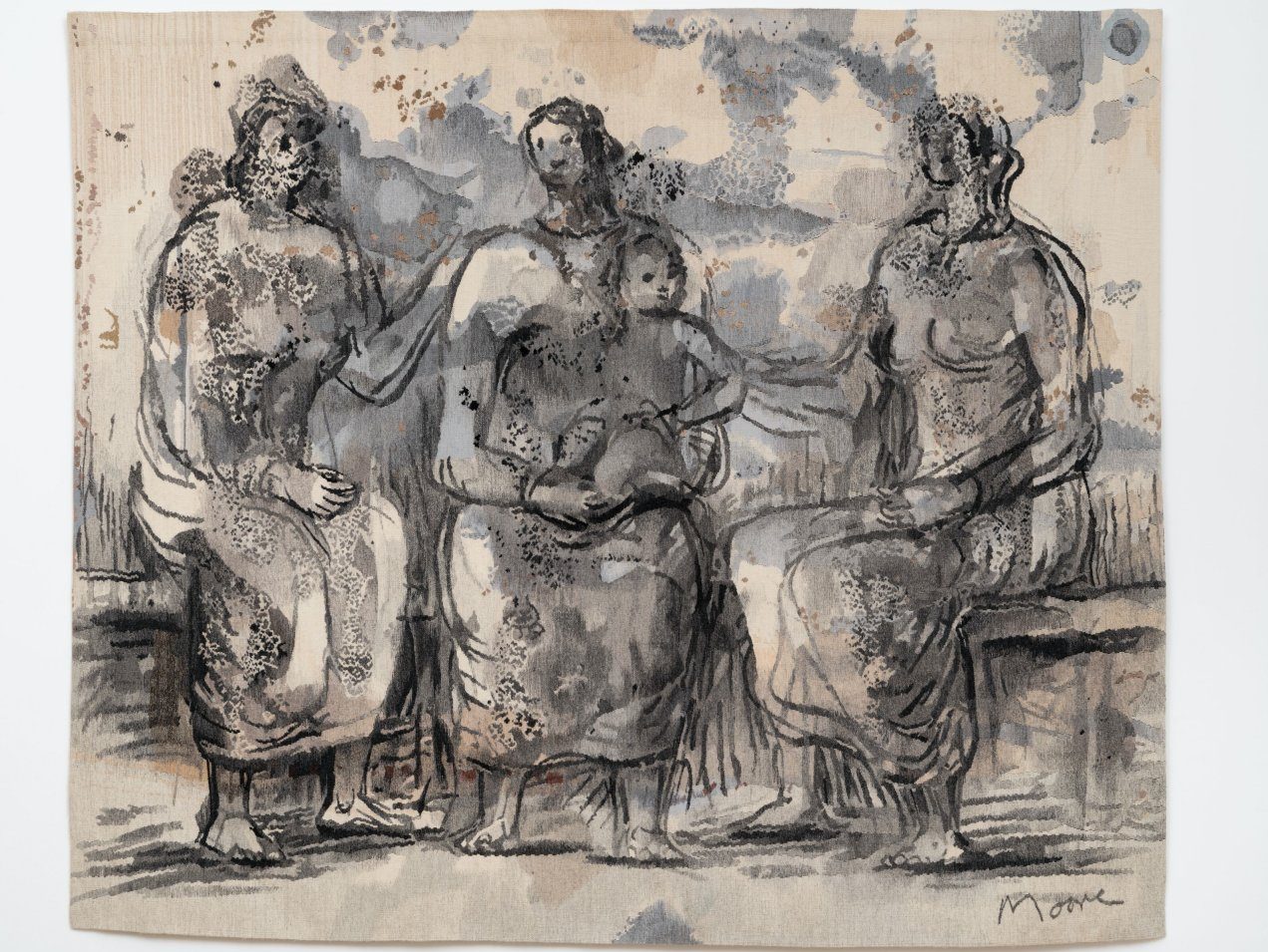
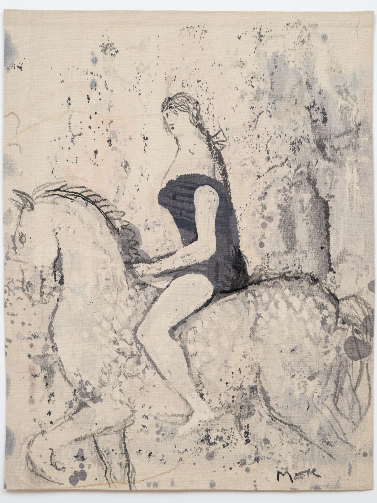
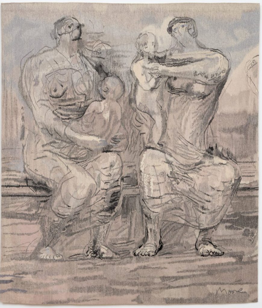
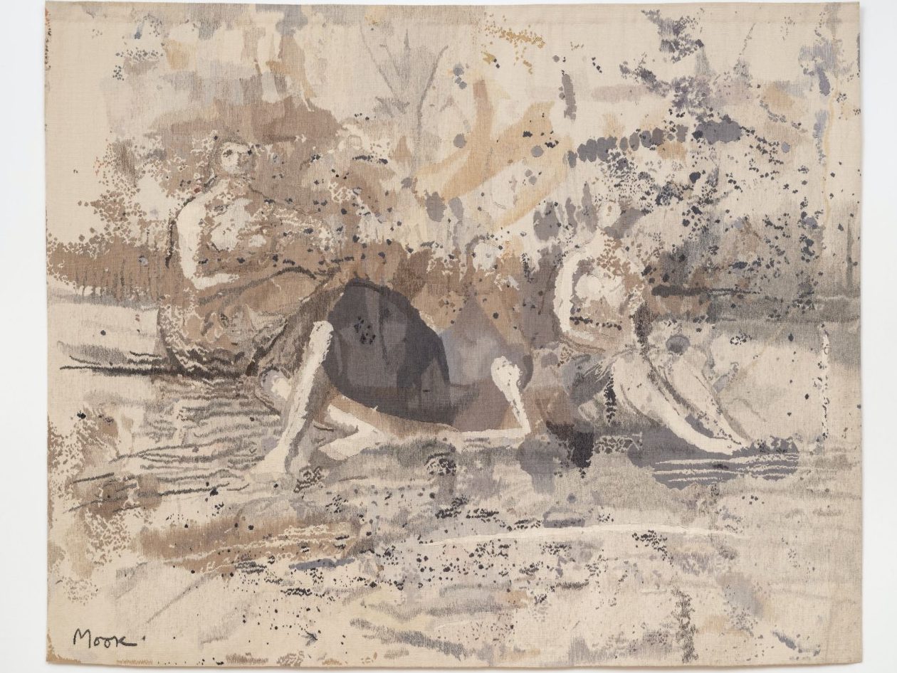
Henry Moore’s daughter Mary was visiting an exhibition of tapestries of young weavers from West Dean, thought their revival of the craft was worthwhile and and convinced her father to work with them. Moore authorized a series of tapestries based on his drawings. He pick the horse and rider below, because he thought his grandson would enjoy the design with a horse and so other children might as well.
The Henry Moore Foundation have issued 23 works between 1976 – 1987. Moore was not a stranger to this type of design, having been inspired by his friend Zika Ascher to design repeating patterns for textiles in 1943, Moore was commissioned by David Whitehead Fabrics in the 1950s to make some designs. Though the process is different from screen printing to weaving, but it shows he had an idea for his work to be in a domestic setting.
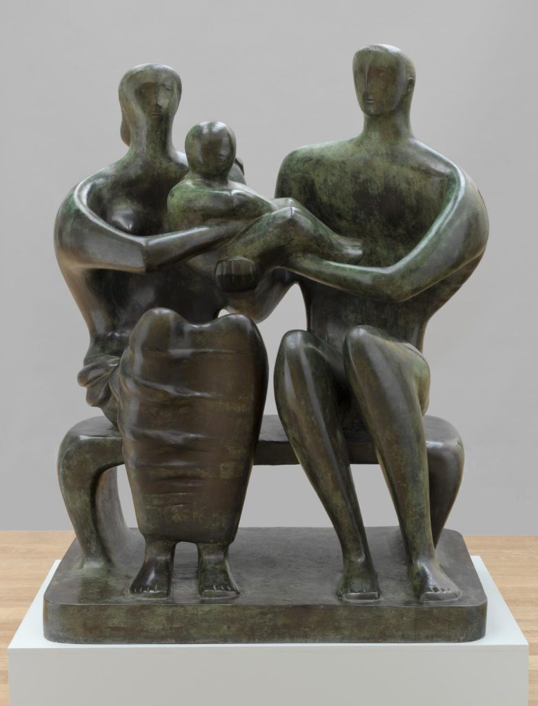
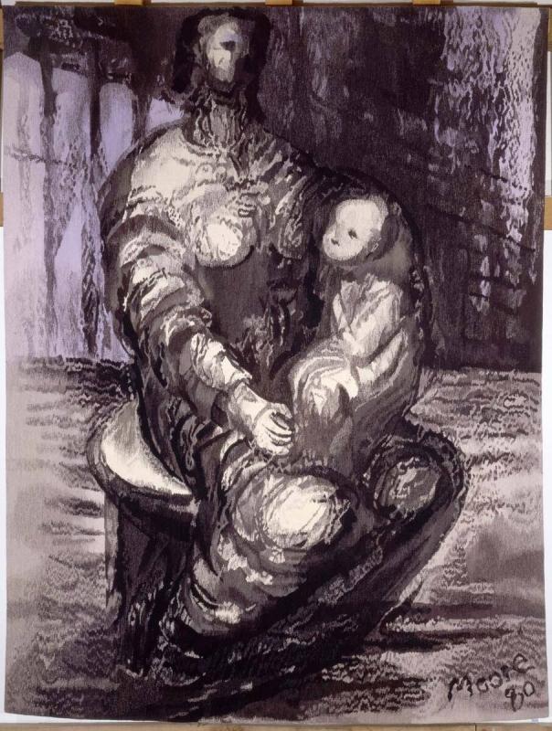
Henry Moore – Family Group, 1950
It is a similar reason of a domestic setting that many of the works are family groups. After the sculpture of the Family Group for the Barclay School in Hertfordshire (cast in 1950 but the original commision came in around 1938), Moore did countless drawings on the theme of children and parents. Maybe it was something he hoped would be universal and sell well.
The technicality of these tapestry designs was down to the weavers, and in an interview they talk of how they wound two different colour tones together in one fiber, to blend the colours of Moores designs into something more fluid and less pixelated, as tapestries have the habit of becoming upclose.
These works were made at the time when Tapestry was more unfashionable than it had been. It was a craft only the wealthy could afford and many of the works made by other artists for the Dovecot Studios at the Edinburgh Tapestry Company were expensive things at the time.
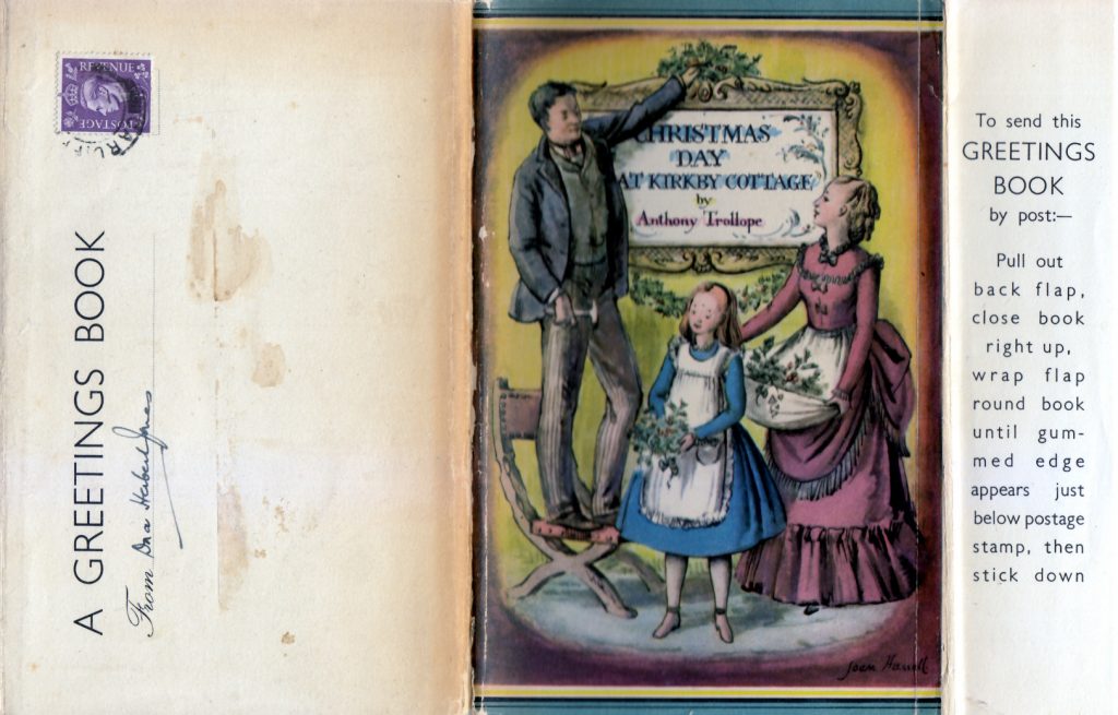
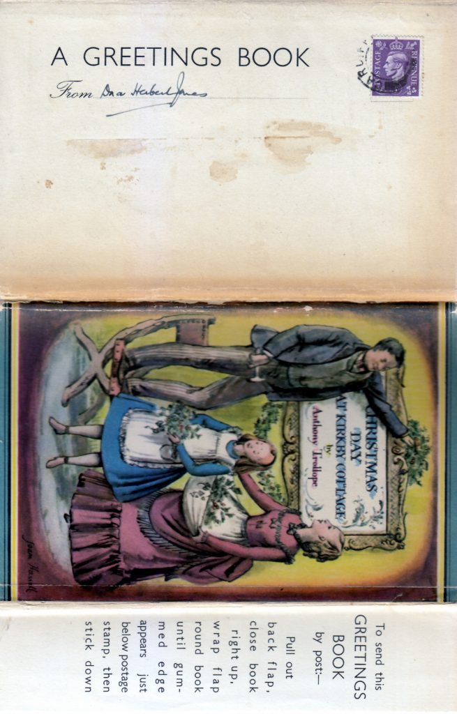
Here is a book you can post. The dust jacket extends and wraps around, ready for a stamp and address.
It says: Pull out back flap, close book right up, wrap flap round book until gummed edge appears just below postage stamp, then stick down. The book is illustrated by Joan Hassell. Others were Old Christmases by William Strode, illustrated by Anthony Gross.
In the communication of today it seems so alien to make the dust jacket part of the design for an envelope, but I think it’s one of the most charming things I have seen.
It has been a great joy to me to read all the reactions from people who have got their copies of my new book. It covers a broader scope than merely just a reprinting. I offer thanks to all who have ordered it. So far it has shipped to seven countries.
For those of you who don’t like online sales and want to keep things local then these are my stocklists:
The farmhouse in which John Piper and his wife Myfanwy, the librettist, have lived since 1935 is couched in a thoroughly British landscape. This, the landscape of England and Wales, together with the art of the ‘‘French revolutionaries”’ — Braque, Picasso, Matisse, have been two main sources of inspiration in John Piper’s work, filtered through his own intensely personal, sometimes highly dramatic, romantic vision.
The involvement with craft techniques as a medium for artistic expression began early. A successful exhibition of his wood engravings in the twenties, “‘held at Heal’s of all places”? John Piper remembers, persuaded him to abandon his training as a solicitor in favour of study at the Royal College of Art and a career as an artist. In the thirties, John and Myfanwy Piper started Axis, a quarterly journal of contemporary art. This encouraged John Piper’s enduring interest in printmaking and in printing techniques. He made the rubber blocks from which to print the colour plates and, in 1938, produced his first aquatints as well as his first illustrated guidebook, The Shell Guide to Oxfordshire. Artists and designers quickly adopted his application of collage techniques to letterpress illustration.
Frequent exhibitions of abstract art in the twenties and thirties included John Piper’s paintings and the assemblages and collages in which he experimented with wood, paper, enamel and canvas materials. But abstract art before the war didn’t pay the rent. John Piper was in the same boat as Henry Moore, Graham Sutherland, Barbara Hepworth, Ben Nicholson and others, buffeted by the waves of the Establishment liner which cruised along with Frank Brangwyn and his kind at the helm. Articles and reviews supplemented the Pipers’ income and those by John Piper for Architectural Review demonstrated his ceaseless curiosity in topography and architecture and natural things; his eye for detail and structure showed itself in an appreciation of multifarious objects, which included sand-blasted pub mirrors, shop-front lettering and examples of nineteenth-century craftsmanship.
John Piper’s love of detailed observation has always been combined with a delight in colour. During conversation, his enthusiasms embraced Surrealism and eighteenth-century French enamels, Vuillard and Howard Hodgkin. When the subject of Minimal art came up, he seemed to seek solace in tangible, natural objects: sitting in the garden, he would trail his hand through pebbles on the ground, a diviner trawling in benign territory.
The preference for jewel-like colour and ornament, characteristic of John Piper’s semi-abstract topographical paintings, made natural his wish to design stained glass. ‘‘I wanted to do stained glass since I was fifteen’’, he said, ‘‘but the opportunity didn’t arise until I was fifty’’, John Betjeman introduced him to Patrick Reyntiens, then a twenty-three-year- old painter turned stained-glass maker, and a partnership began which continues still: Patrick Reyntiens, who also designs his own glass, has just begun the two-year task of making into stained glass John Piper’s fifty-five by thirty-six-foot cartoon for the chapel window at Robinson College, Cambridge. John Piper indicated the physical toll of designing such large-scale glass when, in a barn specially converted in the garden, the artist momentarily stood dwarfed by the huge space in which he worked ceaselessly for eighteen months to complete the 195-panel cartoon for Coventry Cathedral.
The styles of John Piper’s stained glass windows vary from the monumental Romanesque figurative style of the East windows in Oundle School chapel, his first major commission in 1954, to the abstraction of, for example, the windows in St Margaret’s, Westminster, those at Wolverhampton, or at Coventry. “The style of my work in any one medium always corresponds to the style of my painting at the time,” John Piper said. Nevertheless, a unity underlies the apparent eclecticism. As he once wrote: “Abstract painting in the hands of a sensitive painter has a classical appearance but a romantic soul.”
John Piper was reluctant to put into words what he felt about stained glass; but something of the necessary spiritual commitment to Christianity required to create the best stained glass for churches could be gathered from his remark that Picasso tried all media of artistic expression with the exception of stained glass ‘‘because he did not believe in the Church”’.
Patrick Reyntiens and John Piper are agreed on the importance of artists being involved in the creation of stained glass. John Piper’s book, Stained Glass, art or anti-art, serves as a manifesto on this theme. The gradual revival of stained glass making in Britain is due in great part to their collaboration, and John Piper welcomes the work of younger exponents, giving Brian Clark as an example. How does their collaboration work? “‘I am as the violinist is to a piece of music,” Patrick Reyntiens told me, “‘I am the interpreter, reconciling the declared emotional intent of the cartoon with the rhythm of line and the technical possibilities of stained glass.” The lead lines he inserts intuitively and he adapts the colours, which are more intense in glass than in the watercolour of the cartoon. In executing the numerous commissions over the last twenty five years, including windows in churches at Bristol, Liverpool, Swansea, Oxford and Eton College, Patrick Reyntiens has used a 6 the whole batterie de cuisine of technique. He mentions plating – leading two pieces of glass together to create a third colour, and aciding – removing the base colour to create two colours on one piece of glass which, combined with painting and staining can produce five or six colours on one piece of glass. Painting is done with glass paint, iron oxide in the form of glass dust, the technique which, Patrick Reyntiens explained, modifies the natural light and governs the sonority of the piece. Staining is done by means of a silver nitrate solution, while enamelling and transparent washes of fusible glass create further shadows and highlights. Each piece of glass is cut to within one thirty-secondth of an inch of the shapes in the freely-painted cartoon. But even technique at this virtuoso level “is subservient to vision”, Patrick Reyntiens believes.
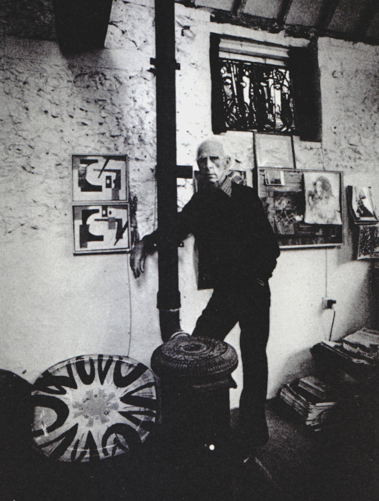
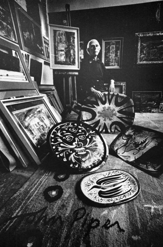
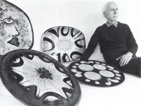
John Piper’s stained glass is painterly, like the French, where colour and light dominate and the lead lines merely hold the composition together. This is the antithesis of German design, where the colour is used to fill in a lead grid composition, typical of their graphic tradition, from Durer to Gunter Grass. This painterly approach also characterises his ceramics. Adverse critics of Picasso’s ceramics (for example Malcolm Haslam, reviewing Georges Ramié’s Picasso’s Ceramics in The Connoisseur, March 1976), let alone those by Duncan Grant and Vanessa Bell, would doubtless raise similar objections to the dishes, plaques and vases by John Piper, since he, too, primarily uses the ceramic form as a canvas. The composition of the decoration decides the form of the object, the antithesis of the craftsman’s approach. ‘‘Painters and sculptors make all the discoveries”’ John Piper said. “‘Craftsmen who make discoveries beyond the materials are artists’’.
Since 1968, John Piper has learnt from the potter Geoffrey Eastop the techniques of hand-built pottery, making moulds, glazing and firing. Recently, John Piper has undertaken the whole process himself, although together they continue to refine the colours and techniques to achieve an ever more inventive painterly style. The use of the more heat-resistant T material earthenware clay is one such development. Its pallor provides a “primed canvas” without the need to use a slip, whilst its ‘‘tooth” (a roughness created by the grog mixture) provides a rougher texture, which enables John Piper to trail the glaze colour across the surface, breaking it as in brush work on canvas. The material, fired at 1150°C, is less inclined to buckle and crack, an advantage for the large-scale form of his pieces. Most of his ceramics are twice-fired, at 1040°C and then, glazed, at 1020°C, but recently, the technique of burning out wax has allowed for a more complex painted background and a third firing at 500°C.
The notable feature of John Piper’s ceramics is the depth of colour, not normally associated with earthenware. The problems of achieving this have inhibited many potters from working in earthenware. Often with underglaze decoration and majolica earthenware colour is not well integrated with form. John Piper achieves both textural depth and rich colour by applying colour and technique at several stages, starting with decorating in the dry state, then in biscuit, then adding glazes, then using wax resist methods to allow for further painting on top of the glazes and oxides. The resultant variety of texture and colour makes his imagery startlingly vivid, be it themes from nature, from mythology or from Poussin and allegorical figurative scenes. The excitement of strong painterly colour and composition is equally evident in John Piper’s tapestries, particularly in the High Altar reredos which hangs in Chichester Cathedral, woven by Pinton Freres near Aubusson. It exudes “‘the rocketing amongst the stars and comets” of a Miro and John Piper continues to be interested in the transposition of colour and curve of his paper cut-out and gouache cartoons into tapestry. (The same painterliness has led him to design vestments, and murals, mosaics and set designs, notably for Britten’s Death in Venice in 1972.) Archie Brennan’s Edinburgh Tapestry Company have recently completed John Piper’s tapestry for Sussex University chapel, and, in Namibia, local weavers are completing tapestries of the Tree in Eden, Zion and Heaven, which the artist hopes will find a home in Hereford Cathedral. ‘‘I have always accepted any commission I thought I could do,” John Piper said, although he has once or twice refused a commission for tapestry or stained glass where the building aroused in him strong antipathetic feelings.
For the future John Piper said: ‘“There is no new medium I want to try.”? When I admired his friend Alexander Calder’s mobile in the garden, nodding like a skeletal prehistoric bird, and asked about working in three dimensions, Mr Piper said that he wouldn’t do sculpture, just as he wouldn’t do jewellery, or, one surmised, anything to do with the primacy of form and plasticity.
But it is also because he is more concerned to show through his art his interpretation of what he experiences and sees in life than to show skill. “Art has taught me everything I know’’, John Piper said, and this has influenced his attitude to crafts: “‘If crafts are to be any good, they must show that they have absorbed the teachings of the art of the time’’. This applies as much to a piece of thirteenth century glass, he says, as to work by Bernard Leach, which John Piper admires along with “‘some Lucie Rie and some Hans Coper’’, and which he feels certainly does reflect the art of his time, especially that of Ben Nicholson.
If artists can affect the way people see the world, perhaps John Piper’s particular interest in working also in craft media is not only because he loves experiment but because of the desire to share his discoveries with a wider audience.
In the sleepy village of Comberton in Cambridgeshire, a few miles from my home, lived two interesting people: Lyn Newman ( née Lloyd Irvine ) and her husband Max. Both of them were students at Cambridge university, Lyn going to Girton and Max at St Johns.
After her graduation Lyn Newman was working in London as a book reviewer for the Hogarth Press, run by Leonard and Virginia Woolf. Lyn edited the book of essays Ten Letter Writers (1931). She worked as a lit crit journalist contributing to Nation, The Listener, The Observer and The Spectator.
Leonard and Max had both been to Cambridge, and it was her Girton friend Katharine Ceceley (Creasy) who introduced them at a Cambridge party in 1932, with the veiled warning, ‘‘Max is our local solipsist!”
Max and Lyn were married in 1934. The next year they moved into Cross Farm, a converted farmhouse with an adjoining dovehouse, situated at the village crossroads of Comberton, five miles from Cambridge. Their first son Edward was born later that year. It was at Cross Farm and Leonard and Virginia stayed once, likely due to Lyn’s work with the Hogarth Press. They might have even gone to see Virginia’s friend Gwen Raverat who was living in Halton, the next village south of there.
Max went on to work at Bletchley Park during the war and worked on the Lorenz cipher making the Tunny magazine (a cipher counterpart for Enima). From this work he knew Alan Turing, then after the war when Max went to work at Manchester University he encourage Turing to work there too in the mathematical department. When Turing commited suicide from being forced to take Lyn Newman joined Turing’s mother (Sara) and brother to the funeral. Lyn provided the forward to Sara Turing’s biography of her son.
In the late 1950s Lyn was working as a Librarian in St John’s College, Cambridge, and that is where she left her papers to.
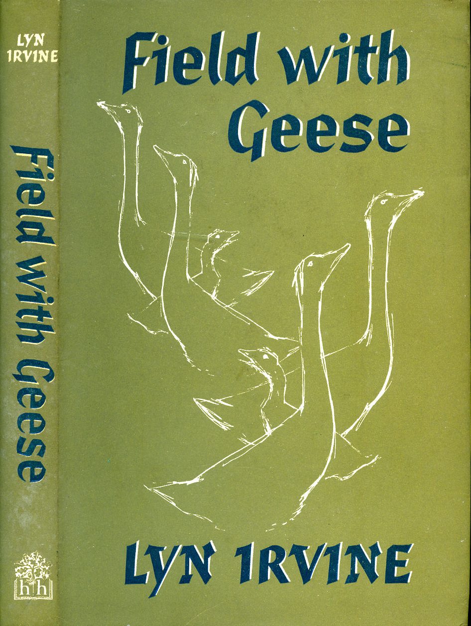
Other than the Hogarth Press’s Ten Letter Writers (1931) works Lyn would continue to write under her maiden with: So Much Love, So Little Money (1957) Field With Geese (1960) and a biography of her friend Alison Cairns and Her Family (1967).
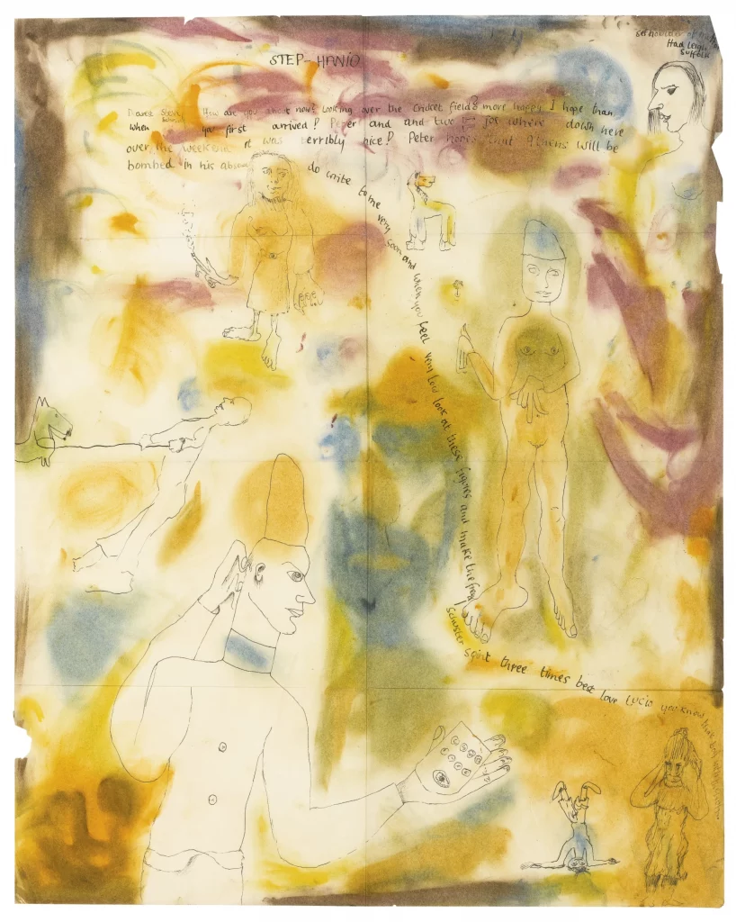
What is this curious thing? Well it is a bonkers letter from Lucian Freud to Stephen Spender c1939-1940
Dearest Steve, How are you about now? Looking over the Cricket field? more happy I hope than when you first arrived? Peter and and two (?) joe where down here over the weekend it was terribly nice! Peter hopes that Athens will be bombed in his absence. Do write to me very soon and when you feel very low
look at these figures and make the freua-schuster squint three times
Jean Iris Ross (Cockburn) (1911-1973) had gone to Berlin in 1930 to be a film actress in Weimar Republic. At this time the war ravaged Germany had become a liberal and cultural beacon for films, as they were made with less censorship and on a budget with great creativity. Although not a utopia for the masses due to inflation, there was work to be found in the music-hall cabaret bars of Berlin.
Having had a liberal education, left wing parents, and fled a Swiss finishing school to study at RADA, acting was the hope at this time in Ross’s life. However in Berlin she would share a boarding house with a young writer called Christopher Isherwood who would change the public perception of her life forever. Through Isherwood’s pen, Jean Ross metamorphosed into Sally Bowles (1937) over the course of three years Isherwood penned the novella that was to be the tinderbox to Mr Norris Changes Trains (1935) and The Berlin Diaries (1939). Although Isherwood abstracted Ross’s life and mannerisms, there were many facts in the book that were based on reality, she was a cabaret singer – though not a good one. She did come from a rich family and she did have an abortion before leaving Berlin.
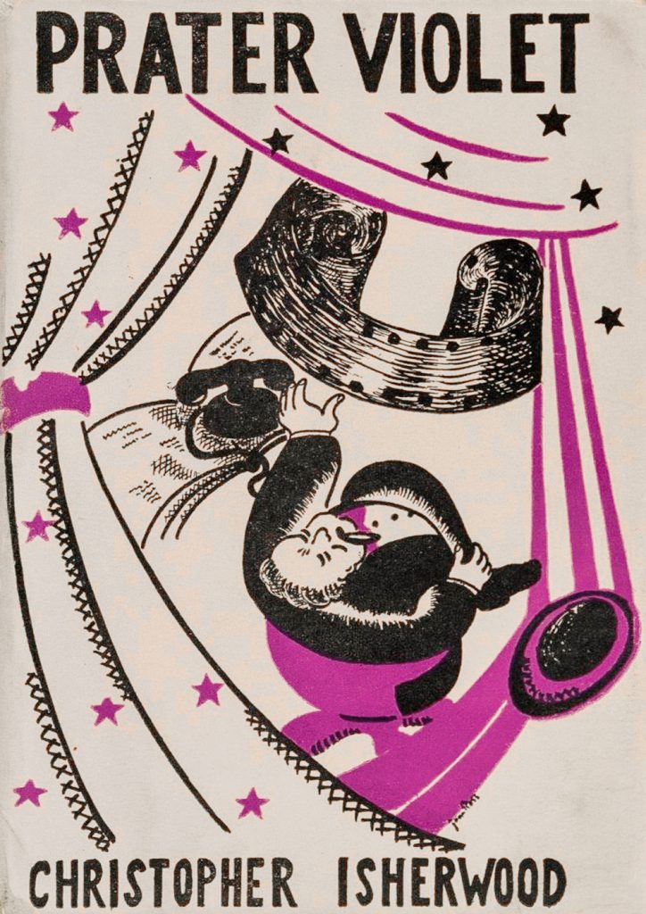
A communist loyal to Stalin living in London she had a relationship with Claud Cockburn and had a daughter, Sarah Cockburn who wrote detective novels. Isherwood and Ross would remain friends and in October, Ross got Isherwood a job at Gaumont-British Studios (where Hitchcock filmed his movies). Isherwood was working under the director Berthold Viertel. Isherwood’s first experience in the film industry provided the material for Prater Violet (1945). (After this job Isherwood moved to California again to live above Viertel’s garage for two years.)
Knowing that Jean Ross and Isherwood were still in communication at this point in 1945 is important as it seems that Ross designed the dust jacket for the British edition of Prater Violet. Thought there isn’t a great deal of evidence Jean Ross became an artist in any other way, her sister Peggy was studying painting and sculpture at Liverpool School of Art around this time and so may have helped either with inspiration or advice. The dust jacket design is signed Jean Ross above the R in Isherwood.
The design also has the feel of some of the Hogarth Press dust jackets designed by Vanessa Bell for her sister’s books. Maybe because the Hogarth Press had published books by Christopher it was a conspiracy to make Prater Violet look like this? At this point it’s just conjecture but I think it can’t be denied they look similar.
It is interesting that the design of this cover isn’t noted by anyone, and that it seems to have been forgotten from history. The bulk of Ross’s life is that of a journalist and mother. Although she was tainted with the legacy of Sally Bowles, this probably wouldn’t have bothered Ross if it only stayed as a book. However when Isherwood’s works were turned into the play I Am A Camera, Sally took on a more flamboyant tone and her role was written as more self obsessed. Then when that stage play became the film Cabaret, Ross tried to disassociate herself from the caricature she had become. Ross’s strong political views clashed with Isherwood’s impassive observations of Berlin and how he wrote Sally, with Isherwood writing that Sally was self obsessed and at times flippantly anti-semitic.
Ross and writer Isherwood met a final time shortly before her death in London. In a diary entry for 24 April 1970, Isherwood recounted their final reunion:
I had lunch with Jean Ross and her daughter Sarah [Caudwell], and three of their friends at a little restaurant in Chancery Lane. Jean looks old but still rather beautiful and she is very lively and active and mentally on the spot—and as political as ever … Seeing Jean [again] made me happy; I think if I lived here I’d see a lot of her that is—if I could do so without being involved in her communism.
Christopher Isherwood – Liberation Diaries, Volume Three: 1970-1983
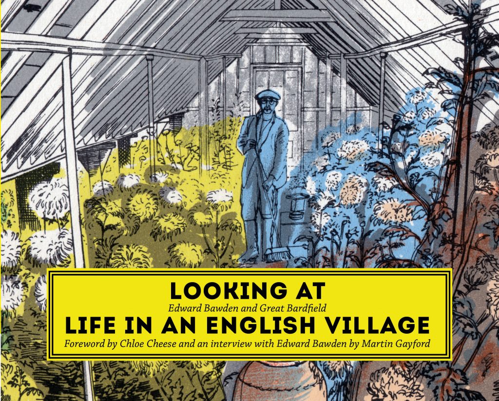
Edward Bawden’s Life in an English Village, with an introduction by Noel Carrington, was first published as a King Penguin book in 1949, and until now the artist’s illustrations have never been reprinted in full.
But far more than a reprinting of the original book, this is an investigation into Bawden’s illustrations, his life as an artist and designer, and the world of Great Bardfield in 1949. You will discover the history of Bawden’s much-loved book and learn about the people and places he depicted in what is still one of East Anglia’s most charming villages.
Through his time as an official war artist in the Second World War, Bawden learnt the art of portraiture and recorded as a journalist what he was confronted with. In Life in an English Village he put the same skills to use in peacetime, capturing in pen and ink the tranquillity of people at work in his village.
This book also features the work of other Great Bardfield artists – among them Eric Ravilious, Walter Hoyle, Michael Rothenstein and Chloe Cheese – who with Bawden made the village a significant centre for art in Britain. In addition, it includes old photographs of the village to bring further to life the Great Bardfield of 1949.
Fully illustrated with the artist’s work, this is a rare chance to discover the secrets of Bawden’s illustrations.