Author: Robjn Cantus
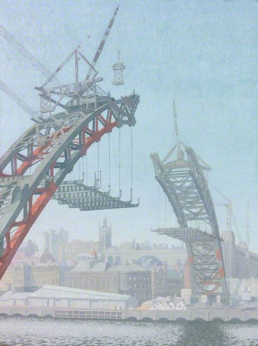
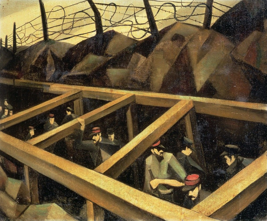
Edward Montgomery O’Rorke Dickey – The Building of the Tyne Bridge, 1928
Edward Montgomery O’Rorke Dickey, known mostly as Dickey, was born in Belfast on 1 July 1894. He was educated at Wellington College and Trinity College, Cambridge. He studied painting under Harold Gilman at the Westminster School of Art. He was art master at Oundle School and then became professor of fine art and director of King Edward VII School of Art, Armstrong College, Durham University from 1926 to 1931. He was then staff inspector of art from 1931 to 1957 for the Ministry of Education.
E.M.O’R. Dickey – Figures on a Train, 1925
Dickey comes in to a lot of research of the War Artists in the Second World War as he was working for the Ministry of Information on the War Artists’ Advisory Committee, first as a secretary from 1939-42, and then joined the committee after. He was one of the people the artists could liaise with.
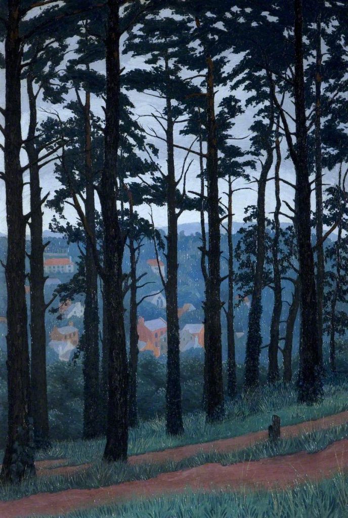
E.M.O’R. Dickey – Budleigh Salterton from Jubilee Park, 1925
Dickey became the first curator of The Minories, Colchester in the 1950s, a post he held for five years. He painted extensively on the continent, and showed at the RA, NEAC. Both Bawden and Gross spoke with enthusiastic memories of him.
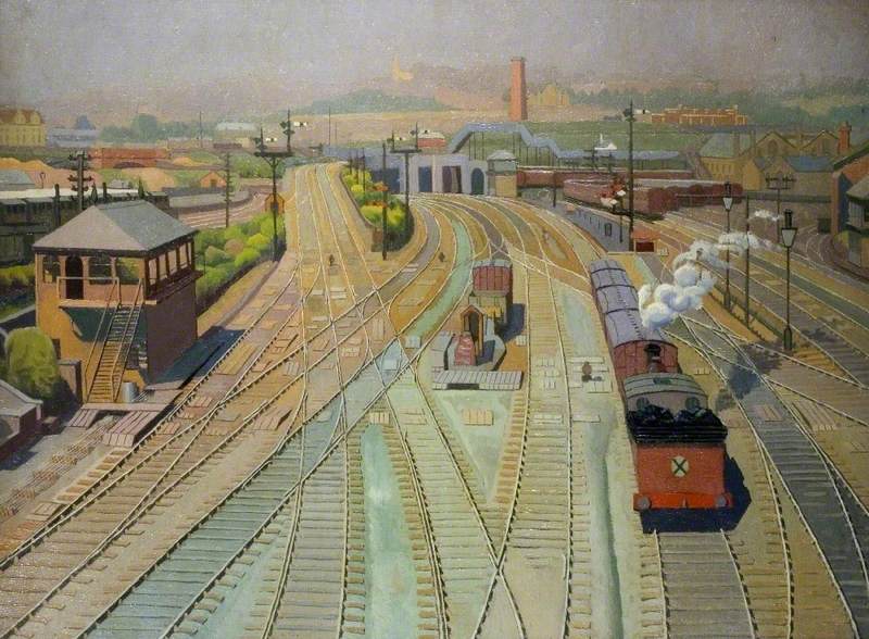
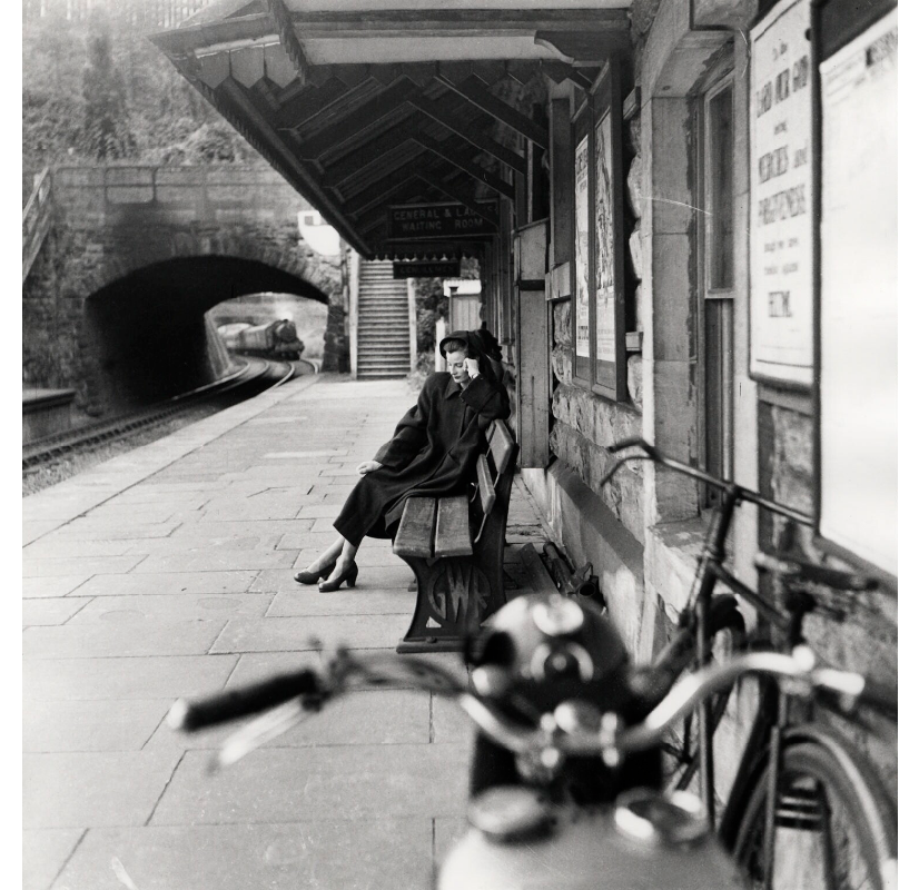
E.M.O’R. Dickey – Kentish Town Railway Station, 1919
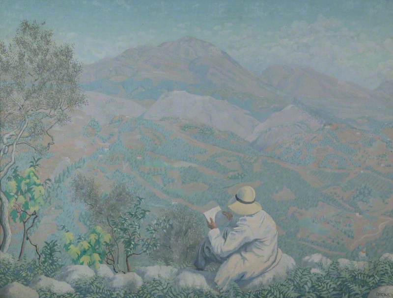
E.M.O’R. Dickey – Monte Scalambra from San Vito Romano, 1923
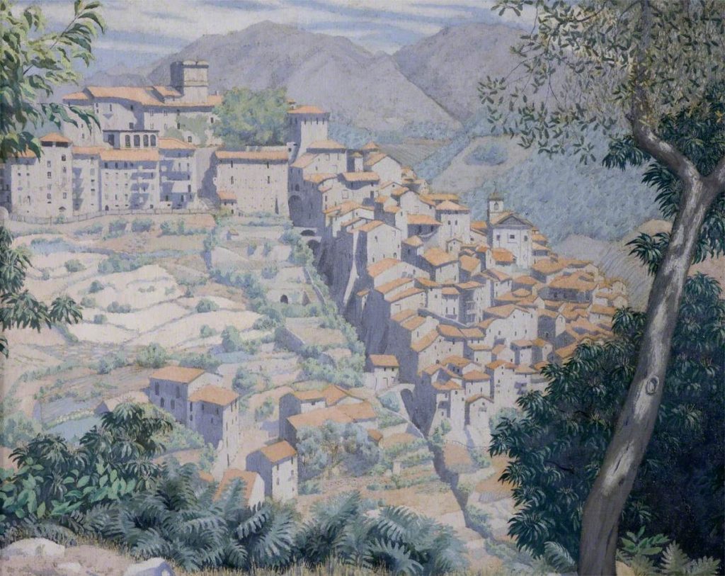
E.M.O’R. Dickey – San Vito Romano, 1923
This is a book of poems by Florence Elon and illustrated by Warwick Hutton in 1984, The Keepsake Press.
Florence Elon, A young poet of impressive range, who draws on continental European, Jewish and cosmopolitan roots, and whose sense of exile is pervasive.
MY EYELIDS OPEN
My eyelids open from a thought of you
to your half-covered shape beside me, blurred
as rain slanting against our window now:
chilled slopes & hollows of your face surprise
my fingertips, that slide across
flesh puckering between
each forehead line; a white flash of the sky
lights up your eyes.
Our bodies, turning towards each other, close
like halves of a book. Taut mass of your thighs
& torso, that my own curves press into,
burns as you sway: warm being next to mine,
in this full touch, clay moulding against clay-
beside which, other acts
are partial, all thoughts, substitutes-
change dream to fact.
LINES FOR AN ALBUM
For sport, long summer days,
falling in love, we took
snapshots of graves
on the outskirts of Rome.
Caged in gold wire
a stage crowned the headstone:
two angels in mid-air
hovered on silver wings,
holding lit bulbs
round a Madonna figurine-
rose-lipped, pearl-robed-
smiling into our lens.
I spread the finished prints
on our tile floor
one late September afternoon.
They show, in blacks & whites:
Madonnas’ teeth
missing, bulbs burnt-out,
& round the stone-
boll-wisp, wing-bone.
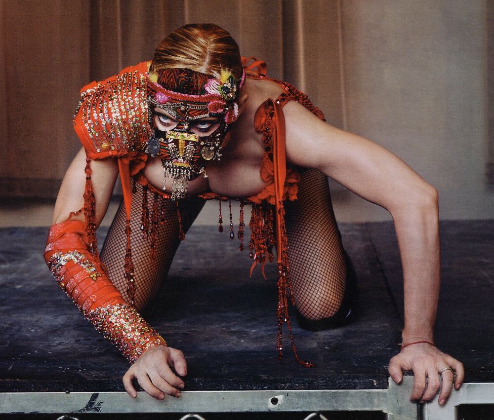
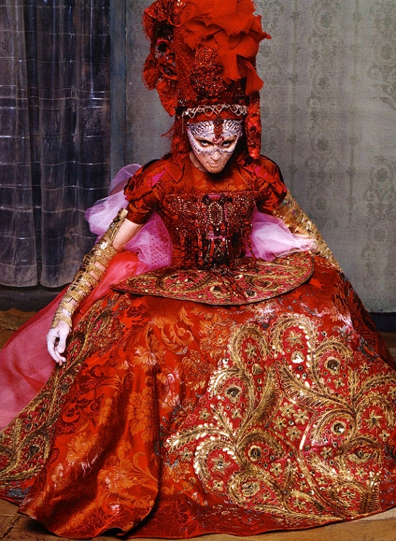
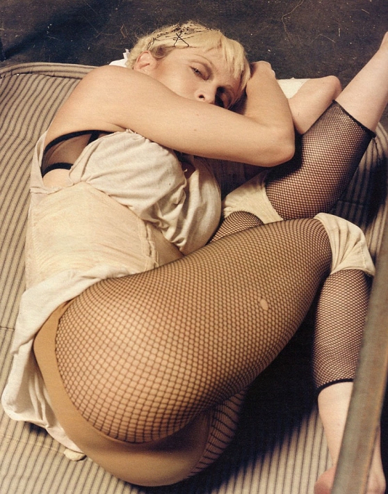
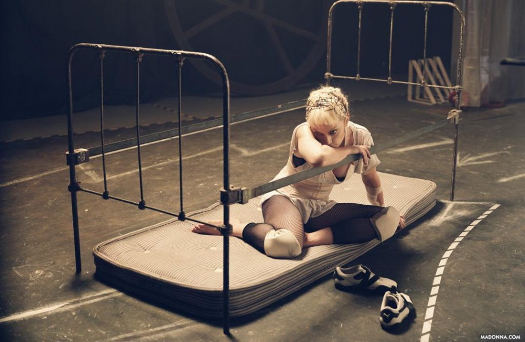
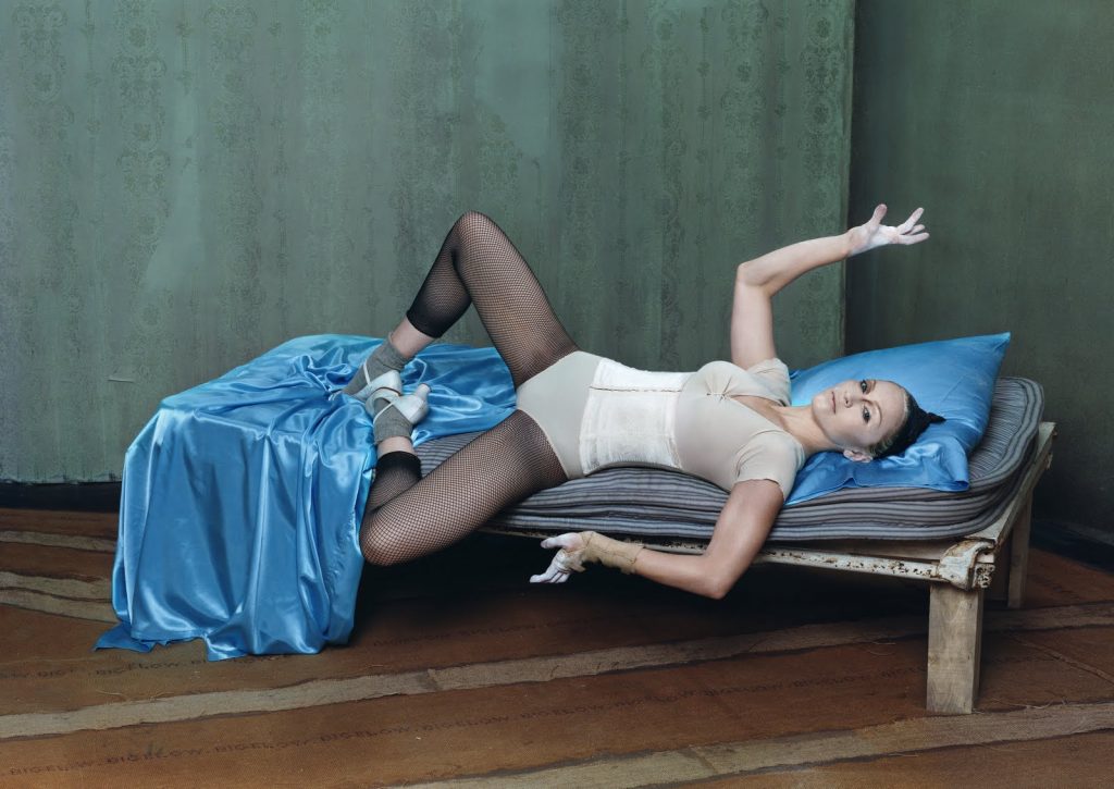
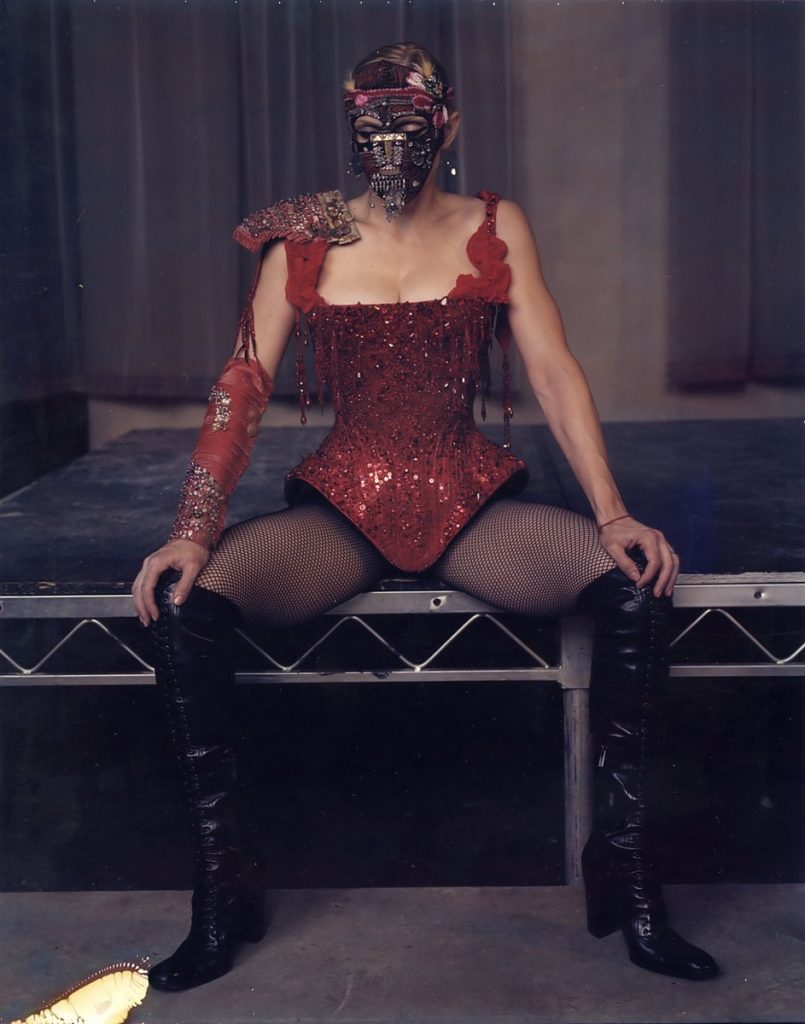
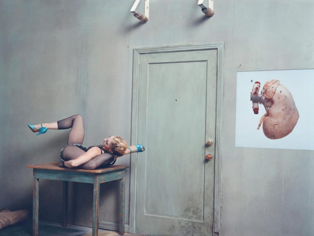
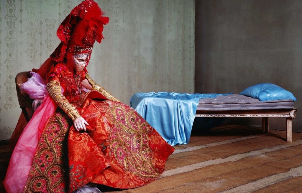
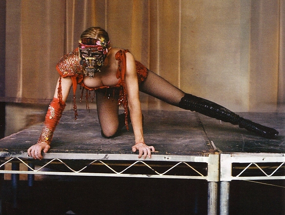
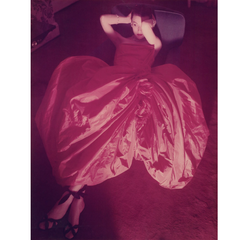
Though not a typical post for me I think it is good to investigate an artist and a muse. The X-STaTIC PRO=CeSS book by signer Madonna and photographer Steven Klein is a curious meeting of minds.
The images use the typical surroundings of the traditional muse, a bed, a chez lounge and the stage of a performer, all without any frills and stripped back. The clothes are by a range of designers but the impressive red dress is by Christian Lacroix

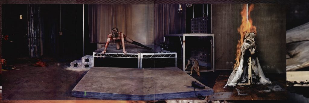
This last video was a photo animation. It was 8 x 26 feet.
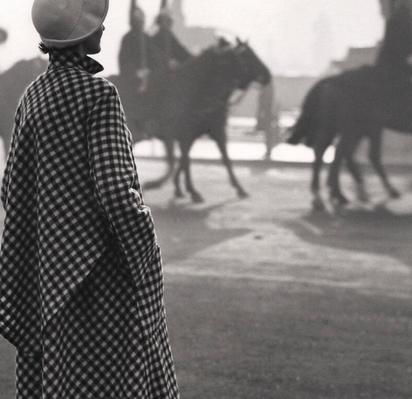
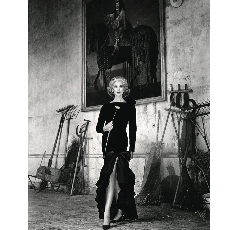
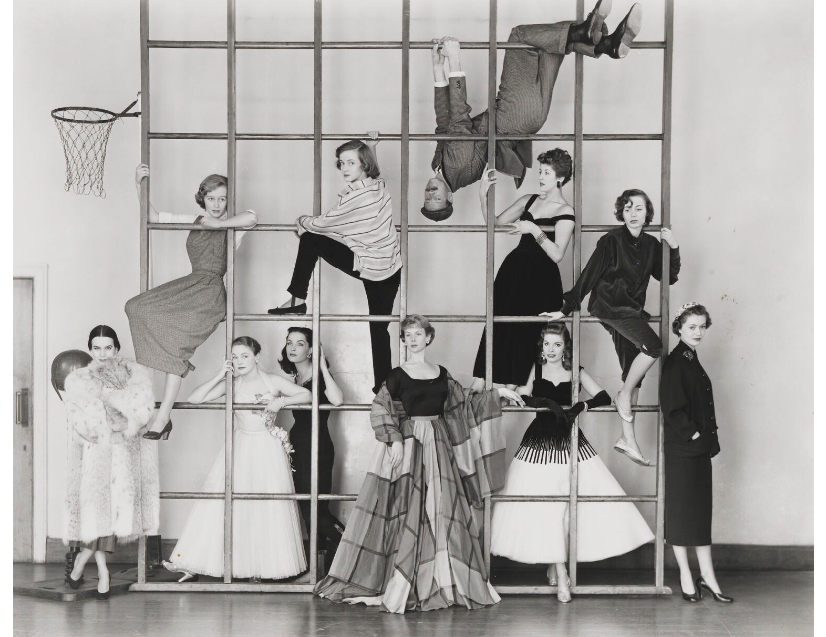
Norman Parkinson was a celebrated British fashion and portrait photographer. Credited for inspiring important shifts in the trends of fashion photography, Parkinson left the more posed studio setting to take outdoor shots that were more dynamic and carefree than his contemporaries, adding inventive humorous elements in to his work.
Parkinson’s work regularly appeared in magazines such as Harper’s Bazaar and Vogue, earning a reputation for finely produced images that combined elegance with British charm. “I like to make people look as good as they’d like to look, and with luck, a shade better,” he once quipped.
Born on April 21, 1913 in London, England, he began his photography career as an apprentice to Speaight and Sons court photographers in 1931. He would later take over as official court photography to the British monarchy following the death of predecessor, Cecil Beaton, in 1975. Parkinson would create many indelible portraits of the royal family, and was the recipient of the title Commander of the Most Excellent Order of the British Empire. He died on February 15, 1990 while on assignment in Singapore.
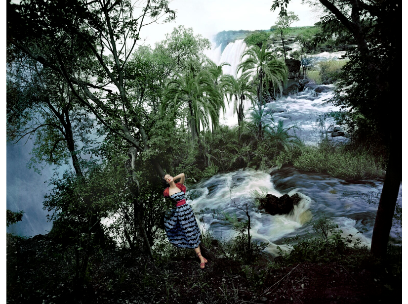
Norman Parkinson – Régine Debrise wearing a Balenciaga ball gown, 1950
Norman Parkinson – Wenda Parkinson (née Rogerson), 1947
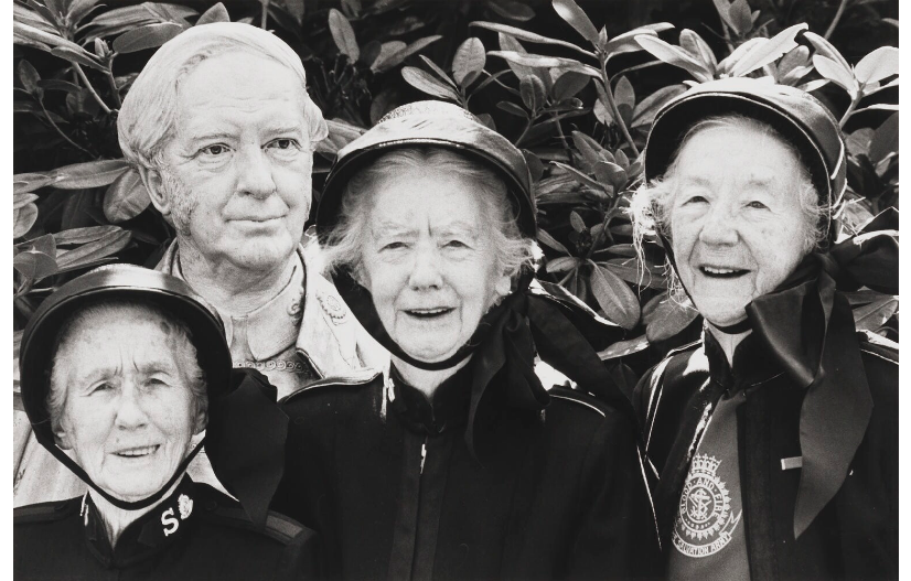
Norman Parkinson – The daughters of William Bramwell Booth (Olive Emma Booth; Dora Booth; Catherine Bramwell-Booth), 1981
Norman Parkinson – Anne Chambers (Owena Anne Chambers (née Newton), 1949
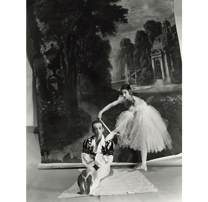
Norman Parkinson – Margot Fonteyn; Sir Robert Murray Helpmann, 1951
Norman Parkinson – Kathleen Ferrier, 1952
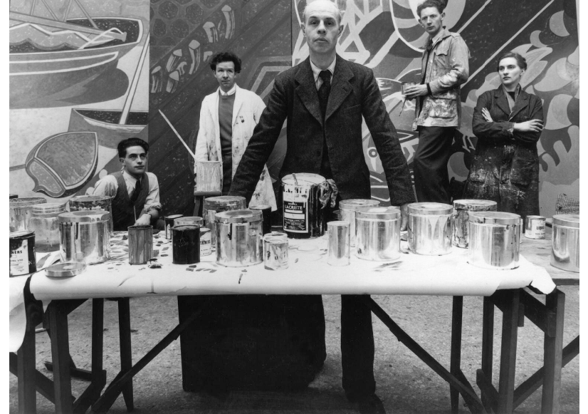
Norman Parkinson – Edward Bawden with Walter Hoyle to his left and Sheila Robinson to his right, 1951
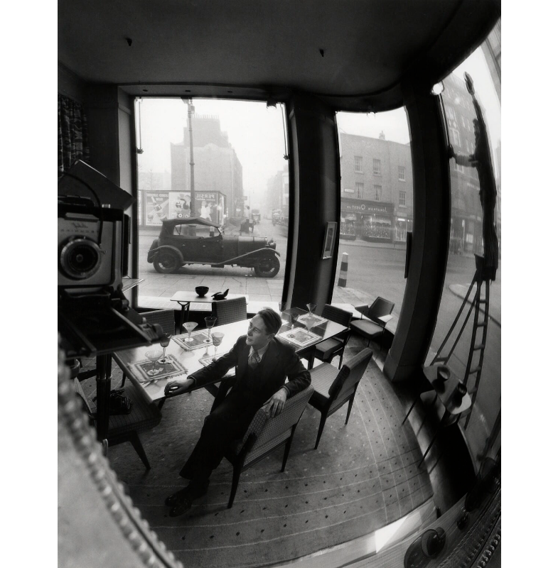
Norman Parkinson – (John) Christopher Heal, 1953
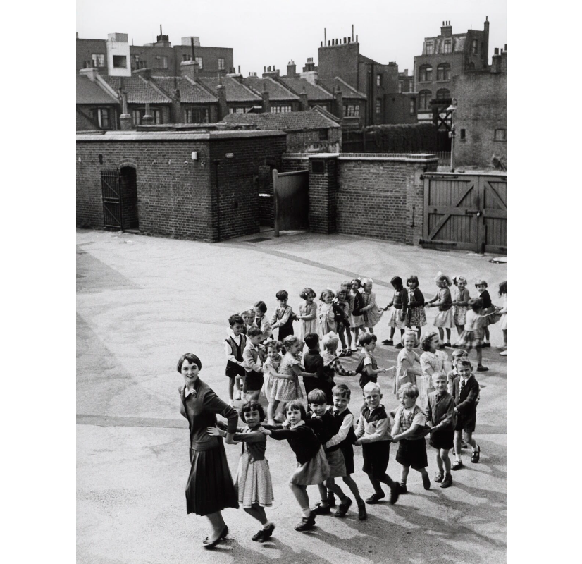
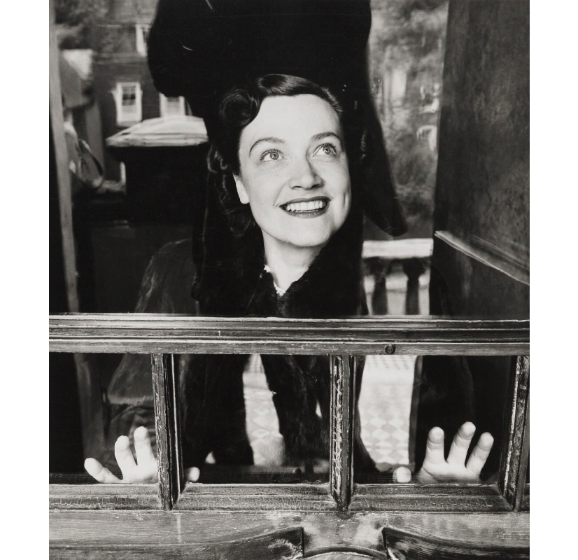
Norman Parkinson – Joan Cox with thirty-five school children, 1955
Norman Parkinson – Wenda Parkinson (née Rogerson), 1951
Norman Parkinson – Carmen Dell’Orefice, 1980
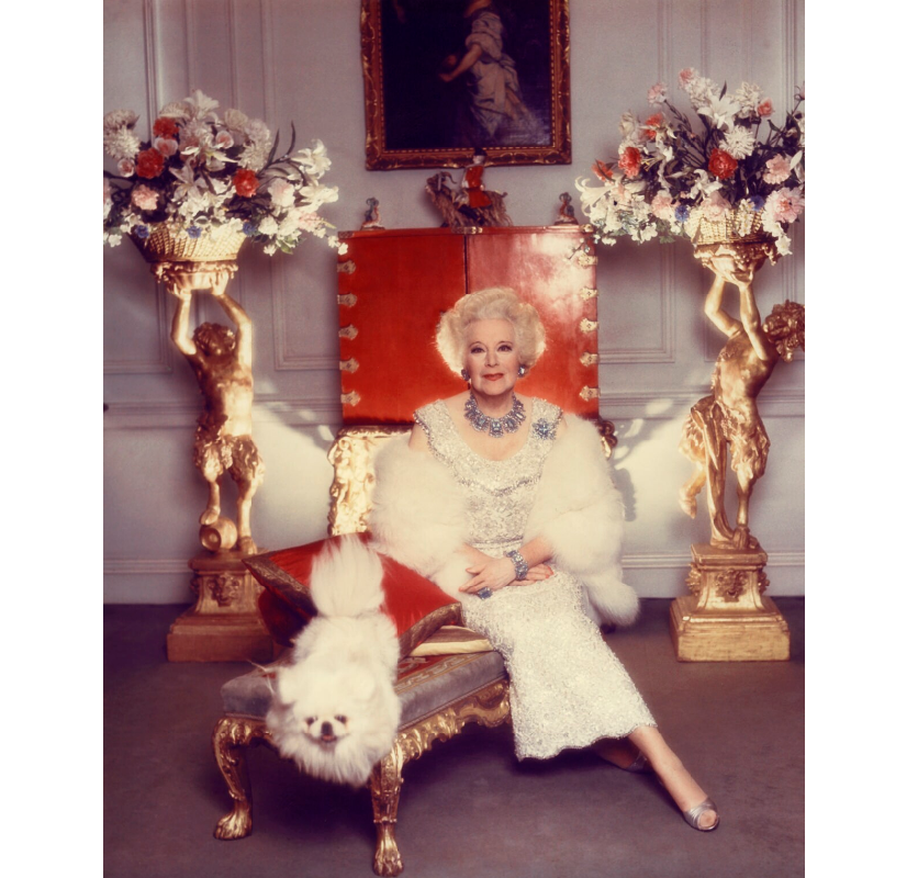
Norman Parkinson – Dame Barbara Hamilton Cartland, 1977
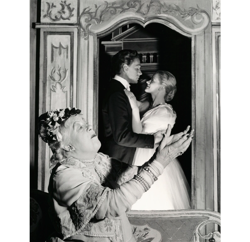
Norman Parkinson – Dame Margaret Rutherford as the Duchess; Paul Scofield as Prince Albert; Mary Ure as Amanda in ‘Time Remembered’, 1955
Norman Parkinson – The Young Look in the Theatre, 1953
Norman Parkinson – Charles Alexander Vaughan Paget, Earl of Uxbridge; Lady Henrietta Charlotte Eiluned Megarry (née Paget), 1953
Norman Parkinson – Virginia Ironside with three children
Nov ‒ Dec 1915. Goupil Gallery, London
I thought this review of the London Group Show was of note as it features so many wonderful painters. I have found some of the paintings on show to illustrate it. Originally published in the magazine, Colour, 1915.
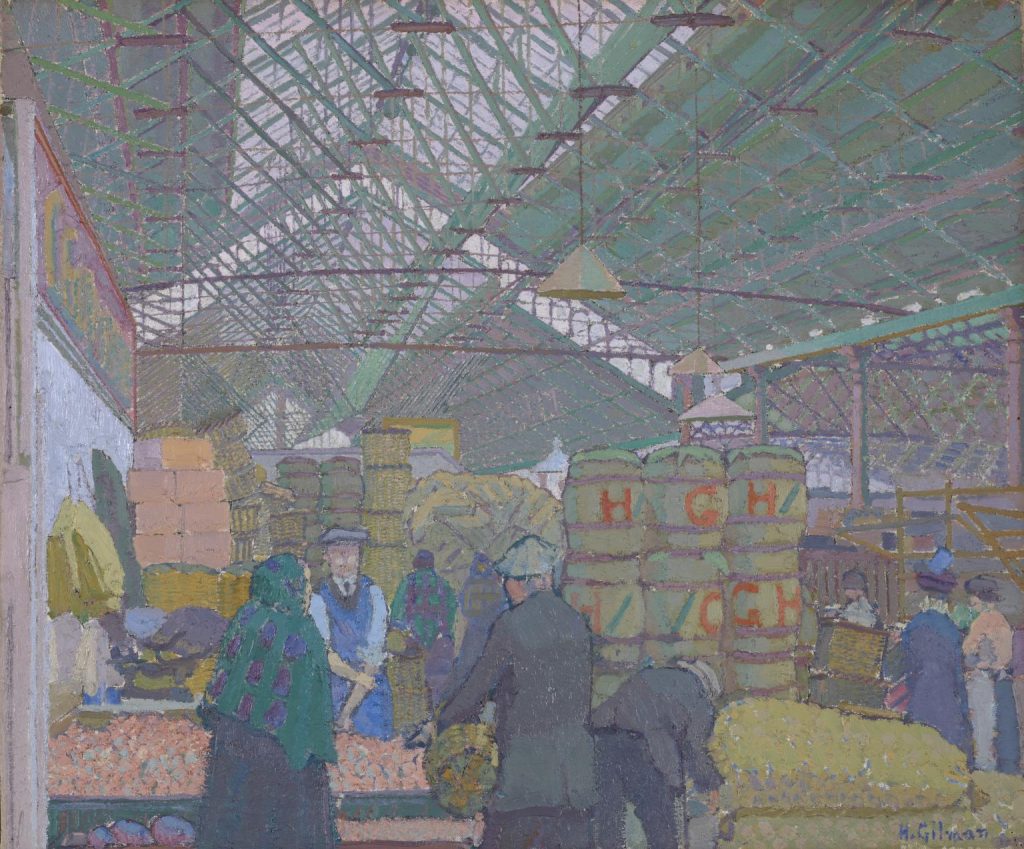
Harold Gilman – Leeds Market, 1913
London Group – The third Exhibition of this group is now on exhibition at the Goupil Salon is one of in which a certain sense of gaiety and experiment is to be seen. The spirit of adventure is also alive, and the group being one where members are not subject to the tyranny of a selecting committee, one notices that with a free hand these artists can give liberal expression to their point of view. There is much good painting in various Styles, and Little that is bad add, while a high level of excellence is in evidence throughout the show. W. B. Adeney show several canvases in which the design is obviously the first aim of the artist. In most cases he is successful. Thérèse Lessore is also greatly interested in the designing of her canvases, but colour also plays an important part. Harmonies of Pale colours, that always good colours, together with a simplified rendering of the figures which people her canvases, make for a series of distinguished works. As decorations they are complete.
Christopher R. W. Nevinson – Les Guerre de Trous, 1914
Figure work and portraits at this exhibition are few, and of the latter nana satisfactory. Of the former, Thérèse Lessore, who we have already mentioned, Mary Godwin, and Horace Brodzky, contribute. The last mentioned painter shows a decoration in which three nudes energetically struggle with a large stone. This work is evidently a sketch for a mural decoration to be painted on a large scale. Mary Godwin’s subjects display a searching after luminosity and texture.
Mark Gertler – Creation of Eve
R.P. Bevan sends a fine landscape “The Corner House,” which shows that he has learnt match from Cezanne without losing his own individuality. The excessive pink and mauve of his earlier work now makes place for dignified colour. His design has significance and weight. Harold Gillman’s best picture here, the interior of a fruit market, is a beautiful harmony in greens, whilst Charles Ginner expresses the greyness of things in a fine painting of Leeds Canal. Mark Gertler shows two intoxications of colour which we are sure were painted in the true spirit of joie de vivre. One piece of sculpture alone is on view, and that by C.R.W. Nevinson.
For the nation – A marble statue by Henri Gaudier-Brzeska has recently been presented to the South Kensington Museum, together with a number of this sculptors drawings.
Frederick Porter, a young painter at present residing in London and a New Zealander by birth, is a colourist of considerable merit. Porter studied at the Academy Julian in Paris from 1907 to 1910. He has also painted with success the landscape of Barbizon, particularly Moret, made famous through the paintings of Tisely, and he has painted for some time in Etaples. In 1911 Porter came to London, where he has exhibited on several occasions at the London Salon. Here his work received considerable attention from discriminating critics, and as he is still a young man and intensely serious, we may expect to find augmented interest in his new work.
Two cartoons, entitled “A Place in the Sun” and “A Controller of Traffic” by Will Dyson, have been purchased by the Felton Bequest for the Melbourne National Gallery.
Randolph Schwabe – Head of an Old Woman
Christopher R. W. Nevinson – Bursting Shell, 1915
Artists on show:
William Ratcliffe – The Old Mill
Charles Ginner – The Angel, Islington
Adrian Paul Allinson – Casino de Paris
Adrian Paul Allinson – Mauve and Green
Christopher R. W. Nevinson – The Bridge at Marseilles
William Ratcliffe – The Mill Stream
William Bernard Adeney – The Spruce
William Ratcliffe – Interior
William Bernard Adeney – The Road through Woods
Mark Gertler – Swing Boat
William Bernard Adeney – Man and Horse
Charles Ginner – From Trinidad
Thérèse Lessore – An Old Woman
Stanisława de Karłowska – White Paintings
Thérèse Lessore – The Cyclist
Stanisława de Karłowska – Still life
Harold Gilman – Portrait
Harold Gilman – Interior
Harold Gilman – Still Life
Adrian Paul Allinson – Queen´s Hall
Stanisława de Karłowska – Woodlands
Horace Brodzky – The Little Mourner
Christopher R. W. Nevinson – A Deserted Trench
Thérèse Lessore – King Street
Robert Polhill Bevan – A Hillside, Devon
John Northcote Nash – Pine Woods
Horace Brodzky – Portrait
Mary Godwin – The Bedroom
Mary Godwin – Fish
Walter Taylor – Brighton
Walter Taylor – The Boat House
Randolph Schwabe – Mrs. Randolph Schwabe
Paul Nash – Tree Tops
Paul Nash – A Sunset
Paul Nash – Moonrise over Orchard
Paul Nash – Tryon´s Garden
Mary Godwin – Ways and Means
Douglas Fox Pitt – Brighton Front
Douglas Fox Pitt – Shoreham
Randolph Schwabe – Portrait
Charles Ginner – Surrey Landscape
John Northcote Nash – Landscape
John Northcote Nash – Steam Ploughing
Horace Brodzky – Expulsion
Sylvia Gosse – Versailles
Sylvia Gosse – The Toilet
Sylvia Gosse – Busch Bilderbogen
Sylvia Gosse – The Answer that turneth away Wrath
Sylvia Gosse – Sussex Meadows
Randolph Schwabe – Landscape in Devonshire
William Bernard Adeney – Dividing Roads
William Bernard Adeney – House and Trees
Thérèse Lessore – The Canal Bridge
Stanisława de Karłowska – The Lane
Stanisława de Karłowska – From an Upper Window
Mary Godwin – Still Life
Mary Godwin – Ewelme Alms House
Robert Polhill Bevan – The Corner House
Robert Polhill Bevan – Tattersall´s
Harold Gilman – My Lonely Bed
Thérèse Lessore – The Confectioner´s Shop
Adrian Paul Allinson – Cotswolds, Spring
Walter Taylor – Interior
Charles Ginner – The Timber Yard, Leeds
Charles Ginner – Crown Point, Leeds
John Northcote Nash – Threshings
John Northcote Nash – Woods
Adrian Paul Allinson – Still Life
Horace Brodzky – Decoration
Horace Brodzky – Cefalu
Mark Gertler – Fruit Stall
William Ratcliffe – London
Douglas Fox Pitt – In the Dome, Brighton
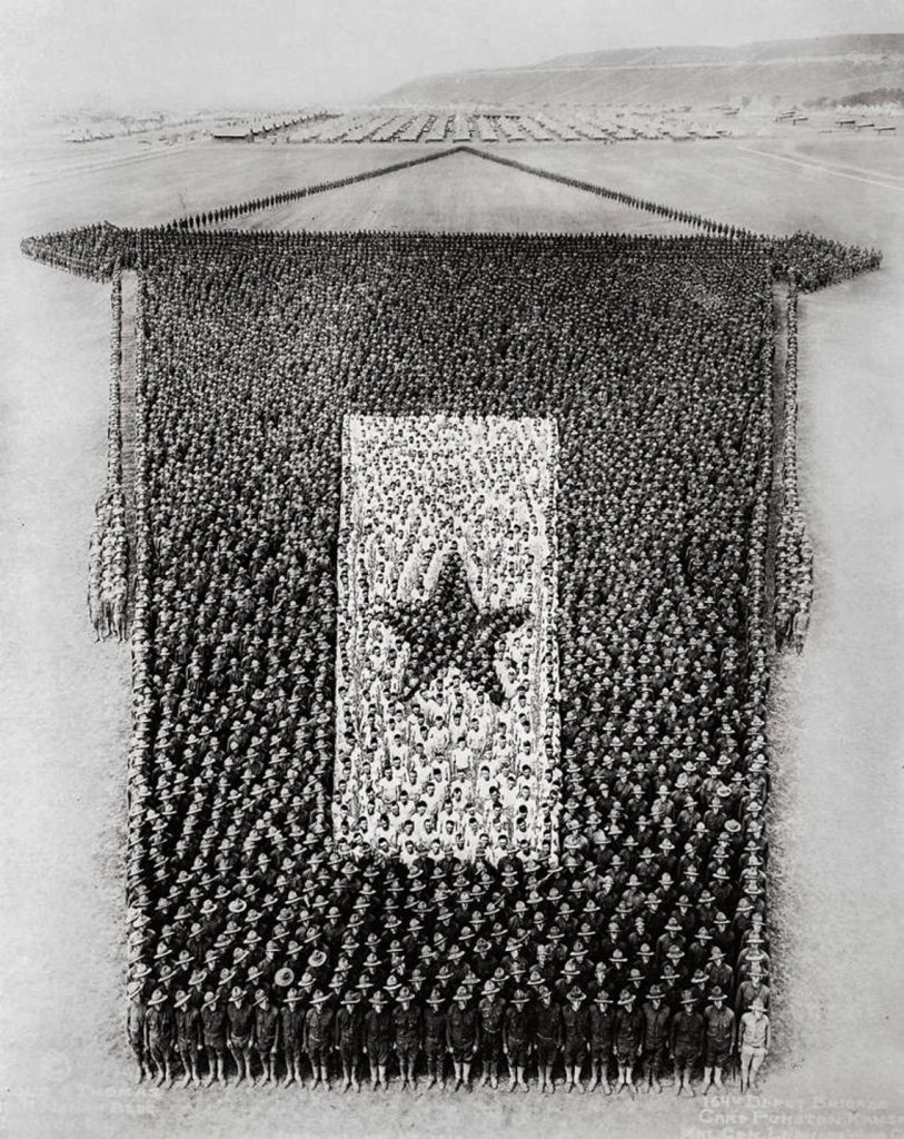
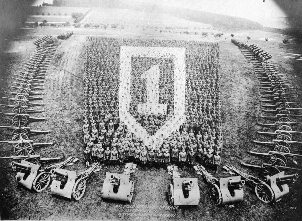
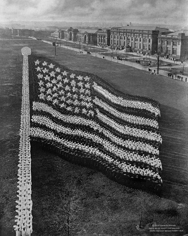
In search of some eye-catching imagery to boost morale surrounding US involvement in WWI, the US military commissioned the English-born photographer Arthur Mole and his assistant John Thomas to make a series of extraordinary group portraits. Between 1915 and 1921, with the dutiful help of thousands of servicemen and staff from various US military camps, the duo produced around thirty of the highly patriotic images, which Mole labelled “living photographs”.
Mole (1889-1983) was born in Lexden, a suburb of Colchester, Essex but when he was 14 years old his family emigrated to America, where he became a citizen. He became a commercial and portrait photographer, came up with the idea of human photographs. These required the construction of a tower for the camera to be placed on and then with a megaphone Mole and his assistant John Thomas would move the troops into picture formation.
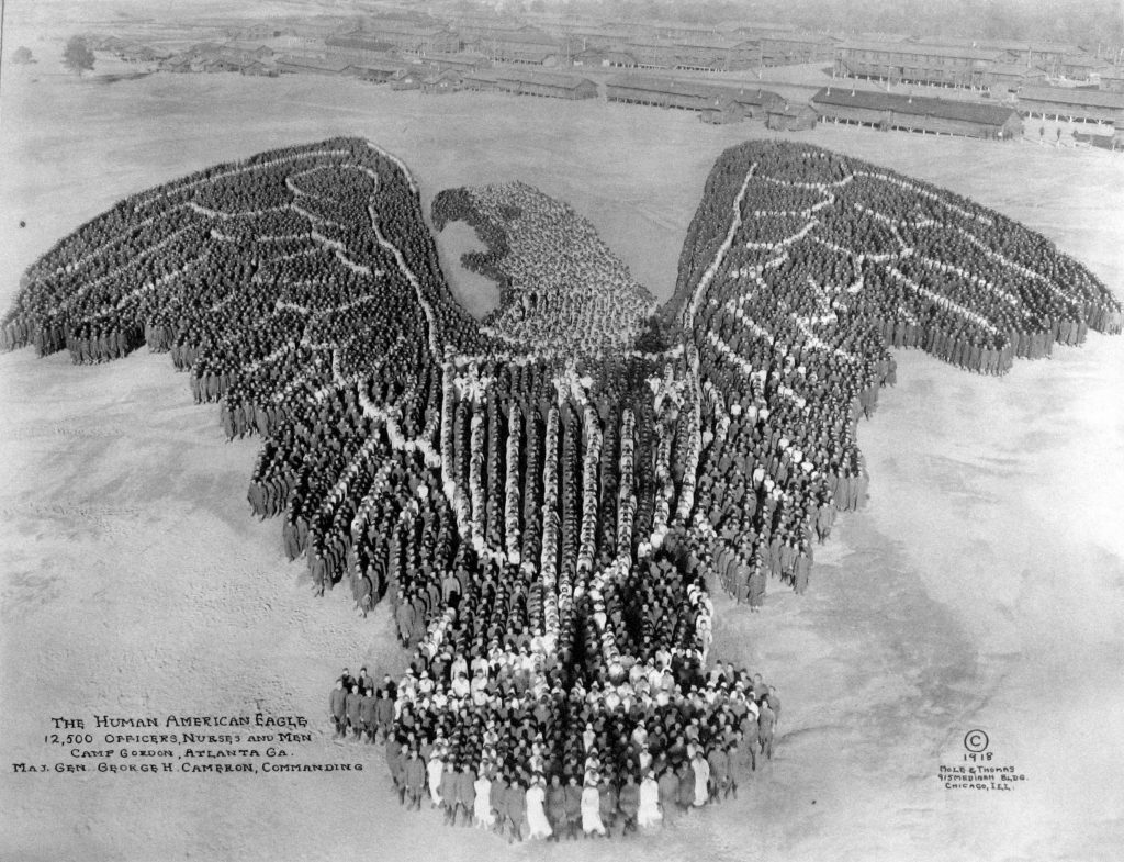
Arthur Mole and John Thomas – The Human American Eagle, 12,500 Men
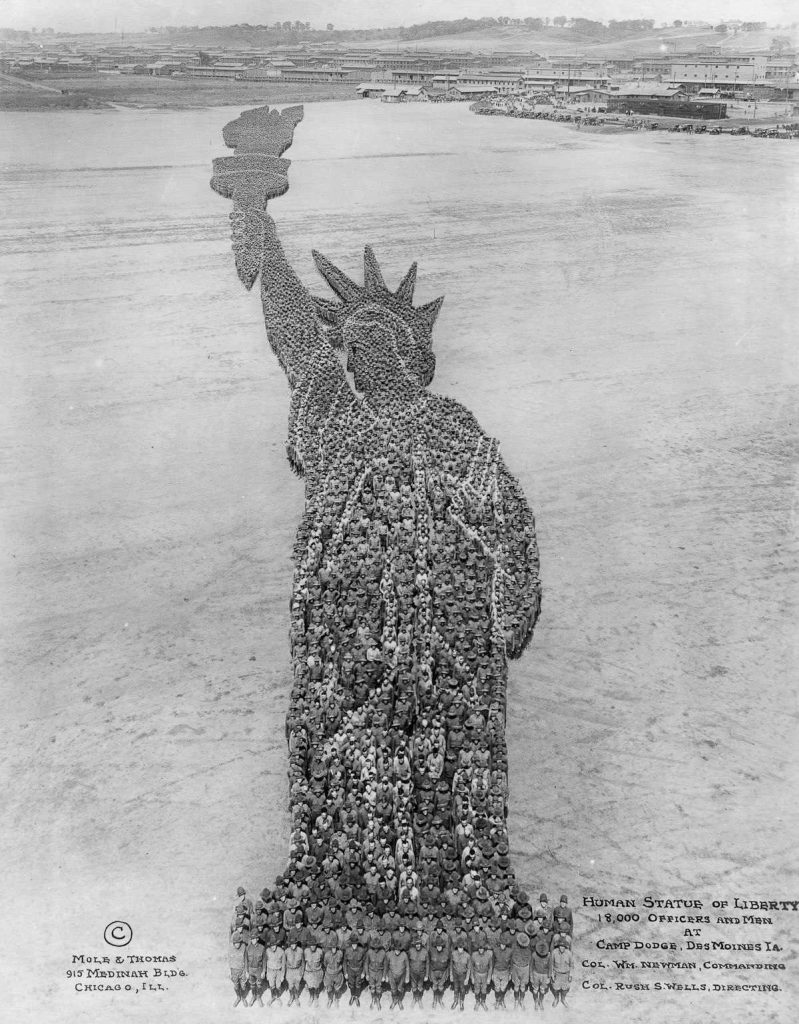
Arthur Mole and John Thomas – The Statue of Liberty, 18,000 Men
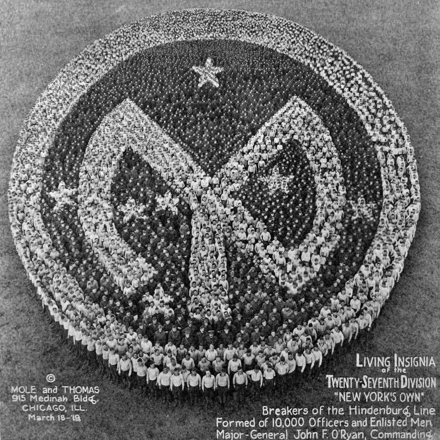
Arthur Mole and John Thomas – 27th Division Insignia, 10,000 Men
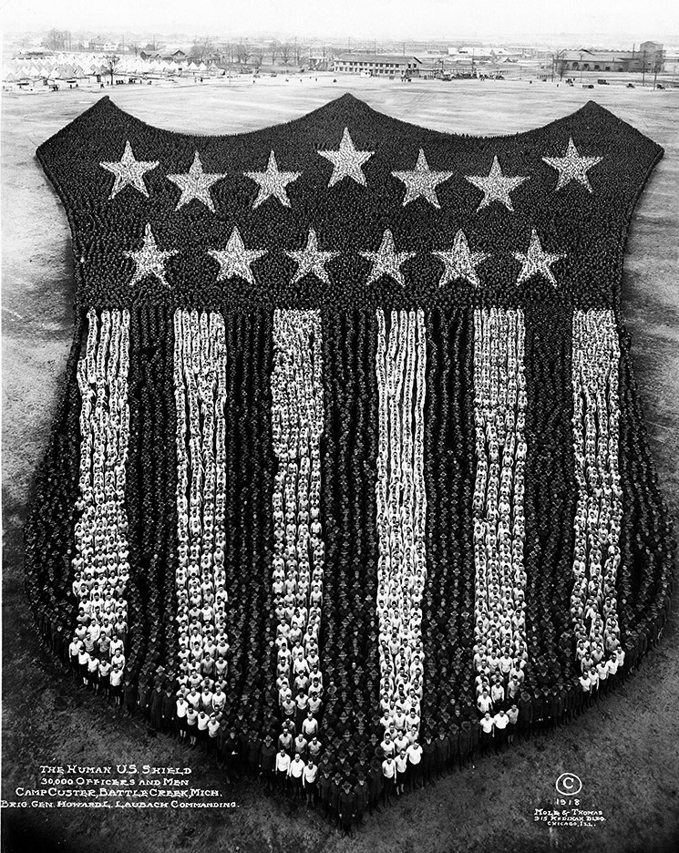
Arthur Mole and John Thomas – US Shield, 30,000 Men
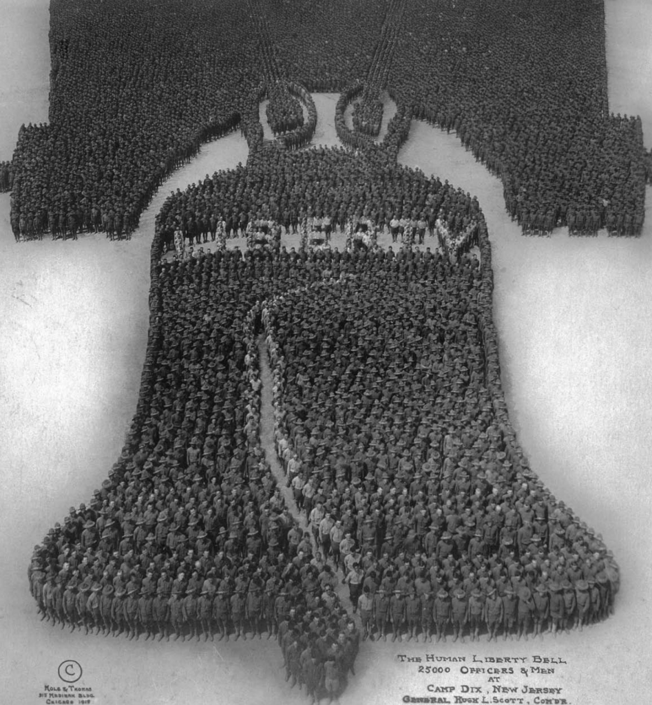
Arthur Mole and John Thomas – Liberty Bell, 25,000 Men
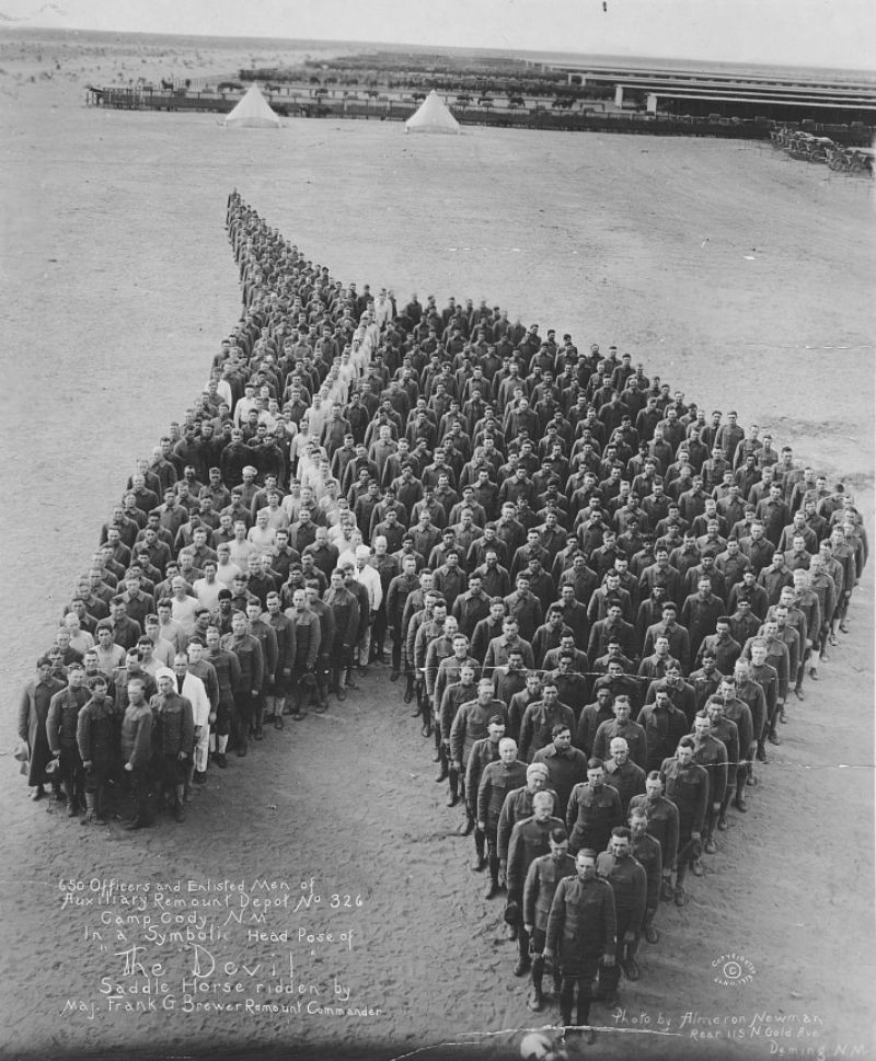
Arthur Mole and John Thomas – WW1 Horse Memorial, 650 Men
Here are two more, I think they are by Mole, but I am not sure.
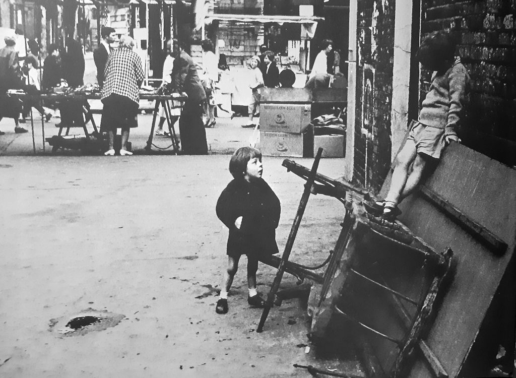
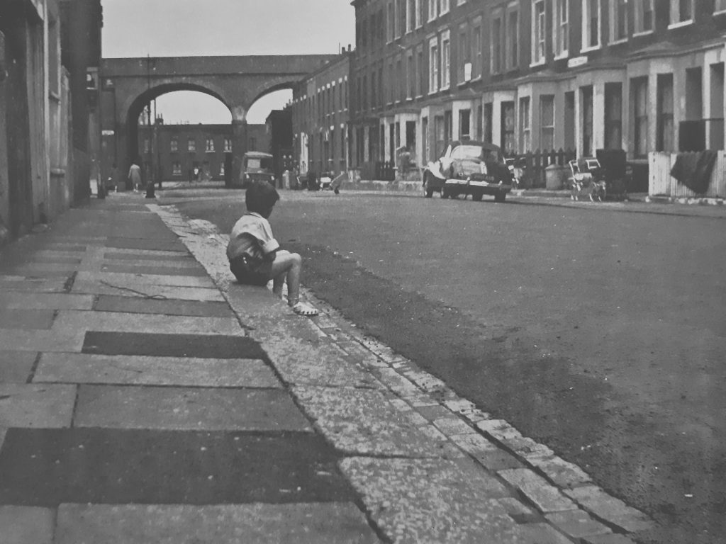
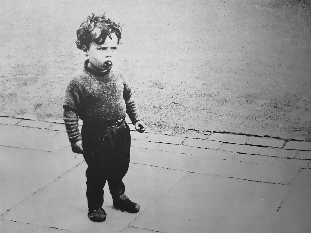
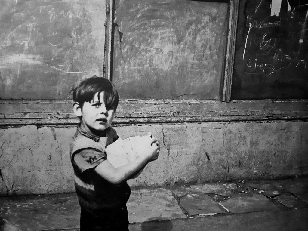
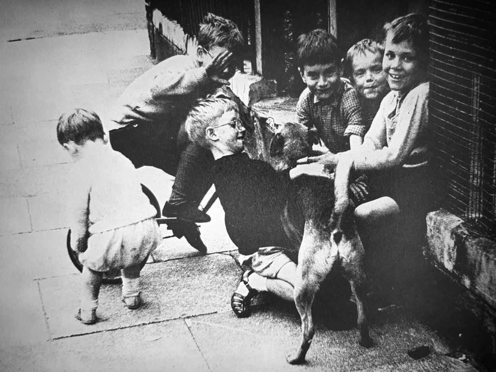
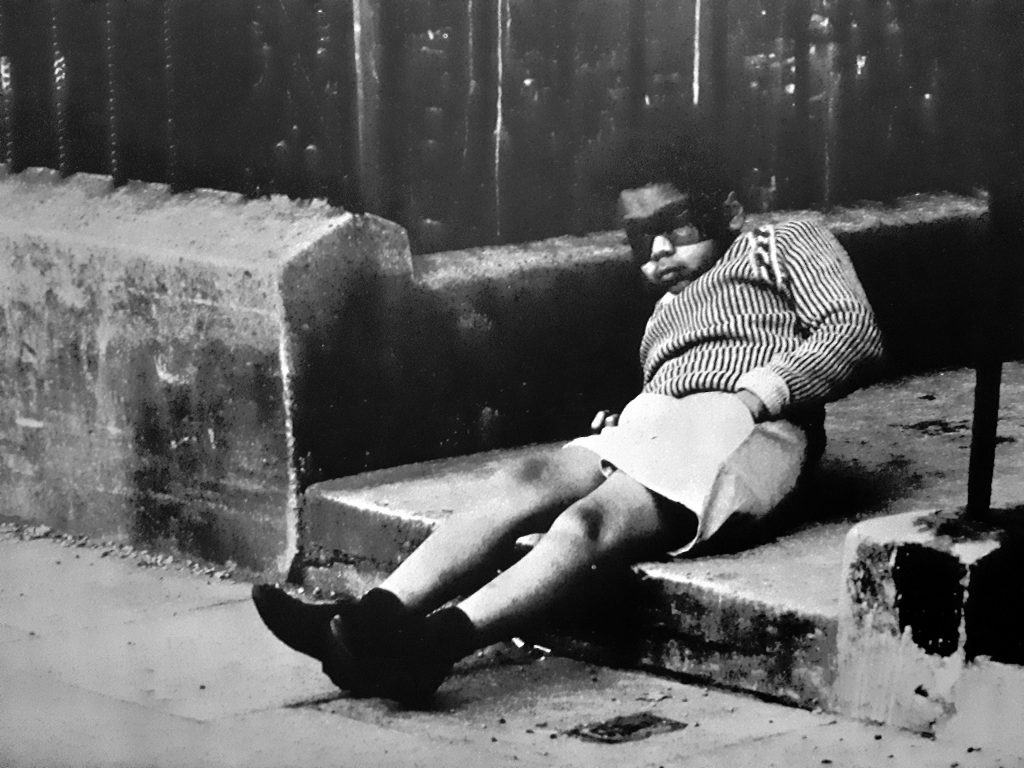
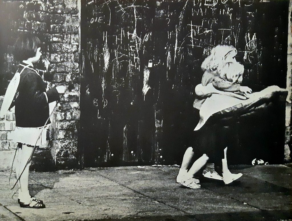
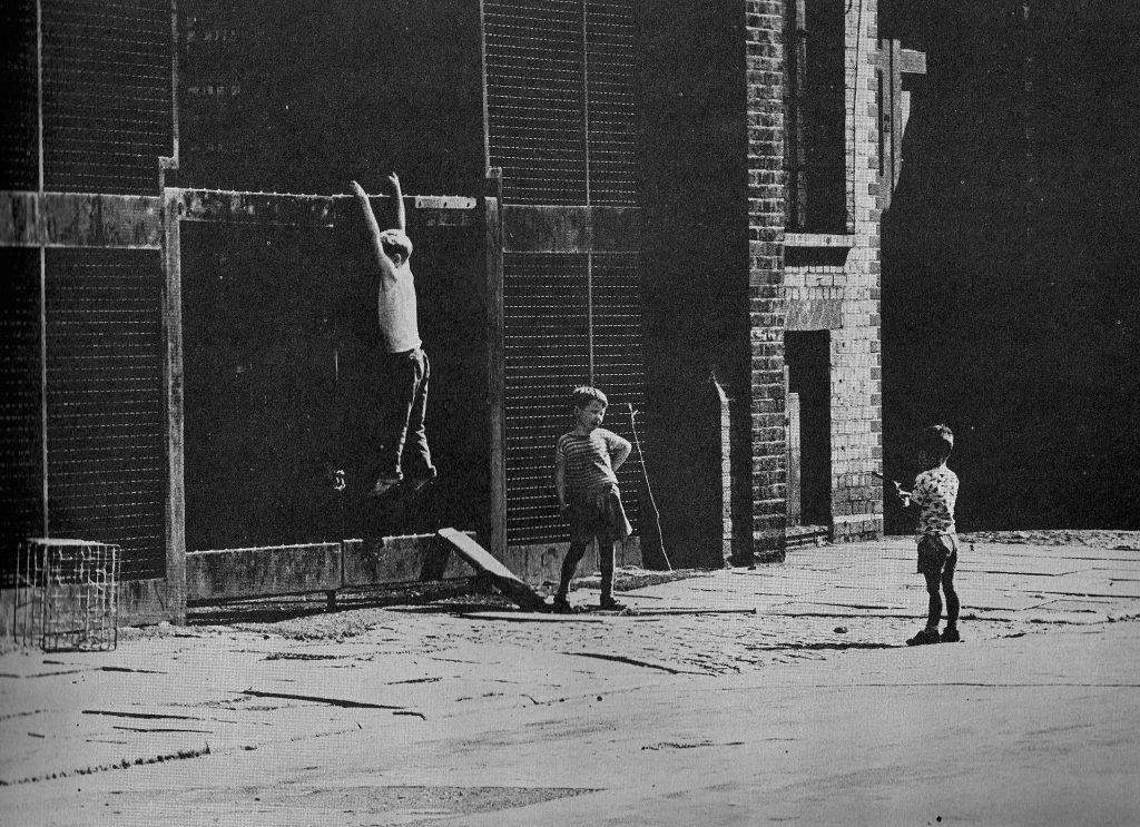
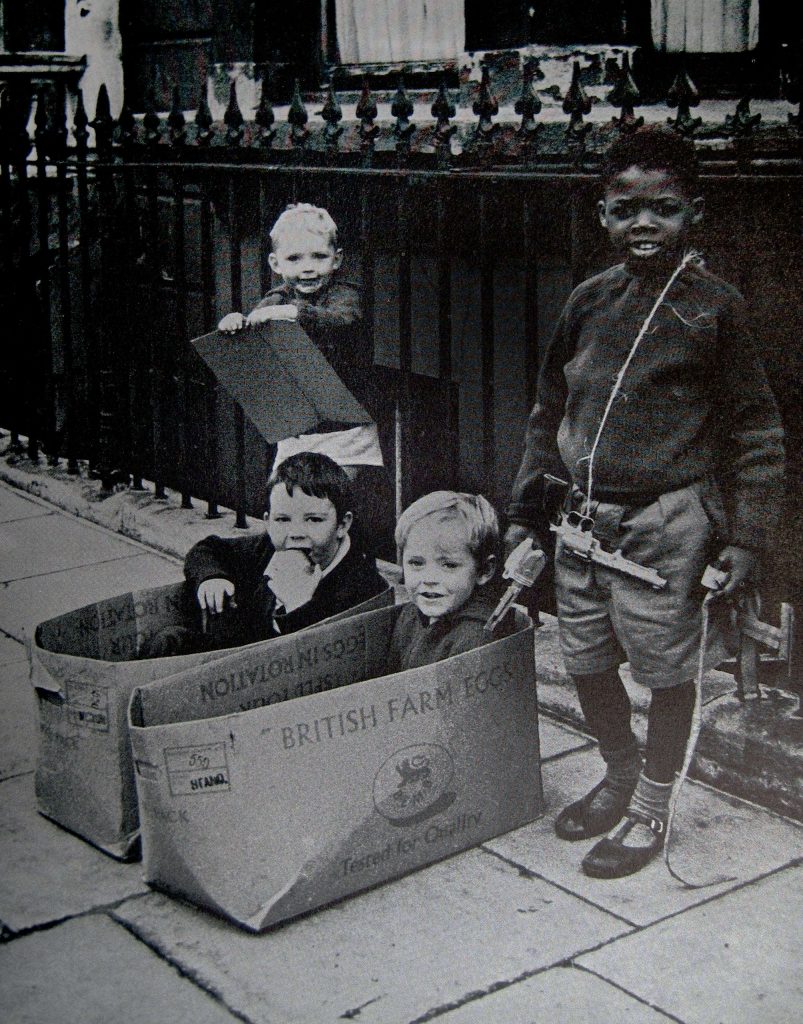
This is a book from 1964, of children playing on the streets. The photos are by Julia Trevelyan Oman and the text (designed to read like observed opinions) was by Bryan Stanley Johnson. The whole thing reminds me of the Mass Observation movement of the 1930s. It is curious to see the streets of what I can only assume is East London and the children looking happy enough finding ways to entertain themselves. It also brought to mind this video called Through the Hole in the Wall.
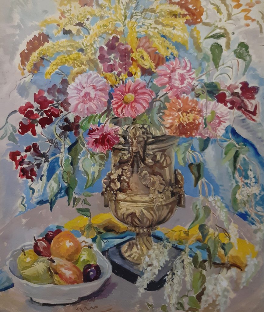
History is full of artists that made amazing works and were forgotten, often in the case of women artists they studied, worked and then ceased painting when they got married. I don’t know if this happened to Peggy Rutherford or not, but she is mentioned in various reports and papers in clippings and periodicals in the 1930s, most notably from Apollo Magazine in 1931 she was mentioned as deserving ‘special praise’ for her painting ‘The Purple Magnolia’. Rutherford had a studio flat in Fitzroy Street in London. From an artistic family her aunt was Maud Rutherford who married George Hall-Neale, both portrait painters.
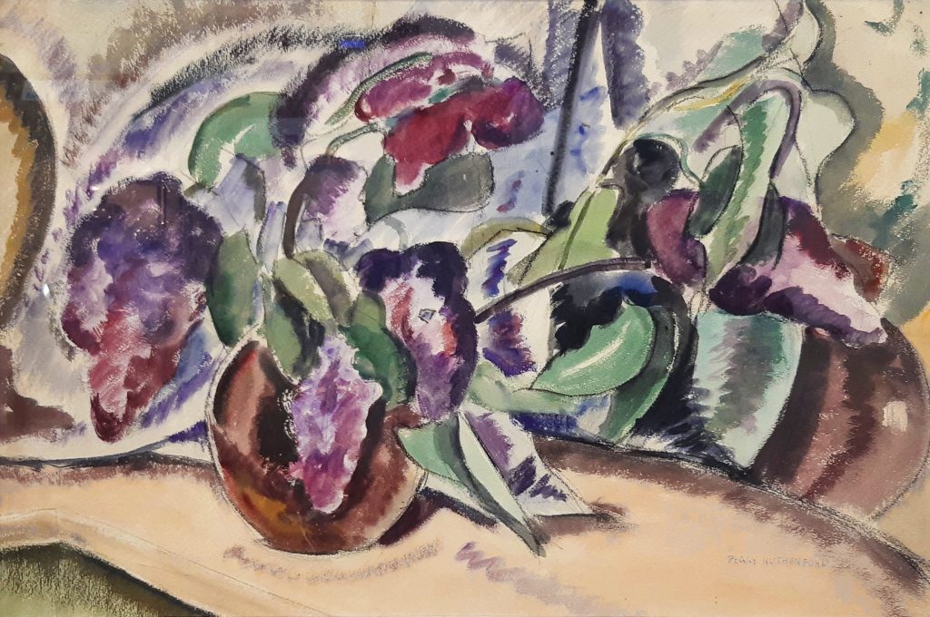
Rutherford studied at the Grosvenor School Of Modern Art under Iain Macnab and alongside Rachel Reckitt and Suzanne Cooper. It is clear that she favoured flower paintings and many of the works here from the 30s have a strong Bloomsbury influence as well. The Grosvenor School was a private British art school and gave the country some of the best inter-war avant garde artists; they nurtured the talents of the some of the most talented women students, Suzanne Cooper, Rachel Reckitt, Alison Mckenzie, Sybil Andrews, Lill Tschudi, Ethel Spowers, Eveline Syme and Dorrit Black to name a few. Some like Rutherford have been less documented than others.
Peggy Rutherford exhibited at the Society of Women Artists, National Society of Painters, Sculptors & Printmakers, (1936) at the Royal Academy with a watercolour called ‘Flower-piece’ (1936). She is in the correspondence of John Piper, and lived at New Malden and Chelmsford.
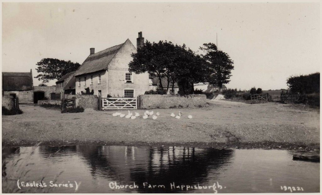
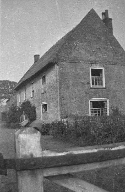
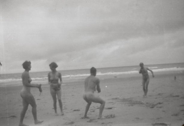
In 1930, two couples, Henry & Irina Moore (married in 1929), and John Skeaping & Barbara Hepworth (married in 1925) holidayed together at Church Farm, Blacksmiths Lane, Happisburgh, on the Norfolk Coast. The holiday was intended as a working one and it was hoped the time in a new location might help Skeaping / Hepworth marriage, but it did not.
In 1931 Hepworth met Ben Nicholson and later invited him and his wife Winifred Roberts to join them on another trip with the letter below:
I enclose a photo of the farm – the colour is very lovely. The country is quite flat but for a little hill with a tall flint church and a lighthouse… The beach is a ribbon of palesand as far as the eye can see. The Moore’s and ourselves should be so pleased if you came… If you can get away the farm will be less full the first week we are there – 9 Sep – 16 Sep †
Winifred was looking after their three children (Jake, Kate and Andrew) and stayed with her family in Boothby, Cumbria, while Ben went to the farmhouse. The Skeaping / Hepworth marriage hadn’t resolved itself and divorce had been spoken of before the holiday, so at first John Skeaping stayed in London. On changing his mind to join his wife in Norfolk, he found she had fallen in love with Ben Nicholson. The next week into the holiday they were joined by Ivon Hitchens and Mary and Douglas Jenkins.
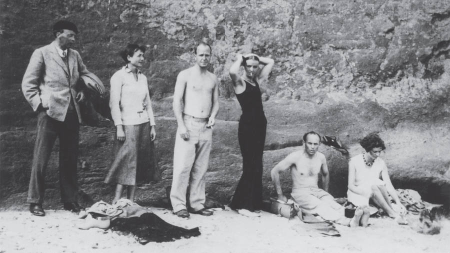
(left to right) Ivon Hitchens, Irina Moore, Henry Moore, Barbara Hepworth, Ben Nicholson and Mary Jenkins, Happisburgh in Norfolk, 1931. Mary’s husband Douglas took the photograph.
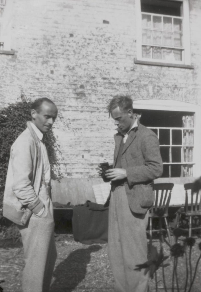
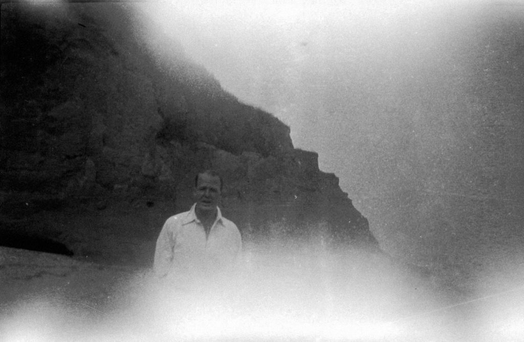
Left: Ben Nicholson and Ivon Hitchens
Right: Henry Moore carrying stone
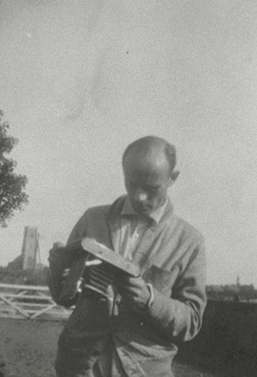
Ben Nicholson with camera
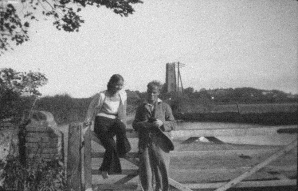
Barbara Hepworth and Ivon Hitchens, by the Church Farm Gate, 1932
Skeaping divorced his wife in two years later. But it wasn’t until 1938 that the Nicholsons got a divorce. In 1932 Hepworth found herself pregnant with Nicholson’s issue, she gave birth to triplets: Rachel, Sarah, and Simon. This would mean Ben Nicholson was the father of six children by two women.
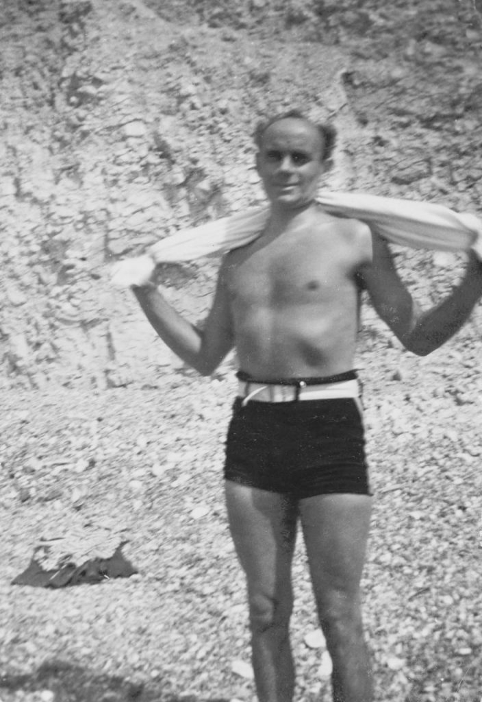
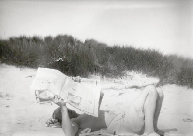
The rest of the photos are taken in 1932 and show the fashion for naked bathing and games. I am sure one day a scriptwriter will turn what must have been an emotionally tense holiday into a screenplay.
† A nest of gentle artists in the 1930s Barbara Hepworth, Henry Moore and Ben Nicholson, 2009