While looking into Eric Ravilious’s work for London Transport I noticed how many times a greenhouse would appear in Ravilious’s work.
Eric Ravilious – Kynoch Press Block 112, 1932
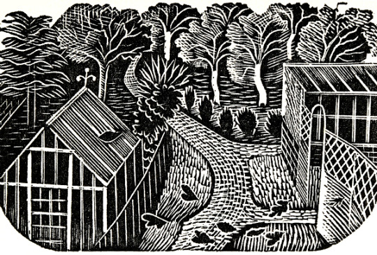
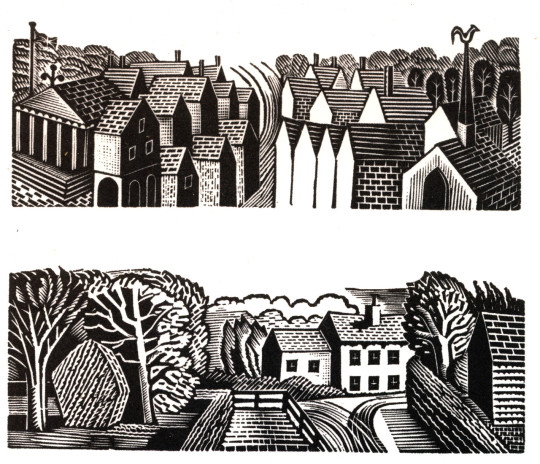
There are two curious observations in this post. One is the wood-engraving above, and the one below are the same location; the walled-off greenhouse with decoration on the end of the roof above the glass panes. It is also like the wood-engraving Tea in the Garden, but not quite.
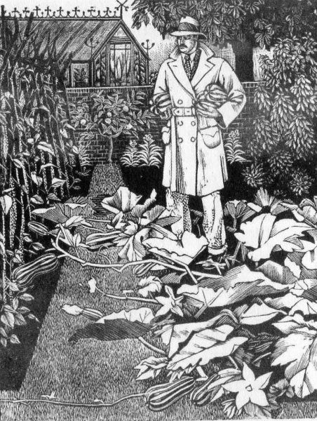
Tirzah, (Ravilious’s wife), was a wonderful wood-engraver and artist in her own right. Below is a man about town in a driving Macintosh laden with marrows, the perfect suburban man.
Tirzah Garwood – The Husband, 1929
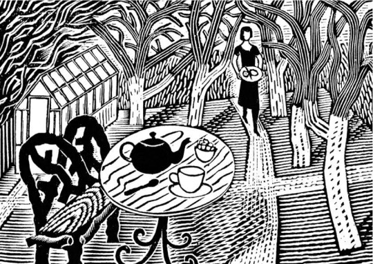
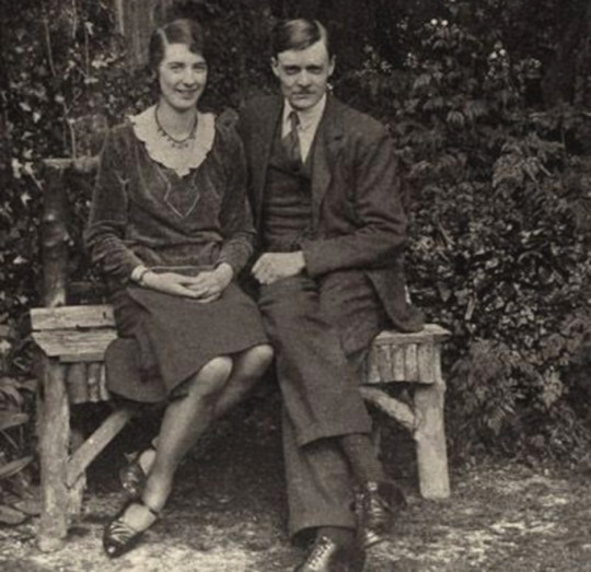
Below are two pictures, one, a wood-engraving featured in last week’s post on London Transport, but also a photograph of Tirzah and Eric together at the time of their engagement.
I include it because it’s the second of my observations in this post – the bench they are sitting on is so remarkably similar to the bench in Tea in the Garden that I would say this is the same bench and the inspiration. The back may have curves on the woodcut but I would suggest this is just to make the design more harmonic.
Eric Ravilious – Tea in the Garden, 1936
Tirzah Garwood and Eric Ravilious at the time of their engagement, 1930
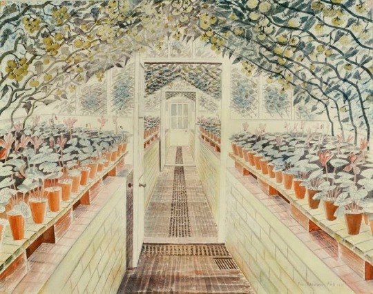
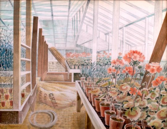
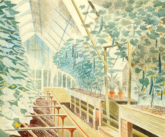
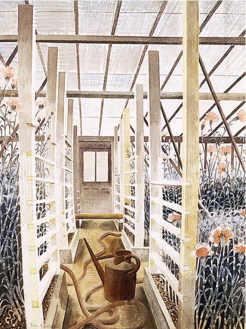
Below are a series of beautiful watercolours of greenhouses by Eric Ravilious included because they are so beautiful. It is very hard to walk into any greenhouse and not think of these paintings. They are the skill of perspective but also that skill found in craftsmen, the ability to paint, carve or make a series of objects, in the case of a carpenter it would be stair rods, in Ravilious’s case it is each plant pot and working with the the backdrop of shadow.
Eric Ravilious – The Greenhouse – Cyclamen and Tomatoes, 1935.
Eric Ravilious – Geraniums And Carnations In Greenhouse, 1935
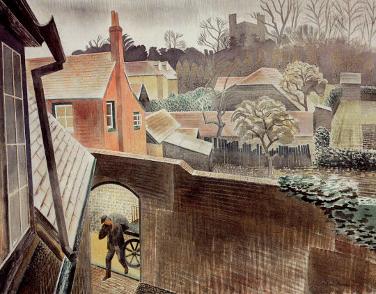
Part of the particular charm of Eric Ravilious’s work is that it is everywhere, I don’t mean on t-towels or mugs, (though regrettably we are at that stage now) it is that his pictures cover scenes that can be found all over Britain. There are many examples where his watercolours could fool you to be a country road you know and pass, until you find it was painted in deepest darkest Sussex and not Northern Essex.
It would surprise no-one then that most of the works he illustrated for London Transport didn’t feature London. The woodcuts made for press adverts and later used on booklets were mostly views from Essex and the village he lived in, Castle Hedingham.
Ravilious and his new wife, the artist and diarist, Tirzah (née Garwood) moved to Bank House in the village in September 1934. It was around the same time that he started an affair with Helen Binyon from 1934-37 – there are a mass of letters between the two to help the writing of this post.
Eric Ravilious – Back Gardens, Castle Hedingham
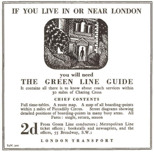
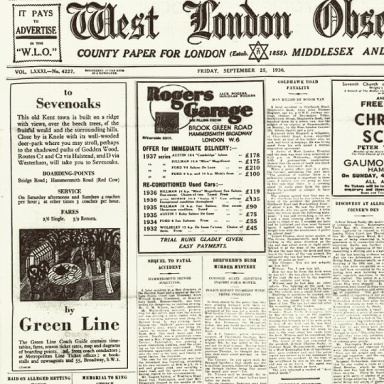
Green Line Coaches Limited was formed on 9th July 1930 by the London General Omnibus Company, to offer coach services from London to towns up to 30 miles away, comprising 60 vehicles on eight routes. London Transport took the company over in 1933 but kept the name the Green Line.
It was via the Curwen Press that Ravilious was asked to make illustrations for London Transport and the Green Line. They wanted a simple, long, thin wood-engraving. This started a series of wood-engravings that Ravilious would produce for other areas of London Transport.
The order was commissioned on the 20th March 1935. In a letter to Helen Binyon ten days later, Ravilious wrote:
30th March 1935 Green Line Buses would like an advertisement for the Essex scenery – some long narrow engravings, so this job will help to pass the time pleasantly next week. I wish commercial work was all so straightforward so much becomes a compromise between the client’s ideas and what the printer thinks about it and always a hurry for results. These engravings will be fun to do I think. †
Eric Ravilious – Green Line Coach Adverts, 1935
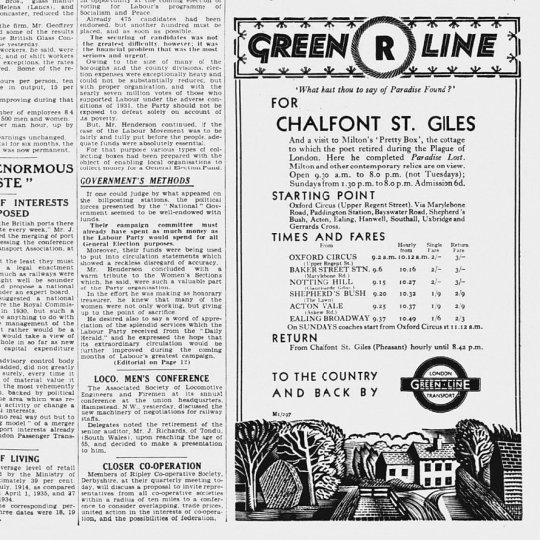
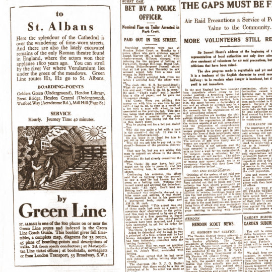
Below is the advert from the original newspaper-sheet, with the news of the day surrounding it. Rather like many adverts of the time there is a quote and a hint at tourism; ‘What hast though to say of Paradise Found?’ and then some information on John
Milton’s home where he completed Paradise Lost.
These remind me of the adverts for Shell Edward Bawden was illustrating at the same time, only these Green Line adverts have a lack of humour in favour of fact. The typography is spot on with dishing out the information, very simple and no fuss. Starting point, times and fares and return journeys, I wish more timetables were like this now.
Eric Ravilious – Advert and wood-engraving in a newspaper, 1935.
Ravilious was very busy at this point in his life, so it will surprise no-one that he was a great re-cycler of his own work, woodcuts for paid trade work became watercolours for his own exhibitions.
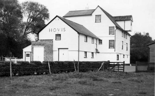
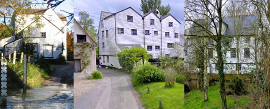
Time would also effect the travelling he could do, so other examples of Ravilious using his local area can be seen by the multi-named Hull’s Mill – Hovis Mill – Maplestead Mill, found in the next village to Castle Hedingham, Sible Hedingham. He would use the building from every angle for a variety of adverts for London Transport from 1935-36.
Eric Ravilious – Hull’s Mill, 1935
In Ravilious’s time the building was known locally as Hull’s Mill but in 1917 it was bought by Hovis who ran it til 1957 and sold it in 1959. Recently, although always considered a part of Sible Hedingham the mill is over the parish line on the Great Maplestead side of the river and is known as Maplestead Mill, located next to Hull’s Farm.
Mechanically it was driven by a water wheel, then after the First World War it was converted to be powered by a turbine and a gas engine and the water mill removed. With the water wheel removed in the painting above you can see the exhaust stack for the turbine and gas apparatus.
Emilie Montgomery Gardner – Hull’s Mill, 1952
Below is the design for the print that Ravilious made of Hull’s Mill, annoying (especially if you are trying to research this) this block is named Hovis Mill, maybe to differentiate it from the watercolour above. It is a larger woodblock for Ravilious and this maybe why he engraved the mill in triptych style. In a letter to Helen Binyon Eric notes:
8 November 1935 …The block is much too big. It is one I happened to have so feel I should use it all. †
Eric Ravilious – Design in Pencil for Hovis Mill, 1935
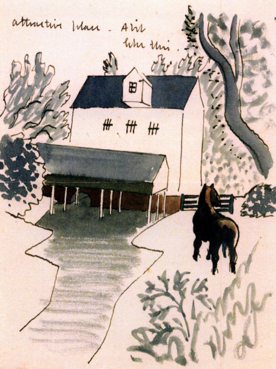
In another letter to Helen Binyon Ravilious writes:
The Mill drawings are going fairly well and may finish themselves one day. It is an extraordinarily attractive place – a bit like this. †
Ravilious illustrated this letter to Binyon and a drawing of the mill and last part of the letter are pictured below.
Eric Ravilious – Design on part of a letter to Helen Binyon, 1935
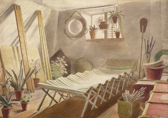
When living at Brick House with Edward and Charlotte Bawden, Tirzah’s uncle made Eric and her a canoe, it maybe why Eric put one in the Hovis woodcut below. The Paddle can be see in the painting The Attic Bedroom, Brick House. The river behind Hull’s Mill is also one of the widest parts of river in the area, being cut wider from when the Mill had a water wheel, and still is free from weeds.
Eric Ravilious – The Attic Bedroom, Brick House, 1934
Eric Ravilious – Hovis Mill, 1935
A set of views of the Mill today, 2018
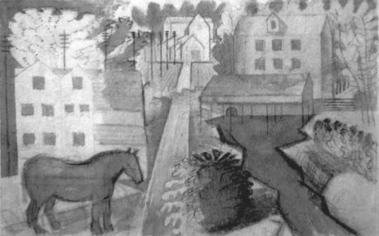
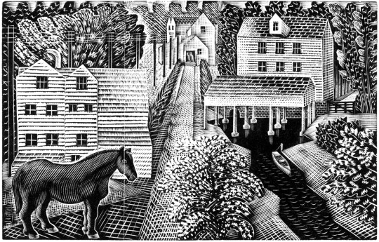
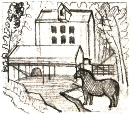
Ravilious would go on to cut the mill in another block using the same design again, this time without the canoe as in the Hovis wood-engraving, but with the horse grazing in the field like the above letter to Binyon. In this wood-engraving this time called Pony by a Mill. Below is the study for his wood-block design, squared off and ready for engraving.
Eric Ravilious – Drawing for Pony by a Mill wood-block, 1936
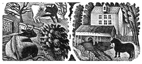
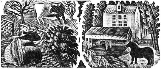
Eric Ravilious – Two Cows / Pony by a Mill, 1936
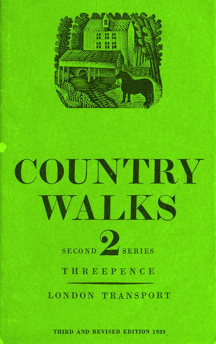
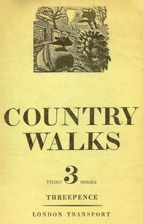
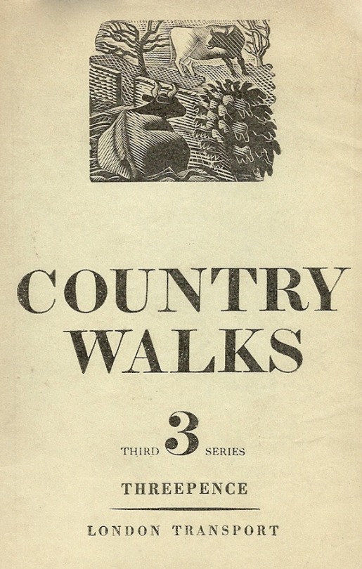
Cover for Country Walks, 2nd Series with a Ravilious Design of Pony by a Mill.
Above is the print Pony by a Mill with the edges chamfered off in use on one of the London Transport booklets, originally printed in 1936. The 3rd series would also feature the Two Cows wood engraving below.
The Country Walk books were by Charles White and printed for London Transport to show people the possibilities of using the train and bus network. Inside they had maps and planned walks showing how to get to the locations and the sights one might see.
Eric Ravilious – Two Cows / Pony by a Mill, 1936
The two images were engraved on the same block of wood and printed together as one proof. On the left a cow and a bull in a field, separated by a stone wall.
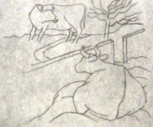
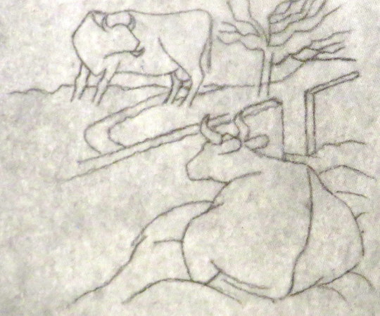
Below is the original drawing on tracing paper for Two Cows, reversed in design as a woodblock always prints backwards.
Eric Ravilious – Two Cows, preliminary study for a woodcut, 1936
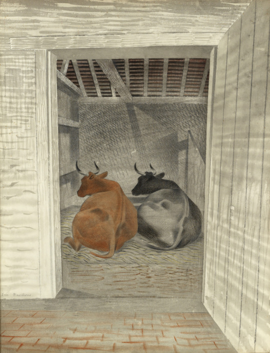
The pencil design and wood-engraving again would be re-cycled into another watercolour, Two Cows. Here keeping the study of a cow in the same pose, now doubled in pose, but this time with the perspective of a barn door to fix the eyes attention.
Eric Ravilious – Two Cows, 1936, The Fry Gallery
1936 cover to Country Walks, 3rd Series with a Ravilious Design of Two Cows.
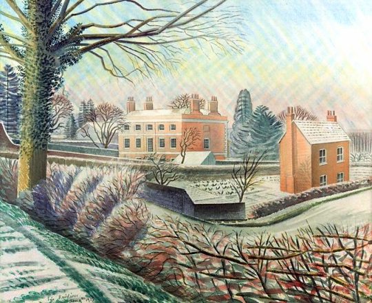
Eric Ravilious – Vicarage in Winter, 1935
Another work with the creativity sparked in Castle Hedingham is the Vicarage in Winter started in the Winter of 1935. Tirzah writes in her diary that Eric’s paint had frozen on the brush and some days later Eric wrote to Helen Binyon:
The snow picture is finished and not bad – rather pretty but so was the thing, like a Christmas card. ‡
This water colour takes us back to the Green Line illustrations and in 1936 Ravilious used the cottage to the right in Vicarage in Winter for one of his wood-engravings for London Transport. According to Barry Kitts:
Ravilious has transformed the slates on the Essex cottage – into thatch. †
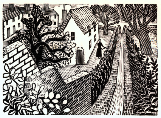
The woman cutting the hedge with the path leading up to a V shaped Sussex style stile are pictured – but it is the wall and hedge in Vicarage in Winter that bind them together as the same location.
Eric Ravilious – Cutting The Hedge, 1936
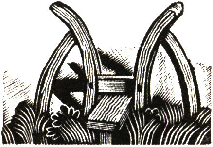
The V Stile also appeared in the Kynoch Press Notebook for 1933. The the stile is on the page for the 8th May but its technical name is Block 121. The Notebook has 42 engraved vignettes of rural life.
Eric Ravilious – Kynoch Press Block 121, 1932
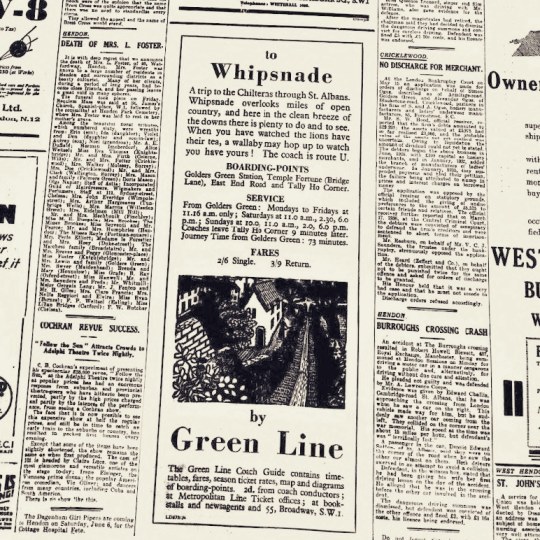
Below is the press advert, the text in the advert talks of the clean breeze of the downs and how you can see Lions at Whipsnade Zoo.
Eric Ravilious – Cutting The Hedge as part of a Green Line Advert, 1936
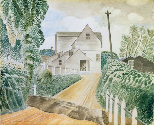
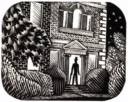
Another design is the Suburban Home with the man in top hat and umbrella standing in the doorway, much like the men are in the watercolour of Hull’s Mill.
Eric Ravilious – Suburban Home, 1936
The house turns out to be the Old Vicarage in Castle Hedingham, the same in Vicarage in Winter, 1935. The steps, the ionic colonnaded door and the window above all say so – it isn’t a fact I have seen in print before. Below is the engraving in the advert as it would appear in the press.
The Old Vicarage in Castle Hedingham as it is now.
Eric Ravilious – Suburban Home as part of a Newspaper advert, 1936
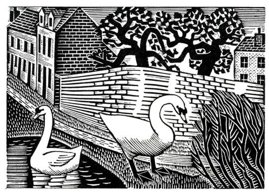
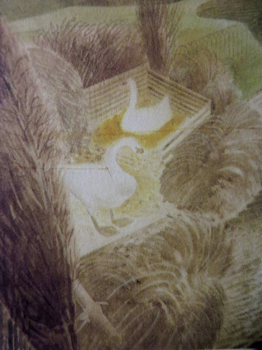
With the Two Swans as others, a watercolour followed like the Two Cows watercolour, though the figures are similar, they have no relation to the backgrounds of each other.
Eric Ravilious – Two Swans, 1936
Eric Ravilious – Two Swans, 1936
The Shepard is one of the most lively engravings that Ravilious made for London Transport. The Sheep and their ears with the hillside up to the house are pleasing. The technicality of the halftone shading are some of his best.
Eric Ravilious – The Shepherd, 1936
Eric Ravilious – The Shepard as part of a Green Line Advert, 1936
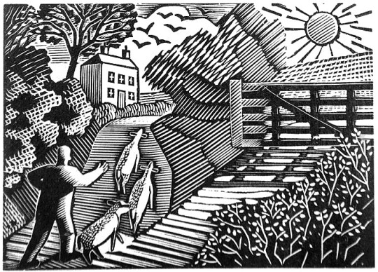
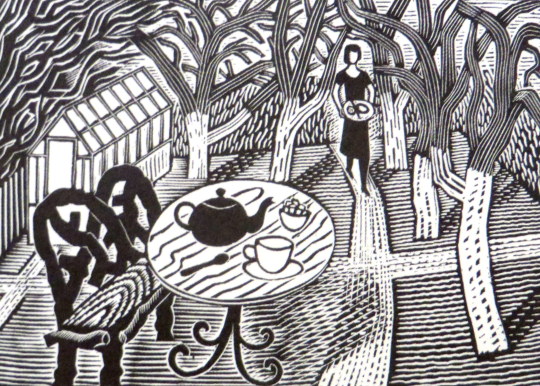
Eric Ravilious – Tea in the Garden, 1936
The last stop on these London Underground travels is of Tea in the Garden. It is a rather abstract design but it was the start of the commuter lifestyle as London was building a new wave of suburbia and you can imagine the print being used with slogans like “home in time for tea” or “enjoy the garden, 20 mins from the city by bus”.
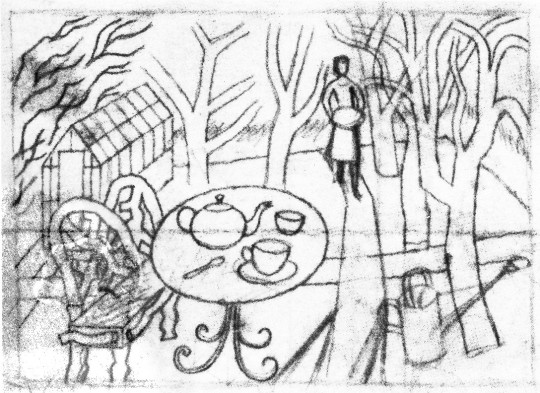
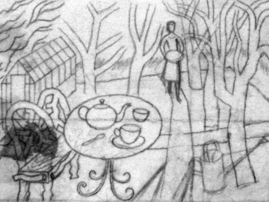
Eric Ravilious – Sketch for Tea in the Garden, 1936
Eric Ravilious – Tea in the Garden as part of a Green Line Advert, 1936
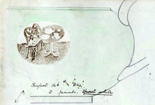
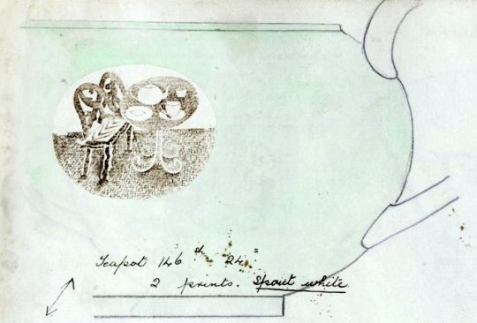
Soon after Ravilious reused the design for a commission with Wedgwood, he was so busy during this point that many designs were recycled from wood engravings to watercolours or china. Below you can see a sketch drawing for a teapot design using the woodblock above. Carving out the legs of the bench and inverting the colours of the table so when printed the transfer will be black and an enamel colour wash painted over.
Eric Ravilious – Sketched idea for Teapot design, 1938
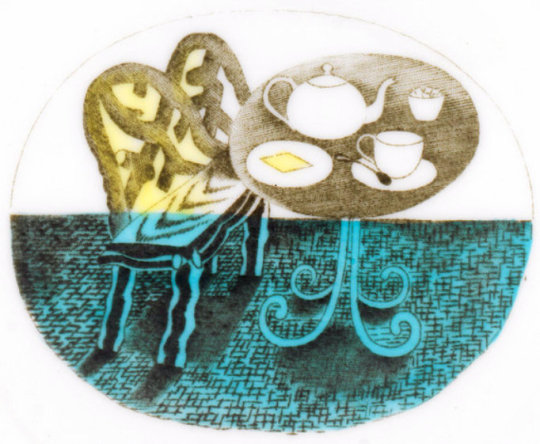
The finished design below, with the colouring in yellow, blue and green. The design has been made simpler and the shading is able to be more subtle as it will be printed on a metal plate, so there is more detail in the halftone lines. It was first used on a preserve jar for Wedgwood.
Eric Ravilious – Printed and Enamelled design from Wedgwood, 1938
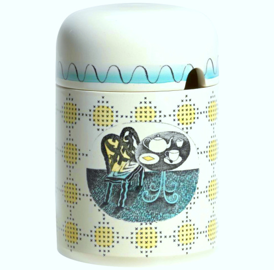
The preserve jar was introduced six months in advance of the rest of the pattern. The design was advertised in 1939 as being available also in breakfast and coffee sets; the war prevented production of these. At first unnamed, later called ‘Teaset’, the design was finally named ‘Afternoon Tea’.
Eric Ravilious – The Final Jampot by Wedgwood using Ravilious’s Design, 1938
† Ravilious – Engravings by Jeremy Greenwood, Wood Lea Press, 2008. Ravilious & Wedgwood by Robert Harling, 1995. Away We Go by Oliver Green and Alan Powers, 2006 Eric Ravilious: Memoir of an Artist by Helen Binyon, 1983
‡ Ravilious: The Watercolours by James Russell, 2015
The journey of any work of art can be interesting in how it is used, forgotten and then reused. As I write this I think it’s endemic of Ravilious’s life that there can be no area or topic on him that hasn’t been probed or turned into a book, but onward I go with my quest for originality.
Eric Ravilious – Sketch for Tea in the Garden, 1936
In 1936 Eric Ravilious made a wood engraving for London Transport. Tea in the Garden was made to be used in newspaper advertisements for the Green Line bus service, a decorative vignette to go with commuter information. It is a rather abstract design but it was the start of the commuter lifestyle as London was building a new wave of suburbia and you can imagine the print being used with slogans like “home in time for tea” or “enjoy the garden, 20 mins from the city by bus”
Eric Ravilious – Finished print of Tea in the Garden, 1936
Soon after Ravilious reused the design for a commission with Wedgwood, he was so busy during this point that many designs where recycled from wood engravings to watercolours or china. Below you can see a sketch drawing for a teapot design using the woodblock above. Carving out the legs of the bench and inverting the colours of the table so when printed the transfer will be black and an enamel colour wash painted over.
Eric Ravilious – Sketched idea for Teapot design, 1938
The finished design below, with the colouring in yellow, blue and green. The design has been made simpler and the shading is able to be more subtle as it will be printed on a metal plate, so there is more detail in the halftone lines. It was first used on a preserve jar for Wedgwood.
The preserve jar was introduced six months in advance of the rest of the pattern. The design was advertised in 1939 as being available also in breakfast and coffee sets; the war prevented production of these. At first unnamed, later called ‘Teaset’, the design was finally named ‘Afternoon Tea’.
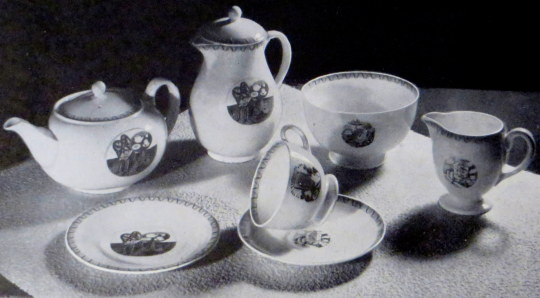
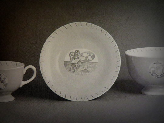
Here the tea-set is advertised in ‘The Studio Year Book of Decorative Art 1943-1948′ (the gap in printing is noted in the introduction due to WW2, lack of paper and designers being commissioned to do essential war work, this year book covers a wide range of time).
The Bone china tea ware decorated with motifs illustrating Afternoon Tea, printed in sepia and hand-coloured green. Designed by Eric Ravilious A.R.C.A. for Josiah Wedgwood and Sons. †
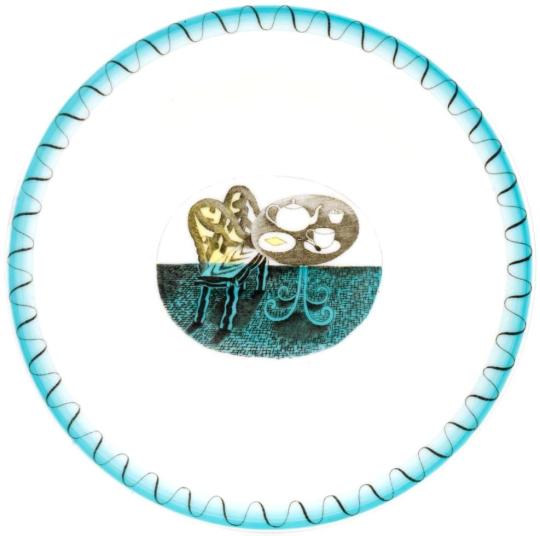
Here is a tea-plate from the set with the simple wave decoration on the perimeter of the plate and washed in blue enamel paint.
In this prototype photograph from 1938 the design is painted around with a pink glaze to the edge of the design and the Ravilious vignette and border uncoloured but printed in a brown sepia with the pink flooding over the whole plate. These are the rarest of all the designs as they were not put into production and the designs were modified to use less colour glaze after the war.
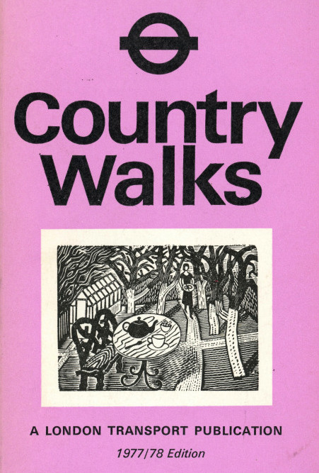
Twenty five years later the original woodblock design would be resurrected and used in a reduced size for advertising and on the covers of Country Walks booklets.
Country Walks with the Ravilious Engraving on the cover, 1978
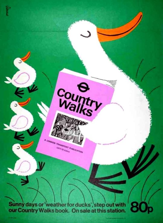
A rather fun and unusual poster for the Country Walks books by Harry Stevens, 1978.
Ravilious Engravings by Ravilious Jeremy Greenwood, Wood Lea Press, 2008. Country Walks, London Transport, 1978. Ravilious and Wedgwood: The Complete Wedgwood Designs of Eric Ravilious, 1995. † The Studio Year Book of Decorative Art 1943-1948
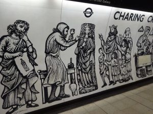
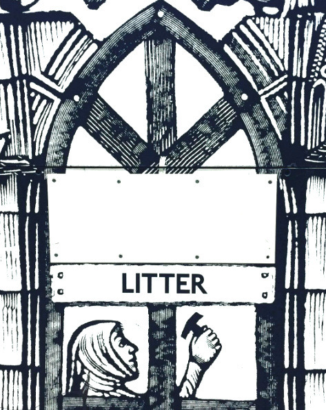
When he was commissioned to design murals for the platforms of Charing Cross underground station, artist David Gentleman (born 1930) chose as his theme the building of the medieval Charing Cross, one of the twelve memorial crosses commemorating Queen Eleanor (who died in 1290). He devised a scheme to take into account the architecture of the station, allowing spaces for entrances and exits and litter bins. He collaged together nearly 50 wood engravings which were then screen-printed onto melamine sheets by Perstorp Waterite Limited. This was the first large-scale application of wood engraving. †
A view of the station platform when decorated in 1979.
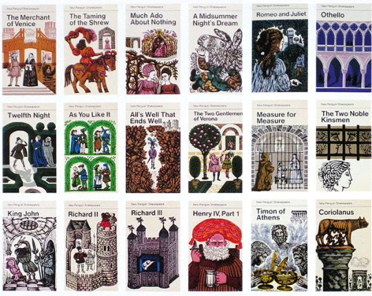
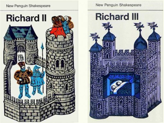
As with many works by any artist, what came before proved to be important. Before the Charing Cross commission Gentleman had been working in wood-engraving commercially for Penguin Books and their Shakespeare reprints. Steeped in a medieval theme and having to produce one image that would summarise a whole play it was useful training.
Penguin Books, Shakespeare collection with covers designed by David Gentleman.
The most interesting and taxing commission to come my way so far did not begin as an engraving job at all. Late in 1977 London Transport asked me to design a mural for Charing Cross Underground station. The practical aspects were clear enough; it was to be fabricated in screen-printed melamine laminate, curved to follow the profile of the tunnel; it would be about two metres high and it would have to find room not only for numerous platform entrances and London Transport roundels but also for various staff letter boxes, telephones, plus litter bins and wooden benches for people to sit on. The subject-matter however was pretty vague. At that time the words Charing Cross suggested little more than a closed-down hospital and a run-down British Rail terminus, and the only brief was that the mural should remind passengers of what the name Charing Cross had once meant. Graphically I was given a free hand, and also the vital assurance of being directly responsible to the two people with real authority: The Chairman, Kenneth Robinson and the Chief Architect, Sidney Hardy. ‡
Having recently been working not only on the Shakespeare covers but also on lithographs for an American edition of The Ballards of Robin Hood, medieval imagery in illuminated manuscripts and paintings was still much in my mind, both for its epigrammatic clarity and for the way it often depicts a sequence of related events in one picture. This narrative technique suited the hundred-metre long strip of platform, and the idea of showing how the original Charing Cross had been constructed came to my mind straight away. ‡
Original Woodblock by David Gentleman
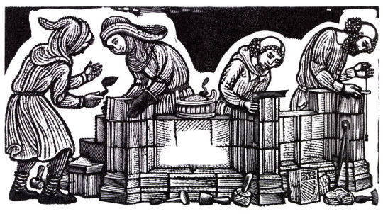
Here one of the early proofs of the woodcut above for the project before the black background had been carved out.
The only proviso they made before they committed themselves absolutely to it was that a strip of it, about twenty yards long, but just as it would be finally, should be built (a mock up) in the disused Aldwych station where there are empty platforms available for such things and I got blown up (photographically) a few engravings and a few roundels… ♠
Underneath the roundel bulls-eye with ‘Charing Cross’ there was a bench where people can sit. So there was a bench built into the mock up, and then as the idea developed I got the idea that I could have the figures in my design sitting on the bench or using it as a work table. ♠
Many stations also feature unique interior designs to help passenger identification. Often these have themes of local significance. Tiling at Baker Street incorporates repetitions of Sherlock Holmes’s silhouette. Tottenham Court Road features semi-abstract mosaics by Eduardo Paolozzi representing the local music industry at Denmark Street. ♥
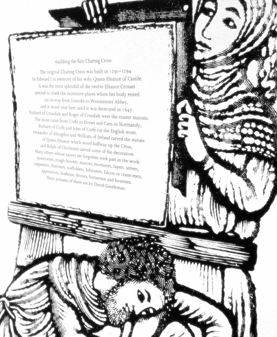
Building the first Charing Cross
The original Charing Cross was built in 1291-1294 by Edward I in memory of his wife, Queen Eleanor of Castile. It was the most splendid of the twelve Eleanor Crosses erected to mark the successive places where her body rested on its way from Lincoln to Westminster Abbey, and stood near here until it was destroyed in 1647.
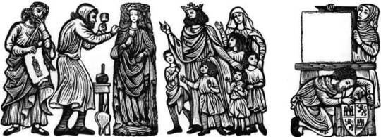
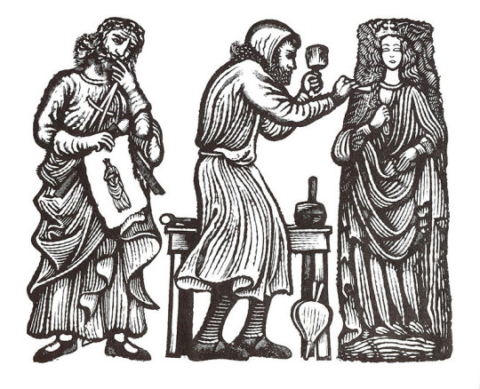
Richard of Crundale and Roger of Crundale were the master masons. The stone came from Corfe in Dorset and Caen in Normandy; Richard of Corfe and John of Corfe cut the English stone. Alexander of Abingdon and William of Ireland carved the statues of Queen Eleanor which stood halfway up the Cross, and Ralph of Chichester carved some of the decoration. Many others whose names are forgotten took part in the work: quarry-men, rough-hewers, masons, mortarers, layers, setters, carpenters, thatchers, scaffolders, labourers, falcon or crane-men, apprentices, hodmen, drivers, horsemen and boatmen. These pictures of them are by David Gentleman ♣
The historical plaque with the text (above) and the enlarged wood engravings by David Gentleman.
† David Gentleman – V&A Website.
‡ The Wood Engravings of David Gentleman, David Esslemont p114, 2000.
♠ Oral History – David Gentleman – Reel 4, Imperial War Museum, 2008-07-03. ♥ London Underground – An overview. Pediapress
♣ Mural text in Charing Cross Station, London.
Guide to the Archive of Art and Design, Victoria & Albert Museum by Elizabeth Lomas, 2001.
In the short time that Eric Ravilious was of working age he produced a massive amount of work for such a young man. He died while serving as an official British War Artist when the aircraft he was aboard crashed off Iceland. He was 39 years old.
At the time of Ravilious’s death there were various projects underway that the war disrupted. As manufacturing was halted, these commissions were put on hold while the country had to economise.
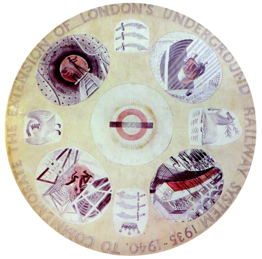
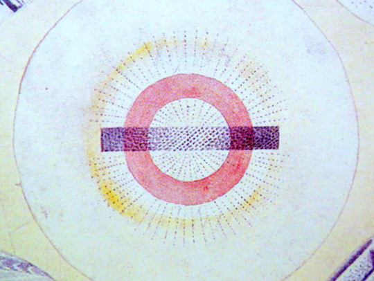
Eric Ravilious – Design for London Underground Plate, 1939.
One of the projects Ravilious had started was for a commemorative plate for the ‘New Works Programme’ of 1935-40 that London Transport had begun.
It was an ambitious extension of the Northern and Bakerloo lines northwards, and the Central line both east and westwards. Although the engineering work was well advanced by the outbreak of war, the project had to be abandoned and was only partly realised in the post-war years. Thus the commemorative plate designed by Ravilious was never produced.
The early Underground train lines, originally owned by several private companies, were brought together under the ‘Underground’ brand in the early 20th century and eventually merged along with the sub-surface lines and bus services in 1933 to form London Transport under the control of the London Passenger Transport Board (L.P.T.B.).
The ‘New Works Programme’ was to develop many aspects of the public transport services run by the L.P.T.B. and the suburban rail services of the Great Western Railway and London and North Eastern Railway.
The investment was largely backed by government assistance as well as by the issuing of financial bonds and was estimated to cost £42,286,000 in 1936 (approximately £2.59 billion today).
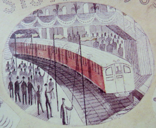
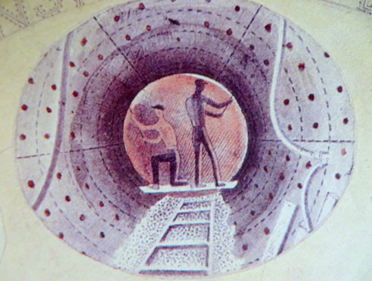
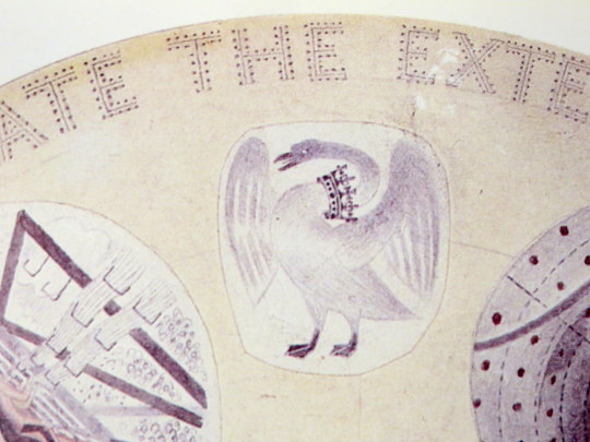
Of the four vignettes Ravilious chose, three were of construction and one was of the predicted Grand Opening, with a tube train and swash bunting along the platform.
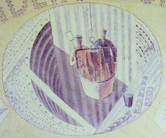
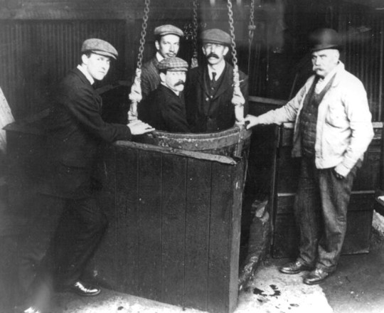
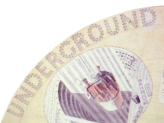
One of the vignettes of construction show men being lowered in buckets into the tube shaft. These were likely non-station locations where the soil was excavated out and the steel and concrete lowered in, like the workers. It was a typical practice in mining.
Men in a small-scale drop lift.
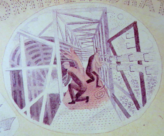
Another of the pictures shows workers putting up the frames for the tube tunnels and station platforms. The wiring being bunched on the sides of the tunnel.
The two workers pictured here are bolting the rivets of the metal into place. The image when manufactured, would have been a black and white transfer and the colour would have been a translucent enamel paint.
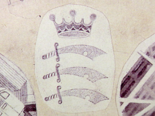
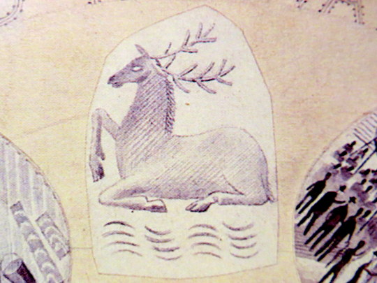
The three heraldic devices show the county badges of Essex, Hertfordshire and Middlesex.
Middlesex Heraldry
Buckinghamshire Heraldry
Hertfordshire Heraldry
The plate would have been one of the last commissions of Frank Pick, chief executive of the London Passenger Transport Board. Pick, who retired in 1940 and died the next year, had worked for the Underground since 1906.
Pick had become publicity officer responsible for marketing and it was at this time that, working with the company’s general manager Albert Stanley, he began developing the strong corporate identity and visual style for which the London Underground later became famous, including the introduction of the ‘Underground’ brand.
One of Pick’s responsibilities was to increase passenger numbers, and he believed that the best way to do so was by encouraging increased patronage of the company’s services outside peak hours. He commissioned posters which promoted the Underground’s trains and London Transport buses as a means of reaching the countryside around London and attractions within the city. Throughout Pick’s career his over-riding passion was for architecture and design, and his adventurous approach and choice of collaborators is famous.
Ravilious had other work planned for London Transport, some posters and wood engravings. During his lifetime he did see some of his work used, a set of his wood-engravings were used for the covers of the Country Walks books in 1936.
1936 cover to Country Walks, 3rd Series with a Ravilious Design of Two Cows.
The Country Walk books were by Charles White and printed for London Transport to show people the possibilities of using the Underground and Bus network. Inside they had maps and planned walks showing how to get to the locations using London Transport.
Each of the three volumes had a wood engraving by Ravilious on the cover. The second volume had a Mill, the third featured the Two Cows wood-engraving.
A print from the original woodblock with Two Cows to the left, and Hull’s Mill, Castle Hedingham to the right. 1935.
The two images were engraved on the same block of wood and printed together as one proof. On the left a cow and a bull in a field, separated by a stone wall; on the right a horse standing next to a mill stream, with watermill (based on Hull’s Mill, Castle Hedingham, near Great Bardfeild) in the background.
Below is the original drawing for Two Cows, reversed in design as a woodblock always prints backwards.
Eric Ravilious – Two Cows, preliminary study for a woodcut, 1935.
The pencil design is remarkable for another reason: part of the design was turned into a watercolour featuring two Cows in the same pose.
Eric Ravilious – Two Cows, The Fry Gallery, 1935.
The book Away We Go by Oliver Green and Alan Powers, documents more of the other work that both Eric Ravilious and Edward Bawden did for London Transport, mostly their designs for press adverts.
Ravilious Engravings by Jeremy Greenwood, The Wood Lea Press, 2008. Moving Metropolis by Sheila Taylor and Oliver Green, Laurence King, 2001. Ravilious and Wedgwood by Robert Harling, Dalrymple Press, 1986