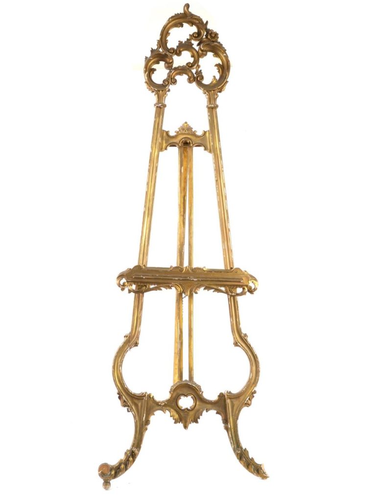
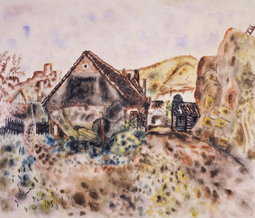
This is just a short blog about something that appears in two works and shows off Edward Bawden’s eccentric lavish life with his Rococo easel. In the painting below, by Eric Ravilious of Edward painting in his studio, it looks unlike most young artists rooms today, with a lavish mirror, Victorian bust and a dress mannequin. At the time this was painted, Bawden was five years out of art school.
Eric Ravilious – Edward Bawden Working in his studio, 1930Edward Bawden – The Absent Presence, 1933
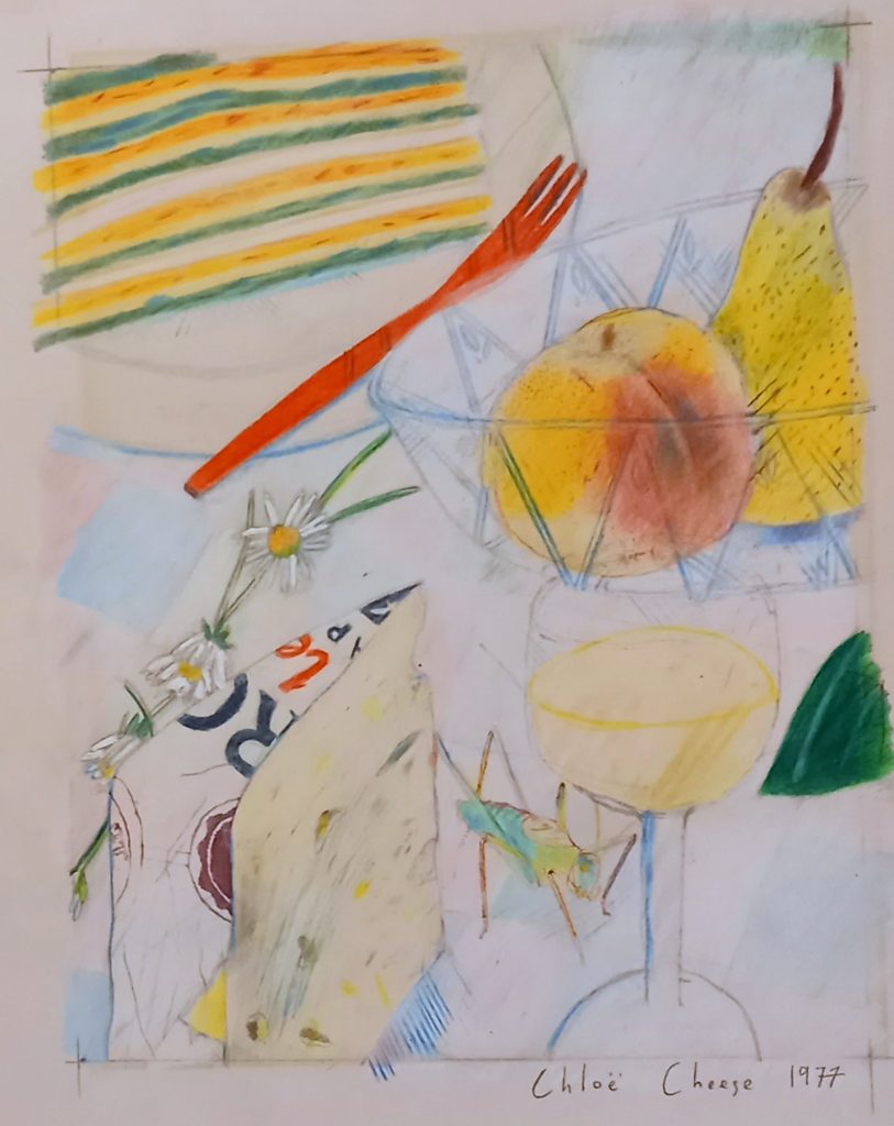
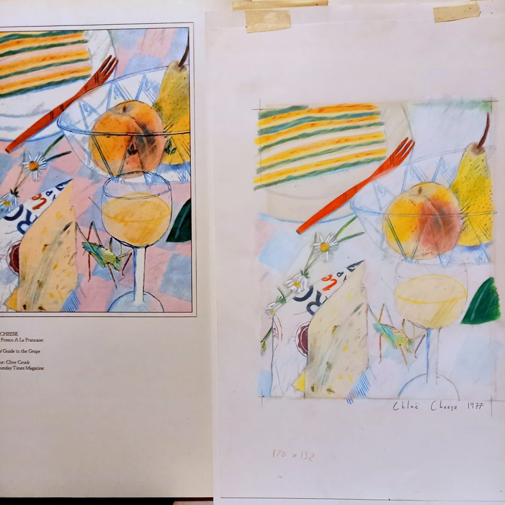
This is the first professional illustration by Chloe Cheese, made for the Sunday Times Magazine in 1977. She was commissioned to make a drawing for one of Caroline Conran’s weekly cooking tips.
It was bought by Terrance Conran and then sold recently when his estate was put up for sale, when i bought it.
Caroline and Terrance opened up the shop Habitat in 1964 and by the 70s he was very famous for making European furniture styles and fitting the shop with stylish international products. I have a collection of some of the early catalogues and they really were key in setting trends rather than following them, due to the fact they had such little competition.
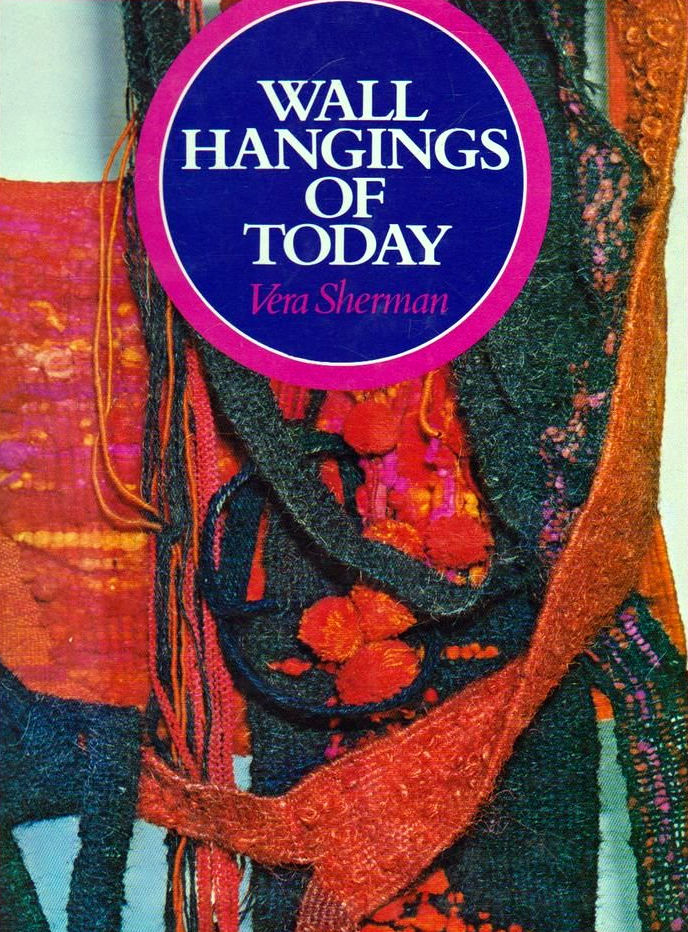
Sherman trained in London at the Regent Street Polytechnic getting a National Diploma in Design for Painting. Later took a Post-Graduate Course in Sculpture. In 1964 awarded the Premio Internazionale Europa Arte award for extensive and meritorious artistic activities.
Works in collections of Public Galleries, Education Authorities and private collectors in Great Britain, Australia, Lebanon, Portugal, Spain, Sweden, Turkey and U.S.A. Organizer of the touring exhibitions Contemporary Hangings and ‘Contemporary Pictures in Fabric and Thread.
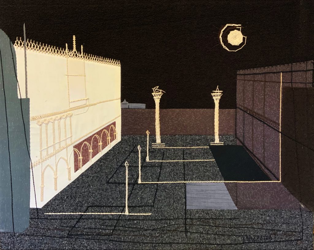
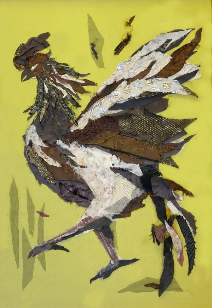
Vera Sherman – Cockerel
Vera Sherman has organized and kept going for some years a highly successful travelling exhibition of wall hangings. The exhibits, which are, of course, changed from time to time, include examples of several crafts weaving, embroidery, batik, tie-dyeing, etc. She is well acquainted with the leading artists in these fields, and has herself contributed some distinguished hangings.
Vera Sherman – Wall Hangings of Today
A by-product of her activities has been this book, illustrating a selection of the attractive and interesting hangings that have appeared in her exhibitions. There are notes on the 33 contributing artists and their method of working, and captions draw attention to special points of design and technique. In this way the book manages to give practical information and yet not fetter the reader’s imagination. Wall hangings are much in fashion at present, and making them is a popular leisure activity no doubt because the scope is so wide and there are many different ways of arriving at successful results. People do, however, need help with ideas to get them started, and it need which will be met by Mrs Sherman’s book.
The painter Frances Hodgkins was known for her portraits, mostly of her friends. Some of these include Cedric Morris and Kitty Church and Anthony West, but this post is about the lesser known Elizabeth Curtis.
Frances Hodgkins – Portrait of Elizabeth Curtis, 1939
Elizabeth Curtis nee Carr was a teacher whose husband Arthur Curtis died in the First World War. In 1923 she had set up a school at Langford Grove, a Georgian mansion in the Essex village of Langford near Maldon to give herself a better income.
The school was a private boarding school for girls aged from about 8 to 17, known for for music and art. One of the most notable pupils was Angelica Garnett. She employed other teachers who were often exhausted at her flippant impulses, as she would barge into the classroom to pick girls to join her to see plays in London or concerts in Cambridge. She also wrote poetry, with a booklet of her works being published by a memorial fund in her name. She retired from her school in 1962.
Frances Hodgkins – Farmyard Scene, 1928
As well as being painted by Hodgkin, Elizabeth also owned some of her works, some included in this blog, but many more.
Frances Hodgkins – Boy Holding a Jug, 1930
Elizabeth chose to send her son Dunstan to Eton. He went to Trinity College, Oxford studying PPE and became a lawyer and politician. In 1939 he married Monica Forbes of the American political family (William Cameron Forbes, John Kerry). After their divorce Monica married the poet John Pudney and Dunstan married the sociologist Patricia Elton (daughter of Australian psychologist Elton Mayo) in 1955, this post work work spent working in Europe and drafting a copy of the European convention on human rights.
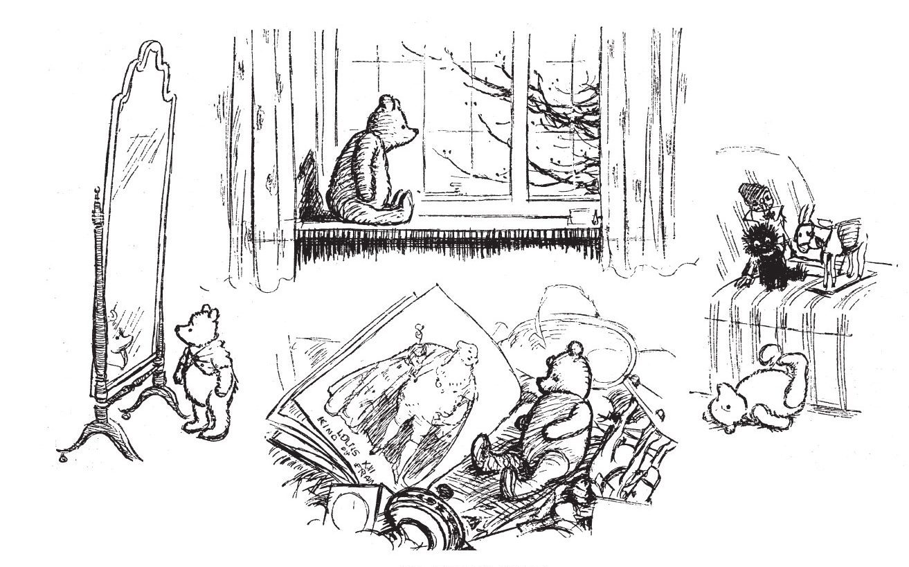
When A A Milne wrote When We Were Very Young (1924) he was looking for an illustrator. It was E V Lucas, head of Methuen that suggested Ernest Shepard. Originally Milne didn’t enjoy Shepard’s illustrations for his book of Poems but Shepard had been an illustrator for Punch and would have been familiar to young parents. The first illustration of Winnie the Pooh appeared in this volume in the thirty-eighth poem Teddy Bear.
A A Milne – Teddy Bear
Shepard encouraged Milne to write more about his son and toys and two years later Winnie-the-Pooh (1926) was published. The authors hope was that the illustrator would observe his son and use them for the drawings, however Shepard used his own son Graham as the basis for Christopher Robin and used Graham’s teddy bear Growler as the inspiration for Mr Saunders aka Winnie the Pooh.
While Christopher Robin lived until 1996, Graham Shepard joined the Navy in the Second World War and died when HMS Poyanthus sunk by a U-Boat in the Atlantic while rescuing the crew of sunk HMCS St. Croix in 1943.
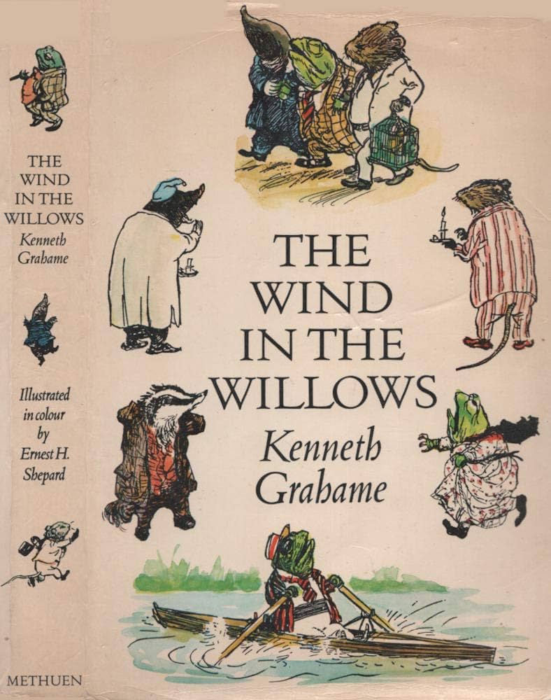
This isn’t the only link to tragedy that linked Shepard to an author; in 1931 Shepard illustrated a new edition of Wind in the Willows (1907) by Kenneth Grahame based on stories written for his son Alistair, a child born partially blind but whom Graham educated well enough to get him a place at Oxford University. But sadly aged 19 he committed suicide by laying down on the London to Oxford train tracks. Shephard’s illustrations have remained the most popular for Wind in the Willows, being reprinted continuously.
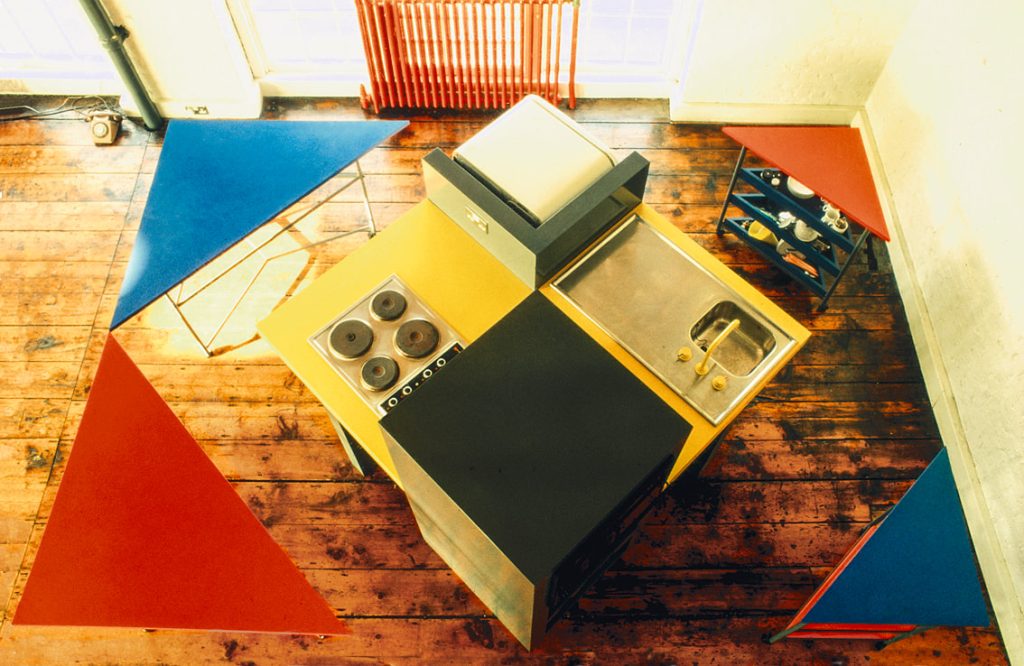
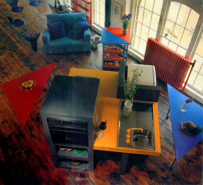
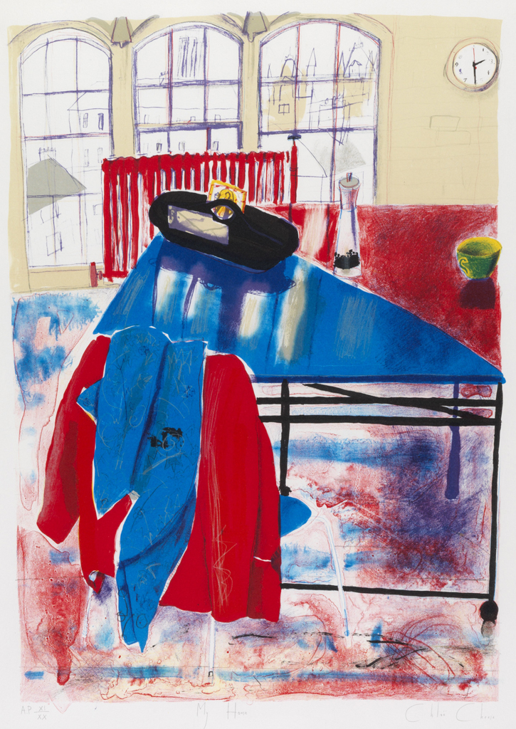
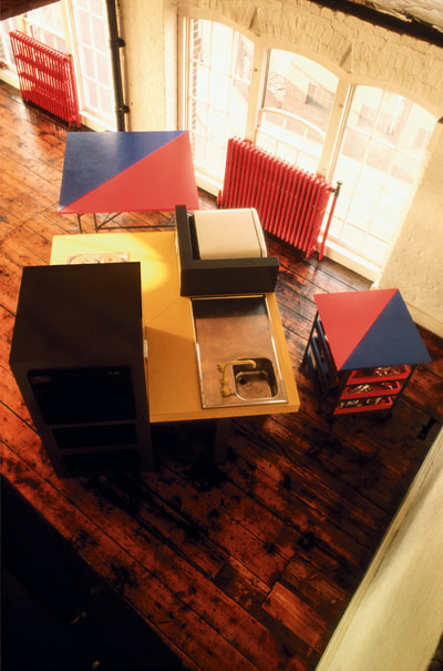
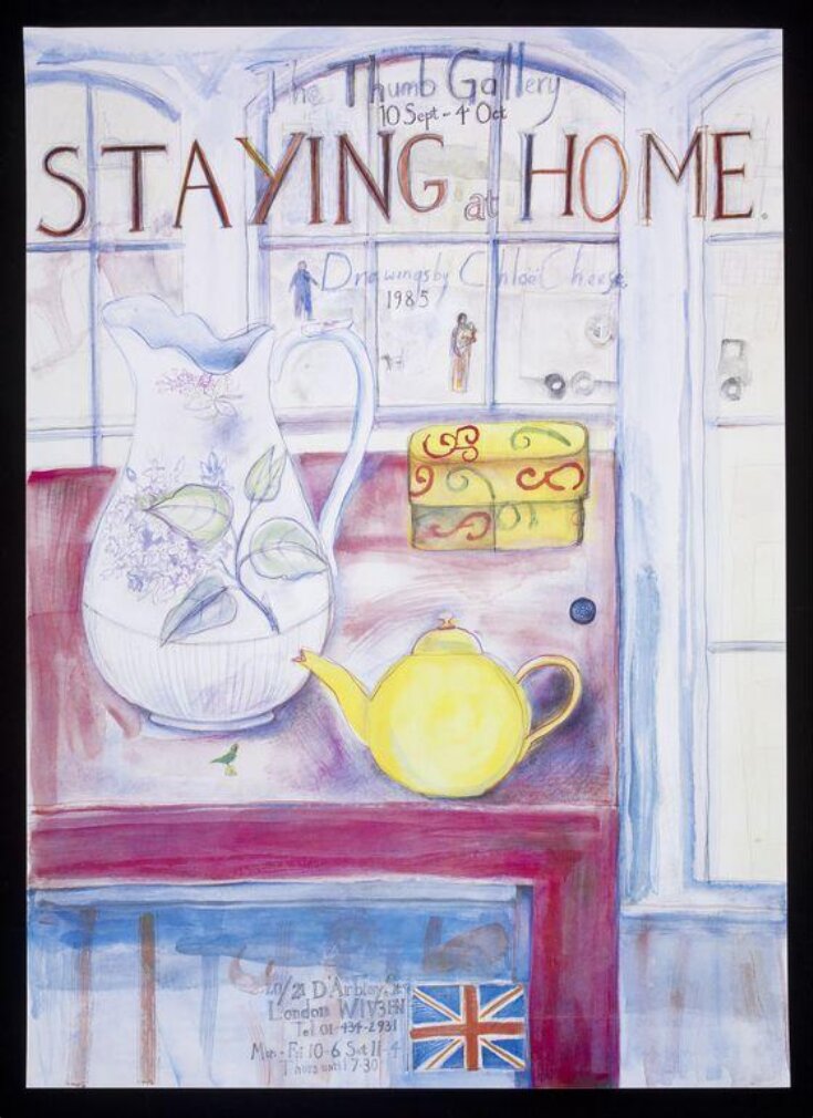
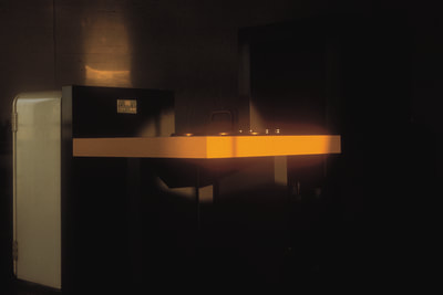
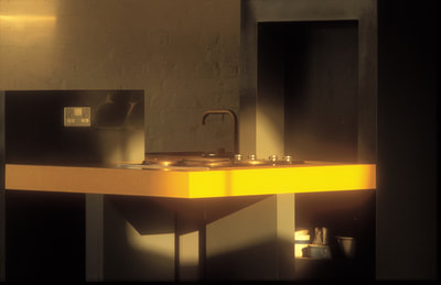
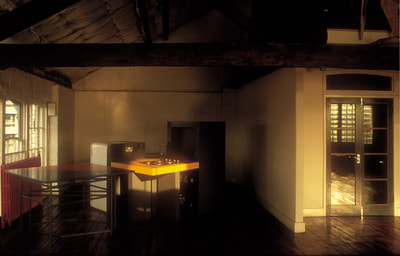
This blog is about an old kitchen owned and designsd for Chloë Cheese by Andrew Holmes. It featured in a print of hers. Its a wonderful design and shows what can be done with a little imagination. I wonder where it is now?
This axonometric drawing by Andrew Holmes was for the kitchen of illustrator Chloë Cheese. Holmes works in many different mediums and is often concerned with the anonymous mobile infrastructure of cities. The design appears to show the different combination of layouts for the units, with movable trolleys for work surfaces and shelving. Holmes and Cheese were both in shows at the Thumb Gallery in London in the early 1980’s; however they had works in different exhibitions.
Although it was designed in 1981 it is reminiscent of the bold lines and strong primary colours of a Mondrian painting. Piet Mondrian’s distinctive aesthetic is still symbolic of what is considered to be ‘Modern’ art.
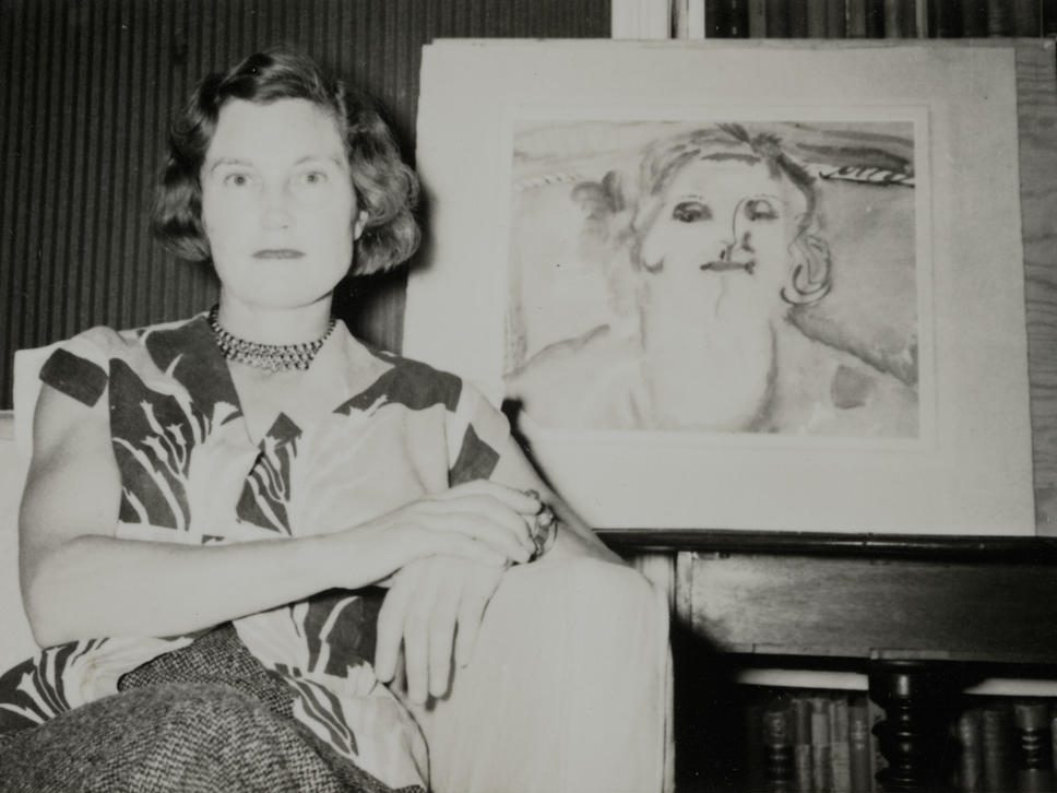
Kitty Church with her portrait by Frances Hodgkins.
Katharine “Kitty” Church (1910–1999) was an English painter known for expressive works, particularly in watercolours and oil paintings. She was associated with the Neo-Romantic movement and a good friend of Ivon Hitchens and John Piper who both owned her work.
Born in Highgate, London, Church studied at the Brighton School of Art, Royal Academy Schools (1930-33), and the Slade School of Fine Art (1933-34).
She had a close friendship with Ivon Hitchens, and for a time was his model. While staying with him in June 1934, at his Suffolk cottage, Hitchens invited John Piper for the weekend. Kitty invited her friend Myfanwy Evans, an Oxford English graduate whom Hitchens also wished to sketch. Piper agreed to meet Myfanwy at Leiston station and was immediately infatuated with Evans, sparking a romance that became a lifelong marriage.
From Kitty, Ivon cribbed her style of painting trees with sweeps of paint and over time he would extend this into his pictures of paintbrush motions of the landscapes. Kittys work had the feel of calligraphy in this way, with confident lines of black making up pictures of the landscape.
During the early phase of her career, Kitty exhibited regularly with the Royal Academy. In 1933, she had her first solo exhibition at the Wertheim Gallery run by Lucy Carrington Wertheim, patron of Christopher Wood and Frances Hodgkins.
Hodgkins painted a portrait of Kitty, Portrait of Kitty West, in 1939, which is now held by the Tate.
Frances Hodgkins – Portrait of Kitty West, 1939
Church exhibited with the New English Art Club and showed regularly with The London Group. From 1937 to 1947, she exhibited her work at the Lefevre Gallery. In 1954, she was invited to take part in the exhibition Figures in their Setting at the Tate Gallery. She was invited to exhibit at the National Museum of Wales in 1982. In 1988, a retrospective of her work was held at the Duncalfe Galleries in Harrogate.
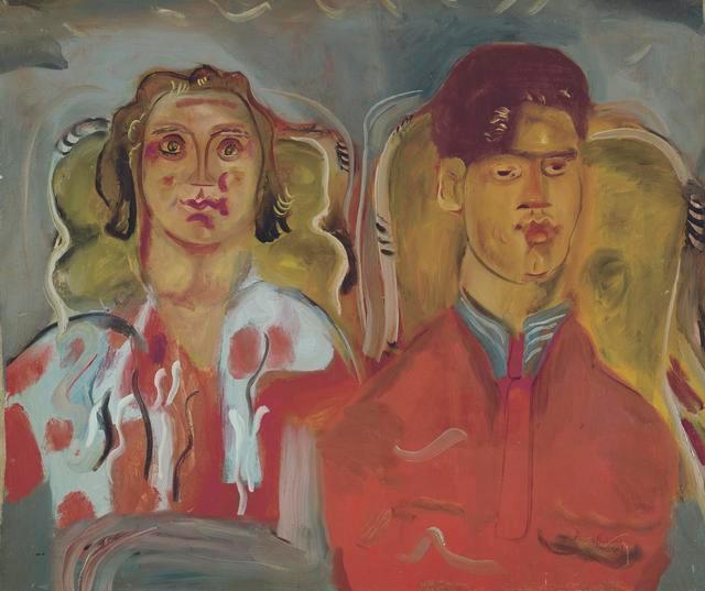
Frances Hodgkins – Portrait of Kitty and Anthony West, 1937-9
Church married Anthony West (son of writer Rebecca West & H. G. Wells) in 1937; the couple had one son (Edmund West) and one daughter (Caroline Frances West).
Among the couple’s close friends were the painter Julian Trevelyan, John Piper and the Bloomsbury writer Frances Partridge.
The Wests divorced in 1952 and Kitty moved to Sutton House in Dorset.
Lately in the news there have been a lot of pieces about protesters using fireworks against the police and this reminded me of Cambridge in the 1930s when there was a fight between Labour / Communist supporters with people who had gone to see the film Our Navy Fighting (1937). Today most people think of Cambridge has a tory place but in the 30s it was quite a Labour city, with the area of Mill Road called Red Romsey due to amount of Russians who had moved there and labour supporters. The Suffragettes had meetings there during the First World War and there was a strong anti war feeling in the fun up to the Second World War.
UNDERGRADS’ TUSSLE WITH POLICE Fireworks were discharged and stink bombs thrown, police truncheons drawn, and a man was knocked into the River Cam, when 500 undergraduates, with band and banner, marched on Thursday night to a Cambridge cinema, where the film, “Our Fighting Navy,” was being shown. The police had a hard struggle to prevent the marchers entering the cinema. and in the midst of the turmoil a man, who had shouted “This is war propaganda” during ( the showing of the film. was ejected. A procter and his officers, forewarned of the intended demonstration, awaited the marchers in the vestibule of the cinema. One undergraduate, who tried to enter the cinema, was seen by an attendant and knocked from a wall into the river. There was a sharp clash between under- graduates and members of the “No More War Association,” a number of whom were roughly handled.
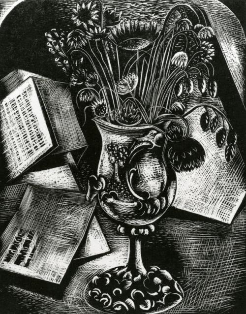
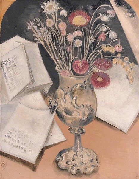
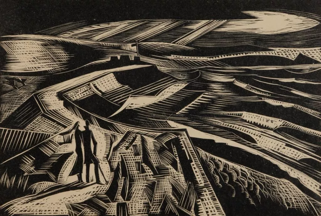
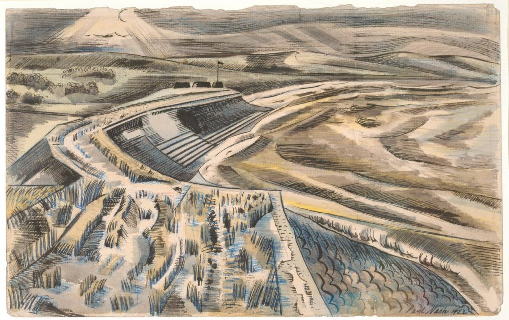
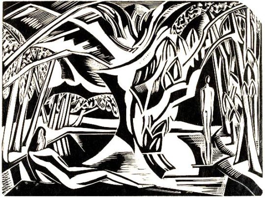
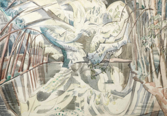
I have long commented how Eric Ravilious reused his work, from painting to wood-engraving. But in this post I want to show his tutor Paul Nash also did the same.
Paul Nash – Bouquet
The revival of wood engraving and the printmaking would mean that an artist could paint a beautiful image but also make some more money selling duplicates.
Nash, Paul; Coronilla; The Fitzwilliam Museum; http://www.artuk.org/artworks/coronilla-4641