It’s not often that I see something so graphic it captivates me totally. As most people know, my obsessions tent to be for the Great Bardfield group of artists and the endless differences in their work. But what attracts me to a work really is the technicality of it.
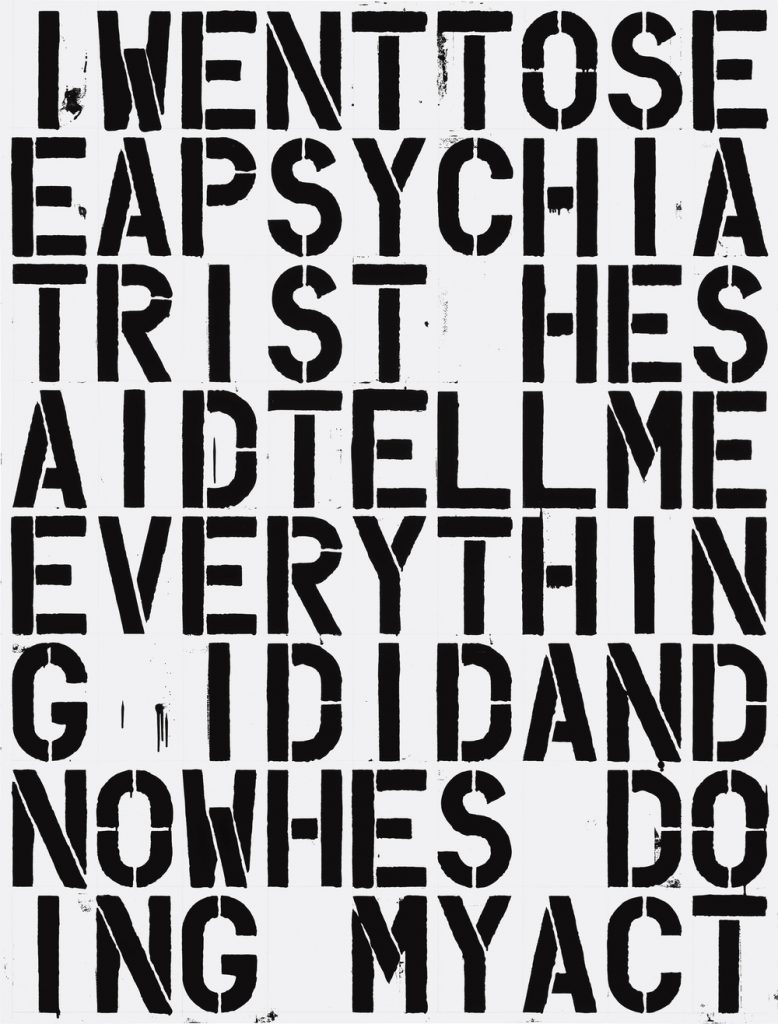
I went to see a psychiatrist… 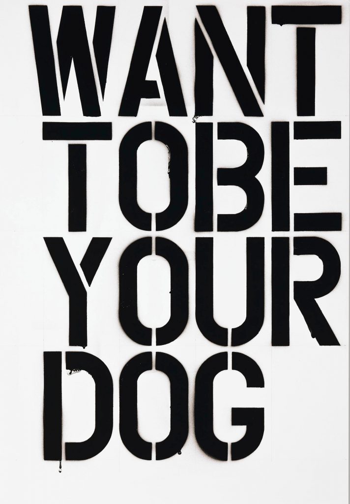
I want to be your dog
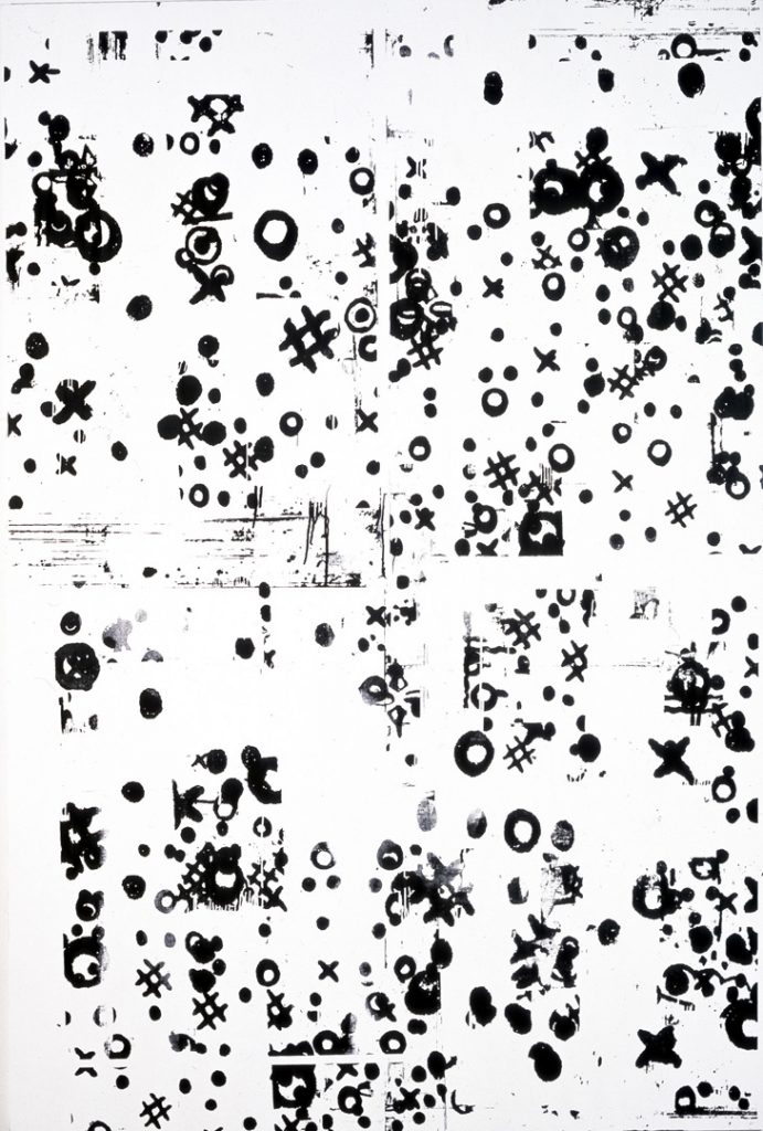
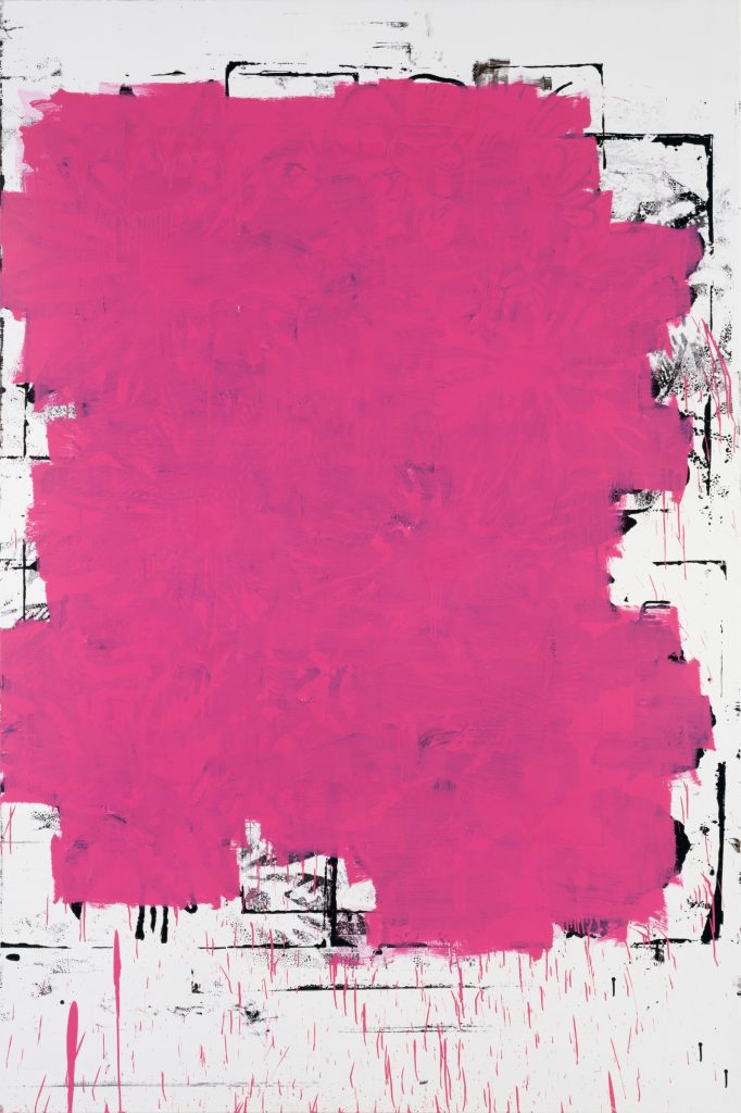
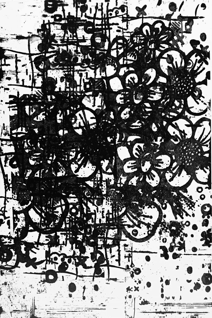
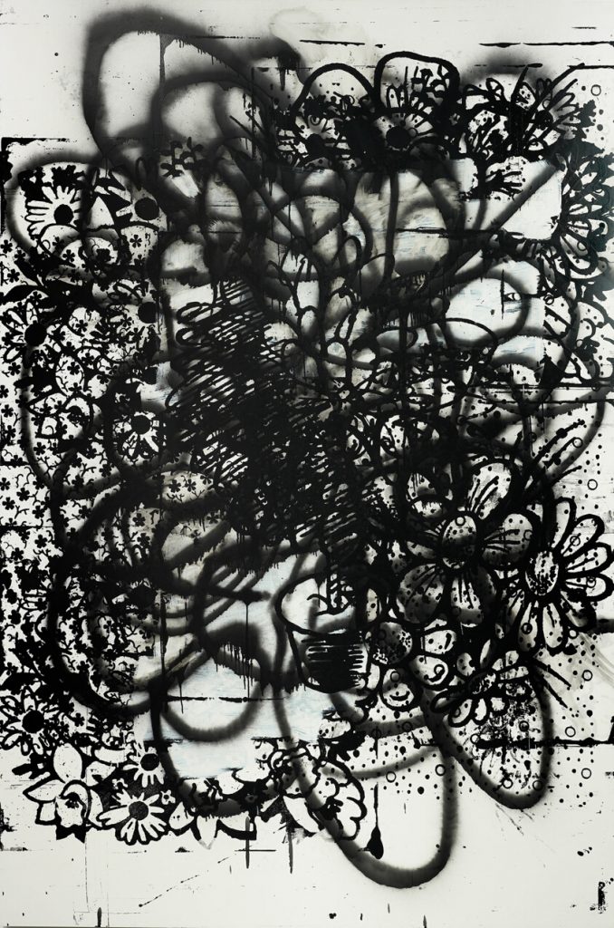
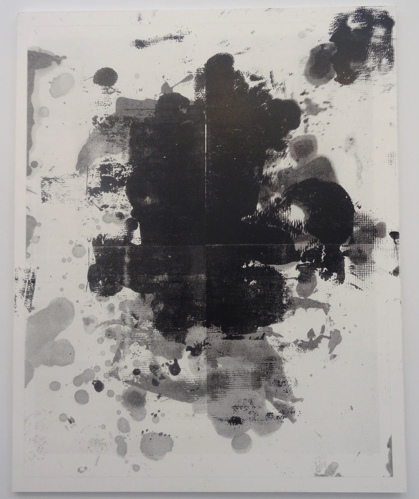
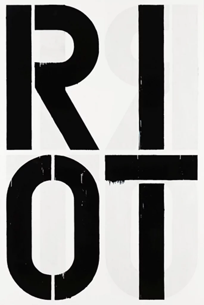
Long before I discovered the work of Great Bardfield, I was rather obsessed with the American artist Christopher Wool, having found a set of his books in the (now closed) Galloway and Porter shop in Cambridge. His work is rude, bold, graphic and he repeats images. It is likely as inspired by the screen prints of Andy Warhol as it is of graffiti. I had a large work by him that I managed to find in a London auction in 2005 that I sold to buy more ‘Bardfield paintings. It was a screen print on metal and over a metre in height.
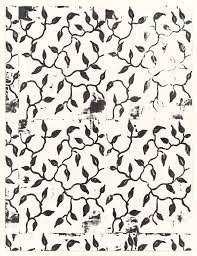
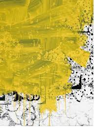
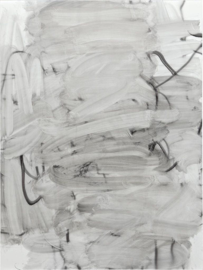
Wood’s work tends to be simple typographic phrases or patterned designs. He has silk screens of different patterns that he uses over and over, mixing them with other designs and sometimes working hard to erase them with areas of colour or pure ink. With colour, smudged, warped by moving the plate while printing… the works are in a constant decay and evolution.
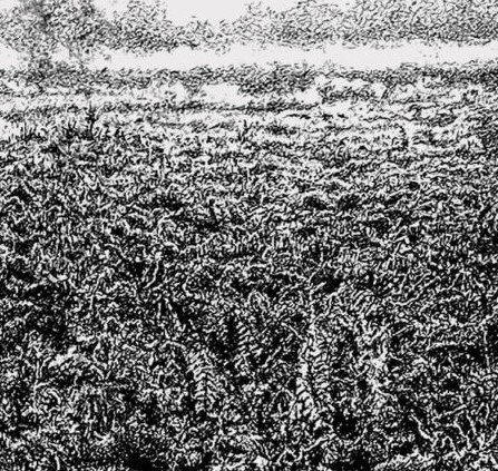
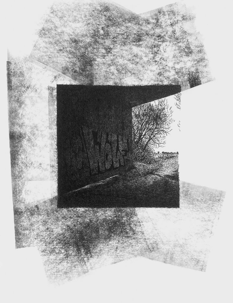
The echos of this obsession were brought back to me when I discovered the work of William ‘Bill’ Bickerstaff, An artist who draws in fine pens and has created a set of drawings of the Cambridgeshire landscape.
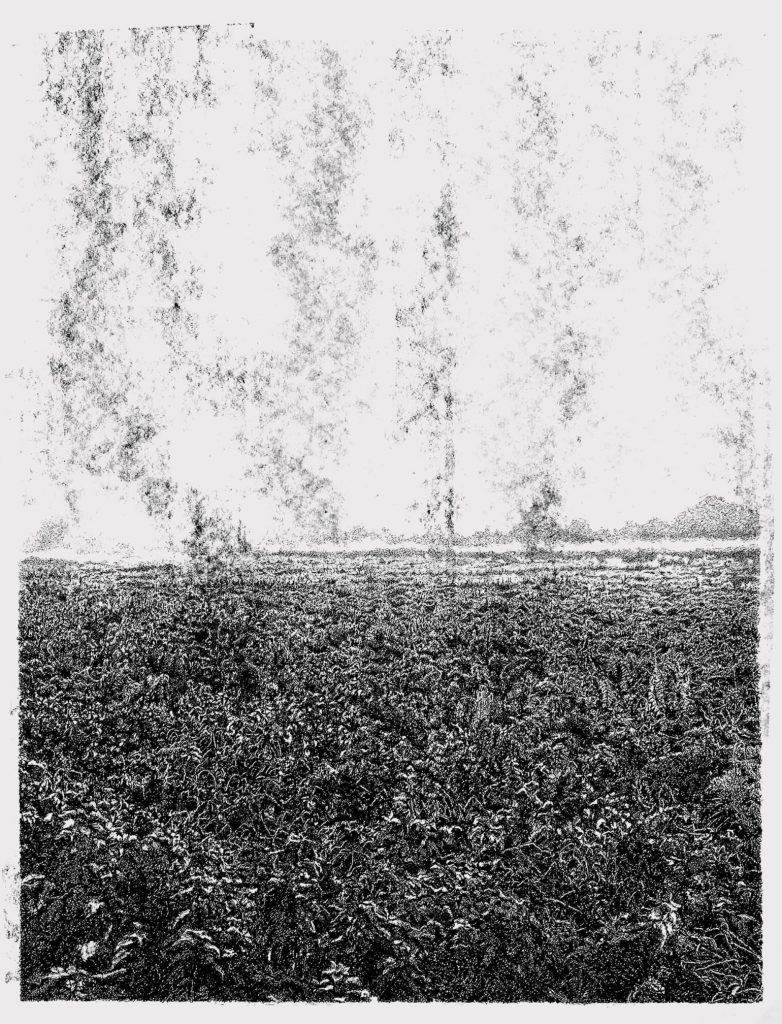
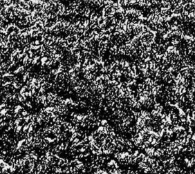
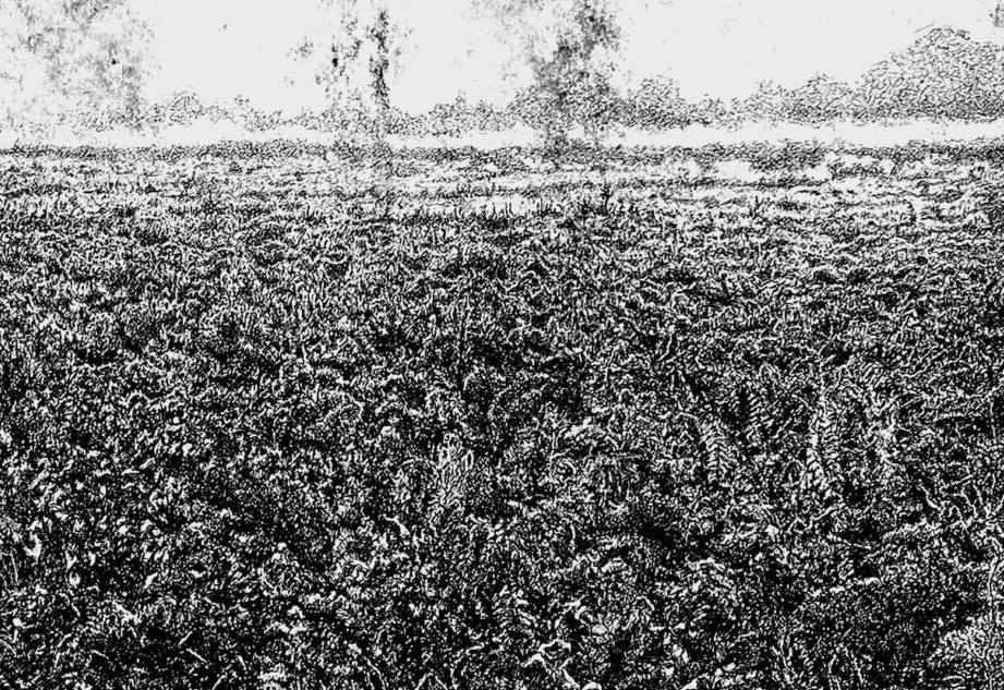
What at first looks like a photograph with ink rollering over it turns out to be a set of intricate works and markings on paper with pen and roller ink, as seen in the details below.
Some of the work would have been sublimely pretty and has echoes of Elisabeth Vellacotts detailed drawings of tree studies, but Bickerstaff takes these drawings and gives a danger to them. In many ways they remind me of Paul Nash works and what he would be doing today, if he were alive. They have the feel of a double exposure on a camera film, something that needs more attention from the viewer to decipher.
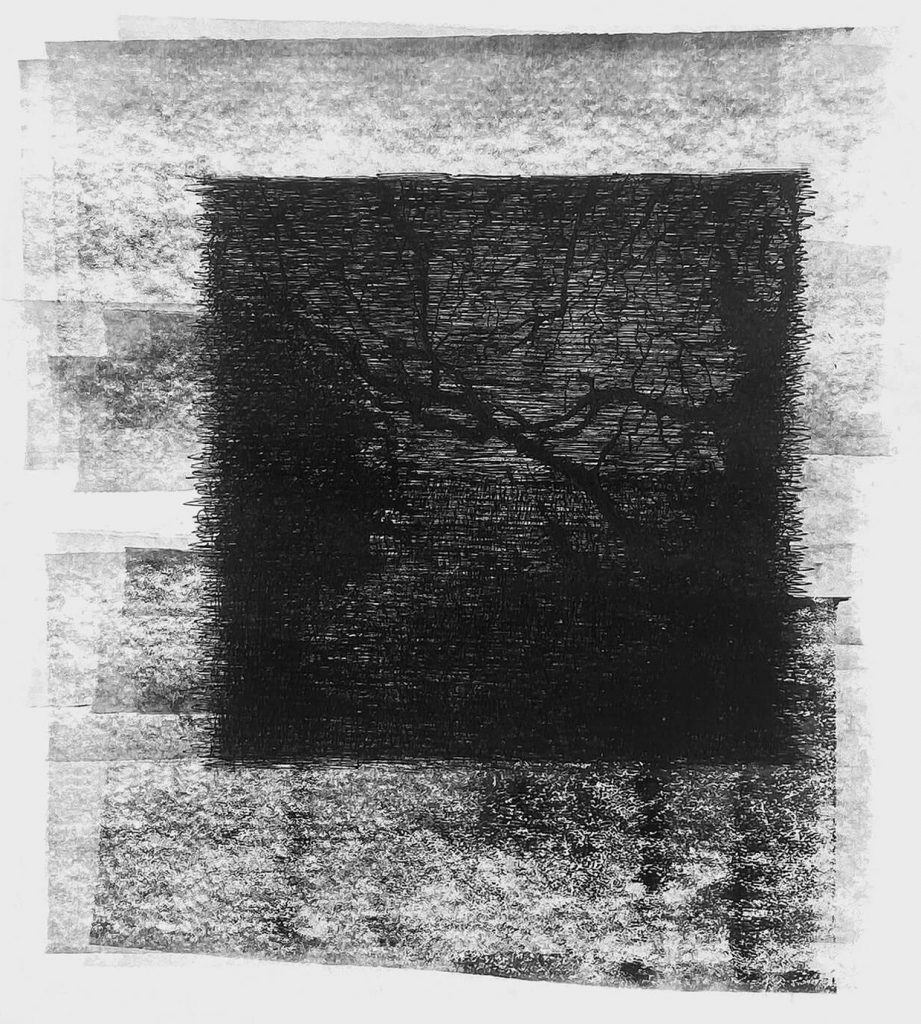
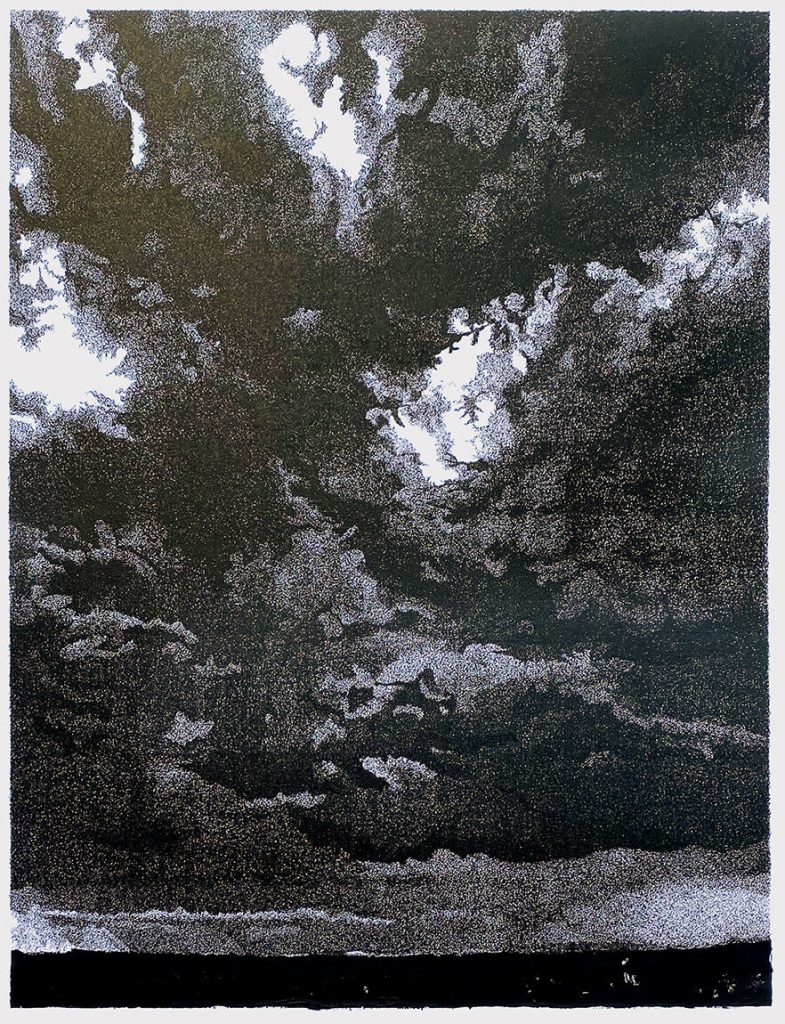
The ability to draw out the overlooked elements of life is something I admire and then to subvert it into something far more interesting is a rare thing to find. So many artists are armed with the skill to depict the world around them but few can push it further and make their own work far more textured than the reality.
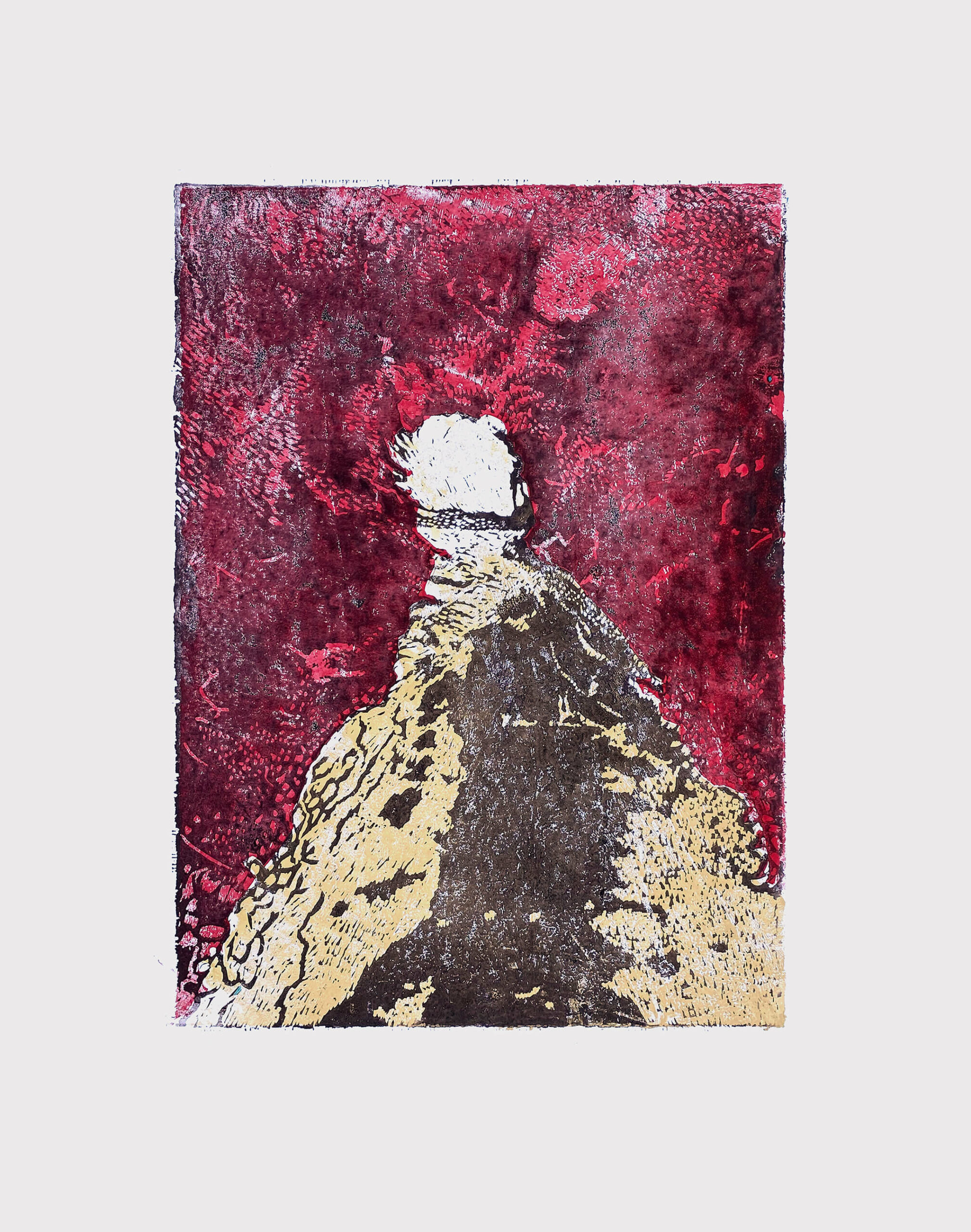
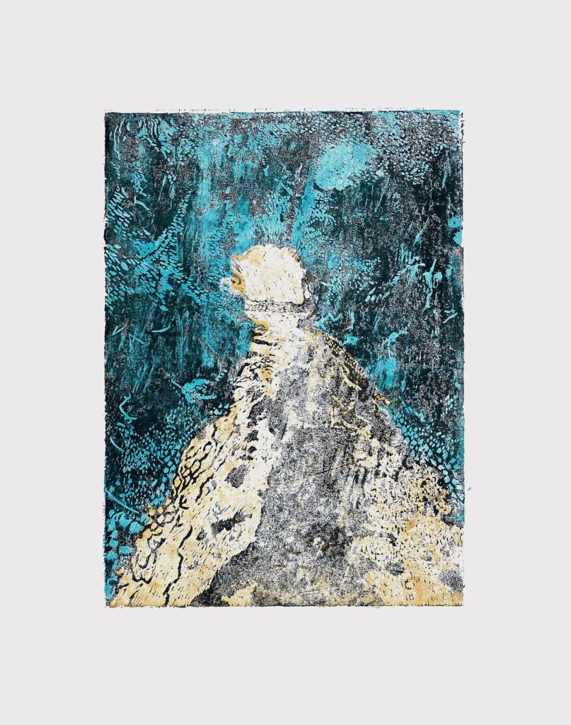
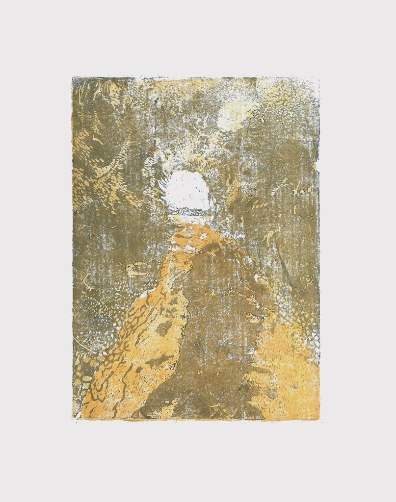
The series below of linocuts layered in colour with erosion of the ink show far more awareness of textures to create a landscape than the typical use of linocuts with thick black inks and bold colours like a stained glass window, in Bickerstaff ‘s work way the ink is applied gives a texture that is much more photographic than you’d expect it to be, it has the feeling of a memory that is always being eroded by the mind’s own perception.
