Jezreels Temple, Gillingham.

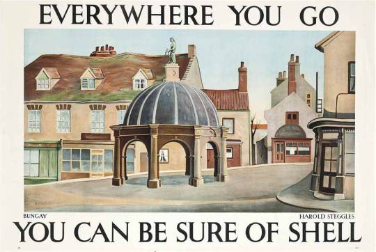
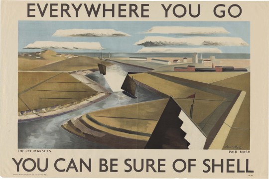
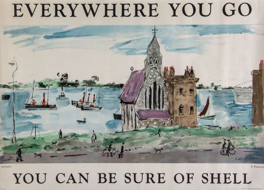
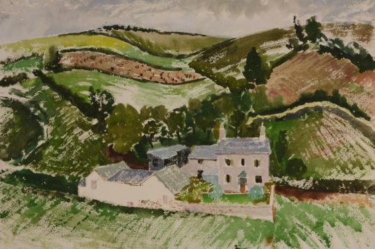
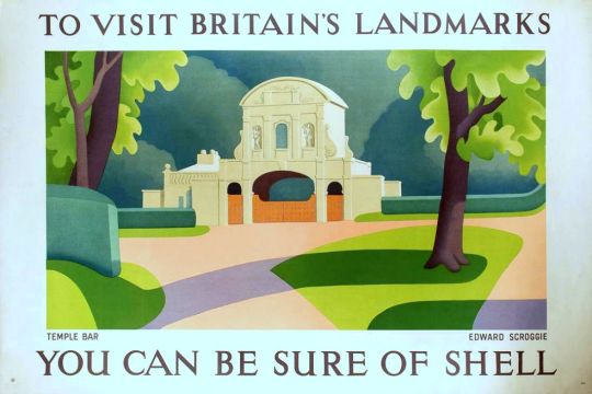
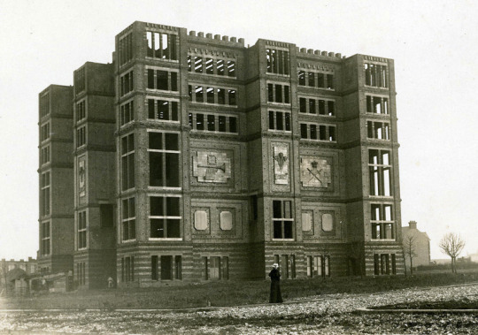
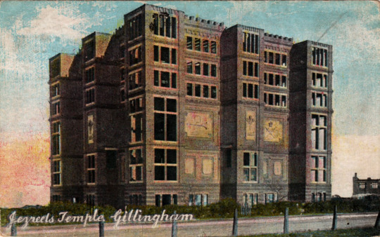
One of the most famous follies in Britain was in Gillingham. It was a folly for it was never completed, it was to be the Jezreel Temple of the Flying Roll. It was built by a religious sect, led by an ex-Indian army corporal
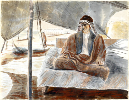
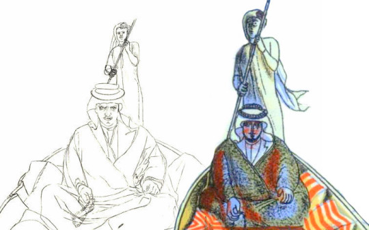
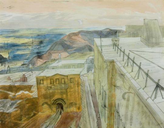
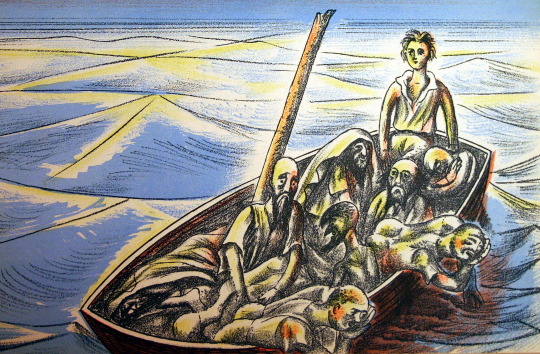
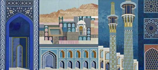
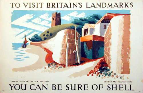
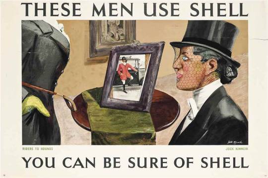
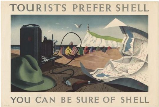
James Roland White, later known as James Jershom Jezreel. It was painted by Tristram Hillier for one of the Shell Posters.

image

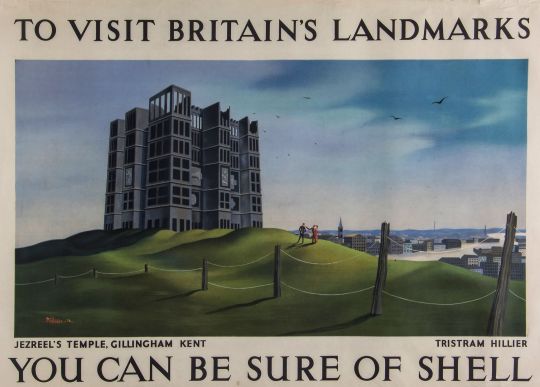
 Tristram Hillier – Jezreel’s Temple Shell Poster, 1936

The printed word in books, pamphlets, newspapers and the postal service may have helped the social situation that made for a boom in new religious orders at the time. In America there were the Mormans but in Britain there was also a wide range of strange religions and cults based on Christ, the power of the pyramids or séance and speaking with the dead, but mostly cranks seeking power. It happens that I collect the books of such people  (especially on the pyramids), as a comedic and weird area of my library.

James White enlisted in the British Army on 27 July 1875 joining the 16th Regiment of Foot as a private, based in Chatham, Kent. It was at this time that White was also becoming interested in other spiritualists who had become famous. One was Joanna Southcott, a domestic servant who aged 42 in 1792 believed she had supernatural powers. Southcott wrote and
dictated prophecies in rhyme, announced herself as the Woman of the
Apocalypse spoken of in the Book of Revelations.

John Wroe was another inspiration. Wroe had set up the Christian Israelite Church at Chatham in 1875. The church was originally set up in Gravesend, Kent, ten miles from Gillingham.

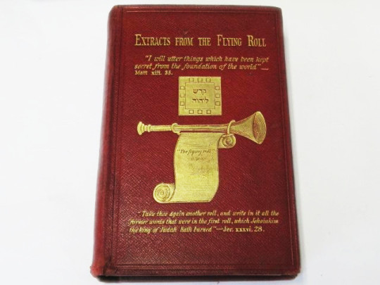
White, while in Secunderabad, India, with his regiment complied a book made up from the writings of Johanna Southcott and John Wroe. To this compilation he gave the title of “The Flying Roll.” It is emblematically sculptured on the western tablet on the south front of the tower building as it remains today. The Flying Roll was described as a “ramshackle” book, made up of extracts “ransacked from the Bible, from Genesis to Revelations” together with references to Southcott and Wroe.

White joined a small branch of a Southcottian sect of Christian Israelites at Chatham, led by a Mr and Mrs Head and calling itself the New House of Israel. Shortly after joining he wrote a version of the manuscript to become known as the “Flying Roll” and took over the church. White adopted the name of James Jershom Jezreel and persuaded some worshippers that he was the Messenger of the Lord. White also went to Wrenthorpe, in Yorkshire, taking his “Flying Roll” with him. Here dwelt a community that had long followed John Wroe and Johanna Southcott. To these he made a fervid appeal claiming himself to be “a messenger sent by God to succeed their former prophet.” They promptly rejected both him and “Flying Roll.” He then returned to Chatham. As the “Flying Roll” had so signally failed him in both of these early appeals James decided to keep it back for later and happier days.

image

White completed his military service in 1881 and left the army to set about building a headquarters for his church. Leaving the army he changed his name from White and went on to be called Jezreel.

The site for his church was at the top of Chatham Hill and the highest point in the area. It was chosen, Jezreel said, after a revelation from God.

He envisaged a building based on Revelation xxi, 16: “And the city lieth foursquare, and the length thereof is as great as the breadth … the length and the breadth and the height thereof are equal.” It was intended to be a
sanctuary, assembly hall and headquarters of the New and Latter House
of Israel, as the church was now called.

Around the perimeter there would be shops plus accommodation for Israel’s International College, a school he had already set up at his home in Woodlands Road, Gillingham.

image

Jezreel wanted the new HQ to be a perfect cube, each side 144 ft long. The architects, however, persuaded him the design was impractical and he agreed a modified version – 124 ft on each side and 120 ft high at each corner. It was to be built of steel and concrete with yellow brick walls and eight castellated towers. The trumpet and flying roll, crossed swords of the spirit and the Prince of Wales feathers (signifying the Trinity), were to be engraved on the outer walls.

First, an enormous cellar had to be constructed for storage, lift machinery, a heating system and the all-important printing presses to turn out thousands of copies of the Flying Roll and other literature essential to the
sect.

image

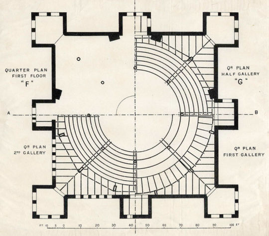
The circular assembly room was a vast amphitheatre, said to be capable of accommodating up to 5,000 people. In the roof would be a glass dome, 94 ft in diameter. Jezreel planned gardens and stately avenues from adjoining streets, making it a focal point for the area. The estimate for these plans was £25,000 and completion was set for 1 January 1885. The money came from his followers savings and fundraising.

image

Jezreel insisted his followers were abstainers from drink – a rule that did not apply to the leader, who often appeared to be drunk.

Jezreel fell ill towards the end of 1884 and died on 2 March 1885. Nobody mourned his death, for the word was without meaning in the sect, who expected his speedy resurrection. His coffin bore the simple inscription James Jershom Jezreel, aged 45 years, and was buried in an unmarked grave in the Grange Road cemetery near his home in Gillingham.

The sect was taken over by his wife Clarissa (née Rogers), a follower 10 years his junior whom he had married on 17 December 1881. (On the marriage certificate she added the name Esther by which she was then known.) She ensured the building work continued. The foundation stone was laid on 19 September 1885.

image

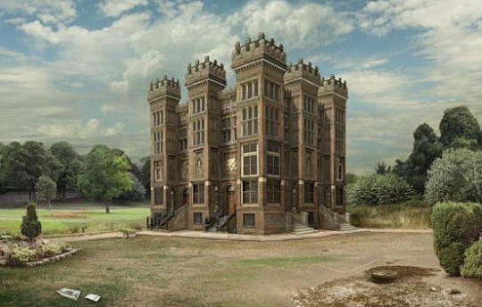
 Digital version of White’s original design.

Much of the tower’s foundations were in place by early 1886 and some of the peripheral buildings were occupied. As building costs soared, Clarissa made economies in the budget for keeping followers. She found the cost of feeding Jezreelites was particularly high and declared the sect would become vegetarian, living off a diet of bread and potatoes.

“Queen Esther” (the derogatory name by which she was called in the press), however, was often to be seen in the area riding in a coach and dressed in fashionable clothing. Inevitably, this led to dissent and the number of followers – at one point as high as 1,400 – began to dwindle. After a legal case involving one of the followers, who had given all his money to the cause, a mere 160 Jezreelites remained.

image

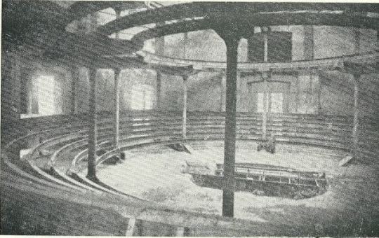
By June 1887, the whole of the outside except for the roof was finished, while inside the ground floor was complete with the newly installed steam printing-presses rapidly turning out the sect’s publications – the ‘Flying Roll’ and ‘Messenger of Wisdom’. On the floor above, large quantities of steel girders had been installed to construct the meeting hall, balconies, the hydraulic choirs and preacher’s revolving platform.

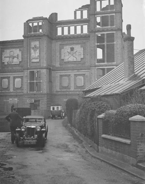
However, payments to the builders began to slow down. In November 1887, the building was ready for its concrete and asphalt roof but this had to be delayed, and as the money finally ran out in March 1888, work ceased. So, roofless and surrounded by scaffolding, Jezreel’s fantastic tower lay exposed to the elements. By that time, £30,000 had been spent and it was estimated that another £20,000 would be needed. There was a possibility that the building could have been finished, but the sudden death of Esther in June 1888 removed the Jezreelites’ unifying influence and almost certainly ensured that this would not happen.

image

In July, 1888, Mrs Jezreel died suddenly from peritonitis. She was 28. The sect fragmented and work on the tower was suspended forever. It was  demolished in 1961. The shops (and members accommodation) mentioned near the site of the tower  and demolished in 2008.

Shell – Everywhere You Go

Both beautiful and inspiring, the artwork that Shell used on their posters was a shift in advertising for two reasons: They were selling the ambitions of the motorist beyond commuting; a generation of day-trippers without trains. Also they were presenting modern art to the public in an era when museums charged admission. The posters were pasted on the sides of petrol stations, lorries and billboards with that simple line “You Can Be Sure of Shell”.

Shell Mex Limited appointed a new Publicity Director in 1932, Jack Beddington. His insight turned the British Shell advertisements of the 1930s into one of the classic campaigns of the twentieth century. The genius of the campaign was to let artists depict Britain in their own styles, they would paint an image and whatever their style, it was surrounded by text. There would be no need for product placement, for models holding petrol cans, it was a campaign exposing the beauty and wonder of Britain and modern art.

Some of these posters were exhibited at the New Burlington Galleries in 1934. Below are two quotes from different reviews on the exhibition that show the surprise of critics to Beddington’s use of modern artists in poster design.

It is now a good many years since, under the able directorship of Mr Frank Pick, some of our best designers were encouraged to show their works in public – using the expression in its broadest sense. People who never though of going to picture galleries could, for the first time find delight in good pictorial art even in an Underground station and in the street. –
Apollo, January to June, 1934, p322

If it can be hoped that big firms like Shell-Mex are really going to patronize art as intelligently as this, we shall expect to be seeing in a few years’ time at Christie’s, not the sale of the collection of the Duke of Frumpshire, but of the Gas Light and Coke Company. If the princes of commerce are going to behave like princes we shall have some fun.

The Everywhere You Go series is one of the more curious for it is before the typographic design for the posters had settled down, a range of typefaces, colours and sizes are used. The first offering by W J Steggles has the tag line in lowercase. Steggles was part of the now fashionable, East London Group of artists, he painted various scenes for Shell posters, as did his brother Harold and

Elwin Hawrhorne.

image

 Walter James Steggles – The Thames at Cookham

image

 Edgar Ainsworth – Gordale Scar

image

 Elwin Hawrhorne – North Foreland Lighthouse

image

 Robert Miller – Devil’s Elbow, Braemar

image

 Harold Steggles – Bungay

image

 Rosemary and Clifford Ellis – Lower Slaughter

image

 Graham Sutherland – Oust Houses nr Leeds, Kent

image

 M. A. Miles – Polperro Cornwall

image

 Charles Mozley – Boxhill 

image

 John Armstrong – Newlands Corner

image

 Graham Sutherland – The Great Globe, Swanage

image

 George Hooper – Kintbury Berks

 John Armstrong – Near Lamorna

image

 Paul Nash – Rye Marshes

image

 Edward Wakeford –   Gravesend

† Apollo, January to June, 1934, p322
W.W.Winkworth – The Spectator –  29 JUNE 1934, p15

Catherine McDermott – Design Museum Book of Twentieth Century Design, 1998, p319

Edward Bawden and the Arabs

image

 Edward Bawden – Lithograph for Travellers’ Verse, 1946.

This post is the story of Edward Bawden’s war work in the War Artists Advisory Committee (WAAC) as an artist and how he used the wartime drawings and paintings in illustration work, like the The Puffin Picture Book ‘The Arabs’ but other post-war commissions. 

image

 Edward Bawden – Shaikh Sharif al-Hafi, 1944.

When the Second World War broke out in 1939, Edward Bawden had already established a reputation as an illustrator, a comic draughtsman, a designer of  typographical ornaments and patterns, a print-maker and a painter of landscapes in water-colour.

Bawden was appointed one of the first Official War Artists and was sent to join the British Army in France with Barnett Freedman and Edward Ardizzone. After being evacuated via Dunkirk, he was sent to the Middle East where he spent two years painting and drawing in Egypt, Libya, Sudan, Ethiopia, Eritrea, Syria, Iraq and Saudi Arabia. During his return journey to England, his ship was torpedoed; he then spent two months in a French internment camp before being released, and arrived in England safely, only to return to the Middle East, journeying around Cairo, Baghdad, Jeddah, Teheran, Ur of the Chaldees; he was drawing all the time, finally ending his travels in Rome.

image

 Edward Bawden – Shaikh Raisan al-Gassid, 1944.

The WAAC recommended in December 1939 that Bawden should be appointed as an official Air Ministry artist. In May 1940, after his return from France with the withdrawal from Dunkirk. Bawden expressed his regret at having had to leave, and Dickey reported him to be “extremely anxious to be sent out again to another scene of activity”. He departed for the Middle East in July. ♦

After the war Bawden stayed in Cheltenham while repairs and work were made to his home, Brick House; It was the only building in Great Bardfield to suffer from bomb damage, but Bawden also used the opportunity to make alterations and build a studio to the back of the house. The house was used and abused by the Home Guard during the war.

image

 John Aldridge – Builders at Work, Brick House, Great Bardfield, 1946.

Bawden’s time as a war artist had given him the advantage of travel but also an abundance of sketch books and work that were still fresh in his mind in 1945. So it was in November of that year that Noel Carrington, the head of Puffin Books at Penguin was writing to his Allen Lane, his boss about Bawden and the planned book ‘The Arabs’:

12th November 1945
I have arranged for Bawden to meet you here on Wednesday afternoon at three o’clock, so you can discuss the alternative approaches to The Arabs book with him. As an illustrator, one method will suit him as well as another.

From this meeting payments were settled and Bawden took on the job of illustrating the book. The text for the book was by Robert Bertram Serjeant, Nicknamed ‘Bob’. Serjeant was a Scottish scholar, traveller, and one of the leading Arabists of his generation.

image

 Edward Bawden – Front cover design for The Arabs, 1947.

Bawden to Carrington, 24 July 1946:
“The book is getting on slowly – I work upon the lithographs for a few hours every day, but because of the fine detail I find the work rather a strain on the eyes. In all I have finished one-fifth of the drawings but these include some of the most elaborate ones such as the two double spreads.’

As you can see in the image below, Bawden recycled some of his paintings from the war and used them in the making of the book. The man to the right – on the boat is ‘Shaikh Sharif al-Hafi’, pictured at the top of this post.

image

 Edward Bawden – Detail from ‘The Arabs’, p18, 1947. 

Below I have edited both images side-by-side and you can see how the line drawing has been simplified for the lithographic process. 

image

Although ‘The Arabs’ became a factual book rather than the ‘story’ title Carrington intended, it is one of the highlights of the series. Bawden’s lithographs are as good as any he completed and the two full double page spreads are superb examples of his mastery of line; Curwen made a good job of the printing. 

image

 Edward Bawden – Detail from The Arabs, p30, 1947

The text of ‘The Arabs’ doesn’t shy away from the Crusades and they are also illustrated as in the image above and below. The historical detail also takes in the history of the Arabic nations, how important they were during the silk road trade routes and how they declined after the European travellers sailed by boat beyond the Cape of Good Hope to China and India. 

image

 Edward Bawden – Double page spread from The Arabs, p30-31, 1947

Again, below and side by side are both the lithographed policeman from ‘The Arabs’ and the portrait Bawden painted during his war service. It really demonstrates the cheerful nature of his line drawings. It also shows how he used paintings and sketches to make the book as accurate as it could be.

 Edward Bawden – Baghdad: An Illustration of Iraqi Policemen’s Uniforms, 1943

image

 Edward Bawden – Detail from ‘The Arabs’, p6, 1947

image

 A Digital Edit of the book ‘The Arabs’ & Bawden’s War Portrait of the Policeman

The most beautiful of the two double-page illustrations is the Battle of al-Qādisiyyah, 636AD, when the Rashidun Caliphate overthrew the Sasanian Empire.

image

 Edward Bawden – Double Page Spread from ‘The Arabs’ p26-27, 1947

The Sassanid Persian army, about 60,000 strong, fell into three main categories, infantry, heavy cavalry, and the Elephant corps. The Elephant corps was also known as the Indian corps, for the elephants were trained and brought from Persian provinces in India. The Arabic side is said to have been 36,000 strong, just over half, and yet they won. 

image

 Edward Bawden – Double Page Spread from ‘The Arabs’ p27, 1947

Interestingly the book was never reprinted, and indeed could have been withdrawn and pulped! On the last pages of The Arabs, Bawden had illustrated ‘Muhammad mounted on Buraq’ ascending to the Seventh Heaven’. Obviously no one Bawden, Carrington or Lane had realised the grave offence that the depiction of the Prophet would cause. 

The Cairo branch of W.H. Smith, which had ordered 5,000 copies, wrote requesting: ‘would there be any way of painting out the rider’. 

Complaints flooded in and the Commonwealth Relations Office wrote to Penguin: The Puffin Picture Book No 61, entitled The Arabs, has on the last page a pictorial representation of the Prophet Mohammed and there have been in the Pakistan Press various letters protesting against this illustration.

As you no doubt know, any representation of the Prophet gives grave offence to Muslim sentiment. Although from a non-Muslim point of view such representations may appear harmless, it is none the less true that Muslim objections to representation of the Prophet in any form are based on sincere conviction.

You will, I am sure, appreciate that in inviting your attention to this matter we do not wish in any way to appear to be interfering with editorial responsibility. But we felt it right to draw your attention to the ill effects which an otherwise excellent little book may have in the Muslim world. Perhaps you would be good enough to bear this in mind should a reprint be under consideration?

One can only imagine the colour of the air when Allen Lane realised that his flagship Puffin was fatally flawed. Understandably The Arabs was never reprinted.

I must add that after mentioning I was writing this post to a friend, they convinced me not to include the image of Mohammed in the blog too. If you wish to see the image you will just have to order a copy of the book to find out at your own offence. 

image

 Edward Bawden – Detail from ‘The Arabs’, p15, 1947

The painting below is of Mohammed Bin Abdullah El Atshan, King Ibn Saud’s representative at Rumaliya. This painting is a copy made in 1966 of a painting from 1943 made at the request of a British Petroleum executive when Bawden was painting a mural at the British Petroleum restaurant. The wall of petrol cans were given the BP logo at the executive’s suggestion.   

image

Edward Bawden – Mohammed Bin Abdullah El Atshan, 1966

What is more curious to me about the above retrospective painting is that parts of it turn up twice in the Puffin ‘Arabs’ book. The image below in colour has the hawk, coffee pots, the boy with water-pot and two men standing behind the wall. The black and white illustration below has the drawing of the sitter.

image

 Edward Bawden – Detail from ‘The Arabs’, p7, 1947

image

 Edward Bawden – Detail from ‘The Arabs’, p25, 1947

Throughout 1946 Bawden was working on the illustrations for ‘The Arabs’ book, but it wasn’t published until 1947. Also in 1946 Bawden would illustrate a collection of poetry chosen by Mary Gwyneth Lloyd Thomas in a book called ‘Travellers’ Verse’ and he would be able to re-encounter his work of the middle east with his illustrations. These projects started to merge as parts of illustrations from his War Time Sketchbooks would end up in both.

image

 Edward Bawden – Detail from ‘The Arabs’, p12-13, 1947

Above is an illustration of a Market in Cairo from ‘The Arabs’ and below is an illustration of a market from ‘Travellers’ Verse’, albeit a more fantastical version. Because ‘The Arabs’ was to be accurate the illustrations are more or less from his war paintings, but the ‘Travellers’ Verse’ book he was able to have more fun with the illustrations and be more fanciful. 

image

 Edward Bawden – Detail from ‘Travellers’ Verse’, 1946

In the top right corner of the image above is the Mohammed Ali Mosque in Cairo in a simple line drawing from 1946. Below you can see it from one of Bawden’s paintings in 1941.

image

Edward Bawden – Cairo, the Citadel: Mohammed Ali Mosque, 1941

Bawden also illustrated the mosque, as below from the other side of the city

image

 Edward Bawden – Detail from ‘The Arabs’, p23, 1947.

During his travels Bawden was able to stay in the centre of Cairo in the Citadel on his stay as he mentions:

Public relations could deal with journalists but they didn’t know how to deal with artists. They were puzzled and Major Asterly said ‘Why not go and stay in the citadel’, which I did and I found delightful. I made one or two drawings of the Mosque of Mohammed Ali.

image

Edward Bawden – Cairo, the Citadel: On the Roof of the Officers’ Mess, 1941

In the ‘Travellers’ Verse’ illustrations we see the city life and a fantasy of life in the countryside, with Mosque towers and street cafes to the desert landscape and camp fires.

image

 Edward Bawden – Detail from ‘Travellers’ Verse’, 1946

image

 Edward Bawden – Detail from ‘Travellers’ Verse’, 1946

In fact Bawden would be able to use the war drawings of Greece and Rome for the other plates in the book. It seems that after Rome, Athens was a disappointment as Bawden mentions: 

When I returned from Florence to Rome it was suggested that I go to Greece, so I went by air, it was the first time I had seen Greece I had been to Rome several times but I was very disappointing on the sight of Athens, it didn’t have the grandeur I was expecting. 

image

 Edward Bawden – Detail from ‘Travellers’ Verse’, 1946

In ‘Travellers’ Verse’ the illustration of a huddled mass of bodies in a boat on a Paul Nash sea has none of the cheer the other images have. The poem being illustrated is ‘Don Juan and his tutor Pedrillo are shipwrecked.’ Bawden himself was shipwrecked during the war off the coast of West Africa on a ship from Cape Town to London. It is another translation of his wartime experiences. 

image

 Edward Bawden – Detail from ‘Travellers’ Verse’, 1946

The Laconia was nearing the Equator in temperatures of 110 degrees Fahrenheit when, at 8pm on the evening of 12th September, 1942, it was hit twice below water level by torpedoes from the German U-boat U156 under the command of Werner Hartenstein. 

Bawden with typical sangfroid resigned himself to death by drowning: ‘so I thought I’d wander round a bit and have a look. I went down to my cabin – I’d bought my wife a watch and thought I might as well go down with the watch as not.’ Then, ‘on returning from my cabin I saw ropes hanging down on the side where life-boats had been lowered and standing by one of these I was joined by a major. ‘After you, Sir’ I said. As he descended there was a splash. Sliding down the next ropes I found myself being gripped and guided into a boat. A few minutes later all the boats pulled away to a safe distance and there we sat waiting, still and silent and tense for the sound of the ship’s final end. 

image

 Edward Bawden – Rescued at sea by the French warship Gloire, 1943.

The survivors were rescued by a French ship who were unkind to them and then taken to an internment camp in Casablanca where they stayed for two and a half months until rescued, this time by the Americans, who were kind. As a British citizen he was shipped to Norfolk, Virginia, USA before being shipped back to London.

image

 Edward Bawden – Illustration from Vathek, 1958.

Many years after the war Bawden illustrated Beckford’s ‘Vathek, an Arabian Tale’ for the Folio Society in 1958, I find these illustrations rather weak personally, I can’t work out if he wanted to change to a looser style of lithographic illustration or if they were dashed out for the money, while technically good with colour layering, the end result in my view is poor. I rather suspect the commission came in conjunction with a larger one – ‘The Histories of Herodotus of Halicarnassus’ for the Limited Editions Club, a company like the Folio Society, but American; For them Bawden provided over 100 illustrations in a two volume book set. 

He would illustrate Johnson’s ‘Rasselas’ in 1975 for the Folio Society with happier outcomes compared to ‘Vathek’, though not totally Arabian, it is a fantasy of travel.

To conclude the various Arabic styles of Bawden we should end with the giant mural for BP’s restaurant at Britannic House. The best of Bawden’s murals, using Islamic designs and architectural drawings to bold outcomes, it uses blocks of colour and pattern design much like one of his linocuts. 

image

 Edward Bawden – Fantasy on Islamic Architecture (Left Panel), 1966

image

 Edward Bawden – Fantasy on Islamic Architecture (Right Panel), 1966

image

 A view of the Dining Room in Britannic House.

† Ruari McLean , Edward Bawden War Artist & His Letters, 1989
‡  Malcolm Yorke – Edward Bawden and His Circle, 2015.
 4622 Edward Bawden Audio Tape, IWM, 1980.
♣  R.B. Serjeant and Bawden Edward – The Arabs, 1947. 
 Joe Pearson – Drawn Direct to the Plate, 2010
Edward Bawden 1939-1944, ART/WA2/03/044/1

Shell – Landmarks

Both beautiful and inspiring, the artwork that Shell used on their posters was a shift in advertising for two reasons: They were selling the ambitions of the motorist beyond commuting; a generation of day-trippers without trains. Also they were presenting modern art to the public in an era when museums charged admission. The posters were pasted on the sides of petrol stations, lorries and billboards with that simple line “You Can Be Sure of Shell”.

image

 Edward Scroggie – Temple Bar

The respectability of motor touring was reinforced by the list of artists commissioned by Shell. It reads like a Who’s Who of the British art establishment of the period – Paul Nash, Graham Sutherland, Vanessa Bell, Ben Nicholson, Rex Whistler and Edward McKnight Kauffer – who between them produced some of the finest examples of commercial art while promoting a nostalgic view of England at the same time. At this stage of the century the motor car itself was not perceived as a threat to the countryside. Buying a car meant buying into a new world.

image

 Richard Guyatt – Ralph Allen’s Sham Castle

Ralph Allen’s Sham Castle:
Ralph Allen was an entrepreneur, philanthropist and was notable for his reforms to the British postal system. He his home, Prior Park, a Palladian house, built to demonstrate the properties of Bath stone as a building material, Allen happened to own a few stone mines in Bath. On the crest of Bathwick Hill facing the city of Bath is the colloquially dubbed “Ralph Allen’s Sham Castle”, built in 1755. Guyatts poster is the most modernist in this post, making use of positive and negative line drawing in the shade and light.

image

 Edward McKnight Kauffer – Dinton Castle, Near Aylesbury

Dinton Castle:

A most charming, innocent folly, standing on a little mound by the Aylesbury-Thame road and circled by pine trees. It was built in 1769 by Sir John Vanhatten to house his collection of fossils, some of which are let into the random rubble walls. The plan is a hexagon with towers at two opposite corners, one for fireplaces and the other for a spiral staircase. ♠

image

 Graham Sutherland – Bringham Rock, Yorkshire

Bringham Rock, Yorkshire.

Sutherland visited this site in the autumn of 1935 at the suggestion of Jack Beddington, who wanted it to figure as one of a series of Shell posters. The result is a dreamlike lithograph, more in the style of Paul Nash. There are other rock structures on the site, all unique. ♣

There are many variations of rock formations, caused by Millstone Grit being eroded by water, glaciation and wind, some of which have formed amazing shapes. ♣

image

 Paul Nash – Kimmeridge Folly, Dorset

Kimmeridge Folly, Dorset
When Paul Nash was working for Shell in 1937 it was to produce the Shell Guide of Dorset. He relocated for the project. His boss for the guide was not just Jack Beddington but also John Betjeman. It was Betjeman who suggested he paint Kemmeridge Folly for the ‘Landmark’s’ campaign. Paul Nash was paid 50 guineas when the picture was accepted as a poster in 1938.

image

 Denton Welch – Hadlow Castle, Kent

Hadlow Castle, Kent

The first few months of 1937 saw Denton working on a large-scale panel of Hadlow Castle, a building some three miles east of Tonbridge. Although the main part of the house dated from the end of the eighteenth century and had been inspired by Strawberry Hill, the 170-foot tower, built between 1938-40, was modelled on William Beckford’s Fonthill. The whole ambience of the place appealed greatly to Denton’s love of the Gothic. His naive painting, which shows the puny tower rising above the other parts like a coffee-iced wedding cake, was designed specifically to be reproduced as a poster. †

Hadlow Castle was built on the site of Hadlow Court Lodge, a country house. The Castle was built over a number of years from the late 1780s, commissioned by Walter May in an ornate Gothic style, it became known as May’s Folly. The architect was J. Dugdale.

His son, Walter Barton May inherited the estate in 1823. It was he, who added a 170 feet (52 m) octagonal tower in 1838, the architect was George Ledwell Taylor. The tower was based in part on James Wyatt’s at Fonthill Abbey. A 40 feet (12 m) octagonal lantern was added two years later in 1840 and another smaller tower was added in 1852. This was dismantled in 1905. Walter Barton May died in 1858 and the estate was sold.

The property passed from many owners in the early twentieth century. During the Second World War it was used as a watchtower by the Home Guard and Royal Observer Corps. The unoccupied castle changed hands several times after the war too, until it was demolished in 1951, except for the servants’ quarters, several stables and the Coach House, which was saved due to campaigning from the society portrait painter and local resident, Bernard Hailstone. The Tower was Listed as a historic structure on 17 April 1951.

Denton Welch: Writer and Artist by James Methuen-Campbell, 2003
The English Landscape in the Twentieth Century by Trevor Rowley 2006
♠ Follies & Grottoes by Barbara Jones, 1953
♣ Wikipedia: Brimham Rocks

Rosemary Ellis

Rosemary Ellis née Collinson was born in Totteridge, North London in 1910. Her grandfather was the leading designer of furniture company Collinson & Lock and her father trained as a cabinet maker and started the firm Frank Collinson & Co.

image

 Clifford Ellis – The Farm, 1945, from my collection.

Rosemary’s father served in WW1 in France and Italy. Having survived this conflict he died of Spanish Flu in 1919 and so Rosemary and her siblings moved in with her mother’s parents in their large house at Netley Marsh in the New Forest. In this environment she developed a love of the forest and its animals. Some time later, the family moved to London.

Rosemary went to study art at the Regent Street Polytechnic in 1928. It was here that she met her future husband Clifford Ellis who was her tutor at the Polytechnic.

image

 Rosemary Ellis – View of Holcombe from Dawlish, 1945, from my collection.

Clifford and Rosemary Ellis were at once husband and wife and an artistic partnership. Their collaboration began in 1931, the year of their marriage, and subsequently almost all their published freelance work is signed jointly. By the time the New Naturalist jackets were designed they had taken to using the cipher C&RE to express their joint authorship. Such consistent use of a joint cipher is unusual, and needs a little explanation. The initials were put in alphabetical order, not out of any sense of seniority.

The couple as artists and designers joined the ranks of Ben Nicholson, Eric Ravilious, Barnett Freedman and Edward Bawden as artists who could create both posters for advertising and book dust jackets. They would join many of these artists in working for Shell Mex and for London Transport on posters.

image

 Clifford and Rosemary Ellise – Appledore – ‘Shell Landmark’ Series No. 491

Work that would welcome further investigation includes posters by Barnett Freeman, Edward Bawden, Richard Guyatt and Clifford and Rosemary Ellis. Another area that was constrained from further investigation by lack of space was the way in which Beddington provided opportunities for women to produce art for commercial use. Women artists were given very little press attention in the 1930s and, although artists such as Barbara Hepworth were active exhibitors, critics rarely reviewed their shows. Apart from Vanessa Bell, six other women artists produced posters for Shell, including Pamela Drew, Eve Kirk, Cathleen Mann and Margaret Brynhild Parker. The reason for the prominence of women in poster design is a potentially interesting area of research that could illuminate issues of female participation in the arts, gender prejudice, and education in the 1930s.

By the time of WW2 Clifford Ellis was the headmaster of the Bath School of Art. He then served as a camouflage artist and official war artist with Grenadier Guards during Second World War.

image

 Rosemary Ellis – Tombstones, Bathampton Cemetery, Bath for Recording Britain, 1943, V&A.

Rosemary too was a official war artist working on the Recording Britain project with Clifford. Above is a beautiful view of a graveyard in Bath. It is one of the most gothic and romantic works she produced and looks more like a John Piper study. The painting above ‘View of Holcombe from Dawlish’ also has elements of John Piper in it: the loosely constructed house, the abstract boat off the shore and the dark sky.

image

 Rosemary Ellis – Teignmouth Bay, 1945, from my collection.

The couple would also be selected as artists for the Lyon’s Lithograph series in 1947. The aim was to produce large lithographs that could cheaply be bought by members of the public but also be displayed to brighten up the tearooms Lyons owned. The Ellis’s submission of Teignmouth was described as almost being a painting rather than a lithograph.

Between 1946 and 1955 the company commissioned three series of prints, some 40 in all, from most of the leading British artists of the day. The lithographs were not advertising per se (the Lyons name only appeared in small type at the bottom of each), but they were branding by association. 

To help, he brought in the artist Barnett Freedman as the technical director. He had long experience as a lithographer and had been both an official war artist and a teacher at the Royal College of Art. ♠

image

 R&CE – Teignmouth From the Lyons Lithographs First Series 1947.

The painting of Teignmouth Bay from 1945 would have been a study around the time of the Lyons lithograph above but looking back and forth onto each other.

Teignmouth Painted by Clifford and Rosemary Ellis: For the lithographs worked up at Chromoworks from originals, (Barnett) Freedman’s input at the proofing stage was crucial. In response to his comments about the proof of Teignmouth, for example, (Frank) Oppenheimer noted at the printers that they would ‘try a light grey printing over the sails etc … alter the colour of the light brown high light in the hills in printing [and] … make the colour of the sky and sea slightly warmer. ♣

Rosemary Ellis worked with her husband Clifford to design over 60 of the dust jackets for the New Naturalist book series, after volume 71 the artist Robert Gillmor took over.

image

 R&CE – Butterflies by E. B. Ford, Collins, 1945

Today these jackets are their best-known work, though book lovers may know some of their other jackets before and after the war, for the Collins Countryside series in the 1970s, or their design for John Betjeman’s Collins Guide to English Parish Churches. Within the art worked they are remembered more as innovative teachers, Clifford Ellis having run the Academy of Art at Corsham Court for a quarter of a century with his wife Rosemary as a leading member of the staff. 

The pair also designed two of the covers to the King Penguin Series.

image

 R&CE – A Book of English Clocks by R.W.Symonds, 1946, King Penguin Books.

The original idea for King Penguins came from the small Insel-Verlag books which were published in Germany before the war. Why, we felt, should there not be a similar series of books in this country? The experiment, started a few weeks after war broke out, turned out to be successful. One of the most distinctive features of this series is their decorative covers. ♦

The King Penguin series itself struggled to make money, because of the costs of colour printing, and it was cancelled in 1957. ♥

image

 R&CE – Flowers of the Woods by E.J.Salisbury, 1947, King Penguin Books.

† Collecting the New Naturalists by Tim Bernhard and Timothy Loe, 2015.
Shell’s England by Malcolm V. Speakman, 2014.
♠ Bawden and battenberg by Michael Prodger, The Guardian 12 July 2013.
Tea and a Slice of Art: The Lyons Lithographs 1946-1955 by Charlie Batchelor.
Reading Penguin: A Critical Anthology by William Wootten and George Donaldson, 2014.
♦ Pevsner: The BBC Years: Listening to the Visual Arts – Page 75
Recording Britain. Volume 4, Edited by Arnold Palmer, 1949.

Shell’s Men

In the 1930s, Shell’s advertising department under Jack Beddington were running various poster series. This post shows the ‘These Men Use Shell’ series.

Shell employed artists such as Tom Eckersley and Paul Nash to produce a range of posters which transformed Shell’s visual identity. As these posters were displayed in petrol stations and on boards where Shell was purchased. The pictures by the artists were framed in the boxes

In being on open display it’s fair to say they were some of the first pieces of modern art the public would have seen.

In 1939, Armstrong designed his fourth poster for Shell, called ‘Farmers Use Shell’, which features an affectionate caricature portrait of Jack Beddington as Farmer George.

There’s no doubt that Armstrong’s Shell postered helped dissminate his work to a wider audience, and together with the GPO posters, made him a more popular and better-known figure in the art world. The  Shell posters were for lorry boards and travelled the length and breadth of the country on the sides of Shell’s tanker-trucks. These lorry bills were known as ‘the common man’s art gallery’ †

image

 Farmers – John Armstrong. The farmer depicted is a portrait of Jack Beddington.

image

 Mobile Police – Charles Mozley

image

 Sightseers – Charles Mozley

image

 Racing Motorists – Richard Guyatt

image

 The Circus – Kavari Schwitzer

image

 Journalists – Zero is the pseudonym for Hans Schlager.

image

 Builders – A. Cantor

image

 Riders to Hounds – Jock Kinnier

image

 Fisherman – Derek Sayer

John Armstrong: The Complete Paintings

Related Posts:
Lyons Teashop Lithographs – How Shell inspired Lyons
Young Artists of Promise – A book by Jack Beddington
A Double Take – Shell Adverts 
Hadlow Castle

A Double Take – Shell Adverts

image

In the 1930’s the adverts of Twinings, Guinness and Shell all followed a similar trend of comic verse and modern illustration.

Advertising needed to work differently in print, especially with the rise of weekly magazines, adverts were serialised, so every week they would have a different poem, illustration or tag line for the same product.

image

 John Patrick – Laurel & Hardy Chorlton-cum-Hardy Shell Petrol, 1937.

The adverts became less about the ‘quality and price’ of the products; but more abstract, advertising what the products do. With Shell it was to make you ‘go faster’, or give the perception of that.

image

The changes happened under Jack Beddington, who it could be argued changed the face of British Advertising by thinking of where his adverts would be seen. In magazines there would be more time to read the adverts, so there were poems or jokes. In petrol stations it was a bright poster with a line of text, something clean, quick to read and inspiring – for early petrol stations, that were mostly grubby sheds or small brick huts.

It was a trick Guinness would use to brighten up gloomy pubs. A decade later Lyons Corner-houses consulted Beddington on artists and lithography choices when doing prints to liven up their tea-rooms.

His adverts used modern art to make the company look modern by association. At this time museums charged admission, so the public didn’t visit them as much, so in these posters, it would have been the first time the public were exposed to modern art. The posters ’You can be sure of shell’ showcased beautiful British Locations by modern artists.

image

 Edward Scroggie – Temple Bar – ‘To Visit Britain’s Landmarks, You can be Sure of Shell’, 1937.

The magazine adverts were, on the whole, black and white with line drawings. The most famous are the series designed by Edward Bawden, but as I couldn’t find the illustrations below online, and the designers are less known, I thought it would be more interesting to showcase those rather than the adverts everyone knows already.

image

I photographed these adverts from old copies of Zoo Magazine: the National Nature Magazine – The Official Organ of the Zoological Society of London from 1937, ’38 and ’39.

image

 John Reynolds – ‘By Gad Sir!’ Reynolds was a book illustrator and cartoonist, best known for his illustrations of 1066 And All That (1930).

image

 Brian Robb – ‘Times Change.’ Robb worked for Punch in the 30′s, made posters for Shell and London Transport and became Head of Illustration at the Royal College, London. He was also a Camouflage Officer in the Western Desert in the Second World War. The advert above reads:

Times Change – So Does Shell
The threatening spectre of Mrs. Grundy and the cool efficiency of the policewoman are each as typical of their period. The working of the modern motor car is just as efficient and effortless. This is not due to any sudden discovery, but to many years of gradual improvement in motor engines, and to the continual change made by Shell to ensure that it will always give the highest performance. 

image
image

 Brian Robb – ‘Times Change’.

Times Change … So Does Shell
That’s Evolution – that is! Darwin might have said this about Shell, if he had been alive today. In the last thirty years motorcars have changed completely in appearance and engine design, but Shell has always adapted itself imperceptibly to the innumerate improvements that have been made. Today, as in 1907.

image
image

 Brian Robb – ‘Times Change’.

Times Change – so does Shell.
Shell has always been a contemporary spirit. It belongs to 1937 as much as it belonged to 1907. Between the years lies a big different made up of countless small improvements, each of which was made immediately it became desirable and possible. If, in the Autumn, you buy a 1938 car, you will find that Shell suits it perfectly; for Shell keeps in step with motor-car design.

image

She’s a hiker…
This girl would be a good walker, if only her clothes would let her. Some petrols suffer from the same handicap; they’ve got the essential power but not in a form in which it is most effective in the high-compression engine.
Shell, on the other hand, is really good petrol made still more suitable for the modern car by the new “re-forming” process.

image

Lyons Teashop Lithographs

image

 Lyons Print: William Scott — The Bird Cage.

The war had not only hit at Britain’s cities with bombs, but also at the people with rationing. Food and fabric, paper and paint, tea and sugar were all rationed.

It was in the war years that the Lyons teashops became shabby and as fashions started to change in the post war era they looked dated. Materials like wood and paint where mostly reserved and rationed for government use in the post war construction, so another idea had to be devised to make the Lyons tearooms look more respectable.

image

  Lyons Teahouse. 1951 The 2nd series of lithographs on the walls.

The directors, Felix and Julian Salmon had the idea of refreshing the tearooms with lithographic pictures to make them more appealing. In 1947 they sort advice from Jack Beddington who was the Artistic Director of Shell-Mex.

image

 Shell Advert by Tristram Hillier — White Cliffs of Dover

The advertising in the 1930’s for Shell-Mex featured British artists modern work with simple text. It had been a public success and an exhibition of the Shell-Mex lithographs in 1939 was well attended.

The art of advertising in London from the mid 1920’s onward had seen modern art projected onto the public with company’s like Shell-Mex & London Transport using artists like Paul Nash, Edward McKnight Kauffer, Horace Taylor and Graham Sutherland to illustrate bold and simple posters.

It was an age when galleries charged admission and in the war years galleries where disbanding and hiding their art collections safe from German bombing raids. This would mean that the colour advertising posters where some of the few artworks to be left open to the public in wartime and where displayed all over the country. It would be the first time the public would encounter these artists.

image

 Shell Advert by Richard Guyatt — Ralph Allen’s Sham Caster nr Bath.

By appointing Beddinton they relied on his contacts with artists to product the lithographs. Samples and designs where commissioned and the first series of these sixteen prints featured Edward Ardizzone, Edward Bawden, Clifford & Rosemary Ellis, Barnett Freedman (who assisted with artistic advice on lithography) Duncan Grant, Edwin La Dell, John Nash to name half. Artists also claimed royalties on copies sold in the tearooms, an unusual practice in it’s day. One thousand five hundred prints where made of each poster in the first series.

image

 Lyons Print: David Gentleman — Cornish Pilchard Boat

Some of the troubles in printing came from printing trade unions and of artists unfamiliar with the lithography process. Some of these posters had to be hand drawn onto the lithographic plate to be printed, pre-made works where translated from paintings by Chromoworks Ltd, London.

The artworks for Lyons had a press release in 1947 at the Trocadero Restaurant, London, where Lyons often had their board meetings.
A special preview was arranged for Queen Mary.

Many prints where glued to wood or mirrors for hanging in the tearooms, the public could then buy the posters un-mounted and unframed, it’s the prints unglued to canvas and board that are worth more money today.

image

 Edward Bawden — The Dolls at Home.

Thirty of the Lyon’s Tea Rooms in London exhibited the prints at first. Due to the press and public interest the prints were soon found in all Lyons’ teashops. The success of the first series of prints meant that a second and third series of prints came in 1951 and 1955.

It is worth noting that companies like Guinness started to produce lithographic prints (The World Record Series) to brighten up their pubs soon after. So the series and it’s publicity had an ongoing effect.

image

 Michael Ayrton — The Spectators

image

 Barnett Freedman — People