The boom in interwar printmaking in Britain was immense, it followed the same popularity of books; naturally the process of colour printing and printmaking where not so dissimilar. People were owning their own homes and they wanted affordable art to put inside.
In the 1920s and 1930s you could either source prints from the Studio Magazine or companies like the Medici print company but then came a series of print publishers who were issuing prints by contemporary artists, not from the past. The first major series of lithographs of modern artists for the public to buy would have been the Contemporary Lithograph series of prints. It was them who started the ball rolling in 1937 and proving that large colour reproduction prints could be made and sold cheaply. Sadly it, like all of the others I will list, were not a financial success. The early print schemes had aspirations of making art more affordable for people. The AIA series was a source of fund-raising for the group and showed off art from their members. The Schools Print series would have likely worked out if it wasn’t for the difficult third series from European artists. But with Lyons Lithographs the public may have felt a little saturated.
Lyons and Guinness both used the idea to their advantage when they needed to brighten up their shabby looking teahouses and pubs in an era of post war austerity.
- Contemporary Lithographs Ltd – 1937-38
- AIA Everyman Prints – 1939 – 1942
- Schools Prints – 1945 – 1949
- Festival of Britain Print Series – 1951
- Coronation Print Series – 1953
- Lyons Lithographs – 1947 and 1955
- Guinness Lithographs – 1956 – 1957
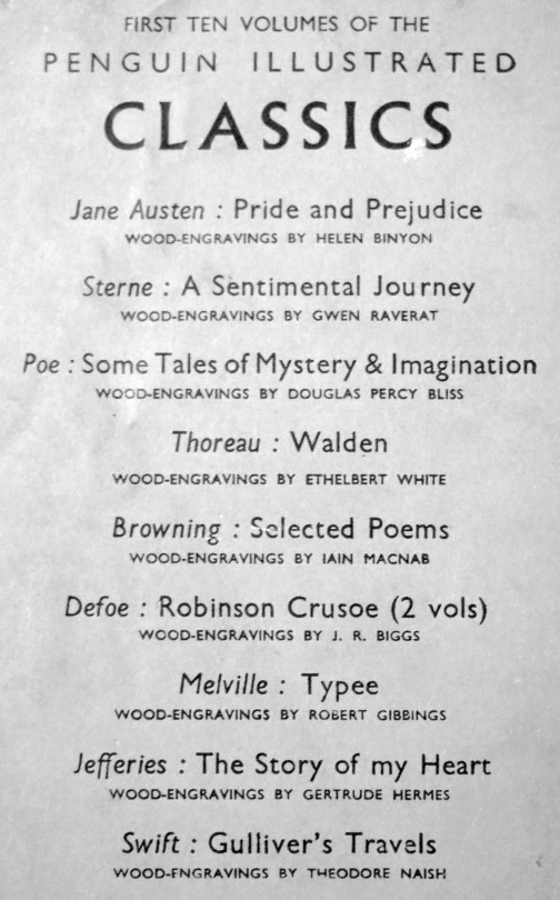
The Penguin series was unusual in that all the prints where old and not designed to be prints for the scheme. It is why they are auto lithographs. The choice of the works were down to Kenneth Clark and it is a curious selection of traditional art and abstract works. The only work I really question is Pieter de Hooch – Courtyard in Delft at Evening- a Woman Spinning, 1656. It is not a picture I can think would hang easily anywhere.
The prints were presented in folders with a size of 13¼” x 17″. Each folder also contained information on the artist and the painting/work of art.
Only 11 prints were produced before Penguin ended the scheme. The first Print was by Turner and appeared in December 1948. The last print was published in April 1952. Below are the works from this long forgotten scheme.
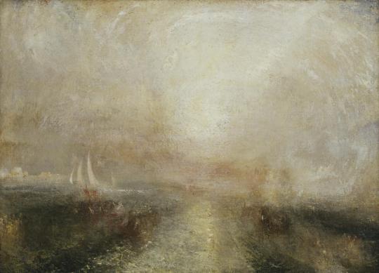
J. M. W. Turner – Yacht Approaching Coast, 1840
Turner painted this view c1840-5 and it was published by Penguin in December 1948. PR1.
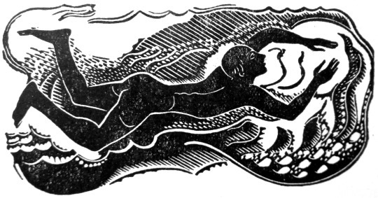
In this painting the light in the sky and on the sea dazzles the viewer, obscuring the scene. This visual effect echoes the progress of Turner’s own work on the painting as he returned to areas of the canvas over a period of several years, covering the original subject. Dark shapes that appear through the layers suggest boats, while the buildings on the left have not been definitively identified but may represent Venice. By reworking the canvas, Turner has created less tangible subjects – those of light and colour themselves.
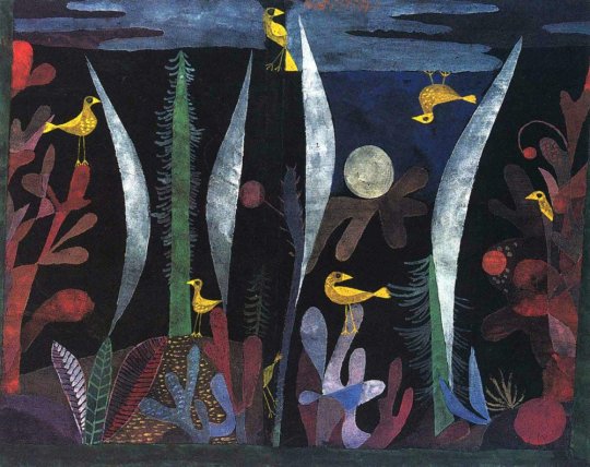
Paul Klee – Landscape with Yellow Birds, 1923
It was published by Penguin in December 1948 PR2
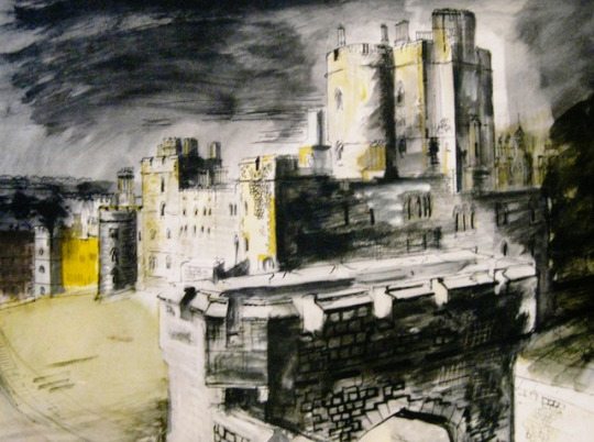
John Piper – View of Windsor Castle, 1940
The John Piper painting was originally made in 1940-41. It was published in 1948. PR3. A blog post about his work at Windsor can be found here.
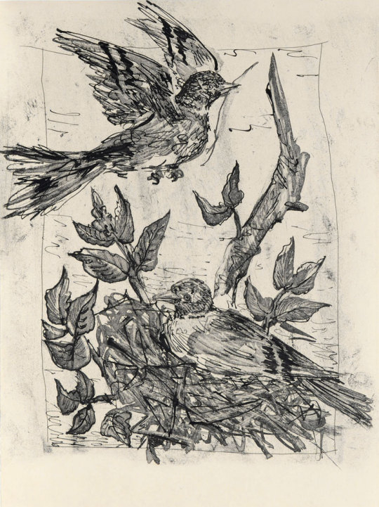
Pablo Picasso – Le Chardonneret, 1936
This print is from Picasso’s series of illustrations for Buffon’s Natural History. The drawings were made in 1936, and that book was published in 1942. The Penguin print is from December 1948. PR4
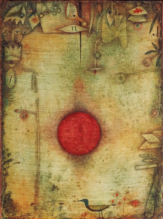
Paul Klee – Ad Marginem, 1930
Ad Marginem was painted in 1930. It was published by Penguin in May 1951.
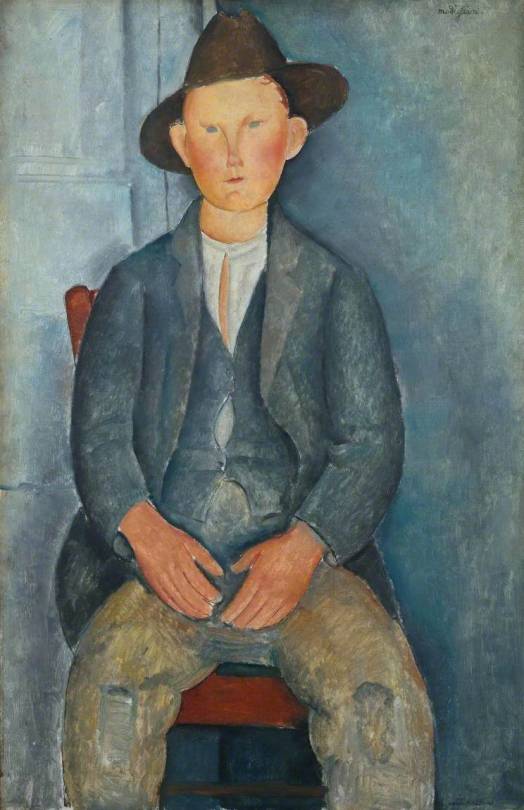
Amedeo Modigliani – Le Petit Paysan, 1918
Amedeo Modigliani – Le Petit Paysan was published as a Penguin Print in 1950.
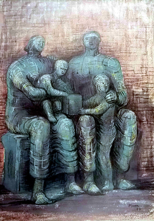
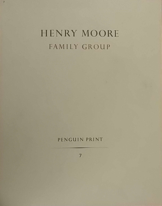
Henry Moore – Family Group, 1944
This work from 1944 looks at Henry Moore’s work earlier in the Second World War of Shelter Drawings, it is visually similar to those drawings and a sculpture he made on the theme. Towards the end of the war Moore made many drawings and sculptures of the family group.
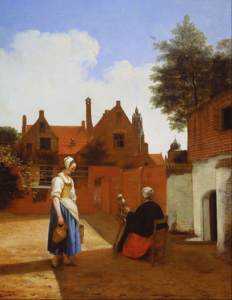
Pieter de Hooch – Courtyard in Delft at Evening- a Woman Spinning, 1656
A curiously odd picture to choose I think as it has nothing that is truly compelling to me about it. The scene is dull, the woman a little surreal but the maid with water jug looks repressed. It’s a sad image.
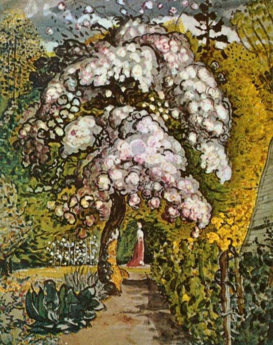
Samuel Palmer – Garden in Shoreham, c1830
An older picture here with Garden in Shoreham but it was part of the revival of interest in Samuel Palmer and his work. Both William Blake and Samuel Palmer were enjoying retrospectives at this point in time.
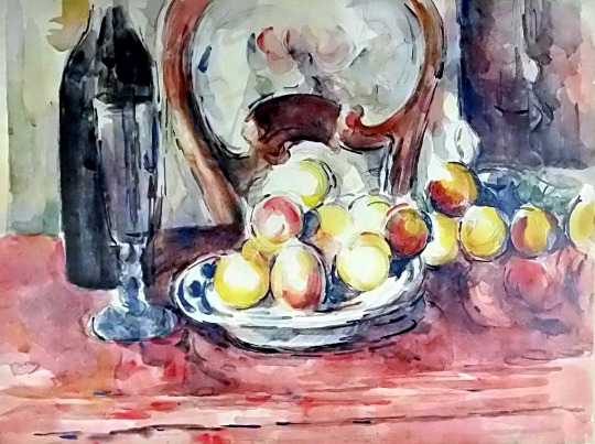
Paul Cézanne – Still Life: Apples, Bottle and Chairback. 1902-1906
One of the looser Cezanne pictures and not an oil like many of his Apple paintings. It is a lovely vibrant still life.
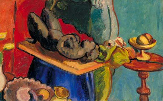
Matthew Smith – Still Life with Clay Figure, I, 1939
The Still Life with Clay figure was part of a series of works Smith made in the same studio space, all rather different to each other. This was the final Penguin print before they abandoned the scheme in 1952.