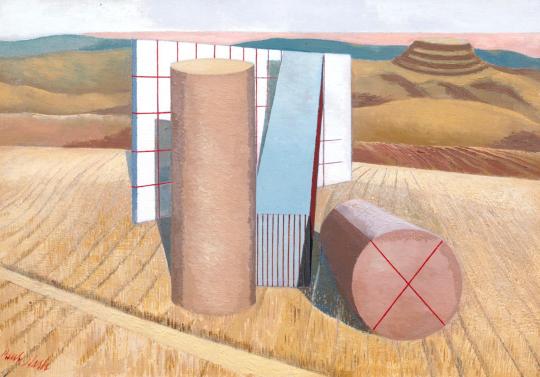
There are many examples where book design is uniform, most famously Penguin Book’s ‘Stripe’ design by Edward Young and perfected by Jan Tschichold in 1935. Bold and colourful they were enormously successful and cheap to make being paperback. The colours they used to coordinate the books also made selecting a book a quicker process due to your preference, Crime-Green. Fiction-Orange. Cerise-Travel. Blue-Biographies. Red-Drama.
There where many other sets imitating Penguin’s success, most of them short lived. Below is a range of book jackets that Edward Bawden and Eric Ravilious had been commissioned to do, but this time in hardback.
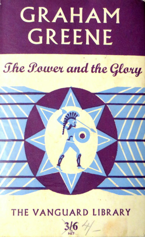
Edward Bawden & The Vanguard Library
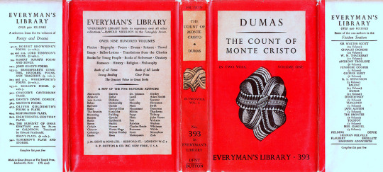
The Vanguard Library (not to be confused with Vanguard Books, a US series from the 1930s) was a joint venture published by Chatto & Windus in association with William Heinemann Ltd. The joint venture was probably to combine the backlist of titles under copyright to both of these smaller publishers. The series was in print for only a few years in the early 1950s. The series consisted of back catalog titles, mostly modern fiction, a smattering of more and less serious fiction. †
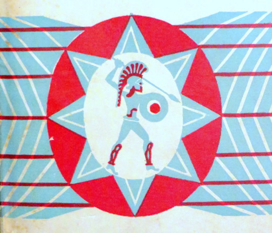
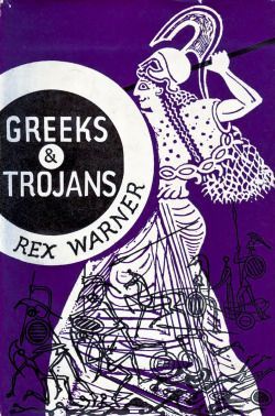
The dust jacket of the Vanguard Library books originally featured a standard design by Edward Bawden of a Trojan warrior on a geometric background.
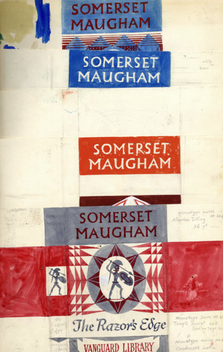
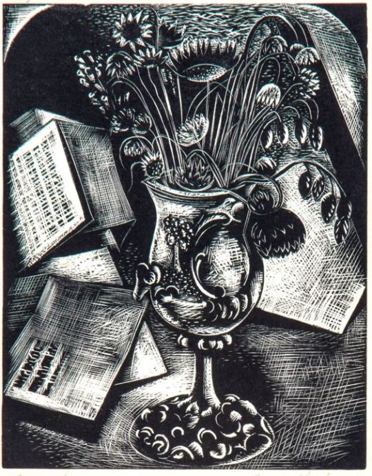
A page from Bawden’s Sketchbooks showing the designs being worked upon.
Although the series would go on with various designs and dust jackets, it is estimated that only twelve books with Bawden’s covers where issued, all in 1952 with his Trojan design but with colour variations.
The inspiration for the Trojan design is likely to have come from another book illustration commission Bawden had completed the year before, illustrating Rex Warner’s ‘Greeks & Trojans’.
Ravilious & Everyman’s Library The series Eric Ravilious was commissioned to re-design was to run far longer than Bawden’s. J. M. Dent and Company began to publish the ‘Everyman’s Library’ series in 1906. It was conceived in 1905 by London publisher Joseph Malaby Dent, whose goal was to create a 1,000 volume library of world literature that was affordable for, and that appealed to, every kind of person, from students to the working classes to the cultural elite.
An Everyman’s Library book with Ravilious’s designs to the cover 1935-45
After running for thirty years and likely with the new release of Penguin paperback books, the series went under a redesign in 1935. Eric Ravilious was asked to redesign the covers, end-papers and make graphic devices for each subject that would also be colour coordinated with the dust jackets, like penguin books were. Both publishers where aiming for the same thing, cheap books for the people.
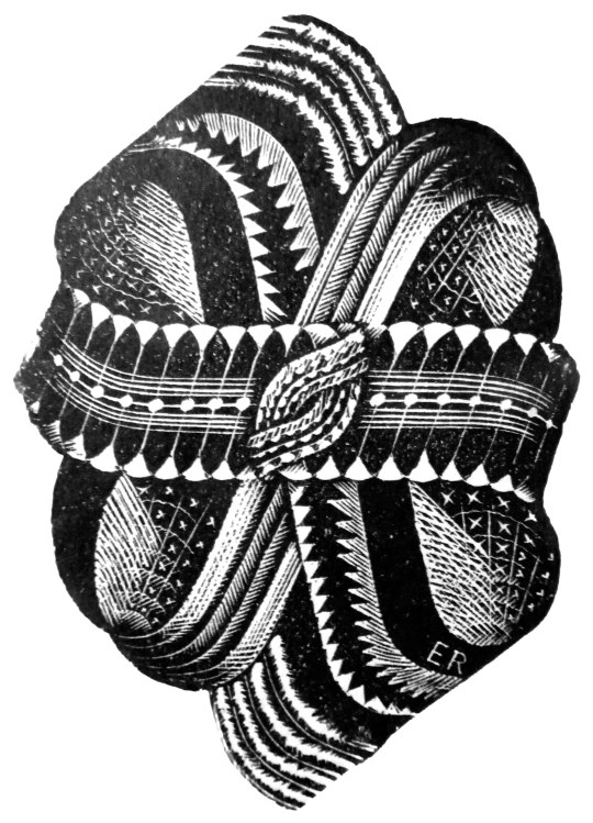
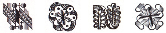
Above is the decorative knot used on the front covers of the books from 1935-1945. Signed ER in the corner. The carving on the top and bottom spikes seemed to lack some detail that would be expected from his normal standard. In two letters to his lover Helen Binyon, Ravilious writes about how the work is rushed and from all accounts takes three months from January to March:
3rd February 1935 …Dents have sent along a proof of the new book which is bad but not very bad, and I am hoping at the eleventh hour to do part of the job again. Unfortunately there is a hurry for it. ‡
21st March 1935
…Everyman is out at last, and seeing six new volumes this morning they looked alright – the one blue Chesterton even rather good. ‡
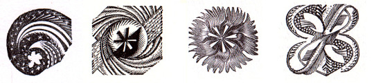
Below are a selection of some of the dust-jacket colours and devices used for the different subjects and featured on the title page of the book. Perplexingly the designs are not featured on the book spines:
Left to right is Oratory (Red), Reference (Pink), Romance (Orange), Poetry & Drama (Green).
Left to right: Science (Grey Blue), Young People (Bright Blue) Travel and Topography (Green), Essays & Bells-Lettres
Looking at the devices under magnification, there is every evidence that the engravings were made in a considerable hurry with engraved lines carrying on where they should have stopped and inadequate clearing of background details, none the less they represent a considerable imaginative achievement and are most effective. ‡
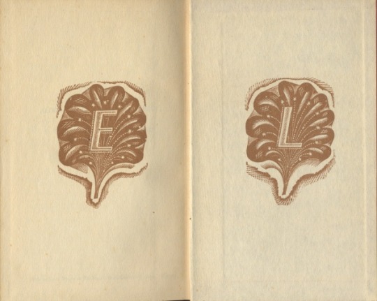
From 1945, the abstract knot was replaced on some volumes with a clam-shell like design overlaid with an ‘EL’, and from 1951 it was used on most jackets until the design was replaced in 1953.
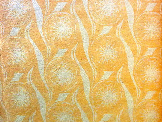
A section of the end paper, with a star like repeat design by Ravilious for the series, it was used from 1935-1953.
An alternative end-paper that was briefly used in 1935 but suspended for the star patterned paper above.
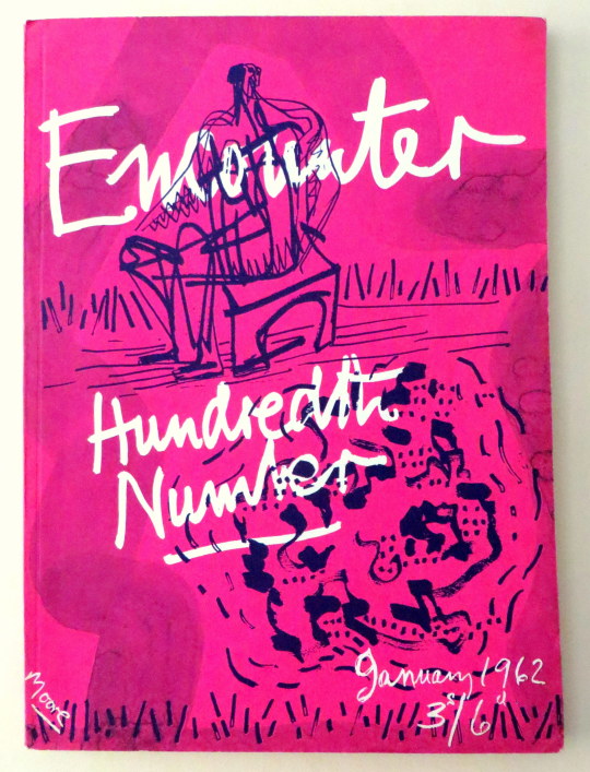
Following my post on Henry Moore’s cover for Poetry London, here is another cover Moore did, this time for Stephen Spender’s Encounter Magazine – The 100th Edition. As a magazine cover I think this rather futuristic for 1962. Pink with blue ink over and a wax resist for the text. Sadly this isn’t worth as much as Poetry London – it’s not lithographically printed for one, also Encounter had a larger audience and thus a bigger print run.
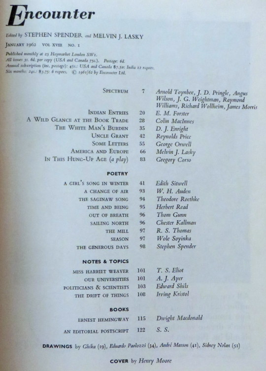
The magazine is full of illustrations and poetry, in this post I have picked out Auden and Spender’s poems below with some of the illustrations.
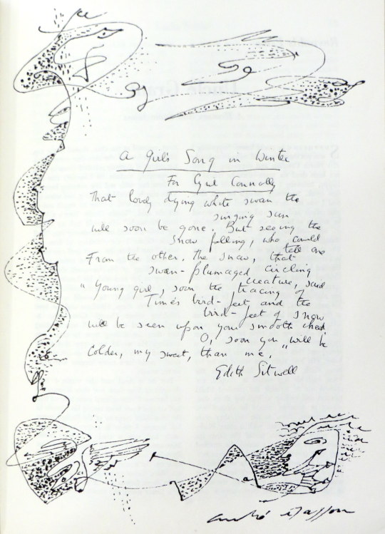
A drawing by Andre Masson
A Change of Air by W.H.Auden
Corns, heartburn, sinus headaches, such minor ailments Tell of estrangement between your name and you, Advise a change of air: heed them, but let The modesty of their discomfort warn you Against the flashy errands of your dreams.
To grow a sailor’s beard, don monkish garb, Or trade in an agglutinative tongue With a stone-age culture would be mollycoddling: To go elsewhere is to withdraw from movement; A side-step, a short one, will convey you thither.
Although its chaffinches, maybe, have learned The dialect of another river-basin, A fault transformed the local building stone, It has a priest, a post-mistress, an usher, Its children know they are not to beg from strangers.
Within its average elsewherishness Your name is as a mirror answers, yourself How you behave in shops, the tips you give : It sides with neither, being outside both, But welcomes both with healing disregard.
Nor, when you both return (you will, of course) Where luck and instinct originally brought you, Will it salute your reconciliation With farewell rites or populate your absence With reverent and irreverent anecdote.
No study of your public re-appearance Will show, as judgement on a cure demands, A sudden change in love, ideas or diet : Your sojourn elsewhere will remain wordless Hiatus in your voluble biography.
Fanatic scholarship at most may prove That you resigned from a Committee, unearth A letter from the Grand Duke to his cousin, Remarking, among more important gossip, That you seem less amusing than you were.
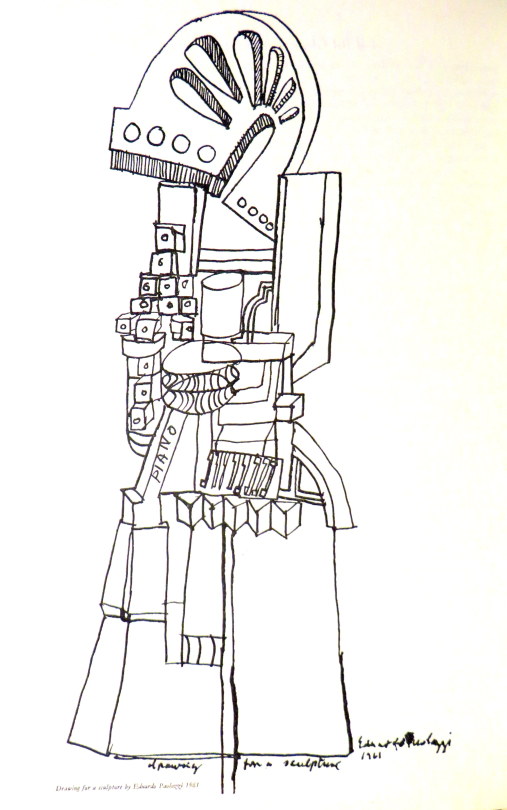
A drawing by Eduardo Paolozzi
The Generous Days by Stephen Spender. His are the generous days that balance Soul and body. Should he hear the trumpet Behind the sun that sends its thinning ray Penetrating to the marrow – At once one with that cause, he’d throw Himself across some high far parapet, Body die to soul down the sheer way Of consummation in the summons.
His also are the days when should he greet Her who goes walking, looking for a brooch Under broad leaves at dusk beside the path – And sidelong looks at him as though she thought His smile might hide the gleam she sought – He would run up to her and each Find the lost clasp hid in them both, Soul live to body where they meet.
Body soul, soul body, seem one breath, Or the twined shadows of the sun, his will, In these his generous days, to prove His own true nature only is to give. Wholly to die, or wholly else to live! Body to soul, and let the bright cause kill, Or soul to body, let the blood make love. Giving is death in life and life in death.
After, of course, will come a time not this When he’ll be taken, stripped, strapped to a wheel That is a world, and has the power to change The brooch’s gold, the trumpet scarlet blaze – The lightning in the bones those generous days – Into what drives a system, like a fuel. Then to himself he will seem loathed and strange Have thoughts yet colder than the thing he is.
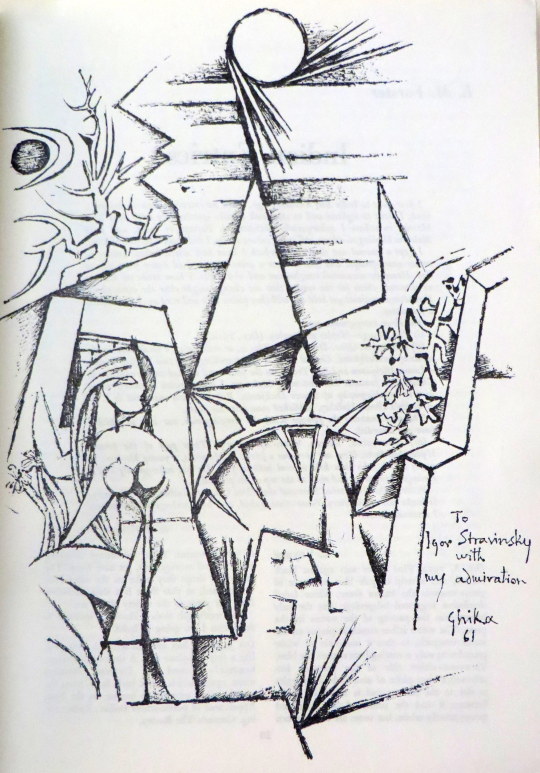
A drawing by Ghika
A drawing by Sidney Nolan
An advert for Guinness by Edward Bawden to the left
An advert for the Everyman series with the logo, designed by Eric Ravilious
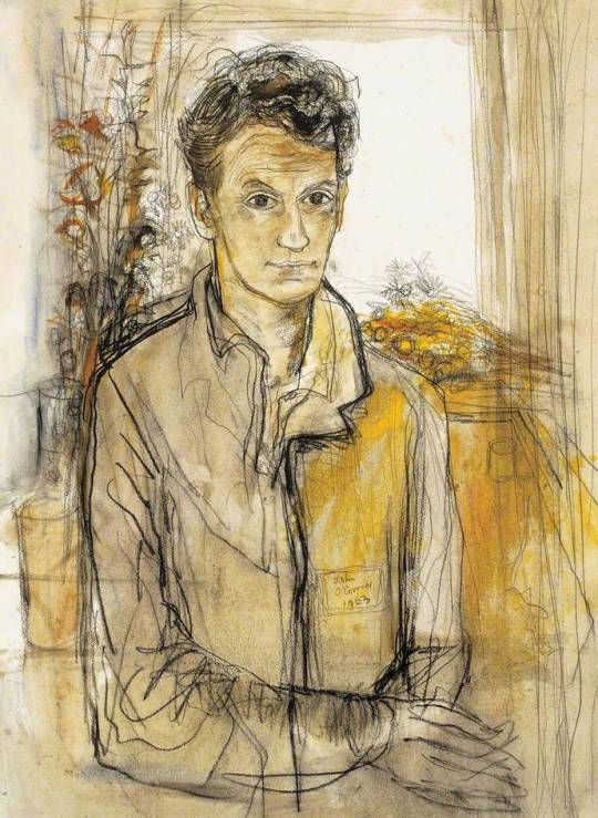
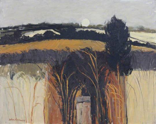
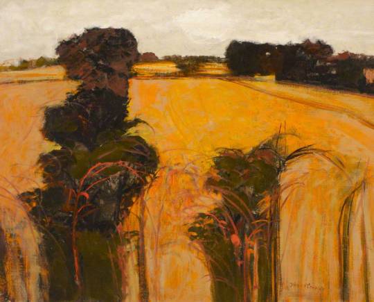
John O’Connor A.R.C.A. R.W.S, is today best known for his woodcuts, but during his lifetime he was also celebrated as a watercolourist. He was educated between the wars at the Royal College of Art in London under John Nash and Edward Bawden.
John O’Connor – Self Portrait, The Ruth Borchard Collection
A quote about Ravilious mentions O’Connor: Through his work and his teaching he became a very real influence both in design and wood engraving. One of his
students was John O’Connor. As an engraver O’Connor is an illustrator and very sensitive draughtsman. In style he is influenced by the Ravilious manner, with an emphasis on pattern and book design techniques. He has made a valuable contribution to book design through his technical experiments which include colour. O’Connor has
also brought wood engraving and other media together in the same work. These are essentially book designing experiments rather than experiments in engravings as such. †
John O’Connor was was born in Leicester in 1913. In 1930 he enrolled at Leicester College of Art before moving onto the Royal College of Art in 1933. His teachers at this time were Eric Ravilious, John Nash and Robert Austin. He graduated in 1937.
On a visit to Eric Ravilious’s home at Bank House, Castle Hedingham in Essex, O’Connor was captivated both by the directness of the wood-engraving technique, and by the simple domestic scene in which Ravilious engraved by a lamp in one corner of the room while his wife Tirzah played with their small son by the fire in another. It was due to Ravilious that O’Connor got his first commission of work aged 23, illustrating Here’s Flowers by Joan Rutter for the Golden Cockerel Press in 1937.
He taught at Birmingham and Bristol before serving in the Royal Air Force form 41-45. He arrived with the allied troops during the fall of Berlin, and sketched the ruined city. Back in England, but still in his flight lieutenant’s uniform, he met his future wife, Jeannie Tennant, who was a teacher, in Filey, North Yorkshire. They married in 1945, and spent their honeymoon cycling around the Yorkshire dales.
John O’Connor – Kersey Church, Suffolk
On being demobbed he illustrated two books for the Golden Cockerel Press and taught in Hastings for two years before moving to Colchester to become the head of the School of Art in 1948. He was affectionately known as ‘Joc’ to his students, using his initials. His colleagues included Richard Chopping, who designed dust jackets for the James Bond novels, his own former teacher John Nash, and Edward Bawden, one of the finest
British printmakers.
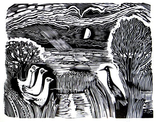
John O’Connor – Heron and Ducks
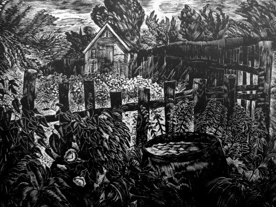
In 1950, O’Connor wrote and illustrated ’Canals, Barges and People’. The book had colour illustrations; wood-engravings by overprinting coloured linocuts. This was something of a revolution, as wood-engraving had till then been largely considered a black-and-white process.
The book also stood out as part of a Folk-art scene looking into the artistic past of Britain. Other writer/artists to be doing this would be Enid Marx, Barbara Jones and Noel Carrington. ’Canals, Barges and People’ was an immediate success, but only 1,000 copies were printed by Shenval Press and the colour made a reprint impractical and too expensive.
John O’Connor – Orange Field. Clare College, University of Cambridge
He saw his favourite painting places in Suffolk – the ponds, willows, briars and honeysuckle – disappear beneath the bulldozer and combine harvester. In 1964 O’Connor retired from teaching full time at Colchester, to concentrate on painting and engraving. He wrote various ‘How to’ books and taught part time at St Martin’s School of Art. In 1975 he and his wife, Jeannie, went to live by Loch Ken in Kirkcudbrightshire, where his love of light and water inspired his many watercolours and oil paintings. He took up a post teaching at Glasgow School of Art from 1977 to 1984.
John O’Connor – Chestwood Meadows, Lewisham Local History & Archives Centre
His engraving continued into yet another decade with the imaginative commission from Richard Ingrams for O’Connor to produce a monthly illustration for The Oldie magazine. These pieces – 36 of which were preserved in hard covers in People and Places – have all the sparkle and wit of the early work, and he only laid down his tools in 2001, a 65-year span which is surely unique.
John O’Connor’s last book of engravings, The Country Scene, a collection for the Whittington Press of his early and largely unknown work, was on the press when he died. As printing was about to begin, the instruction came from his hospital bed that colour was to be introduced wherever possible. Proofs were hurriedly made by his son, Mike, and taken to him, and delightedly approved days before his death.
John O’Connor – Little Garden in the Evening, 1947
In the 1950s and 60s, O’Connor exhibited at the Zwemmer Gallery, in London, and had many exhibitions throughout Britain. His work was purchased by the Arts Council, the Tate Gallery, the British Museum and the Contemporary Art Society, as well as by several local education authorities; it can also be found in the Oslo Museum, the Zurich Museum and at New York central library. He was elected to the Royal Society of Painter-Etchers and Engravers in 1947, and, in 1974, to the Royal Watercolour Society. He was an honorary member of the Society of Wood Engravers. He retired to Stable Cottage, Danevale, Castle Douglas.
He died March 5 2004
Bibliography 1937 – Here’s Flowers by Joan Rutter. Golden Cockerel Press
1945 – Together and Alone by Christopher Whitfield. Golden Cockerel Press
1946 – We Happy Few by Owen Rutter. Golden Cockerel Press
1950 – Canals, Barges and People by John O’Connor, reprinted 2014
1951 – An Essex Pie by T.M. Hope
1959 – A Pattern of People by John O’Connor
1967 – Landscape painting, reprinted 1977
1973 – Introducing relief printing
1971 – The Technique Of Wood Engraving 1979 – A View of Kilvert by John O’Connor. Foulis Archive Press
1989 – The Wood-engravings of John O’Connor
1990 – The Four Elements by Seamus Heaney. Whittington Press 1991 – Wood Engravings From La Vida Breve
1991 – Twins (Came with Matrix 11) by John O’Connor. Whittington Press.
1999 – People and Places by John O’Connor. Whittington Press.
2004 – The English Scene by John O’Connor. Whittington Press.
Selected list of Exhibitions 1954 Zwemmer Media Arts, London
1955 Royal Academy of Arts, London
1973 The Minories, Colchester
1976 The Minories, Colchester
1977 Graphic Work Retrospective, Glasgow School of Art
1990 Royal Watercolour Society, Bankside, London
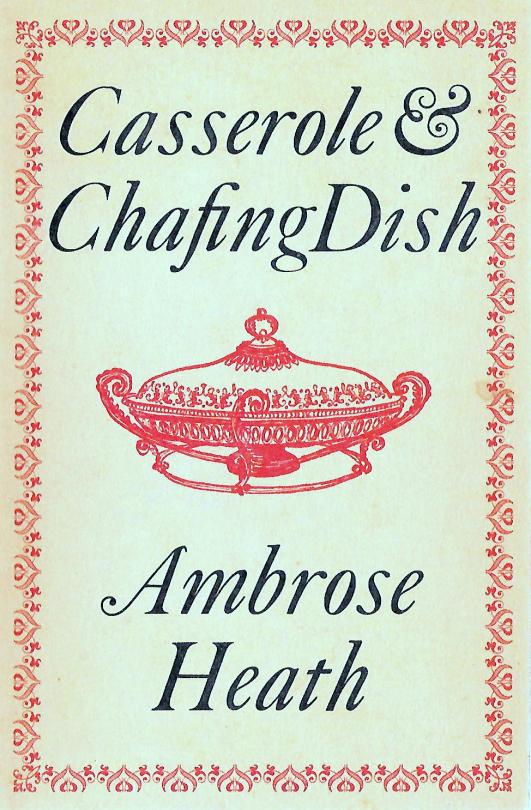
The books of Ambrose Heath illustrated by Eric Ravilious or Edward Bawden are worth a lot of money in mint condition. I was thinking that it was sad that people are only collecting those books, for the illustrations, not the recipes. But also there are so many other wonderful designs of books by Heath worth buying.
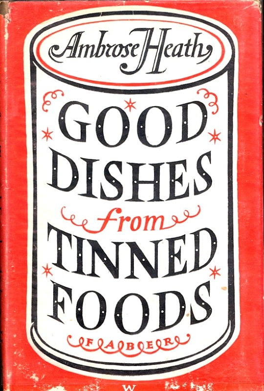
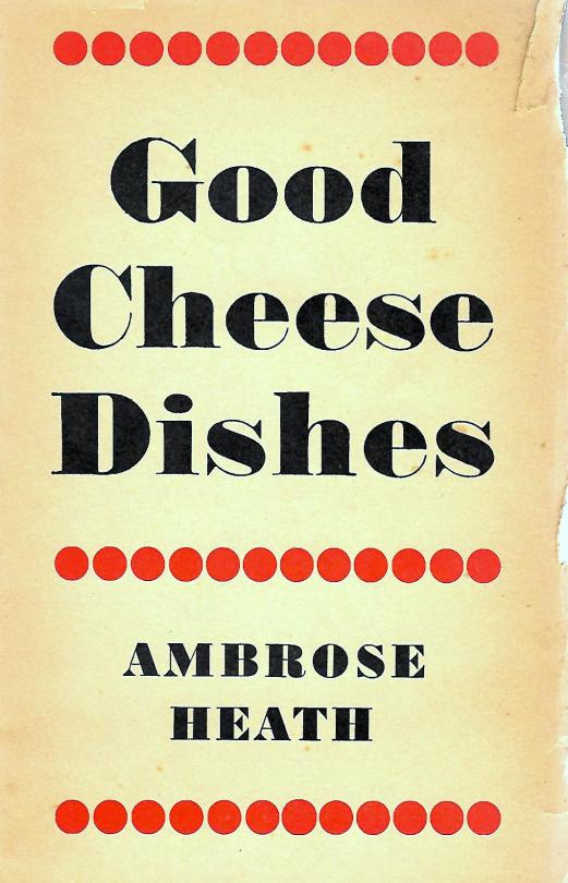
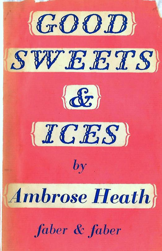
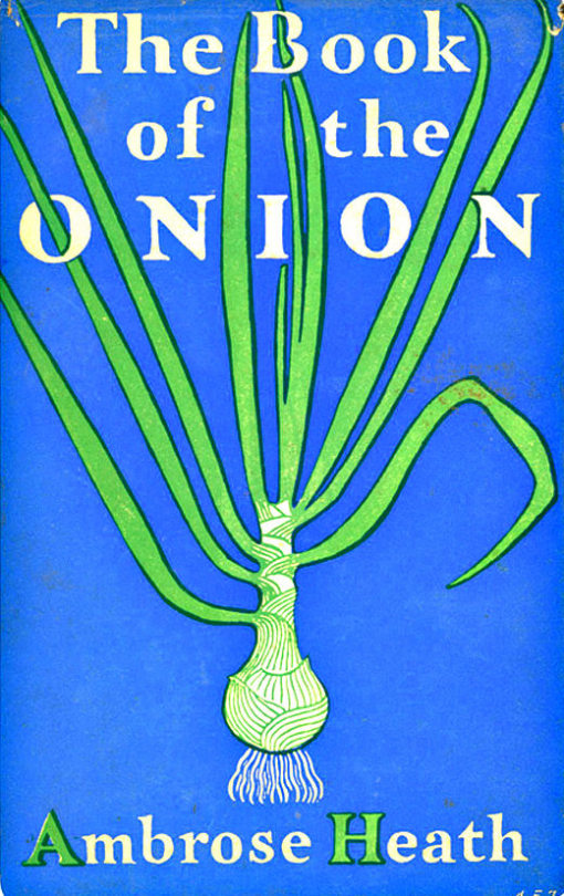
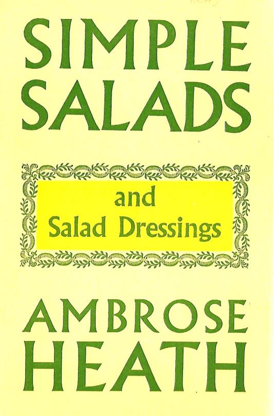
Ambrose Heath – Good Dishes from Tinned Foods – Faber & Faber, 1939.
I doubt that Heath had much say or interest in who illustrated his books or how, most of it seams to be same in the hands of Faber and Faber.
Ambrose Heath
Ambrose Heath was born Francis Geoffrey Miller on the 7th February 1891 in London. He was a journalist and food writer who wrote for newspapers including The Times and The Manchester Guardian, before becoming the food writer for The Morning Post.
In 1933 he published his first book ‘Good Food: Month By Month Recipes’ (illustrated by E. Bawden). It was a success and the year later another three books and reprints came. In the 30′s he wrote over 20 books and many more for publications and companies like Aga stoves. The most expensive of the cook books is undoubtedly ‘The Country Life Cookery Book’ (illustrated by Ravilious in 1937).
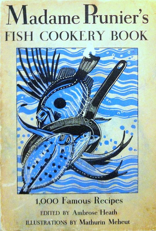
Heath wrote and translated more than one hundred works on food. In his lifetime he was best known for a translation of ‘Madame Prunier’s Fish Cookery Book’ that enjoyed many reprintings. He died on the 31st May 1969 in Surrey.
Ambrose Heath – Madame Prunier’s Fish Cookery Book – Nicholson & Watson, 1938.
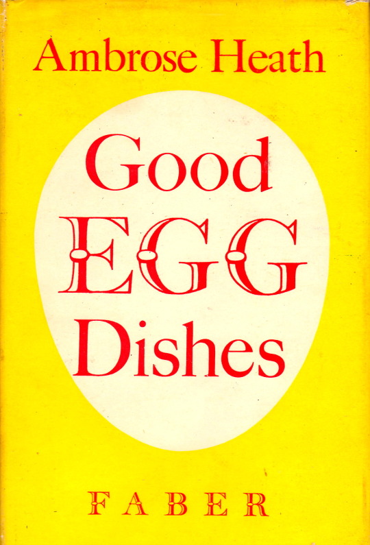
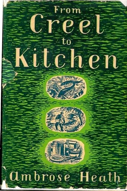
Below are a the beautiful covers of his other books without ER or EB. I think all the samples I have selected where published and thus designed by Faber & Faber.
Today it is hard to ignore the artist effect of Eric Ravilious, the tide of books on him alone prove his popularity. This is an article from ‘The Artist’ magazine, March, 1943. It ends with a short record of his death, some weeks before. I thought it was interesting that its intention was a review of his life and works but became an obituary.
Eric Ravilious by Richard Seddon Artists of note: Number 97. The Artist Magazine. March 1943
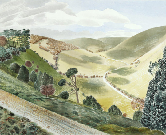
Eric Ravilious – The Causeway, Wiltshire Downs, 1937
Paul Nash was the first to notice the work of Eric Ravilious. This happened when Ravilious was a student of the Royal College of art under the instruction of Nash in the school of design. His wood engraving impressed Paul Nash as being worthy of special attention, and it was on the latter’s introduction that Ravilious became a member of the Society of Wood Engravers. In the society’s exhibitions Ravilious’s engravings immediately drew attention from publishers and their agents. Ravilious illustrated several books and was soon established as a book illustrator of exceptional status.
Between that time and the present he has consolidated a reputation as a leader of contemporary art; not as a leader in figurative or influential, but rather in the most academic sense, of the advancement of research and knowledge. He does not supinely follow the present tendencies and work in a certain manner merely because that manner can be accepted as the logical outcome of the particular form of art and aesthetics accepted at the moment in the country. He does not look for what is being done nowadays, in order to do likewise.
Leadership in art, as in anything else, calls for the usual hackneyed attributes: courage, self-confidence, faith in purpose, and so on. But in art, somehow, as in anything abstract, it needs enthusiasm enough to keep it up in the face of that inexplicable hostility that people show in face of anything that is ‘new.’
In feeling and temperament the work of Ravilious is very English. Ravilious, unlike so many Englishmen, does not try to paint as though he were a Frenchman. His work has its roots deeply sunk into the life and the countryside and the culture of England. His water colours are the lineal descendants of the English eighteenth century school of water colour than in its time gave England a brief reign as a country important in the world’s art, a reign that lasted until the French impressionists wrested the sceptre for France, a reign into which, it is felt, England was re-entering at the beginning of this war, through the excellence of the contemporary school of English landscape, of which Ravilious is one of the most important members.
That, because of his very full knowledge of the history and methods of English art and design, he carries on the English tradition, is apparent in his work in any of the media he employs. His wood engravings revive and extend the essential tradition of Thomas Bewick and the English eighteenth century wood engravers. In his water colours he takes up the story where Peter de Wint, Paul Sandy, John White Abbott and their contemporaries left off, and carries it a stage farther, in the life of modern knowledge. Examples of his pottery design that he carried out for Wedgwood can take their place in the Victoria & Albert Museum, among the original products of Josiah as if by hereditary right.
It is not possible to select one or two influences that can be credited with the moulding of Ravilious’s vision. After leaving school in Eastbourne, he attended Eastbourne School of Art, from where he went up to the Royal College of Art, in London. There, under principal-ship of Sir William Rothenstein, he was tutored by some of the most important contemporary artists in the country. Naturally, the powerful influences of such men must have affected his outlook; indeed, they did. In addition he received, asI have said, an exhaustively comprehensive education in art and design, from which soure he derived the solution of those problems of expression that he always seems to face with courage and solve with ingenuity.
He might easily have been tossed for ears upon a sea of conflicting influences; if so, it happened when he was at the R.C.A., and the process was completed by the time he began his career as a practising artist. At least, no indecision has ever shown itself in the work of his maturity. that he owes something, as all artists, to skilful pilotage, can be safely assumed, but that he emerged with an original style is patently a logical result of his own personal outlook.
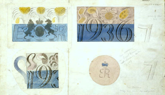
Eric Ravilious – Design for Coronation mug for Edward VIII, 1936.
He is thirty eight, and therefore can be said to have not yet reached the peak of his artistic maturity. As regards his work, whatever the medium he invariable approaches a subject with an open mind and embodies in the work, whether it is a wood engraving, a water colour, ceramics, or fabric design, at least one idea that arises from the needs of that particular job and no other. Of course he refers in his mind as he is thinking it out not only to history but to past works of his own to help in solving the problem of the moment, but he avoids any tendency to repeat successes of the past ad nauseam, giving the same colours, the same subtleties, the same textures and so on, whether or not they are the right ones for the present job. I stress the fact that he does not walk in such a manner because very many artists, both distinguished and otherwise, do so.
Ravilious never rests on his laurels. It cannot be said about a sequence of his work as it can of the work of other artists that, having seen one, you have seen them all. Though they are all built around the personality of the artist, each of his productions is sufficient unto itself.
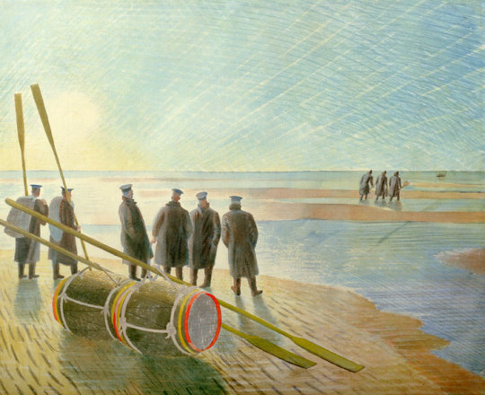
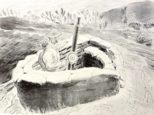
Eric Ravilious – Rendering Mines Safe, 1940. (Now called Dangerous Work at Low Tide)
In a Ravilious exhibition, the paintings are, in the truest sense, variations on a theme and not repetitions. It is said that there are four different ways of looking at a picture, Firstly the observer might stand away and savour the emotional content and the subject matter.Secondly, he might appreciate the purely academic appeal, such as the colour harmony and the broad lines of the composition. Thirdly he might go near the picture and closely examine the technical minutiae: the brushwork, the qualities of the surface, the interplay of ‘fat’ and ‘lean’ painting, and so on. Fourthly, he might scrutinise, analytically, the patterns achieved by the painter, by the use of his range of different ways of coving a surface and of filling in a space.
The Victorian painters appealed to the first two methods, and many contemporary schools solely to the last two. A few contemporary painters, including Eric Ravilious, appeal to all four. Ravilious particularly appeals to the last. His textures and patterns, whatever the medium, are an important feature of his work. He composes as a rule within a tight linear framework, making spaces of carefully contrasted size and shape which he fills with textures that derive partly from the intrinsic textures of the original of the subject and largely from his own fertile imagination. The settings for his landscape painting have been the Downs and coast of Sussex, and localities in Essex, Wiltshire and Wales.
Apart from his war painting he confesses to a tendency to paint in sequences: groups of broken-down tractors and old cars and buses in fields, the discarded machinery of Essex. He has painted a series of Sussex hills, a set of chalk figures (such as the Aylesbury White Horse), a set of lighthouses, rowing boats, beds, beaches and greenhouses. Ravilious was educated at Eastbourne Grammar School. He left the Royal College of Art only to return in 1929 as instructor in design, which position he filled until 1938. Whilst a student at the college he and Edward Bawden completed a well known mural decoration in the refreshment room of Morley College, which was destroyed by a bomb.
Other important mural decorations by Ravilious are those in the circular room at the L.M.S. Hotel at Morecambe and the ceiling decorations in the dining hall of the new Merchant Taylors’ School. Since 1926 he has illustrated books for the Kynoch Press, mainly by wood engravings. His engravings have also illustrated Volume I of ‘Signature’ and Gilbert White’s ‘Selborne.’ From 1937 to 1939 he designed pottery for Wedgwood. One of the best known of these designs was the Coronation Mug. His designing for glass he dismisses as a mere gesture; as a gesture it was brief, but effective.
Exhibitions of the work of Ravilious were held at the Zwemmer Gallery in 1934 and 1937, and one at Tooth’s in 1939. Three of his water colour drawings are in the Victoria & Albert Museum, and there are others in the public galleries. At the beginning of the present war he was offered and he accepted an appointment as official war artist to the Admiralty. He holds with the rank of hon. captain in the Royal Marines.
Eric Ravilious – Lewis Gunner
Since this article was written, Eric Ravilious has been posted as ‘missing’. After spending a period in Iceland, in his capacity as official war artist, he life that island by plane and has not been heard of since. Thus ends the career of a very fine artist, whose last efforts were devoted to recording events connected with the war – records which will go down to posterity, and which will keep his memory green, especially in the art world which respected him for his achievements. He was a sane progressive, sound in judgement and method.
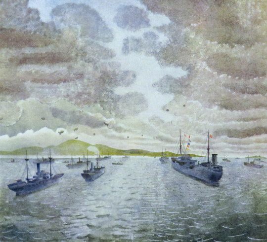
Eric Ravilious – Convoy From Merchant Ship At Anchor, 1943
After buying the etching below and looking up the artist and location, it struck me how the uncovering and preservation of British ancient monuments in the twentieth century, together with the age of motoring bought artists to translate these places into art.
Chalk Men:
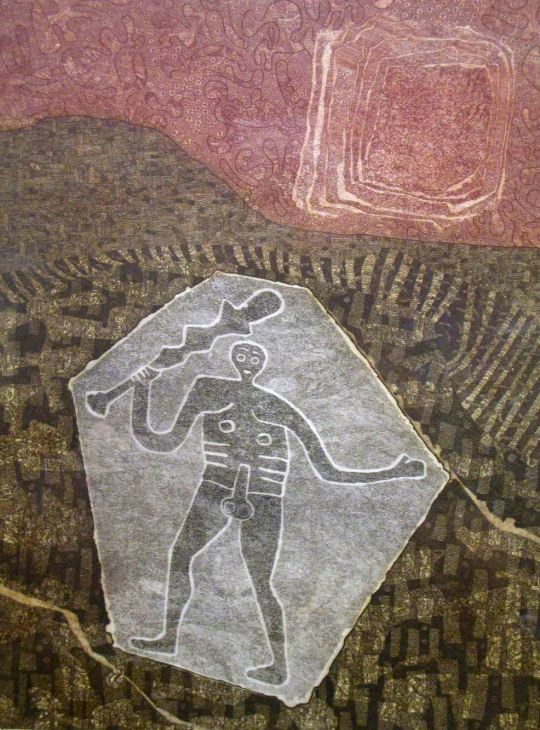
John Grigsby – Cerne Giant
Cerne Abbas is a parish just about eight miles north from Dorchester, in Dorset, England, where, as in the etching above, a human figure has been cut into the chalk hillside. The figure, generally referred to as a giant, is the outline of an ithyphallic man carrying a club in his right hand. At about 55 metres high and 51 metres wide it dominates the valley below. Above the Giant is another landmark, the Iron Age earthwork known as the “Trendle” or “Frying Pan”. The carvings are formed by outlines cut into the turf about 2ft deep, and filled with crushed chalk. The construction of the Wilmington Giant is much the same.
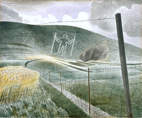
Eric Ravilious – Wilmington Giant, 1939.
“The Long Man of Wilmington and the very phallic Cerne Abbas Giant are of unknown age and controversy still rages over the date of the latter in particular”. †
The Ravilious painting is a watercolour using white resist makes the Giant Glow out from the paper’s natural colour, as do his cross-hatched, almost engraver brush-strokes of differing tones of colour.
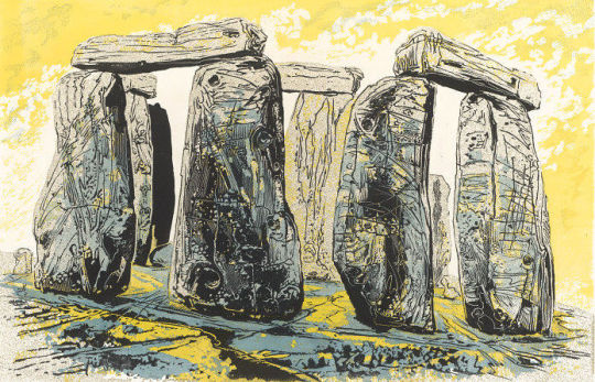
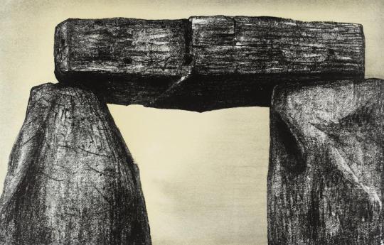
Stonehenge:
Gertrude Hermes – Stonehenge, 1959.
Henry Moore – Stonehenge, 1973
Above two sculptors draw and engrave their perception of Stonehenge. Archaeologists believe Stonehenge was constructed from 3000 BC to 2000 BC. The surrounding circular earth bank and ditch, which constitute the earliest phase of the monument, have been dated to about 3100 BC. Unlike the chalk men, there have been writings of Stonehenge from most of recorded time. The earliest record of the chalk giants is from the 17th century.
Moore on Stonehenge: I began the Stonehenge series with etching in mind, but as I looked at, and drew, and thought about Stonehenge, I found that what interested me most was not its history, nor its original purpose – whether chronological or religious – or even its architectural arrangement, but its present-day appearance. I was above all excited by the monumental power and stoniness of the massive man-worked blocks and by the effect of time on them. Some 4000 years of weathering has produced an extraordinary variety of interesting textures. ‡
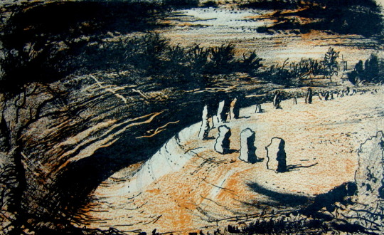
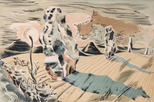
Avebury:
John Piper – Avebury, 1944
Paul Nash – Landscape of the Megaliths, 1937
Above are both the avenue and the stone circle of Avebury painted in different styles by both Nash and Piper. John Piper’s image was for a book on Romantic British Poetry and he is making use of limited use of colours in the printing process of the book to make the dark-to-light drama washed with umbers. Nash’s lithograph is one of his less surreal of this working time period, unlike the image below where Nash project’s his own vision for modern monoliths. They maybe hay-bails or car grills but these are, to Nash, the monoliths of today.
Paul Nash – Equivalents for the Megaliths, 1935.
With Nash it’s best to use his own words about why he came to paint ‘Equivalents for the Megaliths’
These groups (at Avebury) are impressive as forms opposed to their
surroundings both by virtue of their actual composition of lines and masses and planes, directions and volumes; and in the irrational sense, their suggestion of a super-reality. They are dramatic also, however, as symbols of their antiquity, as hallowed remnants of an almost unknown civilisation.
In designing the picture, I wished to avoid the very powerful influence of the antiquarian suggestion, and to insist only upon the dramatic qualities of a composition of shapes equivalent to the prone or upright stones simply as upright or prone, or leaning masses, grouped together in a scene of open fields and hills. – Paul Nash – Letter to Lance Sieveking. May 1937.
† The Cambridge Illustrated History of Prehistoric Art. p116 9780521454735 Paul Nash Places. 9781853320460 ‡ Henry Moore. Writings and Conversations. p299 978-0520231610
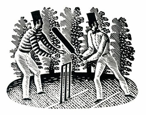
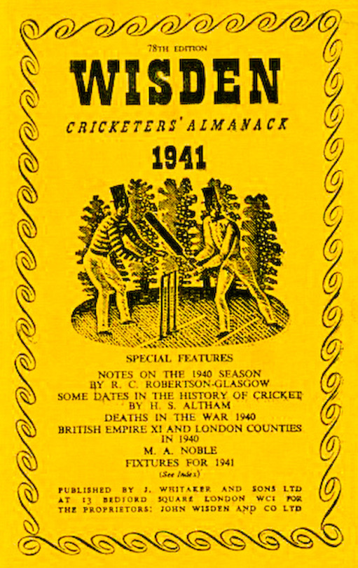
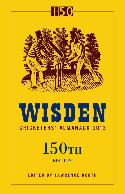
In 1938 typographer and spy, Robert Harling commissioned Eric Ravilious to produce an engraving for the Wisden Cricket Almanac. Harling knew Ravilious had a “special enthusiasm for the game” and wrote: “His engraving of mid-19th century batsman and wicket-keeper remains an ideal graphic introduction to one of England’s most durable publications.”
Over 75 covers have been published since 1938 with the Ravilious batsmen on the cover. The engraving briefly lost its cover-star status in 2003, when a photograph of Michael Vaughan relegated it to the spine of the book’s jacket, incurring the displeasure of traditionalists.
It was immediately restored to the cover in 2004, while staying on the spine as well. And so, for ten editions now, including this one, Ravilious’s creation has been more visible than ever.
Whatever the origin, we do know for certain that Ravilious played cricket, if at a lowly level. In 1935, he wrote of turning out for the Double Crown Club, a dining club for printers and book designers, against the village team at Castle Hedingham in Essex, where he lived for a while. He said the game went on “a bit too long for my liking and I began to get a little absent-minded in the deep field after tea”. He made one not out in defeat, and bowled a few overs. “It all felt like being back at school, especially the trestle tea with slabs of bread and butter, and that wicked-looking cheap cake.” He went on to record the comment of the Double Crown captain Francis Meynell that his bowling was “of erratic length, but promising, and that I should have been put on before. Think of the honour and glory there.”
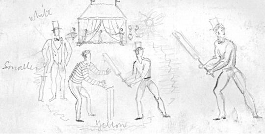
Sketch design by Ravilious for Wisden.
In another game at Castle Hedingham, with his wife Tirzah (a talented artist herself) “in charge of the strawberries and cream”, Ravilious talked of hitting three sixes. “It is, you might say, one of the pleasures of life, hitting a six.”
Ravilious saw only five of the Almanacks to carry his engraving. Yet his work — in many ways a distillation of Englishness — lives on.
John Wisden’s 187th birthday by Google doodle – 5th September 2013.
PS: Before the second world war, Robert Harling taught at the Reimann School of Design in London, where one of his pupils was the young émigré Alex Kroll, later to join him as art director on House & Garden. A keen weekend sailor, Robert took part in the wartime evacuation of British forces at Dunkirk in May 1940, which he described in his book Amateur Sailor, published in 1944 under the pen name Nicholas Drew. The poet John Masefield praised the book as the best eyewitness account of Dunkirk ever written. Robert then joined the Royal Navy, first serving on mid-Atlantic convoy duty. Again, he gave a marvellous account of this experience in his atmospheric memoir The Steep Atlantick Stream (1946).
His friend Ian Fleming was responsible for Robert’s sudden transfer from anti-submarine warfare to the newly constituted Unit 17Z, given its name by Fleming himself and headed by Donald McLachlan. This small and, to Robert, highly congenial outfit, soon to be known as Fleming’s Secret Navy, was responsible for day-to-day liaison between the naval intelligence division and the British war propaganda teams.
Secret navy assignations, involving solitary missions to the US and the far and Middle East, appealed to the cloak-and-dagger instinct in Robert. The fastidious James Lees-Milne described him as “a rough diamond”. So, to some extent, he was. Wartime experiences cemented Robert and Fleming’s mutual admiration. Robert is depicted fondly in The Spy Who Loved Me as the make-up man on the Chelsea Clarion — “a man called Harling was quite a dab hand at getting the most out of the old-fashioned type faces that were all our steam-age jobbing printers in Pimlico had in stock.”
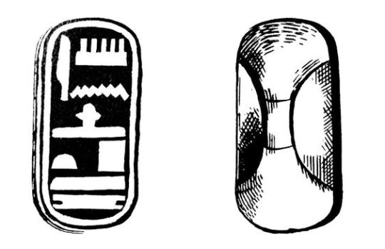
An essay from The Woodcut No.1 An Annual. In its beginning engraving had certain practical uses. One of these was the cutting of hieroglyphics on wooden stamps for the purpose of producing impressions on clay. The cuts were made both in intaglio and in relief. Blocks of this kind, for stamping bricks, where employed by the Egyptians and in Babylon. The accompanying illustration represents a wooden block found in a tomb at Thebes.
Considering these examples of an early method of printing, it is obvious that it was used in other directions, and the inference is that blocks were cut not only with a directly useful intention, as for impressing clay and similar substances, but with a decorative purpose in marking cloth. From the moment the simple craft flowed over from its utilitarian groove it assumed the nature of an art.
That is not to deny that the craft of cutting hieroglyphics may produce consummate art, but a skilled craftsman is not of necessity an artist. Therefore, I date the birth of the art of engraving on wood from the time the craft developed a consciously decorative purpose, and the first-fruits of this were probably in the nature of patterns marked by dyes upon cloth.
It was not until centuries later that the art took on a pictorial significance: even then, for many years after its application to books as an accompaniment to text, its decorative or pattern value was still its true importance. With the increase of skill, however, this quality began to diminish.
The discovery of chiaroscuro only hastened its disappearance, and once the conception of wood engraving as a means for reproducing drawings rather than creating prints was firmly rooted, the decorative value of woodcuts became a matter of accident, dependent, indeed, upon the nature of the drawing translated. Thus, although the art of engraving was already doomed, its spirit has perished long before its ultimate decay into a job for skilled mechanical hacks.
With the revival of wood engraving in recent times, artists have instinctively explored the decorative possibilities of the art. This is only natural in an age interested in the rediscovery of the fundamentals of aesthetics. The woodcut re-seen as an end in itself, and not a means to some other end, discovers itself as a very pure form of art, with its sculptural character, its simple expression in black and white, its direct technique and straightforward application. Of all the arts which are crafts it is the most autobiographical. Indeed, if one may account for the abuse of wood engraving for commercial reasons, it is still difficult to understand the neglect it has received as a means of self-expression. But there is always the dangerous seduction of skillfulness to be taken into account. Hitherto this has been a temptation mainly for the craftsman. To-day it is likely to prove the artist’s snare.
Block Print engraved by Doris Scull
Because, as an engraver, I fear such a danger invading the art I practise I have become lately more interested in woodcut patterns than in woodcut pictures. It is always a relief to be rid responsibility of representation. To concern oneself solely with the problem of formal relationships is to escape into a new world. Here one is in touch with pure reality, and the business of make-believe gives place to other considerations in many ways infinitely more satisfying. I would maintain this about all forms of plastic art, but I feel it to be acutely applicable to engraving on wood. Wood seams to yield to the evolution of an abstract design or a decorative arabesque as stone excites the sculptor to the creation of pure form. For it is the glyptic character of engraving on wood which is its peculiar charm, so that the more the engraver cuts into his block — I do not mean literally in point of depth, in the fractions of an inch — the greater his sense of contact with the reality of his expression.
Unfortunately, the scope of this article may not be extended to a consideration of abstract design as expressed in wood engraving, rather it mush be confined to a cursory examination of a few instances of pattern making by means of wood blocks as practised to-day in England.
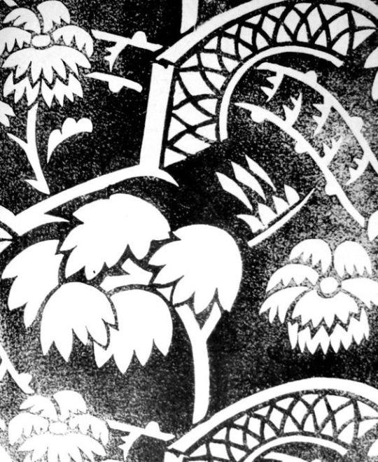
Design and cut on wood by Enid Marx for The Curwen Press
The artist who has worked most consistently and successfully in this direction is Miss Phyllis Barron, who for many years now has produced block-printed materials for dresses and furnishing, using a narrow range of carefully chosen and tested dyes of rather sober but subtle colours on linen, cotton, silk and velvet. Miss Barron, being a true artist as well as a crafts-woman, has created something very definite: in my opinion, as valuable as any contribution to contemporary art in this country. With her are working Miss Dorothy Larcher and Miss Enid Marx. The former is a design of equal ability with Miss Barron, with a personal invention distinguishing all her output. Miss Marx, in one sense, is hardly more than a recruit, but judging by her first efforts one may predict a most interesting future for her art. In the first place she is attempting in her patterns a three-dimensional design.
This is a expedient often resorted by the French with amusing results, but our own textile designers seem generally content with the flat arabesque. Miss Marx’s designs have the character of a fugue in music. Another quality which distinguishes them from the majority of textile designs is the peculiarly rigid movement of the units, which are not conceived in fluid waves or undulations, or as an efflorescence, but are more like the delicate architecture of birds, building with rather awkward shaped sticks.
Design and cut on wood by Eric Ravilious for The Curwen Press
It is difficult to proceed farther in discussing the making of patterns without confessing that they are not all cut on wood. Wood is rapidly becoming supplanted by linoleum, and there is no doubt the latter substance has many advantages for the hand block printer. It is quicker and easier to cut, easily replaced, and there is not the danger of warping, which the wood block so constantly presents. Its disadvantages is its unpleasant pulpy texture, which does not allow of fine engraving, and at the same time is a little too easy to cut. There is however, so much excellent work being done in this medium that is must be recognised here.
The most recent group of designers and engravers on linoleum for producing textile patterns is that established by the energy and resource of Mrs. Eric Kennington (nee Edith Celandine Cecil), in a workshop by the river at Hammersmith. The chief craftswoman here is Mrs. Gwen Pike, a most experienced and able engraver and printer. The works, known as Footprints, reproduce patterns by their own staff, and also designs contributed by independent artists.
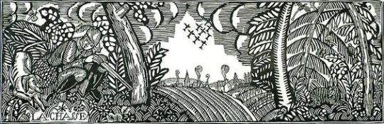
Finally, there remain to be considered two new fields of activity for the woodcutter. These are the making of wallpapers and papers for book covers by means of printed blocks, These has been recently a revival of interest in wallpapers, especially in Paris, Such distinguished artists as Madame Marie Laurencin and Monsieur Dufy have been in demand, and produced some charming designs. No doubt there are other artists who should be mentioned, but their omission is due to my ignorance, not my neglect.
Raoul Dufy — La Chasse (The Hunt) c1910
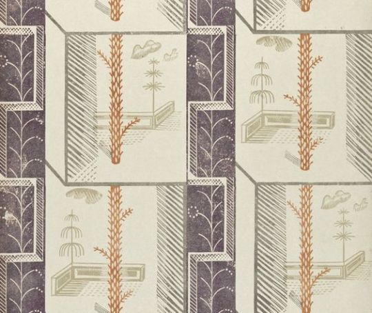
In England I am aware of only one designer who has turned his attention seriously to engraving wallpaper patterns. This is Edward Bawden, whose invention in this direction has produced papers of real distinction and originality. I need scarcely add that they have either been ignored or rejected by every manufacturer who has seen them.
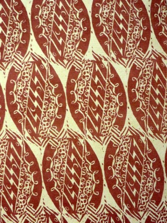
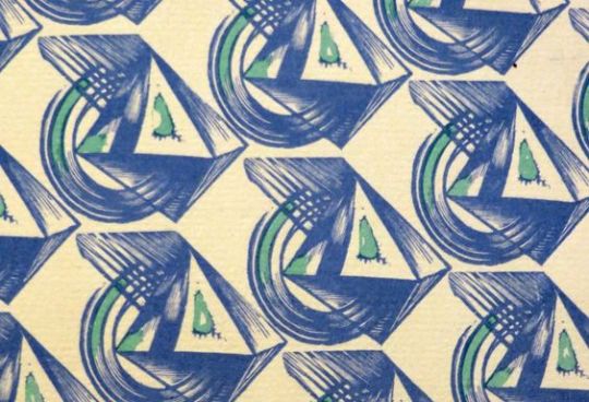
Node: Linocut. One of the four ‘Plaistow Wallpapers’ designs commissioned by Curwen Press in 1932
In the narrower field of book cover patterns designers are more fortunate, since there is not only greater demand for ‘original’ papers, but the cost of production is small. Also we have at least one or who enlightened Presses in this country, although our manufacturers remain benighted. Even so, the industry is minute.
Compared with the production of patterned papers on the Continent, more especially in Germany and Austria, the English output is confined to the work produced by the enterprise of the Curwen Press, which continues doggedly to give encouragement to the two or three artists interested in this branch of design. Alas” that is our trouble in England — the general lack of intelligent encouragement given to her artists for any form of activity, small or great, outside of picture-making.
In England we are still prone to cling rather sentimentally to the idea of the Fine Arts, and think it is a little undignified, or at least unusual, for artists to concern themselves with anything but painting and sculpture, with the result that, for the most part, such arts as interior decoration, stained-glass work, theatre décor and textile designing are left in the hands of the competent but uninspired. The British contribution to the Paris Decorative Arts Exhibition was a shocking enough reminder of this fact, and may serve, perhaps, for as good a reason as any why we should begin to consider patterns as important as pictures.
Paul Nash. 1927
Paul Nash: Woodcut — ‘Bouquet’, 1927
It is important to mention that the bold praise of the Curwen press was due to Paul Nash being the head printer there for some years, and this essay being printed by the Curwen Press in 1927. This is not to say there were not ahead of the other printers and designers, but it is always important to review essays with any bias that seeps in the ink.