This post is a light introduction into Edward Bawden’s early war work and paintings, before he was stationed to the Middle-East.
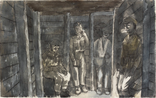
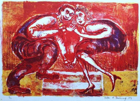
Edward Bawden – In an Air Raid Shelter, Dunkirk – Bombs are dropping, 1940.
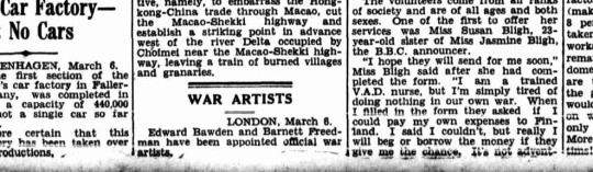
On Thursday, 7th March, 1940, three days before his 37th birthday, it was announced in the British papers that Edward Bawden and Barnett Freeman were to become Official War Artists on behalf of the British War Office.
Newspaper with the small announcement under ‘War Artists’.
In the first days of April, Ardizzone (Edward) and Bawden took rooms for a while in the hotel Commerce in Arras, fussed over by a shared batman. They enjoyed the local wine and hospitality, before being billeted separately. Arras was dour, small and grey, It was also the GHQ for the British Army in France. †
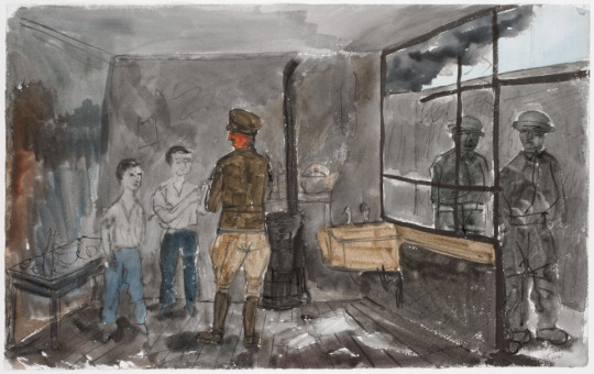
Edward Bawden – Boys Serving Coffee, Dunkirk, 1940.
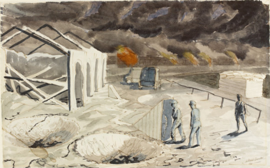
From the outset Edward Bawden had wanted to be close to the action: ‘Mr Bawden … would like to get to the front and live in close touch with the RAF.’ In the event he began his time in France with the 2nd Northampton Regiment, rather than the air force.The Northamptons, he found, were ‘nice, simple fellows … who tear about wagging their tails, fetching sticks and retrieving balls.’ †
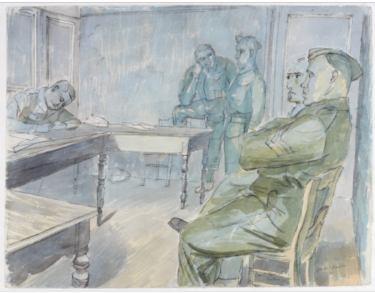
The war artists found themselves being toured around by a Conducting Officer, who would choose the suitable sites and subjects. Once, Bawden was placed under arrest as he was painstakingly drawing a gun. On another occasion he was able to sit in on a court martial and sketch. †
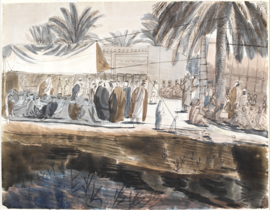
Edward Bawden – A Court-Martial, Halluin, 1940.
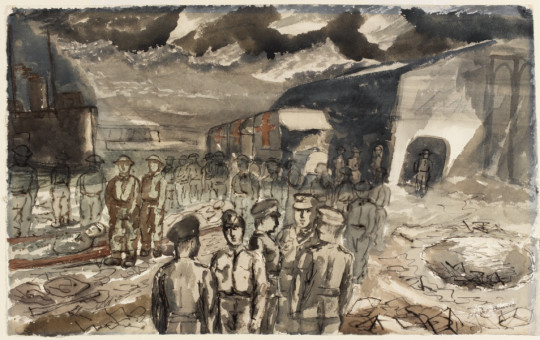
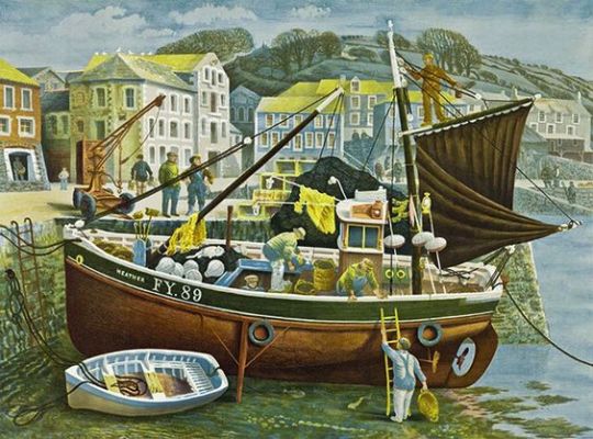
On his way to Dunkirk, Bawden has rolled up his paintings in a cylindrical tin which he clutched under his arm. †
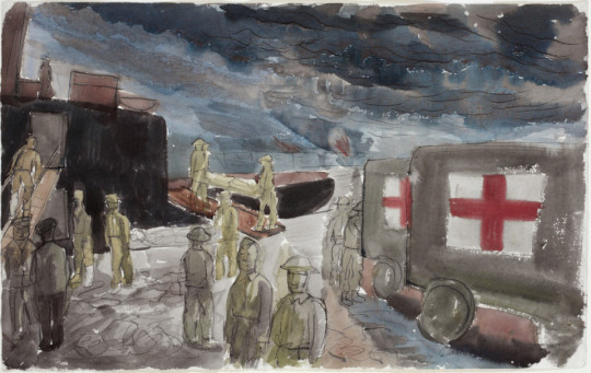
Edward Bawden – Embarkation of Wounded, May, 1940.
Approaching the port, he ditched all his equipment except his art materials (what would the Germans have done with them?) Marching into the town, they ran the gauntlet of ragged French soldiers jeering them. It discomforted him, as did the looters sweeping like locusts through abandoned houses. †
Edward Bawden – The Quay at Dunkirk, 1940.
He reached the quayside in the company of a Canadian major, and they watched with dismay the frantic self-preservation of a group of British generals on the Dunkirk quayside, the swagger sticks pointing at likely boats bound for England. He turned to the major, with a wry smile. ‘Rats always go first’ he said. †
Edward Bawden – Embarkation of Wounded, Dunkirk, May, 1940
After Dunkirk, Bawden found himself off to Iran and Iraq in 1943. The War Artists Advisory Committee (WAAC) found itself in review mid-war, with the pay and styles of the war artists coming into dispute. It was taken over by F.H.Dowden.
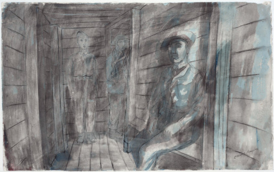
Edward Bawden – The Entrance to an Air Raid Shelter, Dunkirk, 1940
Dowden has previously been an art inspector with the Board of Education (war art otherwise had almost nothing to do with the Home Division), but those credentials did little to facilitate a happy fit between the WAAC and its new minder. Among other things, he vetoed the allocation of funds to pay for the depiction of themes that seemed to him superfluous. ‘There is too much repetition of subjects which are historically unimportant,’ he objected, ‘and it may quite well be that the Committee are more concerned with finding work for artists in whom they are interested, than they are about making a record of the progress of the war.’ As a result of Dowden’s interference the WAAC’s decision to send Edward Bawden to Ian and/or Iraq in 1943 earned Home Office agreement only with difficulty, while a plan to give Stephen Bone an open contract to record subjects of his own choosing was rejected as an irresponsible use of public funds. ‡
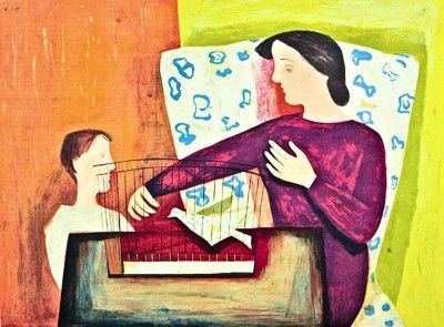
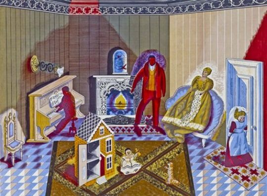
Below is one of the paintings from Bawden’s time in Iraq. It was editioned as a print by the Curwen Press in 2008 in a limited number of 145.
Edward Bawden – Preparing to Entertain, 1944
† The Sketchbook War by Richard Knott, 2013 978-0752489230
‡ War Paint: Art, War, State and Identity in Britain by Brian Foss, 2007. 978-0300108903 p168.
◦ Images c/o the Imperial War Museum, London.
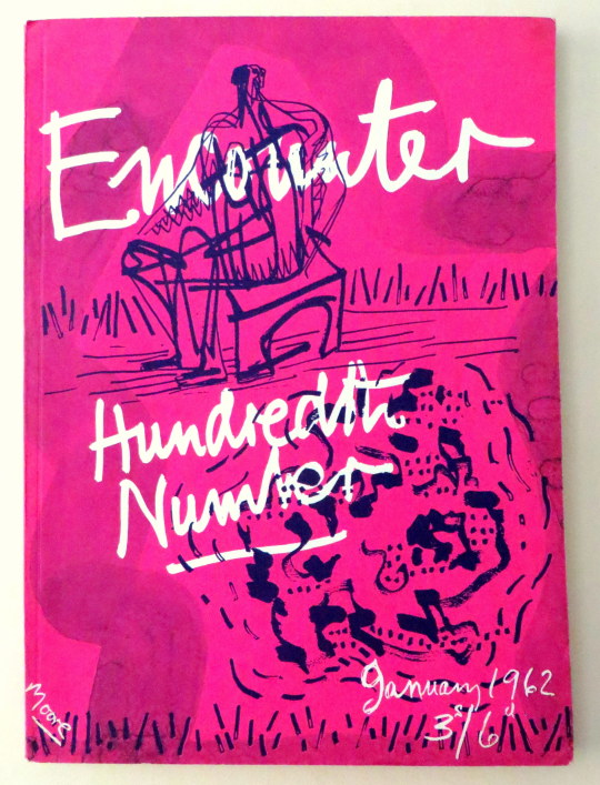
Following my post on Henry Moore’s cover for Poetry London, here is another cover Moore did, this time for Stephen Spender’s Encounter Magazine – The 100th Edition. As a magazine cover I think this rather futuristic for 1962. Pink with blue ink over and a wax resist for the text. Sadly this isn’t worth as much as Poetry London – it’s not lithographically printed for one, also Encounter had a larger audience and thus a bigger print run.
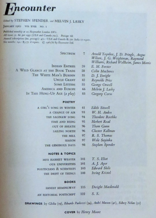
The magazine is full of illustrations and poetry, in this post I have picked out Auden and Spender’s poems below with some of the illustrations.
A drawing by Andre Masson
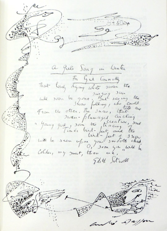
A Change of Air by W.H.Auden
Corns, heartburn, sinus headaches, such minor ailments Tell of estrangement between your name and you, Advise a change of air: heed them, but let The modesty of their discomfort warn you Against the flashy errands of your dreams.
To grow a sailor’s beard, don monkish garb, Or trade in an agglutinative tongue With a stone-age culture would be mollycoddling: To go elsewhere is to withdraw from movement; A side-step, a short one, will convey you thither.
Although its chaffinches, maybe, have learned The dialect of another river-basin, A fault transformed the local building stone, It has a priest, a post-mistress, an usher, Its children know they are not to beg from strangers.
Within its average elsewherishness Your name is as a mirror answers, yourself How you behave in shops, the tips you give : It sides with neither, being outside both, But welcomes both with healing disregard.
Nor, when you both return (you will, of course) Where luck and instinct originally brought you, Will it salute your reconciliation With farewell rites or populate your absence With reverent and irreverent anecdote.
No study of your public re-appearance Will show, as judgement on a cure demands, A sudden change in love, ideas or diet : Your sojourn elsewhere will remain wordless Hiatus in your voluble biography.
Fanatic scholarship at most may prove That you resigned from a Committee, unearth A letter from the Grand Duke to his cousin, Remarking, among more important gossip, That you seem less amusing than you were.
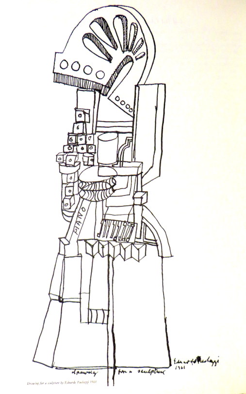
A drawing by Eduardo Paolozzi
The Generous Days by Stephen Spender. His are the generous days that balance Soul and body. Should he hear the trumpet Behind the sun that sends its thinning ray Penetrating to the marrow – At once one with that cause, he’d throw Himself across some high far parapet, Body die to soul down the sheer way Of consummation in the summons.
His also are the days when should he greet Her who goes walking, looking for a brooch Under broad leaves at dusk beside the path – And sidelong looks at him as though she thought His smile might hide the gleam she sought – He would run up to her and each Find the lost clasp hid in them both, Soul live to body where they meet.
Body soul, soul body, seem one breath, Or the twined shadows of the sun, his will, In these his generous days, to prove His own true nature only is to give. Wholly to die, or wholly else to live! Body to soul, and let the bright cause kill, Or soul to body, let the blood make love. Giving is death in life and life in death.
After, of course, will come a time not this When he’ll be taken, stripped, strapped to a wheel That is a world, and has the power to change The brooch’s gold, the trumpet scarlet blaze – The lightning in the bones those generous days – Into what drives a system, like a fuel. Then to himself he will seem loathed and strange Have thoughts yet colder than the thing he is.
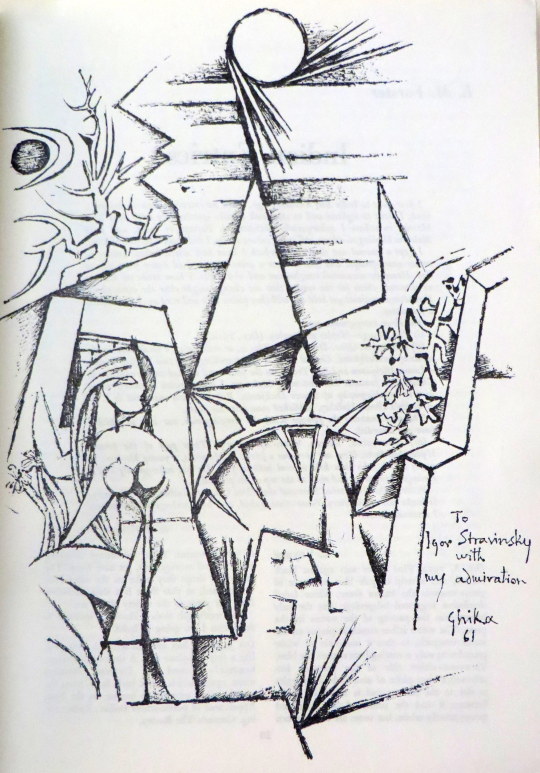
A drawing by Ghika
A drawing by Sidney Nolan
An advert for Guinness by Edward Bawden to the left
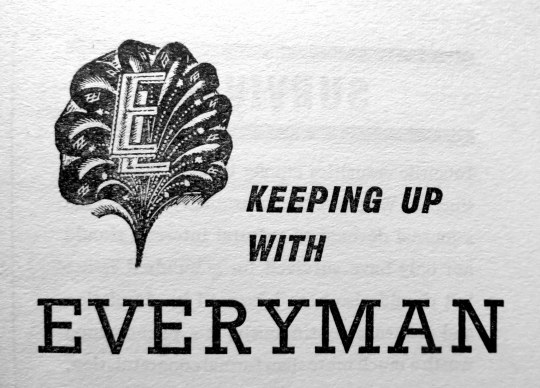
An advert for the Everyman series with the logo, designed by Eric Ravilious
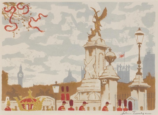
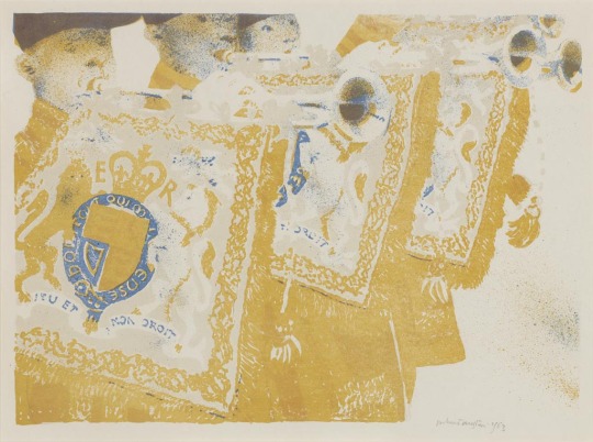
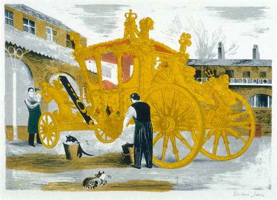
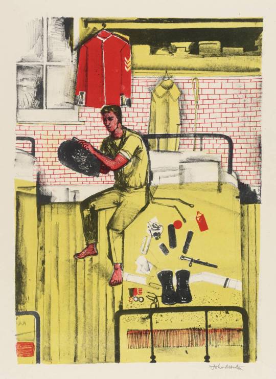
For the Coronation of Elizabeth II, a group of artists were invited to create lithographs for the Royal College of Art. Following the success of the Schools Prints series and Contemporary Lithographs, these prints were sold in limited editions and helped boost the RCA’s skills at reviving lithographic techniques. They were exhibited at the Redfern Gallery from April – May, 1953.
Most of the prints are held in Government collections and gain large prices at auction. It’s one of the least known lithographic collections but showcases some of the best British Artists of the mid twentieth century.
Leonard Rosoman – Two Pipers in the Sunlight, 1953
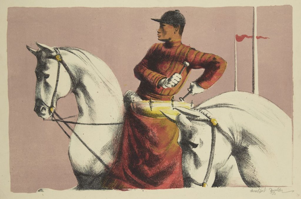
Michael Ayrton – Kettledrums, 1953
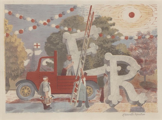
Kenneth Rowntree – Country Celebrations
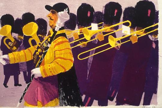
Bernard Cheese – Drum Major
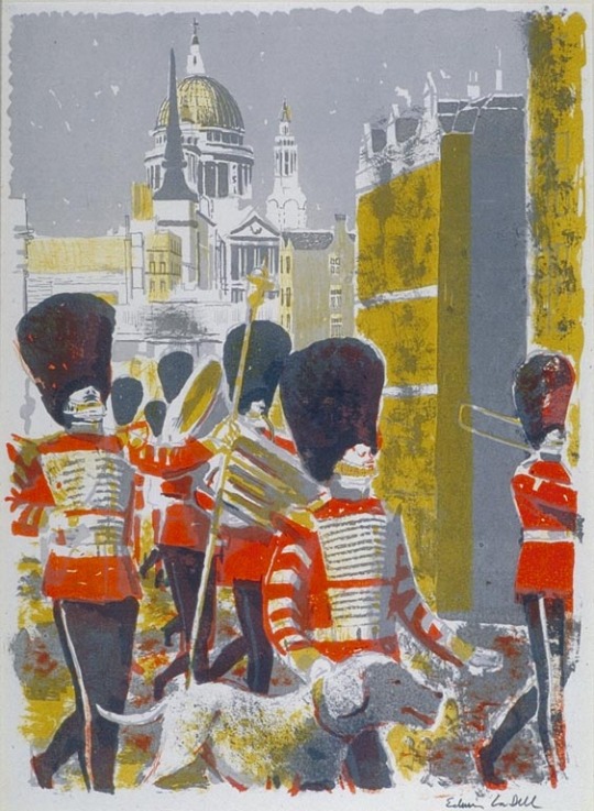
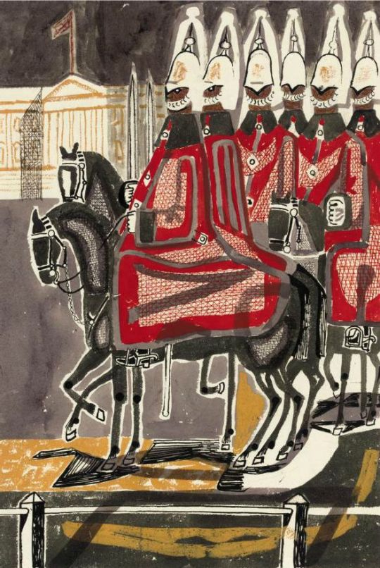
Edwin La Dell – Bandsmen in the City
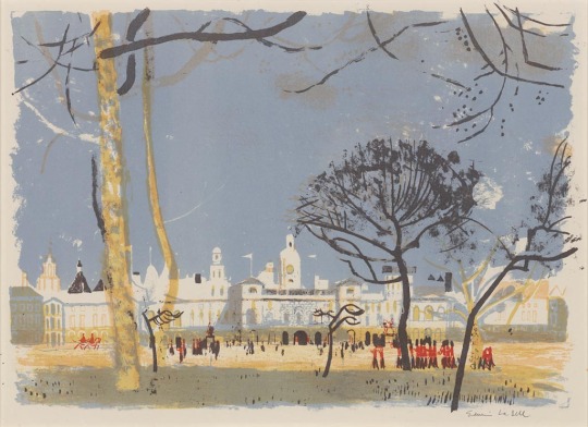
Edwin La Dell – Horse Guards Parade
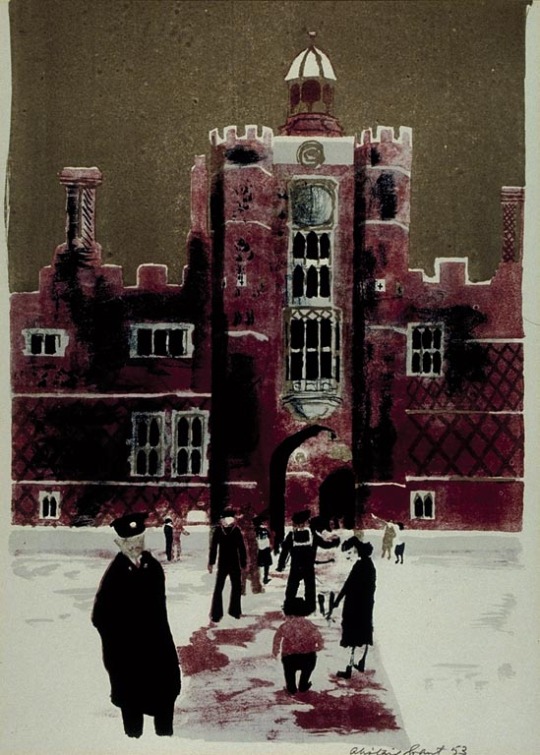
Alistair Grant – Hampton Court
Julian Trevelyan – The Mall
Robert Austin – Heralds
Barbara Jones – Prepairing the Coronation Coach
John Minton – Horseguards in their Dressing Rooms at Whitehall
In writing the previous post I thought how Edwin Smith’s photos looked like some of Edward Bawden’s Linocuts. This isn’t to strike a claim of copycat, it’s just by chance. A nice chance and so here are three instances.
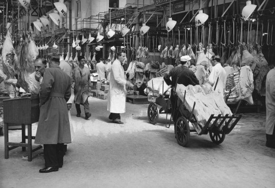
Edwin Smith – West Smithfield, 1953
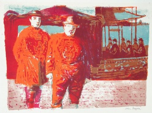
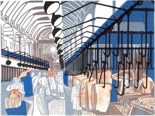
Edward Bawden – Smithfield Market, 1967
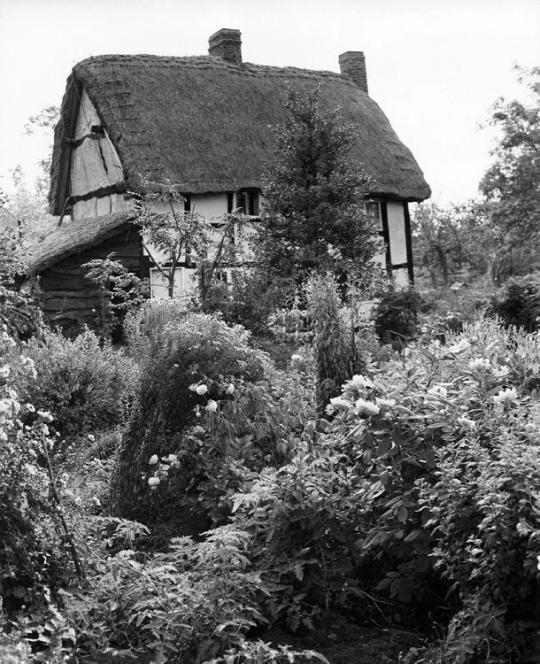
Edwin Smith – Limetree Cottage, 1953
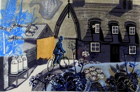
Edward Bawden – The Road to Thaxted, 1956
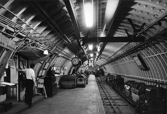
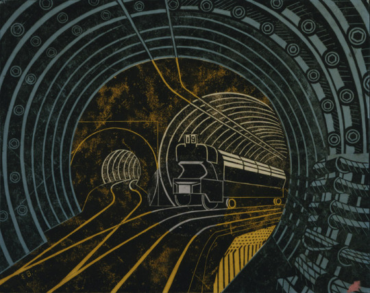
Edwin Smith – Post Office Underground Railway, 1957
The King Penguin book series were beautifully printed books. To me, they were like the Ladybird Books for adults, covering a wide range of unconnected topics and monographs.
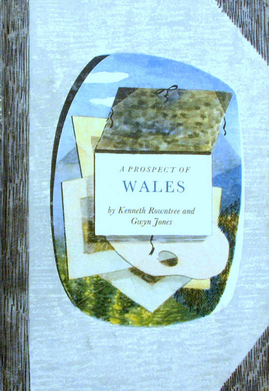
A Prospect of Wales, illustrated by Kenneth Rowntree, 1948.
The motive for Penguin Books was to broaden its appeal to the public. While still a young company, Penguin shocked the Publishing world with paperback books for sale by known and respected authors. Before that the idea of paperback fiction was to expect an unknown author and a throw-away after use book.
The original run of penguin books were black and white inside and mostly text, with the iconic two stripe colour banding. The colour schemes included: orange and white for general fiction, green and white for crime fiction, cerise and white for travel and adventure, dark blue and white for biographies, yellow and white for miscellaneous, red and white for drama; and the rarer purple and white for essays and belles lettres and grey and white for world affairs.
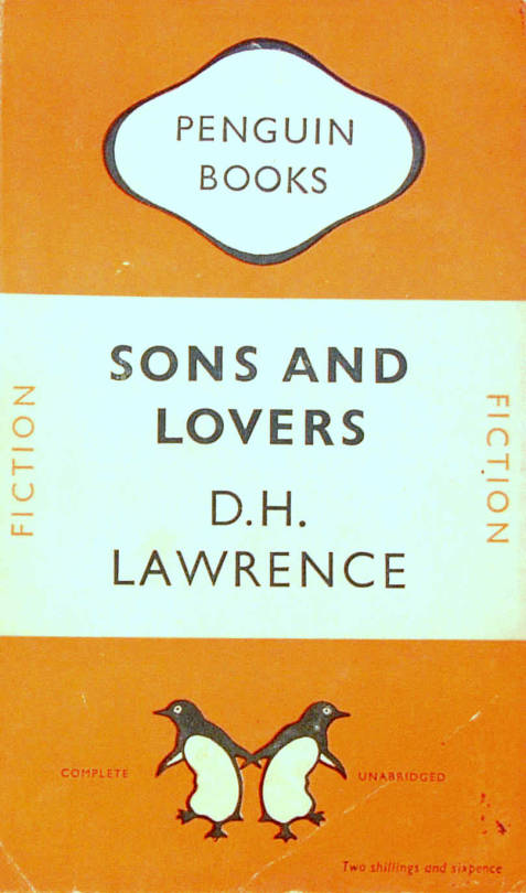
D.H.Lawrence – Sons and Lovers, 1948. Original Penguin Book cover.
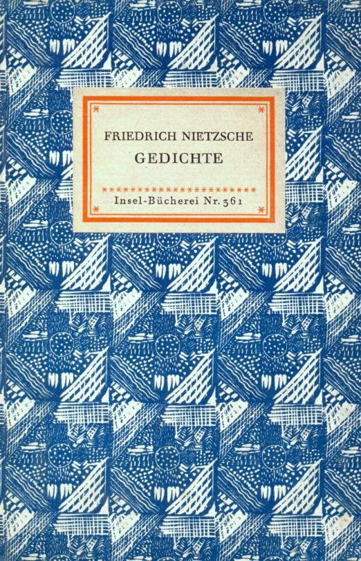
They were an British knock off of the Insel-Bücherei (Island Library) series published in Germany by Insel Verlag from 1912 onwards. The size of the German books with their repeated pattern book coverings was an inspiration. The head of Penguin books is quoted:
“Why, we felt, should there not be a similar series of books in this country? The experiment, started a few weeks after war broke out, turned out to be successful. One of the most distinctive features of this series is their decorative covers.” †
Friedrich Nietzsche – Poems. Insel Bucherei
“The aim of the King Penguin is different. These have not been planned to coincide with the public’s growing appreciation of art, but rather to appeal to the general liking for illustrated keepsakes of special projects.” †
The King Penguin series were also hardback books with colour lithographic illustrations, a move away from paperback and monochrome books.
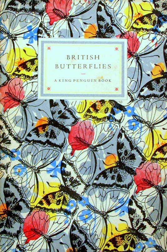
British Butterflies, cover by Paxton Chadwick, 1951.
The books originally combined a classic series of colour plates with an authoritative text. The first two volumes featured sixteen plates from John Gould’s ‘The Birds of Great Britain’ (1873) with historical introduction and commentary on each plate by Phyllis Barclay-Smith, and sixteen plates from Redouté’s Roses (1817–24) with historical introduction and commentary by John Ramsbottom. The third volume began the alternative practice of colour plates from a variety of sources. There were 76 volumes of King Penguin books in total.
Where as the educated scholars writing the books were the famous people at the time, today most people hunt for the illustrators, like John Piper, Edward Bawden, Hutton Clarke, Barbara Jones and Enid Marx.
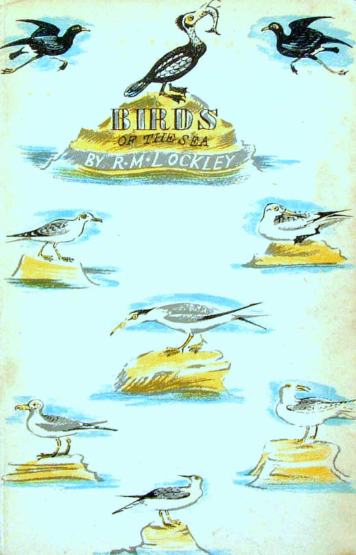
Birds of the Sea, cover designed by Enid Marx, 1945.
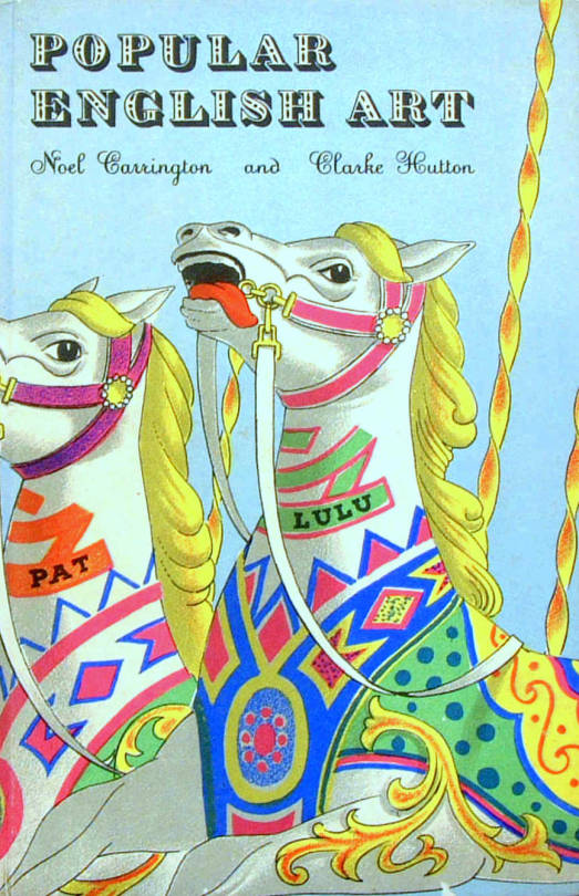
Popular English Art, illustrated by Clarke Hutton, 1945.
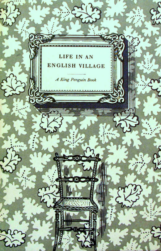
Life in an English Village, illustrated by Edward Bawden, 1949.
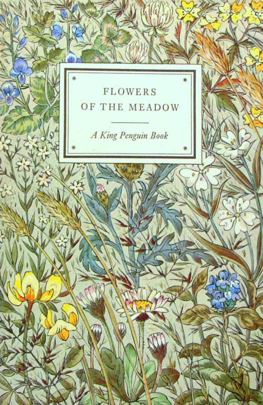
Flowers of the Meadow, Illustrated by Robin Tanner, 1950.
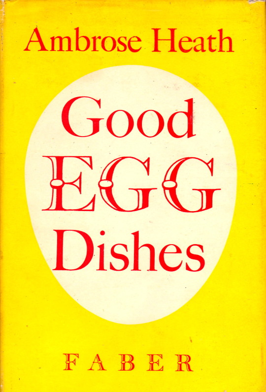
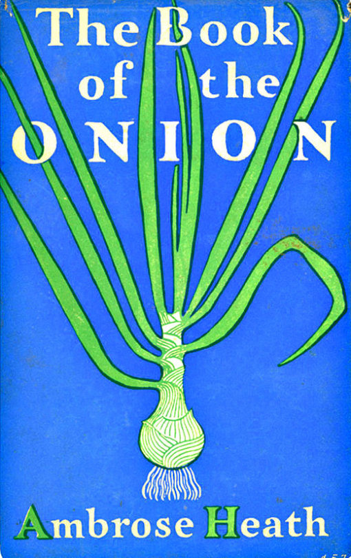
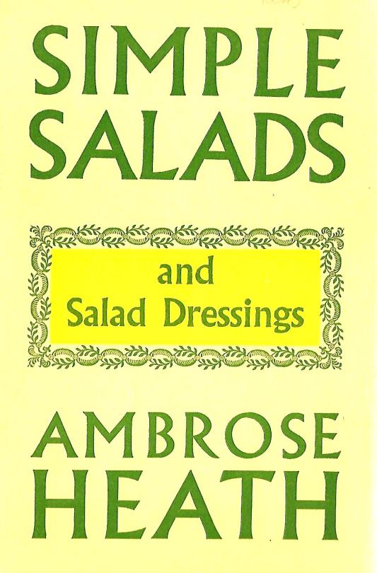
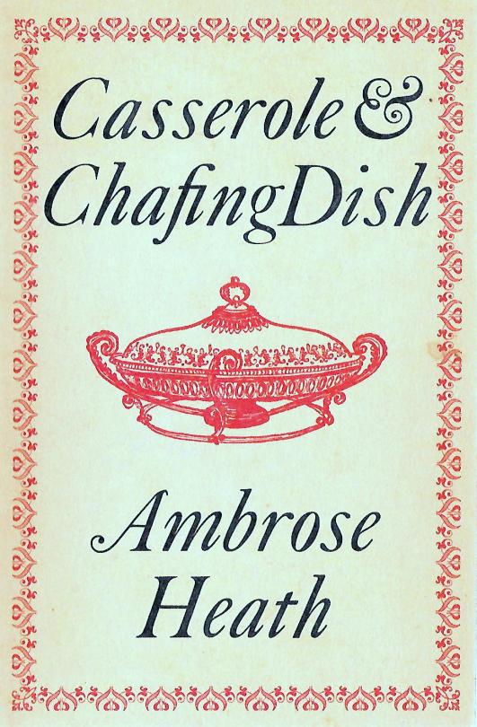
The books of Ambrose Heath illustrated by Eric Ravilious or Edward Bawden are worth a lot of money in mint condition. I was thinking that it was sad that people are only collecting those books, for the illustrations, not the recipes. But also there are so many other wonderful designs of books by Heath worth buying.
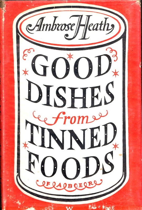
Ambrose Heath – Good Dishes from Tinned Foods – Faber & Faber, 1939.
I doubt that Heath had much say or interest in who illustrated his books or how, most of it seams to be same in the hands of Faber and Faber.
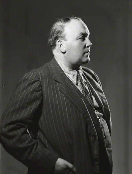
Ambrose Heath
Ambrose Heath was born Francis Geoffrey Miller on the 7th February 1891 in London. He was a journalist and food writer who wrote for newspapers including The Times and The Manchester Guardian, before becoming the food writer for The Morning Post.
In 1933 he published his first book ‘Good Food: Month By Month Recipes’ (illustrated by E. Bawden). It was a success and the year later another three books and reprints came. In the 30′s he wrote over 20 books and many more for publications and companies like Aga stoves. The most expensive of the cook books is undoubtedly ‘The Country Life Cookery Book’ (illustrated by Ravilious in 1937).
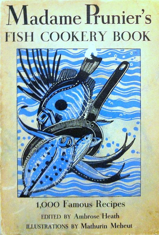
Heath wrote and translated more than one hundred works on food. In his lifetime he was best known for a translation of ‘Madame Prunier’s Fish Cookery Book’ that enjoyed many reprintings. He died on the 31st May 1969 in Surrey.
Ambrose Heath – Madame Prunier’s Fish Cookery Book – Nicholson & Watson, 1938.
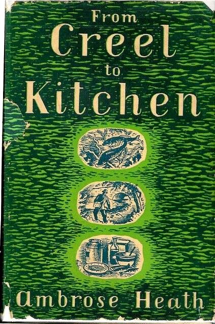
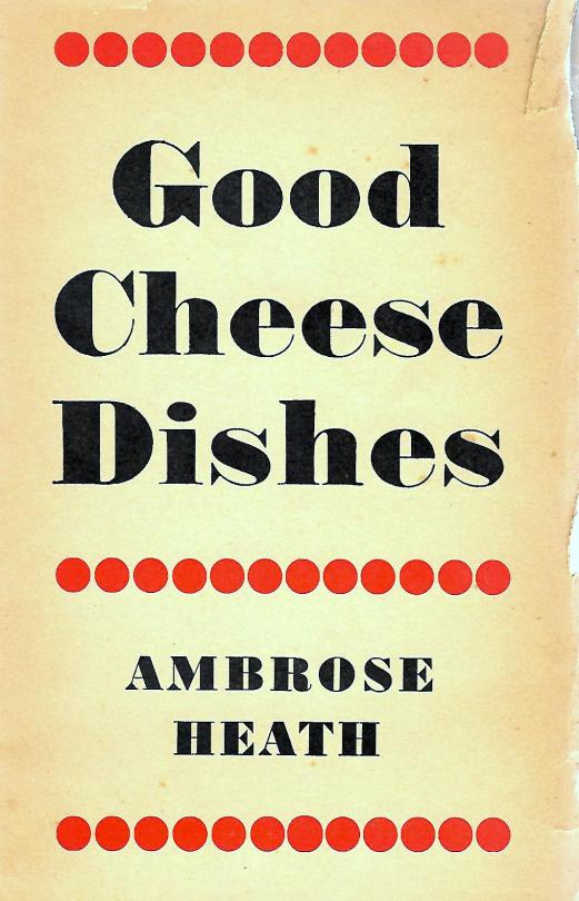
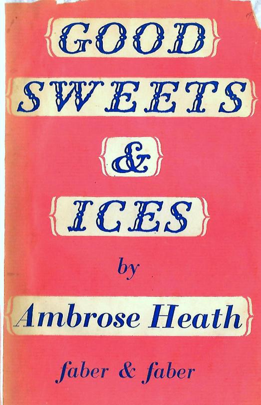
Below are a the beautiful covers of his other books without ER or EB. I think all the samples I have selected where published and thus designed by Faber & Faber.
Today it is hard to ignore the artist effect of Eric Ravilious, the tide of books on him alone prove his popularity. This is an article from ‘The Artist’ magazine, March, 1943. It ends with a short record of his death, some weeks before. I thought it was interesting that its intention was a review of his life and works but became an obituary.
Eric Ravilious by Richard Seddon Artists of note: Number 97. The Artist Magazine. March 1943
Eric Ravilious – The Causeway, Wiltshire Downs, 1937
Paul Nash was the first to notice the work of Eric Ravilious. This happened when Ravilious was a student of the Royal College of art under the instruction of Nash in the school of design. His wood engraving impressed Paul Nash as being worthy of special attention, and it was on the latter’s introduction that Ravilious became a member of the Society of Wood Engravers. In the society’s exhibitions Ravilious’s engravings immediately drew attention from publishers and their agents. Ravilious illustrated several books and was soon established as a book illustrator of exceptional status.
Between that time and the present he has consolidated a reputation as a leader of contemporary art; not as a leader in figurative or influential, but rather in the most academic sense, of the advancement of research and knowledge. He does not supinely follow the present tendencies and work in a certain manner merely because that manner can be accepted as the logical outcome of the particular form of art and aesthetics accepted at the moment in the country. He does not look for what is being done nowadays, in order to do likewise.
Leadership in art, as in anything else, calls for the usual hackneyed attributes: courage, self-confidence, faith in purpose, and so on. But in art, somehow, as in anything abstract, it needs enthusiasm enough to keep it up in the face of that inexplicable hostility that people show in face of anything that is ‘new.’
In feeling and temperament the work of Ravilious is very English. Ravilious, unlike so many Englishmen, does not try to paint as though he were a Frenchman. His work has its roots deeply sunk into the life and the countryside and the culture of England. His water colours are the lineal descendants of the English eighteenth century school of water colour than in its time gave England a brief reign as a country important in the world’s art, a reign that lasted until the French impressionists wrested the sceptre for France, a reign into which, it is felt, England was re-entering at the beginning of this war, through the excellence of the contemporary school of English landscape, of which Ravilious is one of the most important members.
That, because of his very full knowledge of the history and methods of English art and design, he carries on the English tradition, is apparent in his work in any of the media he employs. His wood engravings revive and extend the essential tradition of Thomas Bewick and the English eighteenth century wood engravers. In his water colours he takes up the story where Peter de Wint, Paul Sandy, John White Abbott and their contemporaries left off, and carries it a stage farther, in the life of modern knowledge. Examples of his pottery design that he carried out for Wedgwood can take their place in the Victoria & Albert Museum, among the original products of Josiah as if by hereditary right.
It is not possible to select one or two influences that can be credited with the moulding of Ravilious’s vision. After leaving school in Eastbourne, he attended Eastbourne School of Art, from where he went up to the Royal College of Art, in London. There, under principal-ship of Sir William Rothenstein, he was tutored by some of the most important contemporary artists in the country. Naturally, the powerful influences of such men must have affected his outlook; indeed, they did. In addition he received, asI have said, an exhaustively comprehensive education in art and design, from which soure he derived the solution of those problems of expression that he always seems to face with courage and solve with ingenuity.
He might easily have been tossed for ears upon a sea of conflicting influences; if so, it happened when he was at the R.C.A., and the process was completed by the time he began his career as a practising artist. At least, no indecision has ever shown itself in the work of his maturity. that he owes something, as all artists, to skilful pilotage, can be safely assumed, but that he emerged with an original style is patently a logical result of his own personal outlook.
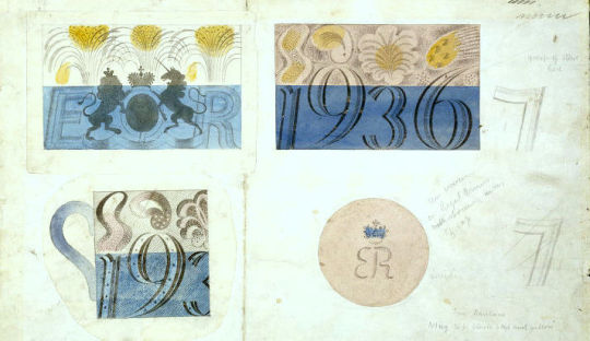
Eric Ravilious – Design for Coronation mug for Edward VIII, 1936.
He is thirty eight, and therefore can be said to have not yet reached the peak of his artistic maturity. As regards his work, whatever the medium he invariable approaches a subject with an open mind and embodies in the work, whether it is a wood engraving, a water colour, ceramics, or fabric design, at least one idea that arises from the needs of that particular job and no other. Of course he refers in his mind as he is thinking it out not only to history but to past works of his own to help in solving the problem of the moment, but he avoids any tendency to repeat successes of the past ad nauseam, giving the same colours, the same subtleties, the same textures and so on, whether or not they are the right ones for the present job. I stress the fact that he does not walk in such a manner because very many artists, both distinguished and otherwise, do so.
Ravilious never rests on his laurels. It cannot be said about a sequence of his work as it can of the work of other artists that, having seen one, you have seen them all. Though they are all built around the personality of the artist, each of his productions is sufficient unto itself.
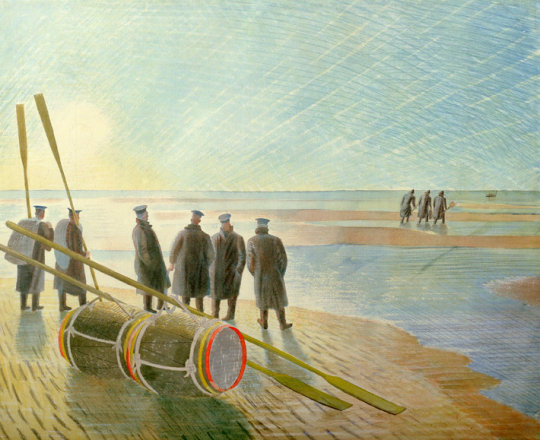
Eric Ravilious – Rendering Mines Safe, 1940. (Now called Dangerous Work at Low Tide)
In a Ravilious exhibition, the paintings are, in the truest sense, variations on a theme and not repetitions. It is said that there are four different ways of looking at a picture, Firstly the observer might stand away and savour the emotional content and the subject matter.Secondly, he might appreciate the purely academic appeal, such as the colour harmony and the broad lines of the composition. Thirdly he might go near the picture and closely examine the technical minutiae: the brushwork, the qualities of the surface, the interplay of ‘fat’ and ‘lean’ painting, and so on. Fourthly, he might scrutinise, analytically, the patterns achieved by the painter, by the use of his range of different ways of coving a surface and of filling in a space.
The Victorian painters appealed to the first two methods, and many contemporary schools solely to the last two. A few contemporary painters, including Eric Ravilious, appeal to all four. Ravilious particularly appeals to the last. His textures and patterns, whatever the medium, are an important feature of his work. He composes as a rule within a tight linear framework, making spaces of carefully contrasted size and shape which he fills with textures that derive partly from the intrinsic textures of the original of the subject and largely from his own fertile imagination. The settings for his landscape painting have been the Downs and coast of Sussex, and localities in Essex, Wiltshire and Wales.
Apart from his war painting he confesses to a tendency to paint in sequences: groups of broken-down tractors and old cars and buses in fields, the discarded machinery of Essex. He has painted a series of Sussex hills, a set of chalk figures (such as the Aylesbury White Horse), a set of lighthouses, rowing boats, beds, beaches and greenhouses. Ravilious was educated at Eastbourne Grammar School. He left the Royal College of Art only to return in 1929 as instructor in design, which position he filled until 1938. Whilst a student at the college he and Edward Bawden completed a well known mural decoration in the refreshment room of Morley College, which was destroyed by a bomb.
Other important mural decorations by Ravilious are those in the circular room at the L.M.S. Hotel at Morecambe and the ceiling decorations in the dining hall of the new Merchant Taylors’ School. Since 1926 he has illustrated books for the Kynoch Press, mainly by wood engravings. His engravings have also illustrated Volume I of ‘Signature’ and Gilbert White’s ‘Selborne.’ From 1937 to 1939 he designed pottery for Wedgwood. One of the best known of these designs was the Coronation Mug. His designing for glass he dismisses as a mere gesture; as a gesture it was brief, but effective.
Exhibitions of the work of Ravilious were held at the Zwemmer Gallery in 1934 and 1937, and one at Tooth’s in 1939. Three of his water colour drawings are in the Victoria & Albert Museum, and there are others in the public galleries. At the beginning of the present war he was offered and he accepted an appointment as official war artist to the Admiralty. He holds with the rank of hon. captain in the Royal Marines.
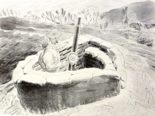
Eric Ravilious – Lewis Gunner
Since this article was written, Eric Ravilious has been posted as ‘missing’. After spending a period in Iceland, in his capacity as official war artist, he life that island by plane and has not been heard of since. Thus ends the career of a very fine artist, whose last efforts were devoted to recording events connected with the war – records which will go down to posterity, and which will keep his memory green, especially in the art world which respected him for his achievements. He was a sane progressive, sound in judgement and method.
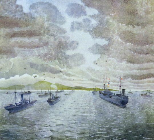
Eric Ravilious – Convoy From Merchant Ship At Anchor, 1943
The war had not only hit at Britain’s cities with bombs, but also at the people with rationing. Food and fabric, paper and paint, tea and sugar were all rationed.
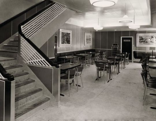
It was in the war years that the Lyons teashops became shabby and as fashions started to change in the post war era they looked dated. Materials like wood and paint where mostly reserved and rationed for government use in the post war construction, so another idea had to be devised to make the Lyons tearooms look more respectable.
Lyons Teahouse. 1951 The 2nd series of lithographs on the walls.
The directors, Felix and Julian Salmon had the idea of refreshing the tearooms with lithographic pictures to make them more appealing. In 1947 they sort advice from Jack Beddington who was the Artistic Director of Shell-Mex.
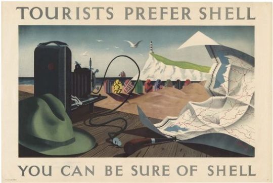
Shell Advert by Tristram Hillier — White Cliffs of Dover
The advertising in the 1930’s for Shell-Mex featured British artists modern work with simple text. It had been a public success and an exhibition of the Shell-Mex lithographs in 1939 was well attended.
The art of advertising in London from the mid 1920’s onward had seen modern art projected onto the public with company’s like Shell-Mex & London Transport using artists like Paul Nash, Edward McKnight Kauffer, Horace Taylor and Graham Sutherland to illustrate bold and simple posters.
It was an age when galleries charged admission and in the war years galleries where disbanding and hiding their art collections safe from German bombing raids. This would mean that the colour advertising posters where some of the few artworks to be left open to the public in wartime and where displayed all over the country. It would be the first time the public would encounter these artists.
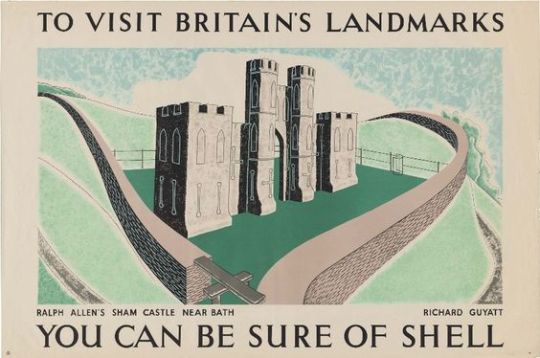
Shell Advert by Richard Guyatt — Ralph Allen’s Sham Caster nr Bath.
By appointing Beddinton they relied on his contacts with artists to product the lithographs. Samples and designs where commissioned and the first series of these sixteen prints featured Edward Ardizzone, Edward Bawden, Clifford & Rosemary Ellis, Barnett Freedman (who assisted with artistic advice on lithography) Duncan Grant, Edwin La Dell, John Nash to name half. Artists also claimed royalties on copies sold in the tearooms, an unusual practice in it’s day. One thousand five hundred prints where made of each poster in the first series.
Lyons Print: David Gentleman — Cornish Pilchard Boat
Some of the troubles in printing came from printing trade unions and of artists unfamiliar with the lithography process. Some of these posters had to be hand drawn onto the lithographic plate to be printed, pre-made works where translated from paintings by Chromoworks Ltd, London.
The artworks for Lyons had a press release in 1947 at the Trocadero Restaurant, London, where Lyons often had their board meetings.
A special preview was arranged for Queen Mary.
Many prints where glued to wood or mirrors for hanging in the tearooms, the public could then buy the posters un-mounted and unframed, it’s the prints unglued to canvas and board that are worth more money today.
Edward Bawden — The Dolls at Home.
Thirty of the Lyon’s Tea Rooms in London exhibited the prints at first. Due to the press and public interest the prints were soon found in all Lyons’ teashops. The success of the first series of prints meant that a second and third series of prints came in 1951 and 1955.
It is worth noting that companies like Guinness started to produce lithographic prints (The World Record Series) to brighten up their pubs soon after. So the series and it’s publicity had an ongoing effect.
Mainstream British wallpaper design regressed dramatically between the wars, bogged down in a sea of ‘porridge’. But the artist Edward Bawden made a valiant attempt to redeem the medium. ‡
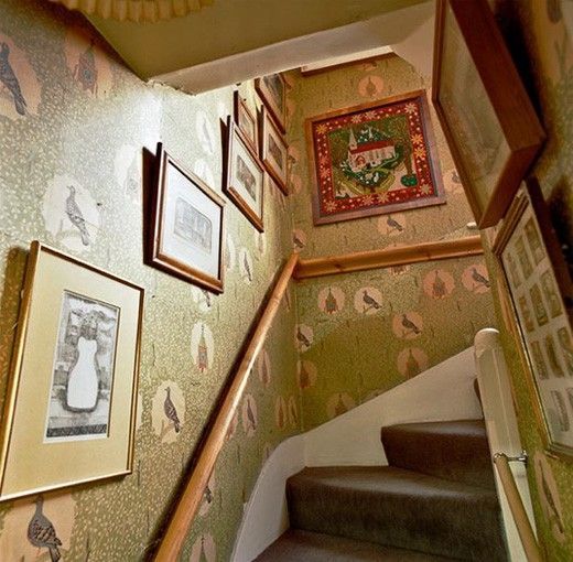
Roy Hammans photo of Edward Bawden’s Saffron Walden House for the Fry Gallery.
Bawden, studied at the Cambridge School of Art (1919–1921), then moved on to the Royal College of Art. It was here where he studied alongside Eric Ravilious and both were tutored by Paul Nash.
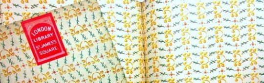
Nash’s connections to Harold Curwen meant that in 1928 when the Curwen Press published ‘A Specimen Book of Curwen Pattern Papers’ — (It was a book of patterned papers for bookbinding and shop wrap and boxes)… Bawden’s work was included alongside Ravilious, Enid Marx, Paul Nash and Althea Willoughby.
A Sample book covered in the Pattern Papers with ‘A Specimen Book of Curwen Pattern Papers’ behind, 1928
After his time at the RCA Bawden started to experiment with wallpaper designs. In his book ‘Edward Bawden and His Circle’ Malcolm Yorke describes the lino process:
After drawing the design in a soft pencil on thin paper it could be laid face down on a whitened sheet of lino and the design transferred by rubbing with a spoon. Cutting with a Japanese knife then began from the middle towards the edges, the knife becoming a drawing instrument as the hand became more skilled. Compared to cutting end-grain boxwood for wood-engraving, warmed lino sliced like butter.
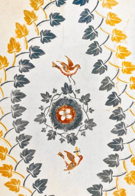
Edward Bawden – Bird Nest and Ivy Leaves, 1924
The first known work was never produced industrially, and exists only as a trial print called ‘Bird Nest and Ivy Leaves’ from 1924. Other designs by Bawden followed:
His approach to wallpaper was very much that of a graphic artist. Initially he used lino-printing to produce his own designs, but from 1926 the Curwen Press produced his patterns in the form of colour lithographs. †
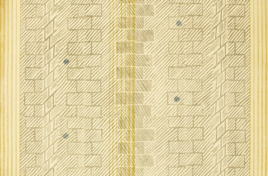
Edward Bawden – Ashlar, 1930
It was these designs from 1926 – 1933 that were produced in lithograph by the Curwen Press. Unlike most modern wallpapers, printed on long rolls of paper, the Curwen Press printed these wallpapers as sheets, in sizes up to about 34 x 22 ins. Very few of these sheets survive unused. The reason for printing in sheet form was that the lithographic machines could not support the long rolls of paper. The traditional way of printing wallpapers being to screen print the design or print direct onto the blank role from the woodblock.
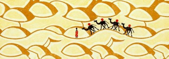
Edward Bawden – Sahara, 1928
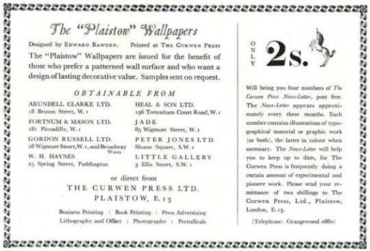
The wallpapers printed by the Curwen Press were known as the Plaistow Wallpapers, as the press was based in Plaistow Place, London. With them being printed, “Paul Nash introduced Bawden to Elspeth Little and her ‘Modern Textiles’ shop in Beauchamp Place for a sales outlet, but his royalties over six years and sales of 507 sheets came to a miserly £2. 0s. Lod.” Soon after other shops started to sell them, including: Heals, Fortnum & Mason and Gordon Russell’s furniture shop.
Plaistow Wallpaper Advert.
Façade sold a total of 3,899 sheets. While ‘Façade’ might be thought just a neutral title, is it possible that it could have been in the artist’s mind because of the popularity around that time of William Walton’s musical suites of that name, based on Edith Sitwell’s poems. Frederick Ashton’s ballet of Faade was premiered in 1931.
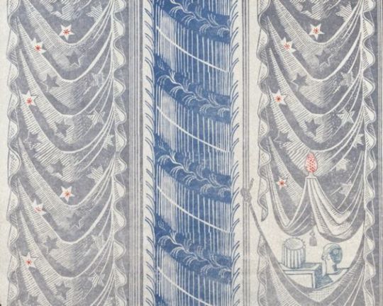
Edward Bawden – Façade, 1933
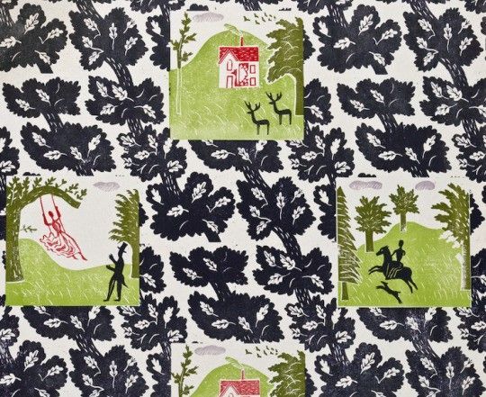
Bawden’s approach of comic and country images was a shift in British wallpaper design. Some of them form geometric beautiful patterns and others make your walls into giant linocut pictures as you can see from Bawden’s own home.
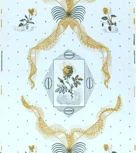
Edward Bawden – Rose & Lace, 1938
In the 1930’s Bawden was given the chance to print wallpapers by the Roll and not sheets! This range was called the ‘Bardfield Wallpapers’, after the Great Bardfield artist community, these wallpapers where a range by Cole and Son, with designs by Bawden and John Aldridge. The designs were originally developed in 1939, but commercial production was interrupted by the war. The early versions were printed direct from the wood and lino blocks. Some of the designs were exhibited that year at The Little Gallery off Sloane Square in London, but they were not produced commercially until 1946, after the War.
Edward Bawden – Knole Park, 1929
Although the designs were popular, and some were featured in the Festival of Britain in 1951, they were produced in limited quantities to order, and were relatively expensive.
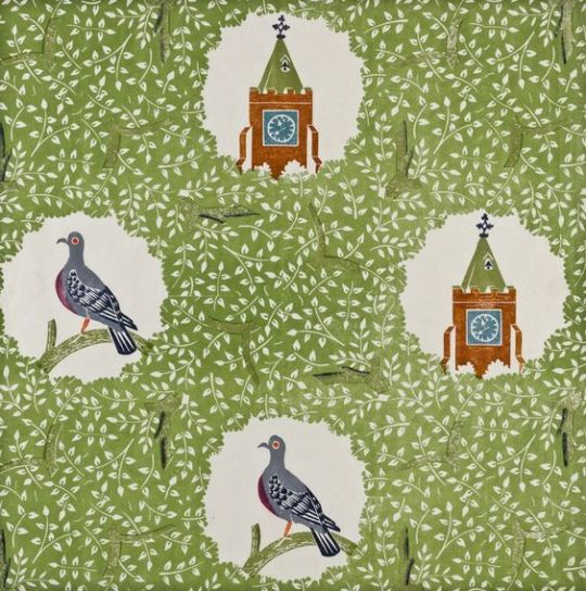
Bawden’s best-known design, Woodpigeon (1927), featured vignettes of birds and church spires emerging through windows in a “wallpaper” of leafy trees. Similarly, in Knole Park (1929) with primitive rural vignettes. These were initially lino-printed [sic] but the blocks were acquired by Cole & Sons in 1946. †
To my bias opinion, Faber & Faber have always seamed a more artistic publisher based on the work in the 1930’s and 40’s. The typesetting of the poetry to the beautifully illustrated dust jackets always seam to be ahead of other publishers when it came to literature and how to employ artists.
The Ariel poems were a series of 38 pamphlets that contained illustrated poems published by Faber and Gwyer and later by Faber and Faber.
Faber and Faber began as a firm in 1929. However, its roots go back further — to The Scientific Press, owned by Sir Maurice and Lady Gwyer and derived much of its income from the weekly magazine the ‘Nursing Mirror’.
The Gwyers aimed for trade publishing and this led them to Geoffrey Faber. The partnership was then founded in 1925 and known as Faber and Gwyer. It was at this time In 1925 that T.S.Eliot left Lloyds bank to join the publishing firm Faber and Gwyer, as an editor.
The partnership of Gwyers and Faber didn’t last for long, four years later in 1929, the Nursing Mirror was sold and Geoffrey Faber and the Gwyers parted company. Searching for a name with a ring of respectability, Geoffrey hit on the name Faber and Faber, although there was only ever one Faber.
In 1927, Eliot was asked by Geoffrey Faber, to write one poem each year for a series of illustrated pamphlets with holiday themes to be sent to the firms clients and business acquaintances as Christmas greetings.
This series became the “Ariel Series” and would amass 38 pamphlets from a selection of English writers and poets from 1927 through 1931. It was a mark of considerable taste by Faber & Faber as they paired their authors with modern artists.
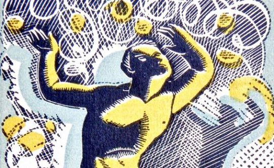
A detail of the wood engraving by Gertrude Hermes for Ariel Poem #23
The first editions of the Ariel Poems where released in numbers of 3000–5000 printings per copy. A set of limited editions where also issued in various printings of 250–500 copies each. These were signed and numbered by the authors and bound with thicker hand cut paper. Both versions of the editions had an illustration on the front cover, then a frontispiece by the illustrator that was sometimes coloured. Then the poems text. The pamphlets were bought back in 1954, when eight new publications were released in the New Series. These came with a colourful envelope from when they were posted.
The pamphlets, in order, are as follows:
Yuletide in a Younger World by Thomas Hardy, drawings by Albert Rutherston
The Linnet’s Nest by Henry Newbolt, drawings by Ralph Keene
The Wonder Night by Laurence Binyon, drawings by Barnett Freedman
Alone by Walter de la Mare, wood engravings by Blair Hughes-Stanton
Gloria in Profundis by G. K. Chesterton, wood engravings by Eric Gill
The Early Whistler by Wilfred Gibson, drawings by John Nash
Nativity by Siegfried Sassoon, designs by Paul Nash
Journey of the Magi by T. S. Eliot, drawings by E. McKnight Kauffer
The Chanty of the Nona, poem and drawings by Hilaire Belloc
Moss and Feather by W. H. Davies, illustrated by Sir William Nicholson
Self to Self by Walter de la Mare, wood engravings by Blaire Hughes-Stanton
Troy by Humbert Wolfe, drawings by Charles Ricketts
The Winter Solstice by Harold Monro, drawings by David Jones
To My Mother by Siegfried Sassoon, drawings by Stephen Tennant
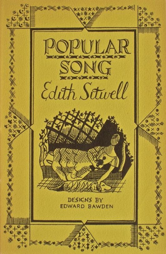
Popular Song by Edith Sitwell, designs by Edward Bawden
A Song for Simeon by T. S. Eliot, drawings by E. McKnight Kauffer
Winter Nights, a reminiscence by Edmund Blunden, drawings by Albert Rutherston
Three Things by W. B. Yeats, drawings by Gilbert Spencer
Dark Weeping by “AE”, designs by Paul Nash
A Snowdrop by Walter de la Mare, drawings by Claudia Guercio
Ubi Ecclesia by G. K. Chesterton, drawings by Diana Murphy
The Outcast by James Stephens, drawings by Althea Willoughby
Animula by T. S. Eliot, wood engravings by Gertrude Hermes
Inscription on a Fountain-Head by Peter Quennell, drawings by Albert Rutherston
The Grave of Arthur by G. K. Chesterton, drawings by Celia Fiennes
Elm Angel by Harold Monro, wood engravings by Eric Ravilious
In Sicily by Siegfried Sassoon, drawings by Stephen Tennant
The Triumph of the Machine by D. H. Lawrence, drawings by Althea Willoughby
Marina by T. S. Eliot, drawings by E. McKnight Kauffer
The Gum Trees by Roy Campbell, drawings by David Jones
News by Walter de la Mare, drawings by Barnett Freedman
A Child is Born by Henry Newbolt, drawings by Althea Willoughby
To Lucy by Walter de la Mare, drawings by Albert Rutherston
To the Red Rose by Siegfried Sassoon, drawings by Stephen Tennant
Triumphal March by T. S. Eliot, drawings by E. McKnight Kauffer
Jane Barston 1719–1746 by Edith Sitwell, drawings by R. A. Davies
Invitation To Cast Out Care by Vita Sackville-West, drawings by Graham Sutherland
Choosing A Mast by Roy Campbell, drawings by Barnett Freedman
The 1954 series was as follows:
Sirmione Peninsula by Stephen Spender, drawings by Lynton Lamb
The Winnowing Dream by Walter de la Mare, drawings by Robin Jacques.
The Other Wing by Louis Macneice, drawings by Michael Ayrton.
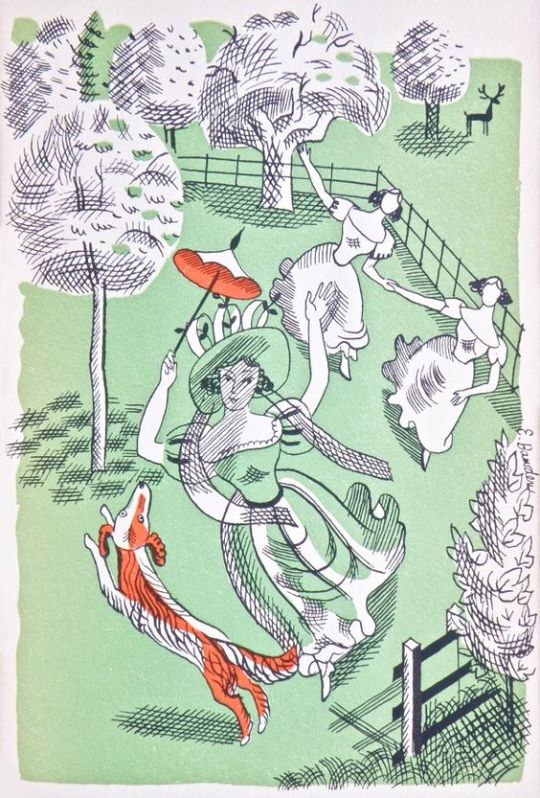
Mountains by W. H. Auden, drawings by Edward Bawden.
Nativity by Roy Campbell, drawings by James Sellars.
Christmas Eve by C Day Lewis, drawings by Edward Ardizzone
The Cultivation of Christmas Trees by T. S. Eliot, drawings by David Jones.