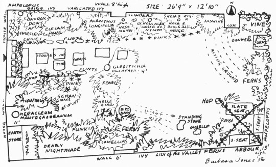
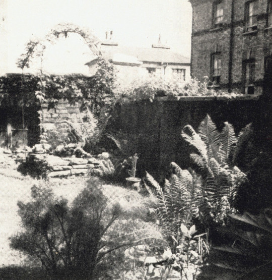
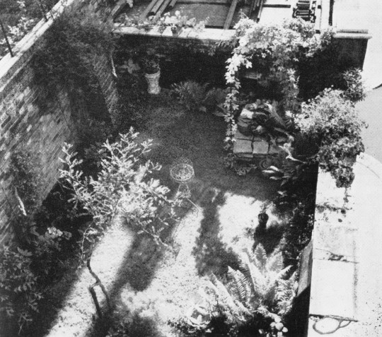
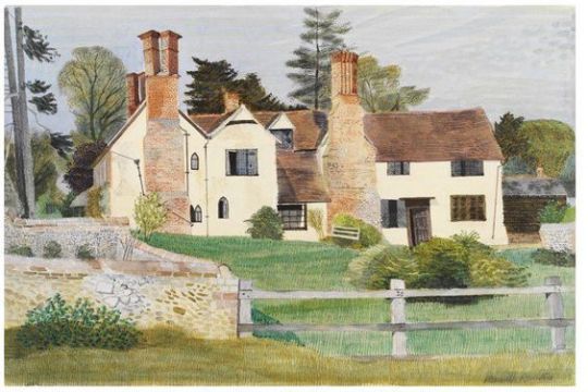
This a post from the The New Small Garden book by Marjory Allen and Susan Jellicoe. The book features Barbara Jones’s garden for her house on Well Walk, and the garden that backed on to Willow Road, her house has been split into two flats and the garden now is even smaller, divided into two. However below is the garden as she would remember it.
This exquisite little garden has been evolved by Miss Barbara Jones, artist and writer, from as unprepossessing a back yard as can be imagined. It is essentially a collector’s garden, where each plant is valued as an individual.
The tiny scale makes the individual treatment of plants not only appropriate but necessary. It is her delight to arrange her plants so that the shape and texture of each will act as a sympathetic foil to its neighbours.
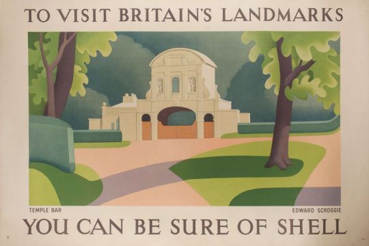
Both beautiful and inspiring, the artwork that Shell used on their posters was a shift in advertising for two reasons: They were selling the ambitions of the motorist beyond commuting; a generation of day-trippers without trains. Also they were presenting modern art to the public in an era when museums charged admission. The posters were pasted on the sides of petrol stations, lorries and billboards with that simple line “You Can Be Sure of Shell”.
Edward Scroggie – Temple Bar
The respectability of motor touring was reinforced by the list of artists commissioned by Shell. It reads like a Who’s Who of the British art establishment of the period – Paul Nash, Graham Sutherland, Vanessa Bell, Ben Nicholson, Rex Whistler and Edward McKnight Kauffer – who between them produced some of the finest examples of commercial art while promoting a nostalgic view of England at the same time. At this stage of the century the motor car itself was not perceived as a threat to the countryside. Buying a car meant buying into a new world. ‡
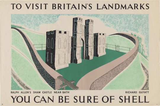
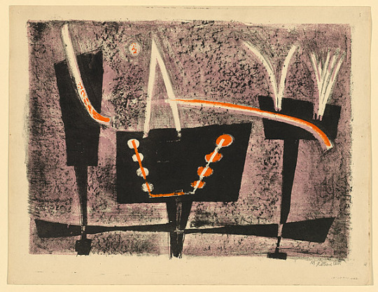
Richard Guyatt – Ralph Allen’s Sham Castle
Ralph Allen’s Sham Castle: Ralph Allen was an entrepreneur, philanthropist and was notable for his reforms to the British postal system. He his home, Prior Park, a Palladian house, built to demonstrate the properties of Bath stone as a building material, Allen happened to own a few stone mines in Bath. On the crest of Bathwick Hill facing the city of Bath is the colloquially dubbed “Ralph Allen’s Sham Castle”, built in 1755. Guyatts poster is the most modernist in this post, making use of positive and negative line drawing in the shade and light.
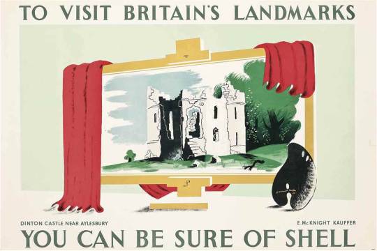
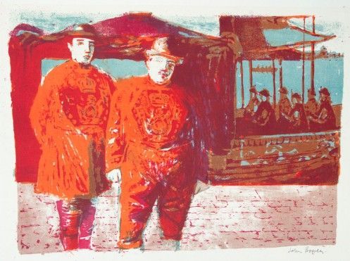
Edward McKnight Kauffer – Dinton Castle, Near Aylesbury
Dinton Castle:
A most charming, innocent folly, standing on a little mound by the Aylesbury-Thame road and circled by pine trees. It was built in 1769 by Sir John Vanhatten to house his collection of fossils, some of which are let into the random rubble walls. The plan is a hexagon with towers at two opposite corners, one for fireplaces and the other for a spiral staircase. ♠
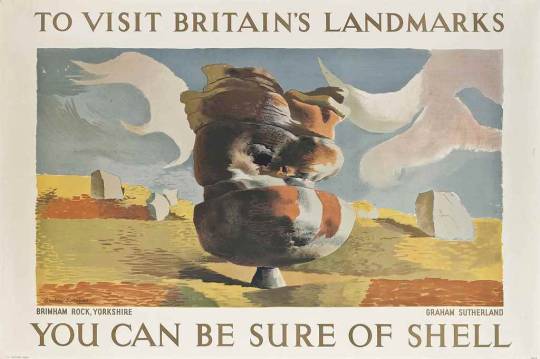
Graham Sutherland – Bringham Rock, Yorkshire
Bringham Rock, Yorkshire.
Sutherland visited this site in the autumn of 1935 at the suggestion of Jack Beddington, who wanted it to figure as one of a series of Shell posters. The result is a dreamlike lithograph, more in the style of Paul Nash. There are other rock structures on the site, all unique. ♣
There are many variations of rock formations, caused by Millstone Grit being eroded by water, glaciation and wind, some of which have formed amazing shapes. ♣
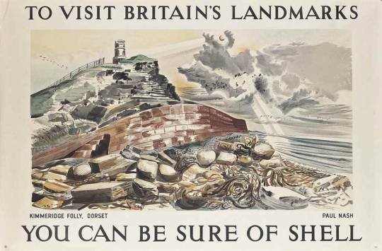
Paul Nash – Kimmeridge Folly, Dorset
Kimmeridge Folly, Dorset When Paul Nash was working for Shell in 1937 it was to produce the Shell Guide of Dorset. He relocated for the project. His boss for the guide was not just Jack Beddington but also John Betjeman. It was Betjeman who suggested he paint Kemmeridge Folly for the ‘Landmark’s’ campaign. Paul Nash was paid 50 guineas when the picture was accepted as a poster in 1938.
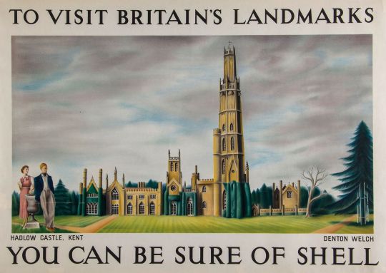
Denton Welch – Hadlow Castle, Kent
Hadlow Castle, Kent
The first few months of 1937 saw Denton working on a large-scale panel of Hadlow Castle, a building some three miles east of Tonbridge. Although the main part of the house dated from the end of the eighteenth century and had been inspired by Strawberry Hill, the 170-foot tower, built between 1938-40, was modelled on William Beckford’s Fonthill. The whole ambience of the place appealed greatly to Denton’s love of the Gothic. His naive painting, which shows the puny tower rising above the other parts like a coffee-iced wedding cake, was designed specifically to be reproduced as a poster. †
Hadlow Castle was built on the site of Hadlow Court Lodge, a country house. The Castle was built over a number of years from the late 1780s, commissioned by Walter May in an ornate Gothic style, it became known as May’s Folly. The architect was J. Dugdale.
His son, Walter Barton May inherited the estate in 1823. It was he, who added a 170 feet (52 m) octagonal tower in 1838, the architect was George Ledwell Taylor. The tower was based in part on James Wyatt’s at Fonthill Abbey. A 40 feet (12 m) octagonal lantern was added two years later in 1840 and another smaller tower was added in 1852. This was dismantled in 1905. Walter Barton May died in 1858 and the estate was sold.
The property passed from many owners in the early twentieth century. During the Second World War it was used as a watchtower by the Home Guard and Royal Observer Corps. The unoccupied castle changed hands several times after the war too, until it was demolished in 1951, except for the servants’ quarters, several stables and the Coach House, which was saved due to campaigning from the society portrait painter and local resident, Bernard Hailstone. The Tower was Listed as a historic structure on 17 April 1951.
† Denton Welch: Writer and Artist by James Methuen-Campbell, 2003
‡ The English Landscape in the Twentieth Century by Trevor Rowley 2006
♠ Follies & Grottoes by Barbara Jones, 1953
♣ Wikipedia: Brimham Rocks
The tropical pineapple was first grown in England in the reign of King Charles II, and a painting was made of the royal gardener, John Rose, presenting the first one to the king. Perhaps at that point, the two distinct forms, the pine-apple (cone) and the pineapple (tropical fruit) were merged into a single emblem. London architects of the post-Great-Fire period used the pine-apple freely. †
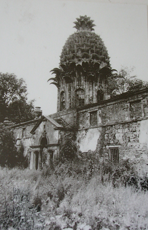
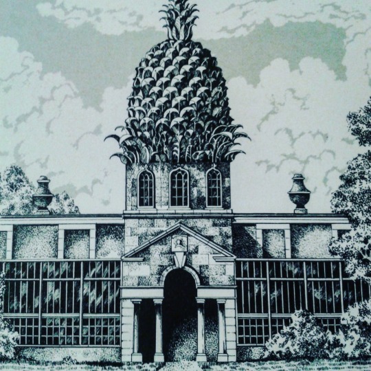
The Dunmore Pineapple is an 18th century summerhouse building with a giant stone pineapple as its central architectural feature. It is located in Dunmore Park, in Stirlingshire, Scotland, and has been described as one of the United Kingdom’s greatest follies, and ‘the most bizarre building in Scotland’.٭
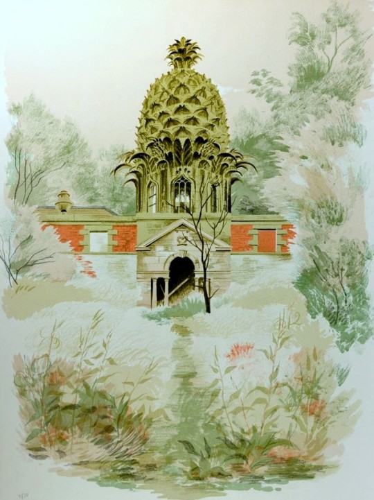
Illustration of Dunmore’s Pineapple with the house-houses.
The two-storey building contained a hothouse along the lower front level and was built around the time of 1761 by John Murray, the 4th Earl of Dunmore. The hothouse was used, among other things, for growing pineapples which were considered to be exotic fruit that travellers to the Indies and America would bring back as trophies.
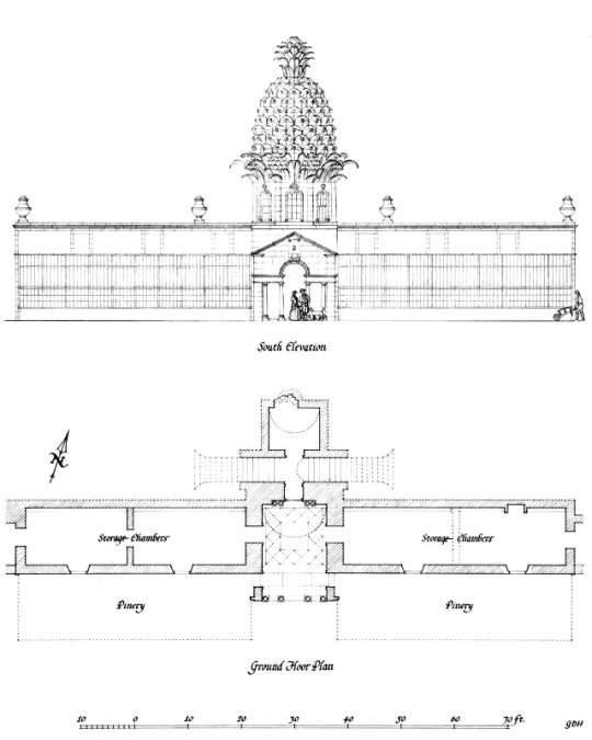
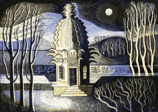
Built into a hill, from each side they appear to be on ground level. The south side (as depicted by Barbara Jones) had the hothouses lining the edge of the building, backing on to the walled orchard and gardens. The north side (as depicted by Ed Kluz) has the top of the Pineapple folly.
South Elevation of the Dunmore Pineapple by Barbara Jones.
The pineapple is around 14 metres high and is intricately carved in stone to form an elaborate cupola on top of an octagonal pavilion. Conventional architraves put out shoots and end as stone-shaped ‘prickly leaves’. According to its intended purpose as a hothouse, the walls are of double construction with a cavity for the circulation of hot air for the old greenhouses.
North Elevation of the Dunmore Pineapple by Ed Kluz.
† Sacred Architecture of London by Nigel Pennick, 2012. 9781904658627
‡ The Pineapple: King of Fruits by Francesca Beauman 2006 p117 9780099469445
٭ Collins Encyclopaedia of Scotland – p22, 2000 9780007103539
For the Coronation of Elizabeth II, a group of artists were invited to create lithographs for the Royal College of Art. Following the success of the Schools Prints series and Contemporary Lithographs, these prints were sold in limited editions and helped boost the RCA’s skills at reviving lithographic techniques. They were exhibited at the Redfern Gallery from April – May, 1953.
Most of the prints are held in Government collections and gain large prices at auction. It’s one of the least known lithographic collections but showcases some of the best British Artists of the mid twentieth century.
Leonard Rosoman – Two Pipers in the Sunlight, 1953
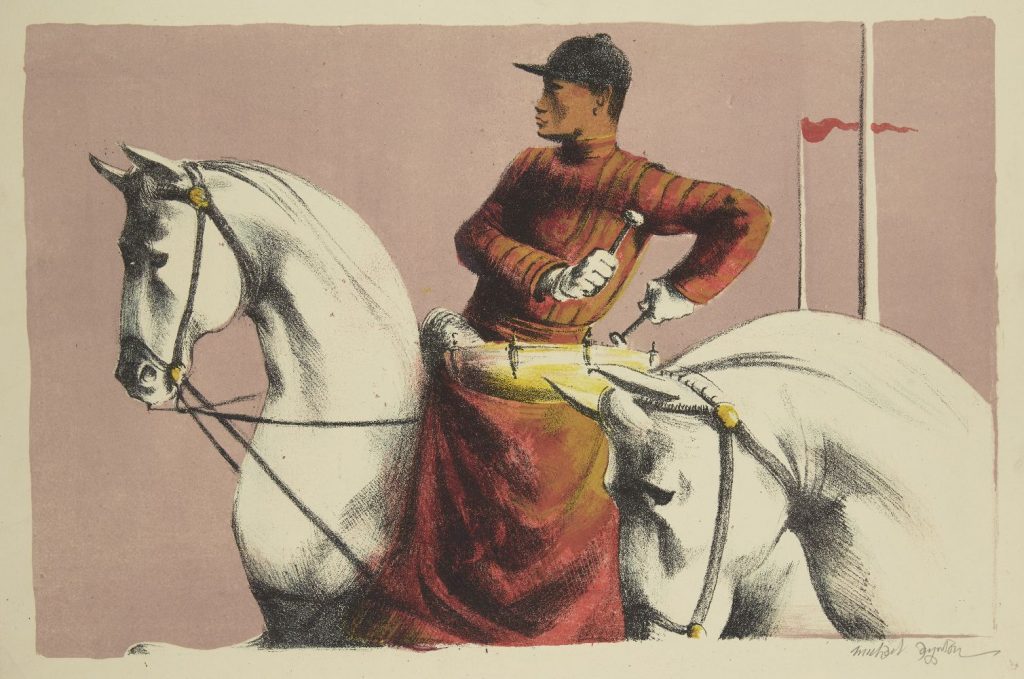
Michael Ayrton – Kettledrums, 1953
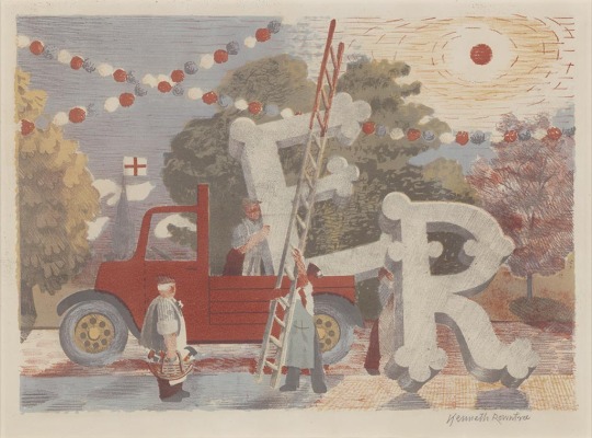
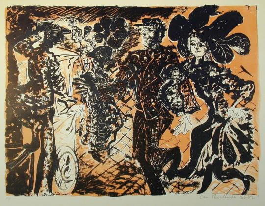
Kenneth Rowntree – Country Celebrations
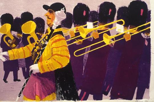
Bernard Cheese – Drum Major
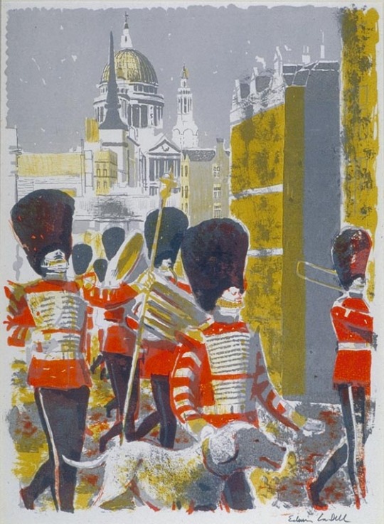
Edwin La Dell – Bandsmen in the City
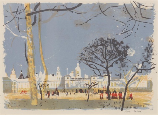
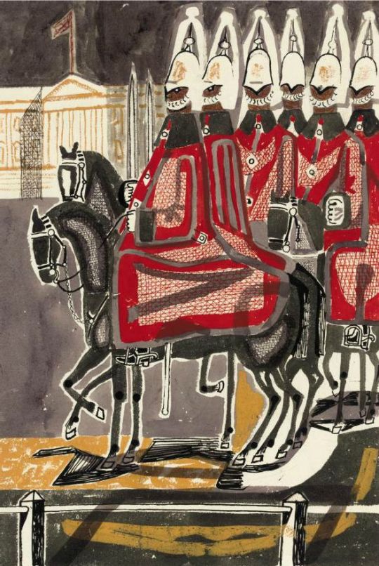
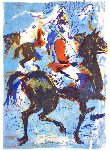
Edwin La Dell – Horse Guards Parade
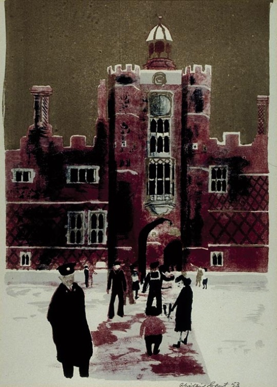
Alistair Grant – Hampton Court
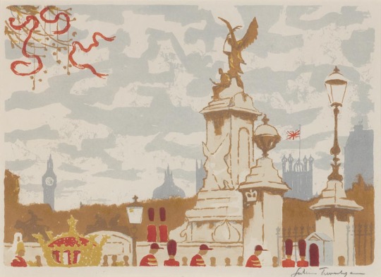
Julian Trevelyan – The Mall
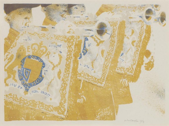
Robert Austin – Heralds
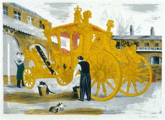
Barbara Jones – Prepairing the Coronation Coach
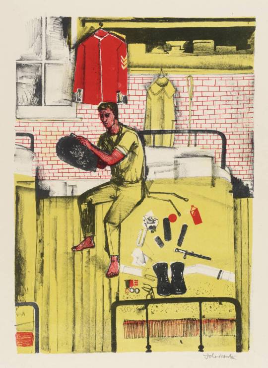
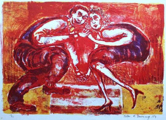
John Minton – Horseguards in their Dressing Rooms at Whitehall
The King Penguin book series were beautifully printed books. To me, they were like the Ladybird Books for adults, covering a wide range of unconnected topics and monographs.
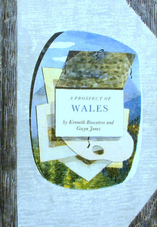
A Prospect of Wales, illustrated by Kenneth Rowntree, 1948.
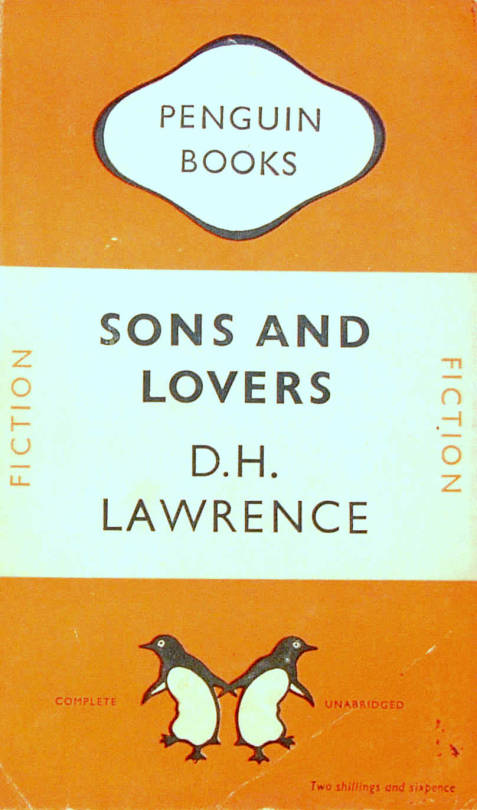
The motive for Penguin Books was to broaden its appeal to the public. While still a young company, Penguin shocked the Publishing world with paperback books for sale by known and respected authors. Before that the idea of paperback fiction was to expect an unknown author and a throw-away after use book.
The original run of penguin books were black and white inside and mostly text, with the iconic two stripe colour banding. The colour schemes included: orange and white for general fiction, green and white for crime fiction, cerise and white for travel and adventure, dark blue and white for biographies, yellow and white for miscellaneous, red and white for drama; and the rarer purple and white for essays and belles lettres and grey and white for world affairs.
D.H.Lawrence – Sons and Lovers, 1948. Original Penguin Book cover.
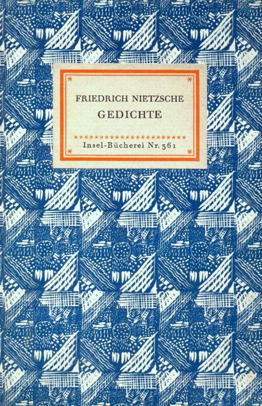
They were an British knock off of the Insel-Bücherei (Island Library) series published in Germany by Insel Verlag from 1912 onwards. The size of the German books with their repeated pattern book coverings was an inspiration. The head of Penguin books is quoted:
“Why, we felt, should there not be a similar series of books in this country? The experiment, started a few weeks after war broke out, turned out to be successful. One of the most distinctive features of this series is their decorative covers.” †
Friedrich Nietzsche – Poems. Insel Bucherei
“The aim of the King Penguin is different. These have not been planned to coincide with the public’s growing appreciation of art, but rather to appeal to the general liking for illustrated keepsakes of special projects.” †
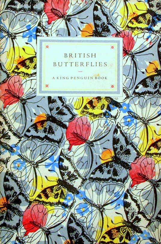
The King Penguin series were also hardback books with colour lithographic illustrations, a move away from paperback and monochrome books.
British Butterflies, cover by Paxton Chadwick, 1951.
The books originally combined a classic series of colour plates with an authoritative text. The first two volumes featured sixteen plates from John Gould’s ‘The Birds of Great Britain’ (1873) with historical introduction and commentary on each plate by Phyllis Barclay-Smith, and sixteen plates from Redouté’s Roses (1817–24) with historical introduction and commentary by John Ramsbottom. The third volume began the alternative practice of colour plates from a variety of sources. There were 76 volumes of King Penguin books in total.
Where as the educated scholars writing the books were the famous people at the time, today most people hunt for the illustrators, like John Piper, Edward Bawden, Hutton Clarke, Barbara Jones and Enid Marx.
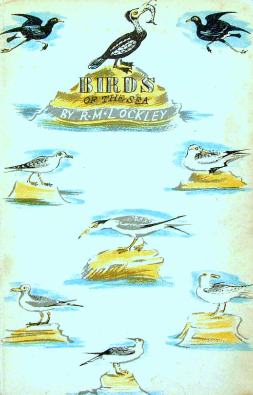
Birds of the Sea, cover designed by Enid Marx, 1945.
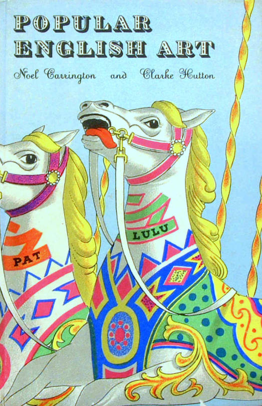
Popular English Art, illustrated by Clarke Hutton, 1945.
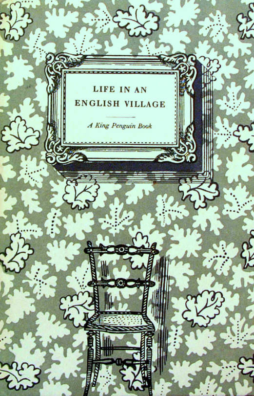
Life in an English Village, illustrated by Edward Bawden, 1949.
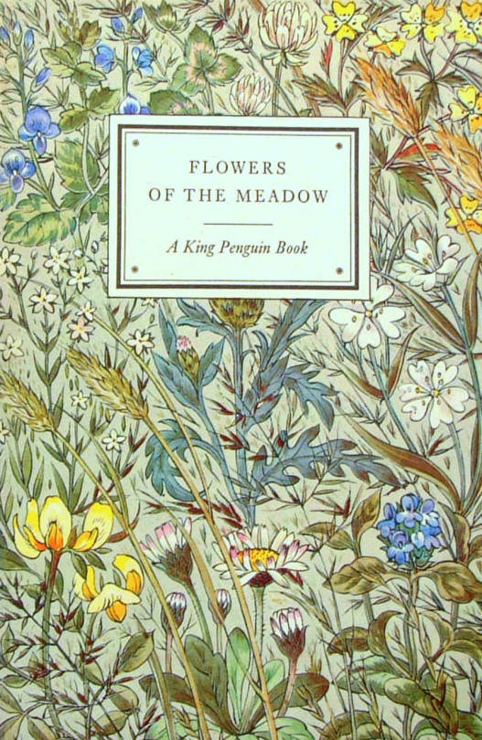
Flowers of the Meadow, Illustrated by Robin Tanner, 1950.
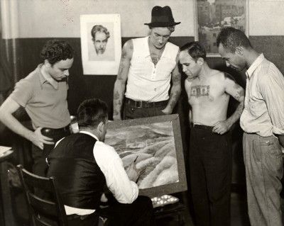
During the Great depression in America artists were employed by the state to make works for the public. It was called the Federal Art Project and from 1935 the project was mostly famous for the murals in post offices, but it also covered sculpture and graphic design work. The project is said to have made 200,000 works from 1935 to 1943.
A charming picture of an Artist giving Art classes to Navy and Merchant Seamen at the Seamen’s Institute. 1935.
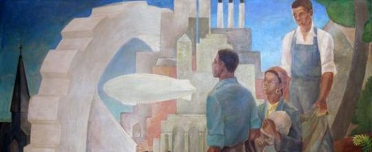
Vertis Hayes mural ‘Pursuit of Happiness’ painted in Harlem Hospital, NYC.
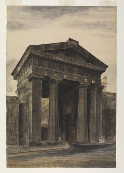
The director of the National Gallery, Sir Kenneth Clark was inspired by the Federal Art Project in the run-up to the Second World War years. In 1940 the Committee for the Employment of Artists in Wartime, part of the Ministry of Labour and National Service, launched a scheme to employ artists to record the home front in Britain, funded by a grant from the Pilgrim Trust. It ran until 1943 and some of the country’s finest watercolour painters, such as John Piper, Sir William Russell Flint, Rowland Hilder, and Barbara Jones were commissioned to make paintings and drawings of places which captured a sense of national identity.
Their subjects were typically English: market towns, villages, churches, country estates, rural landscapes; industries, rivers, monuments and ruins. Northern Ireland was not covered, only four Welsh counties were included and a separate scheme ran in Scotland.
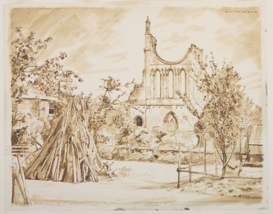
Barbara Jones: The Euston Arch for The Recording Britain project, 1943. V&A.
The premonition that Britain would be changed by WWII wasn’t the only motivation for starting the project, the ever expanding suburbs and new roads would mean that Britain was changing into a new industrial age.
The idea of a ‘vanishing Brtiain’ was also not new; in 1877 the Society for the Protection of Ancient Buildings (SPAB) was chiefly set up by William Morris and Philip Webb to conserve buildings in Britain. After the huge loss of life in the First World War, along with death duties, many family mansions where auctioned off and destroyed. (A practice that sadly went on long after the second world war.)
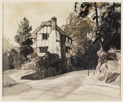
Rowland Hilder – The Old Cottage, Pulborough. 1940. V&A.
Another motivation for Clark was to help British artists during wartime and keep traditional art mediums fashionable. Many of the works were either done in watercolour or gouache.
In total over 1500 works were produced and 97 artists participated. The works were displayed three times during the war in the now, mostly empty, National Gallery and toured across Britain as a national moral boosting piece of propaganda.
Kenneth Rowntree – Brent Hall from the South, Finchingfield. 1940. V&A.
The Pilgrim Trust donated the works to the Victoria and Albert museum, London in 1949. A four volume set of books was published and is now highly collectable. Two other books have been edited by Gill Saunders in 1990, 2011 and 2012.
Michael Rothenstein – Byland Abbey – 4 June 1940. V&A.
These last works to Nikolaus Pevsner:
My answer to that is the War Artists’ Committee which was appointed at the beginning of the war to select artists as records of all kinds of war events. It has chosen its artists judiciously and on the whole put them into the right positions. It suggested to them subjects which were up their street anyway, and it left them an amazing amount of freedom as to how they wished to work. The result has been very good indeed. Henry Moore in the tube shelters, John Piper and Graham Sutherland amongst the bombed buildings, Stanley Spencer in machine shops, Eric Ravilious with the Fleet Air Arm, Edward Bawden in Abyssinia and so on — a record of which any country may be proud.
[And one more case-] Another group of young artists got their chance also by means of such a committee: the Recording Britain scheme of the Pi;grim Trust. Again, they were intelligently chosen to do a job of work which they liked to do: this time, the recording of anything they cared for in any county of Britain — Medieval castles, railway junctions, cottages, Victorian pubs, work in the fields, a deserted mine and iron stove and commandment boards in a church — anything. It has actually brought a few artists right into the limelight who had not before had quite such an opportunity to show what they could do: Kenneth Rowntree, for instance, and Barbara Jones. †
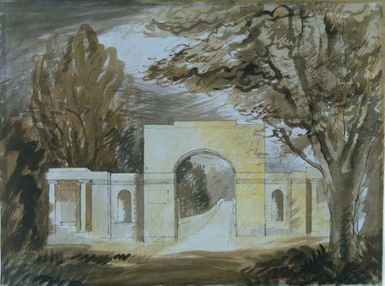
John Piper – Entrance Screen, Tyringham, 1940.
† From a radio broadcast ‘Art and the state’ from the show Art for Everyone. BBC Overseas Services — The Complete Broadcast Talks: Architecture and Art on Radio and Television.